27 Best Display Serif Fonts in 2026
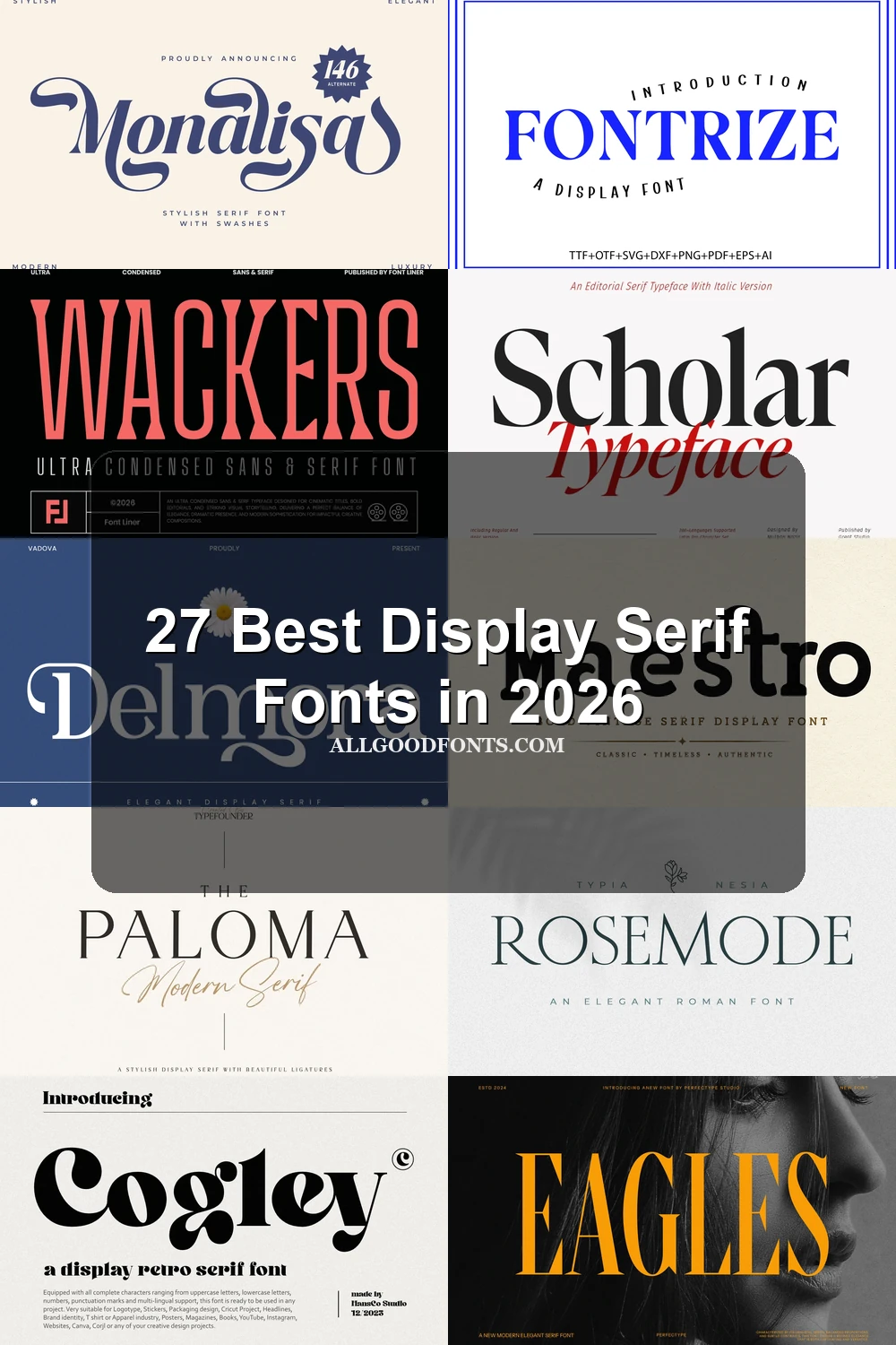
This collection spans sharp high-contrast serifs, compressed headline forms, flowing flourishes, and textured slab-like structures. These Display Serif Fonts are suited to logos, packaging, posters, invitations, editorial titles, and other applications where letter construction and scale shape the design role.
Looking for more serif fonts? Browse our complete Serif Fonts collection to compare modern, elegant, bold, logo-friendly, and vintage serif styles.
Display Serif Fonts: High-Contrast Foundations
These Display Serif Fonts share upright, high-contrast construction, pointed serifs, and formal proportions. Compared with the other groups, they prioritize structured authority over compression, flourishes, or surface texture.
Dihot Font

Best For: display text, high-end designs
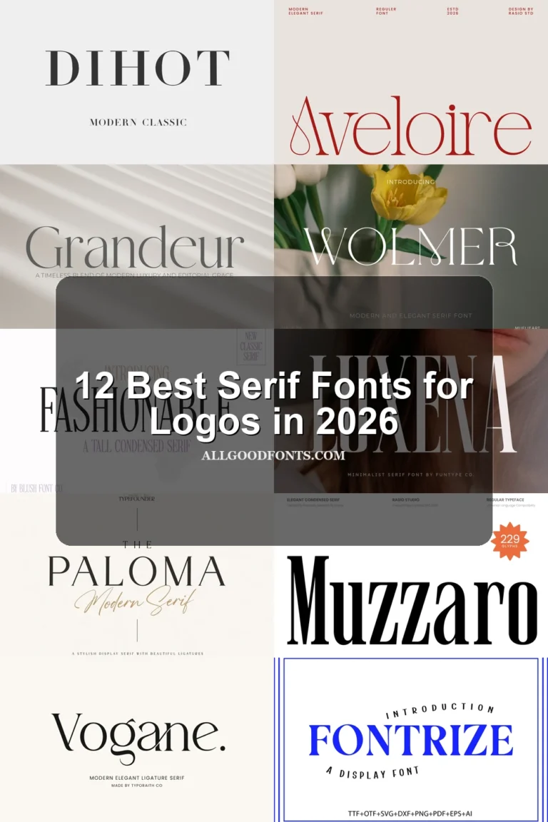
Dihot Font combines a wide stance, large x-height, and crisp high contrast, giving headline lines an imposing frame. Its thin strokes need generous scale, so it works better for display text than compact supporting copy.
Rethena Font

Best For: branding, fashion branding, display text
Rethena Font sets open bowls and loops against pointed, high-contrast serifs, helping headline words retain recognizable internal shapes. Its thin details can fade when reduced, making it most useful for branding and large display text.
Fontrize Font
Best For: branding, headlines, display text
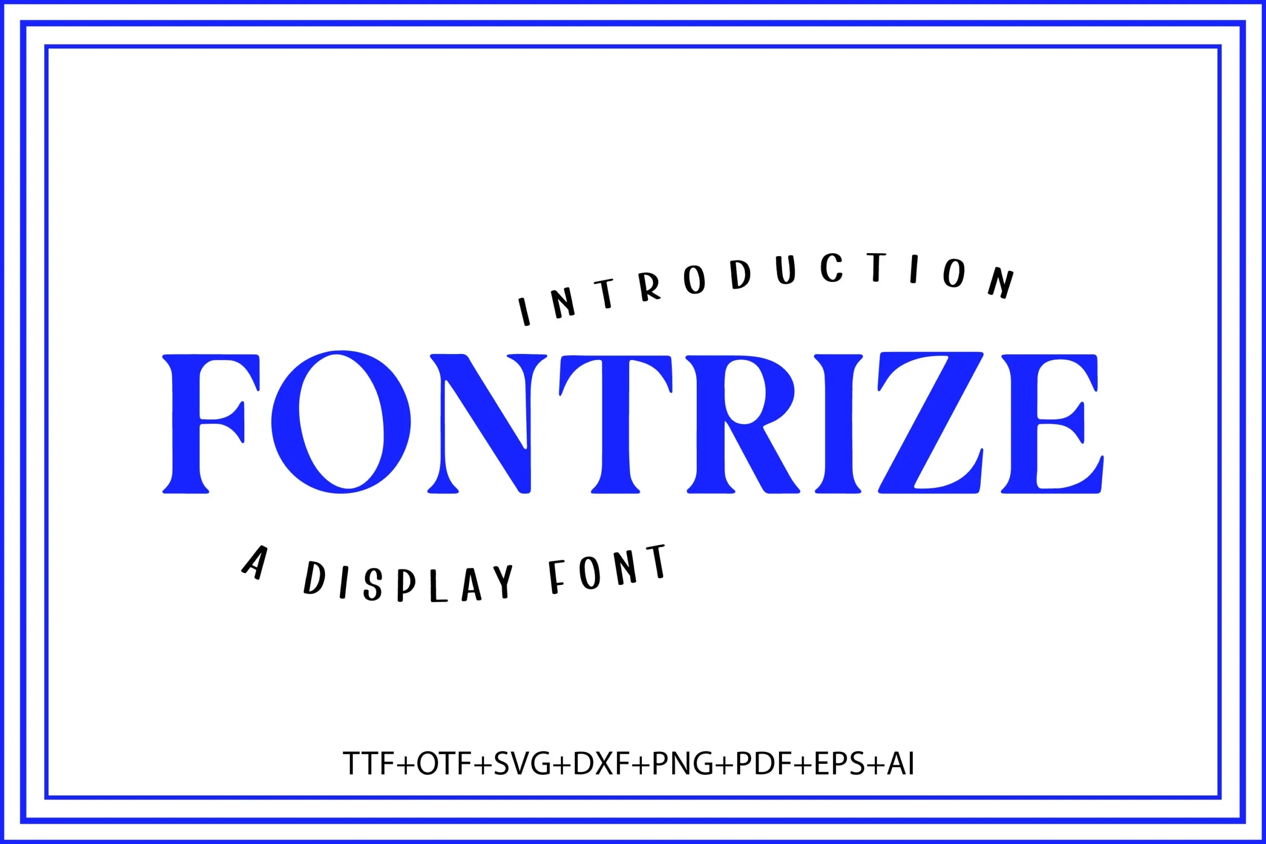
Fontrize Font brings geometric proportions into a formal serif structure with sharp, prominent serifs and an upright axis. The orderly construction suits authoritative headers, although its hairlines may weaken below large display sizes.
Olivera Font

Best For: product labels, display text, modern designs
Olivera Font pairs pointed triangular serifs with closed counters and consistent lowercase proportions. The controlled shapes keep Display Serif Fonts readable in headings, though delicate strokes still make dense text a poor application.
Strong Font
Best For: logos, branding, packaging, display text
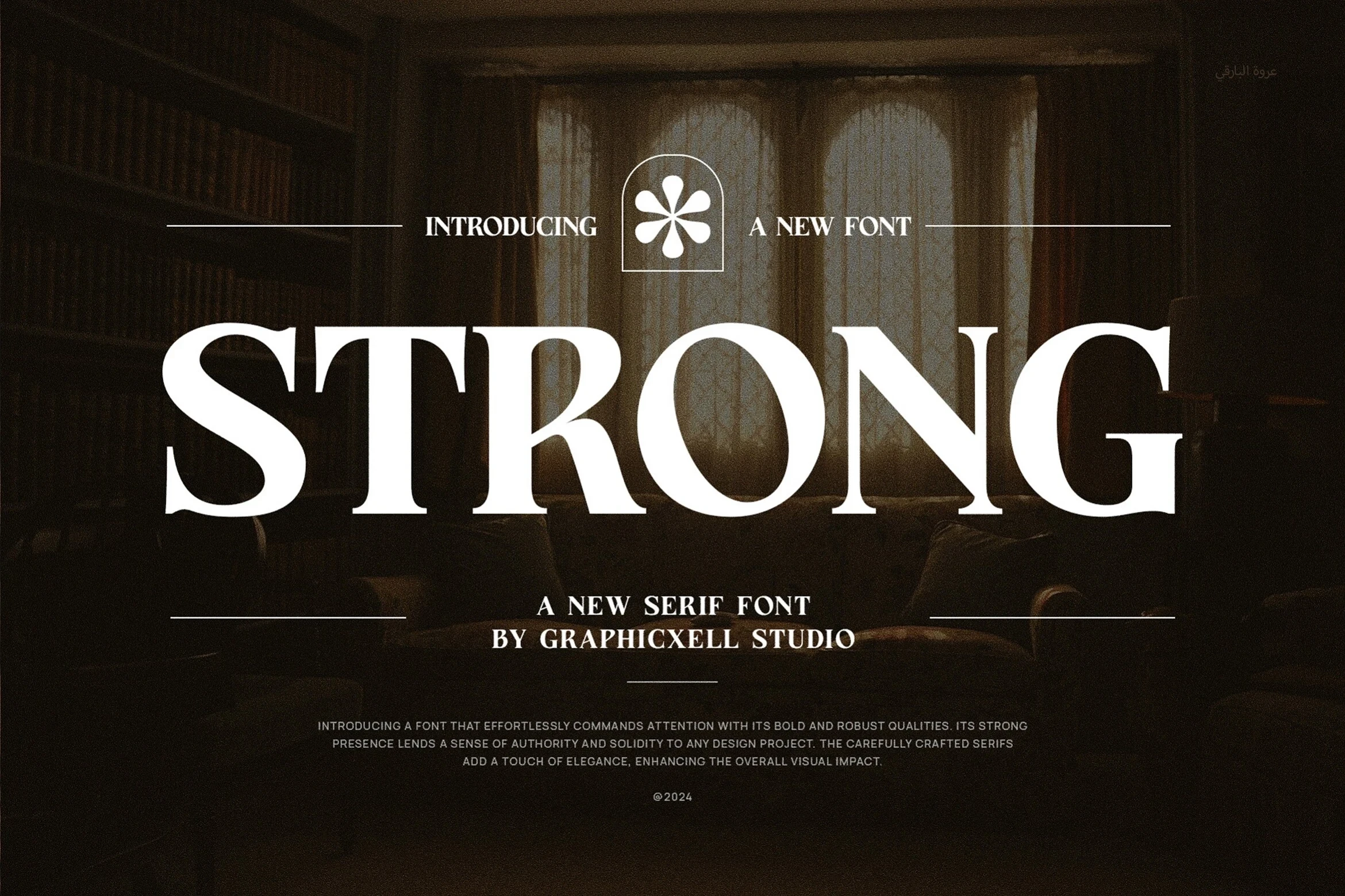
Strong Font combines a wide upright frame, large x-height, and bracketed triangular serifs for substantial lettering. Its broad proportions read clearly in logos and packaging, while fine hairlines can disappear in smaller applications.
Grandeur – Elegant Classic Serif Font

Best For: display text, modern designs, clean designs
Grandeur – Elegant Classic Serif Font has a light weight, thin sharp serifs, and moderate x-height. Its fine contrast needs spacious sizing, making it better for airy display text than compact labels or dense copy.
Elegant Font

Best For: high-end designs, display text, clean designs
Elegant Font keeps its characters clearly disconnected while shaping them with high contrast and curved details. The orderly separation supports prominent display text, but thin strokes still restrict it to larger sizes.
Nivella Font

Best For: branding, fashion branding, high-end designs, website headers
Nivella Font adds a sweeping tail to the capital N and curved terminals to otherwise controlled serif forms. Those gestures individualize a brand name, while high contrast keeps the design most effective in large headers.
Scholar Typeface Font

Best For: display text, clean designs, elegant designs, editorial designs
Scholar Typeface Font offers upright and right-leaning styles within a high-contrast wedge-serif system. The paired orientations can separate editorial accents, but teardrop terminals and fine contrast favor titles over continuous text.
Rosemode Font
Best For: headlines, display text, modern designs, clean designs
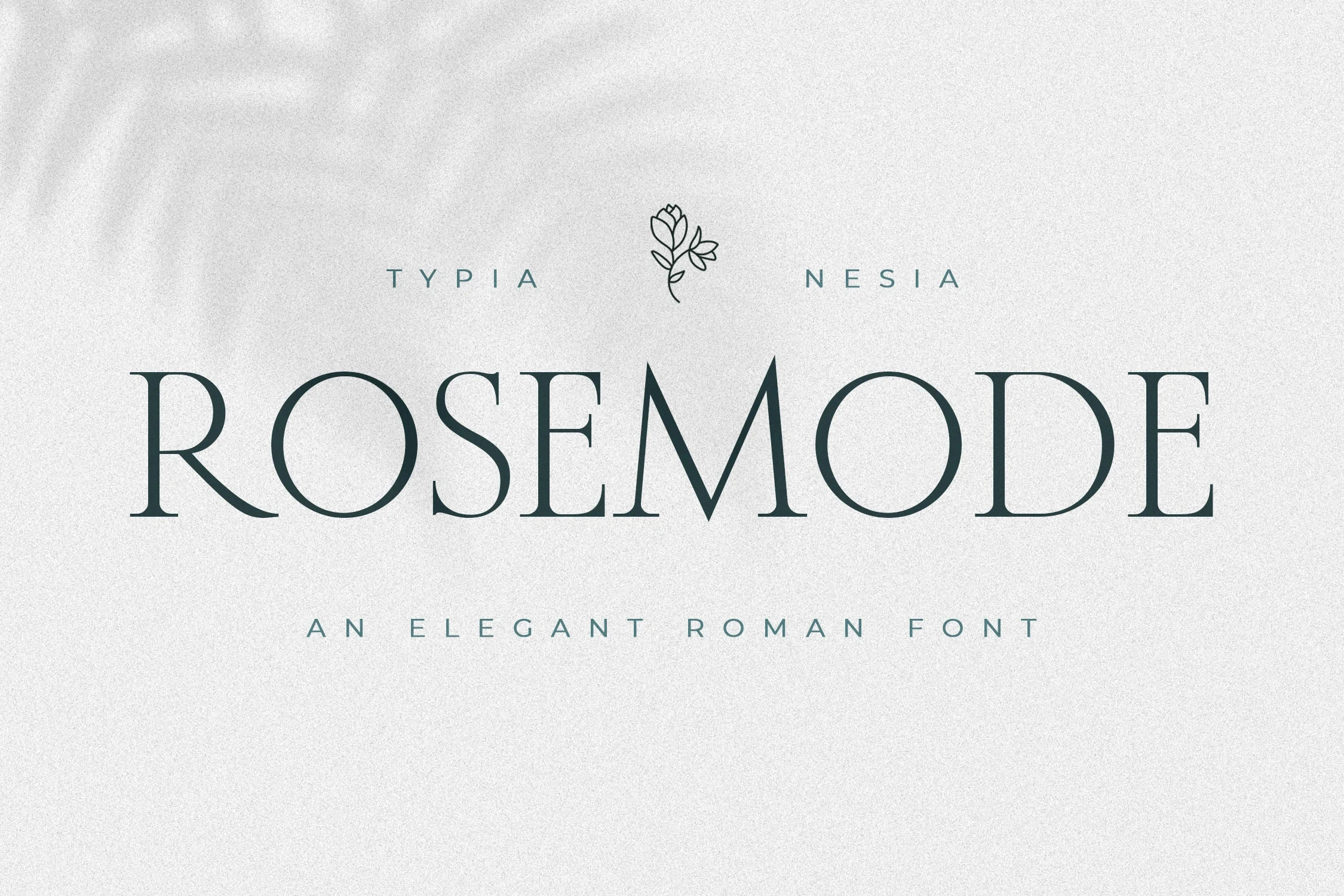
Rosemode Font uses wide geometric structures and sharp serifs for a spacious, controlled presence. It is among the more open Display Serif Fonts for clean headlines and logos, though high contrast keeps it out of long-form body use.
Condensed Display Serifs
Condensed proportions, tall vertical rhythms, and narrow counters define this group. They occupy tight headline spaces more efficiently than the wider display serifs, but their density limits extended reading.
Wackers Font

Best For: branding, packaging, fashion branding, display text
Wackers Font uses ultra-condensed proportions, strong vertical stress, and flared wedge terminals to create a cinematic rhythm. Its narrow silhouette fits title stacks, fashion branding, and packaging panels, but the elongated forms are unsuitable for body reading.
Muzzaro Font

Best For: fashion branding, branding, packaging, headlines
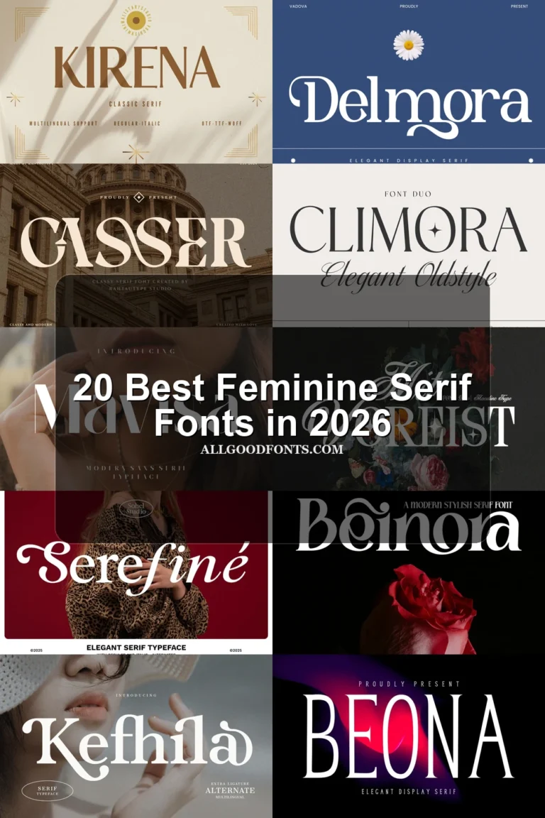
Muzzaro Font compresses a formal, high-contrast voice into narrow proportions with bracketed serifs and a vertical stance. It fits fashion branding, packaging, and headlines efficiently, but density and thin strokes reduce small-size readability.
Mafesta Font
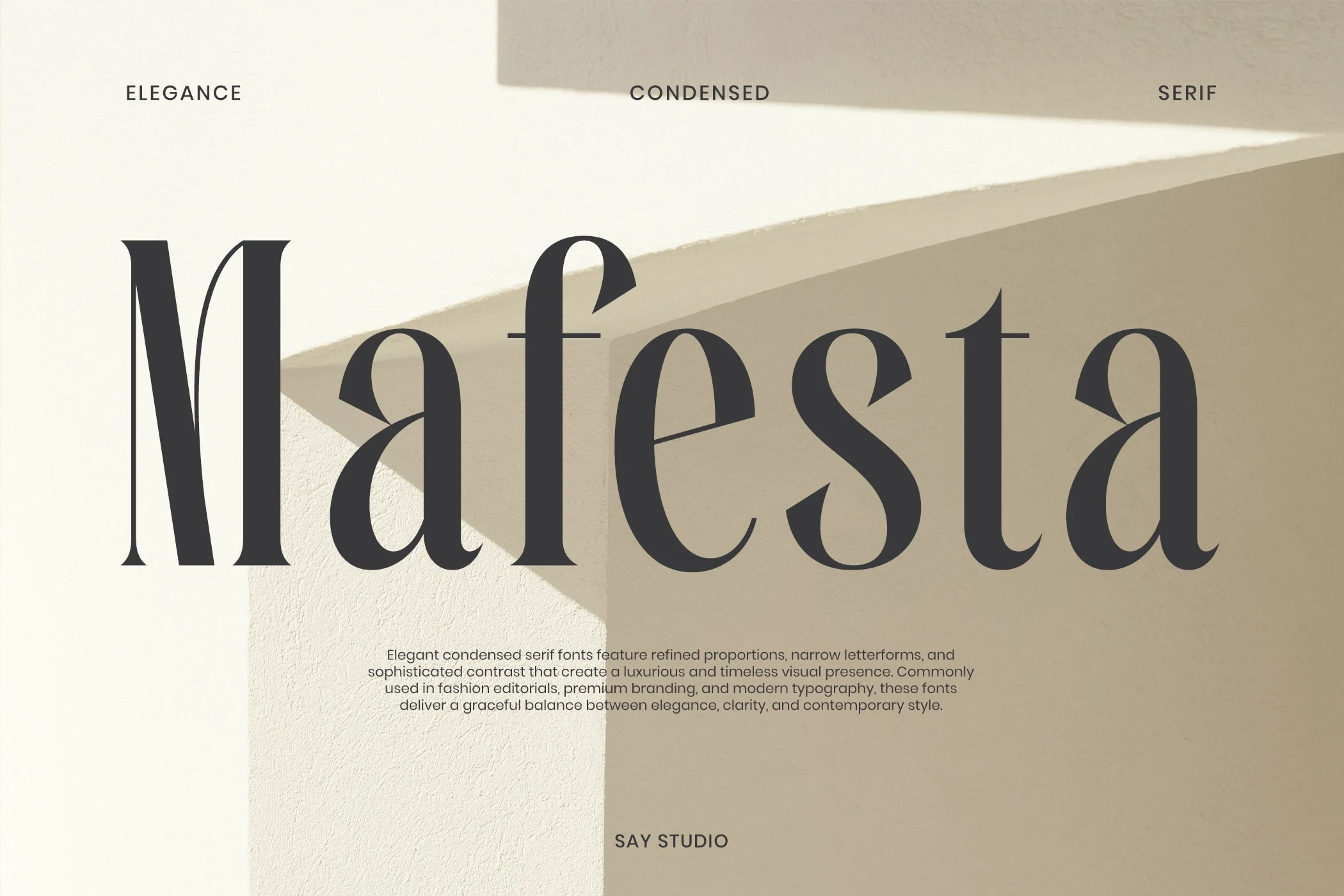
Best For: branding, packaging, fashion branding, product labels
Mafesta Font compresses bracketed serifs into a nearly vertical silhouette, giving fashion branding and packaging efficient narrow coverage. Its high contrast remains dependent on larger sizes, where thin strokes have room to separate.
Luxena Font

Best For: logos, branding, posters, headlines
Luxena Font forms an unusually tall, condensed column with sharp bracketed serifs. These Display Serif Fonts work well for logos, posters, and tight headline areas, while the compressed structure discourages long reading. OTF and TTF formats support broad compatibility.
Eagles Font

Best For: display text, modern designs, clean designs
Eagles Font combines condensed vertical proportions, a large x-height, and triangular serifs for compact headline impact. It remains readable at display scale, though thin serif details lose definition in smaller supporting copy.
Ornamental and Flowing Display Forms
Swashes, ligatures, connected scripts, overlapping characters, and curved terminals drive this decorative category. These forms offer stronger personality than the restrained groups, yet require generous sizing for clarity.
Vogane Font
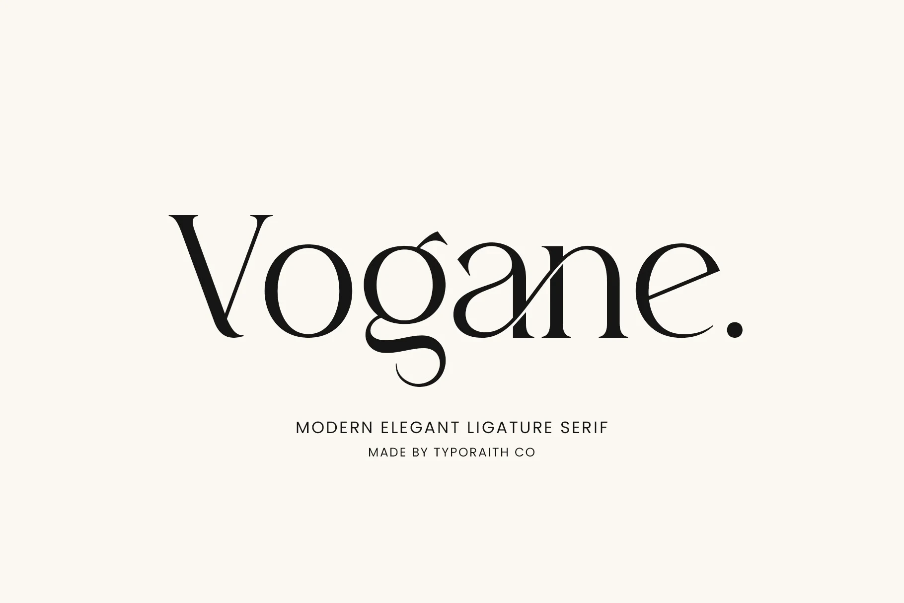
Best For: logos, branding, packaging, invitations
Vogane Font builds a customized display identity through integrated ligatures, alternate characters, and curving flourishes from the g and n. Its intricate joins are best reserved for large titles, logos, and invitations, where the construction can remain visible.
Welp Clair Font

Best For: logos, branding, packaging, social media graphics
Welp Clair Font pushes pointed serifs and sweeping lowercase curves toward a decorative vintage finish. Ligatures and alternate characters strengthen logos, packaging, and social graphics, while the high contrast and flourishes call for large display sizing.
Cogley Font

Best For: packaging, posters, headlines, stickers
Cogley Font replaces restrained serif geometry with bulbous curves, swooping terminals, and retro character shapes. Its stylization gives packaging, posters, stickers, and headlines a strongly individual surface, but intricate curves lose detail when downsized.
The Paloma Font

Best For: branding, high-end designs, logos, display text
The Paloma Font pairs a formal high-contrast serif with a connected script accent. Use the serif for large titles and reserve the flowing companion for short branding accents, since its varied pressure is less dependable in compact text.
Praise Font

Best For: branding, fashion branding, logos, display text
Praise Font is recognizable through P and S swashes and a diamond-shaped accent between I and S. Those details help short names stand out in branding, but can overwhelm long wording or reduced-size display text.
Monalisa Font

Best For: display text, clean designs, elegant designs, decorative designs
Monalisa Font is a connected display script with rhythmic baseline movement and prominent entry and exit swashes. Continuous connections suit short titles and decorative branding, but not extended wording or tightly set text.
Stanza Font

Best For: posters, social media graphics, display text
Stanza Font creates overlapping display texture through interlocking characters, pointed terminals, and pronounced S and A swashes. It gives posters and social graphics a strong word shape, though the overlap becomes unreliable when reduced.
Ronsa Font

Best For: display text, modern designs, minimal designs
Ronsa Font centers its identity on an R-to-O flourish and an extended underline-like sweep. The connected decoration is most convincing as a logotype treatment, but it can disrupt readability across longer headings.
Delmora Font

Best For: logos, branding, packaging, invitations
Delmora Font combines organic curves, terminal flourishes, alternate characters, and multilingual support. That flexibility helps branding and invitations handle varied wording, although decorative edges still require large sizing to remain clear.
Textured and Slab-Like Display Serifs
Wide slab-like serifs, blunt terminals, and distressed surfaces give this group a heavier tactile presence. They generally retain more stroke solidity than delicate high-contrast designs, though texture can reduce clarity.
Patcher Font

Best For: fashion branding, logos, branding, packaging
Patcher Font uses wide proportions and clean, slab-like horizontal serifs rather than ornamental flourishes. Its open upright construction makes these Display Serif Fonts practical for readable editorial headers, logos, and packaging labels.
Maestro Font
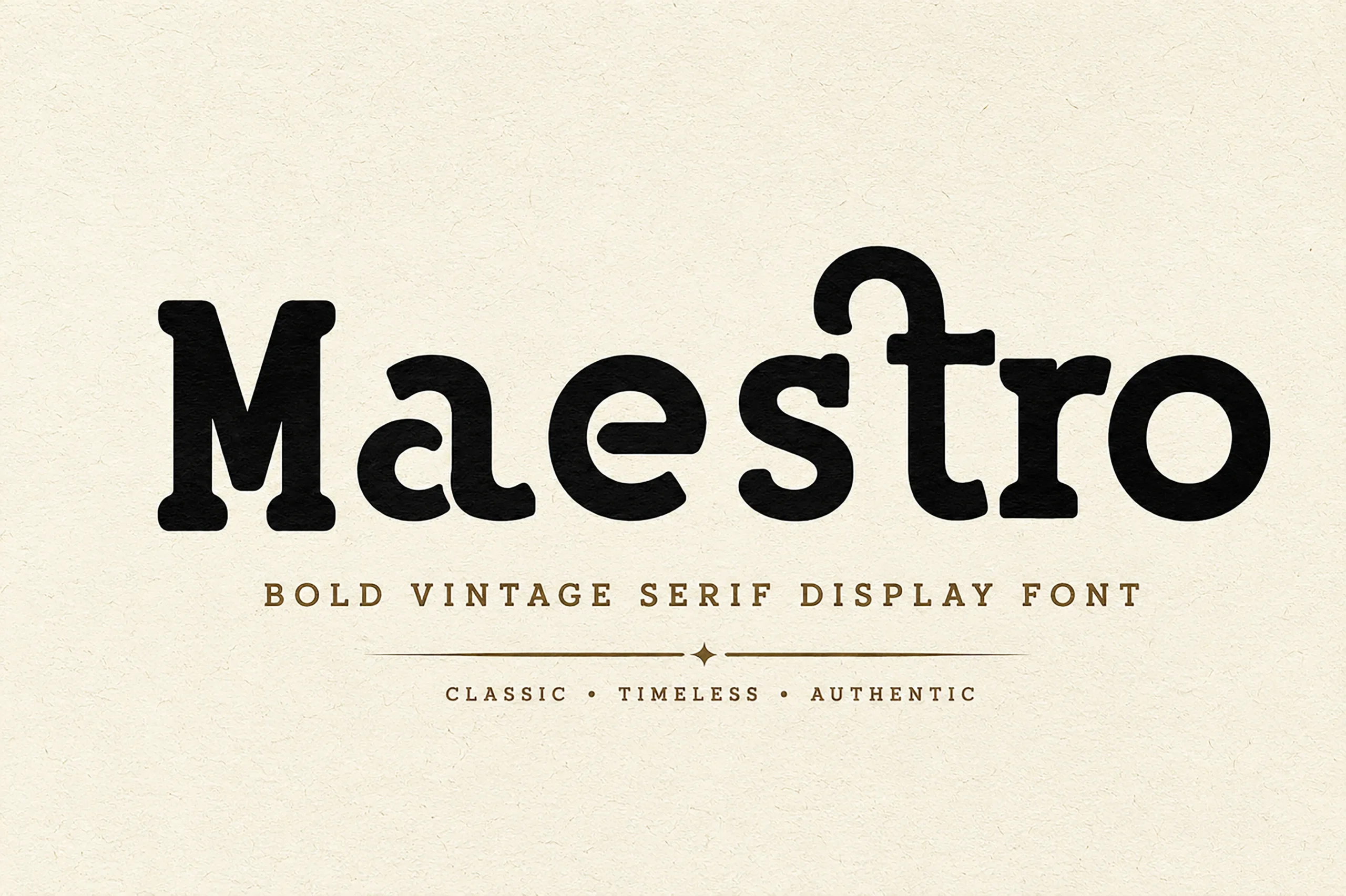
Best For: branding, display text, clean designs, classic designs
Maestro Font breaks from the high-contrast norm with low contrast, blunt rounded serifs, and an eccentric curved r terminal. Heavier strokes preserve clarity in display text, while the terminal supplies its distinctive character.
West Postage Font

Best For: branding, invitations, quotes, display text
West Postage Font applies a distressed, weathered surface to an upright traditional serif framework. The texture establishes a rustic context for branding, invitations, and quotes, but directly reduces clarity at small sizes.
How to Choose the Right Font
Choose by construction first: wide, open forms such as Patcher or Strong support clearer headlines, while condensed options like Luxena and Wackers conserve space. For branding, compare restrained serifs with flourished designs such as Vogane or Ronsa. Use high-contrast Display Serif Fonts at generous sizes, and reserve textured or connected styles for short wording where their details remain legible.