20 Best Feminine Serif Fonts in 2026
This collection of Feminine Serif Fonts spans connected swashes, sharp high-contrast serifs, condensed fashion silhouettes, and ready-made serif-and-script pairings. The practical differences are equally important: some prioritize distinctive branding marks, while others offer clearer large-scale titles, invitations, packaging, and editorial headings.
Looking for more serif fonts? Browse our complete Serif Fonts collection to compare modern, elegant, bold, logo-friendly, and vintage serif styles.
Feminine Serif Fonts With Decorative Swashes
These Feminine Serif Fonts build their identity through swashes, flourished terminals, flowing curves, and decorative details. Compared with the structured groups, they deliver more ornament and require more display space.
Beinora Font

Best For: display text, elegant designs, feminine designs
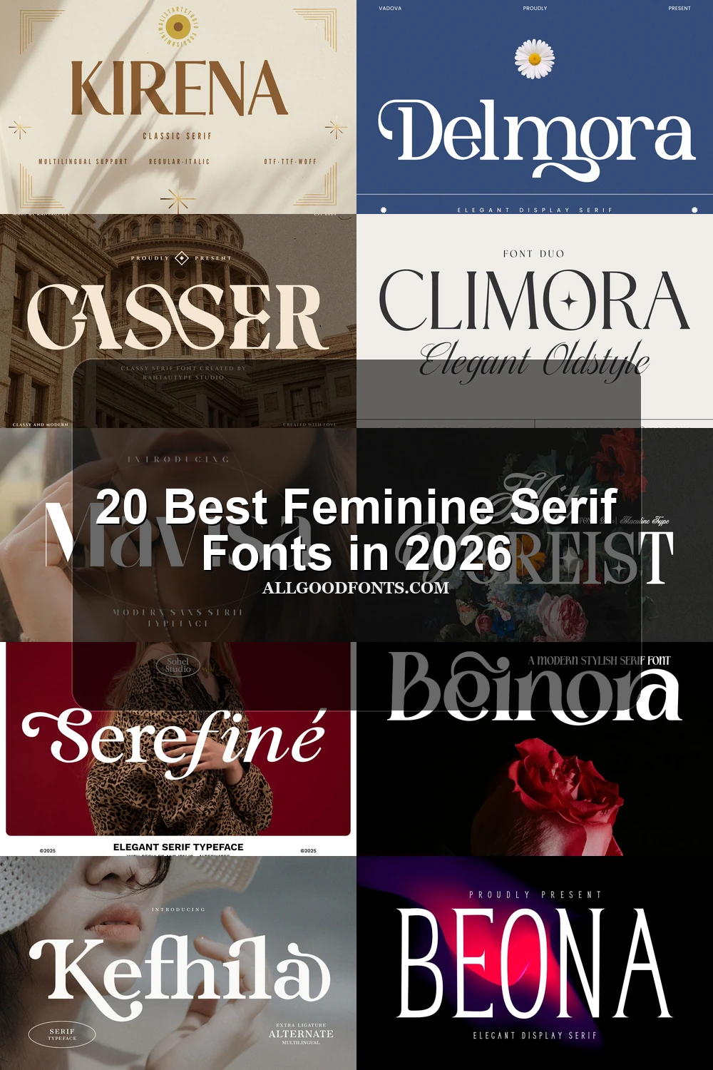
Beinora Font draws attention to its ornamental lowercase e and expansive curves. This Feminine Serif Fonts option creates a tight, intricate silhouette for logos and short headlines, but its flourishes and close spacing make sustained reading impractical.
Selaris Font

Best For: branding, high-end designs, website headers, display text
Selaris Font suits branding and website headers where an unusual silhouette matters. Needle-like serifs, exaggerated swashes, and open, unconventional letter construction give these Feminine Serif Fonts a distinctive edge, though thin strokes and complex forms reduce body-text clarity.
Milarose Regular Font

Best For: packaging, invitations, high-end designs
Milarose Regular Font adds movement through sharp high-contrast serifs and swashes running along the baseline. Its decorative treatment works well on invitations and packaging, provided the lettering receives enough display size to stay distinct.
Serefine Font

Best For: packaging, invitations, quotes, display text
Serefine Font balances a sturdy serif framework with flowing calligraphic curves and a prominent swash on the uppercase S. It has enough structural weight for packaging and invitations, though its exaggerated terminals clearly position it as a headline face.
Barghain Font

Barghain Font makes its mark with elongated swash-like curves on characters including R, G, and H. Those extensions give logos and short headlines a directional contemporary feel, but delicate strokes are better kept out of supporting copy.
Kefhila Font
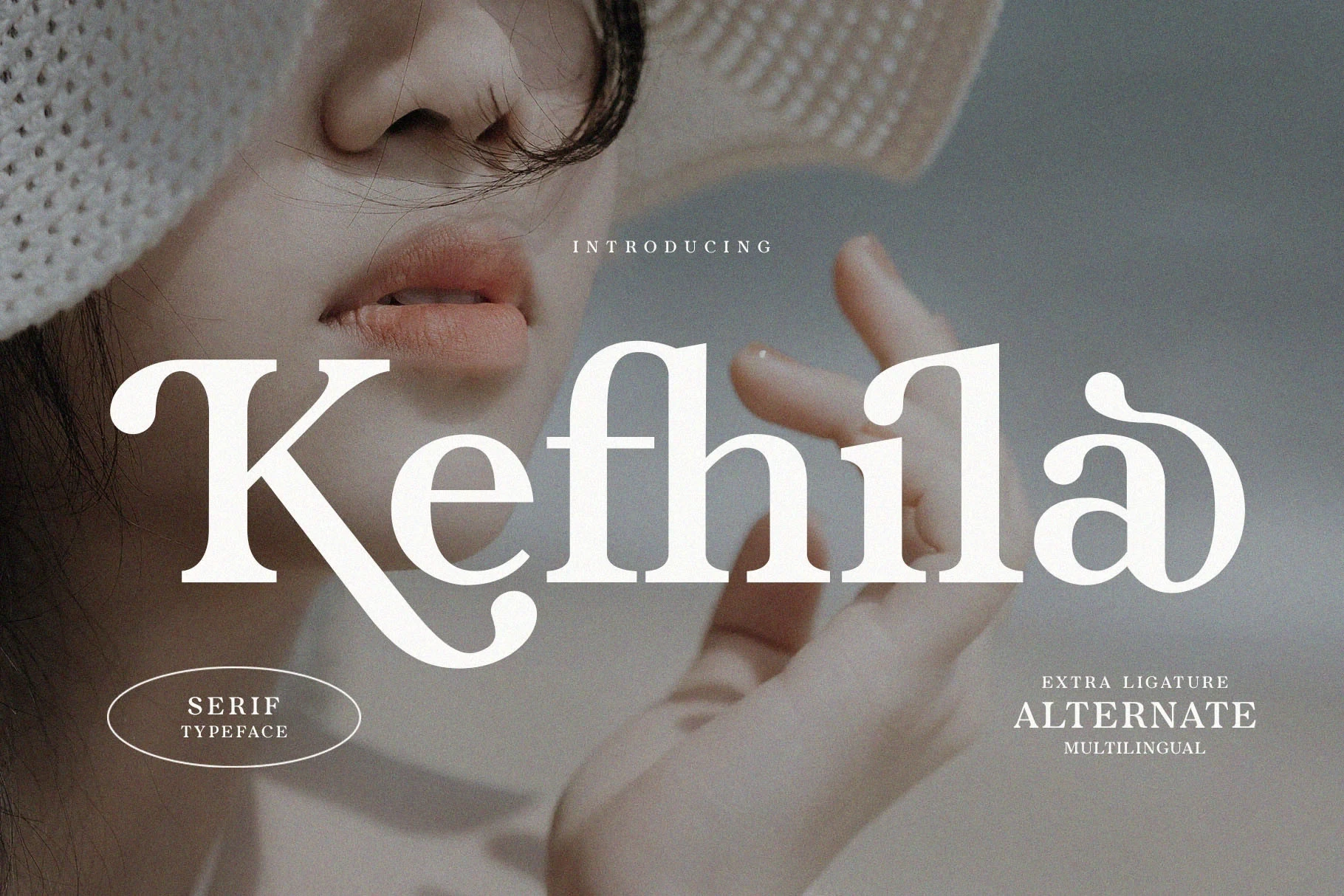
Best For: branding, product labels, display text
Kefhila Font concentrates its decoration around exaggerated swash terminals on the K and lowercase a, set within a bracketed serif structure. The upright posture remains stable, making its signature detail useful on product labels and titles.
Carien Font

Best For: display text, modern designs, elegant designs
Carien Font is suited to title work where separate ornamental accents can carry the mood. Sweeping flourishes on the C and R, together with a curling lowercase-style I, create a rich display texture but make paragraph use unsuitable.
Delmora Font
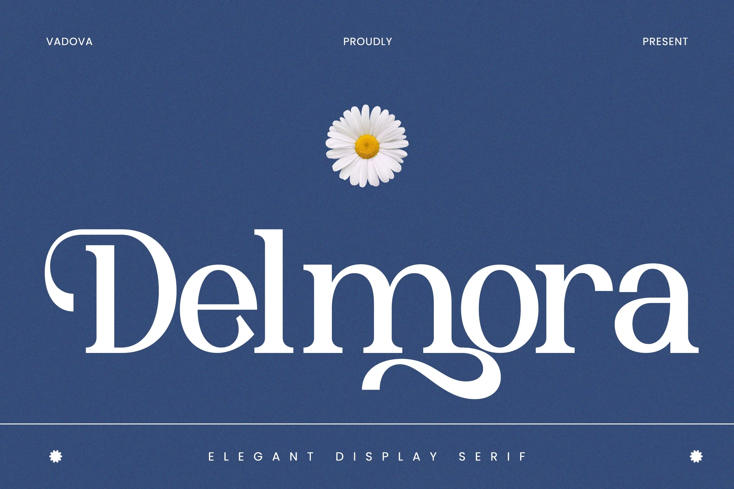
Best For: logos, branding, packaging, invitations
Delmora Font combines bracketed serifs with a curly D swash and a flourished lowercase a. Alternate characters and multilingual support broaden its use for logos, packaging, and invitations, while the elaborate forms remain firmly display-led.
Grand Sapphire Font

Best For: headlines, display text, modern designs, elegant designs
Grand Sapphire Font relies on liquid curves, asymmetrical strokes, and elongated sweeping terminals within a regular-width structure. Alternate characters extend its branding range, but the unconventional forms need headline scale to preserve their intended shape.
Editorial And Structured Display Serifs
This group emphasizes upright proportions, pointed or bracketed serifs, open counters, and editorial structure. Its forms feel more controlled than the swashed designs, while still relying on display-scale contrast.
Kirena Font

Best For: branding, display text, clean designs
Kirena Font uses wide, upright proportions, a strong vertical axis, and crisp wedge serifs for a controlled editorial presence. Among Feminine Serif Fonts, its broad structure reads confidently in branding and headings, while thin strokes need larger sizing.
Casser Font

Best For: branding, editorial designs, product labels, display text
Casser Font is built from expansive proportions, pronounced bracketed serifs, and curving forms that intertwine across the word. The width gives product labels and editorial titles authority, but those connected shapes are too involved for dense text.
Grosia Font
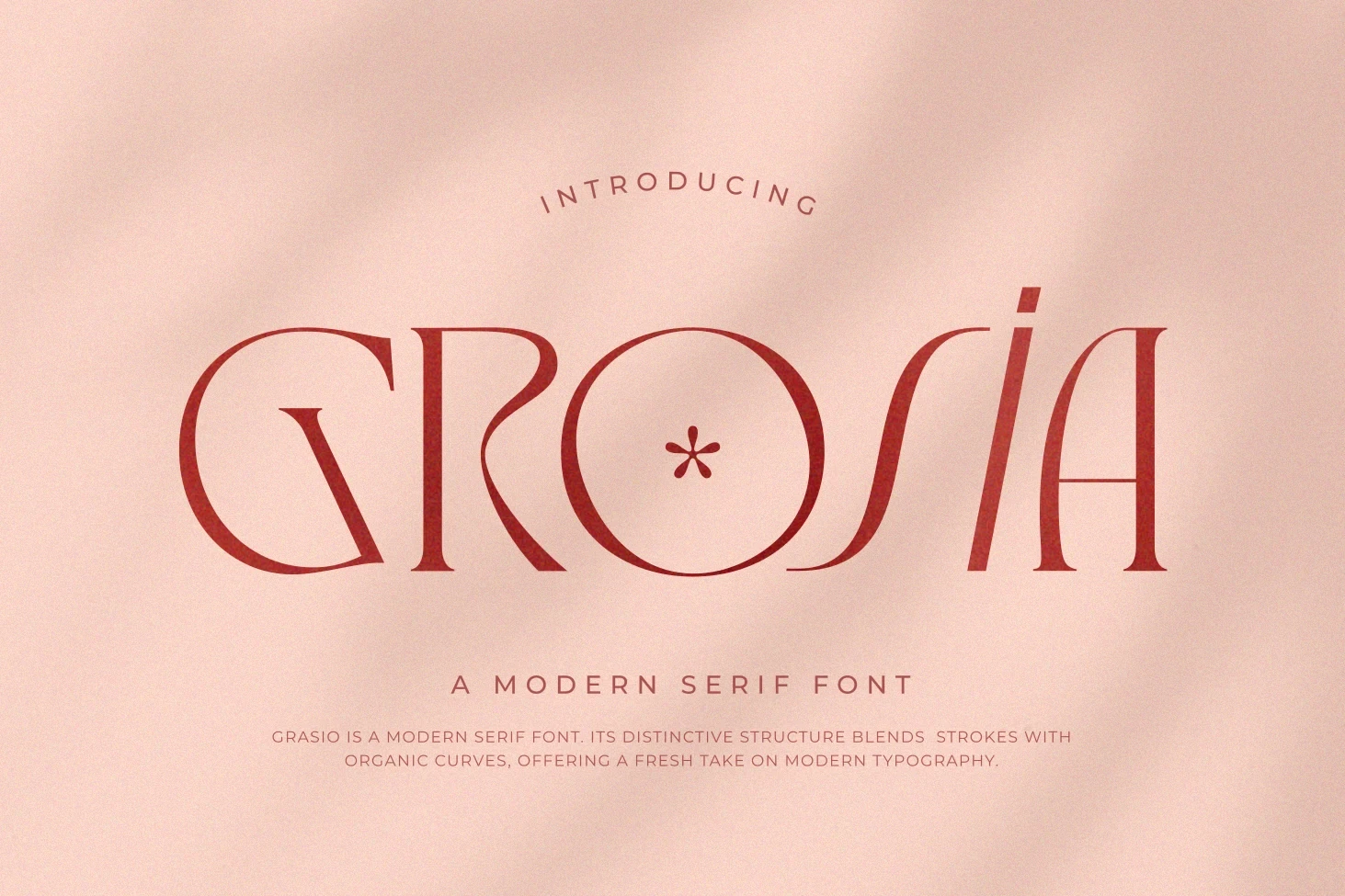
Best For: branding, headlines, fashion branding, display text
Grosia Font stretches its letters horizontally and replaces familiar serif endings with organic, stylized terminals. That extended silhouette suits fashion branding and headlines especially well, where viewers can appreciate its unusual proportions without demanding paragraph-level readability.
Zacorsea Font

Best For: beauty branding, logos, branding, packaging
Zacorsea Font combines wide proportions and pointed serifs with an unusual horizontal connection between the C and O. Included ligatures reinforce its beauty-branding potential, while the intricate joins need large sizing to avoid softening.
Qallisa Font

Best For: logos, branding, packaging, headlines
Qallisa Font pairs triangular serifs and flowing transitions with open counters in rounded lowercase letters. The open interiors support clearer large-scale branding and packaging, although its high-contrast hairlines still make small text unreliable.
Olivera Font

Best For: branding, high-end designs, display text, modern designs
Olivera Font combines wide, open apertures with sharp pointed serifs and a strong vertical axis. Its open counters preserve more large-size clarity than heavily flourished alternatives, although the high contrast still favors branding and titles over dense copy.
Nebulen Font
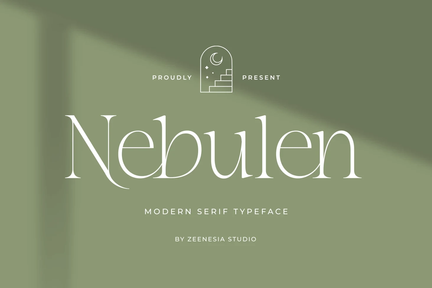
Best For: branding, display text, modern designs, elegant designs
Nebulen Font keeps an upright posture while adding tapered hairline serifs and extended terminals on the N and n. Its restrained ornament creates a distinctive modern word shape, though the fine terminals can disappear in small text.
Condensed And Fashion-Weight Serifs
These serifs use narrow or fine fashion-oriented proportions to create impact in limited width. Their thin details and high contrast make size and reproduction quality especially important.
Boena Serif Font

Best For: logos, branding, headlines, wedding designs
Boena Serif Font is the collection's most visibly condensed choice, pairing sharp serifs and high contrast with a right-leaning display posture. For Feminine Serif Fonts, its narrow width is useful for logos and wedding titles, but thin details need scale.
Mavisa Font

Best For: branding, invitations, fashion branding, display text
Mavisa Font brings a light, high-contrast construction with flared terminals, horizontal serifs, and an elongated arch on the v. This Feminine Serif Fonts selection suits invitation and fashion-branding titles, but its fine strokes require generous size.
Serif Pairings And Display Duos
These pairings combine a structured serif with a connected script, adding movement without requiring separate font selection. Both are strongest in large titles rather than dense information.
Mit Voreist Font

Best For: display text, elegant designs, classic designs
Mit Voreist Font combines a fluid, connected calligraphic script with an upright, high-contrast serif. The deliberate two-part construction creates a finished title treatment for Feminine Serif Fonts, but both styles need generous sizing for clarity.
Climora Duo Font

Best For: logos, branding, packaging, invitations
Climora Duo Font joins a high-contrast serif with a flowing script and places a four-pointed star inside the uppercase O. This Feminine Serif Fonts pairing supplies a built-in branding accent, but the combined treatment belongs on large display text.
How to Choose the Right Font
Choose swashed styles when the lettering itself should become the visual feature, and choose structured serifs when open counters and upright construction matter more. Condensed or light options conserve width but need careful sizing; pairings add instant contrast. Across these Feminine Serif Fonts, reserve the most intricate joins and hairlines for titles, logos, packaging, and other display applications.