14 Best Bold Serif Fonts in 2026
This collection of Bold Serif Fonts spans sharp editorial contrast, sturdy slabs, rounded retro forms, decorative swashes, and expressive serif-script pairings. Their practical roles range from commanding headlines and logos to packaging, posters, invitations, and supporting display accents where scale and readability can be controlled.
Looking for more serif fonts? Browse our complete Serif Fonts collection to compare modern, elegant, bold, logo-friendly, and vintage serif styles.
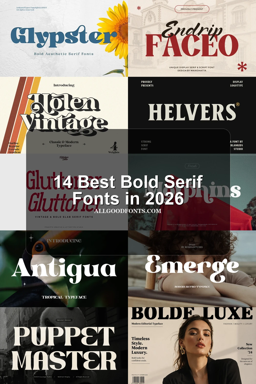
Bold Serif Fonts: High-Contrast Display
These Bold Serif Fonts rely on high contrast, pointed or blocky serifs, and stable vertical structures for polished editorial impact. They are generally clearer and less ornamental than the retro group.
Strong Desire Font

Best For: headlines, display text, elegant designs, classic designs
Strong Desire Font compresses heavy stems and thin strokes into a high-contrast, bracketed serif with an authoritative editorial tone. Its tight spacing and vertical axis make it especially effective for large headlines, display text, and elegant branding, but less suitable for extended reading.
Helvers Font

Best For: display text, modern designs, clean designs, bold designs
For clear large-scale headings, Helvers Font offers wide, stable letterforms with sturdy blocky serifs and a vertical construction. Its strong stroke weight delivers confident impact without ornamental distractions, making it one of the more dependable Bold Serif Fonts for display text, clean designs, and forceful titles.
Antigua Font

Best For: branding, packaging, posters, social media graphics
Antigua Font pairs high contrast with flared triangular serifs, rounded proportions, and a bulbous lowercase a for vintage elegance. Its stylized terminals suit branding, packaging, posters, and social graphics, while the included ligatures provide extra flexibility for prominent display lettering.
Erstoria Font

Best For: branding, posters, headlines, website headers
Erstoria Font balances wide rounded letters with sharp, pointed triangular serifs, giving its high-contrast construction both authority and editorial elegance. It creates strong branding, posters, headlines, and website headers at large sizes, though its pointed details can lose clarity when reduced.
Bolde Luxe Font
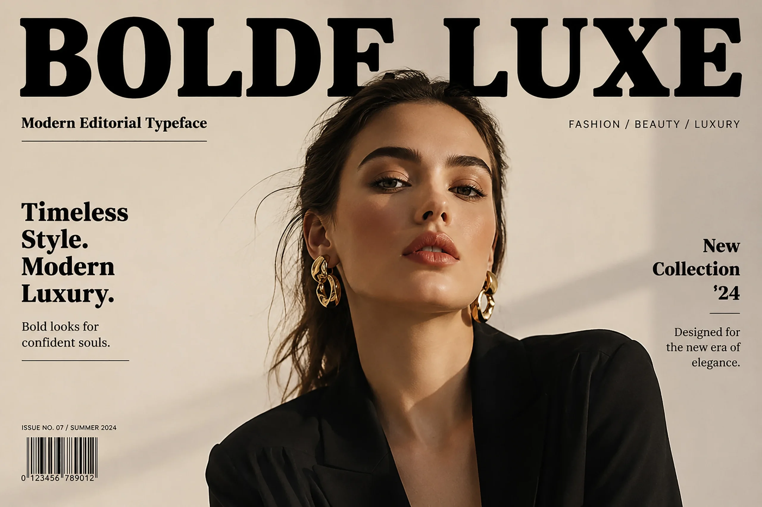
Best For: social media graphics, fashion branding, logos, branding
Bolde Luxe Font uses sharp horizontal serifs, open counters, and a vertical axis for a polished, comparatively clear fashion-oriented display face. Among these Bold Serif Fonts, it is a strong choice for logos and fashion branding, while its paired geometric sans-serif can carry smaller labels.
Decorative Retro Serifs
Decorative retro serifs add ball terminals, flowing curves, swashes, unusual crossbars, or layered effects. Their personality is stronger than the cleaner display faces, so they need generous sizing and shorter wording.
Puppet Master Font
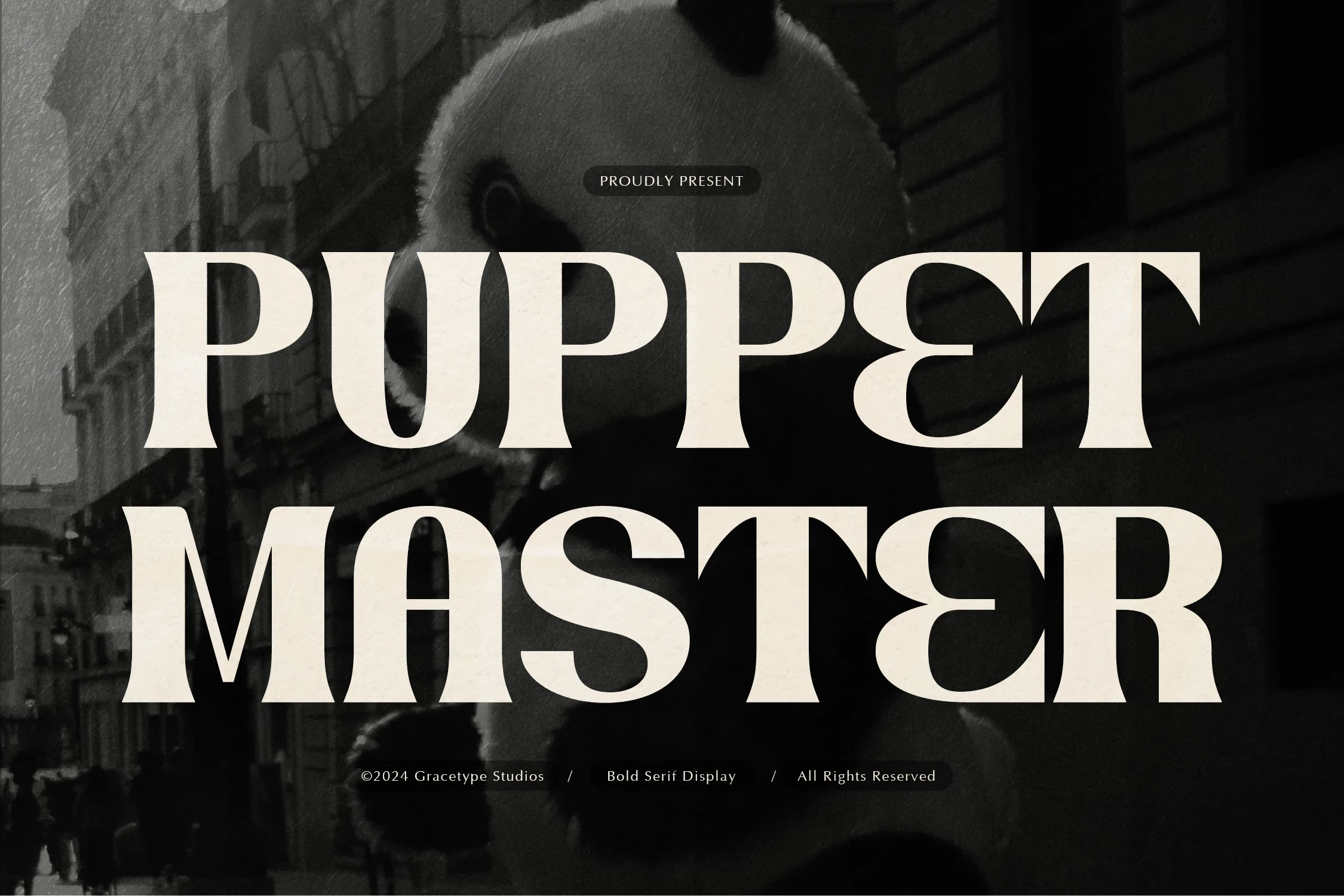
Best For: branding, posters, product labels, book covers
Puppet Master Font uses wide, heavy proportions and thick bracketed serifs to create a substantial retro presence. It stays forceful and legible in posters, product labels, branding, and book covers, although its dense strokes and tight spacing are more comfortable at display sizes than in small copy.
Glypster Font
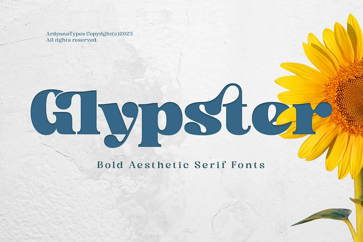
Best For: business cards, logos, posters, display text
Glypster Font turns a heavy serif into a playful flowing-retro style through curving connections, extended lowercase crossbars, and bracketed serifs. The ornate shapes and tight kerning give logos, business cards, posters, and short display lines distinctive character, but they are not intended for continuous reading.
Emerge Font

Best For: display text, clean designs, elegant designs, soft designs
Emerge Font softens its heavy high-contrast structure with prominent ball terminals, exaggerated curves, and wide rounded letters. The nostalgic treatment remains readable in display text and clean designs, while its decorative contours make it better for elegant or soft headline work than small supporting copy.
Morphins Font
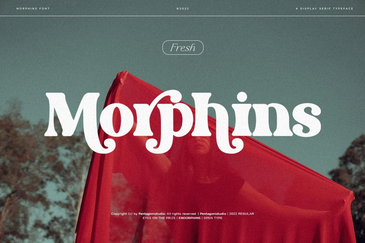
Best For: product labels, display text, modern designs, minimal designs
Morphins Font pushes beyond conventional heavy serif construction with swash-like downward curves, prominent ball terminals, and moderately wide forms. Its retro, fluid personality works for product labels, display text, and short titles, but the elaborate letter shapes can disrupt readability in longer wording.
Lugife Font

Best For: branding, invitations, social media graphics, eye-catching designs
Lugife Font builds its identity around an oversized terminal flourish on the lowercase g, set within an otherwise high-contrast display structure. That signature detail makes it memorable in branding, invitations, social graphics, and eye-catching designs, provided the ornate forms receive enough space and scale.
Holen Vintage Font

Best For: display text, modern designs, clean designs, luxury designs
Holen Vintage Font layers swash terminals, variable widths, and overlapping extrusion effects into a dimensional retro treatment. It is designed for display text and stylized headlines rather than body copy; its PUA-encoded characters also provide convenient access to additional decorative forms.
Slabs and Serif Pairings
This group emphasizes sturdy slab construction or deliberate serif-and-script contrast. The serif styles provide readable structure, while italic or cursive companions introduce vintage energy and handcrafted emphasis.
Gluttoner Font
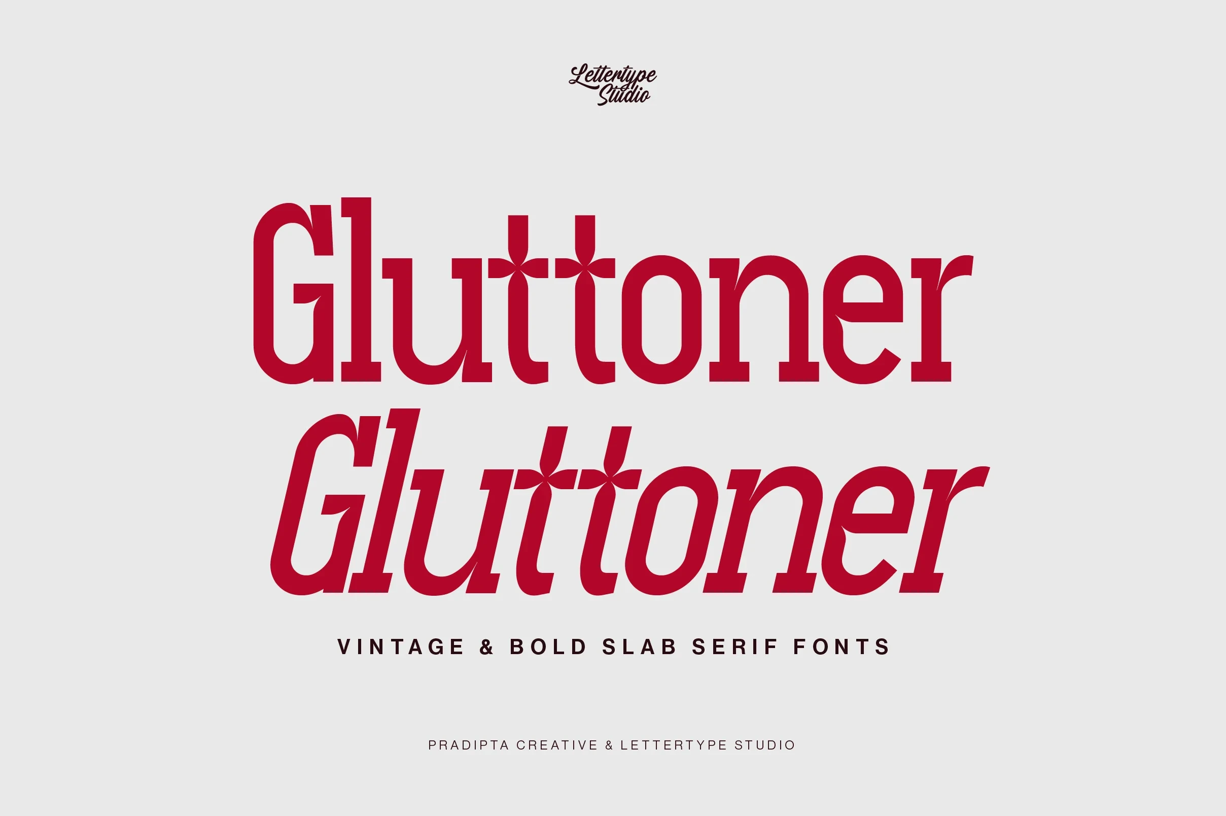
Best For: headlines, clean designs, bold designs, vintage designs
Gluttoner Font takes Bold Serif Fonts in a sturdier direction, using heavy slab serifs, strong weight, and sharp angular bracketed joins instead of delicate thick-thin refinement. Its upright and right-leaning styles support clear headlines, clean designs, bold treatments, and vintage emphasis with reliable large-scale legibility.
Hartens Font
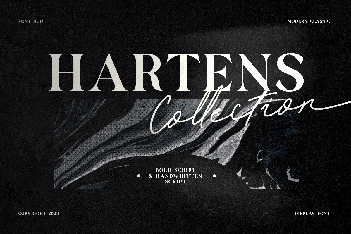
Best For: branding, invitations, logos, display text
Hartens Font combines a legible high-contrast serif with a fluid monolinear cursive whose variable baseline adds a handcrafted accent. Use the serif for headlines and the script for brief decorative wording; the contrast works particularly well in branding, invitations, logos, and display text.
Endrip Faceo Duo Font
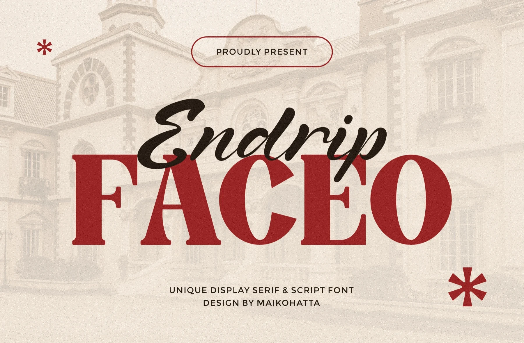
Best For: branding, packaging, invitations, social media graphics
Endrip Faceo Duo Font sets an upright, wide serif against a connected right-slanting calligraphic script, making the formal-versus-fluid contrast immediately visible. The serif handles titles and packaging with clarity, while the script is best reserved for brief invitations, accents, and social graphics.
How to Choose the Right Font
Choose among Bold Serif Fonts by matching construction to scale: high-contrast faces need generous sizing, slabs provide sturdier headline clarity, and swashes or flourishes demand shorter wording. For flexible layouts, select a serif with open counters; for invitations or packaging, a controlled script pairing can add contrast without letting decorative joins overpower the message.