16 Best Best Serif Fonts in 2026
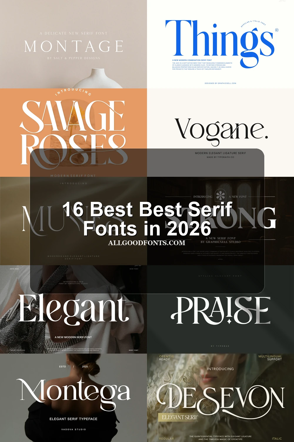
This collection of Best Serif Fonts spans high-contrast editorial faces, sturdy display serifs, refined classics, and decorative statement styles. Use them for logos, branding, packaging, wedding stationery, social graphics, invitations, headlines, and other short-format designs where the letterforms set the visual character.
Looking for more serif fonts? Browse our complete Serif Fonts collection to compare modern, elegant, bold, logo-friendly, and vintage serif styles.
Best Serif Fonts for Display
These Best Serif Fonts emphasize swashes, ligatures, elongated forms, and decorative terminals. They make a stronger visual statement than the more controlled editorial group and need generous display sizing.
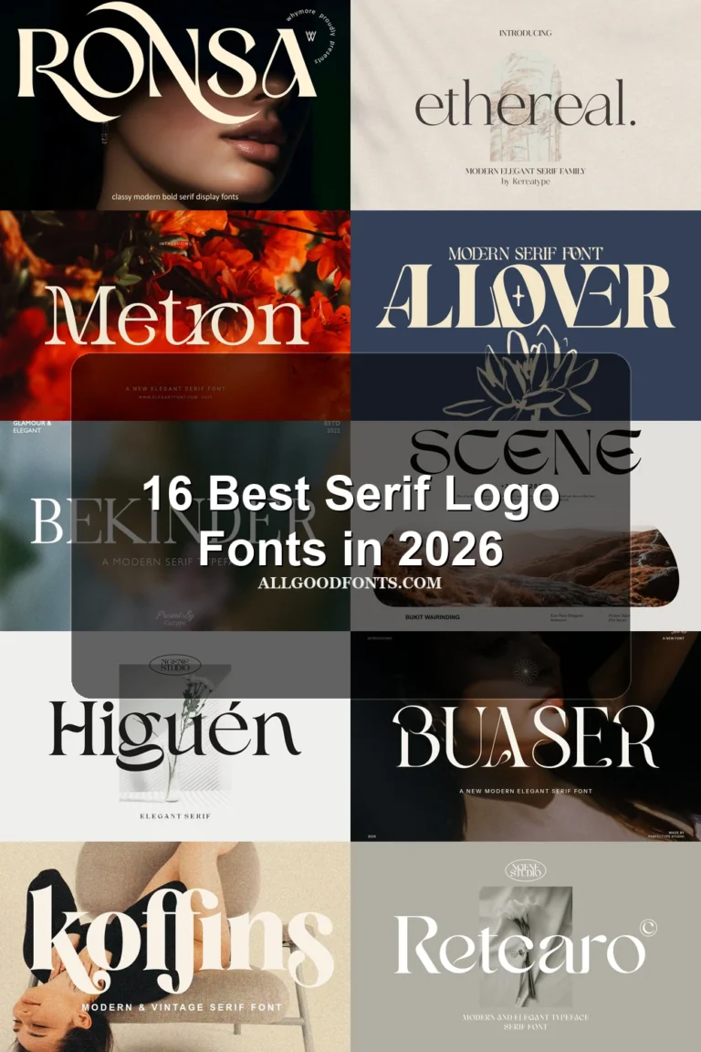
Ronsa Font
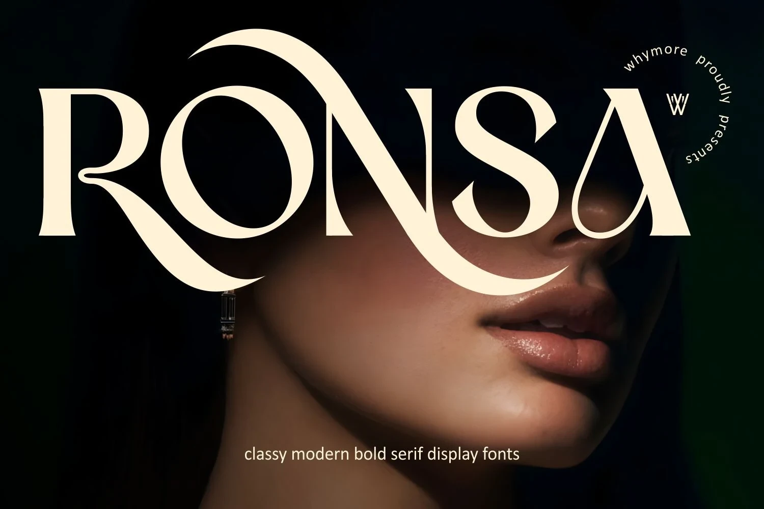
Best For: display text, modern designs
Ronsa Font uses interlocking upright letters, strong contrast, and extended flourishes for a fashion-forward display treatment. The overlapping construction gives short headlines a distinctive silhouette, but it reduces clarity in body copy, so use it large and sparingly.
Silkydusk Font
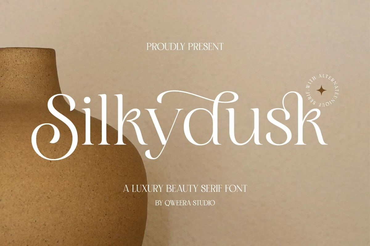
Best For: logos, display text, modern designs
For logos or prominent title lines, Silkydusk Font brings pronounced swashes, curved terminals, and a wide, high-contrast structure. Its included ligatures and alternate characters broaden the lettering options, but the intricate forms need generous sizing and breathing room to remain clear.
Montega Font

Best For: logos, beauty branding, fashion branding
Montega Font is defined by elongated, curving serifs and flared, ball-style terminals. That decorative construction gives beauty and fashion branding a clear visual identity, while its high contrast makes it better for names and headings than extended reading.
Savage Roses Font
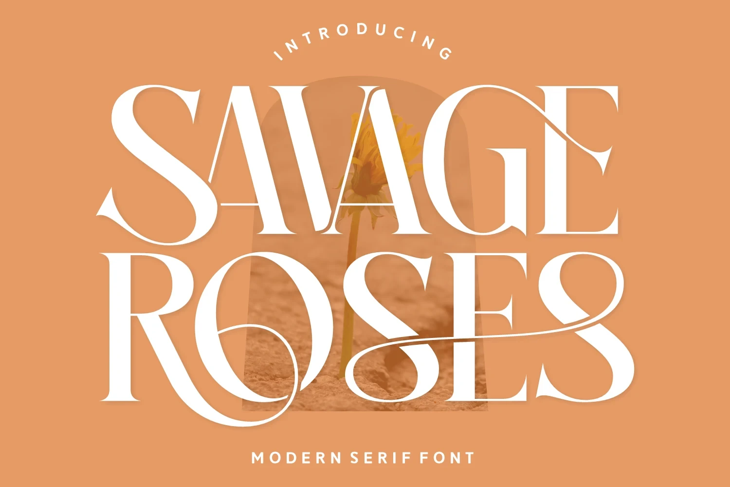
Best For: display text, modern designs, romantic designs
Savage Roses Font is suited to logos and editorial headers where expansive proportions and terminal swashes can remain visible. Its S and R flourishes add ornamental movement, while the contrast and width make compact text a poor match.
Vogane Font
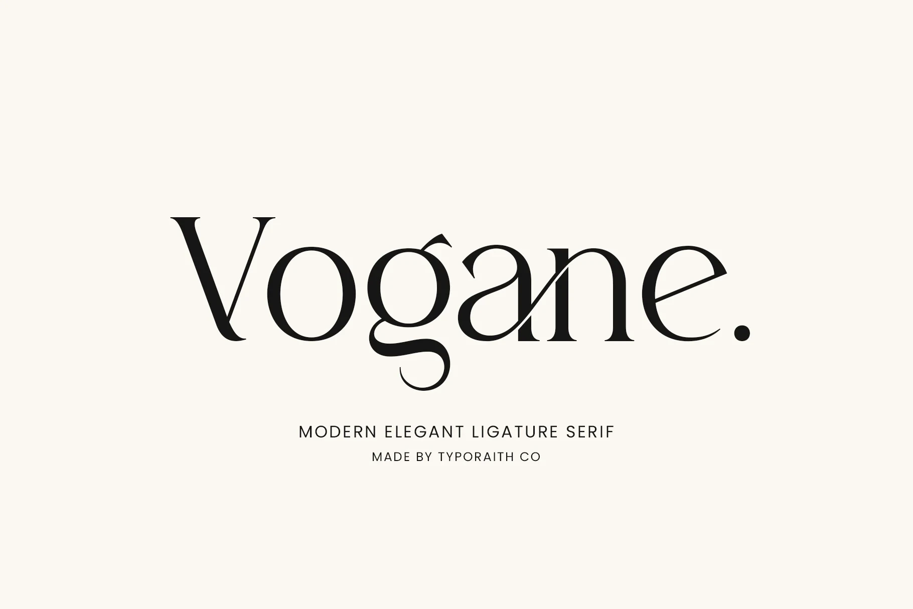
Best For: logos, branding, packaging, invitations
Vogane Font creates a connected display effect through pronounced ligatures, tapering terminals, and a curved lower-case g. Its alternate characters extend branding and invitation possibilities, but the joined forms need larger settings to preserve letter-by-letter clarity.
Munnes Font
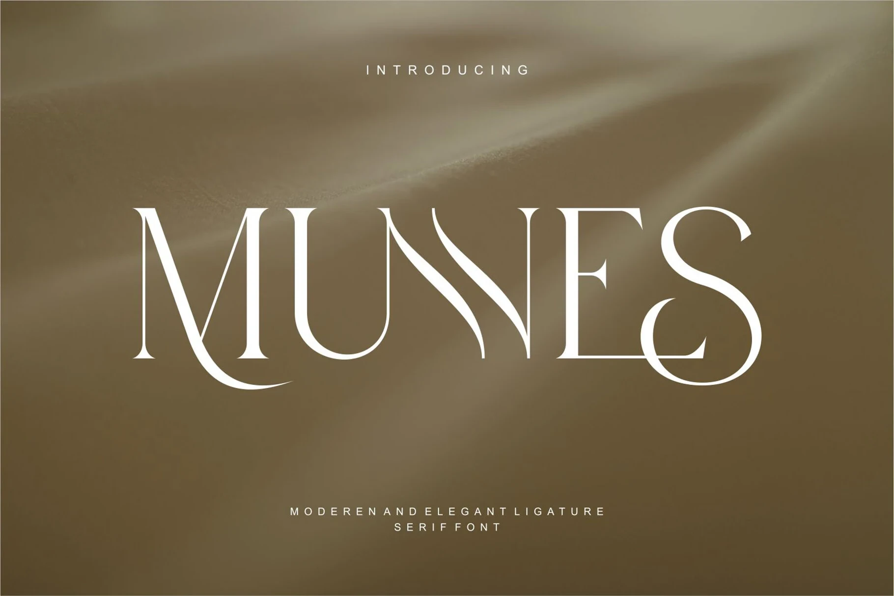
Best For: display text, modern designs, decorative designs
Munnes Font makes its custom M-U and E-S letter treatments the main event. The interlocking forms give logos and headers an immediate signature, while the stylization deliberately moves it away from neutral body-copy use.
Arome Font
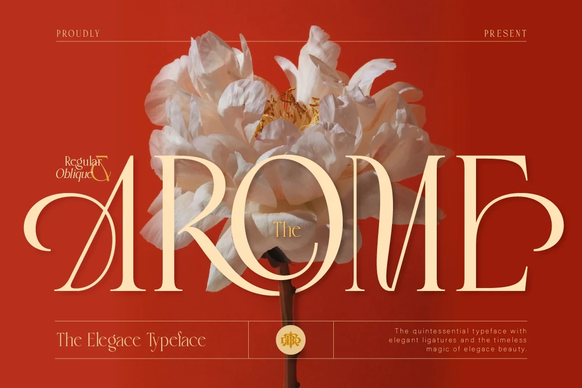
Best For: display text, modern designs, luxury designs
Arome Font combines wide proportions with long uppercase swashes and sharp serifs, producing a sweeping display silhouette. Its thin strokes and flourishes need large title settings, where the letter shapes can be appreciated without collapsing into visual noise.
Praise Font
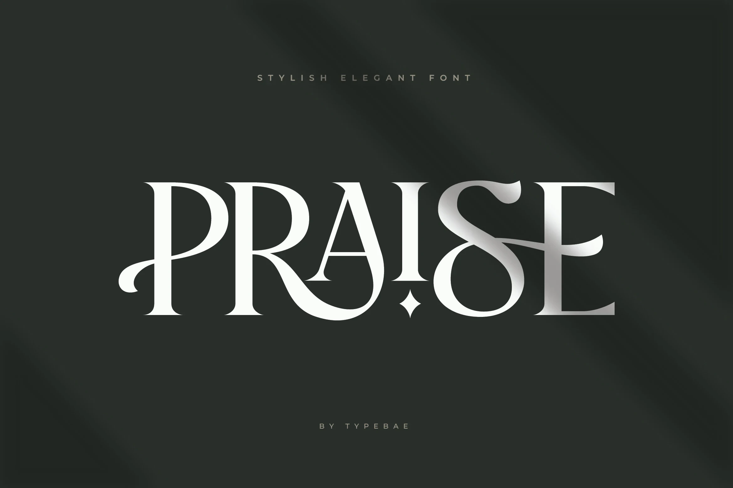
Best For: branding, logos, display text
Praise Font uses a condensed width to fit branding names into narrower spaces, then adds a central diamond-shaped dot and swooping P and E swashes. Its high contrast is striking at display scale but too intricate for small body text.
Desevon Font

Best For: display text, modern designs, luxury designs
Desevon Font brings prominent swashes, elongated letterforms, horizontal serifs, and built-in ligature support to large titles and logos. The uneven stroke weights add character, while the decorative construction makes dense text impractical.
High-Contrast Editorial Serifs
This group centers on pronounced thick-thin contrast, pointed serifs, and open counters. Compared with the decorative display faces, its structure is more restrained, though delicate details still favor titles over dense copy.
Grandeur – Elegant Classic Serif Font

Best For: display text, elegant designs
Grandeur – Elegant Classic Serif Font combines a wide, heavy build with sharp serifs and pronounced thick-thin contrast. Its open counters help at display sizes, while the finer strokes become less dependable in small text. Use it for editorial titles and clean, spacious compositions.
Elegant Font

Best For: display text, clean designs, elegant designs
Elegant Font softens its upright high-contrast structure with flowing terminals and pronounced serifs. The delicate thin strokes create a polished title treatment, though they can weaken in dense or small settings. It works best where a headline needs shape without heavy ornament.
Things Font

Best For: display text, modern designs, classic designs
Things Font pairs sharp bracketed serifs with open counters and pronounced stroke contrast. Regular and Italic styles provide useful directional variation for titles, but ornate terminals and thin details are more dependable at display sizes than in small copy.
Ethereal Font

Best For: display text, modern designs, clean designs
For airy title layouts, Ethereal Font combines open circular forms and sharp serifs with an elongated swash tail on the lowercase a. The high contrast keeps it firmly display-oriented, so use it large when the tail and thin strokes need to remain legible.
Montage Font

Best For: high-end designs, modern designs, clean designs
Montage Font takes a controlled editorial approach, using open uppercase proportions, sharp serifs, and minimalist geometry within a high-contrast structure. It can sit beside a lighter serif, but its thin details may disappear at very small sizes.
Bold Feature Serifs
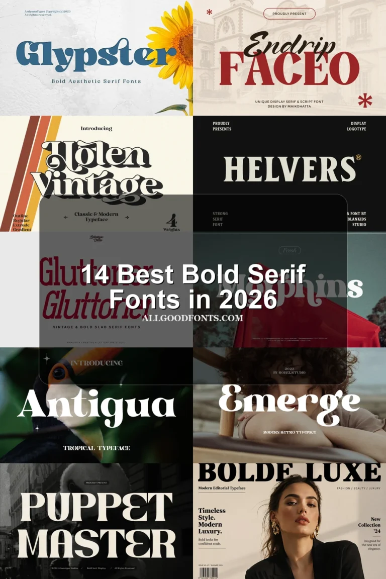
Bold feature serifs use wide proportions, heavy strokes, or signature ligatures to create immediate impact. They feel sturdier and more assertive than the finely detailed editorial and flourished display styles.
Moon Creme Font

Best For: display text, modern designs, decorative designs
Moon Creme Font builds its signature around a distinctive OO treatment, wide proportions, and a flowing R tail. The high-contrast construction gives Best Serif Fonts collections a memorable feature style, but the customized forms need large names or headlines to read cleanly.
Strong Font

Best For: logos, branding, packaging
Strong Font relies on large slab-like serifs, wide rounded proportions, and bold contrast for an unusually sturdy presence. It suits Best Serif Fonts searches focused on packaging, logos, and headings, where its weight can lead the composition rather than support restrained reading text.
How to Choose the Right Font
Choose by scale first: heavily flourished faces and custom ligatures need short, spacious headlines, while open counters and sharper editorial structures offer a little more control. For Best Serif Fonts selection, compare width, contrast, joins, and swash complexity against the role—branding, packaging, or a readable title—before setting the final size.