22 Best Vintage Serif Fonts in 2026
This collection spans weathered slabs, condensed sign-painting forms, sharp high-contrast serifs, and layered ornamental treatments. Vintage Serif Fonts can give logos, packaging, posters, labels, book covers, and editorial titles a period-led identity, but their texture, contrast, and display-focused construction make sizing especially important.
Looking for more serif fonts? Browse our complete Serif Fonts collection to compare modern, elegant, bold, logo-friendly, and vintage serif styles.
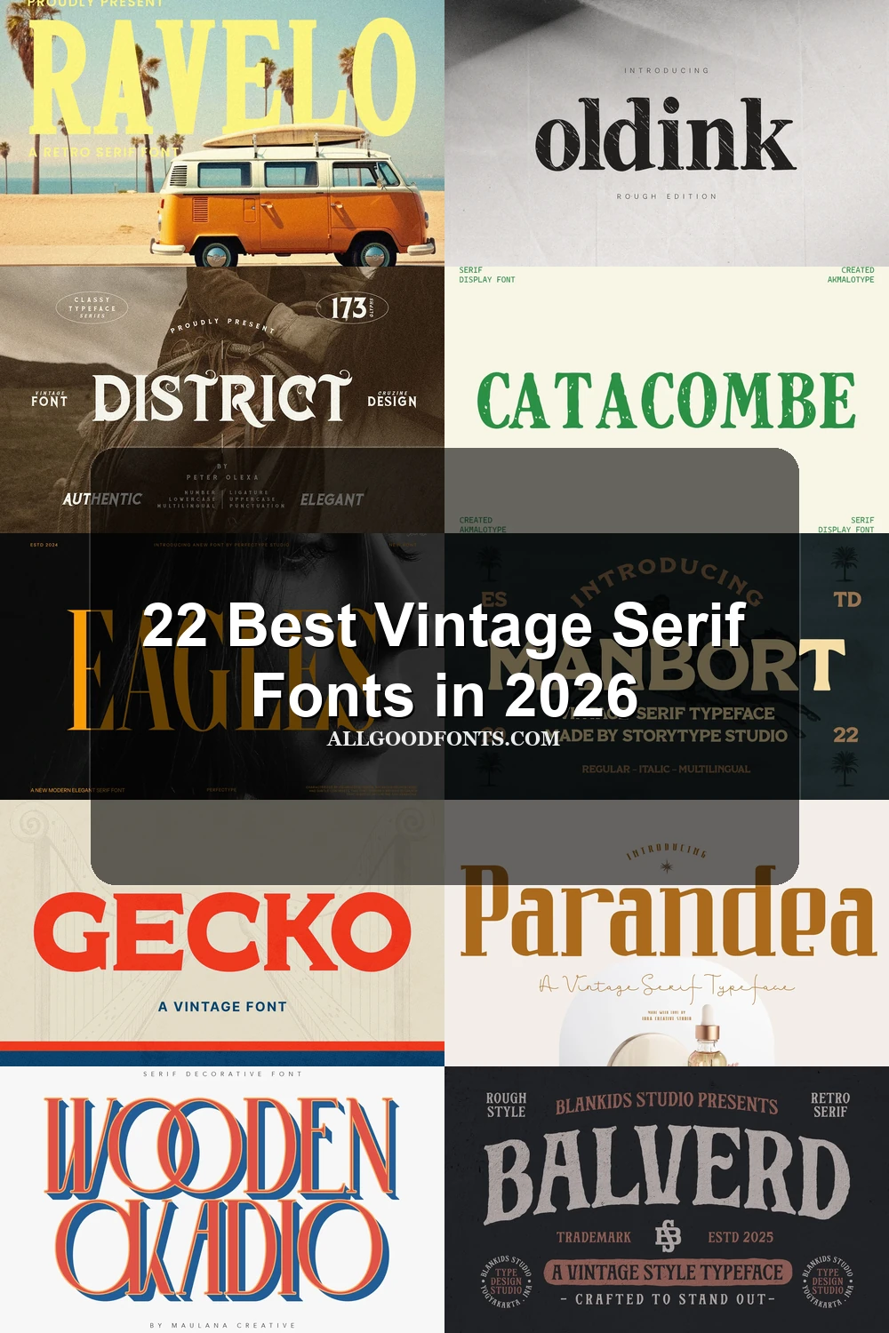
Vintage Serif Fonts
Vintage Serif Fonts in this group rely on worn surfaces, antique detailing, or bifurcated terminals. They feel more materially aged than the cleaner slab and polished high-contrast categories.
Balverd Font

Best For: branding, packaging, posters, product labels
Balverd Font uses heavy slab-like serifs, wide sturdy proportions, and a visibly distressed edge. This Vintage Serif Fonts choice has strong presence in branding and packaging, but its rough texture is best reserved for large headlines.
Dustone Font

Best For: branding, packaging, logos, product labels
Dustone Font combines a distressed surface with bifurcated terminal details rather than plain slab geometry. Among Vintage Serif Fonts, it is especially suited to logos, labels, and packaging; its decorative contrast makes sustained body text impractical.
Catacombe Font

Best For: logos, branding, headlines, quotes
Catacombe Font gives Vintage Serif Fonts an explicitly antique surface by overlaying worn texture on blocky, high-contrast serifs. It strengthens logos and headlines, but the distressing can obscure character detail when the design is reduced.
Oldink Font

Best For: book covers, display text, clean designs, classic designs
Oldink Font places hatched distressing throughout the letterforms rather than only along their edges. Its moderate contrast and bracketed serifs suit book covers and titles, but the internal texture restricts small-scale use.
Blocky Slab Displays
These blocky slabs prioritize weight, width, and immediate legibility, ranging from monolinear forms to condensed shadows. Their sturdy construction is simpler and less delicate than the refined serif displays.
Gecko Font
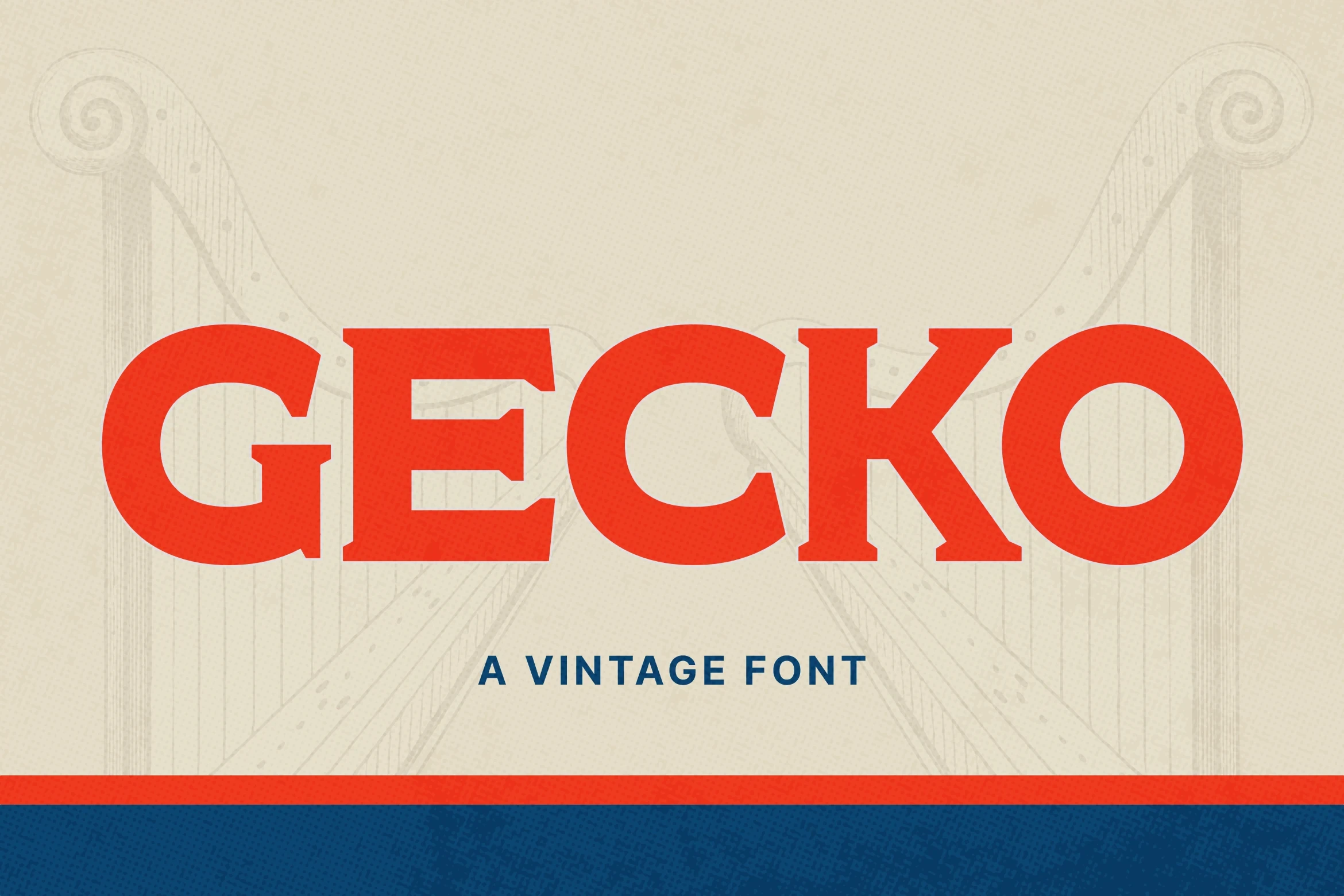
Best For: display text, modern designs, clean designs, elegant designs
Gecko Font gives Vintage Serif Fonts a wide, heavy silhouette built around thick blocky serifs. Its upright forms stay clear in large headlines, making it a straightforward foundation for retro branding and other uncomplicated display work.
Retro Typewriter Font
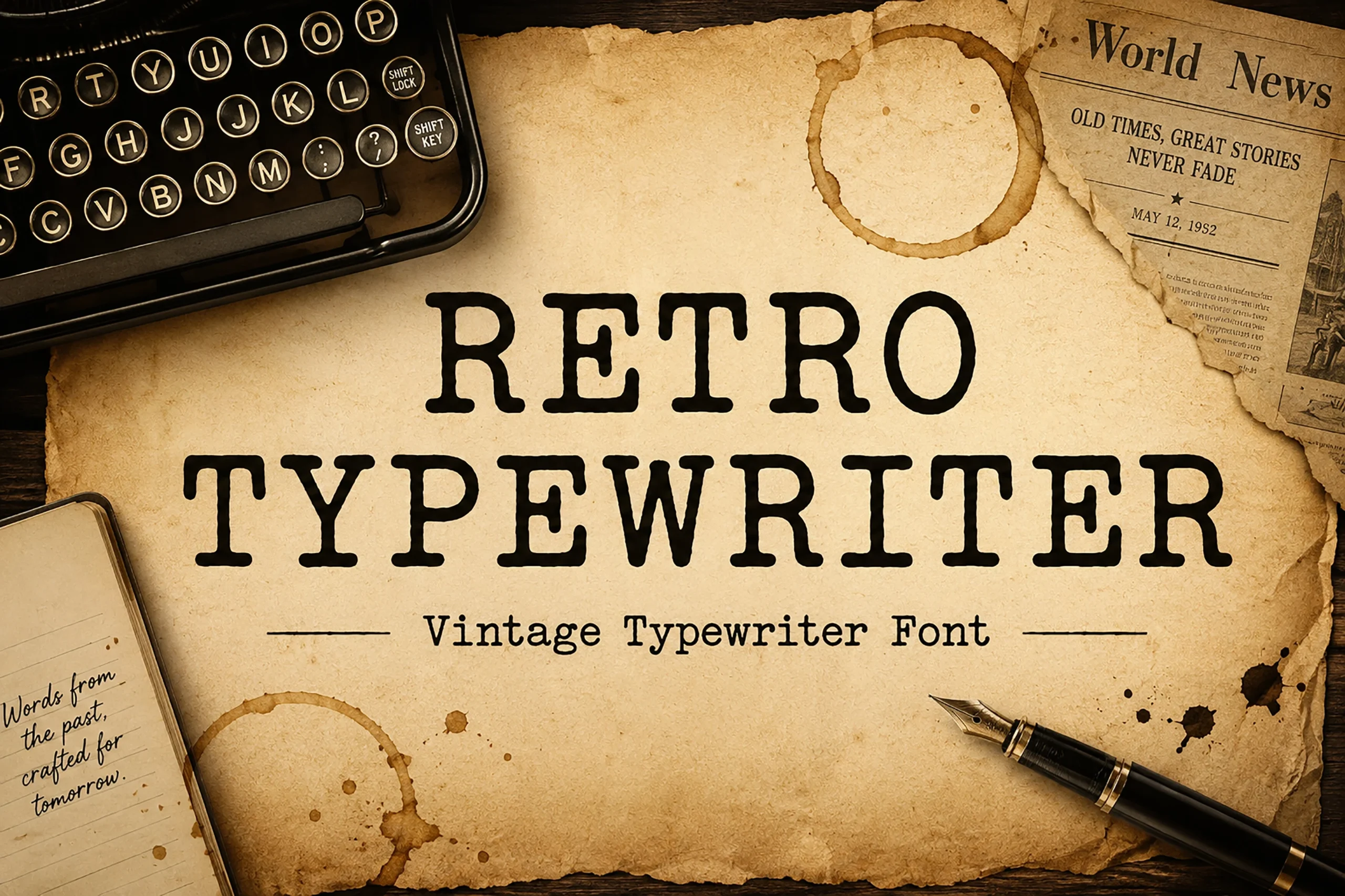
Best For: old-school designs, display text, headlines, classic designs
Retro Typewriter Font uses square serif terminals, a vertical stress axis, and a typewriter-associated slab construction. Its journalistic, industrial character suits headlines, although the contrast between thick and fine strokes can weaken at small sizes.
Wooden Okadio Font
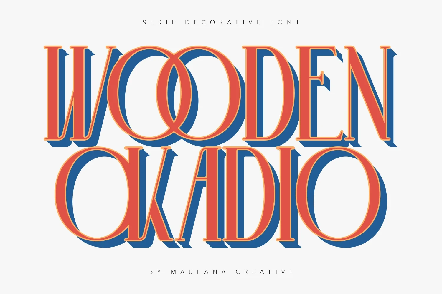
Best For: display text, bold designs, retro designs, vintage designs
Wooden Okadio Font pairs condensed letterforms with a layered shadow, creating a compact, sign-like presence. The narrow structure fits bold retro titles where space is limited, though the shadow can reduce clarity when the type is reduced.
Watern Font
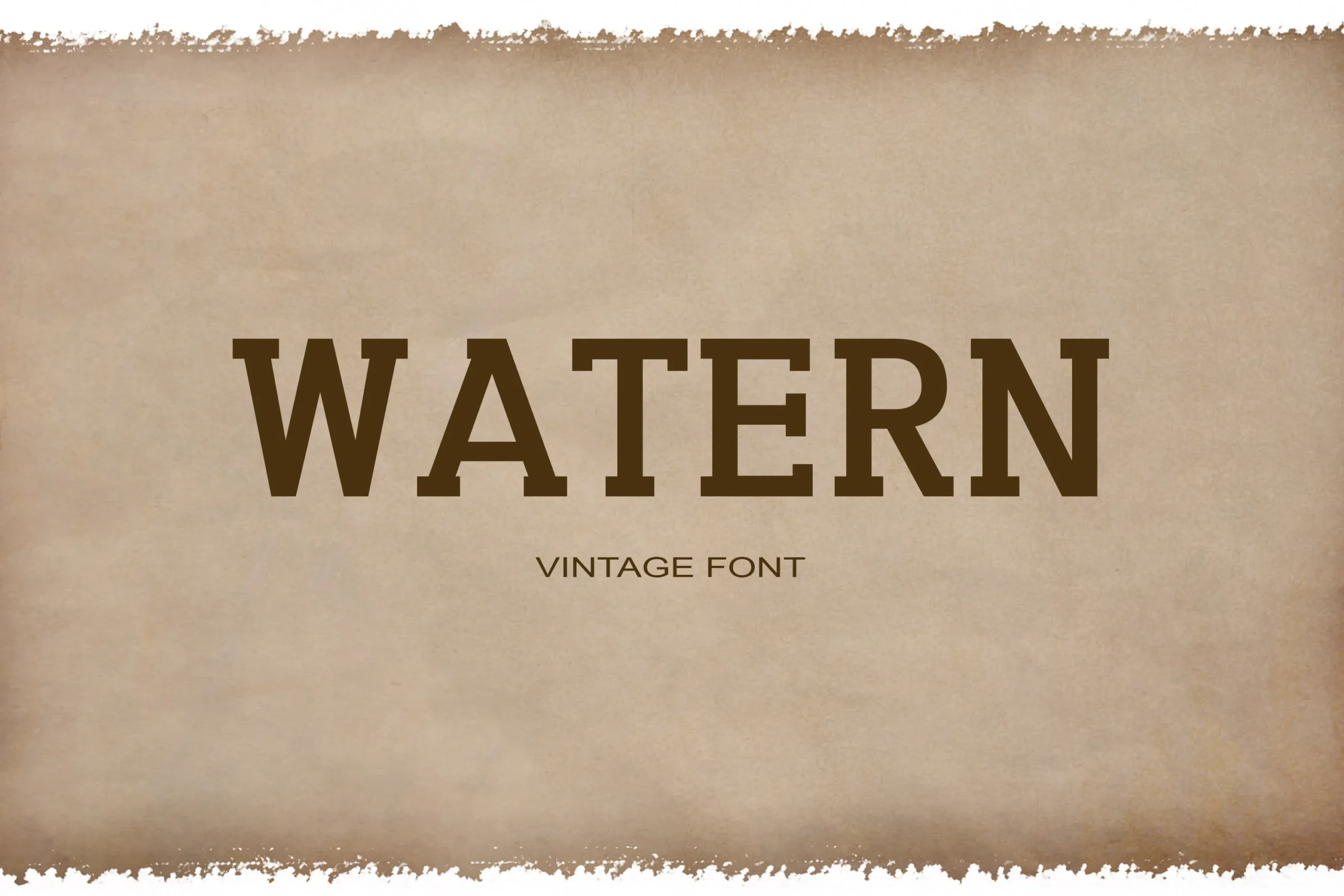
Best For: display text, modern designs, clean designs, vintage designs
Watern Font separates itself from more contrasted Vintage Serif Fonts with heavy monolinear strokes, thick slab serifs, and an all-caps construction. The blocky upright forms remain highly legible in large headings and support a sturdy traditional tone.
Western Finalist Font
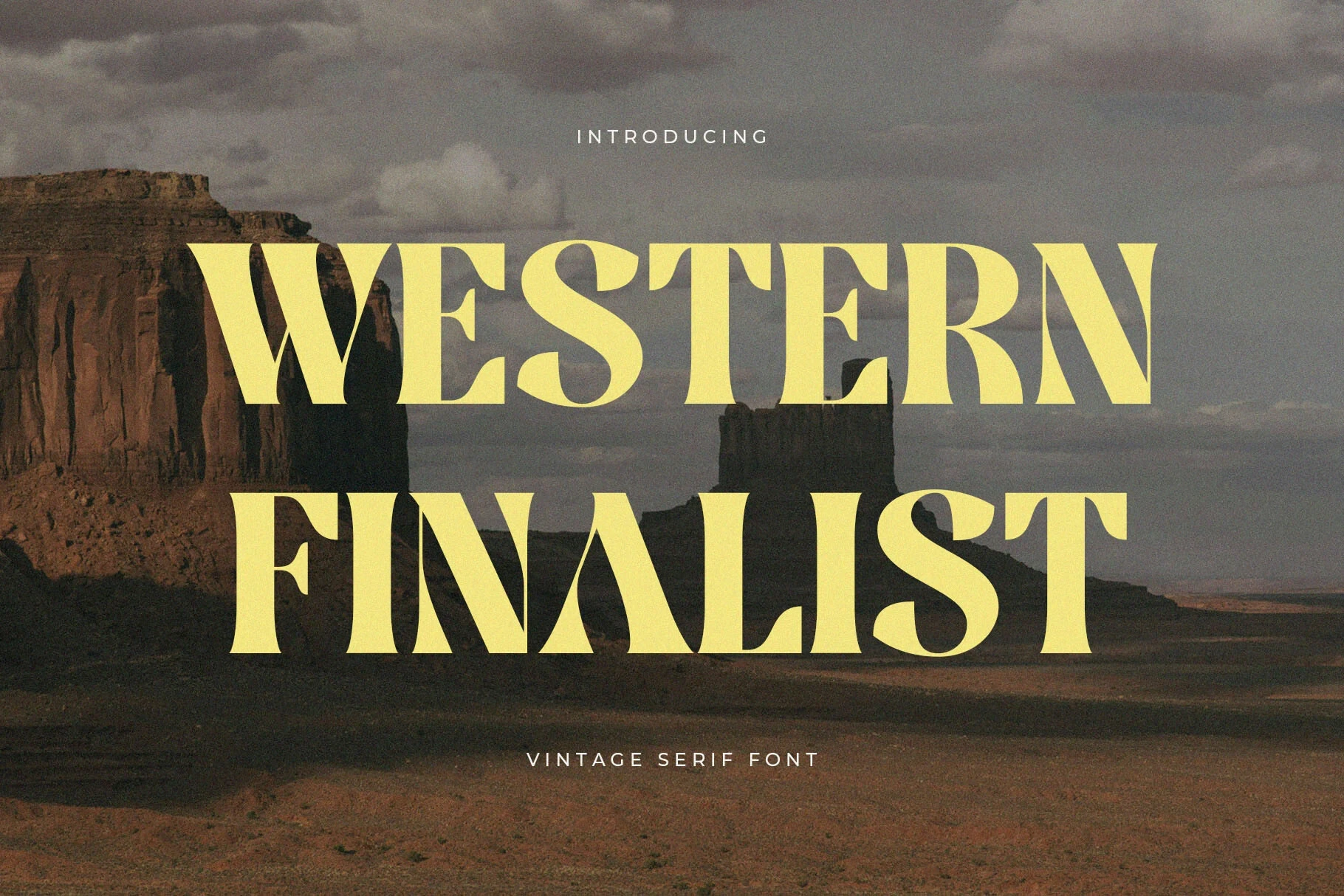
Best For: branding, posters, product labels, display text
Western Finalist Font gives Vintage Serif Fonts an expansive silhouette through wide proportions and pronounced bracketed serifs. Its cinematic scale works for posters and labels, while the thin high-contrast strokes can disappear at small sizes.
Rustem Font
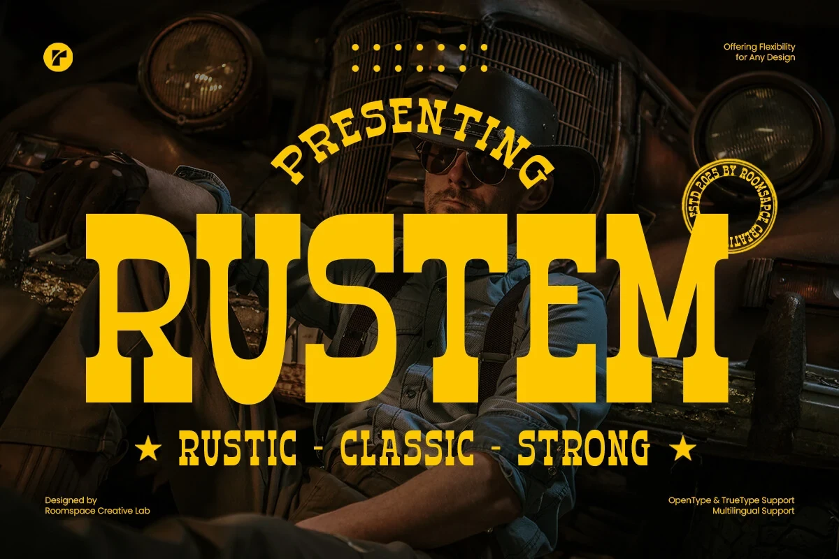
Best For: branding, headlines, signage, product labels
Rustem Font packs heavy slab construction into condensed proportions, preserving substantial stroke weight where vertical space is limited. It performs well in signage, headlines, and labels, though the dense forms can feel crowded at smaller sizes.
Manbort Font
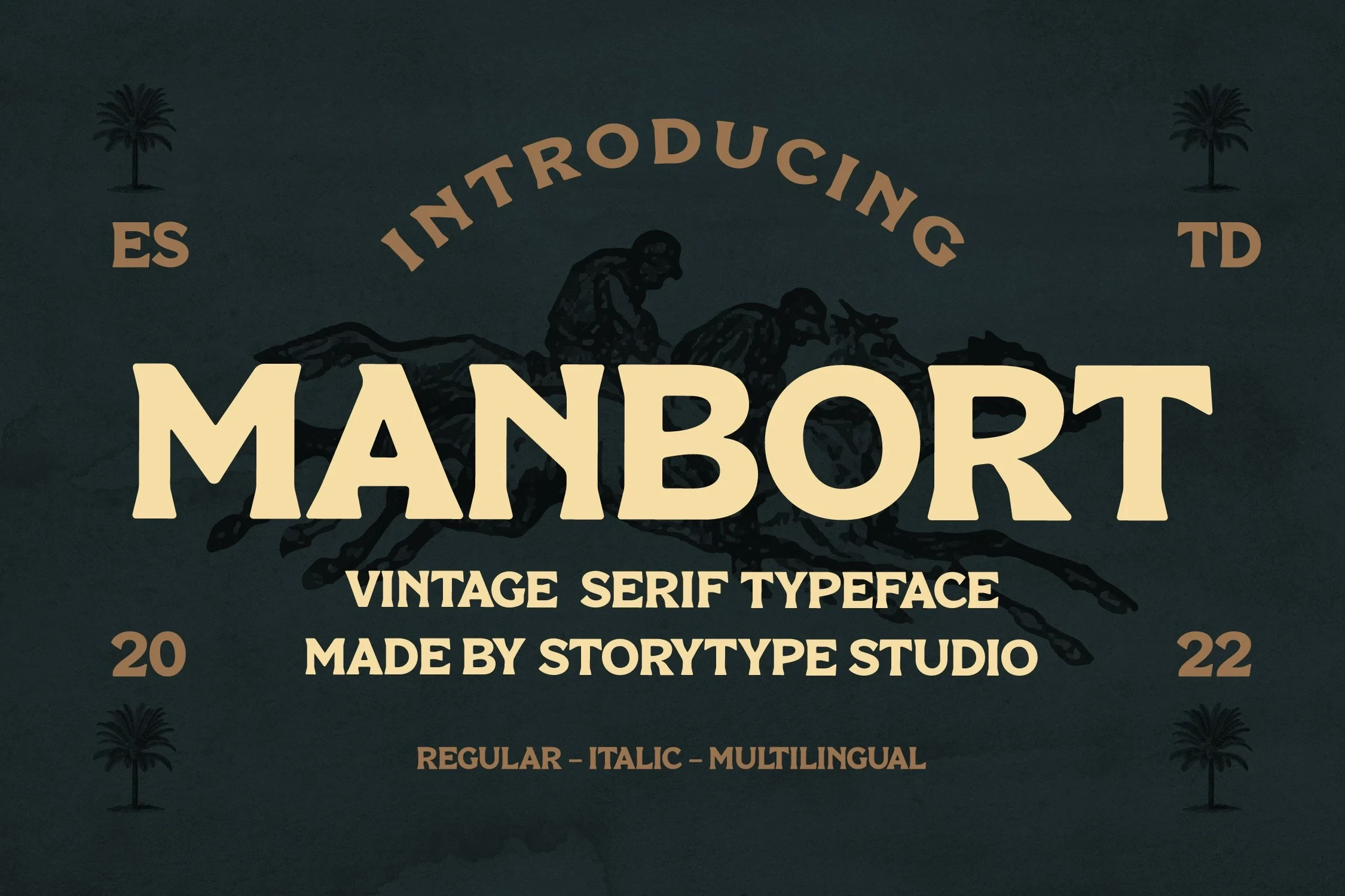
Best For: logos, packaging, signage, old-school designs
Manbort Font softens its wide, heavy forms with concave curved terminals around pronounced bracketed serifs. The dense texture suits logos and packaging, but its weight and tight spacing can become congested at reading sizes.
High-Contrast Classic Displays
Sharp serifs, strong thick-thin contrast, and upright or slightly angled structures define this group. Compared with the slabs, these faces offer more formal detail but need generous display sizing.
Retro Dream Font
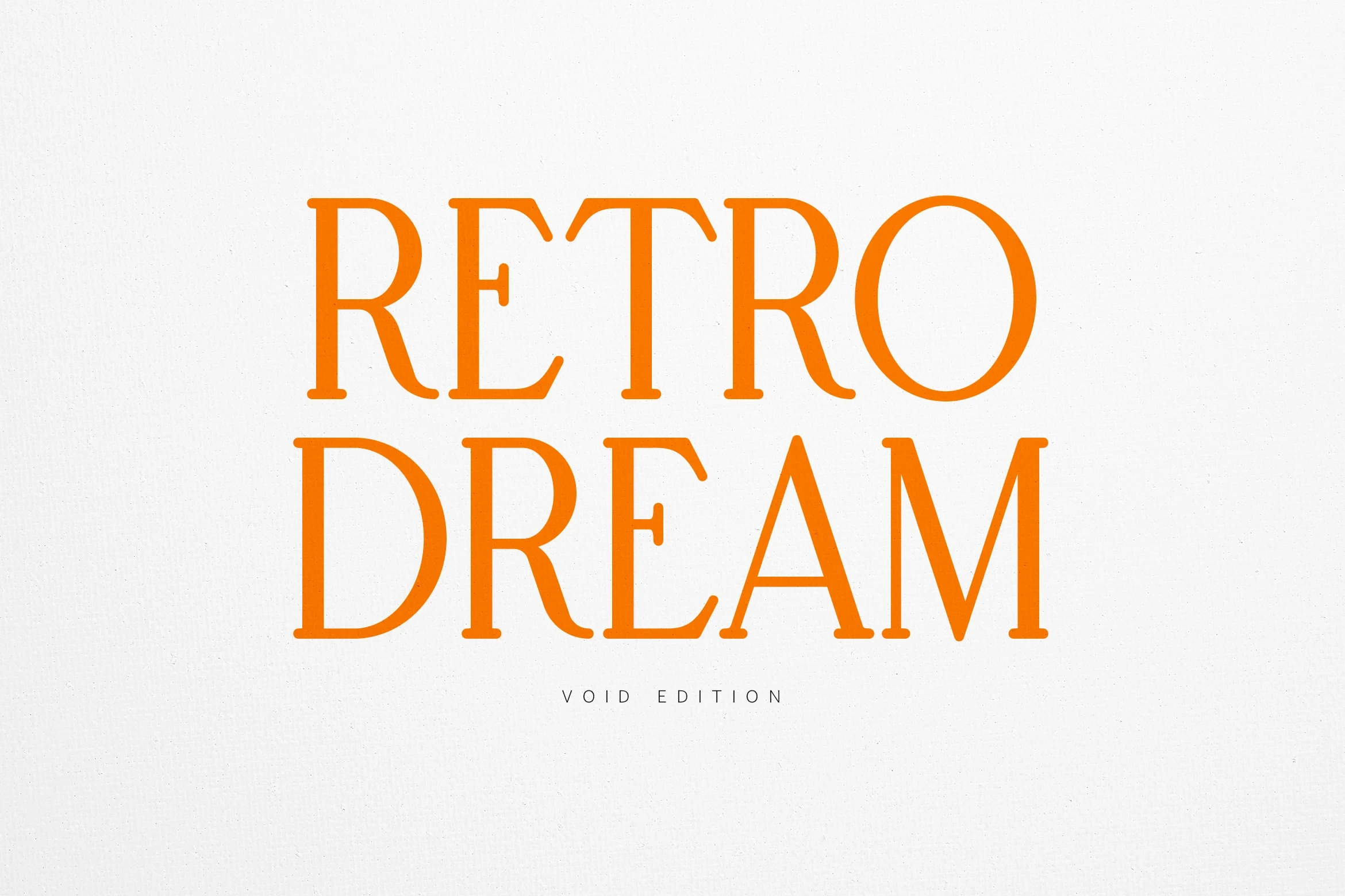
Best For: branding, packaging, website headers, display text
Retro Dream Font brings an upright, balanced structure to Vintage Serif Fonts, with sharp serifs and pronounced thick-thin contrast. Its polished display face works well for editorial headers, branding, and packaging; widely spaced supporting text needs more size for clarity.
Mayqueen Font
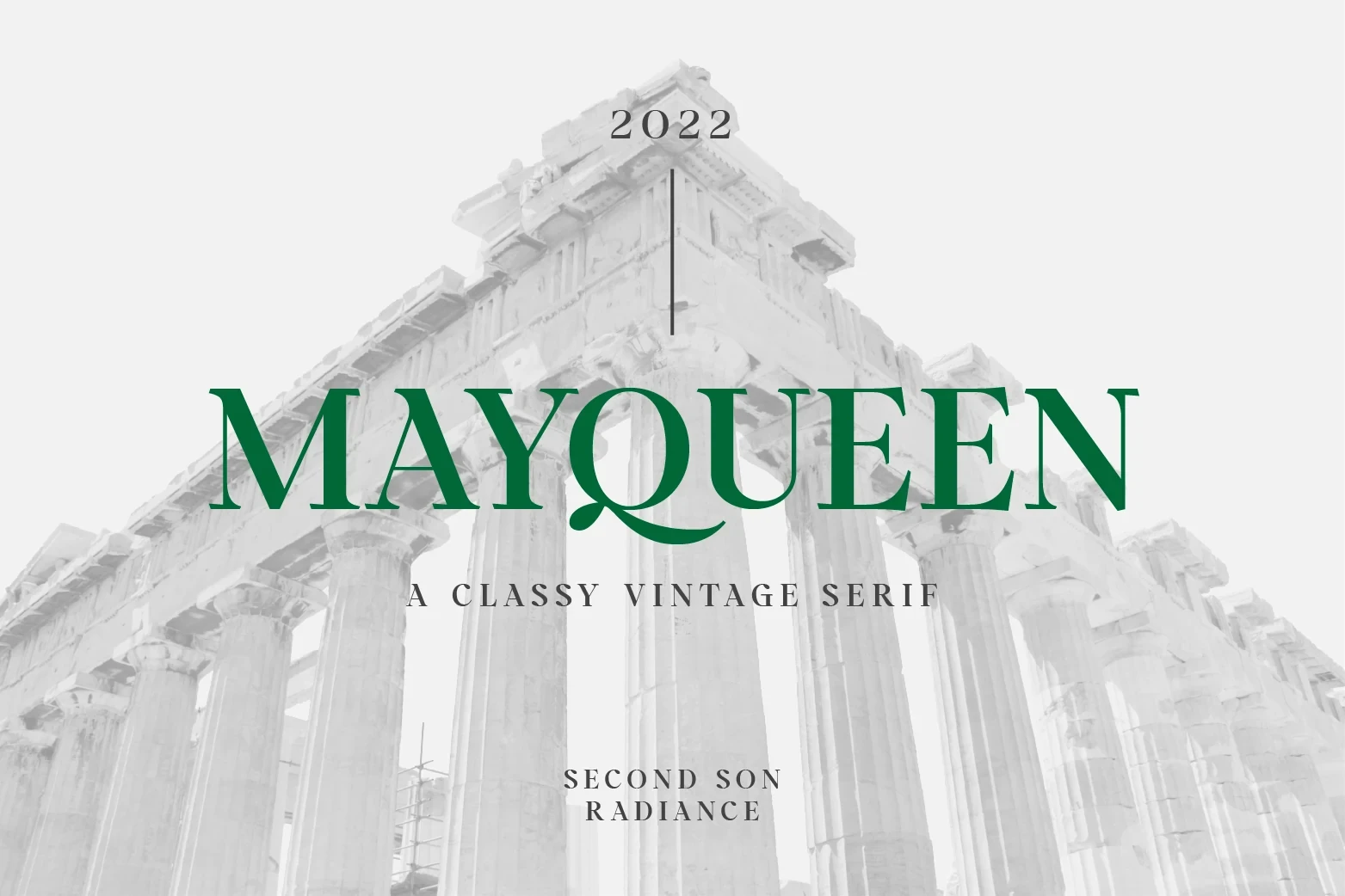
Best For: branding, editorial designs, invitations, quotes
Mayqueen Font is distinguished by pointed high-contrast serifs and the elongated tail of its Q. The upright face reads cleanly in large titles and invitations, while a simpler sans-serif can carry dates and other smaller information.
Ravelo Font

Best For: logos, branding, packaging, wedding designs
Ravelo Font uses an uppercase-only structure and bracketed, high-contrast serifs to create a formal wordmark character. It stays clear in large logos and packaging, but its thin hairlines make small applications less dependable.
Cantero Font
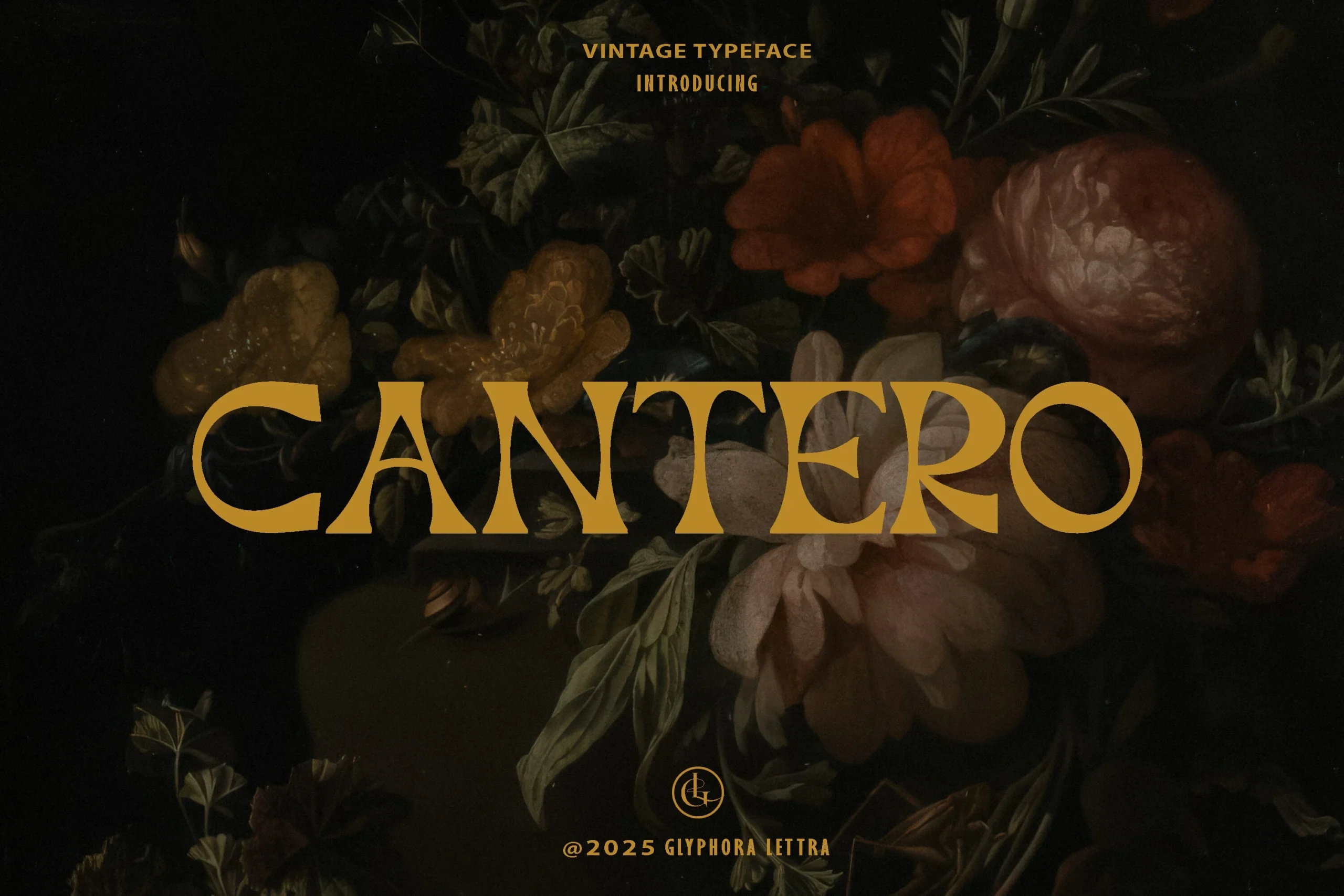
Best For: display text, elegant designs, classic designs, bold designs
Cantero Font balances sharp wedge-shaped serifs with curved, flowing terminals on letters such as C and O. The contrast adds historic refinement to logotypes, but its elaborate construction remains best for large display text rather than body copy.
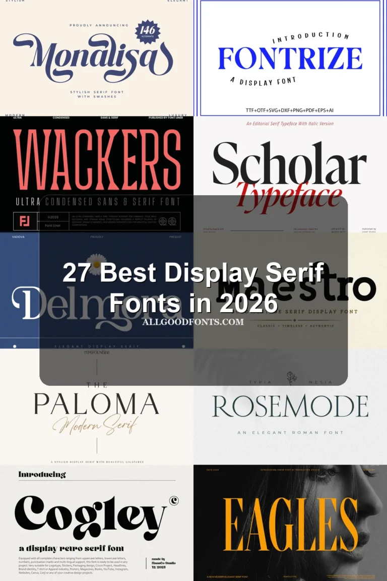
Eagles Font

Best For: display text, clean designs, elegant designs, classic designs
Eagles Font combines condensed proportions with sharp triangular serifs for an authoritative vertical profile. It fits formal logos and classic titles, while the finer strokes make it less reliable for small text or extended reading.
Forence Font
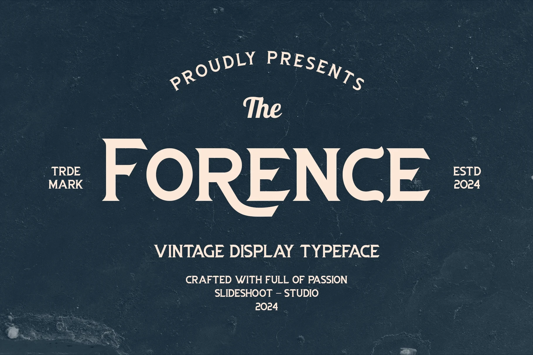
Best For: logos, display text, modern designs, clean designs
Forence Font introduces movement through a slight right lean, an elongated F tail, and wide high-contrast forms. Ligatures and alternate characters help create distinctive logos, but its thin strokes are best kept to large headlines.
Chromes Font

Best For: packaging, logos, product labels, display text
Chromes Font is notable for the crosshair terminal inside its geometric o, set against bracketed triangular serifs and a tall x-height. That structured contrast suits packaging, labels, and branding more than sustained body reading.
Parandea Font
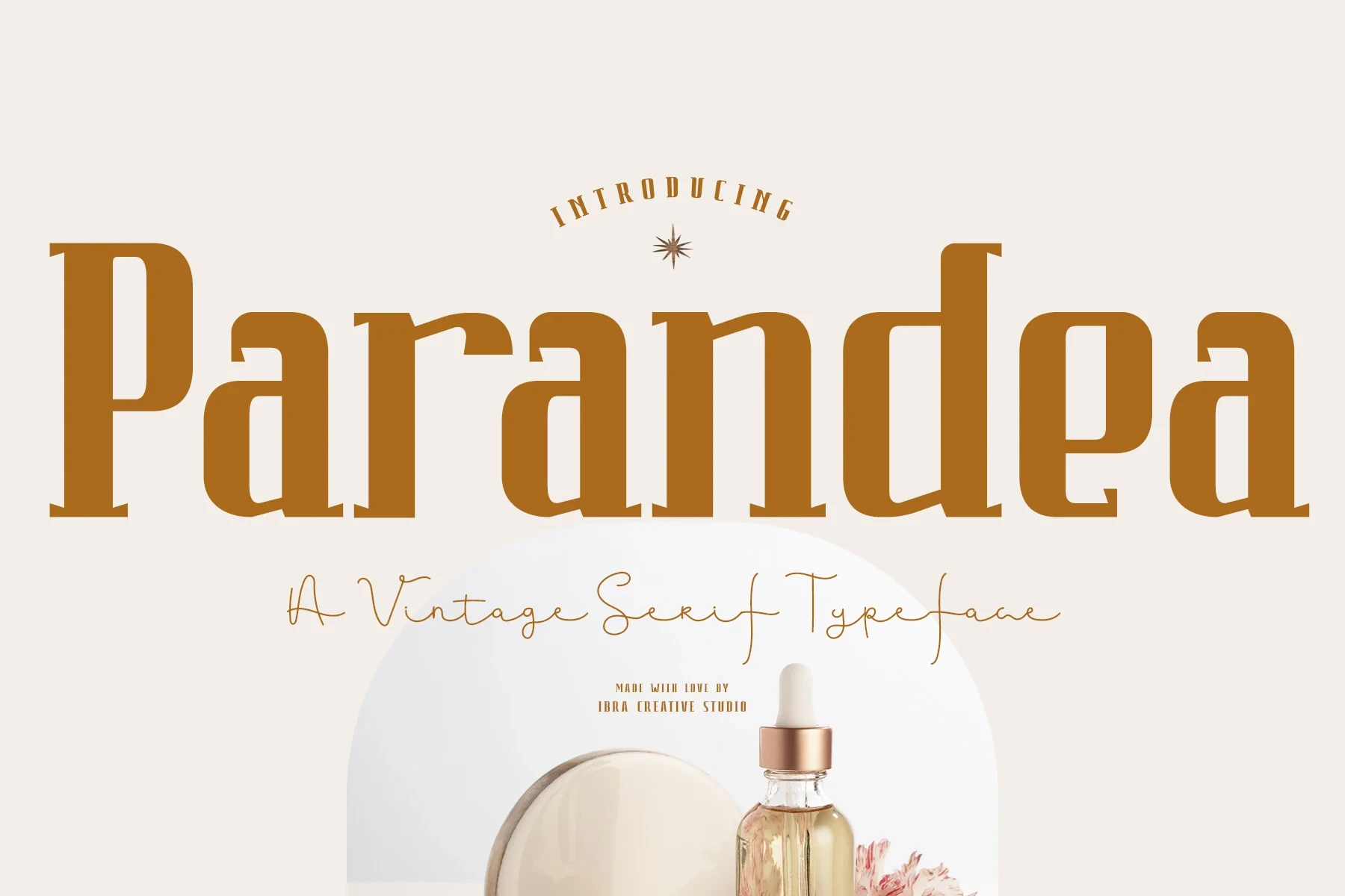
Best For: display text, modern designs, elegant designs, classic designs
Parandea Font uses sharp triangular slab-like serifs and a large x-height for a crisp upright silhouette. It remains readable in large titles and pairs naturally with a fluid subtitle, which needs additional size to stay clear.
Ornamental and Layered Styles
Layering, swashes, shadows, and mixed components create the most visibly embellished options here. They offer more customization than the other groups, while their added detail demands careful spacing and scale.
Silver Stone Font

Best For: book covers, branding, packaging, display text
Silver Stone Font deliberately combines a high-contrast, slightly slanted script with a disconnected slab-serif display component. Swashes and thin transitions suit branded titles and book covers, provided the lettering remains large enough to preserve its intricate construction.
Heralon Font
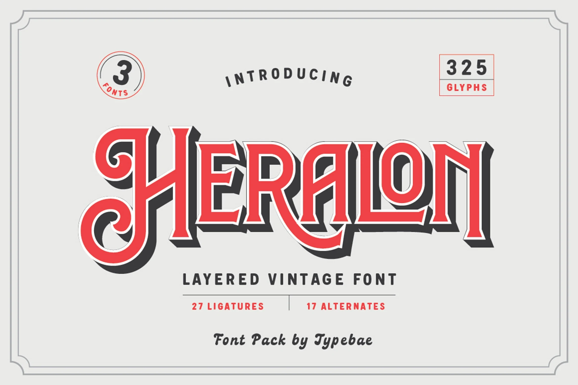
Best For: logos, packaging, posters, signage
Heralon Font adds dimensionality to Vintage Serif Fonts through a layered drop shadow over high-contrast slab-inspired forms. Its three styles, 26 ligatures, and 21 stylistic alternates support varied logos and posters, but the effects need large display settings.
District Font
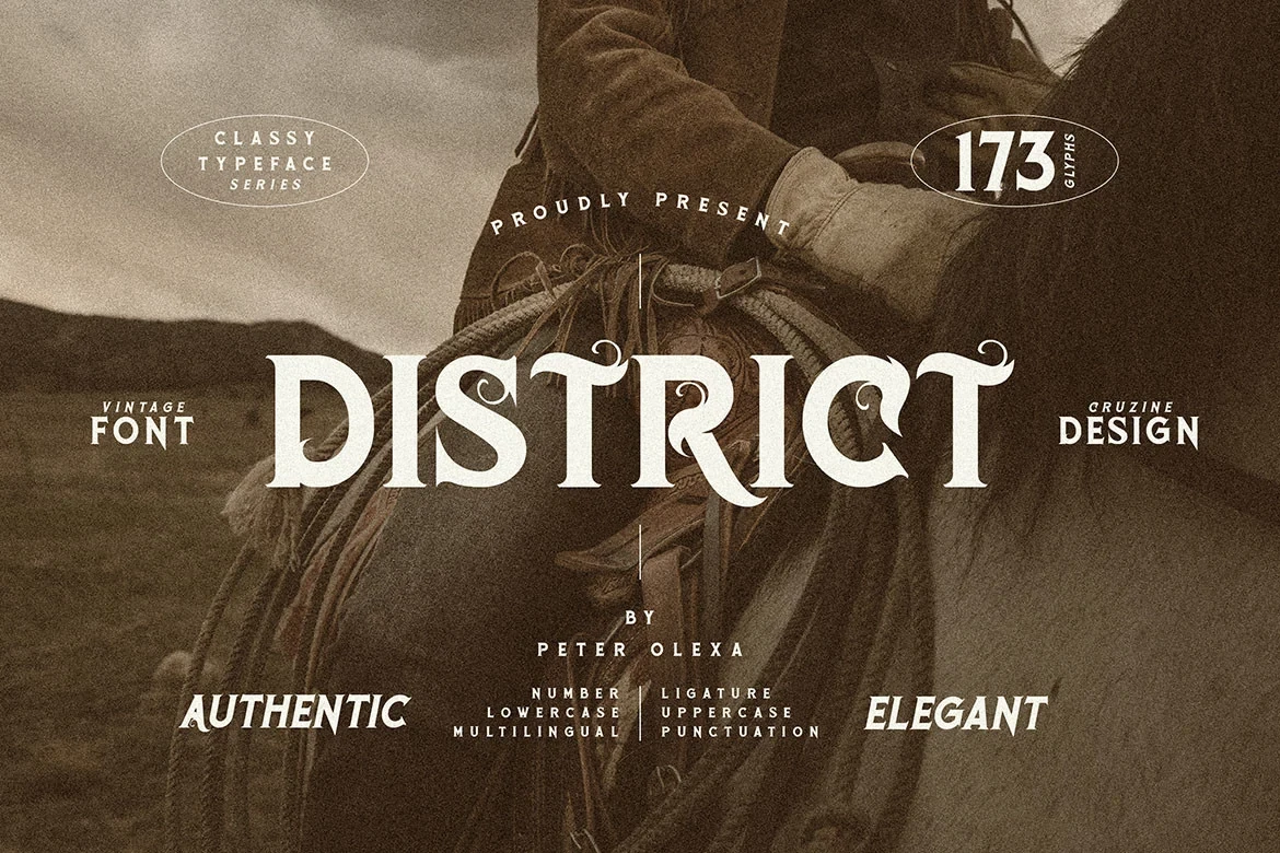
Best For: branding, signage, display text, clean designs
District Font keeps wide, bracketed serif forms but introduces ornamental swash terminals on selected letters. The detail gives signage and titles a distinctive finish, although those swashes reduce legibility when the face is used small.
How to Choose the Right Font
Choose Vintage Serif Fonts by matching construction to scale: heavy slabs and condensed faces handle signage, labels, and short headlines, while high-contrast serifs need room for their hairlines and pointed details. Use distressed textures for immediate surface character, and reserve swashes, shadows, ligatures, and alternates for prominent titles rather than small supporting copy.