16 Best Serif Logo Fonts in 2026
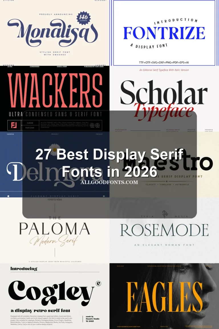
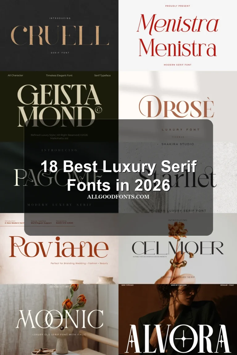
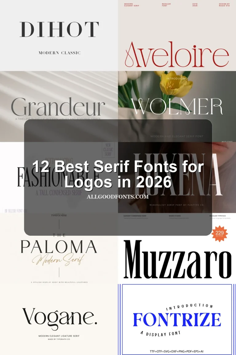
This collection spans wide architectural serifs, condensed display shapes, delicate high-contrast forms, and flourished lettering with distinctive swashes. These Serif Logo Fonts are suited to wordmarks, packaging, fashion identities, editorial titles, badges, and other branding where letter construction carries the visual role.
Looking for more logo fonts? Browse our complete Logo Fonts collection to compare logo-friendly logo styles.

Serif Logo Fonts: Structured Display Forms
These Serif Logo Fonts rely on upright structure, sharp terminals, broad or condensed proportions, and controlled contrast rather than ornamental connections. They create stable, recognizable wordmarks.
Geista Mond Font

Best For: branding, headlines, fashion branding, high-end designs
Geista Mond Font uses wide, upright proportions, sharp serifs, and pronounced thick-thin contrast. Its expansive silhouette reads clearly in large branding and fashion wordmarks, although delicate strokes can weaken when reduced.
Retcaro Font
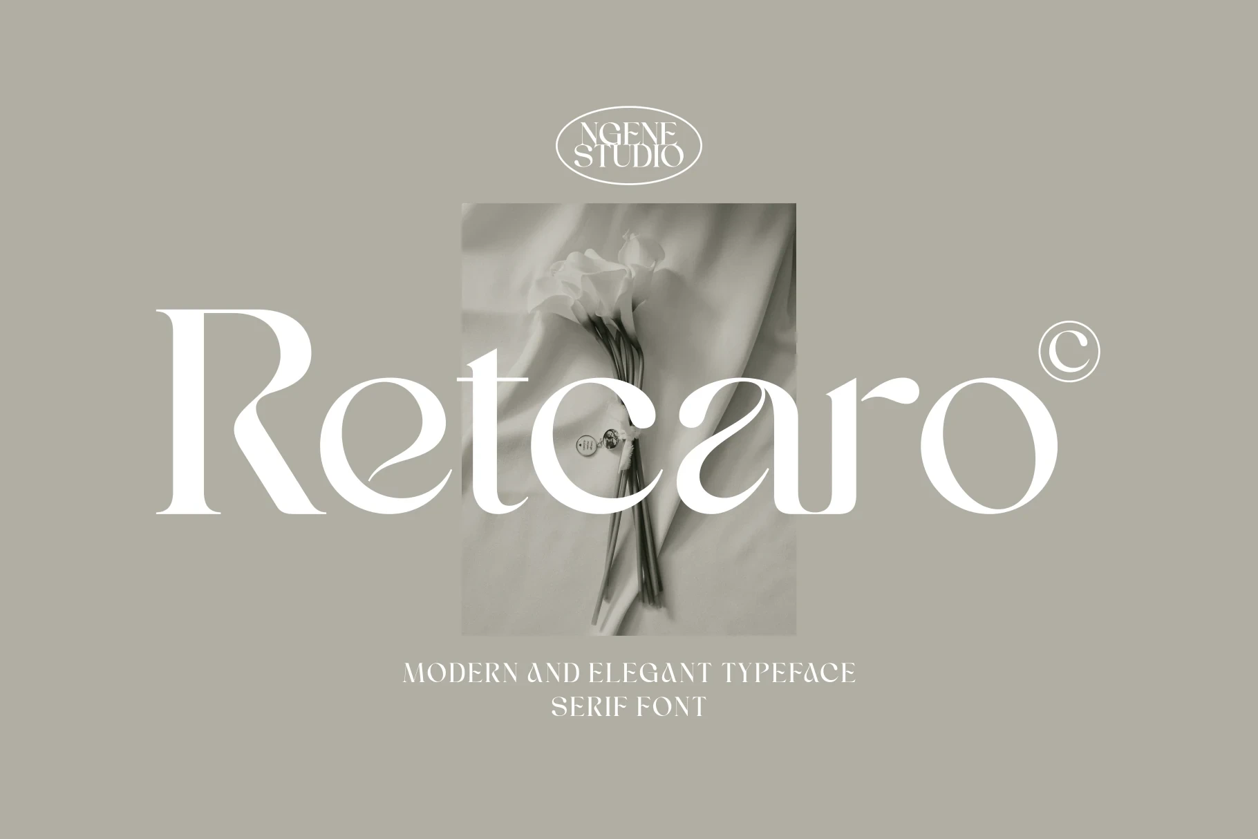
Best For: badges, logos, magazine covers, display text
For short names, badges, and editorial marks, Retcaro Font offers slender strokes, a clean display construction, and a contemporary letterform rhythm. Its multilingual support broadens naming possibilities, while its refined shapes are easiest to assess in short phrases rather than dense copy.
Bekinder Font

Best For: book covers, T-shirts, branding, packaging
Bekinder Font brings wide architectural proportions, upright wedge-shaped serifs, and strong contrast to brand titles and packaging. Its stable uppercase presence suits large layouts, while the display construction makes it unsuitable for long copy. Among Serif Logo Fonts, it favors structure over ornament.
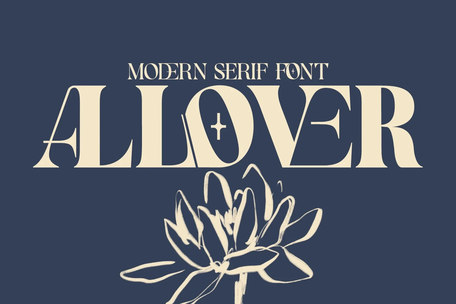
Allover Modern Font
Best For: branding, packaging, fashion branding, logos
Allover Modern Font makes the O a focal point with an engraved-style cross element, then reinforces it with pointed corners and wedge serifs. The detail suits large fashion and packaging marks, where its high contrast remains clear.
Metron Font

Best For: branding, beauty branding, high-end designs, logos
For beauty branding and distinctive wordmarks, Metron Font adds a diagonal slice through the o within an otherwise sharp serif structure. That signature detail separates a name from simpler Serif Logo Fonts, though it can interrupt a neutral reading rhythm.
Flourished Logo Serifs
This group adds curling terminals, connected lowercase gestures, and custom flourishes to serif frameworks. Compared with the structured group, these faces demand more space and display scale.
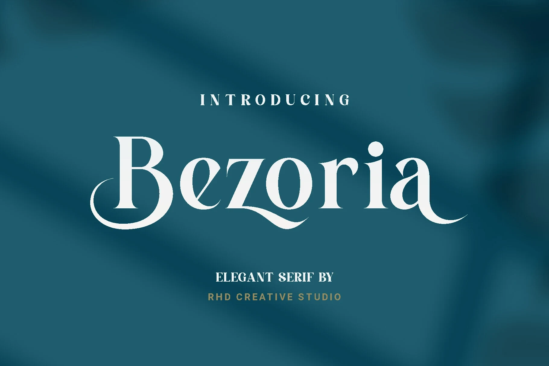
Bezoria – Elegant Serif Font
Best For: branding, high-end designs, logos, display text
Swash terminals on the B and a give Bezoria – Elegant Serif Font its defining movement, while curved baseline flourishes reinforce the ornament. It suits prominent logos and display text, but is too intricate for compact marks or continuous reading.
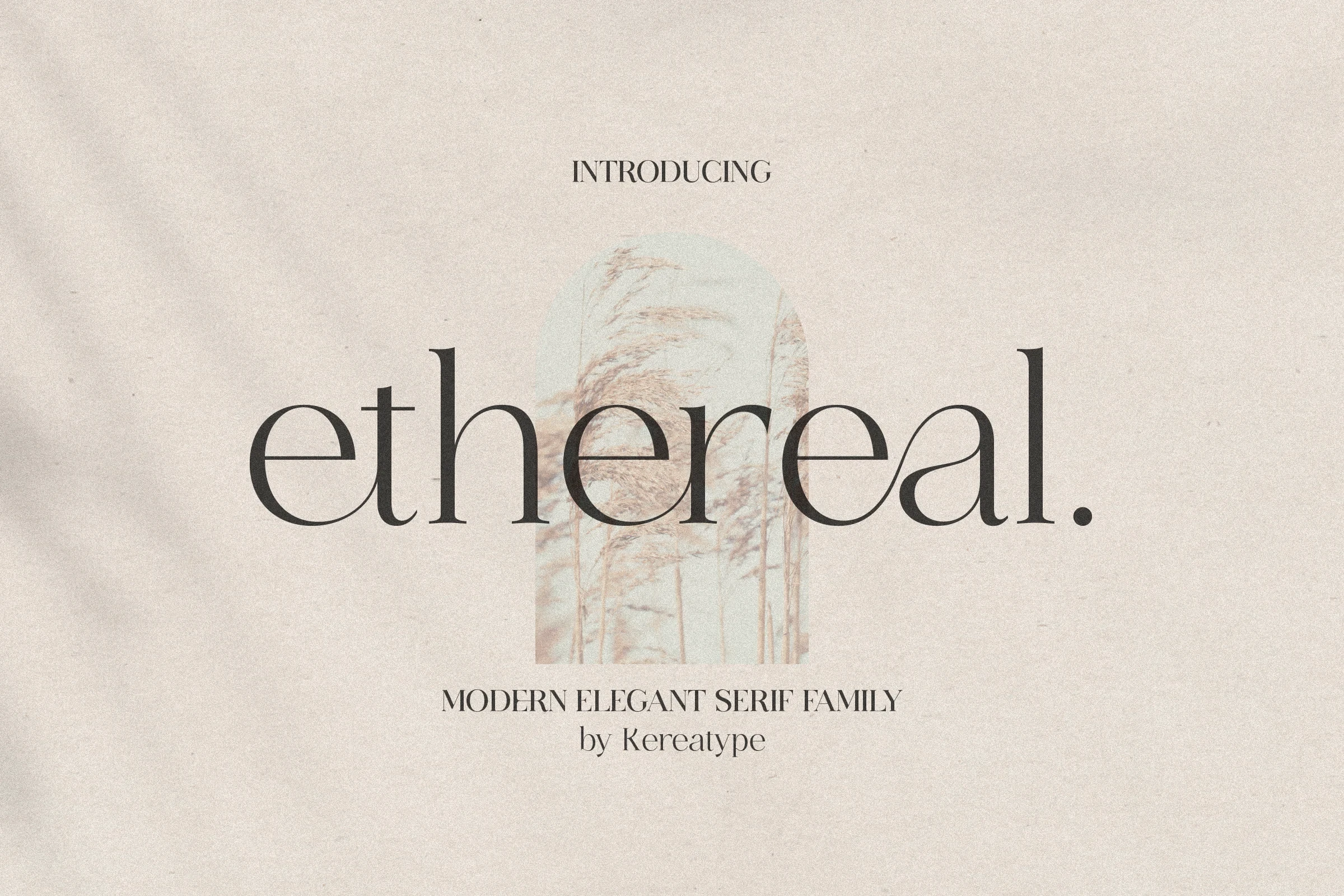
Ethereal Font
Best For: logos, display text, modern designs, clean designs
Ethereal Font is built around elongated flowing serifs and a visible connection between the lowercase a and l. That joined gesture gives short logos a fluid rhythm, while its high contrast keeps it better suited to display text than body copy.
Higuen Font

Best For: badges, logos, magazine covers, display text
For badges and magazine covers, Higuen Font offers a strong focal detail in its sweeping lowercase g swash. Sharp wedge serifs and open counters support large-size readability, but the flourish needs spacing and careful sizing.
Milden Font

Best For: logos, branding, fashion branding, magazine covers
Milden Font keeps an upright posture while curling terminals add controlled ornament to its high-contrast serif structure. It fits logos, fashion branding, and magazine covers, though its delicate details require large-scale reproduction.
Rogelia Font

Best For: badges, logos, magazine covers, display text
Rogelia Font balances curvilinear lowercase swash connections with transitions from sharp terminals to softer rounded forms. Its multilingual support helps with varied logo names, but complex joins are best judged in short display phrases.
Buaser Font

Best For: branding, fashion branding, high-end designs, logos
Buaser Font gives flourished B, A, and R forms extra flexibility through built-in ligatures and alternate characters. Those features help tailor distinctive wordmarks, but the high-contrast, ornamental structure remains a large-scale solution. It is one of the more customizable Serif Logo Fonts here.
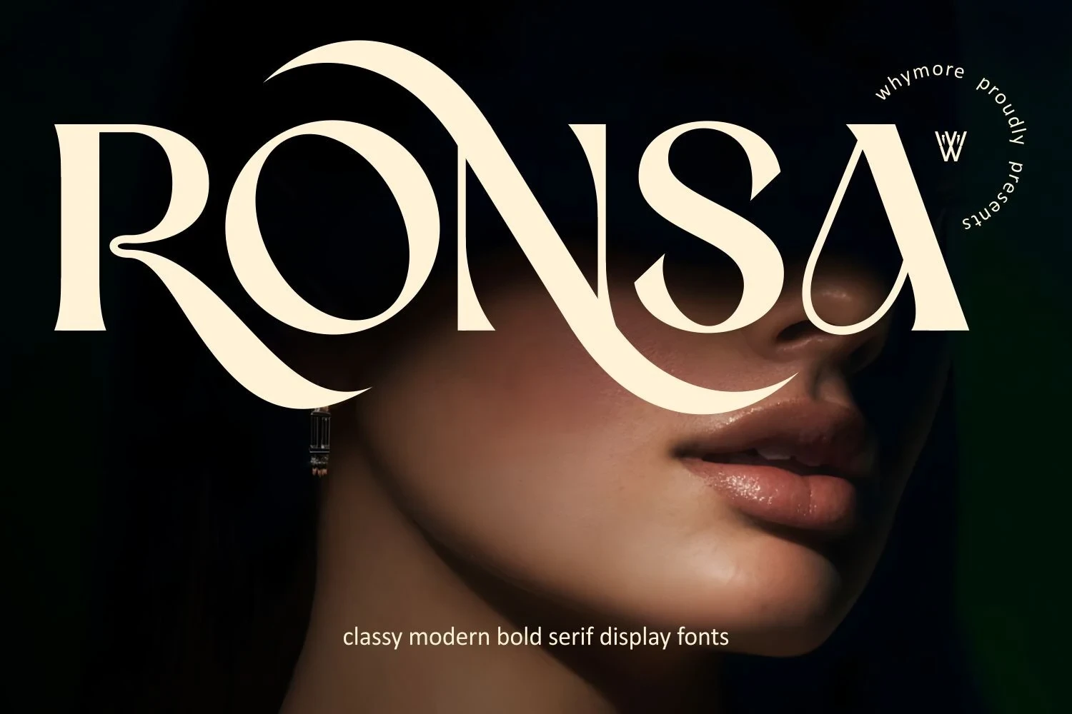
Ronsa Font
Best For: logos, display text, modern designs, minimal designs
Ronsa Font pairs pointed serifs with organic swashes extending from the R and A, creating a directional finish for editorial logos. Thin strokes and flourishes reward large-scale use, where the letter details have room to remain readable.
Characterful Statement Serifs
Characterful statement serifs use unusual proportions, rounded forms, sweeping curves, or modified letters to establish a strong personality. They make memorable marks but need careful sizing.
Koffins Font

Best For: book covers, T-shirts, branding, packaging
Koffins Font combines rounded slab-like serifs with curved swash terminals and an upright stance. The result gives branding, book covers, and packaging a retro-led presence, though its intricate curves need generous sizing to remain legible.
Theqor Font

Best For: branding, packaging, fashion branding, logos
Theqor Font packs heavy, condensed proportions into a narrow footprint, with elongated crossbars, a distinctive Q, and an extended R serif. It works for compact logos and brand names, but fine subtitle lettering needs larger rendering.
Sego Font

Best For: logos, website headers, display text, modern designs
Sego Font uses wide letterforms, horizontal flared terminals, and organic sweeping curves for open logo layouts and website headers. It reads well as a large title, but thin strokes and decorative flares lose clarity when reduced.
Pink Sunset Font

Best For: logos, display text, headlines, modern designs
Pink Sunset Font creates a strongly retro profile through exaggerated bulbous serifs, wide rounded proportions, and curvilinear flourishes. It can anchor a playful logo or headline, but the decorative silhouette needs headline-sized reproduction.
How to Choose the Right Font
Choose based first on scale and construction: structured faces offer steadier readability, while swashes and altered letters create stronger focal points but need room. Check joins, contrast, flourishes, and unusual characters in the full name, then test the mark small and large. The best Serif Logo Fonts preserve recognition without losing their defining detail.