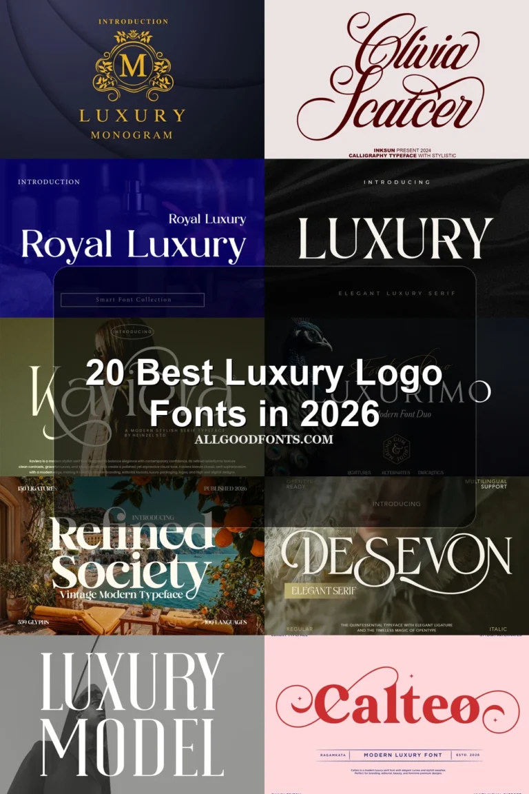
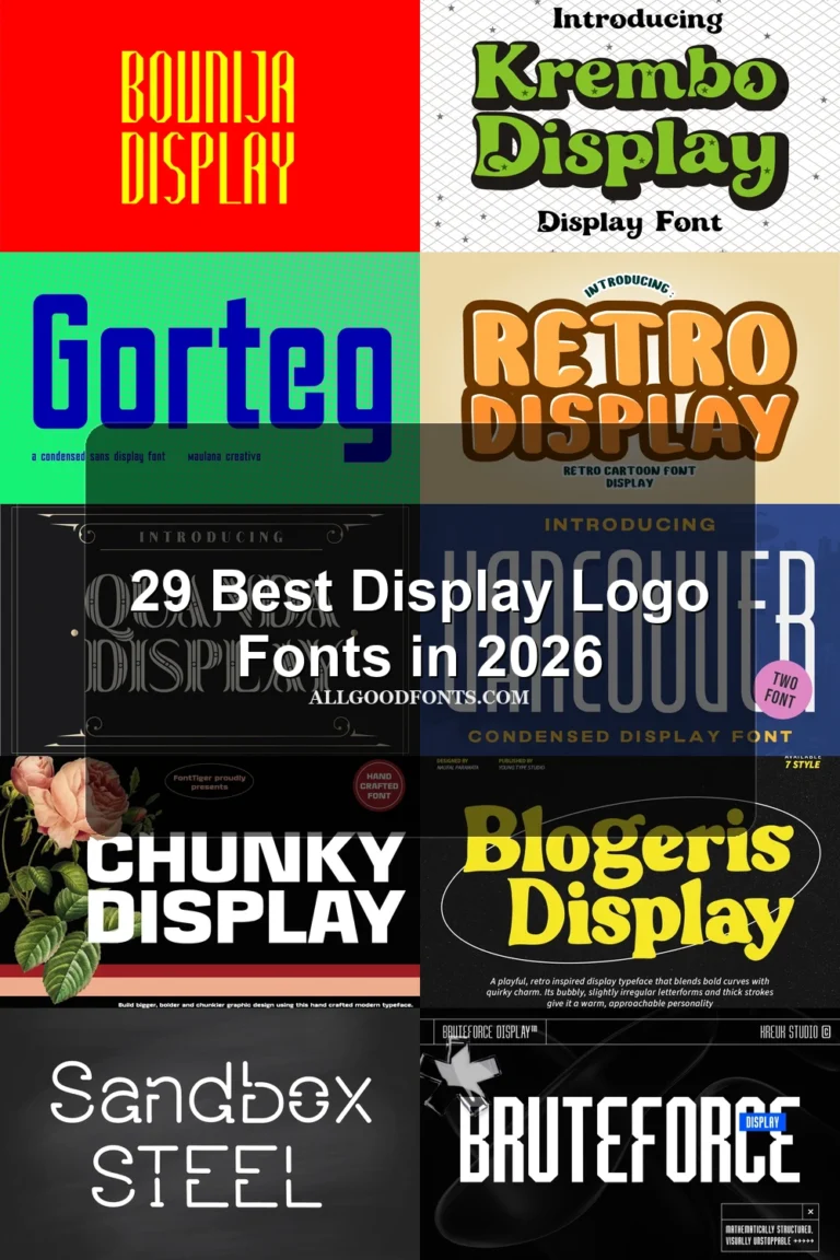
15 Best Elegant Logo Fonts in 2026
This collection spans connected brush scripts, light cursive lettering, high-contrast serifs, and decorative forms with distinctive terminals or swashes. These Elegant Logo Fonts are best assessed as display identities, where construction, readability, and scale determine whether a mark suits packaging, websites, stationery, or a prominent wordmark.
Looking for more logo fonts? Browse our complete Logo Fonts collection to compare logo-friendly logo styles.

Elegant Logo Fonts: Script and Expressive Display Lettering
These expressive scripts and display forms rely on connected movement, slender strokes, or visible texture. They feel more personal and fluid than the upright serif groups, but need short wording and generous scale.
Silhouette Elegant Font

Best For: business cards, logos
Silhouette Elegant Font uses connected dry-brush lettering with textured edges and a pronounced horizontal swash underline. Its wide movement makes these Elegant Logo Fonts strongest for large logos and business cards, rather than small identity text.
Million Smiles Font
Best For: logos, display text, elegant designs
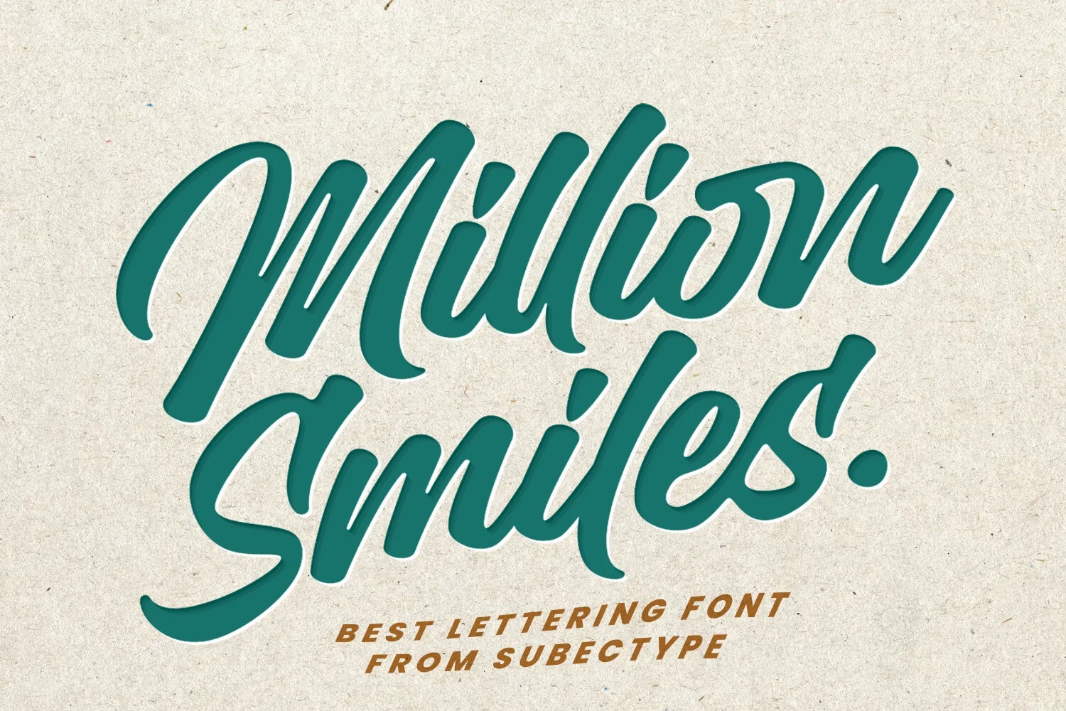
Million Smiles Font combines substantial connected script weight with flowing movement and slender strokes. The weight helps short names hold their shape in Elegant Logo Fonts, while longer phrases should stay brief for clear letter comparison.
Elegant Font

Best For: logos, wall art, elegant designs
Elegant Font brings light connected script, rounded letterforms, and a softer signature to names or wall-art logos. Its slender construction needs short display phrases, while PUA-encoded characters make its glyphs and swashes easy to access.
Praise Font

Best For: branding, logos, display text
Praise Font offers light display lettering with a clearly defined stroke rhythm, without relying on a specified serif or script construction. Test it in short brand names and headings, where each individual form can be judged directly.
High-Contrast Serif Structures
High-contrast serifs organize the group through sharp edges, open counters, and strong thick-to-thin transitions. Their structured silhouettes suit formal branding, while delicate hairlines make them less dependable at small sizes.
Strong Font

Best For: logos, branding, packaging
Strong Font builds broad upright letters from sharp bracketed serifs and pronounced thick-to-thin contrast. It reads clearly in large branding and packaging, although its fine serif details can weaken when reduced to very small sizes.
Amsio Elegant Serif Font

Best For: logos, branding, packaging, creative projects
For a memorable focal letter, Amsio Elegant Serif Font offers wide, light construction and an ornamental interlocking letterform at the center. The overlap gives a wordmark a distinctive anchor, but thin hairlines demand generous display sizing for reliable recognition.
Papillon Serif – Elegant Modern Luxury Font

Best For: branding, high-end designs, logos
Papillon Serif – Elegant Modern Luxury Font combines a geometric-influenced structure with sharp horizontal serifs and a right-leaning presentation. It suits formal large-scale wordmarks; reduced versions may lose the thin horizontal strokes that define its character.
Grandeur – Elegant Classic Serif Font

Best For: logos, display text
Grandeur – Elegant Classic Serif Font is wide and high contrast, with pointed serifs and a ball terminal on the lowercase r. Its fine details reward prominent logos and editorial-style marks more than compact applications.
Elegant Font

Best For: logos, branding, packaging
Elegant Font uses high-contrast serif shapes, open counters, and curved terminal flourishes. Those open interiors support recognition in large branding and packaging, but delicate contrast limits it to display roles rather than body copy.
Patcher Font

Best For: fashion branding, logos, packaging
For fashion branding or packaging, Patcher Font pairs slab-like horizontal serifs with open rounded bowls, giving its wordmarks a firm silhouette. High contrast improves large display impact but rules it out as a body-text choice.
Elegant Font

Best For: branding, fashion branding, logos
Elegant Font stands out through prominent ball terminals on the lowercase g and t within an upright, high-contrast serif design. The terminals suit fashion branding and website headers, although delicate strokes reduce clarity at small sizes.
Things Font
Best For: logos, display text, modern designs
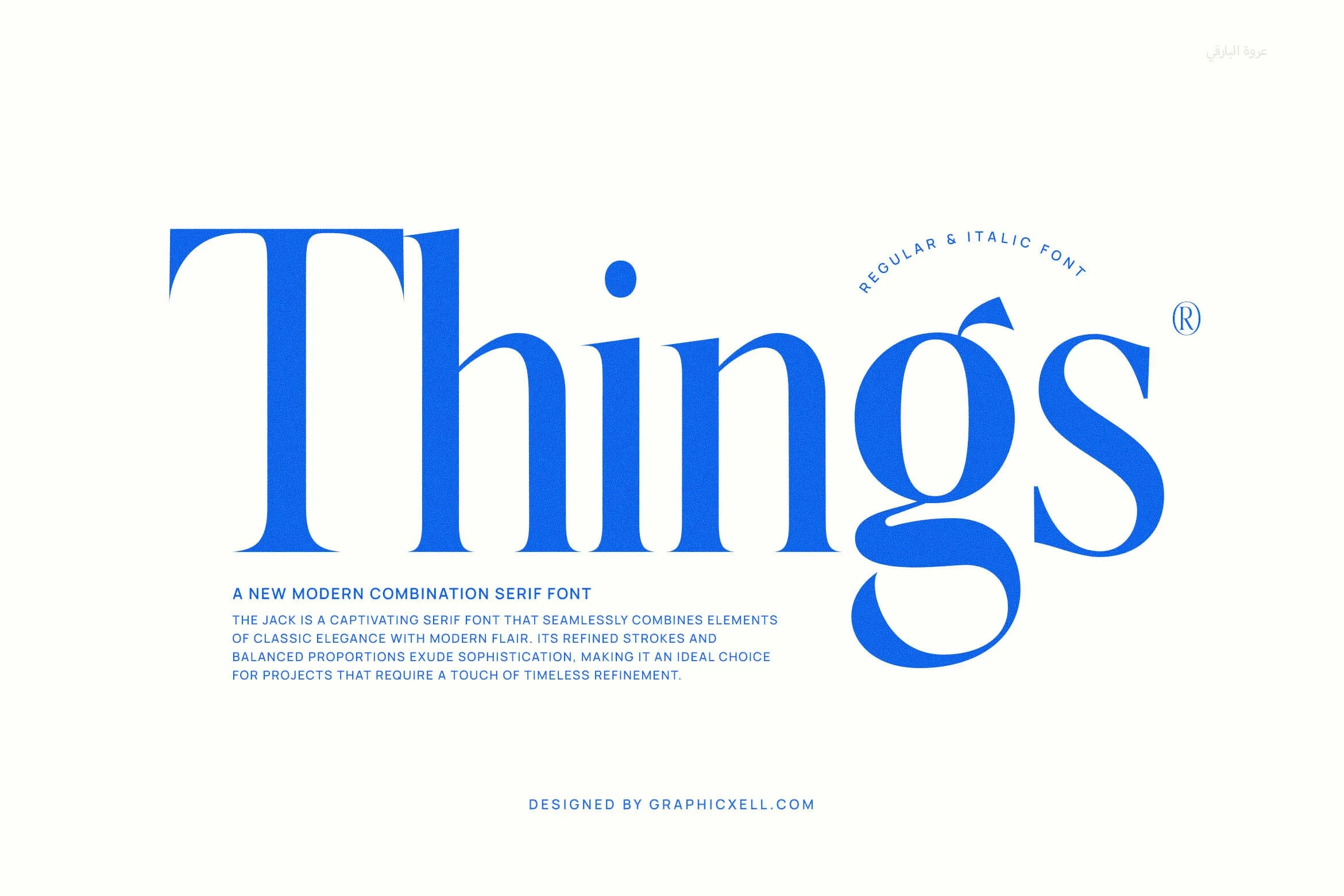
Things Font uses wide, high-contrast serif forms with wedge-shaped serifs, vertical stress, and a teardrop terminal on the g. Regular and Italic options expand logo treatments, but delicate details remain dependent on display-size use.
Ornamental Serif Marks
These ornamental serif designs make individual letters memorable through swashes, curled terminals, ligatures, and unusual glyph details. They create stronger focal points than the restrained serif group, but require simpler wording.
Marquis – Elegant Modern Serif Font

Best For: logos, display text, modern designs
For a heavily decorated wordmark, Marquis – Elegant Modern Serif Font layers baseline swashes, teardrop and ball terminals, and included ligatures over an upright serif structure. Its flourishes reward large logos but make dense or extended wording difficult to read.
Quater Elegant Font
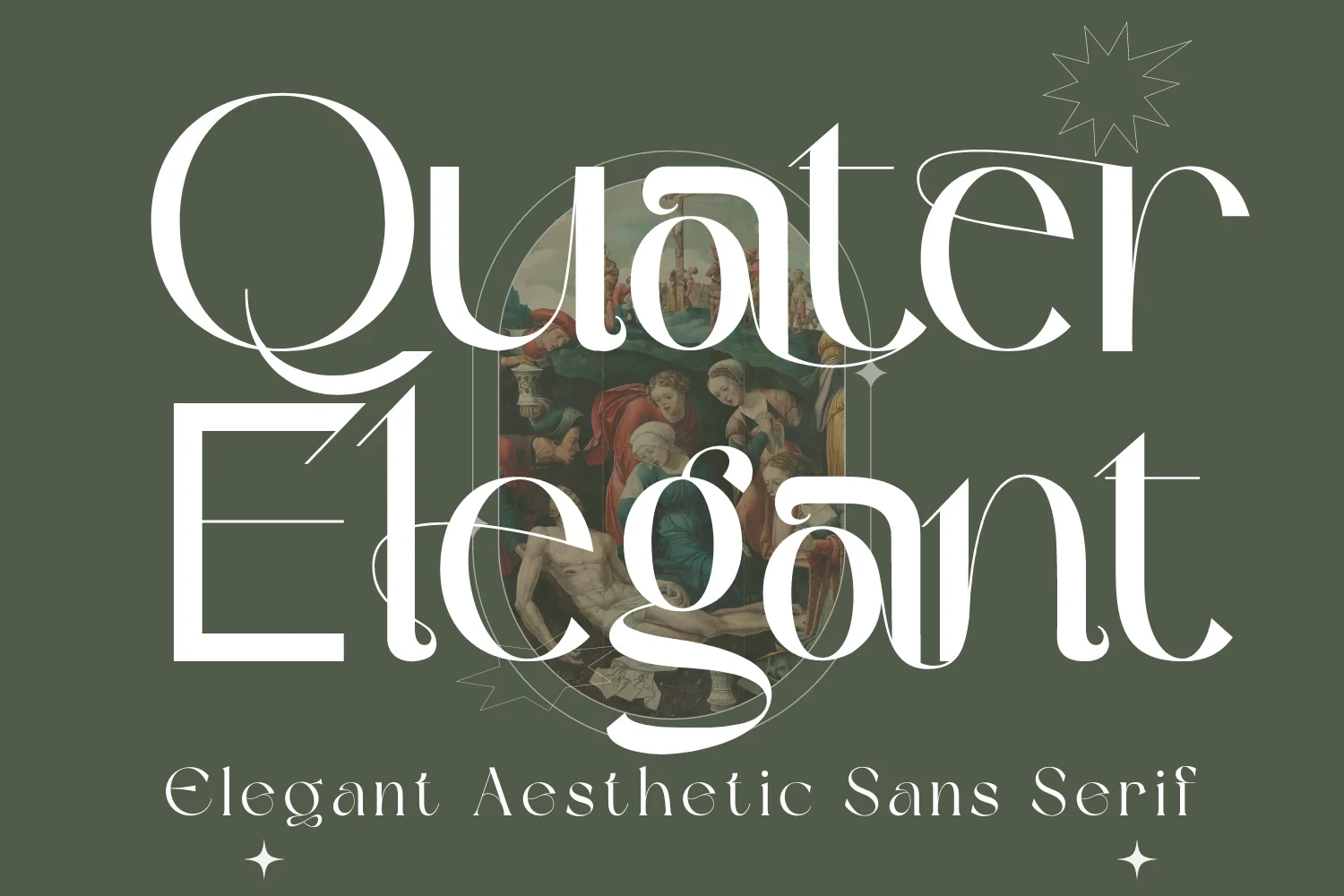
Best For: invitations, social media graphics, logos
Quater Elegant Font is identified by sweeping lowercase g and uppercase Q swashes, supported by open apertures and rounded curves. The forms remain identifiable at logo scale, though elaborate terminals need space and should not carry long text.
Bezoria – Elegant Serif Font
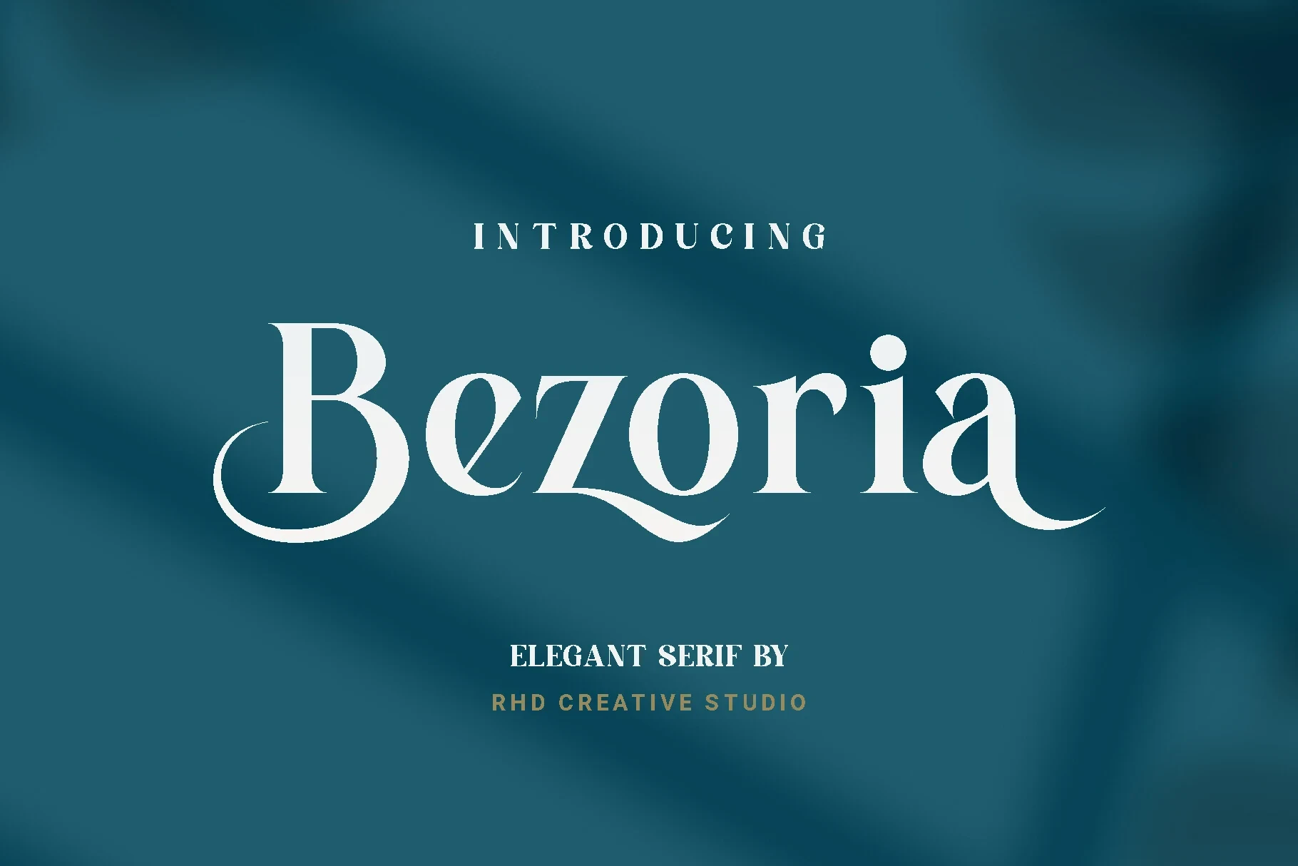
Best For: branding, high-end designs, logos
Bezoria – Elegant Serif Font makes the lowercase a and uppercase B its clearest signatures through curled, swash-style terminals. These details create a distinctive logo accent, but need large sizing so the flourishes remain visible.
How to Choose the Right Font
Choose connected scripts when movement and signature character matter, then compare join clarity in the actual name. For serif marks, inspect contrast, counters, terminals, and horizontal strokes at final size: decorative flourishes need room, while open forms preserve recognition. The strongest Elegant Logo Fonts balance a memorable focal detail with dependable reading.