20 Best Geometric Logo Fonts in 2026
This collection moves from heavy serif forms and crisp sans construction to slender strokes and connected cursive movement. These Geometric Logo Fonts are geared toward short wordmarks, posters, packaging, social graphics, and headlines, with readability depending closely on weight, scale, and the detail of each letterform.
Looking for more logo fonts? Browse our complete Logo Fonts collection to compare logo-friendly logo styles.

Geometric Logo Fonts: Bold Display Marks
These Geometric Logo Fonts share substantial bold construction, giving short names a firm graphic footprint. Compared with the lighter groups, they prioritize visibility and headline presence over extended reading.
Torsena Font
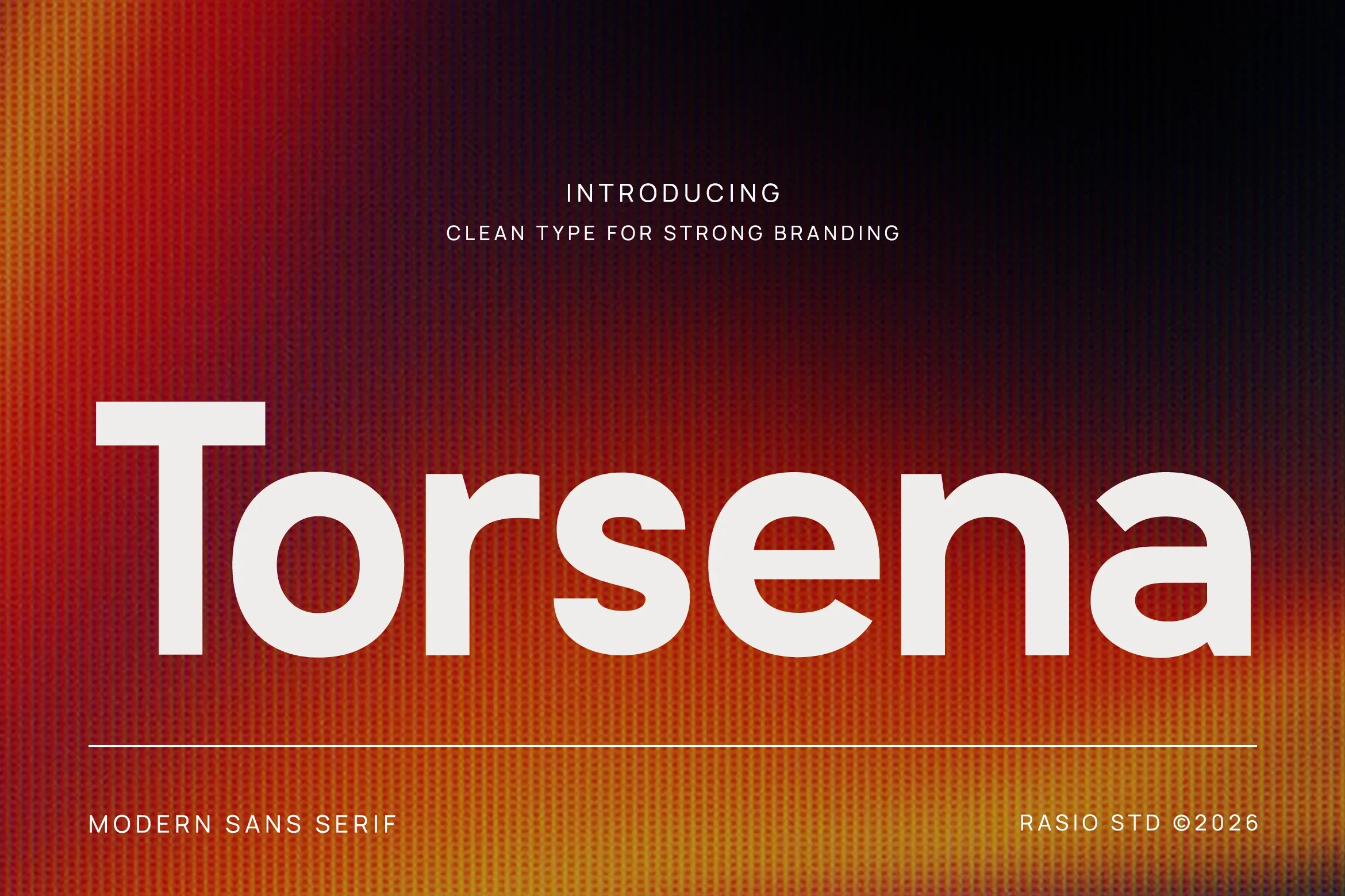
Best For: branding, logos, display text, modern designs
Torsena Font gives serif lettering substantial bold weight and immediate visual authority. Its clear construction works well for branding, headlines, and compact wordmarks that need a firm presence without relying on long text.
Agilov Font

Best For: logos, display text, modern designs, clean designs
Agilov Font combines heavy display construction with a clean contemporary outline, producing a strong silhouette at larger sizes. Keep it for compact logos and prominent display text rather than small, information-dense applications.
Chrones Font

Best For: branding, posters, headlines, logos
Chrones Font uses heavy serif weight to anchor headline-scale marks with substantial letterforms. It can hold a poster or logo effectively, but its dense construction is better suited to short wording than extended phrases.
Cottem Font

Best For: logos, display text, soft designs, bold designs
Cottem Font pairs bold serif structure with an expressive display tone, giving logo names a softer branded feel while retaining enough mass for strong compositions. It is most useful when short wording must remain prominent.
Blush Font
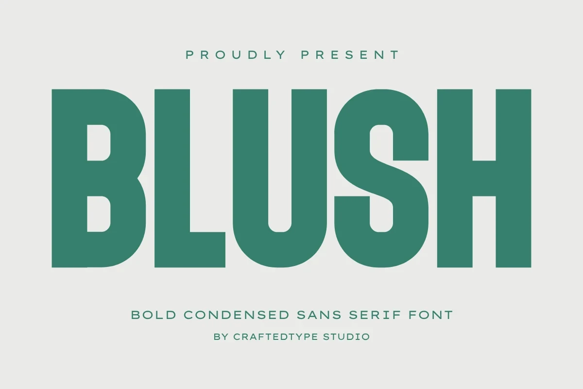
Best For: social media graphics, branding, posters, stickers
Blush Font uses bold serif display letters for high-visibility graphic treatments. Its clear weight is well suited to posters, stickers, and social graphics, where the mark can be read at a glance without fine-detail identity work.
Terra Naro Font

Best For: branding, posters, headlines, logos
Terra Naro Font gives short marks a substantial serif footprint and a strong headline presence. It also includes uppercase and lowercase characters, punctuation, numerals, and multilingual support, making it useful for branding systems spanning multiple languages.
Exima Geometric Font

Best For: logos, posters, display text, bold designs
Exima Geometric Font turns bold display construction into a firm graphic block, with letterforms suited to compact wording. It is a strong choice for logos and posters when the design needs visible force at display scale.
Balimo Font

Best For: branding, headlines, professional designs, logos
Balimo Font combines bold serif forms with a substantial footprint and a clearly display-focused role. Its branding and professional-design applications point toward compact names and headlines, not paragraphs or information-heavy layouts.
Refined Serif Logo Forms
This group uses serif detailing and recognizable stroke rhythm to make short branding text feel shaped rather than neutral. Its letterform focus separates it from the heavier, more block-like display styles.
Pogonia Font

Best For: logos, posters, social media graphics, website headers
Pogonia Font uses clean contemporary serif construction and a clear stroke rhythm, so its expressive letterforms remain easy to compare in short names. It is more convincing in display-scale branding than in extended identity text.
Kopile Font

Best For: branding, logos, display text, modern designs
Distinctive serif shapes give Kopile Font an expressive outline without making individual letters difficult to distinguish. That combination suits wordmarks and display text where viewers need to inspect the lettering quickly.
One More Font

Best For: logos, display text, modern designs, clean designs
For short branding text, One More Font offers clean serif forms with a visibly display-oriented character. Its recognizable shapes reward layouts where each letter can be seen clearly, rather than paragraphs or tightly packed copy.
Hugos Font

Best For: logos, branding, headlines, display text
For logos and headlines, Hugos Font brings contemporary serif detailing and a visibly shaped display profile. The supplied evidence supports short branding uses, so assess spacing and legibility before extending it into broader text settings.
Cenura Font

Best For: logos, display text, modern designs, clean designs
Cenura Font emphasizes clean serif construction and recognizable display shapes without a specified heavy weight. That makes it useful for logos whose identity depends on letterform detail and inspection rather than sheer visual density.
Meigan Font

Best For: branding, logos, social media graphics, display text
For branding and social artwork, Meigan Font supplies expressive serif shapes that give a logo a visibly designed silhouette. Its short display wording remains easy to inspect, making the individual forms part of the identity.
Tanod Font

Best For: logos, display text, modern designs, clean designs
Tanod Font uses contemporary serif shapes and a clear stroke rhythm to support recognizable logo lettering. Its clean-design applications favor short marks that need display character without depending on a specified heavy weight.
Slender and Expressive Displays
Slender strokes and expressive display proportions define this lighter set. They offer a narrower visual presence than the bold categories, but require careful sizing so fine forms remain readable.
Digital Geometric Font

Best For: business cards, logos, display text, expressive designs
Digital Geometric Font brings refined slender strokes to a lighter display silhouette. Use it for concise logos or business-card text, testing the actual size carefully because its fine construction needs enough scale for clear reading.
Mirano Extended Font
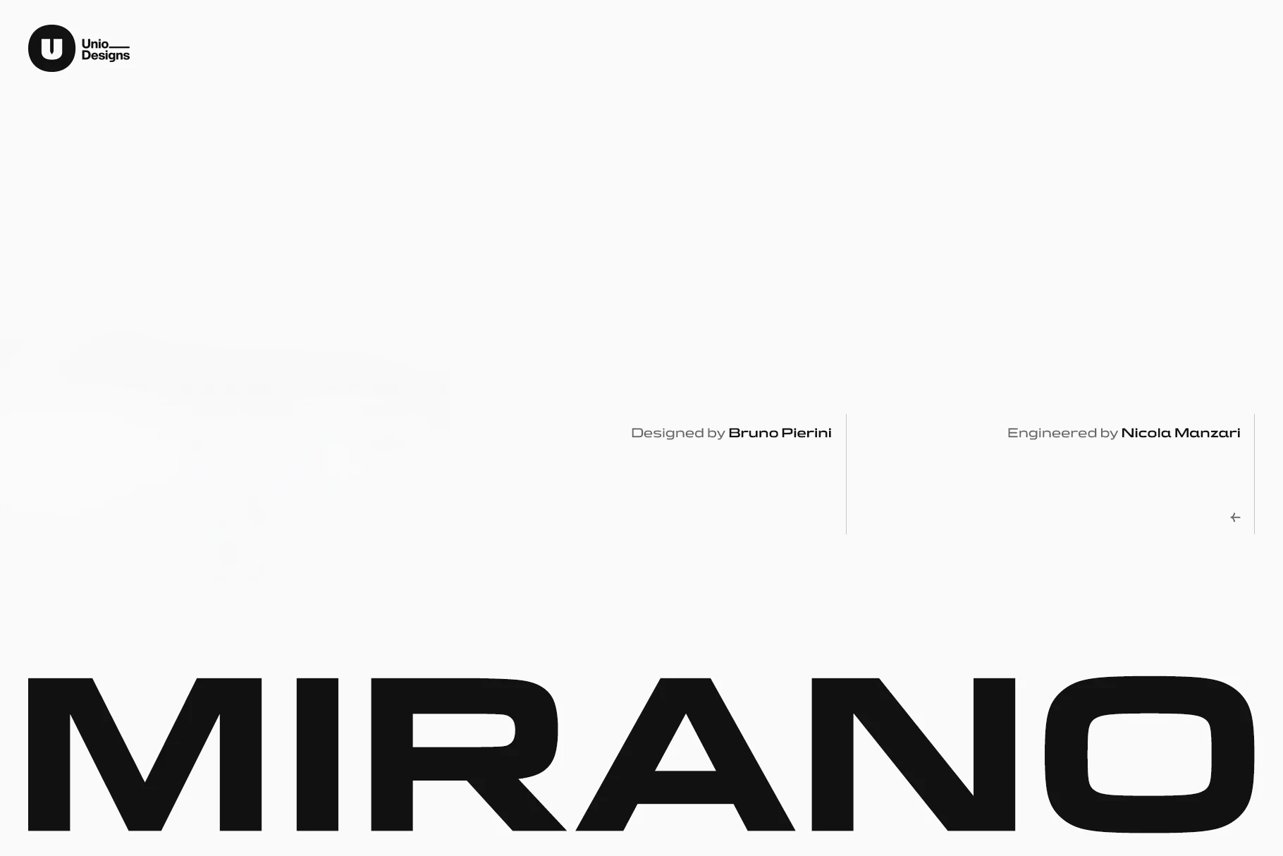
Best For: logos, display text, expressive designs, social media graphics
Mirano Extended Font is built around display-focused shapes and a pronounced stroke rhythm that invites close inspection. It fits short expressive marks and social artwork where the lettering carries much of the visual identity.
Montreal Font

Best For: logos, display text, modern designs, clean designs
Montreal Font offers light serif strokes as an alternative to the collection's heavier styles. Its slender construction suits short logos and clean designs, provided the chosen size preserves the clarity of its display letterforms.
Non-Serif and Connected Forms
These non-serif and connected forms provide the collection's clearest alternatives to conventional serif lettering. One favors fast recognition through weight; the other relies on joined movement for short names.
Begob Font

Best For: branding, packaging, posters, logos
Begob Font takes a bold display sans serif route, replacing serif detail with a straightforward, quickly recognized silhouette. Its weight makes it practical for packaging, posters, and brand marks that need immediate visual clarity.
Cornero Font

Best For: logos, branding, headlines, beauty branding
Cornero Font connects its bold cursive forms into continuous handwritten movement, making short names feel shaped by the joins between letters. It suits beauty branding especially well, while longer wording may take more effort to parse.
How to Choose the Right Font
Choose heavier serif or sans forms when a short name must hold its shape on posters, packaging, or social graphics. Select lighter serif styles only when size preserves their strokes, and inspect connected lettering carefully for parsing issues. For Geometric Logo Fonts, compare joins, weight, contrast, and word length at the final application scale.