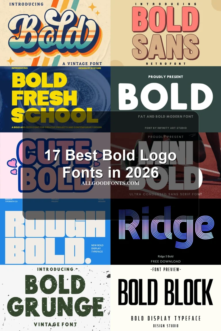
22 Best Retro Logo Fonts in 2026
This collection spans heavy display lettering, connected scripts, serif structures, and rounded forms, with differences in stroke weight, joins, and period character. These Retro Logo Fonts are intended for brand names, badges, invitations, posters, packaging, and other short display applications where construction matters.
Looking for more logo fonts? Browse our complete Logo Fonts collection to compare logo-friendly logo styles.

Retro Logo Fonts: Bold Display Lettering
These Retro Logo Fonts emphasize substantial weight, defined shapes, and clear display rhythm. Compared with the other groups, they create firmer brand marks and badge-like headings.
Langford Font
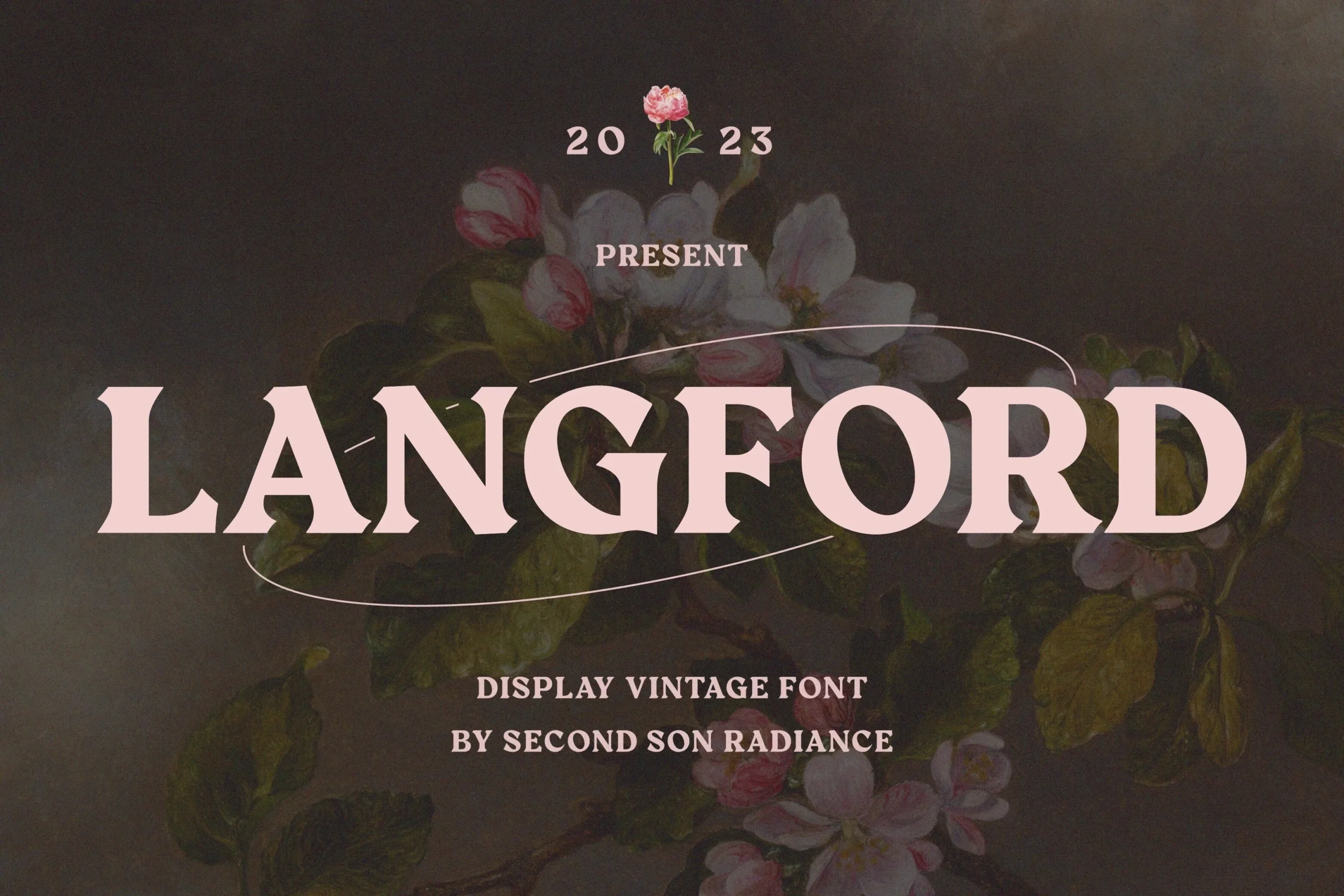
Best For: branding, invitations
Langford Font brings substantial weight to a clean, contemporary display construction. Its strong shapes make Retro Logo Fonts clear in brand names and short headings, though the dense presence is less comfortable for extended wording.
Bellgum Font

Best For: branding, invitations, book covers
Bellgum Font reinforces bold display weight with clean, distinctive letterforms. It helps a short brand name hold its ground on covers or invitations, while its dense presence offers little advantage for paragraph-length copy.
Retro Chalet Font
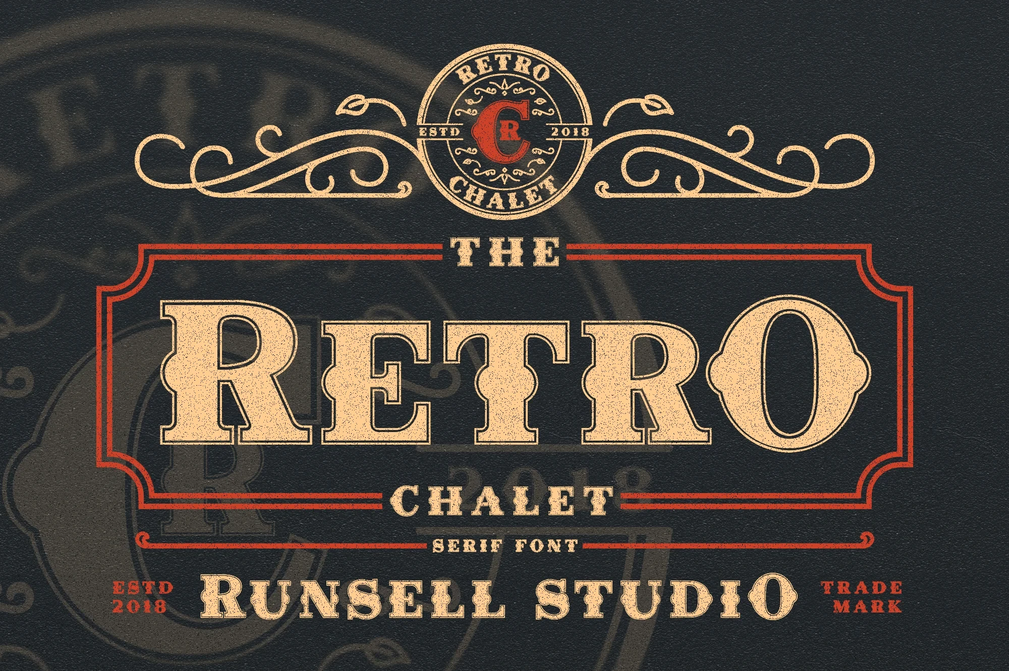
Best For: logos, display text, expressive designs
Retro Chalet Font combines heavy display presence with a pronounced stroke rhythm. That construction supports assertive logos and expressive compositions, while compact wording keeps its dense letterforms easier to compare. It is best treated as a short-mark solution rather than a text font.
Retro Extra Font

Best For: branding, posters, headlines
Retro Extra Font is a bold display construction aimed at headline-scale lettering. Its weight gives branding and posters strong name recognition, but it can dominate a layout when used beyond short text. Reserve it for prominent words with enough surrounding space.
Darkwood Font

Best For: logos, branding, packaging
Darkwood Font uses bold serif lettering and a clear, even stroke rhythm. The structured forms can carry packaging and badge-style logos, while short display text keeps the dense weight readable. It provides firmer construction than the collection's rounded options.
Kogaine Font
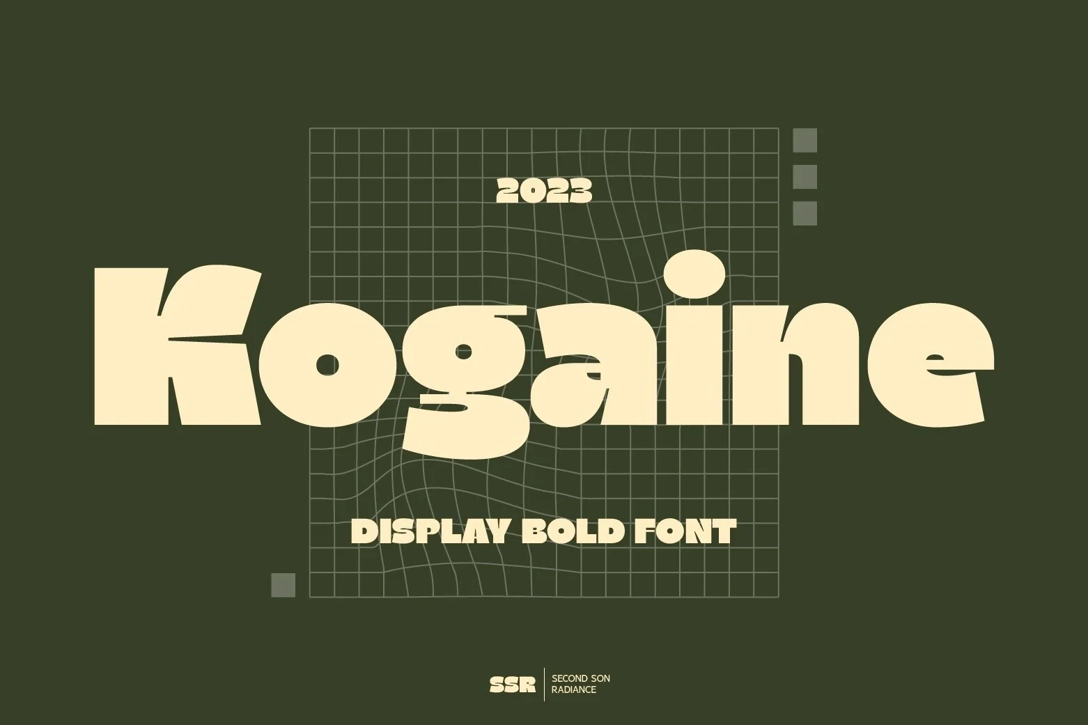
Best For: branding, invitations, book covers
Kogaine Font places clean contemporary construction inside a bold period-inspired display style. It offers a direct route to readable brand names and covers, though its substantial weight is better reserved for prominent text. Short wording will keep the forms open and comparable.
Vintage Sheriff Font
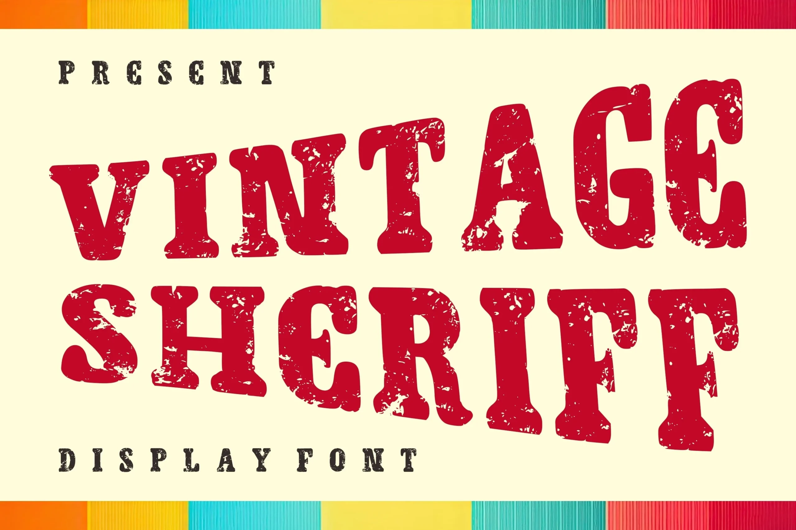
Best For: posters, badges, logos
Vintage Sheriff Font shapes substantial display weight into distinctive badge-ready lettering. Its strong forms support posters, badges, and logos, while short phrases prevent the heavy construction from becoming crowded. It is most effective when the mark has room to function as a compact emblem.
Connected Script Marks
Connected letters create continuous handwritten movement and a signature-like finish. They feel more personal than serif or rounded displays, but their joins make compact wording easier to read.
Angela Heart Font

Best For: logos, display text
Angela Heart Font uses connected handwritten movement with refined slender strokes. The joined flow gives a logo or name a personal signature, while short phrases preserve its letter clarity better than dense text.
Bruschetta Font

Best For: logos, display text, expressive designs
For expressive logo lettering, Bruschetta Font offers a bold connected construction with a distinctly period-inspired display character. Its heavy script presence anchors compact marks effectively, but the joins can make longer wording harder to parse. As Retro Logo Fonts, it works best when the name remains brief and given generous space.
Daliot Font

Best For: logos, display text, bold designs
Daliot Font is built for bold logo lettering through substantial connected script weight. Its joined letters create continuous movement in short marks, giving Retro Logo Fonts a strong signature quality. Longer phrases may become difficult to parse, so keep the wording compact and inspect the joins at the final size.
Retro Music Font

Best For: logos, branding, invitations
Retro Music Font uses connected script movement with an elegant display-oriented tone. These Retro Logo Fonts suit invitations and logo signatures, but the flowing joins limit dependable readability in longer wording. Keep the mark compact and test letter connections before committing to a final size.
Refined and Serif Display Styles
Serif frameworks, slender strokes, and controlled contrast give this group a more structured display presence. It offers greater refinement than rounded styles without the continuous movement of scripts.
Goldfield Font

Best For: logos, clean designs
Goldfield Font combines a bold display serif framework with clean contemporary detailing. Its serif structure gives a logo a defined, established edge, and short display lines make the letterforms easiest to compare. Among Retro Logo Fonts, it suits designs needing structure without connected script movement.
Magmalow Font

Best For: branding, quotes, book covers
Magmalow Font has a clear stroke rhythm within a nostalgic serif display design. That controlled construction helps branding, quotes, and covers retain readable word shapes while keeping an expressive period character.
Retro Thunder Font

Best For: logos, product labels, posters
Retro Thunder Font takes a lighter display approach, using refined slender strokes and a clear rhythm. This gives Retro Logo Fonts an airy period feel for labels and logos, though it carries less visual force than the heavier choices and needs sufficient display size.
Retro Change Font
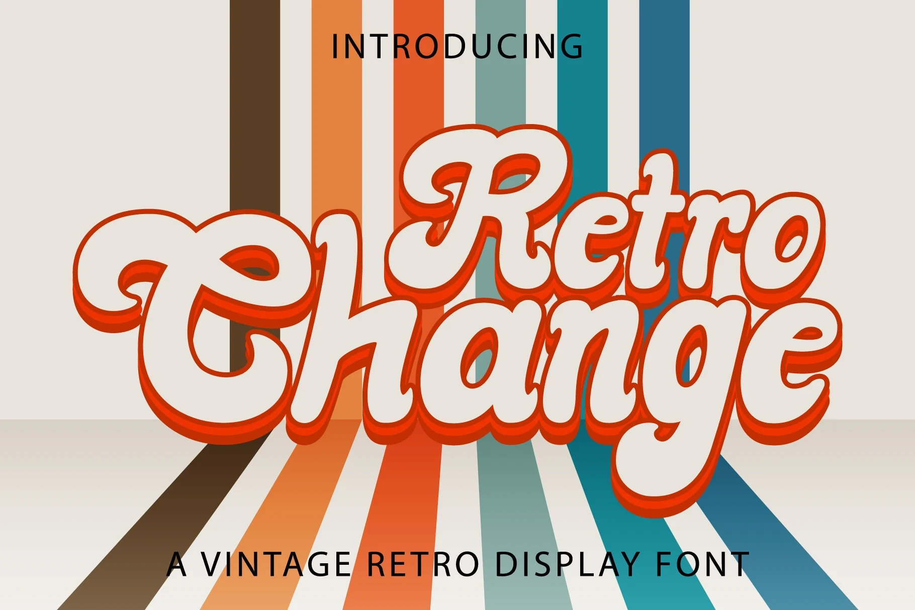
Best For: logos, branding, wedding designs
Retro Change Font uses distinctive display shapes with an elegant nostalgic tone. Its expressive styling fits logos, invitations, and wedding marks, but it is more specialized than neutral display lettering. Short phrases will reveal its character without making the composition feel crowded.
Bluesmont Font
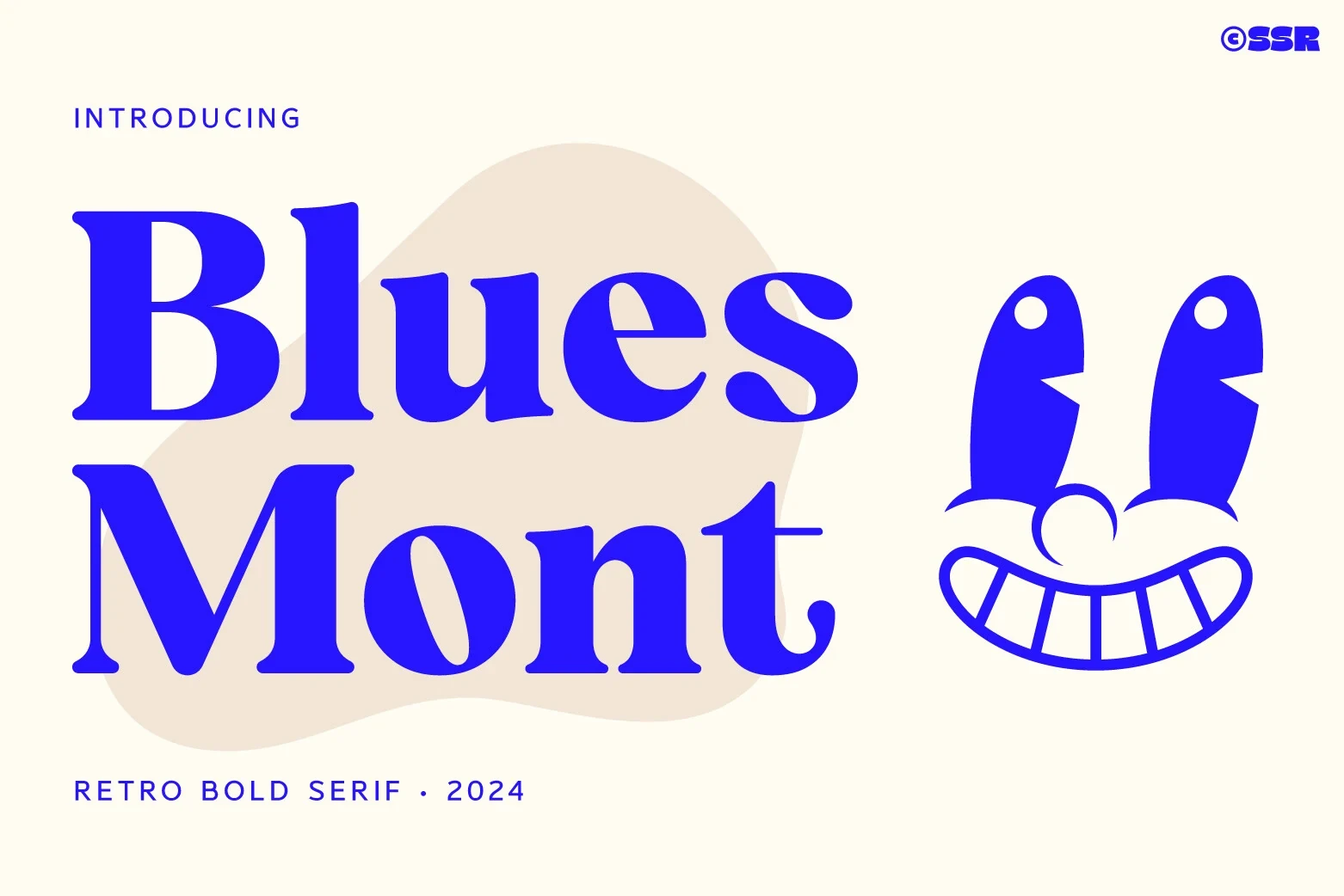
Best For: branding, invitations, book covers
Bluesmont Font balances bold serif display weight with refined slender strokes. The contrast gives Retro Logo Fonts a more refined, elegant edge for branding and cover titles, while short phrases show its stroke variation most clearly. It has more structure than a script and more contrast than rounded displays.
Usa Retro Font
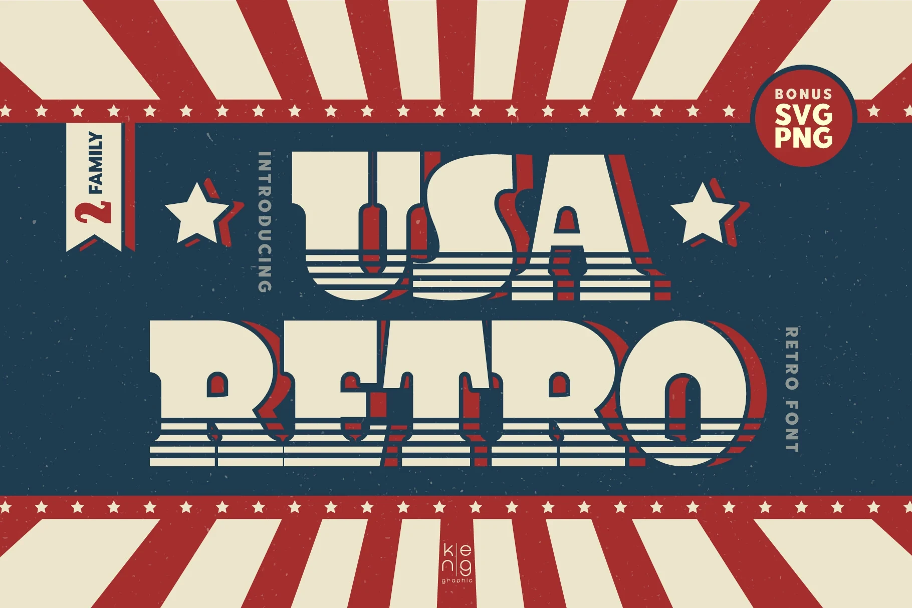
Best For: logos, display text, expressive designs
Usa Retro Font uses light display weight and refined slender strokes. Its restrained construction lets expressive logos feel less heavy, but short wording is essential if the mark must retain presence at display sizes. It works best where airiness matters more than density.
Rounded Playful Displays
Rounded silhouettes and playful stroke rhythms soften the period influence. These fonts feel friendlier than heavy serif displays, though their expressive shapes can overwhelm restrained identities.
Just Retro Font

Best For: logos, display text, playful designs
Just Retro Font pairs rounded playful forms with a clear display stroke rhythm. The softer silhouettes make Retro Logo Fonts suitable for friendly logos and headlines, but they move an identity away from formal, restrained branding. Short display text will show its shapes most clearly.
Retro Give Font
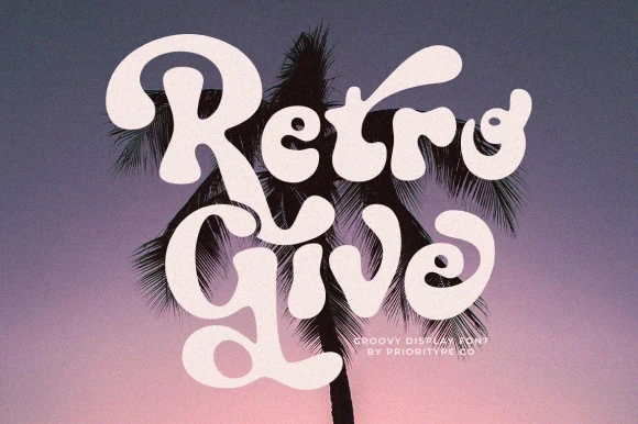
Best For: logos, branding, posters
Retro Give Font combines rounded playful character with substantial display weight. Its sturdy silhouette suits logos and posters, while the informal tone may not fit restrained brand systems. Use short names to let the rounded construction remain legible without adding visual congestion.
Wild Retro Font
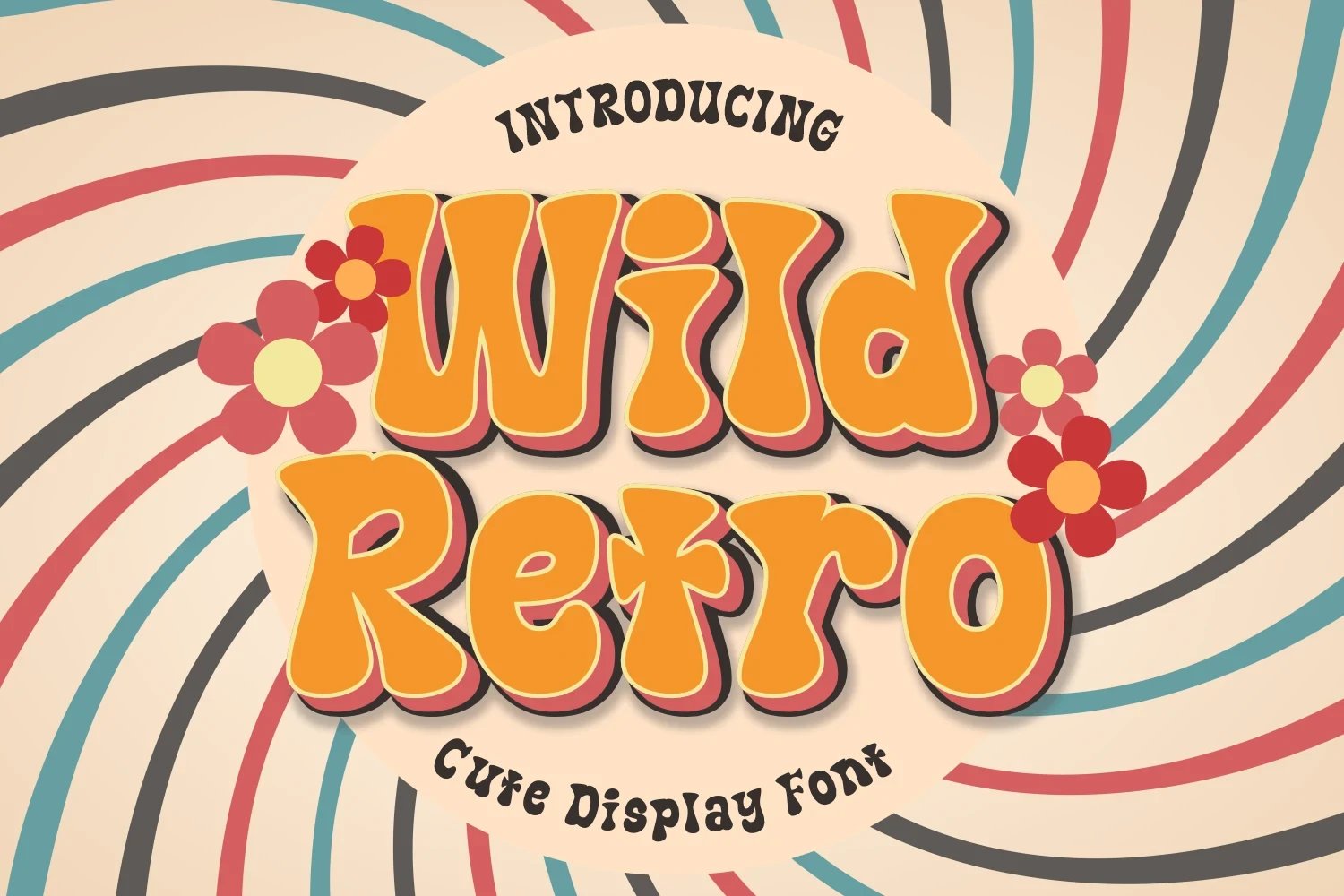
Best For: book covers, posters, invitations
Wild Retro Font has rounded display letterforms and a playful, expressive silhouette. It fits posters, invitations, and book covers, but its strong personality can overpower an understated logo concept. Keep the wording short so the softer shapes remain easy to distinguish.
Retro Volt Font

Best For: logos, social media graphics, product labels
Retro Volt Font organizes playful rounded forms around a distinct display rhythm. It can give product labels and social graphics an immediate period cue, while short names read more cleanly than extended copy. Choose it when softness matters more than restrained neutrality.
Retro 1960 Font

Best For: logos, branding, invitations
Retro 1960 Font has distinctive display letterforms with an explicitly 1960s-oriented character. The focused period cue makes it useful for era-specific logos and invitations, though it offers less flexibility when a contemporary identity needs to stay neutral.
How to Choose the Right Font
Choose by construction first: connected scripts suit brief signature marks, bold displays support strong names, serif styles add structure, and rounded forms soften the identity. For Retro Logo Fonts, compare weight, joins, stroke contrast, and spacing at the intended scale, then favor short wording whenever readability starts to weaken.