22 Best Sans Serif Logo Fonts in 2026
This collection spans open geometric forms, tightly condensed lettering, heavy display constructions, and expressive serifed styles. These Sans Serif Logo Fonts can shape readable wordmarks, packaging marks, social graphics, apparel lettering, and short brand signatures, with scale and spacing determining how well each choice performs.
Looking for more logo fonts? Browse our complete Logo Fonts collection to compare logo-friendly logo styles.
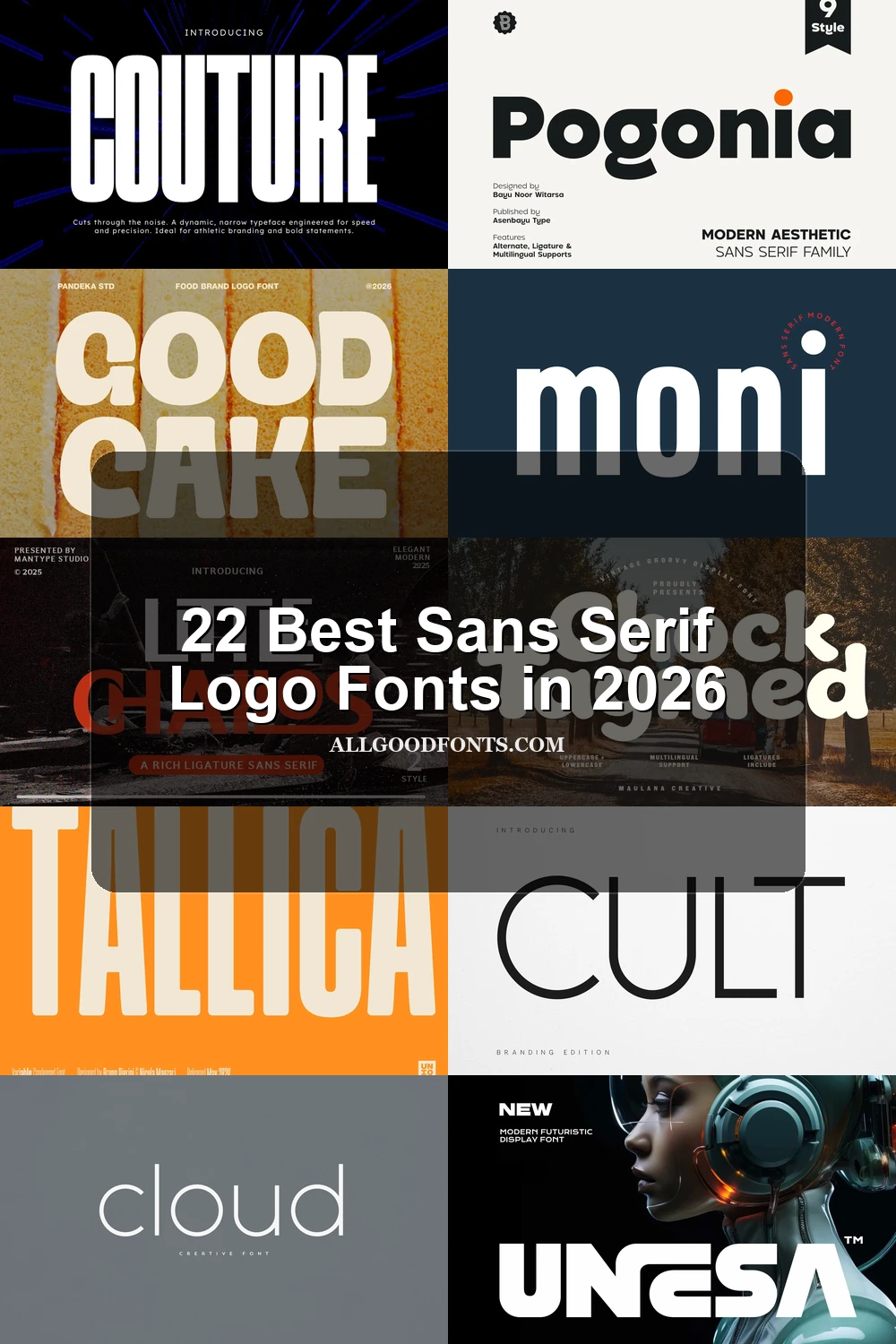
Sans Serif Logo Fonts: Clean Geometric Marks
These Sans Serif Logo Fonts share geometric construction, open or controlled counters, and display-focused weight. They range from approachable wide forms to angular, technological marks built for readable brand systems.
Pogonia Font

Best For: logos, posters, social media graphics, website headers
Pogonia Font uses wide geometric proportions, open counters, a large x-height, and softened corners. Its generous spacing gives Sans Serif Logo Fonts a welcoming wordmark presence that stays readable in logos, posters, and headers.
Cloud Font
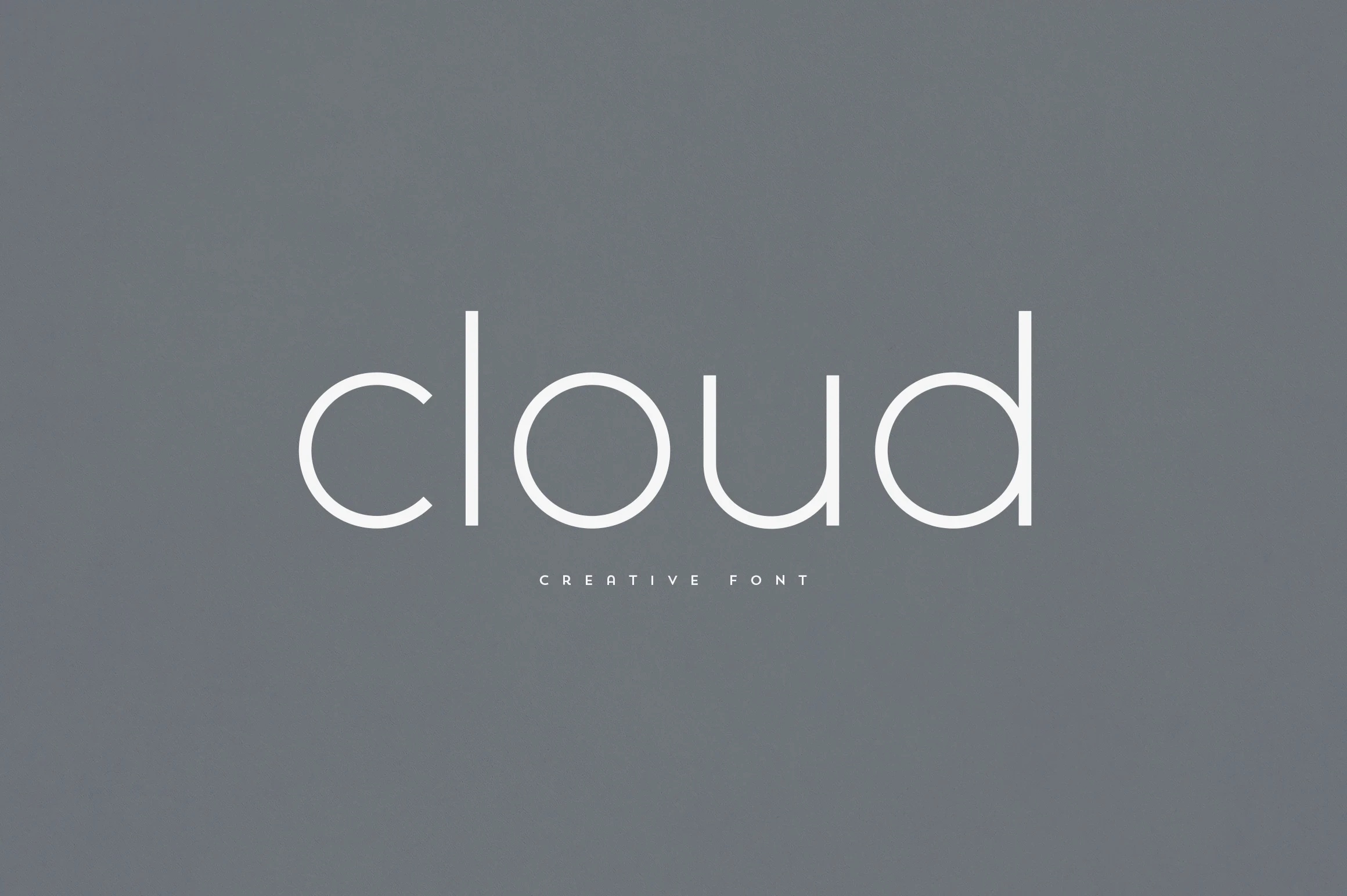
Best For: branding, logos, display text, headlines
Cloud Font combines wide proportions, uniform geometric strokes, and rounded terminals for a friendly, plainly readable mark. As Sans Serif Logo Fonts go, its paired weights are especially useful when a bold brand name needs a lighter supporting line.
Acoety Font
Best For: branding, packaging, posters, headlines
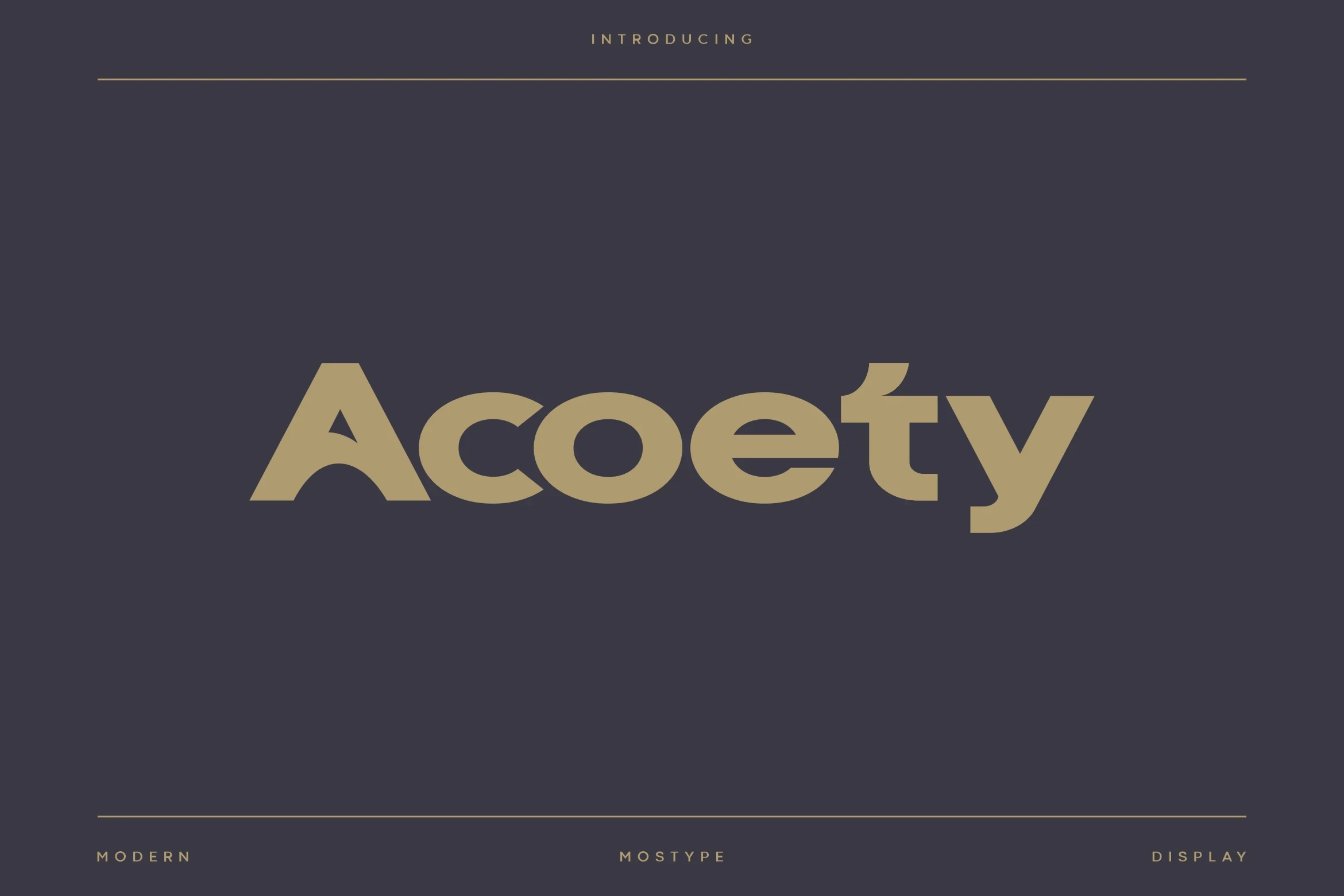
For branding and packaging that need a heavier edge, Acoety Font uses substantial strokes, angular terminals, and a memorable crossbar treatment on the t. Its wide spacing supports large headlines while keeping the construction visibly geometric.
Seyna Font

Best For: logos, social media graphics, posters, display text
Seyna Font balances heavy geometric mass with humanist details: open S and A apertures plus subtly curved terminals. Those openings keep Sans Serif Logo Fonts readable in large marks while softening the mechanical effect of its weight.
Davetica Font
Best For: T-shirts, logos, posters, social media graphics
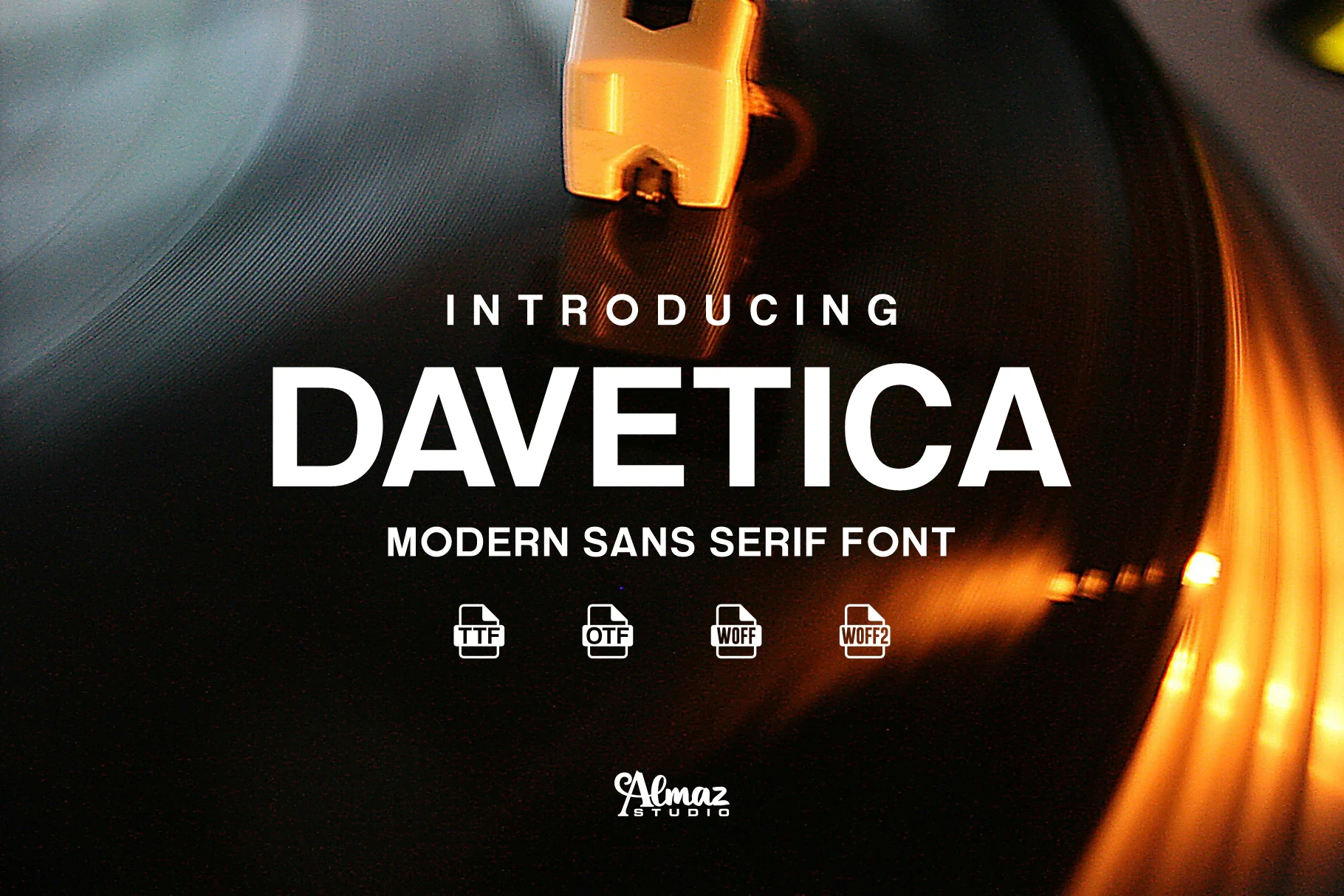
Davetica Font relies on high cap height and uniform geometric strokes to create a compact headline presence. It reads best in large logos, posters, and short social graphics, where its clean construction has room to register.
Montreal Font

Best For: branding, logos, display text, modern designs
Montreal Font has an upright geometric stance, a sharp M apex, and closed a and e apertures. These details give its Sans Serif Logo Fonts a controlled, angular personality, but reduced-size testing is important because the apertures can tighten.
Ceoma Font
Best For: logos, social media graphics, display text, headlines
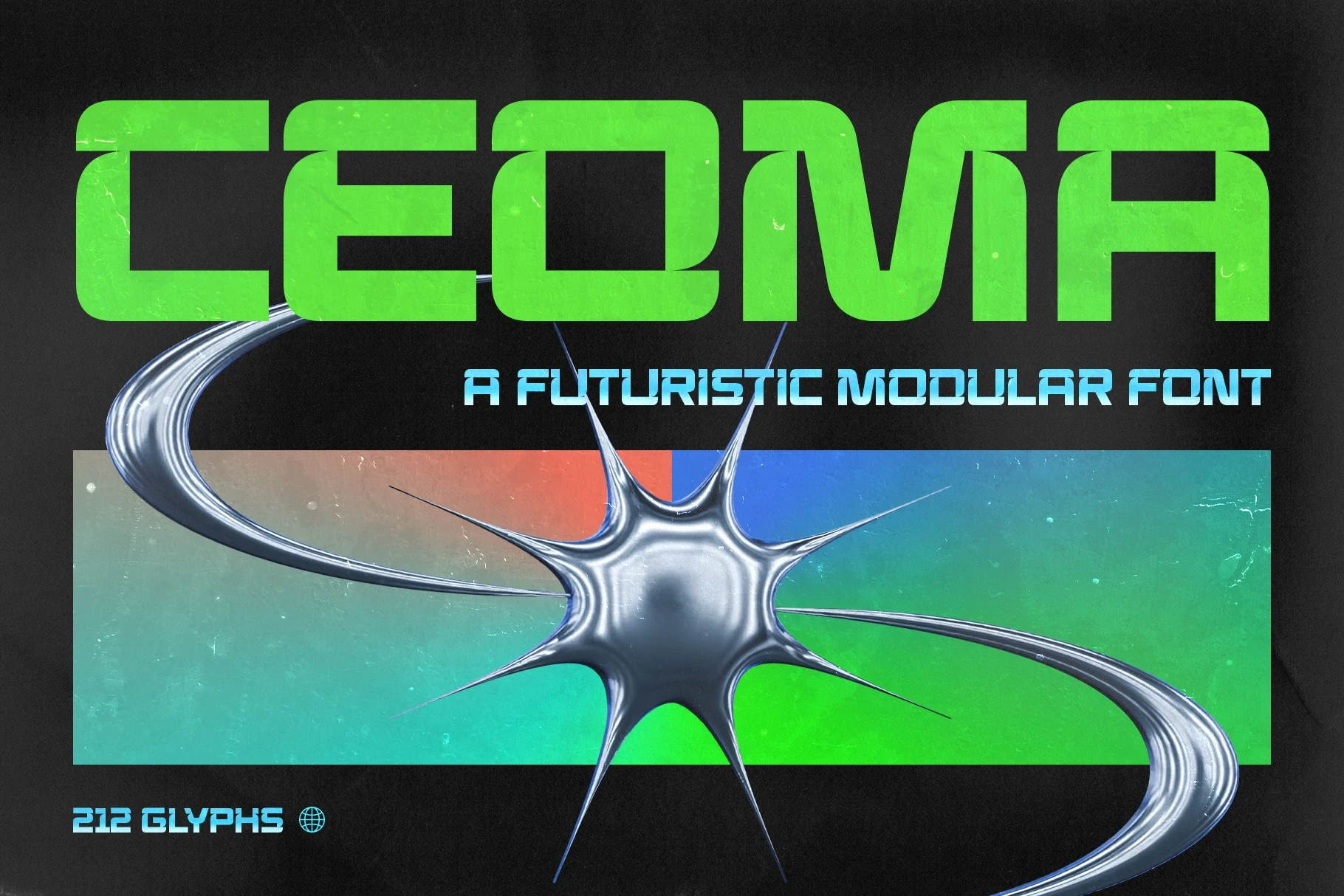
Ceoma Font uses wide proportions, heavy monolinear strokes, and squared outer corners softened by rounded interiors. The result is a technological logo texture that holds at display size, though its simplified construction is less suitable for small or extended text.
Mansfield Font
Best For: branding, logos, display text, modern designs
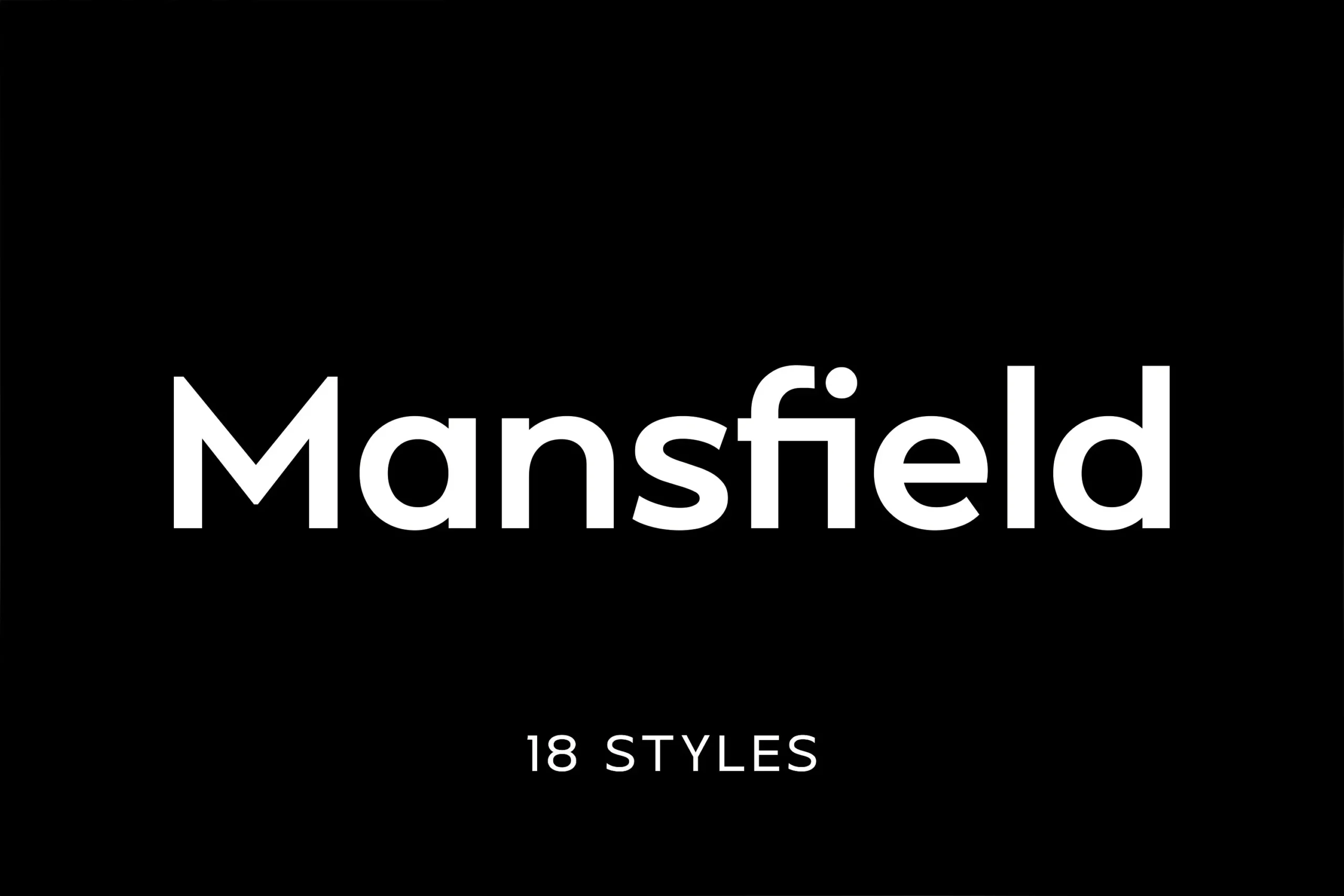
Mansfield Font is a readability-led option, combining a large x-height, open counters, and uniform strokes. Among Sans Serif Logo Fonts, its neutral geometry can support a logo system without competing with a symbol or nearby information.
Minimalist Sans Font
Best For: logos, display text, headlines, modern designs
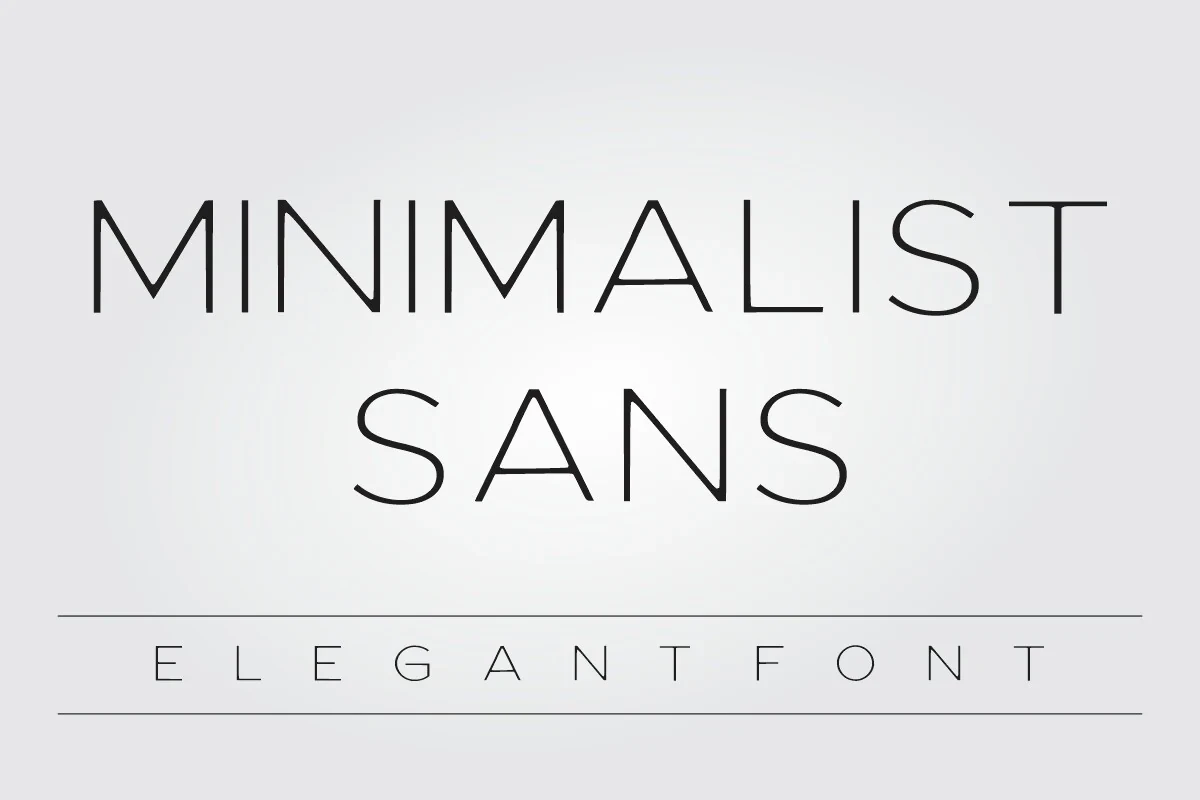
For a main mark plus descriptor arrangement, Minimalist Sans Font pairs a bold headline face with a thinner, wider-spaced uppercase companion. Its high crossbars and rounded S and O curves give Sans Serif Logo Fonts a controlled geometric identity.
Cult Font
Best For: branding, logos, product labels, modern designs
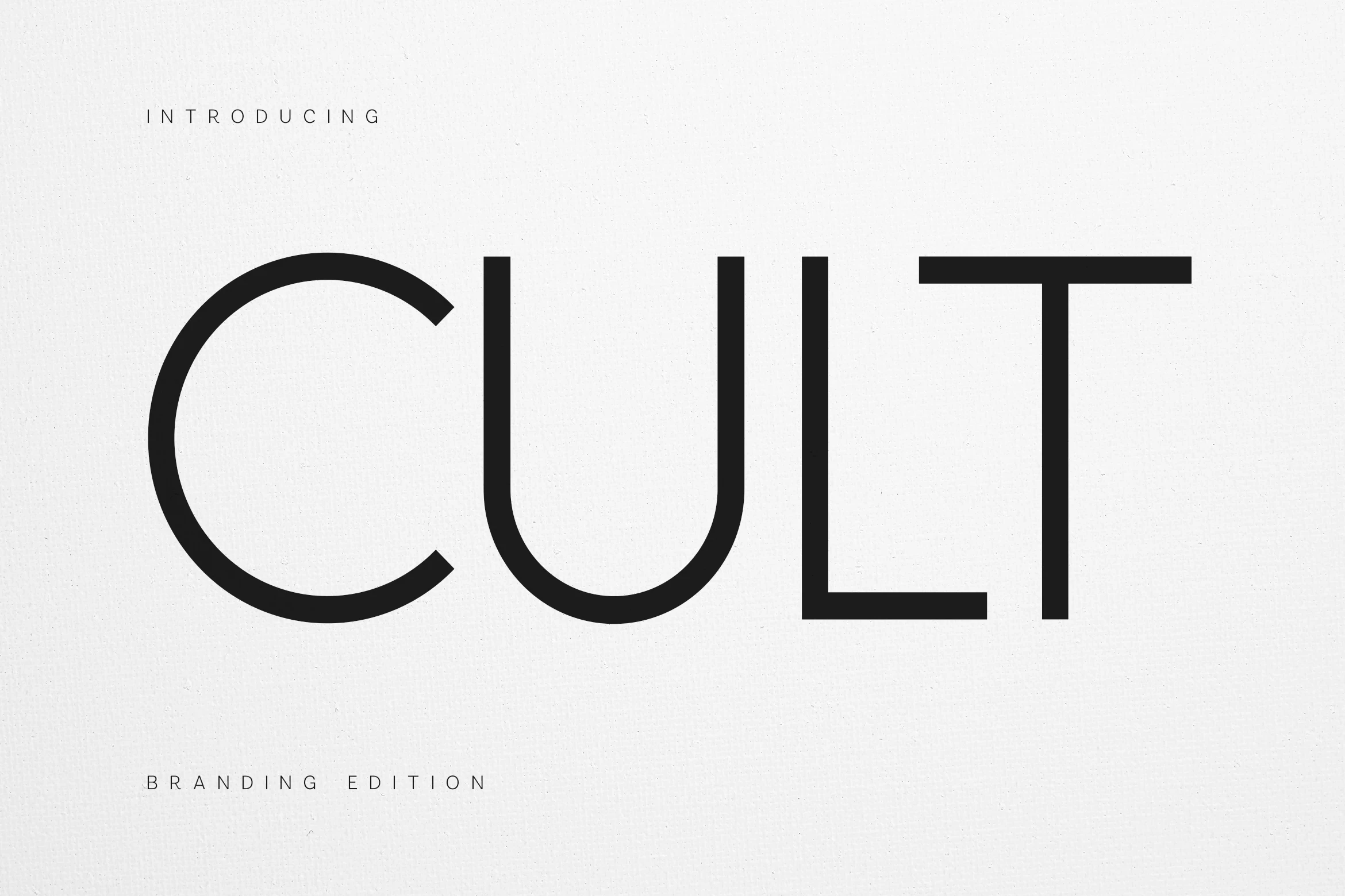
Cult Font pairs an open-counter geometric wordmark with a monospaced-style supporting line. This primary-versus-technical contrast makes Sans Serif Logo Fonts useful for labels and brand systems, although the main identity may weaken when reduced significantly.
Condensed Impact Marks
Condensed marks trade generous width for vertical force and efficient wordmark fitting. Their narrow spacing creates stronger large-scale impact than the broader geometric group, but demands more caution at small sizes.
Couture Font
Best For: branding, posters, headlines, fashion branding
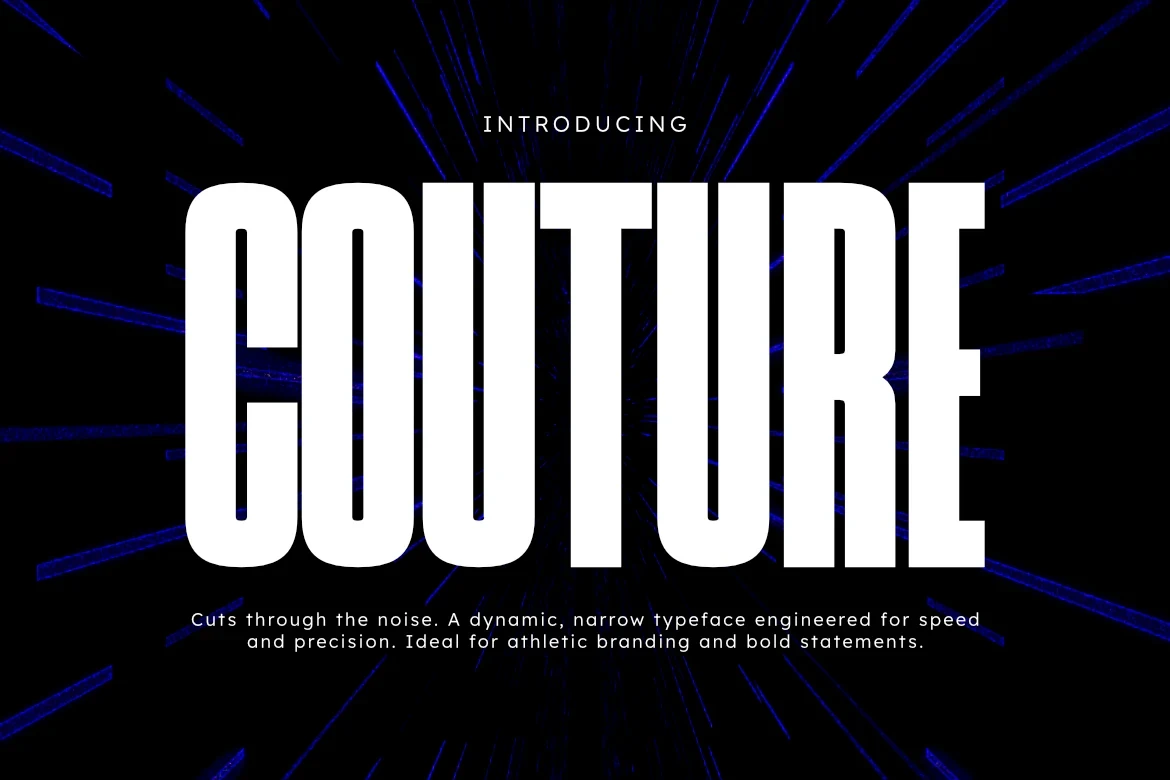
Couture Font compresses letters into an extreme vertical axis with straight-cut terminals and monolinear strokes. The narrow spacing gives Sans Serif Logo Fonts an athletic, urgent wordmark effect at large sizes, though smaller applications may crowd.
Bingar Font
Best For: book covers, branding, packaging, posters
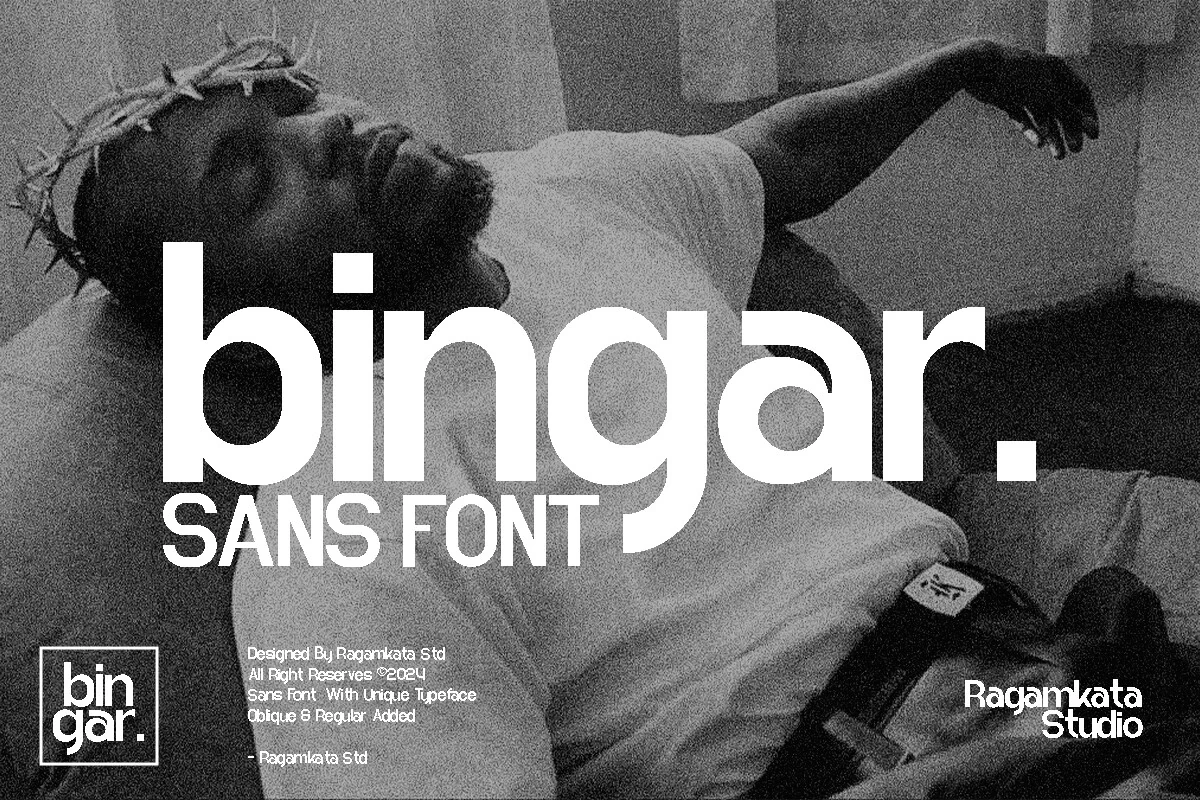
Bingar Font uses condensed proportions, heavy strokes, and vertical terminals to fit longer names into a compact mark. Its bold display construction reads well at large sizes, although the narrow structure can feel crowded in small applications.
Bynoxda Font
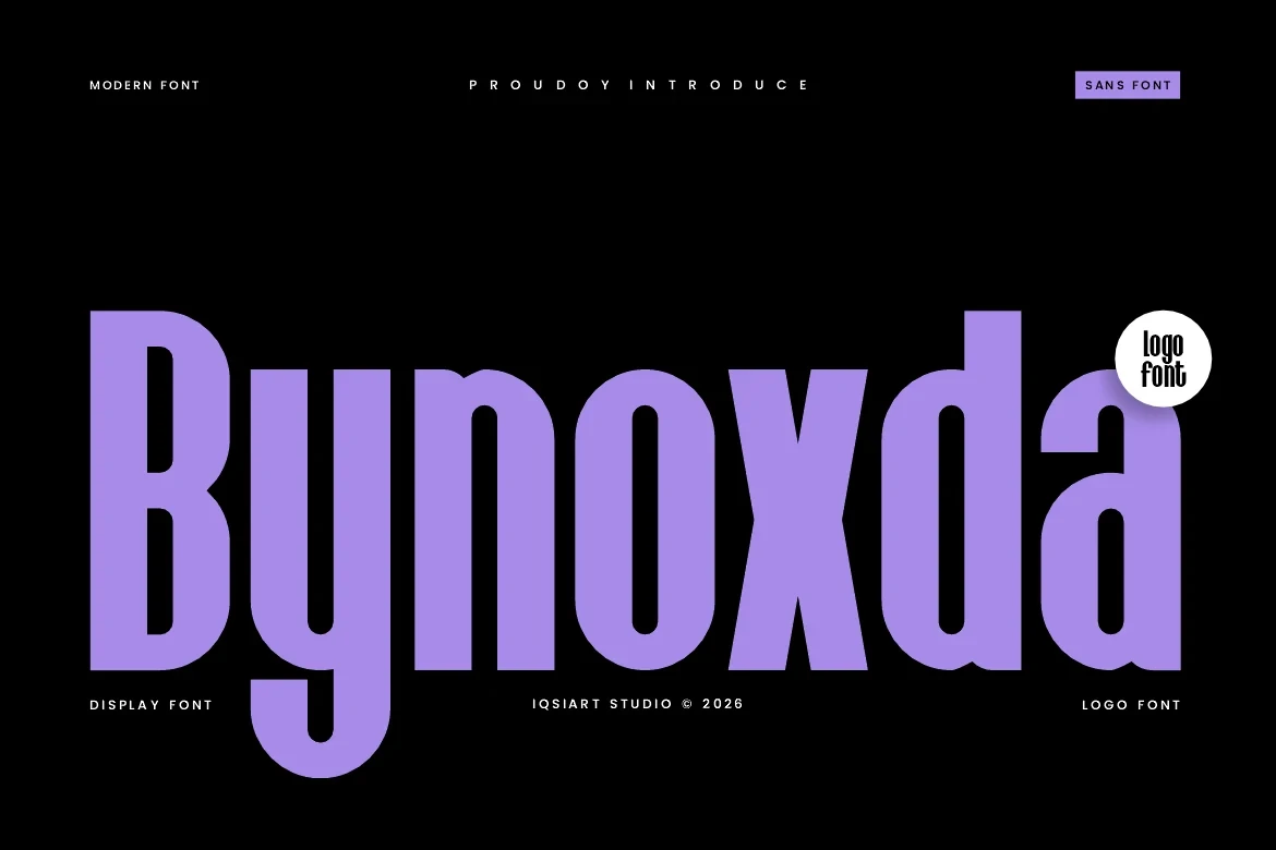
Best For: logos, display text, modern designs, minimal designs
Bynoxda Font has a condensed upright profile, rounded terminals, and minimal stroke contrast. Its weight keeps short marks visible, while the narrow construction places it firmly in the title and logo category rather than long-form text.
Tallica Font
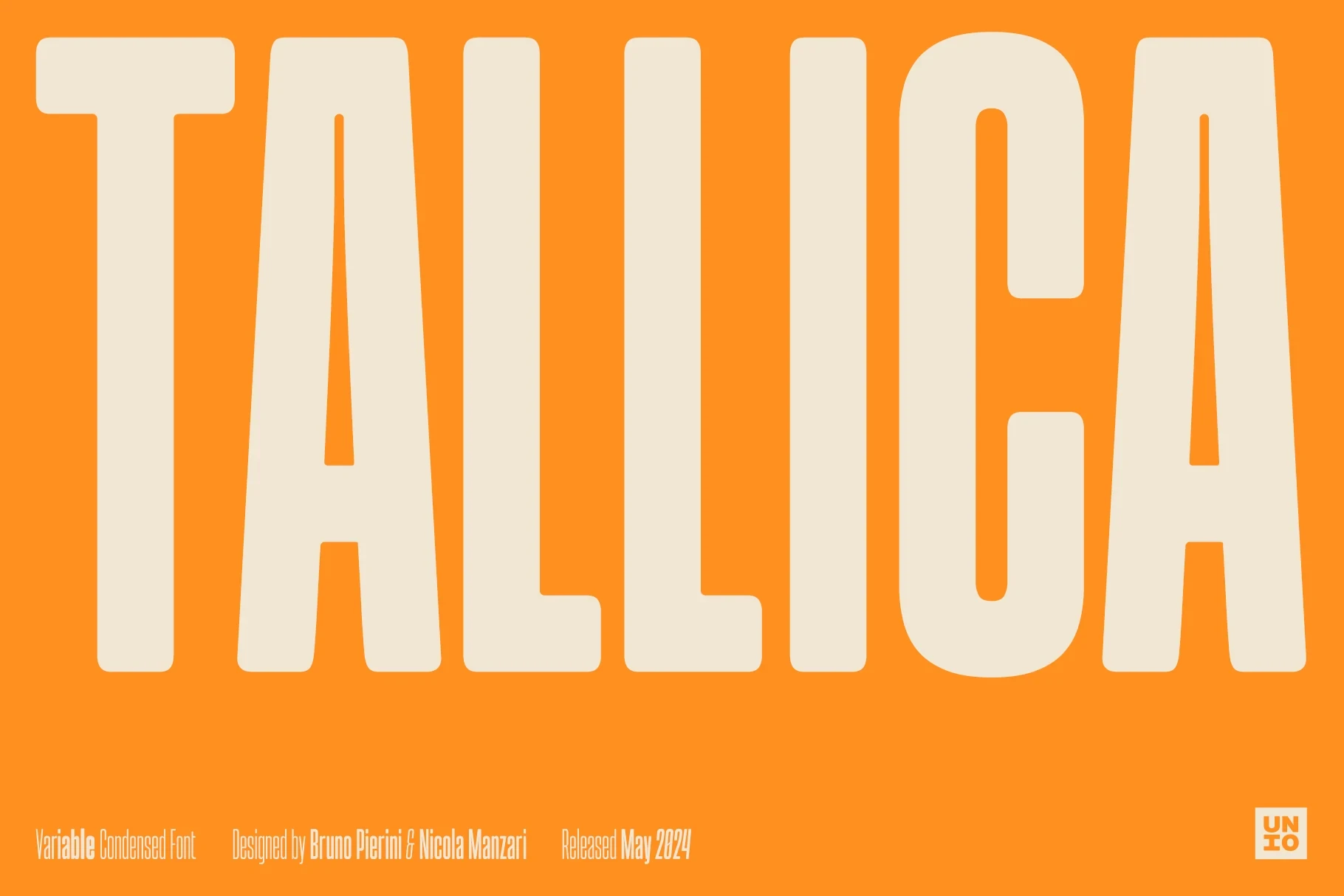
Best For: headlines, logos, display text, modern designs
Tallica Font compresses letters into extremely tall proportions with minimal negative space and close spacing. That vertical construction creates immediate presence in short wordmarks, but it needs large reproduction and should not be used for body text.
Expressive Display Marks
Expressive display marks prioritize personality through serifed forms, irregular contours, contrast, or ornamental details. Unlike the utility-led sans group, they make the lettering itself the central brand statement.
Moni Font
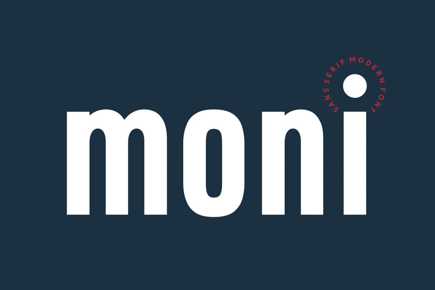
Best For: logos, display text, modern designs, clean designs
Moni Font brings a period-inspired display serif character with a contemporary construction and clear stroke rhythm. Its nostalgic forms suit short names, logos, and headings, but they are too distinctive to serve as neutral informational lettering.
Romansa Font
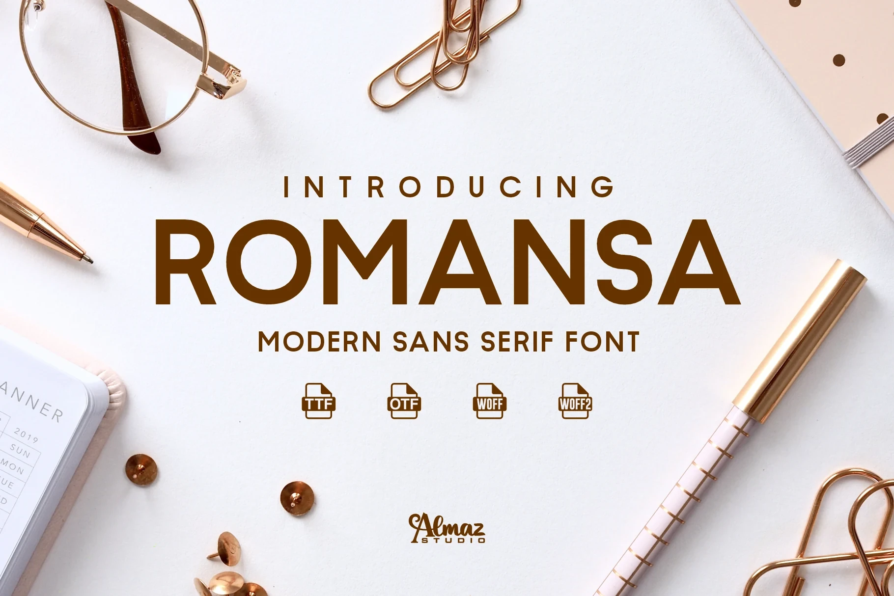
Best For: T-shirts, logos, posters, social media graphics
Romansa Font favors slender strokes and an expressive display serif presence, making it lighter and more delicate than the heavier choices here. Keep it large for short logos, apparel lettering, posters, or social graphics where its forms can remain clear.
Nura Font

Best For: branding, posters, headlines, logos
Nura Font makes the lettering the primary visual statement through distinctive display forms and a clear stroke rhythm. Its expressive serif construction is better suited to short brand names, headlines, and posters than extended copy or neutral corporate systems.
Good Cake Font
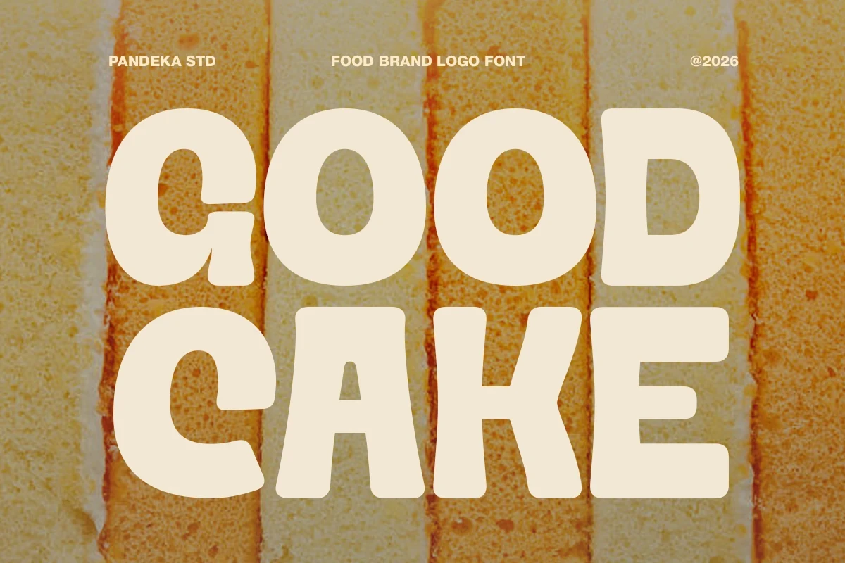
Best For: logos, branding, packaging, stickers
Good Cake Font is a substantial rounded display serif with period-inspired cues and a nostalgic personality. It suits brand names, packaging, and stickers, while its ornamental character makes it less appropriate when a logo needs neutral corporate restraint.
Little Chailos Font

Best For: T-shirts, branding, packaging, editorial designs
Little Chailos Font stretches into wide proportions with comparatively high contrast, creating an industrial display presence rather than neutral utility. It suits apparel, packaging, and other large applications, but its contrast can reduce clarity when reproduced small.
Unesa Font

Best For: logos, posters, display text, expressive designs
Unesa Font uses expressive display-seriffed forms and a clear stroke rhythm, putting personality ahead of neutral function. It works best when a short logo or poster needs the lettering itself to carry the visual identity.
Tremor Font
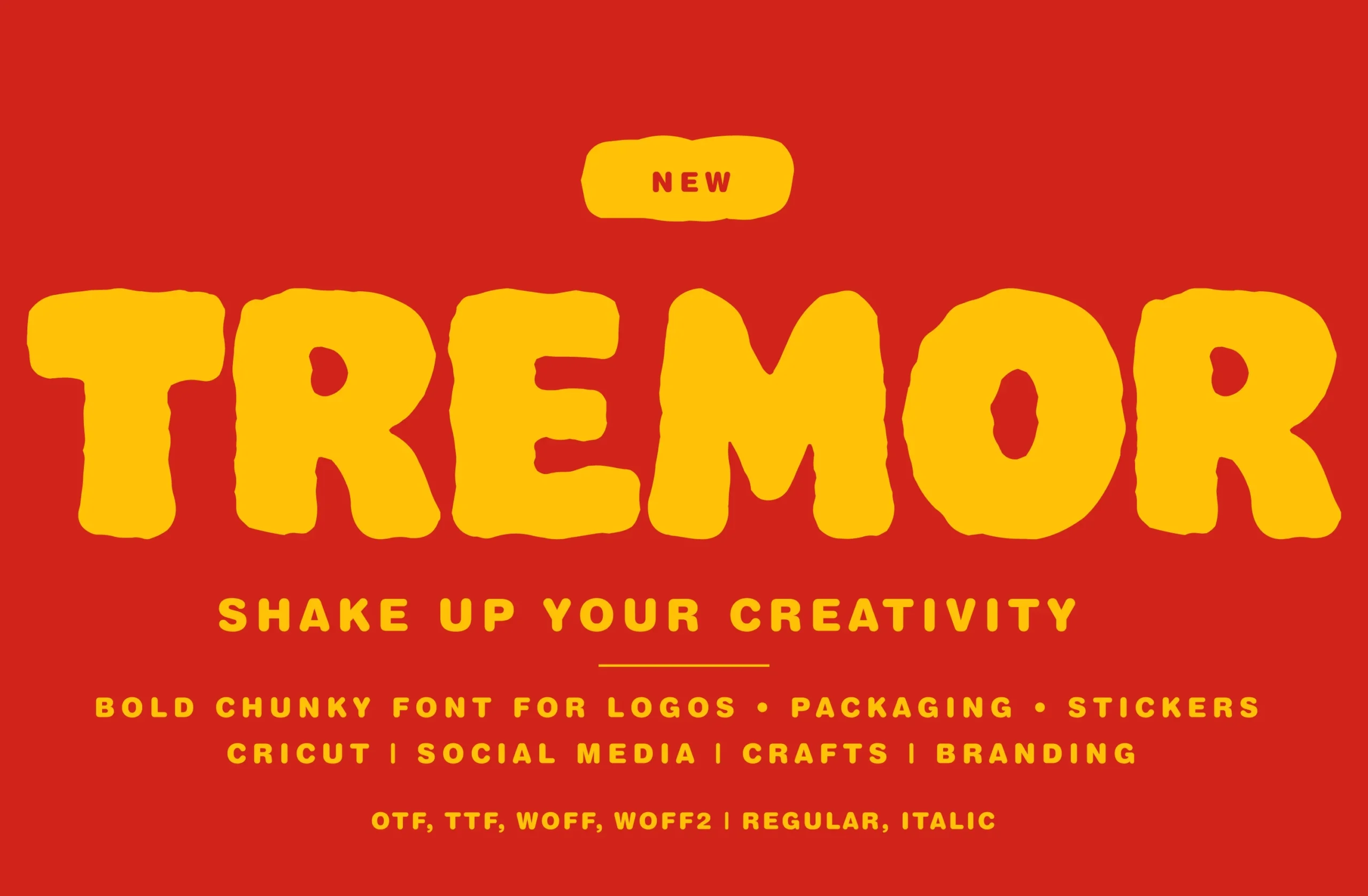
Best For: logos, display text, minimal designs, clean designs
Tremor Font leaves conventional sans geometry behind for irregular, bumpy contours and rounded slab-serif construction. Its textured edges give informal logos a tactile character, though the outlines can lose definition when scaled down.
Chock Tagmed Font
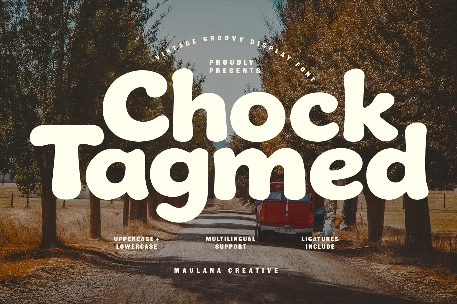
Best For: book covers, branding, packaging, posters
Chock Tagmed Font combines a substantial rounded display serif with ligatures and multilingual support. Its nostalgic weight suits packaging, branded titles, and short names, while the ligatures provide additional character without relying on small text.
How to Choose the Right Font
Choose based first on construction and reproduction size. Open counters and generous spacing favor dependable readability, while closed apertures, tight condensation, high contrast, and irregular edges need larger display settings. For Sans Serif Logo Fonts, use neutral geometric options when the mark must support a wider identity system; reserve expressive or serifed choices for names where personality is the priority.