21 Best Luxury Sans Serif Fonts in 2026
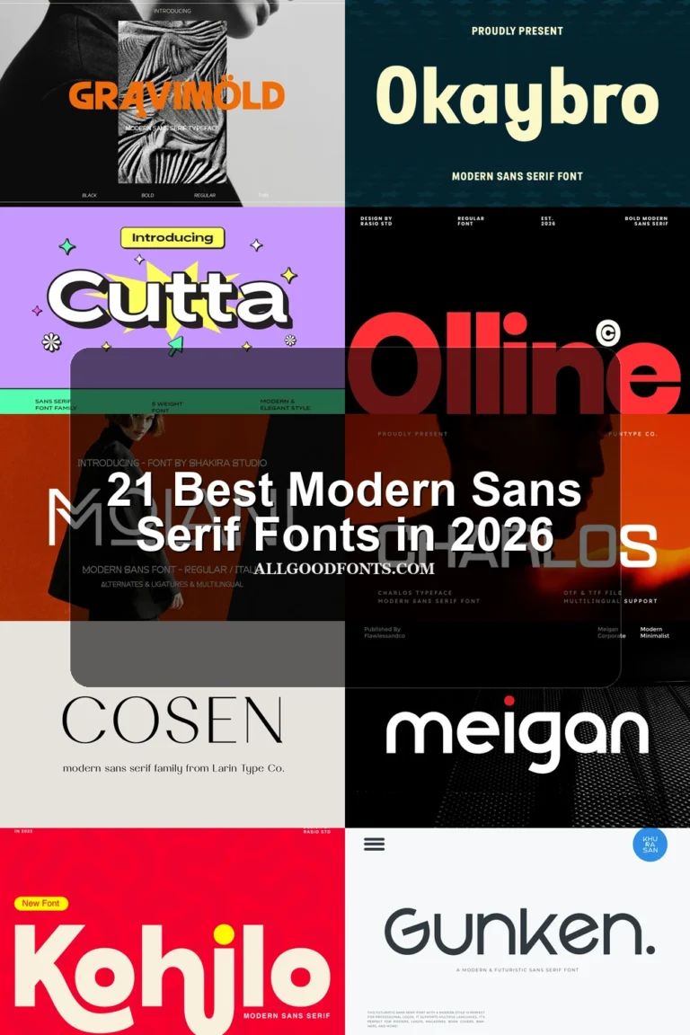
This collection moves from wide, high-contrast geometric capitals to condensed silhouettes, cutout constructions, and expressive serif pairings. These Luxury Sans Serif Fonts are chiefly display tools for logos, packaging, fashion marks, headlines, and supporting text systems rather than universal body faces.
Looking for more sans serif fonts? Browse our complete Sans Serif Fonts collection to compare modern, elegant, bold, logo-friendly, and geometric sans serif styles.
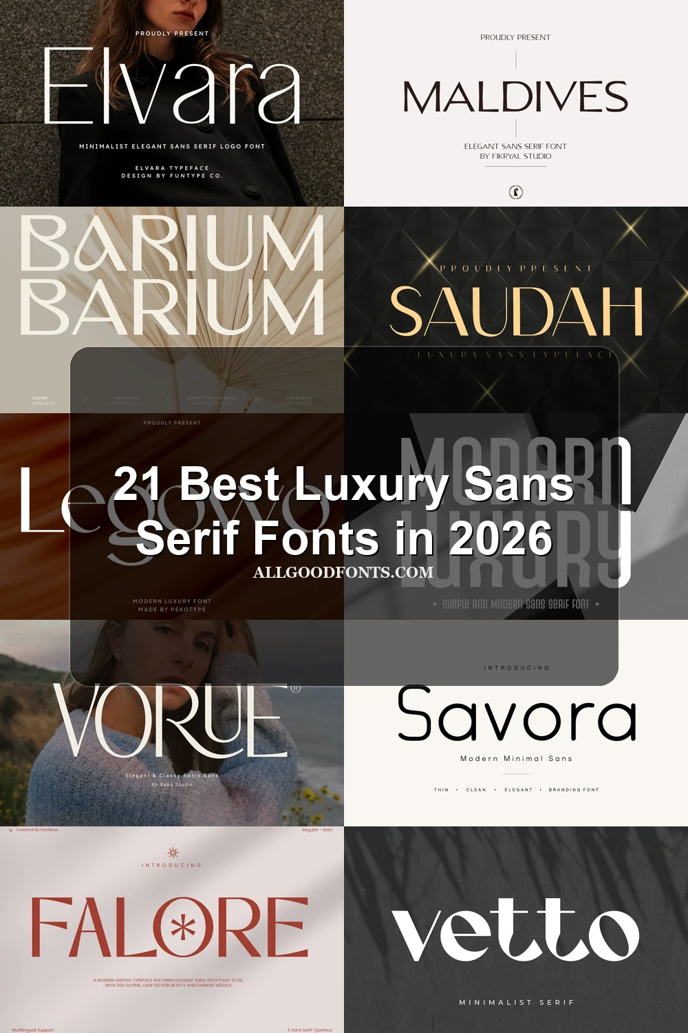
Luxury Sans Serif Fonts
Luxury Sans Serif Fonts in this group rely on geometric structure, open spacing, contrast, and distinctive terminals. They remain cleaner and more adaptable than the cutout or serif-led categories.
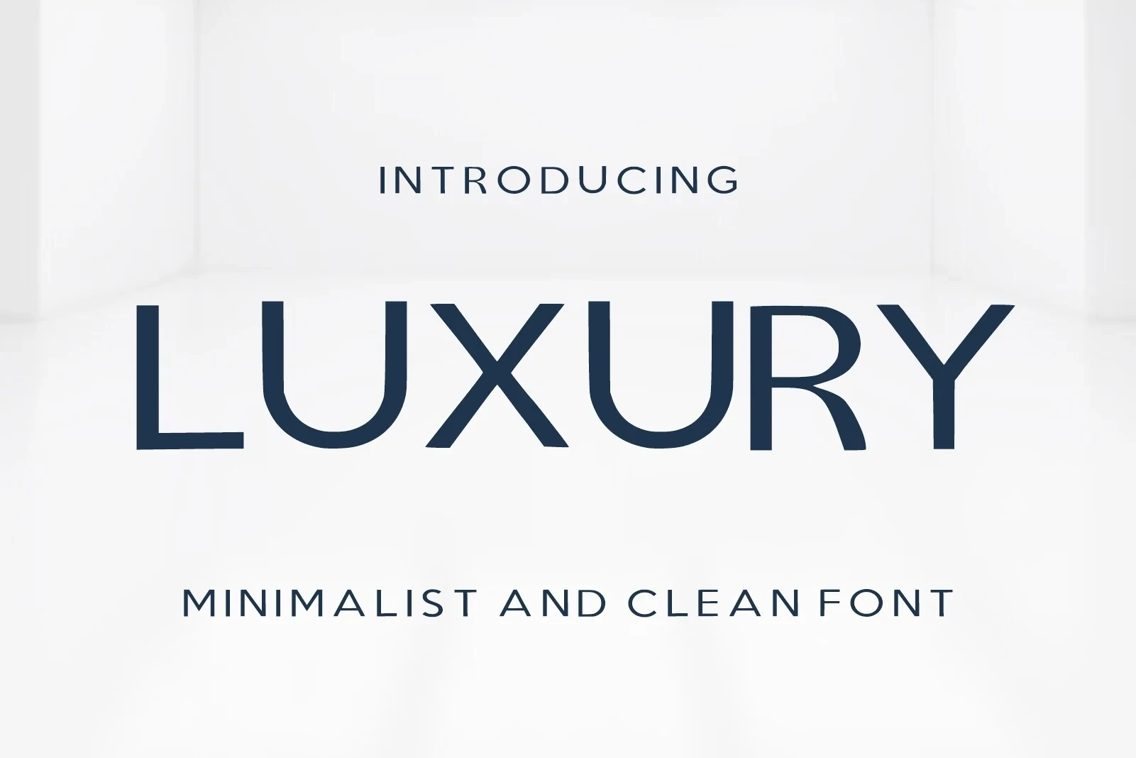
Luxury Font
Best For: branding, display text, modern designs
Luxury Font uses wide geometric letters, open apertures, and strong stroke contrast. Generous spacing keeps headlines clear, making it persuasive for branding and display text, though its display construction is less suitable for extended reading.
Vorue Font

Best For: branding, packaging, headlines, fashion branding
Vorue Font pairs an extended, high-contrast title style with a simpler geometric sans for captions. Its flowing R tail supplies identity, but thin strokes require large sizing; the companion style is the more dependable choice for supporting information.
Highfield Font

Best For: modern designs, clean designs, elegant designs, luxury designs
Highfield Font is built around tall, condensed proportions, sharp terminals, and pronounced thick-to-thin contrast. It fits narrow headline areas and large architectural marks particularly well, while its fine contrast and reduced width can weaken readability at smaller sizes.
Falore Font

Best For: branding, creative projects, beauty branding, fashion branding
Falore Font adds flared horizontal terminals to an upright, wide geometric structure. The controlled decoration gives branding and beauty work extra flexibility, especially with alternate characters, but the terminal treatment is better suited to headlines than paragraphs.
Caveline Font

Best For: logos, branding, premium designs
Caveline Font creates an airy wordmark through thin geometric strokes, expansive proportions, and open spacing. It performs best in logos and branding, where its delicate contrast can remain visible; small text and dense paragraphs are less reliable.
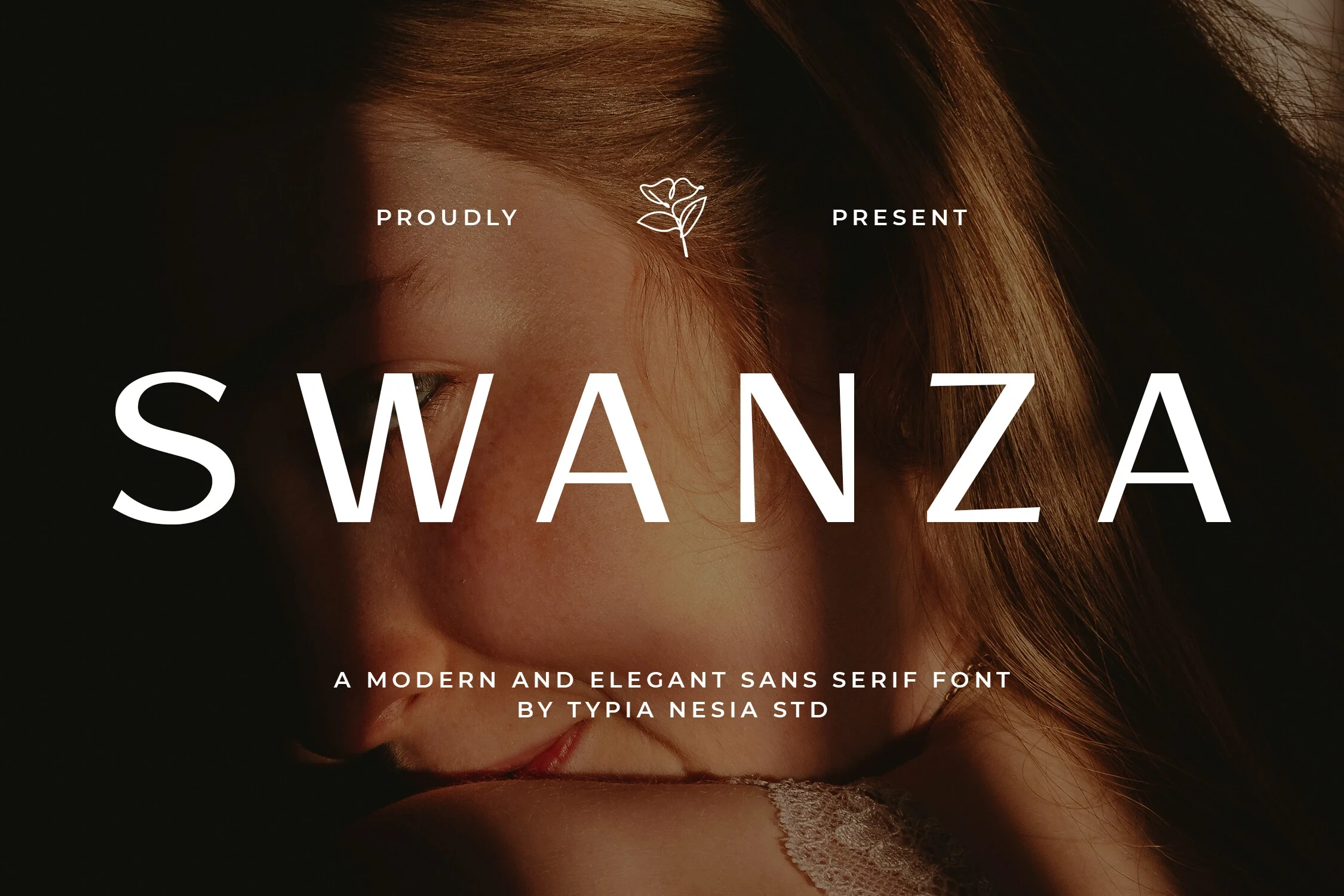
Swanza Font
Best For: modern designs, minimal designs, clean designs, elegant designs
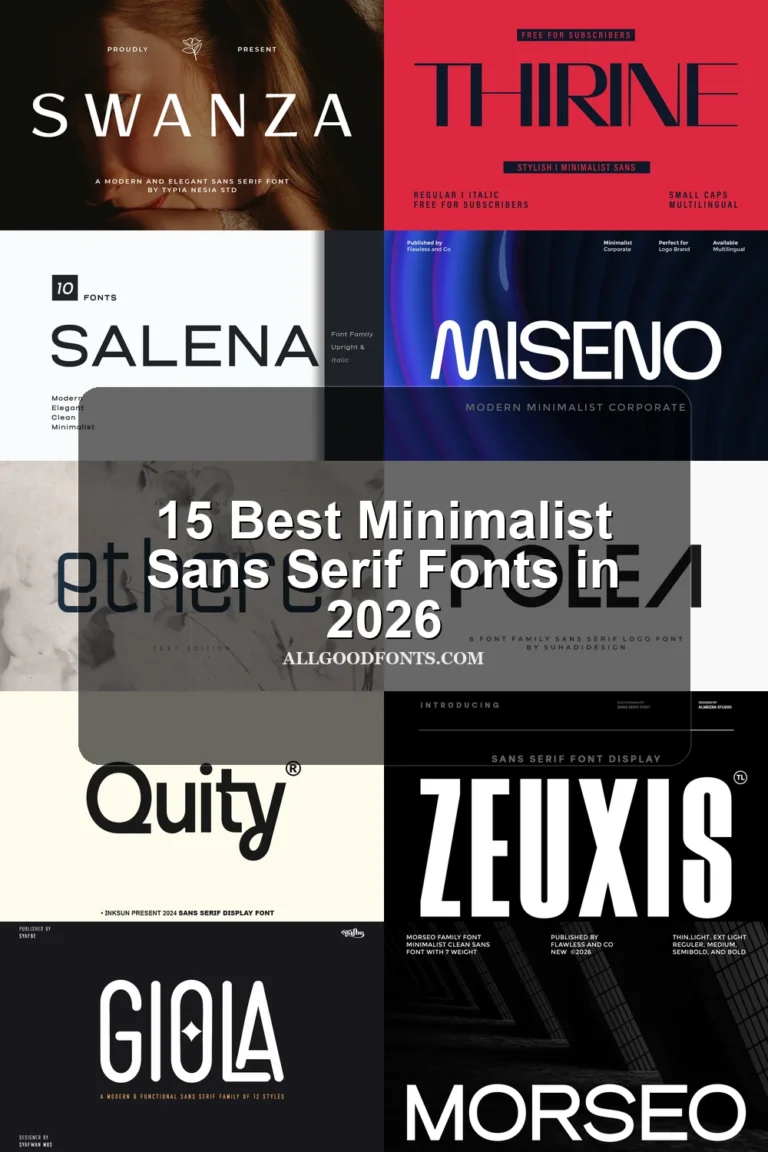
Swanza Font combines wide geometric capitals and straight-edged terminals with a lighter, monospaced-style companion. The main face gives wordmarks disciplined structure, while the secondary style organizes captions without competing for attention.
Elvara Font

Best For: logos, high-end designs, display text, modern designs
Elvara Font softens high-contrast geometry through circular apertures in the a and curved treatment of the r. Those details reward large logo and title applications, but thin strokes make it a poor substitute for body copy.
Savora Font

Best For: branding, display text, modern designs, clean designs
Savora Font uses uniform strokes, rounded terminals, and open counters for an even, approachable construction. Its calm forms can support flexible branding systems and display text, although dense small-scale use may lose some character distinction.
Saudah Font

Best For: branding, packaging, high-end designs, product labels
Saudah Font relies on upright, extended proportions rather than a slant to create a tall display presence. Wide spacing helps labels and marks breathe, but its thin high-contrast strokes need generous sizing for dependable readability.
Maldives Font

Best For: display text, modern designs, clean designs, elegant designs
Maldives Font gives wide geometric letters an engineered edge through tapered junctions, sharp terminals, and strong contrast. It delivers clear large-format definition for display text, while fine angles can disappear in smaller applications.
Pavesky Font

Best For: branding, packaging, posters, invitations
Pavesky Font finds its identity in custom gestures: a sweeping P, altered E bar, and curved K tail. These flourishes stay distinctive in posters, packaging, and titles, but display sizing is necessary to preserve their legibility.
Modern Luxury Font
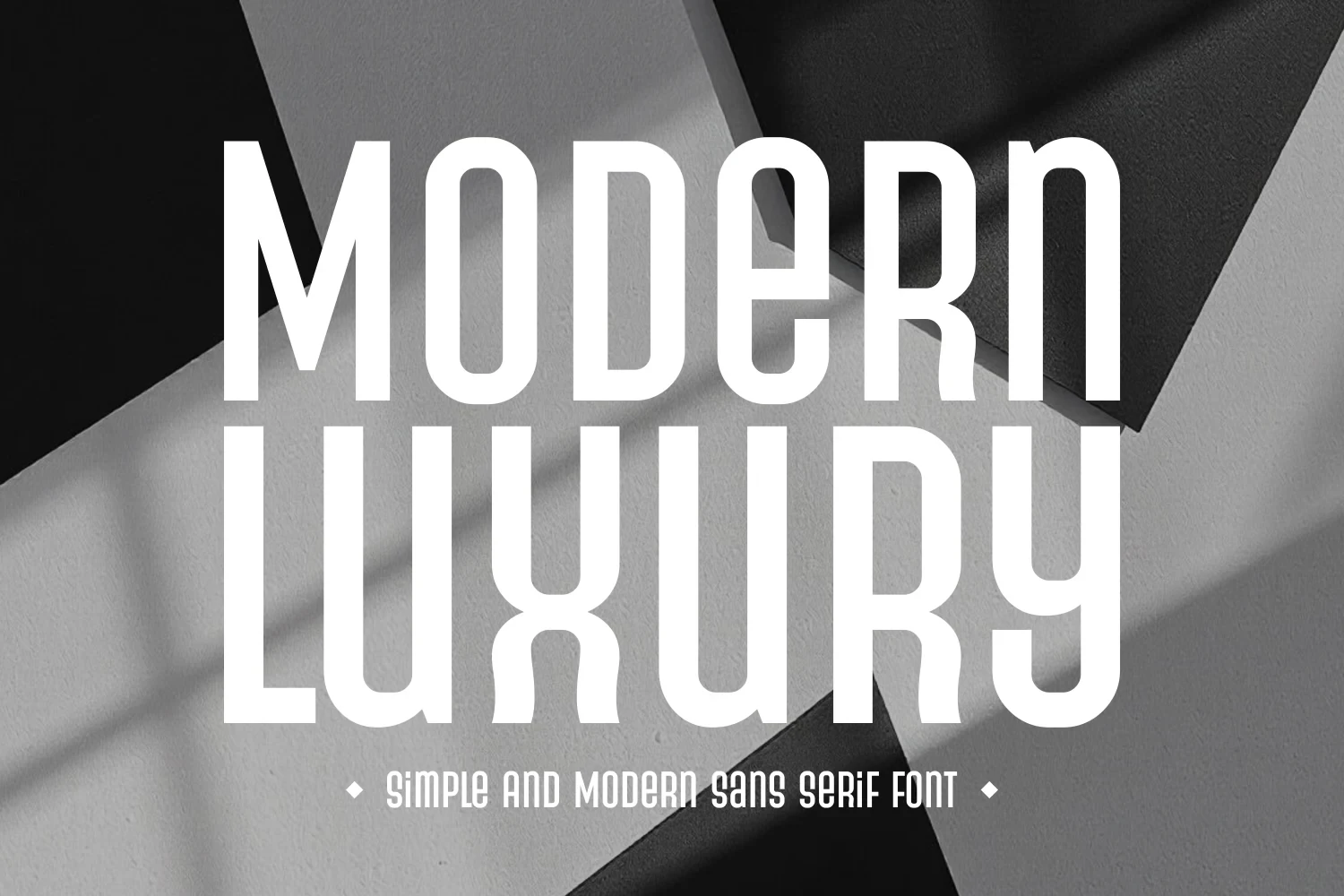
Best For: logos, branding, premium designs, fashion branding
Modern Luxury Font uses strong vertical elongation, condensed width, rounded corners, and monolinear strokes. It fits narrow logos and fashion-branding formats efficiently, but its unusual proportions are unsuitable for ordinary text blocks.
Elvera Font

Best For: fashion branding, branding, packaging, display text
Elvera Font balances wide proportions and clean terminals with a heavy display presence and geometric restraint. Its airy structure works well in packaging and branding, although thin high-contrast strokes should not carry small copy.
Avery Font

Best For: quotes, social media graphics, logos, website headers
Avery Font gives an otherwise geometric display sans an immediate signature through the missing crossbar in its A. It works effectively for headers, quotes, and social graphics, but the stylization rules it out as a body-text substitute.
Geometric and Cutout Displays
These display faces make negative space, stencil gaps, disconnected strokes, or ligatures part of the letter construction. Their sign-like character is stronger and less text-friendly than the main sans group.
Bacher Font

Best For: display text, headlines, wall art, modern designs
Bacher Font uses Art Deco geometry and disconnected letterforms, treating negative space as part of each character. That construction gives headlines and wall art a strong sign-like presence, although the gaps can interrupt recognition when the design is reduced.
Barium Font

Barium Font is recognizable through a teardrop-shaped counter in the B and an extended A crossbar. These cutout details make logos and display text memorable, though they become less dependable when reduced to small reading sizes.
Glavoire Font

Best For: branding, packaging, signage, fashion branding
Glavoire Font turns lettering into a constructed wordmark with stencil gaps, extended terminals, and ligature-based connections. It creates strong signage and packaging impact, but interrupted thin strokes make continuous reading impractical.
Serif-Led Luxury Pairings
Here, sharp or rounded serifs lead the visual identity, while paired geometric sans styles handle supporting information. They offer more editorial expression but fall outside a strict sans serif brief.
Skinova Font

Best For: beauty branding, branding, packaging, fashion branding
Skinova Font is a serif-led display pairing rather than a pure sans serif. Prominent sharp serifs, expressive terminals, and high contrast suit beauty branding and fashion titles, while the accompanying geometric sans is the clearer, safer choice for supporting information.
Vetto Font

Best For: branding, beauty branding, fashion branding, high-end designs
Vetto Font is a serif-led display face with flared terminals and tapered endings, not a pure sans serif. Its delicate contrast suits beauty and fashion branding, while the paired geometric sans handles subtitles and practical text more effectively.
Orviele Font

Best For: magazine covers, logos, branding, packaging
Orviele Font is a serif-led pairing marked by rounded serifs and a circular terminal on the lowercase l. The primary face suits magazine covers and marks, while its accompanying sans provides more dependable secondary text.
Legowo Font
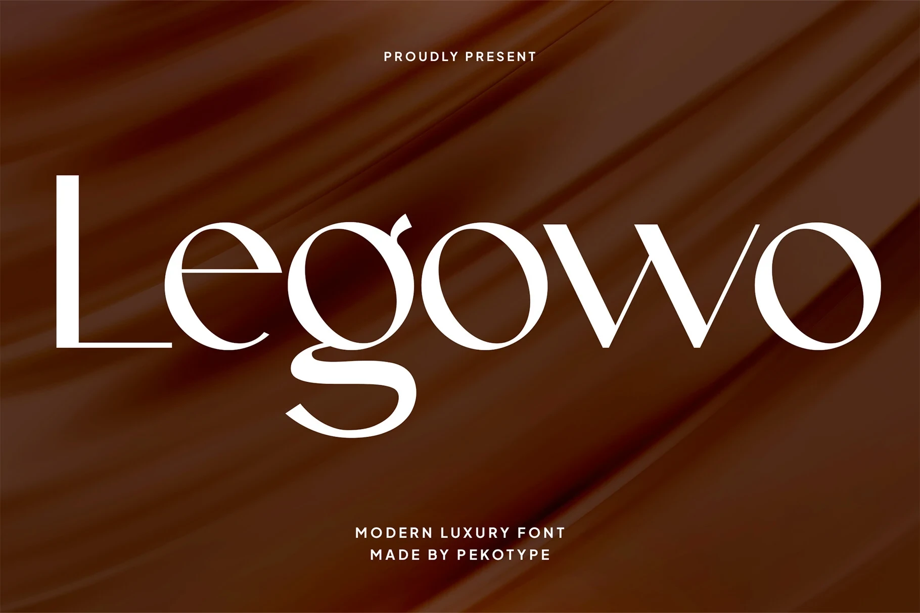
Best For: logos, branding, editorial designs, social media graphics
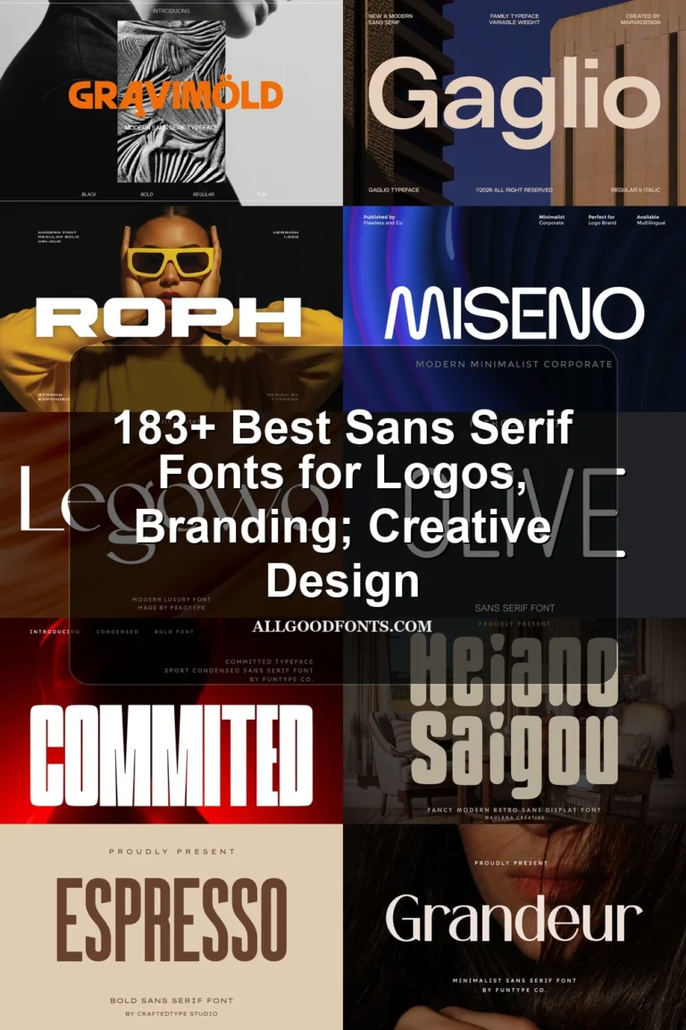
Legowo Font is a serif display face defined by bracketed serifs, open counters, and a decorative lowercase g tail. It supports editorial designs and logos at large sizes, while the paired geometric sans is better for explanatory text.
How to Choose the Right Font
Choose Luxury Sans Serif Fonts by matching construction to scale: wide, open styles suit wordmarks; condensed faces conserve space; cutouts and ligatures prioritize recognition; and high contrast or flourishes demand generous sizing. For readable captions and explanations, use the simpler companion sans, reserving the expressive primary face for titles, marks, packaging, or social graphics.