13 Best Clean Sans Serif Fonts in 2026
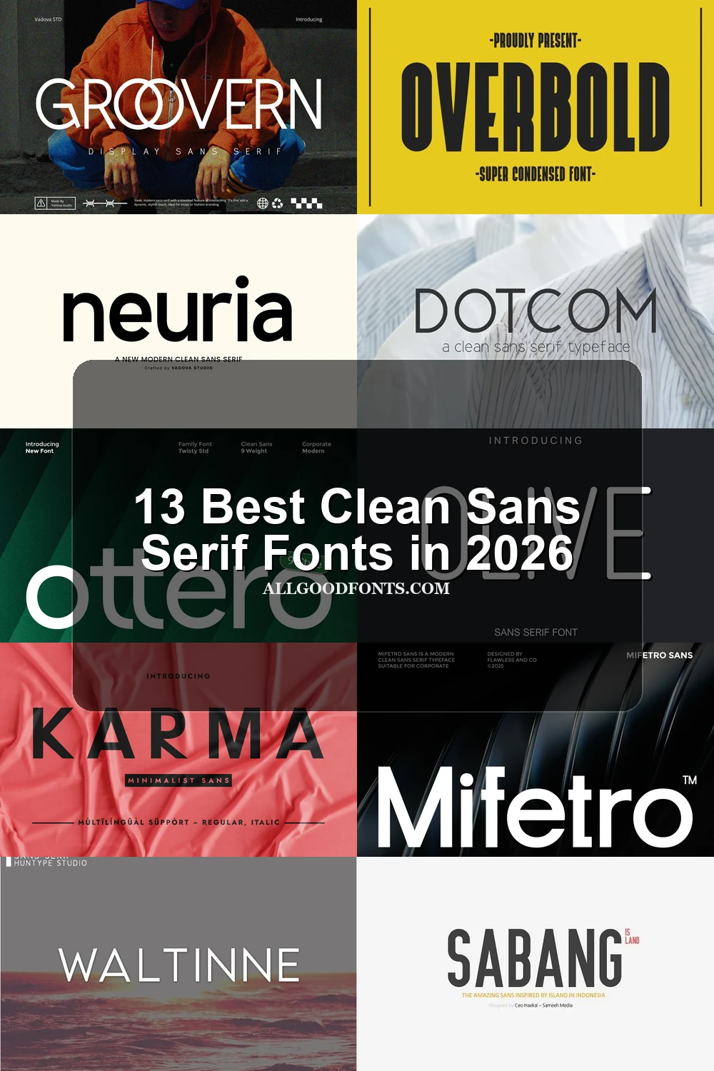
This collection of Clean Sans Serif Fonts moves from tightly compressed, heavy display lettering to wide geometric forms and more humanist, readable faces. Together, they cover practical roles including headlines, logos, packaging, signage, social graphics, and supporting copy, with construction and scale guiding each choice.
Looking for more sans serif fonts? Browse our complete Sans Serif Fonts collection to compare modern, elegant, bold, logo-friendly, and geometric sans serif styles.
Clean Sans Serif Fonts: Condensed Display Faces
The Clean Sans Serif Fonts here pair narrow proportions with condensed display energy, creating authoritative silhouettes for headlines and signage rather than comfortable long-form reading.
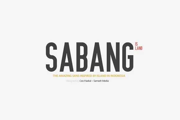
Sabang Island Font
Best For: headlines, display text
Sabang Island Font uses condensed proportions, a large x-height, and heavy, nearly uniform strokes. Its vertical compression gives headlines and signage authority, though the dense structure is better reserved for large display text than extended reading.
Movault Font

Best For: website headers, display text, headlines
For short website headers, Movault Font creates a tall, block-like silhouette through supercondensed proportions, extreme vertical orientation, and rectilinear geometry. Its uniform strokes hold up clearly in large headlines, while the severe compression makes it unsuitable for continuous text. The athletic, industrial character also suits focused graphic campaigns.
Olive Font
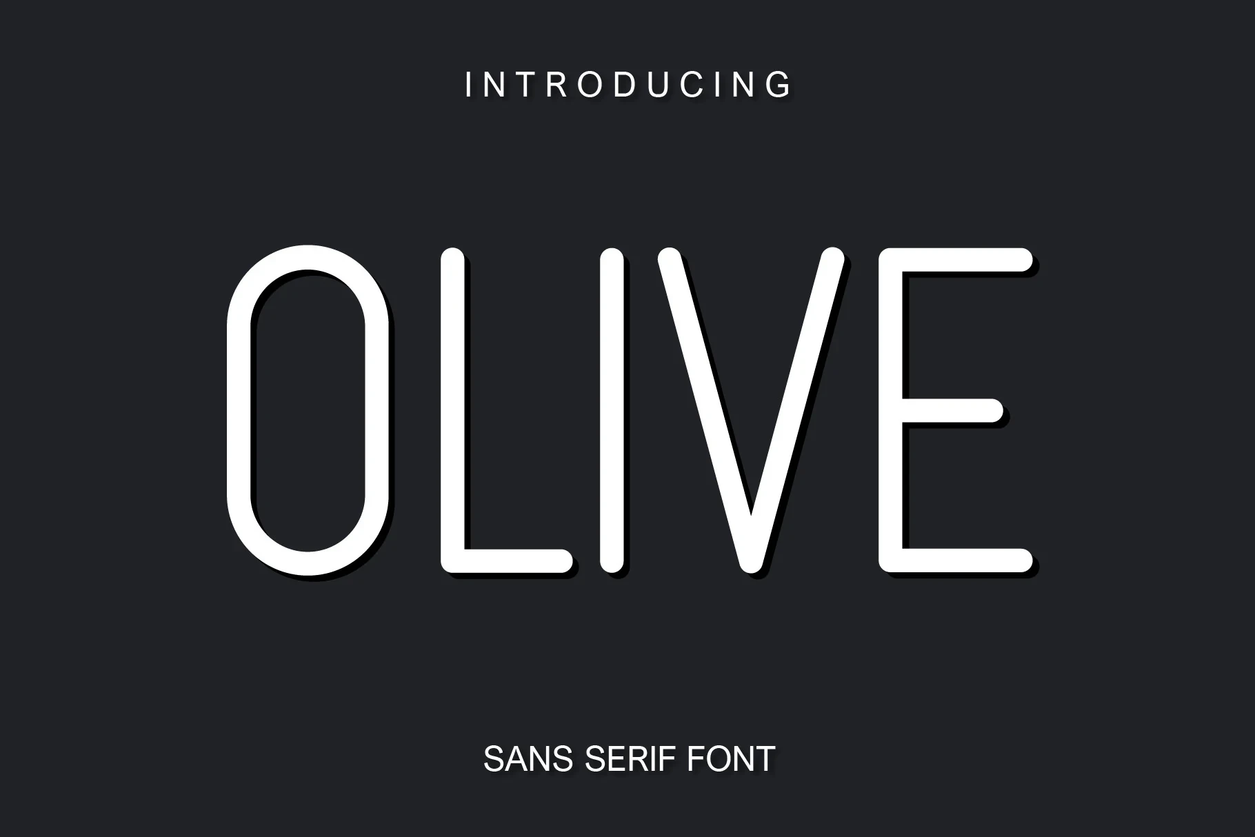
Best For: display text, modern designs, minimal designs
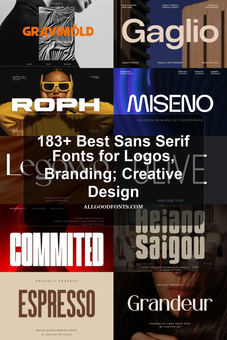
Olive Font softens condensed lettering with a light monolinear build, narrow proportions, rounded terminals, and a high cap height. Its thin strokes need generous display scale, where the tight structure can support clean headings without being asked to carry dense body text.
Overbold Font
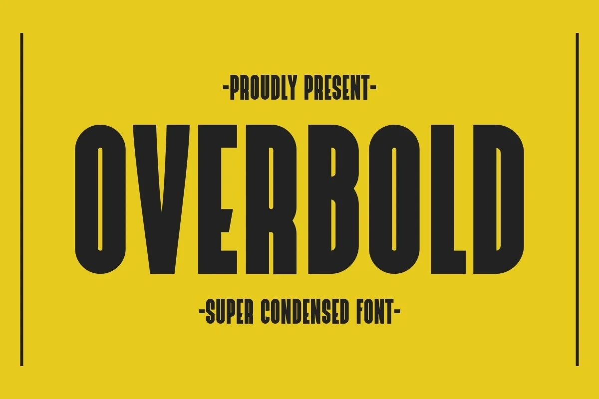
Best For: T-shirts, posters, quotes, display text
For T-shirts, posters, and quotes, Overbold Font delivers an extremely condensed, upright block of heavy lettering. Its high stroke weight and compressed counters create a compact graphic texture that remains legible in large settings, but the narrow forms discourage extended copy and tightly packed paragraphs.
Geometric and Structured Display Faces
These geometric and structured faces rely on measured spacing, angular or circular construction, and strong display presence for branding, labels, packaging, and prominent headings.
Greenth Font
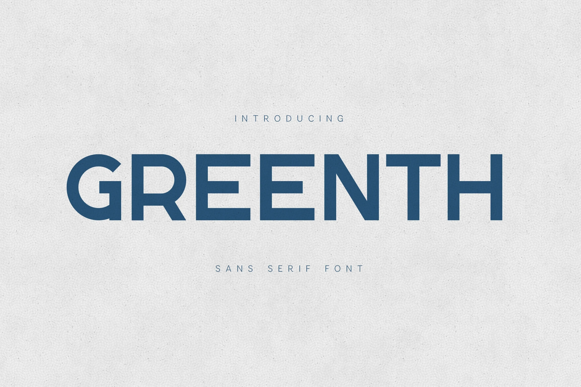
Best For: branding, product labels, display text
Greenth Font builds its presence from wide geometric forms, horizontal terminals, and strongly weighted strokes. Generous spacing helps the lettering remain legible at large sizes, making it particularly suitable for branding, product labels, and other display text.
Groovern Font
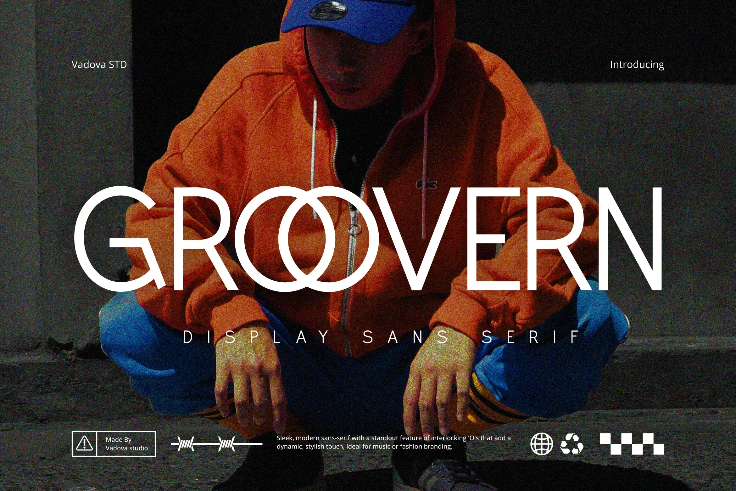
Best For: social media graphics, website headers, fashion branding, branding
Groovern Font’s geometric structure and wide, upright construction give it a distinctive display presence. The clear large-scale forms make it more appropriate for headlines, fashion branding, and short social graphics than paragraphs.
Mifetro Font
Best For: modern designs, clean designs, professional designs
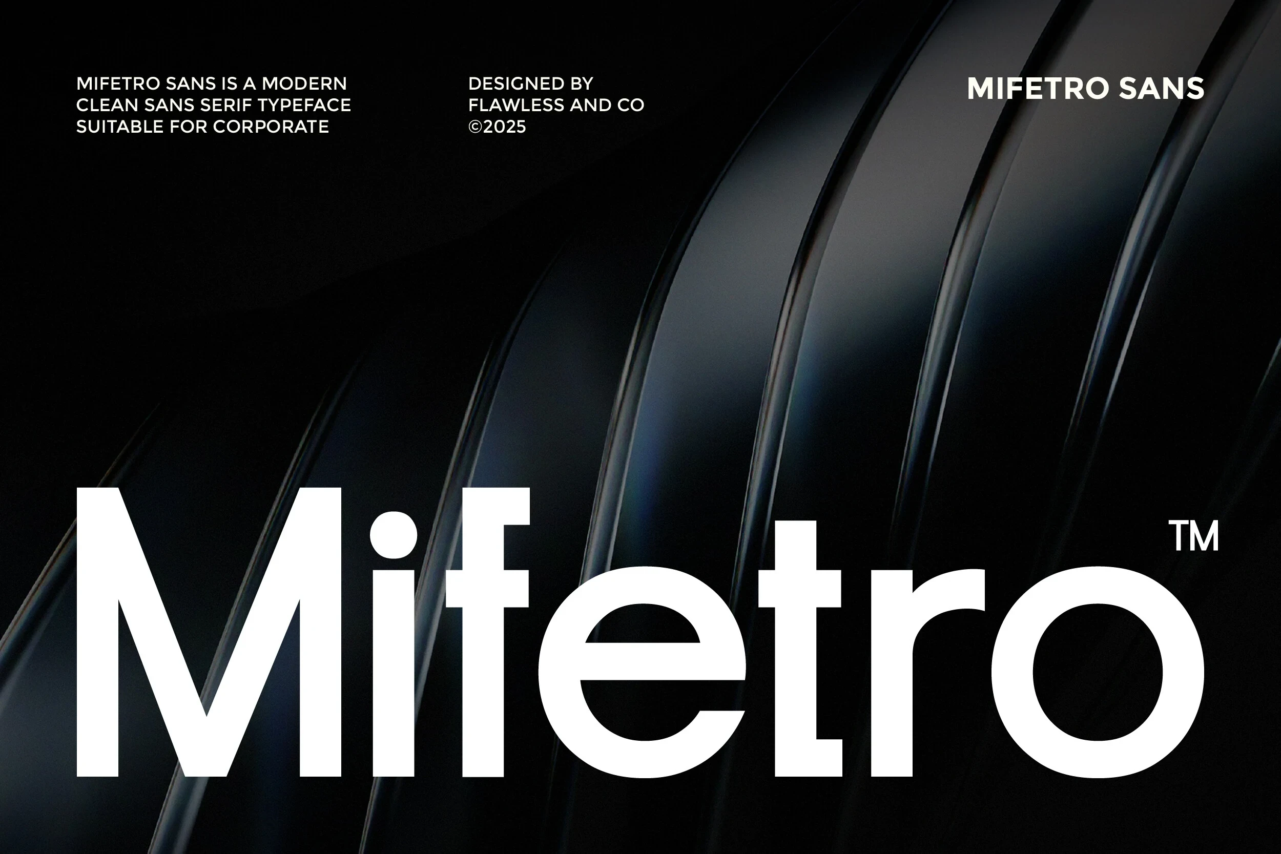
Mifetro Font uses high stroke weight, negligible contrast, horizontal terminals, and balanced spacing to create a controlled corporate display texture. Its clear, structured forms work especially well in headings, brand marks, and uppercase descriptors where the lettering needs to remain prominent and legible.
Neuria Font
Best For: display text, modern designs, clean designs
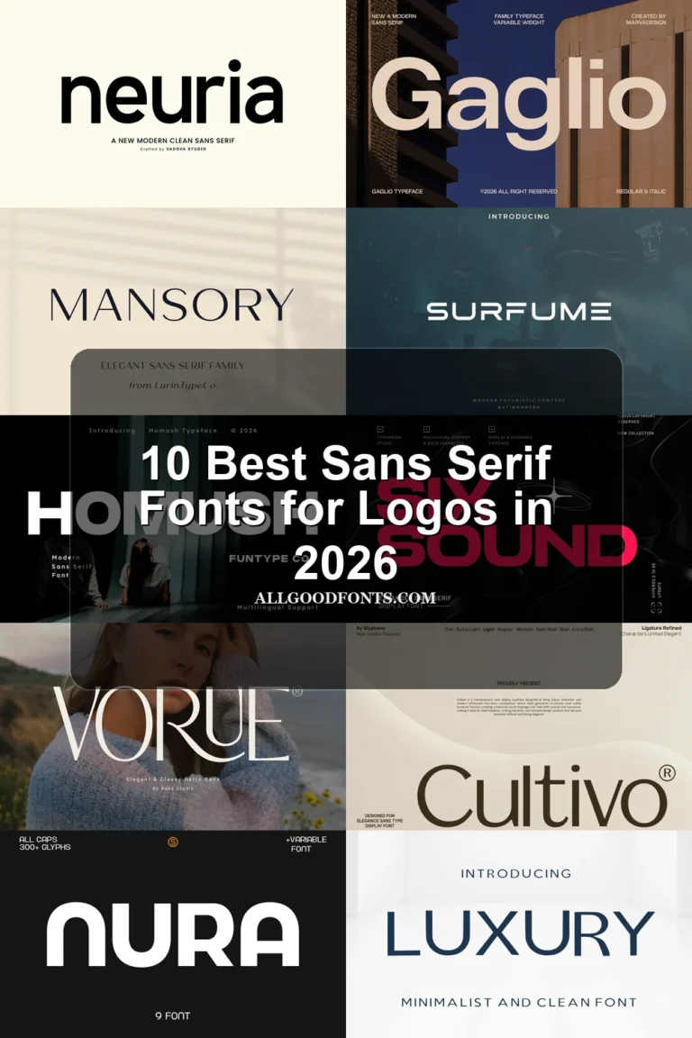
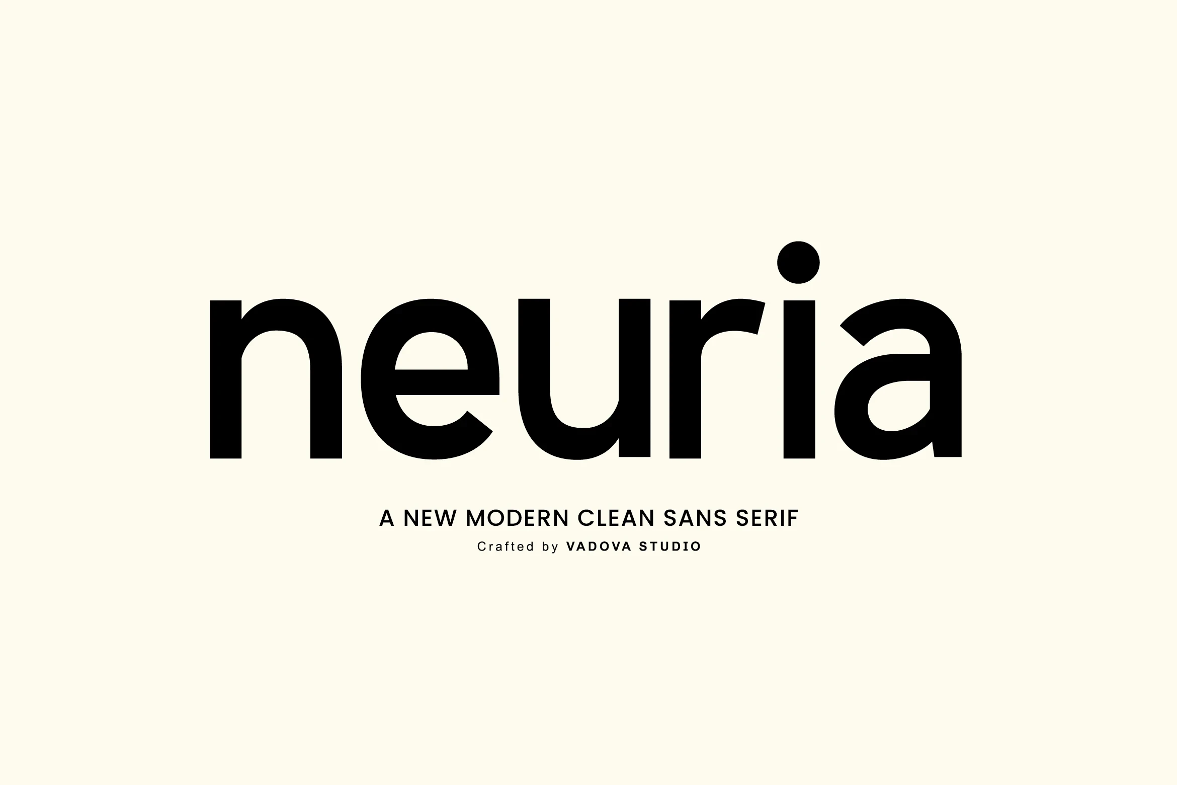
Neuria Font has closed apertures in e and a, circular i dots, and horizontal terminals, giving its geometric construction a precise, contained appearance. Generous negative space supports heading clarity, while multilingual support extends its usefulness for branding and display text.
Waltinne Font
Best For: logos, branding, display text
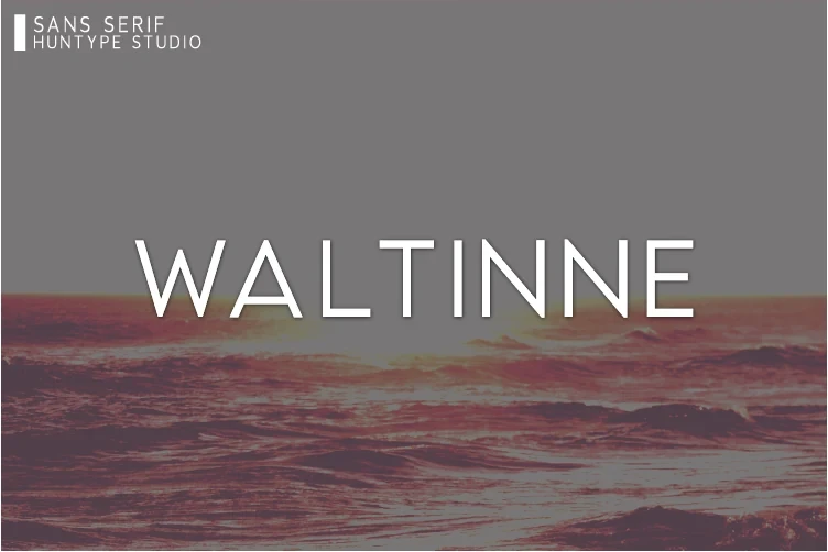
Waltinne Font relies on wide character proportions, uniform strokes, and geometric forms with horizontal crossbars in A and E. It reads clearly at large sizes for logos and branding, although dense settings may need additional spacing so the broad letters do not crowd one another.
Dotcom Font
Best For: display text, headlines, modern designs
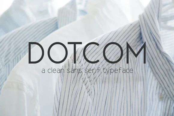
For headings that need dependable clarity, Dotcom Font combines large circular apertures in O and C with a high x-height and uniform geometric strokes. The clean lines preserve legibility at larger sizes, while its wide proportions give display layouts a confident, spacious rhythm without relying on decorative detail.
Karma Font

Best For: packaging, posters, modern designs, clean designs
Karma Font uses heavy all-caps lettering, sharp angular terminals, and geometric construction to create a firm graphic edge. Its high-contrast presentation remains highly legible in large layouts, making it well suited to packaging, posters, and focused brand applications.
Readable Versatile Sans Serifs
Readable versatile sans serifs introduce clearer character distinction and gentler construction, allowing them to move from headlines into smaller supporting text more comfortably.
Ottero Font
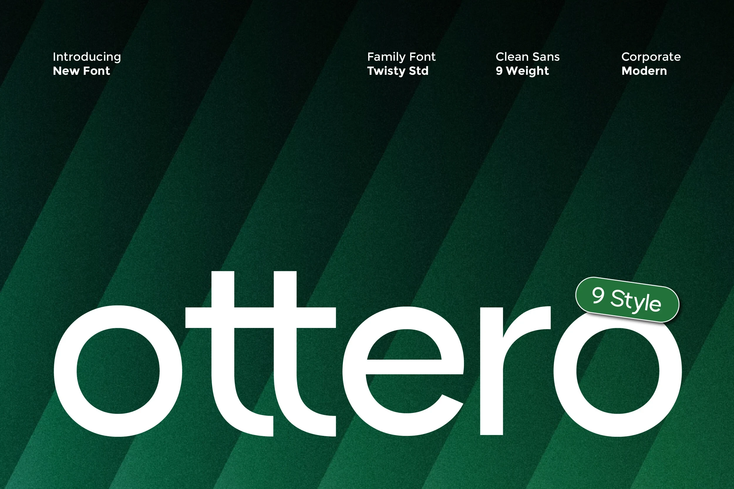
Best For: headlines, modern designs, clean designs
Ottero Font combines circular bowls in its o and e with tall stems and uniform strokes. These clear forms make Clean Sans Serif Fonts practical beyond headlines, extending into smaller supporting copy while retaining a restrained geometric texture.
Alein Font
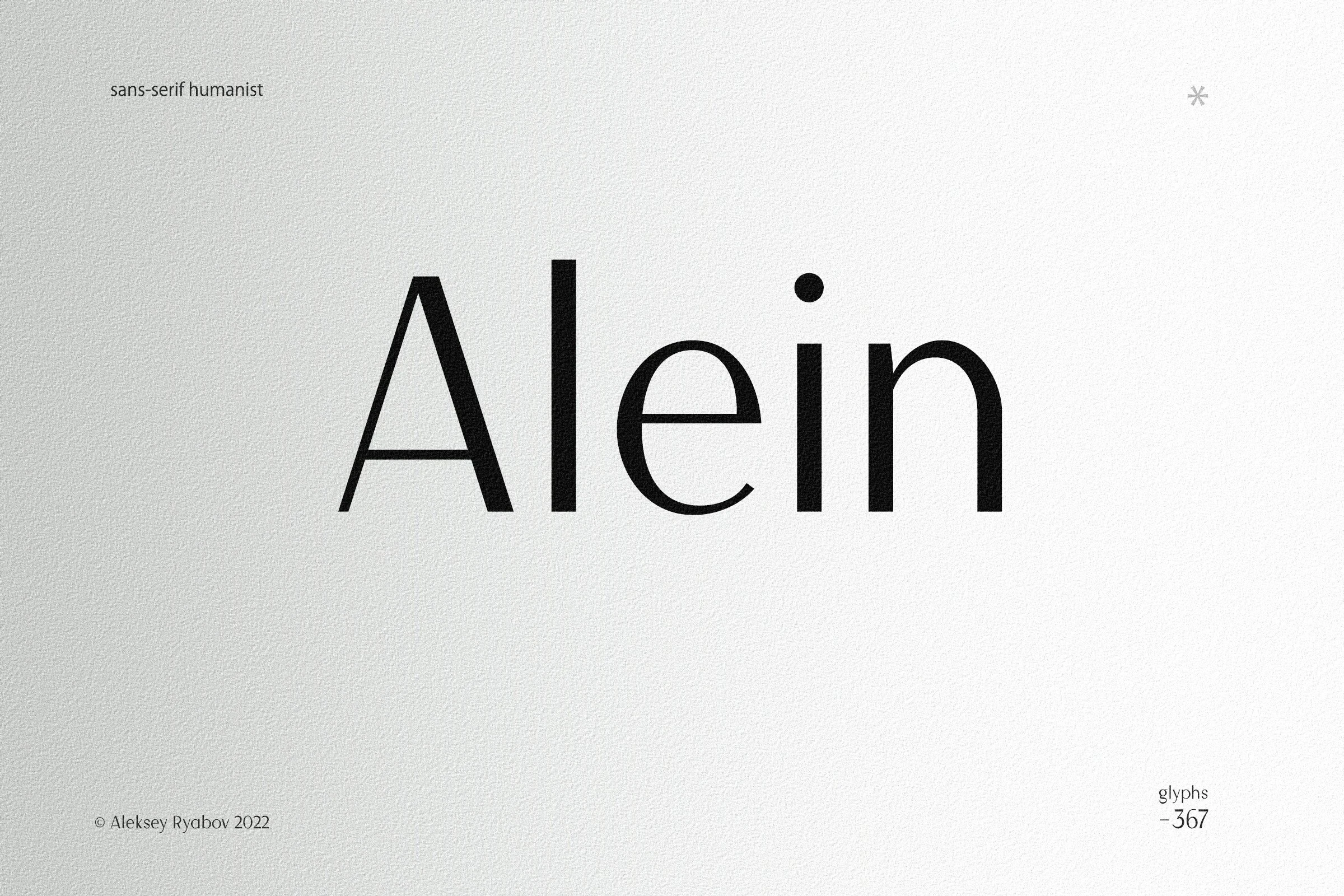
Best For: logos, invitations, quotes, magazine covers
Alein Font brings humanist details to Clean Sans Serif Fonts through an open e, slight calligraphic stroke modulation, and a high x-height. Clear character distinction lets it handle headlines and body text more comfortably than specialized display faces, while its upright setting avoids a slanted feel.
How to Choose the Right Font
Choose Clean Sans Serif Fonts by matching construction to reading distance. Condensed, heavy options suit short headlines, posters, and signage; wide geometric faces support logos and branding; and humanist or clearer designs are safer for smaller copy. Check apertures, joins, weight, spacing, and intended scale before committing to a full layout.