10 Best Sans Serif Fonts for Logos in 2026
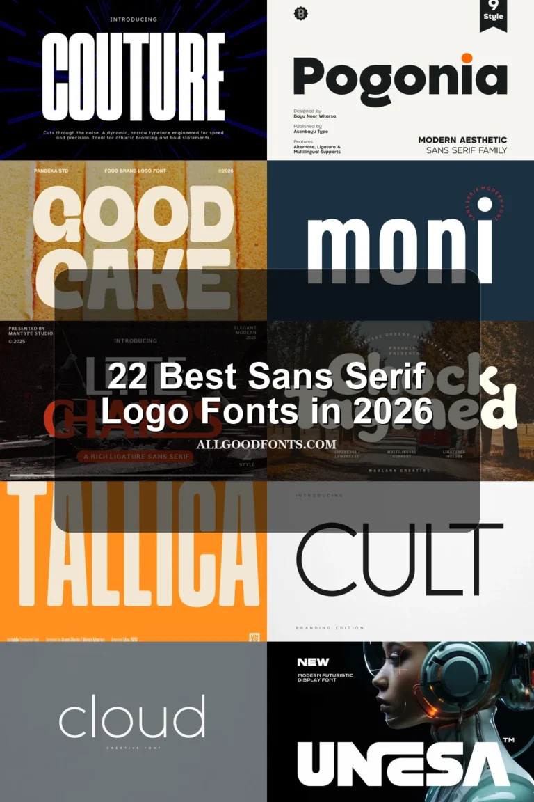
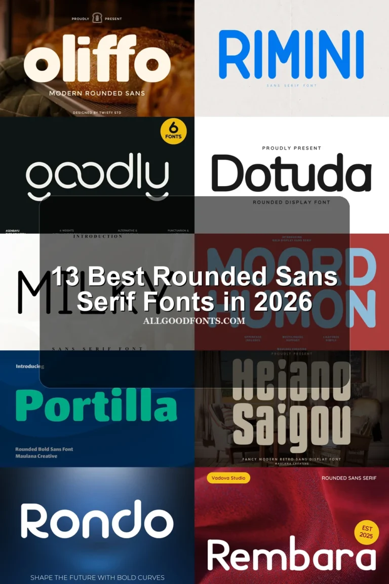
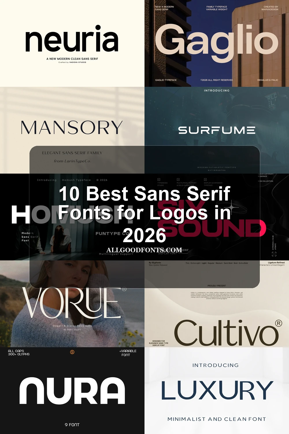
This collection spans wide geometric capitals, rounded modern forms, segmented futuristic lettering, and high-contrast decorative displays. These Sans Serif Fonts for Logos differ in construction and scale, helping you choose a mark that stays readable while expressing anything from approachable modernity to industrial or retro character.
Looking for more sans serif fonts? Browse our complete Sans Serif Fonts collection to compare modern, elegant, bold, logo-friendly, and geometric sans serif styles.
Sans Serif Fonts for Logos: Geometric Forms
These geometric Sans Serif Fonts for Logos rely on structured proportions, uniform strokes, and controlled terminal details, offering more approachable readability than the expanded or decorative groups.
Nura Font
Best For: logos, branding, posters
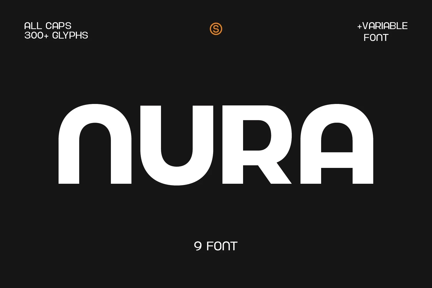
Nura Font uses wide, all-caps geometry and heavy monolinear strokes to make Sans Serif Fonts for Logos immediately legible at large sizes. Its industrial, modern structure suits bold branding and headlines, but the uniform weight offers less flexibility for delicate marks.
Neuria Font
Best For: logos, website headers, modern designs, minimal designs
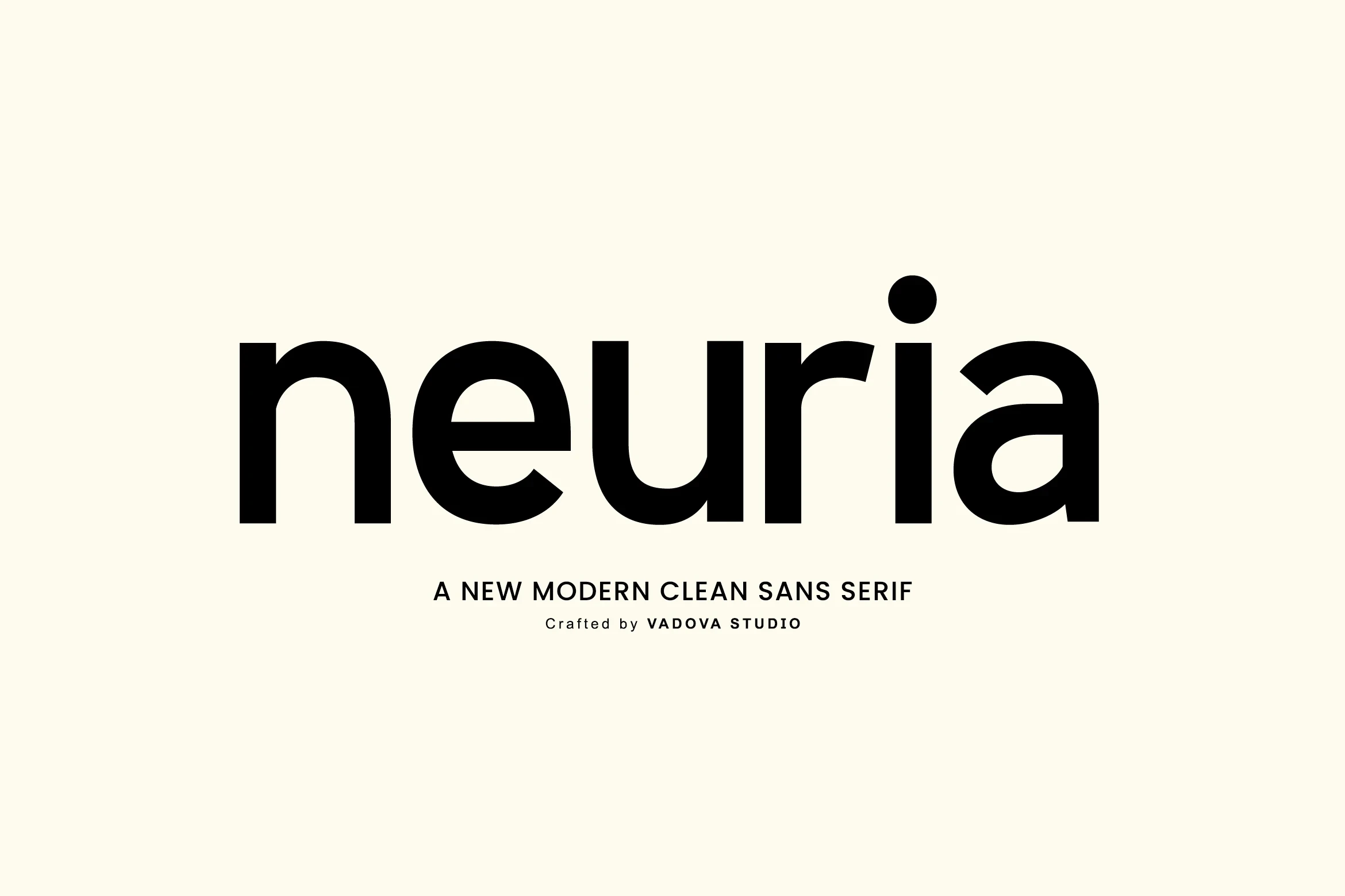
For approachable modern identities, Neuria Font combines rounded geometric forms, nearly uniform strokes, and a high x-height. Closed apertures give its letters a distinctive compact character, while open spacing supports large display use. Uppercase and lowercase characters, numerals, punctuation, and multilingual support extend its usefulness across brand systems.
Gaglio Font
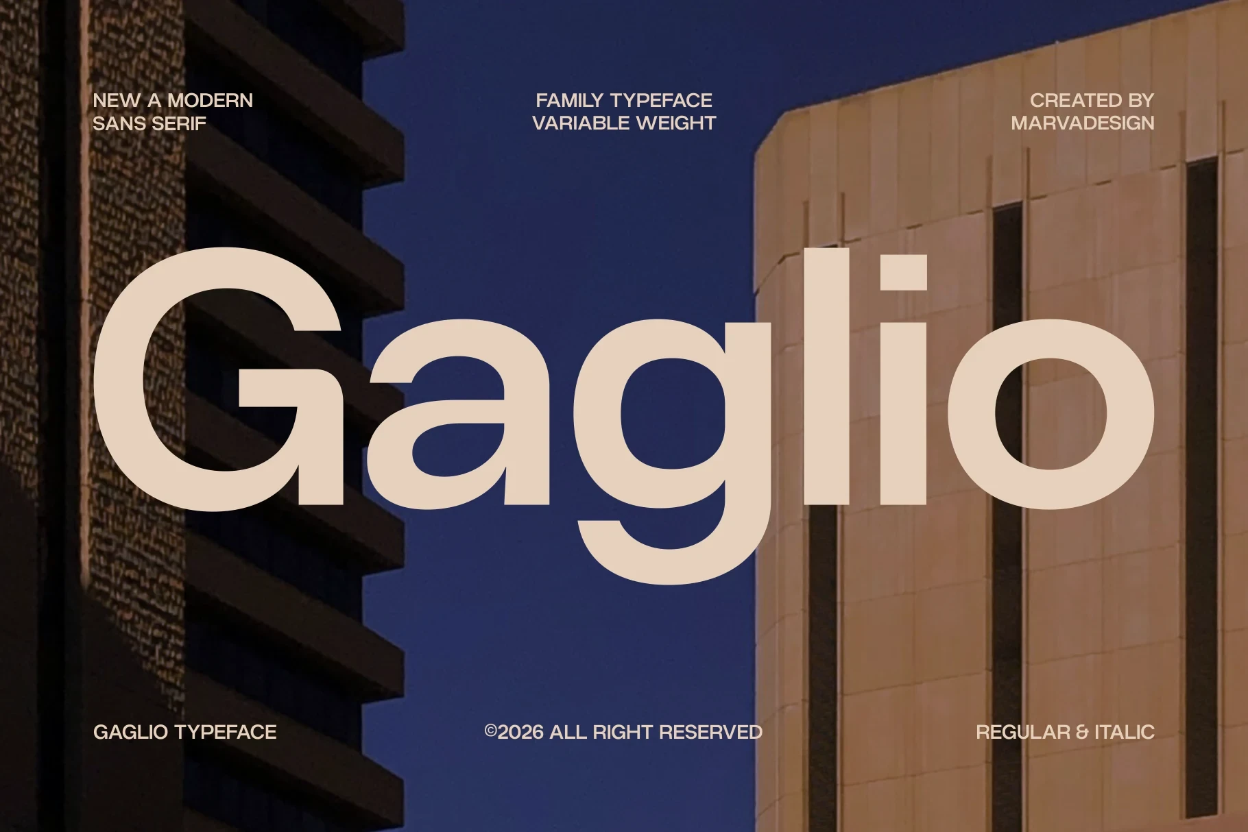
Best For: logos, branding, creative projects
Gaglio Font balances a constructed geometric build with open counters and circular o and g forms. Its substantial display presence remains readable without compressed proportions or ornamental distractions, making it a practical choice for contemporary branding and prominent wordmarks.
Luxury Font
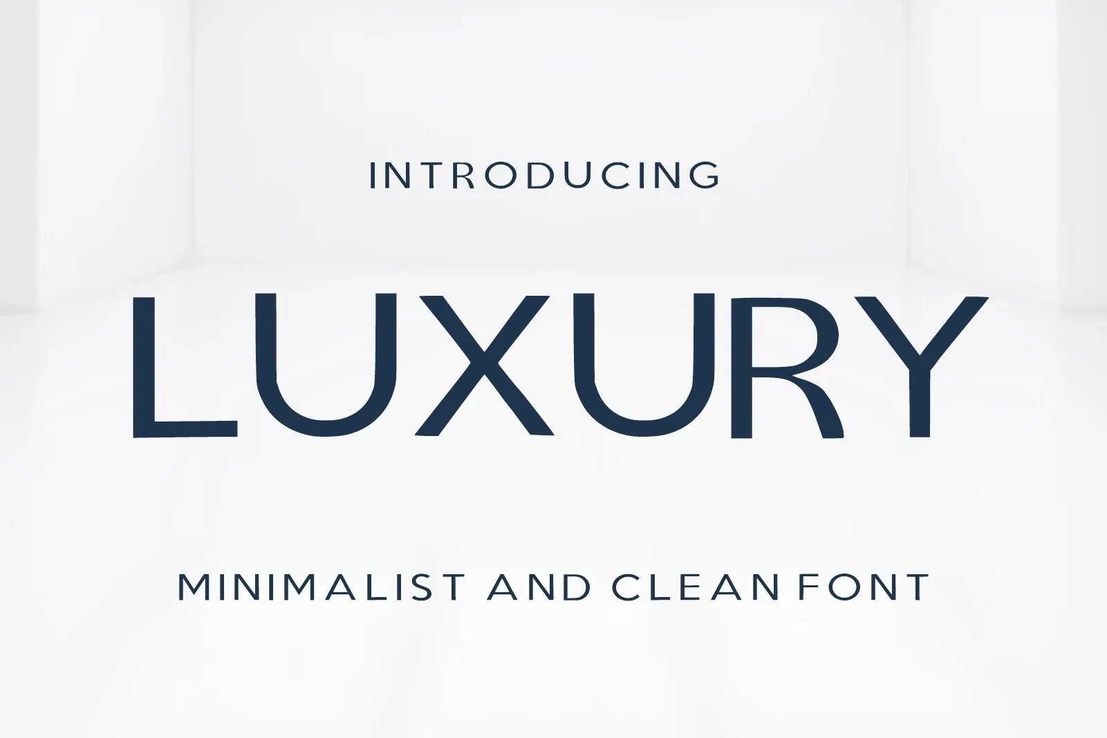
Best For: logos, modern designs, minimal designs, clean designs
Luxury Font suits identities that need geometric structure without a generic result. Its high-set A crossbar and slightly flared L and Y terminals introduce small points of distinction, while uniform strokes and generous spacing preserve strong large-scale legibility across modern logo applications.
Homush Font
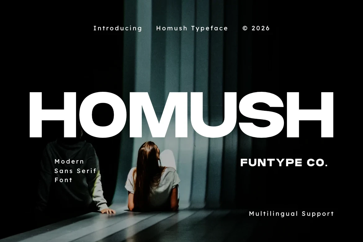
Best For: website headers, logos, branding, packaging
Homush Font uses heavy wide geometry and horizontal terminals to create a strong logo or packaging headline. Its large letters remain highly legible, and multilingual support broadens practical use; however, tight tracking can reduce clarity when the design is printed small.
Futuristic and Expanded Displays
Wide proportions and unusual stroke breaks define this futuristic group, creating technological wordmarks with strong presence but more demanding spacing and reproduction requirements.
Surfume Font
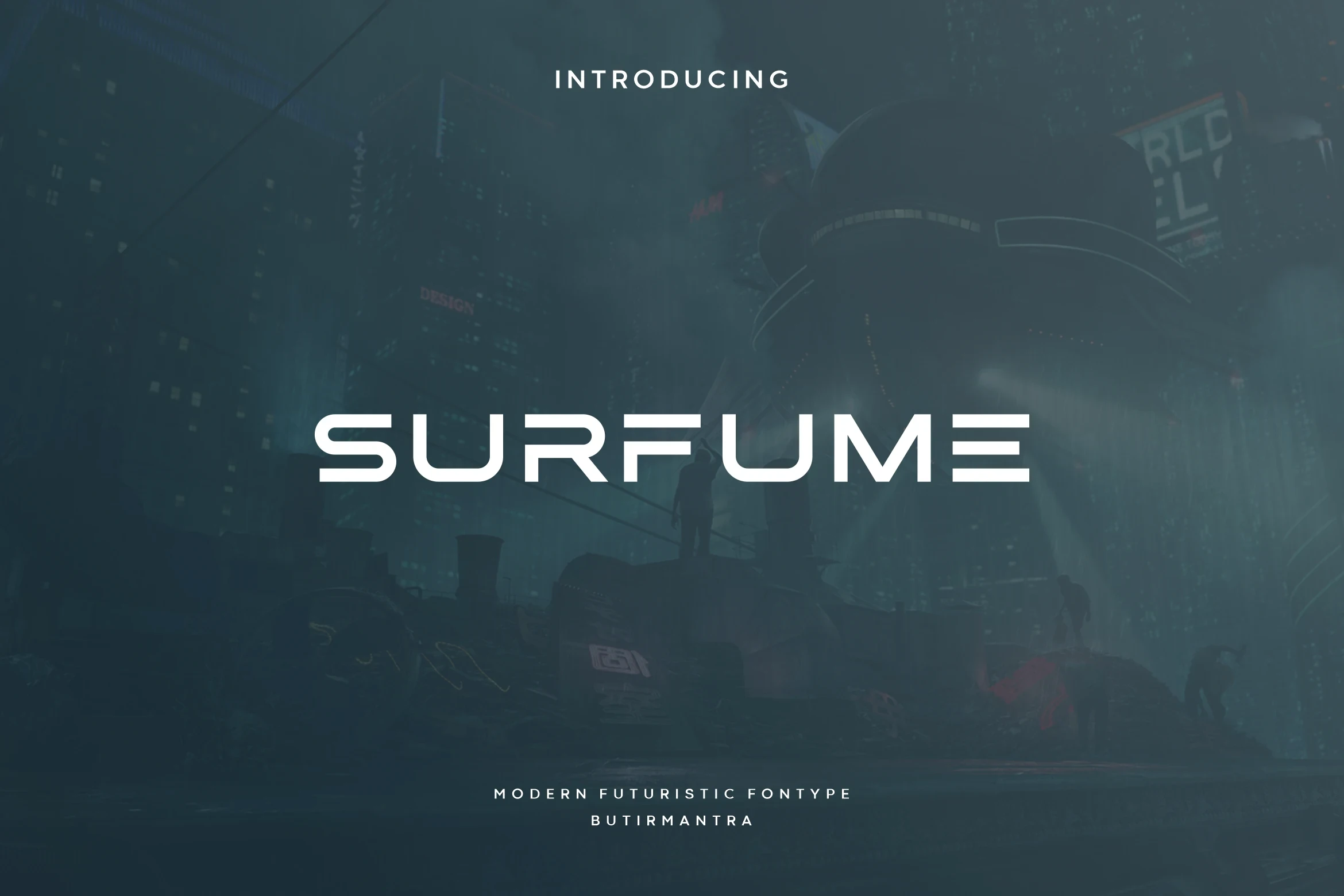
Best For: logos, posters, product labels, book covers
Surfume Font uses wide, light geometry and segmented horizontal strokes to create a distinctly technological voice. The breaks add visual character to large logo lettering, but its thin sections may lose definition when a mark is reproduced at smaller sizes.
Six Sound Font

Best For: logos, branding, posters, headlines
Six Sound Font combines ultra-wide expansion, heavy monolithic strokes, and rounded outer corners for an industrial wordmark with immediate presence. Ligatures, alternates, and multilingual support enable customization, although its extreme width can make compact logo arrangements difficult.
High-Contrast and Decorative Displays
High contrast, flared terminals, and serif or art-deco influences give this display group a distinctive editorial direction, though fine details need generous logo scale.
Mansory Font

Best For: logos, high-end designs, display text
Mansory Font brings sharp serifs and a pronounced thick-to-thin relationship, creating a high-end editorial direction rather than a conventional sans serif identity. Its primary display face reads strongly at large sizes, while thinner supporting text can lose clarity when reduced.
Cultivo Font

Best For: logos, high-end designs, website headers, display text
Cultivo Font builds a geometric identity system from Thin through Extra Bold weights, making it useful when one brand needs varied visual emphasis. High contrast and open circular bowls favor display sizing, while ligatures provide additional opportunities to customize a wordmark.
Vorue Font

Best For: logos, branding, packaging, headlines
Vorue Font gives branding an art-deco, retro-editorial signature through wide proportions, flared terminals, and pronounced stroke contrast. The fine strokes and stylized construction need generous sizing, so it works better for display marks and packaging than compact or information-heavy lockups.
How to Choose the Right Font
Choose rounded forms and open counters when readability and approachability lead; select heavier wide constructions for assertive packaging or large wordmarks. Segmented strokes, ligatures, and alternates add customization but need testing at final size. For Sans Serif Fonts for Logos, check joins, contrast, tracking, and fine details before approving the smallest reproduction.