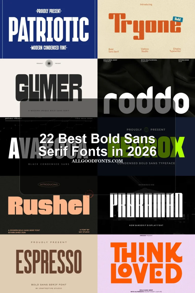
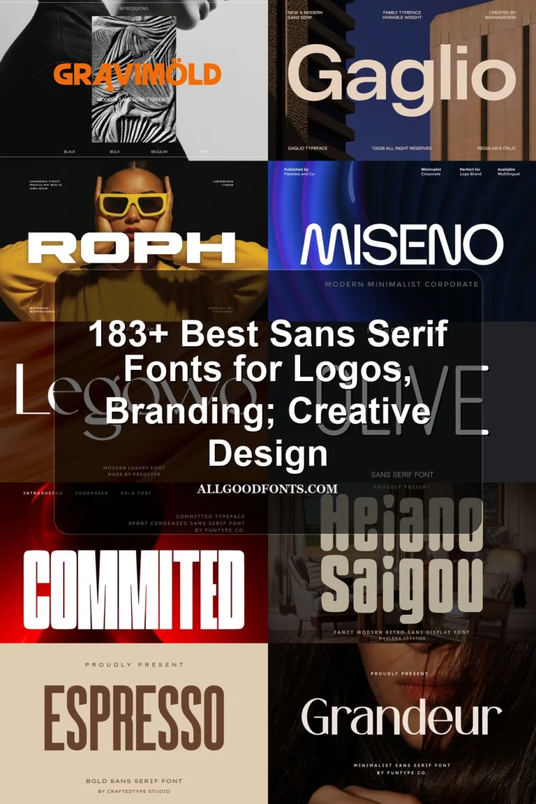
15 Best Minimalist Sans Serif Fonts in 2026
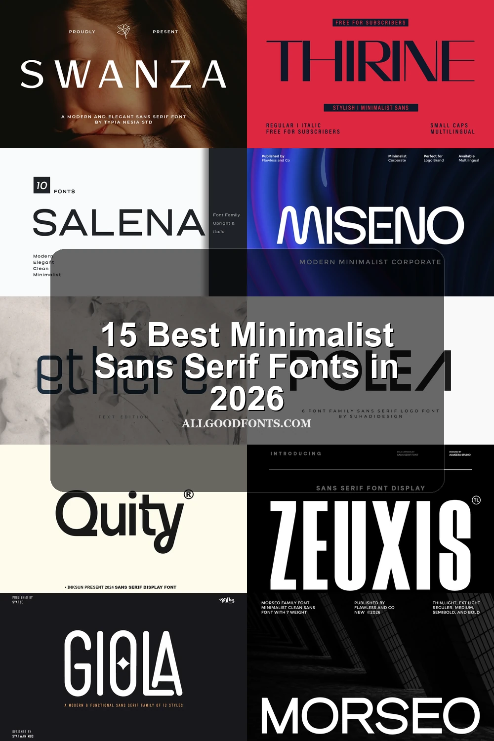
This collection spans tall geometric forms, compact heavy lettering, abstract constructions, and display faces with sharper contrast. Minimalist Sans Serif Fonts here are aimed at practical design work, from logos and packaging to headlines, social graphics, business cards, and other large-scale applications.
Looking for more sans serif fonts? Browse our complete Sans Serif Fonts collection to compare modern, elegant, bold, logo-friendly, and geometric sans serif styles.
Minimalist Sans Serif Fonts: Open Geometric Forms
These Minimalist Sans Serif Fonts share open counters, geometric construction, and generous spacing, with a more readable, restrained silhouette than the heavier or more experimental groups.
Moderan Font
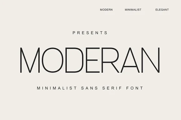
Best For: logos, branding, headlines
Moderan Font combines tall, condensed geometry with pronounced thick-thin contrast. Open apertures and large bowls remain clear at headline size, making these Minimalist Sans Serif Fonts suitable for editorial titles, logos, and luxury branding rather than long-form text.
Miseno Font

Best For: display text, modern designs, business cards
For readable display text and business-card layouts, Miseno Font brings uniform geometric strokes, rounded terminals, open counters, and wide spacing. These Minimalist Sans Serif Fonts retain a clear structure at large sizes, though their strongest role remains display work rather than continuous reading.
Salena Font

Best For: branding, headlines, modern designs, clean designs
Salena Font pairs wide geometric proportions with a large x-height, uniform strokes, and generous spacing. As Minimalist Sans Serif Fonts, its upright and right-leaning italic styles support headlines and compact display work while adding a built-in directional change.
Morseo Font

Best For: display text, modern designs, clean designs, professional designs
Morseo Font applies upright geometric construction, uniform strokes, and large circular counters to a readable heading style. These Minimalist Sans Serif Fonts preserve the same basic silhouette across multiple weights, allowing emphasis to change without altering the overall structure.
Swanza Font

Best For: display text, modern designs, clean designs, elegant designs
For headlines and branding, Swanza Font uses wide geometric letters, uniform strokes, open counters, and generous spacing. These Minimalist Sans Serif Fonts establish a restrained system, while the supporting sans style reinforces the hierarchy without adding decorative contrast.
Bold, Compact Display Structures
Compact proportions, dense weights, rounded corners, and tight spacing define this group, which favors posters, labels, logos, and short headlines over extended reading.
Urban Grind Font
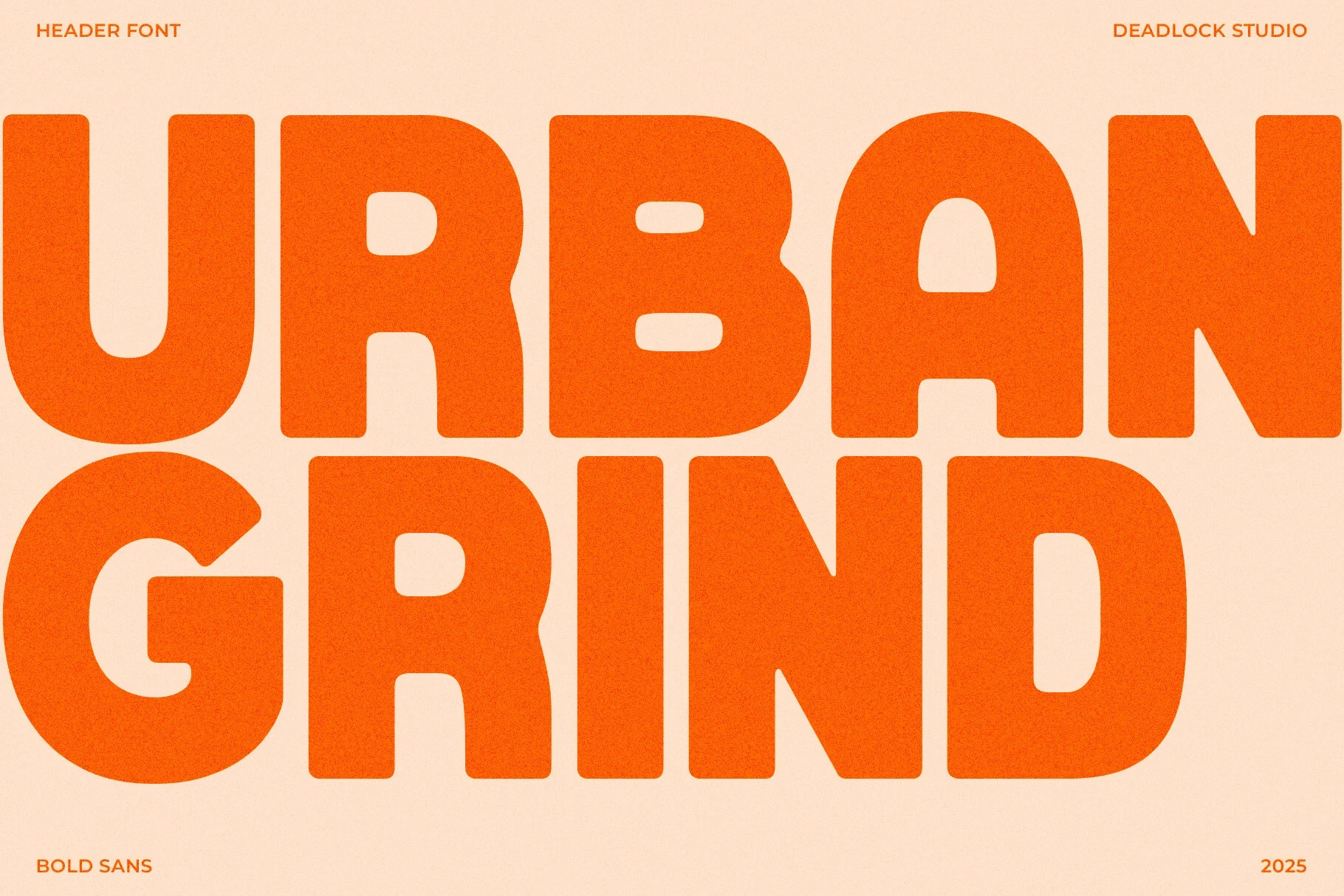
Best For: social media graphics, logos, branding, posters
Urban Grind Font uses ultra-bold, wide letterforms with rounded corners and very little stroke contrast. Its sturdy silhouette holds together in posters, logos, and short headlines, although tight spacing makes it a poor choice for extended copy.
Ethere Font

Best For: product labels, display text, modern designs, clean designs
Ethere Font uses heavy monolinear forms, rounded corners, and rounded terminals to create a dense display silhouette. It performs well on product labels and large text, though low apertures can reduce clarity when the lettering is printed very small.
Zeuxis Font

Best For: logos, branding, headlines, display text
For logos and prominent headlines, Zeuxis Font uses condensed, upright lettering with heavy strokes and flat horizontal terminals. Its narrow footprint saves space, while the dense weight and vertical construction make it less appropriate for body copy.
Remar Font

Best For: packaging, headlines, product labels, book covers
Remar Font ranges from thin outlines to heavy solid blocks across several slants, giving packaging, covers, and headline systems multiple visual levels. Its tight spacing and shifting stroke weights require careful large-scale control, since smaller sizes lose clarity.
Architectural and Abstract Letterforms
Elongated proportions, disconnected strokes, and unusual terminals give these faces an architectural or abstract character, separating them from the collection’s more regular geometric forms.
Thirine Font

Best For: branding, packaging, fashion branding, display text
Thirine Font separates its letters and extends horizontal strokes, creating a high-contrast editorial presence for branding and fashion packaging. Thin details can weaken at smaller sizes, while regular and italic styles, small caps, and multilingual support broaden its display use.
Polea Normal Font

Best For: display text, modern designs, clean designs, elegant designs
Polea Normal Font keeps its base forms geometric but adds abstract definition through the high-contrast P and diagonal A terminals. That futuristic edge suits large titles, although the unusual details can slow recognition when the face is reduced to body-text size.
Giola Font
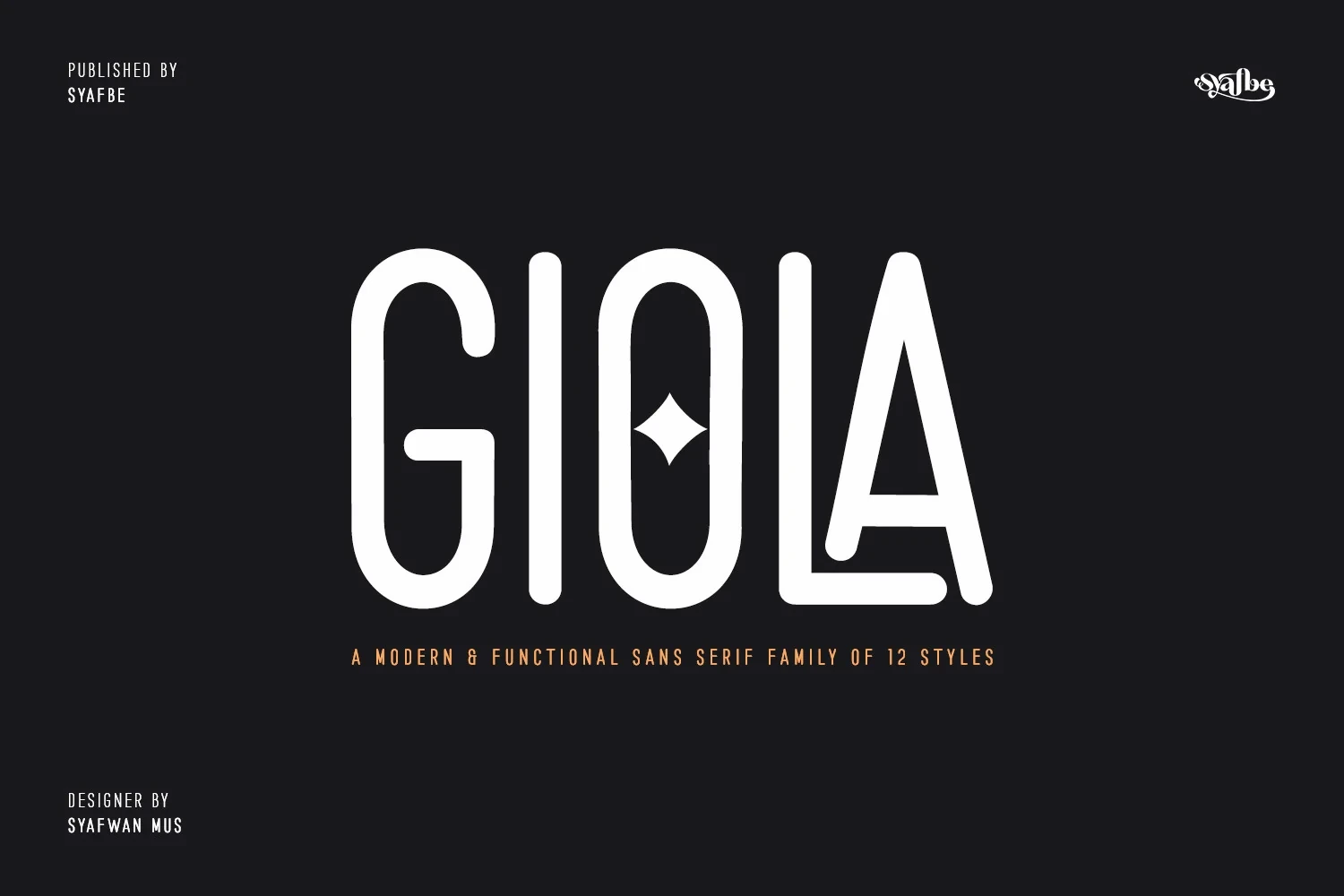
Best For: branding, display text, modern designs, business cards
Giola Font stretches geometric forms vertically while retaining rounded terminals and open apertures, creating a tall branded presence. Its elongated details favor large display use; PUA encoding also makes access to its characters and swashes a practical consideration.
Distinctive Display Contrasts
These display styles rely on contrast, flourishes, or hybrid construction to create distinction, making them useful for branding and titles but less dependable for small supporting text.
Monolog Font

Best For: branding, website headers, display text, modern designs
Monolog Font builds its primary sans serif from circular counters, open apertures, and low vertical stress, producing approachable headers with straightforward readability. Its accompanying irregular script is less suitable for small supporting text because of its uneven baseline and strokes.
Quity Font
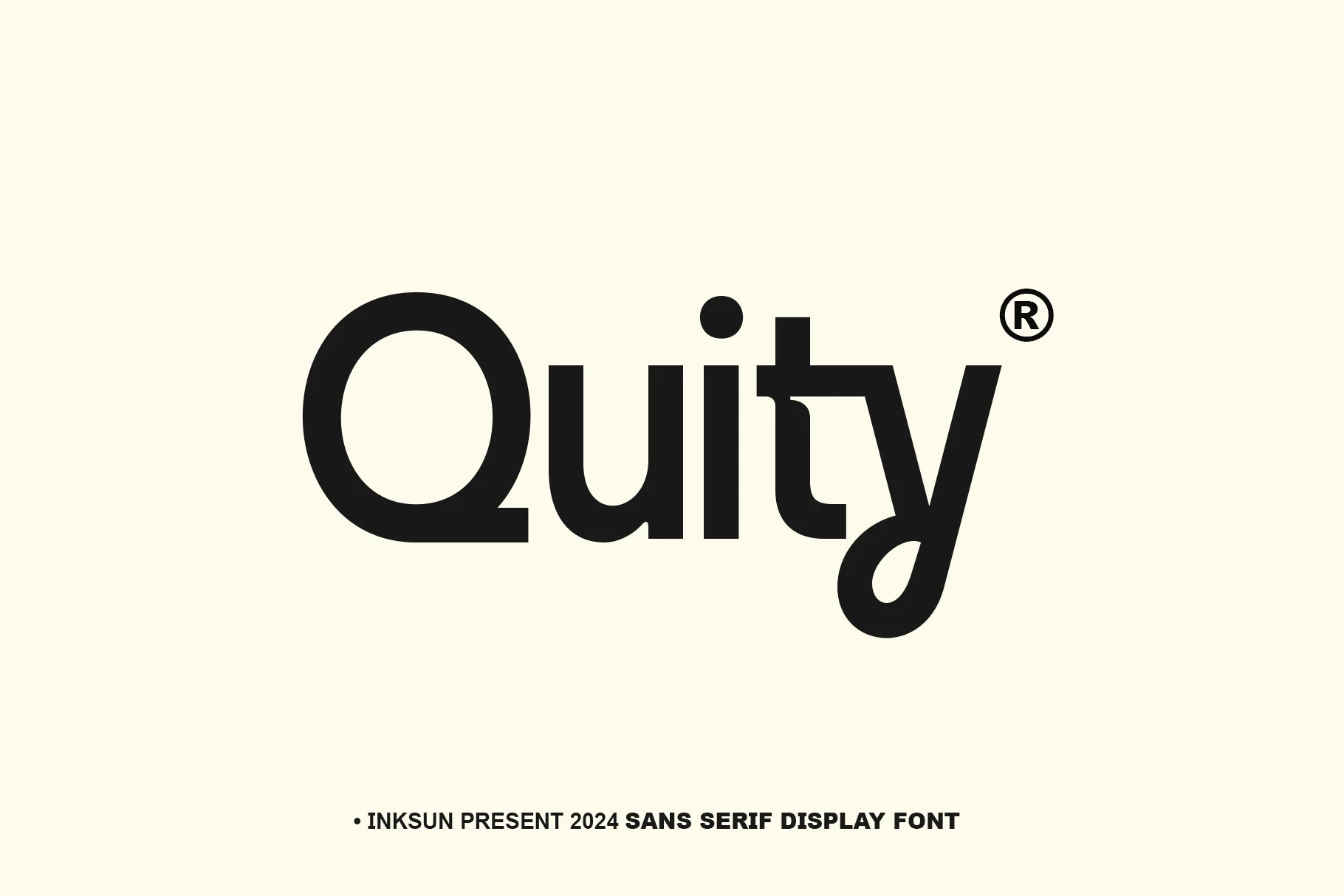
Best For: logos, branding, display text, modern designs
Quity Font combines a geometric sans structure with subtle script-like flourishes, a circular Q and y, and a sharp right-angle t. The distinctive construction works well in logos and large headings, but the unusual t may interrupt rapid reading at small sizes.
Valuxe Font
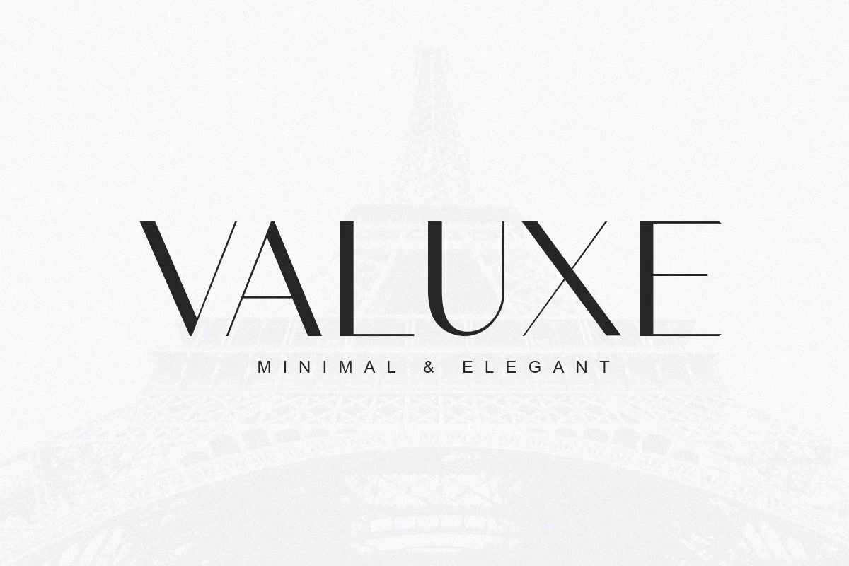
Best For: branding, display text, modern designs, clean designs
Valuxe Font is a high-contrast serif display face paired with a widely spaced geometric sans, so it is not a standalone minimalist sans-serif option. The contrast suits editorial titles and branding, but thin serif strokes need generous display sizing.
How to Choose the Right Font
Choose by construction first: open counters and generous spacing offer the safest readability, while condensed or heavy forms save space but need larger sizing. Use high-contrast, disconnected, or flourished faces for controlled display moments, and reserve the clearest Minimalist Sans Serif Fonts for headings, branding systems, and supporting layouts where consistency matters.