22 Best Bold Sans Serif Fonts in 2026
This collection spans wide geometric forms, compressed capitals, squared modular lettering, expressive serifs, and connected script. The Bold Sans Serif Fonts lead the practical range, offering distinct options for branding, posters, shirts, packaging, headlines, and other short display applications where construction and scale matter.
Looking for more sans serif fonts? Browse our complete Sans Serif Fonts collection to compare modern, elegant, bold, logo-friendly, and geometric sans serif styles.

Bold Sans Serif Fonts
These Bold Sans Serif Fonts share heavy strokes and display-first construction, but range from wide rounded forms to condensed, squared, or closed-aperture designs.
Roddo Font
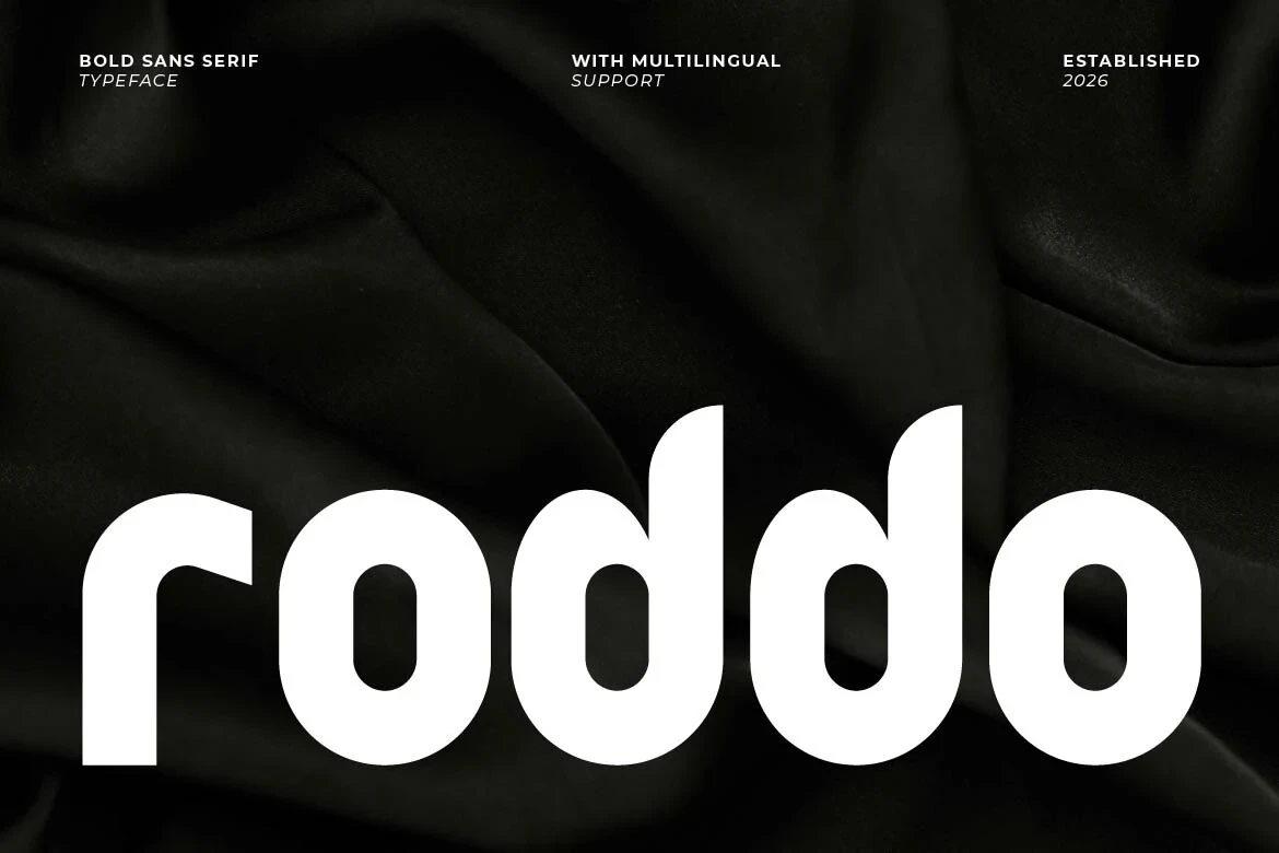
Best For: display text, modern designs
Roddo Font is a wide, monolinear display face with rounded terminals and geometric lowercase forms. Open apertures keep this Bold Sans Serif Fonts option readable in large branding headers, though its evidence supports display use rather than extended text.
Neurox Font

Best For: branding, posters, headlines
Neurox Font uses condensed heavy capitals, a high cap height, and slightly squared corners. This Bold Sans Serif Fonts choice creates compact poster and headline impact, but its tight proportions are less comfortable at small sizes.
Moulage Font

Best For: branding, packaging, headlines
Moulage Font suits branding, packaging, and large headlines through modular squared construction, flat terminals, and expansive proportions. Its tight counters and narrow apertures make this Bold Sans Serif Fonts style better for display scale than small text.
Nubolts Font
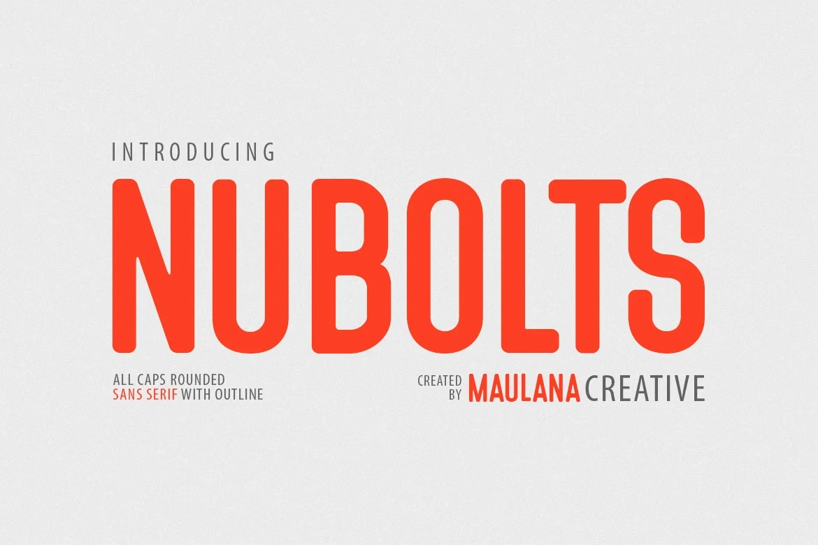
Best For: T-shirts, logos, posters
Nubolts Font brings all-cap condensed lettering together with rounded terminals and uniform strokes. Among these Bold Sans Serif Fonts, it offers dependable display legibility for logos, shirts, and posters without relying on elaborate details.
Humbler Sans Font
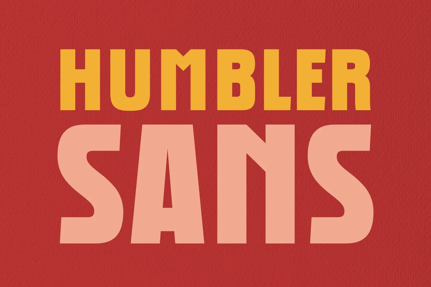
Best For: book covers, headlines, social media graphics
Humbler Sans Font combines a condensed geometric structure with softened corners and closed apertures. This Bold Sans Serif Fonts option has a chunky headline texture for covers and social graphics, while tight spacing limits smaller applications.
Bold Display Serifs
This group shifts from sans-serif geometry to substantial display serifs, using distinctive stroke rhythms and letter shapes for expressive headings, logos, packaging, and short phrases.
Single Line Font
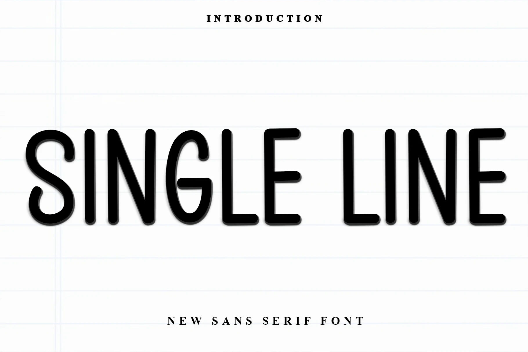
Best For: headlines, display text, expressive designs
Single Line Font is identified as a substantial display serif with distinctive letterforms and a clear stroke rhythm. Its weight is easiest to assess in headings, names, and short display phrases rather than extended reading.
Proraman Font

Best For: headlines, display text, modern designs
Proraman Font uses contemporary display-serif construction, substantial weight, and clearly differentiated letterforms. The defined stroke rhythm supports headings and short phrases, but the supplied evidence does not establish comfortable body-text performance.
Rincoln Font

Best For: branding, display text, clean designs
Rincoln Font has a clean contemporary display-serif treatment with substantial weight and expressive letterforms. It is best directed toward branding and short display text, where its stroke rhythm can remain visible and comparable.
Things Font

Best For: T-shirts, logos, packaging
Things Font balances refined slender strokes with rounded display-serif forms. Its TTF and OTF formats, along with PUA-encoded characters, support practical lettering workflows for logos, packaging, and other short applications.
Close Warning Font

Best For: logos, book covers, posters
Close Warning Font pairs substantial display-serif weight with slender strokes and distinctive letter shapes. Its expressive rhythm is most useful in logos, book or magazine covers, and posters where wording remains brief.
Tryone Font

Best For: branding, posters, book covers
Tryone Font places a period-inspired display character inside a contemporary serif construction. The contrast gives branding, posters, and book covers a nostalgic-modern tension while preserving the short-phrase focus expected of display lettering.
Espresso Font
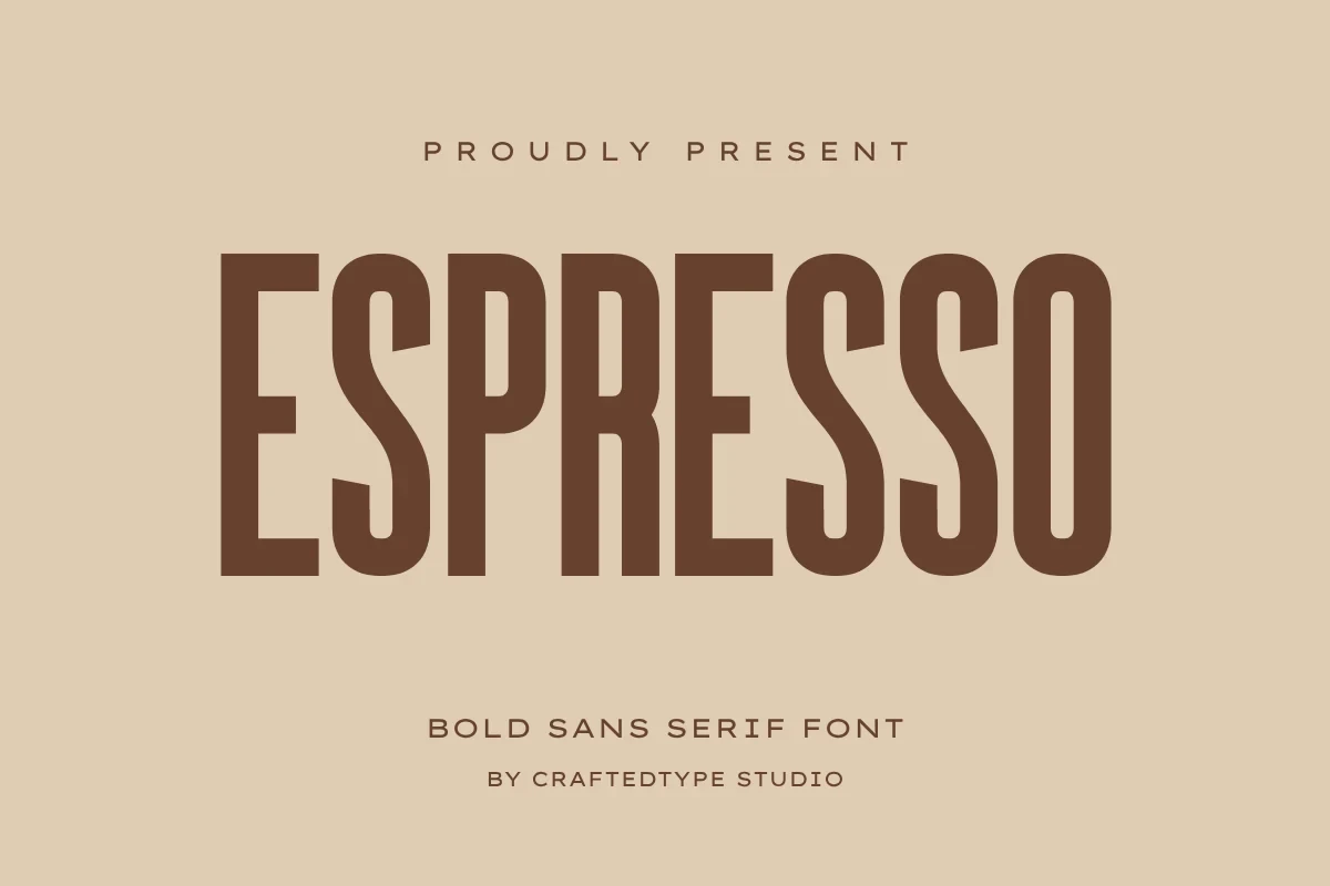
Best For: T-shirts, logos, packaging
Espresso Font combines rounded display-serif forms with slender strokes and a playful character. TTF and OTF formats plus PUA encoding make it practical for logo and packaging lettering when accessible character handling matters.
Tondo Font

Best For: branding, packaging, logos
Tondo Font is built around substantial display-serif weight, distinctive letterforms, and a clearly defined stroke rhythm. Use it for packaging, logos, and short display text rather than general reading passages.
Bouldy Font

Best For: display text, modern designs, playful designs
Bouldy Font places a rounded, playful character within a contemporary display serif. Its substantial forms suit headings and short phrases, especially when a modern display treatment needs approachable letter shapes without becoming text-heavy.
Glimer Font
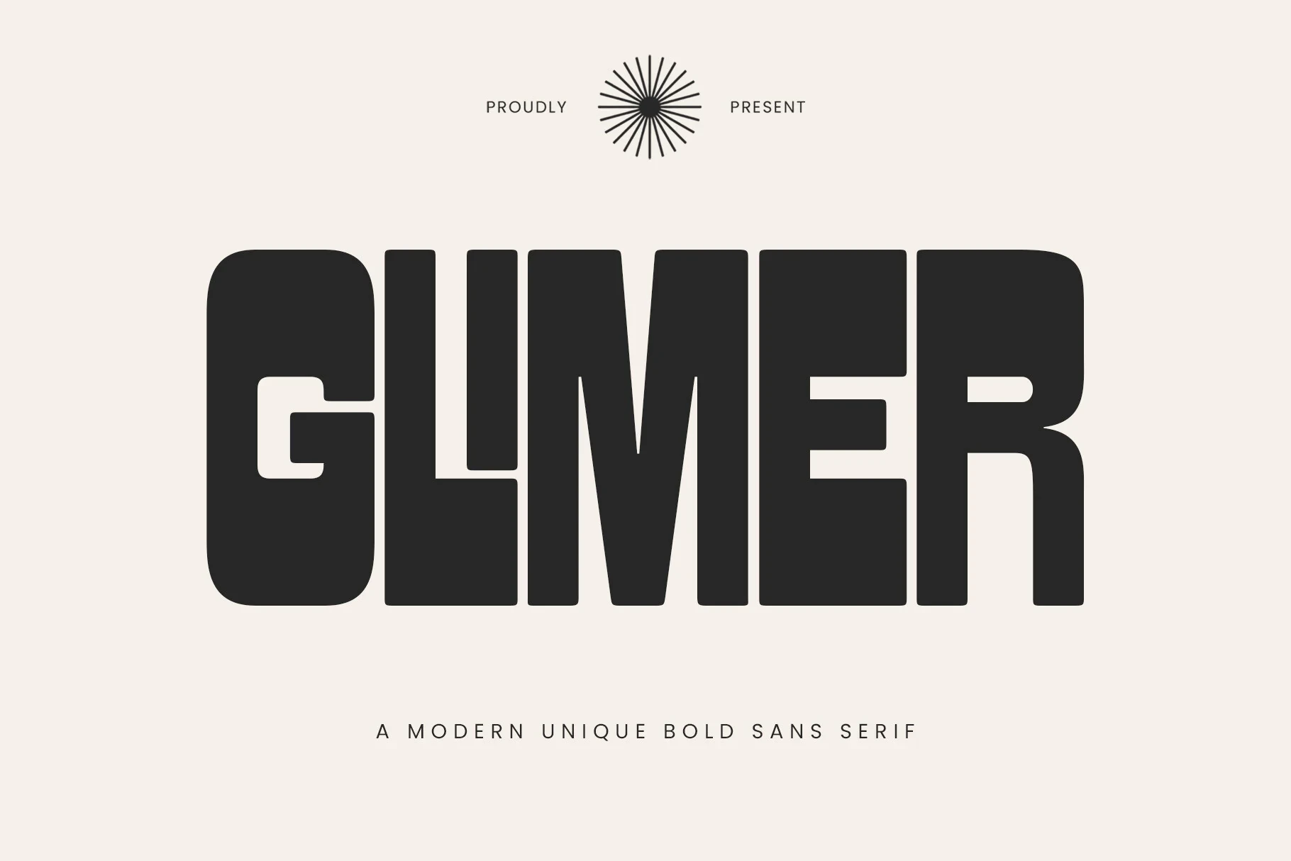
Best For: branding, posters, headlines
Glimer Font uses a substantial contemporary display-serif construction with a clear stroke rhythm. It fits posters, headlines, and display text, where its distinctive forms can remain legible at an appropriately generous scale.
Avaboca Font
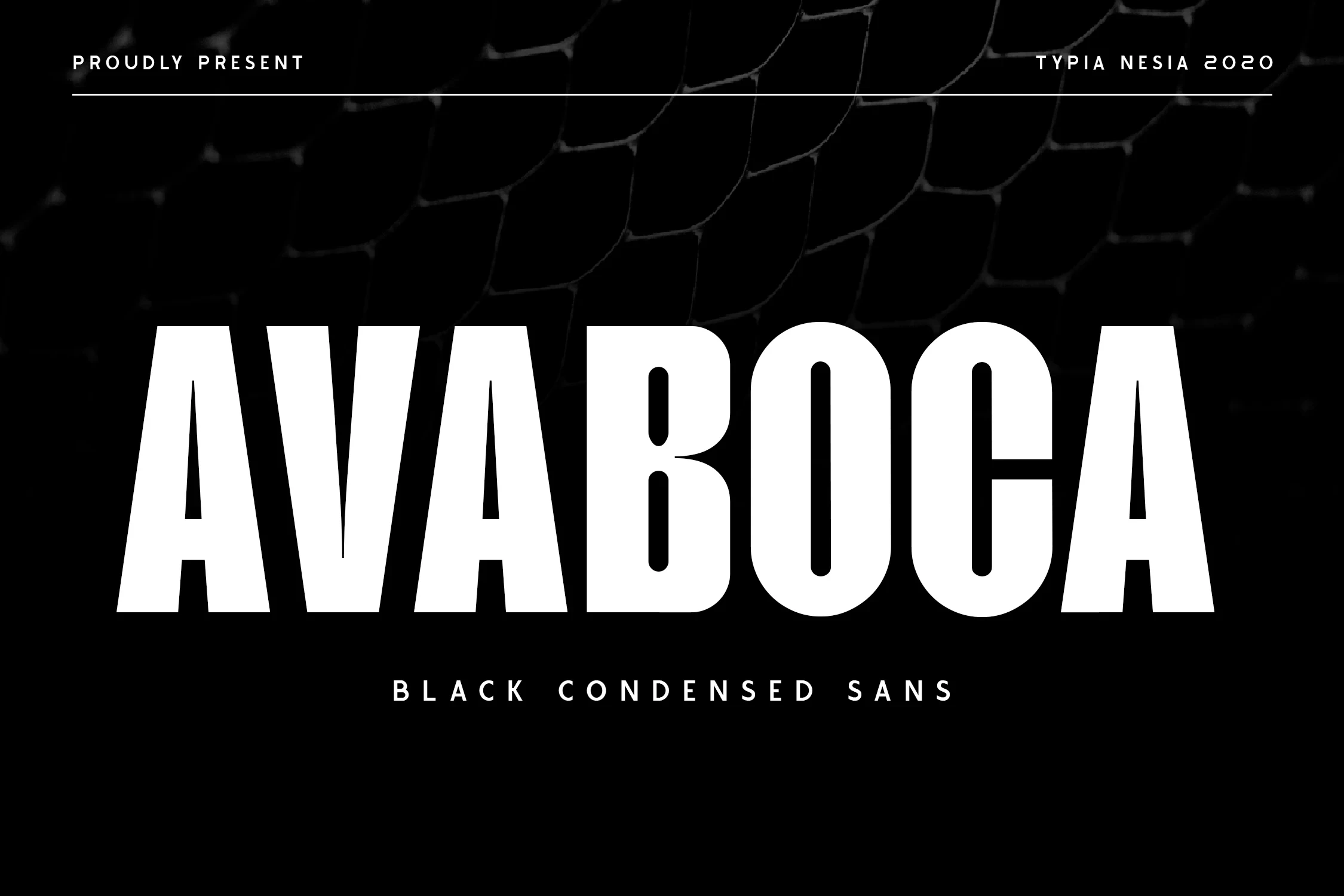
Best For: display text, bold designs, expressive designs
Avaboca Font offers distinctive display-serif letterforms with a substantial, expressive profile. Keep the wording short so its unusual shapes can lead the design in display text, bold designs, or expressive lettering.
Patriotic Font

Best For: T-shirts, posters, quotes
Patriotic Font is a substantial contemporary display serif with a clear stroke rhythm and distinctive forms. Its evidence-supported uses include shirts, posters, quotes, and other short treatments where display scale protects readability.
Think Loved Font

Best For: headlines, social media graphics, display text
Think Loved Font combines rounded playful serif forms with slender strokes, while ligatures and alternate characters add variation. It is described as a Bold Sans Serif Fonts option, best tested in headlines and social graphics where its alternates can register.
Nordin Extrude Family Font

Best For: display text, bold designs, premium designs
Nordin Extrude Family Font signals a dimensional direction within the supplied display-serif classification. Its substantial weight is best reserved for short expressive or premium designs where the added treatment can remain visible.
Rushel Font

Best For: branding, display text, clean designs
Rushel Font uses contemporary display-serif construction, substantial weight, and distinctive letterforms. Branding and short display text are the supported roles; the evidence does not establish sans-serif reading behavior for longer copy.
Voltage Font
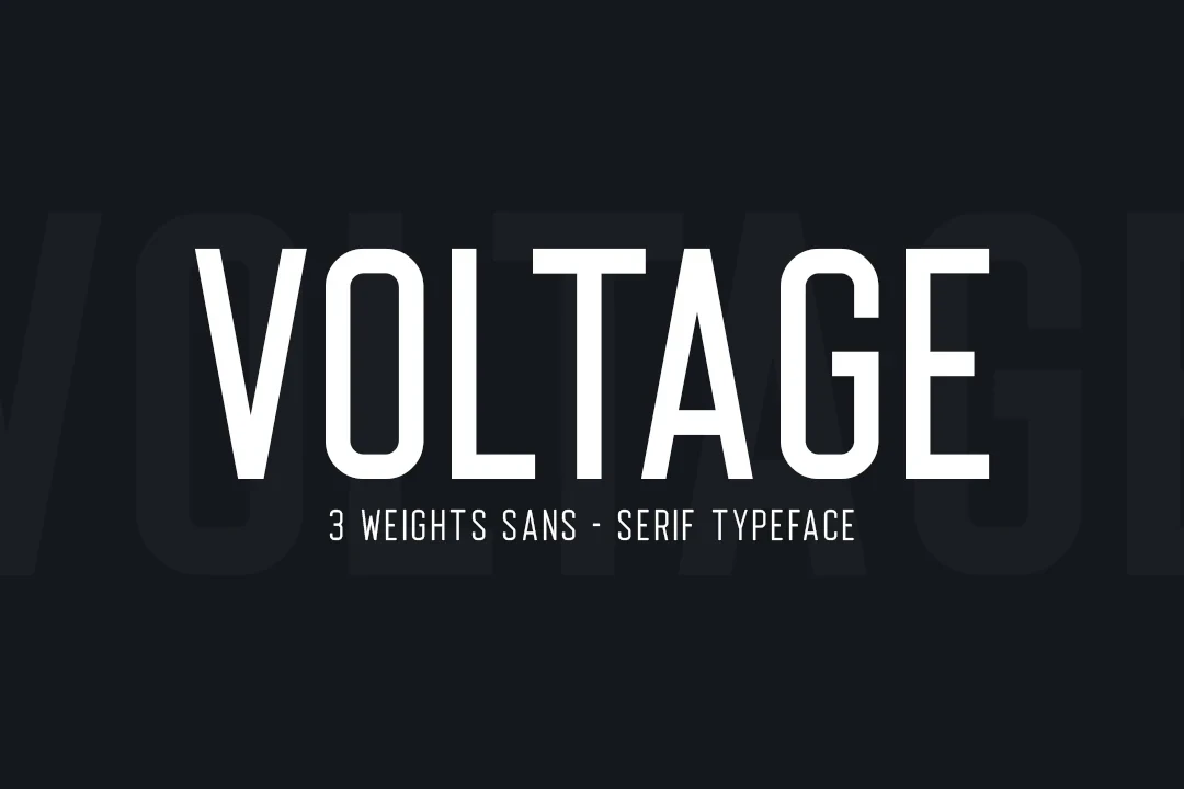
Best For: display text, bold designs, professional designs
Voltage Font organizes substantial display-serif letterforms around a clear stroke rhythm. It supports expressive display text and professional designs most effectively when phrases stay short enough for its distinctive shapes to remain legible.
Connected Cursive Display
The connected cursive group is defined by joined, flowing letterforms, giving names and brief display wording more handwritten movement than the structured serif and sans-serif groups.
Stuneman Font
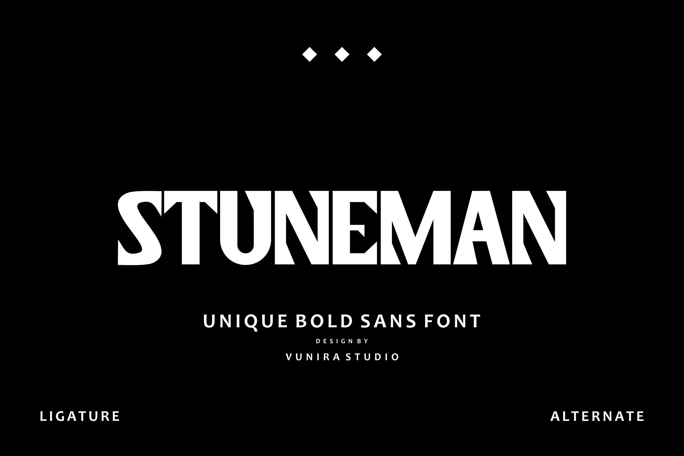
Best For: business cards, branding, invitations
Stuneman Font uses connected cursive construction and flowing handwritten movement. Its joins suit names, invitations, business cards, and branding, while short display phrases remain the safest zone for preserving letter-by-letter readability.
How to Choose the Right Font
Choose Bold Sans Serif Fonts by first checking width and aperture: wide, open forms favor readable headers, while condensed or closed designs need larger sizing. For a different voice, compare serif stroke rhythm or cursive joins, then reserve the most distinctive options for short phrases, logos, posters, packaging, and other display-led work.