29 Best Condensed Sans Serif Fonts in 2026
This collection of Condensed Sans Serif Fonts spans clean geometric families, humanist forms, bold display styles, and restrained modern lettering. Use them for logos, branding, packaging, wedding stationery, social graphics, invitations, headlines, and other short-format designs where the letterforms set the visual character.
Looking for more sans serif fonts? Browse our complete Sans Serif Fonts collection to compare modern, elegant, bold, logo-friendly, and geometric sans serif styles.
Condensed Sans Serif Fonts
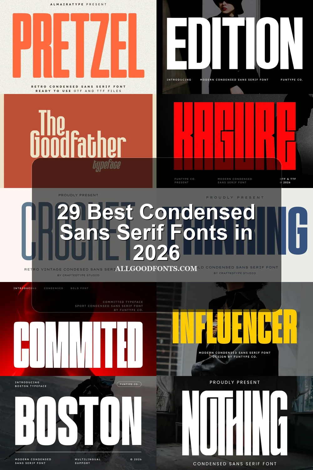
These Condensed Sans Serif Fonts emphasize upright compression, squared terminals, and restrained construction, offering dependable headline hierarchy while remaining less expressive than the rounded or feature-led groups.
Burnian Font

Best For: branding, posters, headlines
Burnian Font uses extreme vertical compression, monolinear strokes, blocky geometry, and very small counters. These Condensed Sans Serif Fonts create a forceful poster or logo presence, but tight spacing makes large display sizes essential.
Luckies Font
Best For: logos, branding, posters, headlines
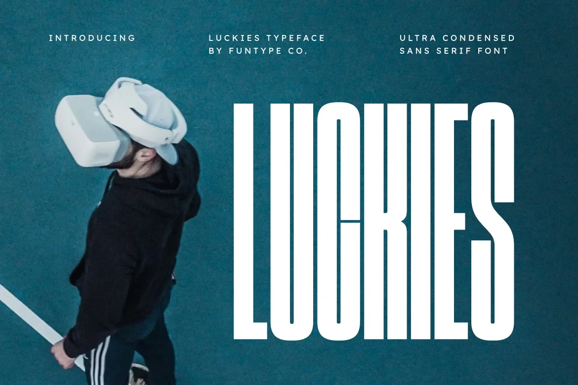
For logos and headlines, Luckies Font brings pronounced vertical elongation, monolinear strokes, and crisp horizontal-cut terminals. Its compressed rhythm gives short wording a strong display presence, but the narrow proportions are unsuitable for body copy. TTF and OTF formats are included.
Kagure Font
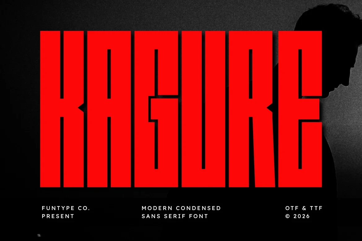
Best For: logos, branding, posters, headlines
Kagure Font relies on heavy strokes and squared or angular terminals for a forceful silhouette. It performs best in large headlines, posters, and logos; at smaller sizes, dense spacing and strong weight reduce clarity. TTF and OTF files are supplied.
Dilabo Font
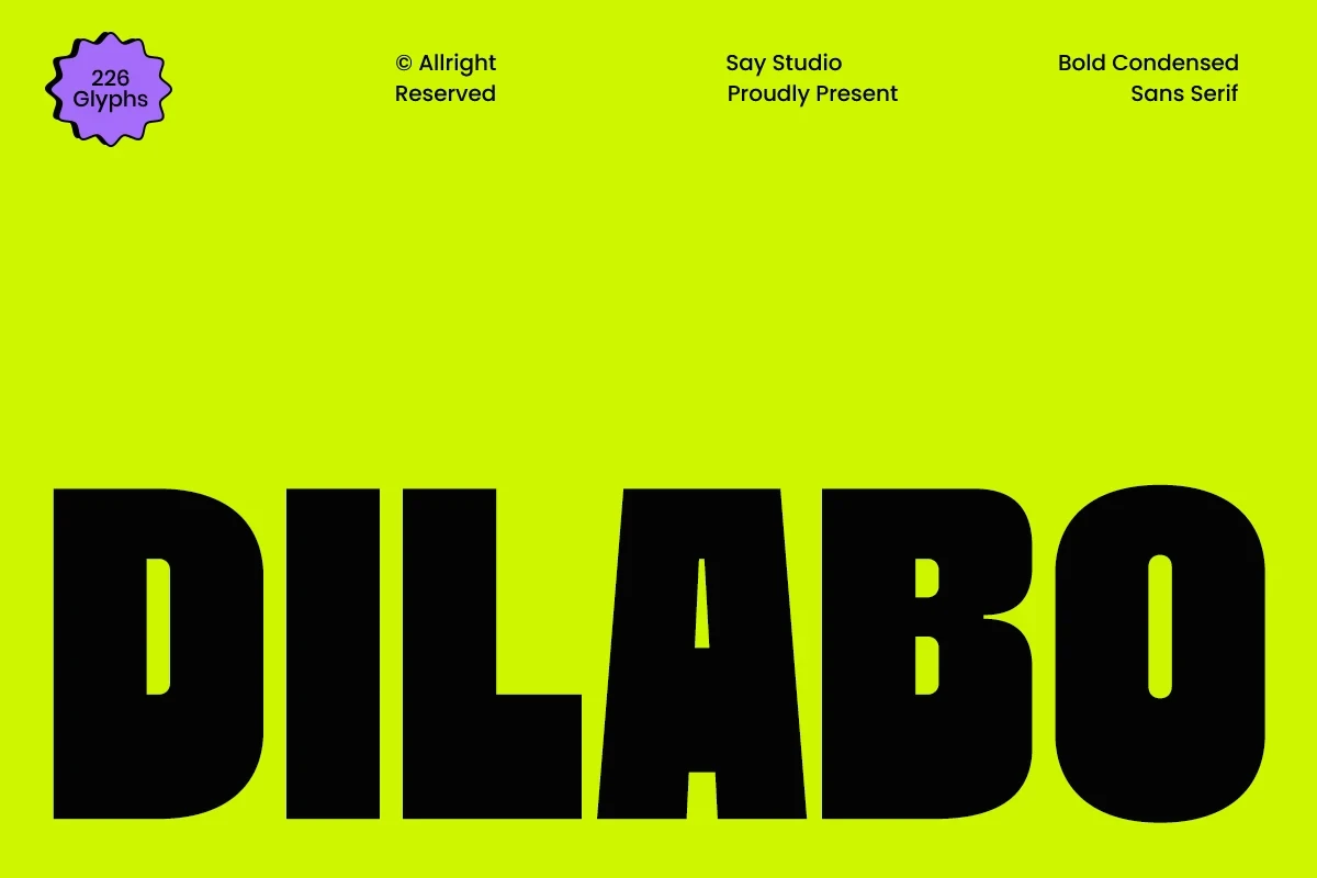
Best For: branding, creative projects, display text
Dilabo Font combines uniform heavy strokes, flat terminals, and tight spacing into a dense branding texture. It holds attention in large display text, though accumulated weight can blur smaller lettering and limits its usefulness for longer copy.
Commited Font
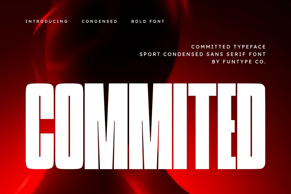
Best For: logos, branding, posters, headlines
Commited Font softens its strongly vertical condensed structure with rounded rectangular terminals and uniform strokes. That balance works for logos, posters, and headlines, although narrow spacing still favors short wording over paragraphs or extended text.
Boston Font

Best For: logos, branding, posters, headlines
Boston Font adds slightly angled vertical terminals to heavy, minimally contrasted letterforms. The small directional detail gives titles and logos extra character without changing its large-size role; tight proportions remain difficult in small text or long blocks.
Godplan Font
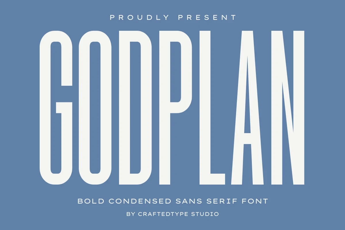
Best For: display text, headlines, modern designs
For headline hierarchy, Godplan Font offers an upright, monolinear structure with no italic movement or visible stroke contrast. Its compressed width creates dependable display emphasis, but continuous reading is hindered by the narrow proportions.
Hoodie Font

Best For: branding, headlines, display text, modern designs
Hoodie Font uses squared, flat terminals and strong contrast to create a harder display texture. Large headings benefit from the difference between thick and thin strokes, while crowded spacing can reduce clarity in tiny settings.
Pistacho Font
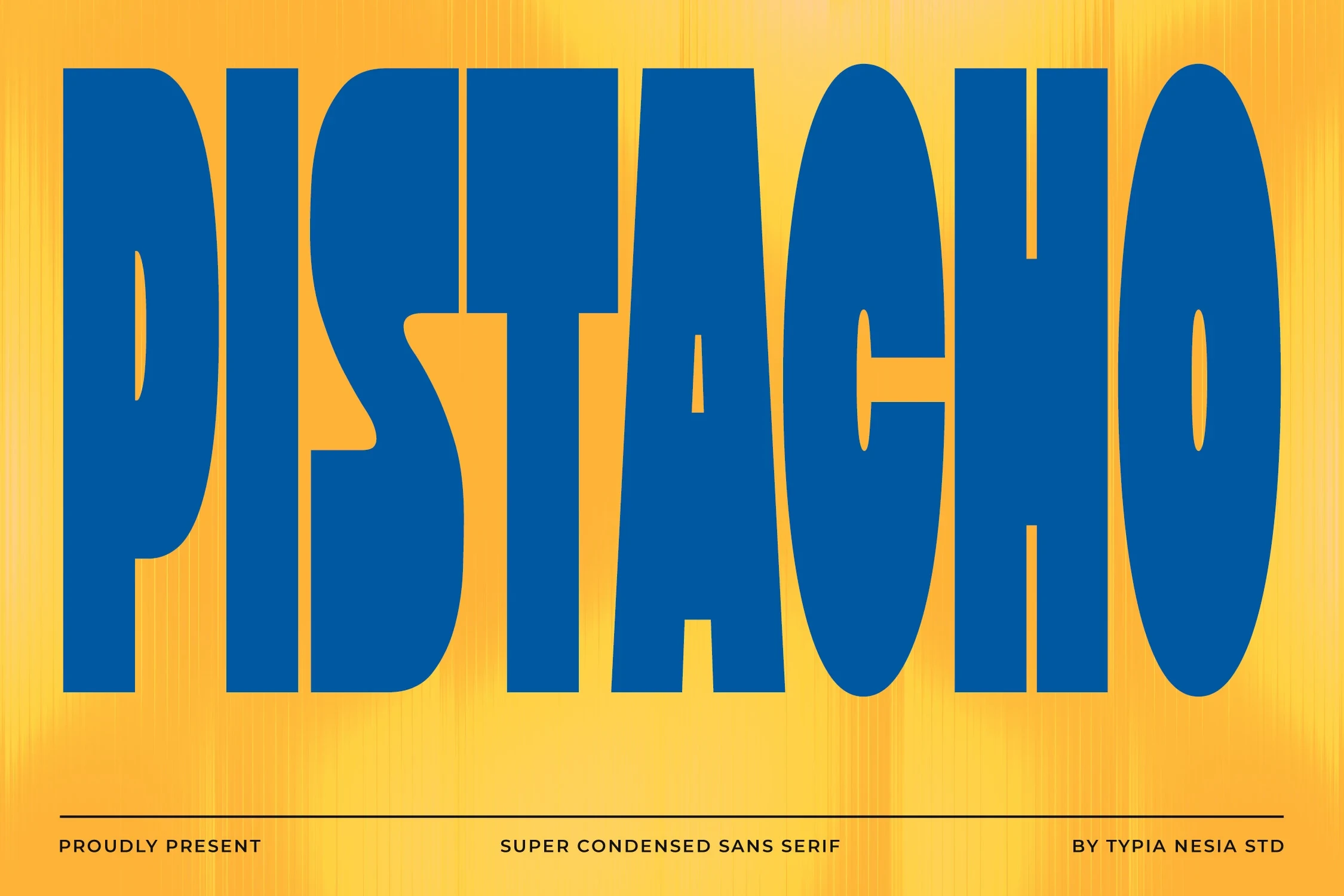
Best For: logos, display text, modern designs, clean designs
Pistacho Font emphasizes height through super-condensed proportions, uniform strokes, and geometric terminals. It is effective for short logos and display text, but its minimal spacing leaves little tolerance for small lettering or longer lines.
Might Font
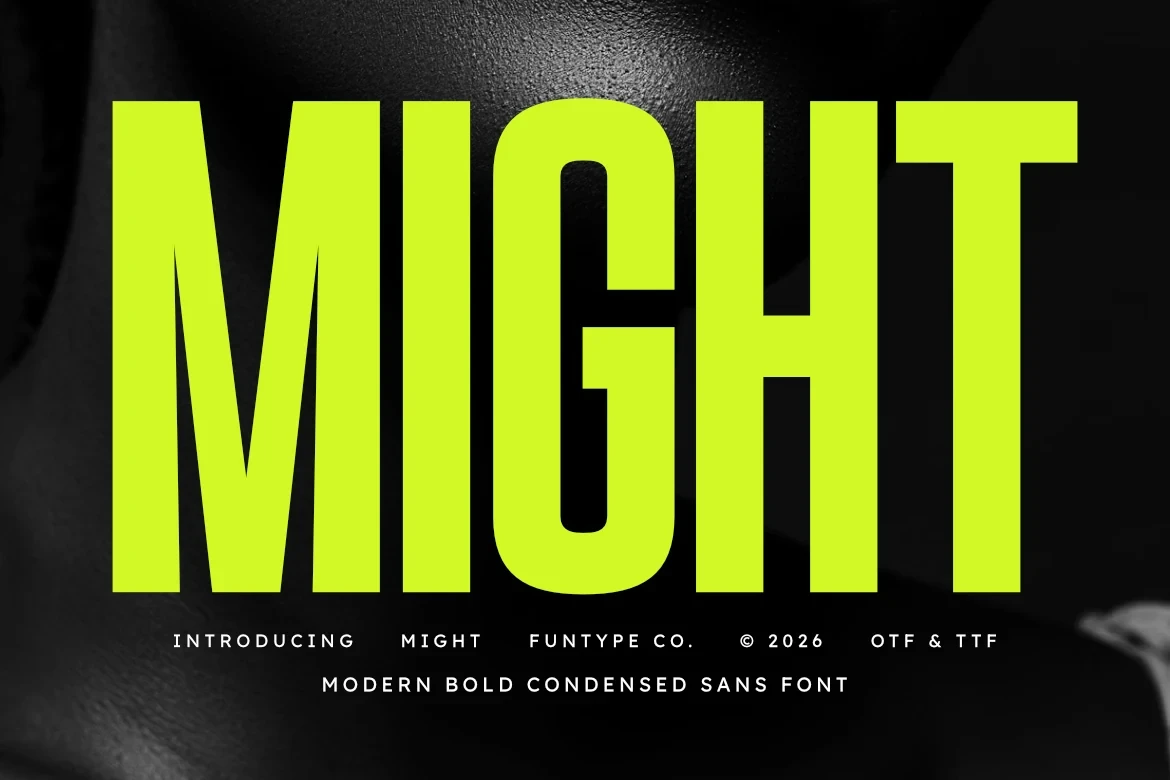
Best For: logos, branding, posters, headlines
Might Font combines squared terminals, high verticality, and monolinear strokes for a consistent display texture. It holds together well in logos and headlines, but dense paragraphs magnify the compressed proportions. TTF and OTF formats are included.
Sunlight Font
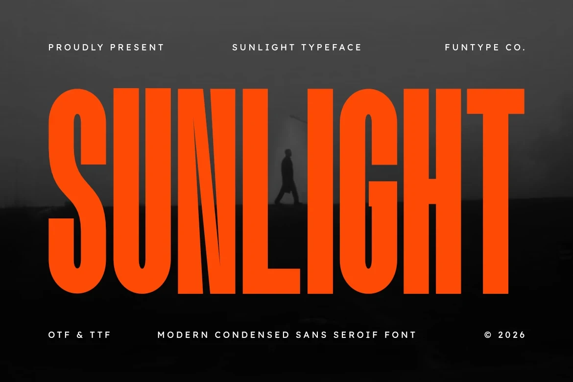
Best For: branding, posters, headlines, social media graphics
Sunlight Font takes a restrained geometric approach to tall, narrow forms, making it useful for identity work, posters, and social graphics. Its text should remain short and large because extreme compression compromises small-size reading.
Crochet Font

Best For: display text, modern designs, clean designs, elegant designs
For short, carefully spaced lines, Crochet Font offers an upright, uniform structure with extreme narrowness and geometric terminals. Its restrained framework gives logos and display text consistency, but longer copy has little room to breathe.
Condensans Font

Best For: branding, posters, headlines, high-end designs
Condensans Font uses squared angular geometry and minimal internal negative space to create a strong stacked display presence. It suits posters, branding, and high-end identity work, but the narrow width and vertical elongation rule out body copy.
Rounded And Slanted Condensed Forms
Rounded corners, softer terminals, and occasional slant introduce friendlier movement here, separating these condensed faces from the straighter, more severe constructions elsewhere.
Hooked Font
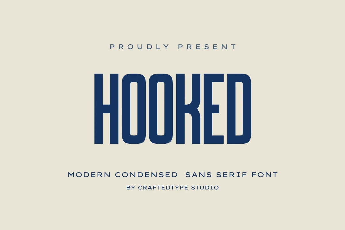
Best For: T-shirts, logos, branding, packaging
Hooked Font balances rounded exterior corners against squared interior negative space, giving these Condensed Sans Serif Fonts a structured-soft contrast. It suits T-shirts, logos, and packaging, while long paragraphs expose the limits of its narrow width. TTF, OTF, and PUA-encoded characters are included.
Crusher Font

Best For: logos, branding, posters, headlines
For active headlines, Crusher Font introduces a right-leaning stance into a rigid, squared condensed design. Its extreme height and minimal stroke variation create directional movement, but body-copy clarity falls quickly. TTF and OTF formats support broad compatibility.
The Goodfather Font

Best For: logos, packaging, posters, quotes
The Goodfather Font uses semi-circular terminals and uniform strokes to give its narrow forms a nostalgic display character. It works for logos, packaging, posters, and quotes at generous sizes, while tight spacing limits smaller applications.
Pretzel Font
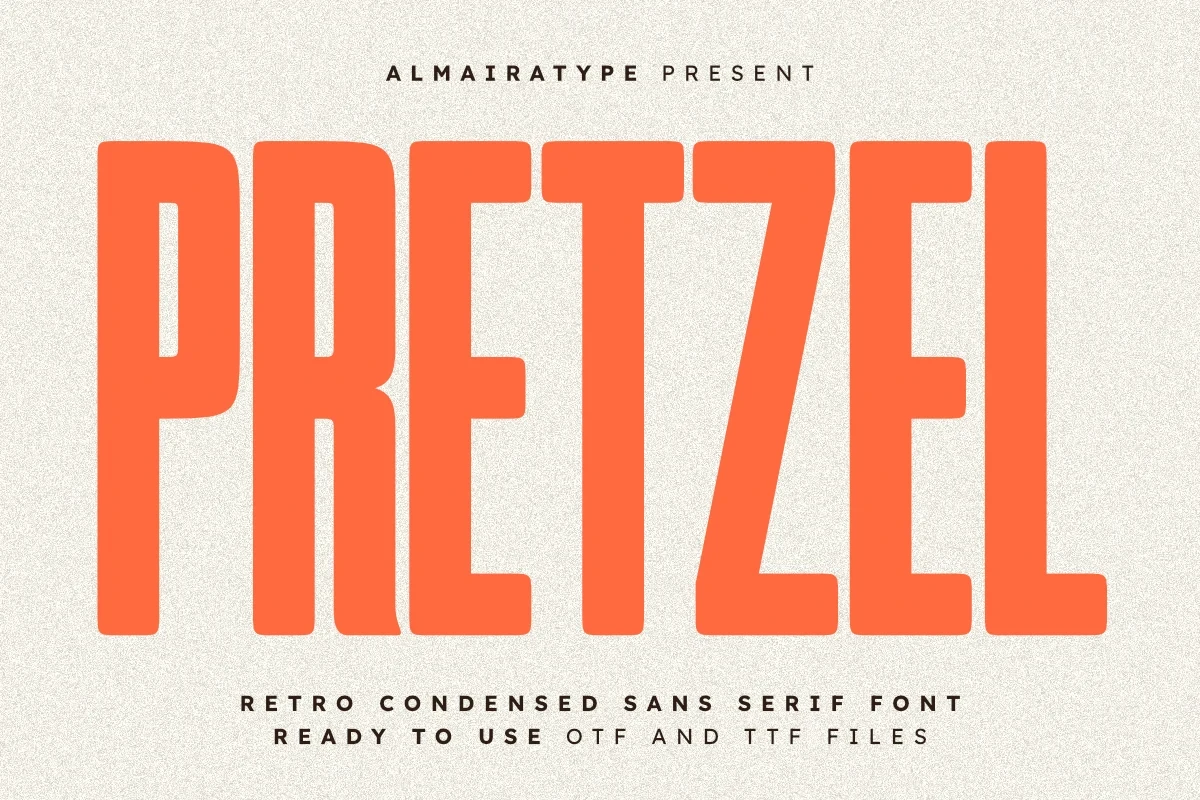
Best For: T-shirts, headlines, social media graphics, creative projects
Pretzel Font makes these Condensed Sans Serif Fonts friendlier through rounded corners, rounded terminals, and a tall x-height. The consistent strokes suit T-shirts, headlines, and social graphics, while display sizing remains important for clarity.
Angular And Feature-Led Displays
Sharp corners, high contrast, cutouts, and unusual internal details give this group a stronger signature, making it more suitable for identity-led display work than neutral titling.
Mosport Font

Best For: branding, packaging, posters, headlines
Mosport Font sharpens its unusually tall structure with angular joins and terminals. The athletic-industrial character suits packaging, branding, and headlines, while its narrow proportions make extended reading impractical. TTF and OTF formats support flexible production workflows.
Influencer Font
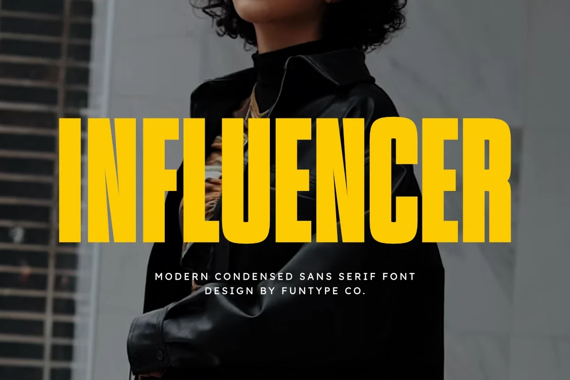
Best For: branding, posters, headlines, display text
Influencer Font introduces high-contrast vertical strokes and square-like terminals to an upright condensed structure. The tonal variation helps branding and display text, while narrow proportions still restrict it to large headings rather than body use.
Clinched Font

Best For: logos, packaging, posters, headlines
Clinched Font strips the design back through uniform geometric strokes and minimal letter spacing. Its narrow width favors large logos, packaging titles, and headlines; full multilingual support broadens its practical reach across branding and product work.
Rotation Font

Best For: logos, branding, packaging, posters
Rotation Font contrasts a light stated weight with a very narrow vertical framework and thin counters. The sharper outline needs generous scale for logos, packaging, and posters, since small settings can quickly lose readable letter detail. TTF and OTF formats are included.
TRT Burn Font

Best For: branding, headlines, display text, modern designs
TRT Burn Font applies extreme weight, sharp angles, and high contrast for the collection's strongest visual pressure. These Condensed Sans Serif Fonts command branding and headlines, but dense strokes make long-form reading inappropriate.
Movault Font

Best For: display text, modern designs, minimal designs, clean designs
Movault Font packs tall, flat-ended forms tightly through minimal internal and inter-letter negative space. The dense texture suits posters and short display phrases, while small sizes lose clarity and longer wording becomes difficult to manage.
Nothing Font
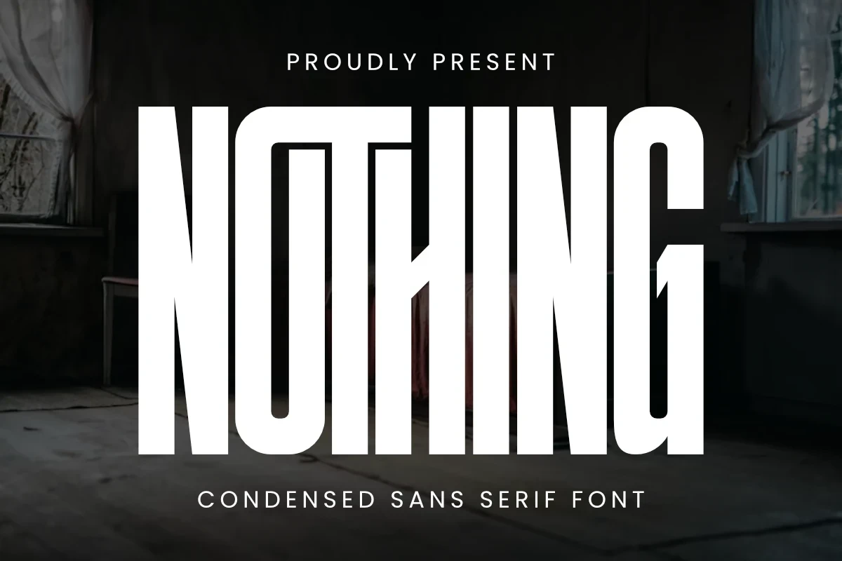
Best For: logos, branding, packaging, posters
For posters and packaging, Nothing Font adds sharp top-left corners to an otherwise uniform, vertically oriented structure. That interruption creates a distinctive identity, though narrow spacing and tall letterforms make extended wording unsuitable.
Thinking Font
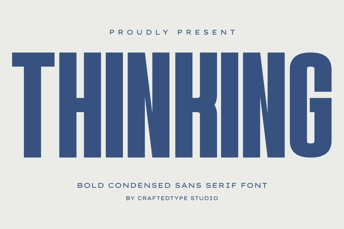
Best For: T-shirts, headlines, social media graphics, posters
Thinking Font combines high cap height, sharp vertical stress, and strong contrast for prominent display lettering. It works especially well on T-shirts, posters, and social graphics, although compressed spacing can crowd smaller words.
Praise Font

Best For: logos, branding, posters, headlines
Praise Font interrupts block forms with horizontal splits and cutout details, giving logos and posters a specific internal feature. Tight strokes can congest at small sizes, so its strongest results come from large, short display wording. Subtle ligatures are included.
Limited Font

Best For: branding, posters, headlines, social media graphics
Limited Font adds sharp internal angles to a monolinear, highly compressed structure. Its narrow profile saves horizontal space in headlines, posters, and logos, though long blocks and small settings remain difficult to read.
Polaroid Font

Best For: fashion branding, branding, packaging, posters
Polaroid Font pairs sharp angles with a uniform upright stance and minimal contrast. Its narrow forms support fashion branding, packaging, and posters at substantial scale; TTF and OTF availability helps integrate it into design and print workflows.
Serif Construction Exception
This lone serif departs from the collection's narrow sans-serif logic, using visible stroke rhythm and serif detail for short headings, names, and distinctive display phrases.
Edition Font

Best For: branding, posters, headlines, social media graphics
Edition Font is the collection's serif exception, using substantial weight and clear stroke rhythm rather than condensed sans-serif construction. These Condensed Sans Serif Fonts are not its role; reserve it for branding, names, headings, and short display phrases.
How to Choose the Right Font
Choose by construction before choosing by mood: squared, monolinear faces feel more controlled, rounded terminals soften the message, slant adds movement, and contrast or cutouts create a stronger signature. Use Condensed Sans Serif Fonts for short, large text, then test spacing and counters at the final size; reserve the serif exception for headings that need a different rhythm.