21 Best Geometric Sans Serif Fonts in 2026
This collection moves from open, circular letterforms to condensed constructions, squared block shapes, and heavily stylized display alphabets. These Geometric Sans Serif Fonts suit logos, packaging, posters, interfaces, signage, and headlines, with readability depending strongly on weight, spacing, aperture, and scale.
Looking for more sans serif fonts? Browse our complete Sans Serif Fonts collection to compare modern, elegant, bold, logo-friendly, and geometric sans serif styles.
Geometric Sans Serif Fonts
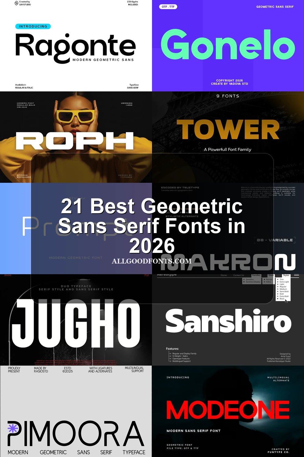
These Geometric Sans Serif Fonts use open counters, low contrast, and rounded or squared details for a comparatively readable range, bridging display branding and supporting text.
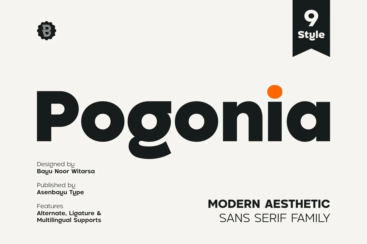
Pogonia Font
Best For: posters, social media graphics, logos, product labels
Pogonia Font builds its Geometric Sans Serif Fonts character from uniform strokes, circular counters, upright forms, and generous apertures. That low-contrast construction remains clear in posters, labels, and headlines, though its bold presence is primarily intended for display scale.
Gonelo Font
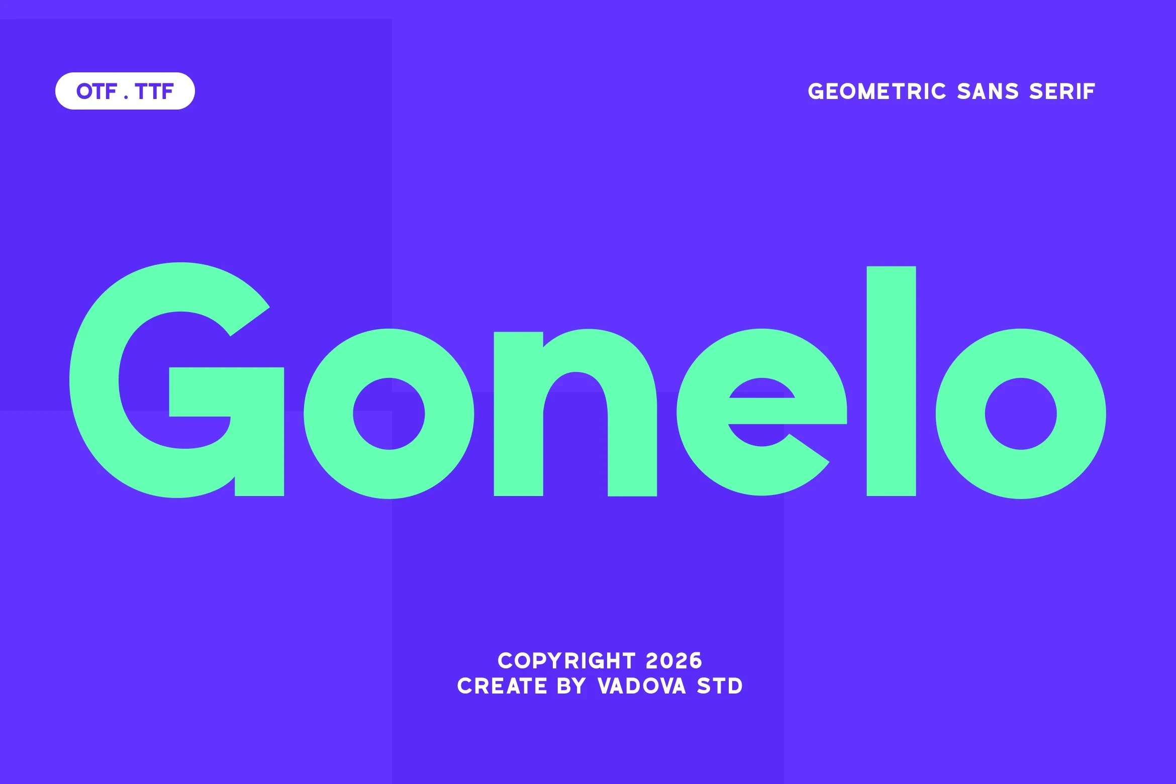
Best For: branding, display text, clean designs
Gonelo Font pairs wide proportions with uniform strokes and circular, open letterforms. The broad shape gives branding and display text a generous presence, although its distinctions become less dependable at very small sizes.
Etermal Font
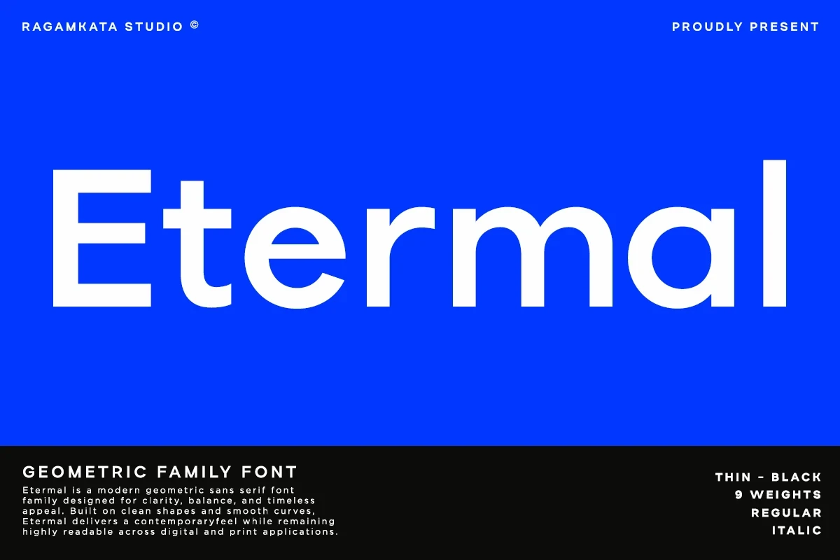
Best For: modern designs, clean designs, professional designs, display text
Etermal Font gives Geometric Sans Serif Fonts a broader practical role through low contrast, squared terminals, and open counters in e, a, and m. Its clear, restrained construction holds up in display settings and at smaller text sizes.
Prompt Font
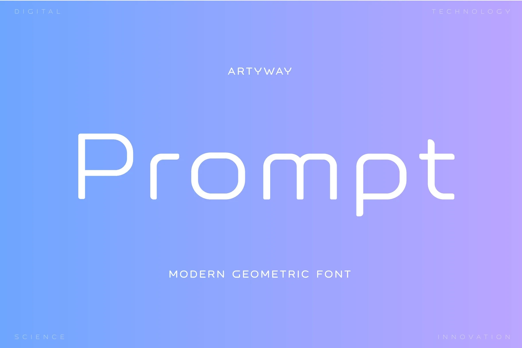
Best For: product labels, display text, clean designs
Prompt Font softens a consistent geometric stroke with rounded corners and terminals while keeping its apertures open. Its medium weight can bridge headers and supporting text, especially in labels and interface-like product graphics.
Neueral Grotesk Variable Font

Best For: business cards, logos, branding, display text
Neueral Grotesk Variable Font combines wide low-contrast geometry, rounded corners, broad apertures, and supplied ligatures. The open construction supports legible branding and display work, while ligatures add a controlled typographic point of distinction.
Cenura Font

Best For: display text, modern designs, clean designs, premium designs
Cenura Font uses circular-inspired curves, a vertical axis, and generous spacing to create an open geometric texture. The breathing room supports readable medium and large display text while giving identity work a more refined finish.
Heavy Wide Display Geometrics
Heavy, wide forms dominate this group, using dense counters, squared terminals, and extended proportions to create strong headline and logo silhouettes rather than small-text flexibility.
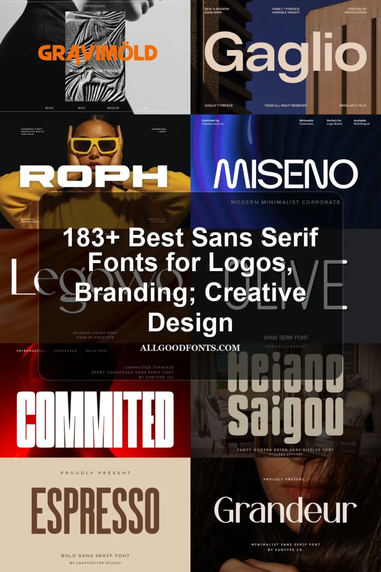
Roph Font
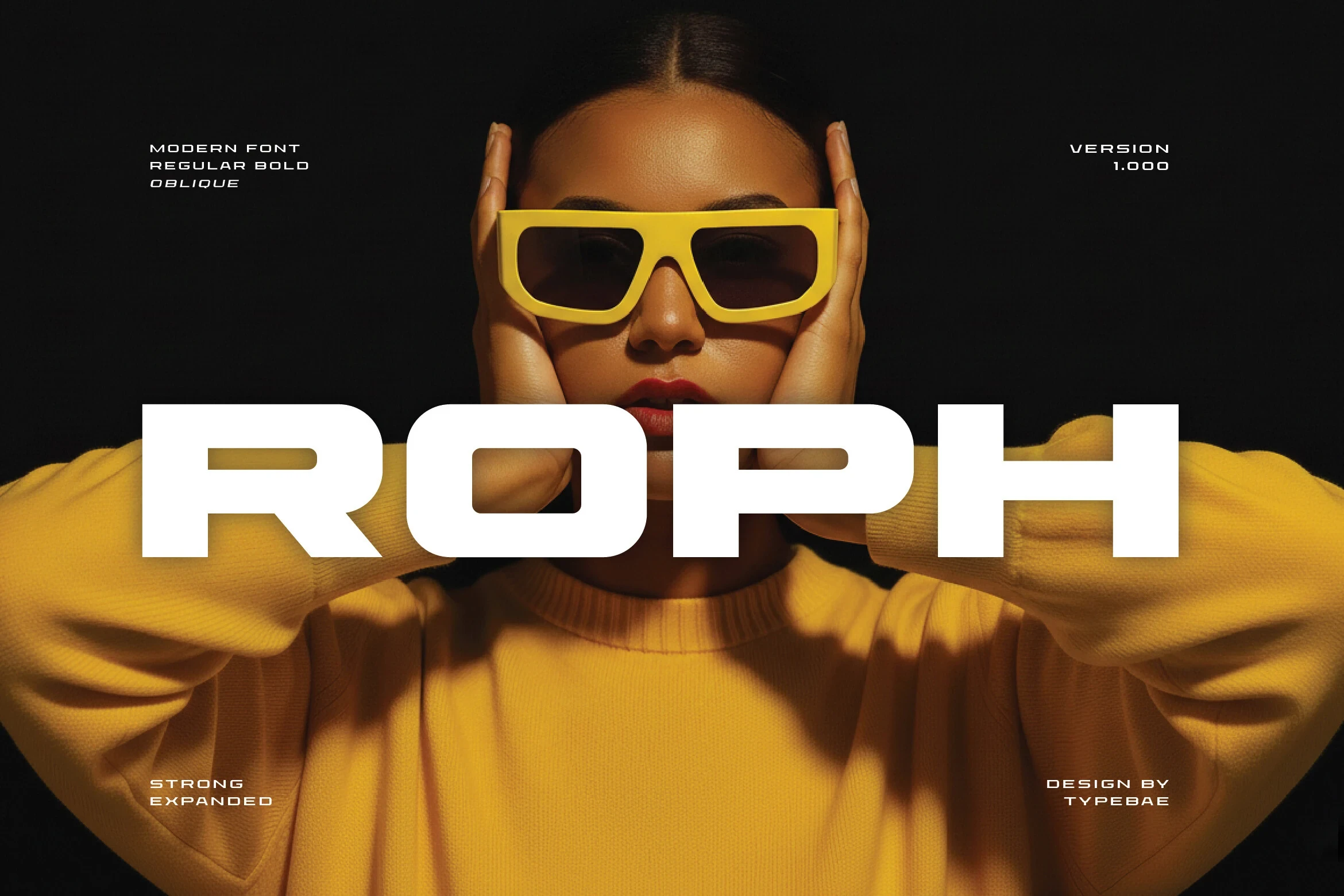
Best For: branding, display text, modern designs
Roph Font delivers an ultra-bold, expanded silhouette with square-leaning forms and a large x-height. Its forceful counters and limited negative space make headlines and wordmarks effective, while dense layouts and small text quickly become crowded.
Modeone Font
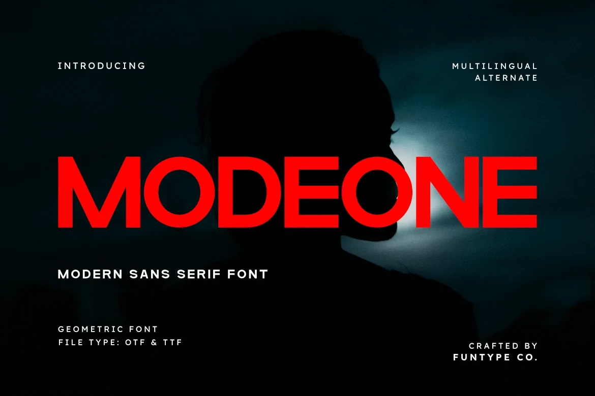
Best For: branding, headlines, logos, display text
Modeone Font suits logos and headlines through heavy wide forms, sharp squared terminals, and closed counters. Its block-like construction reads clearly at display size, but the dense interiors can crowd together when lettering is set small.
TRT Makron Font
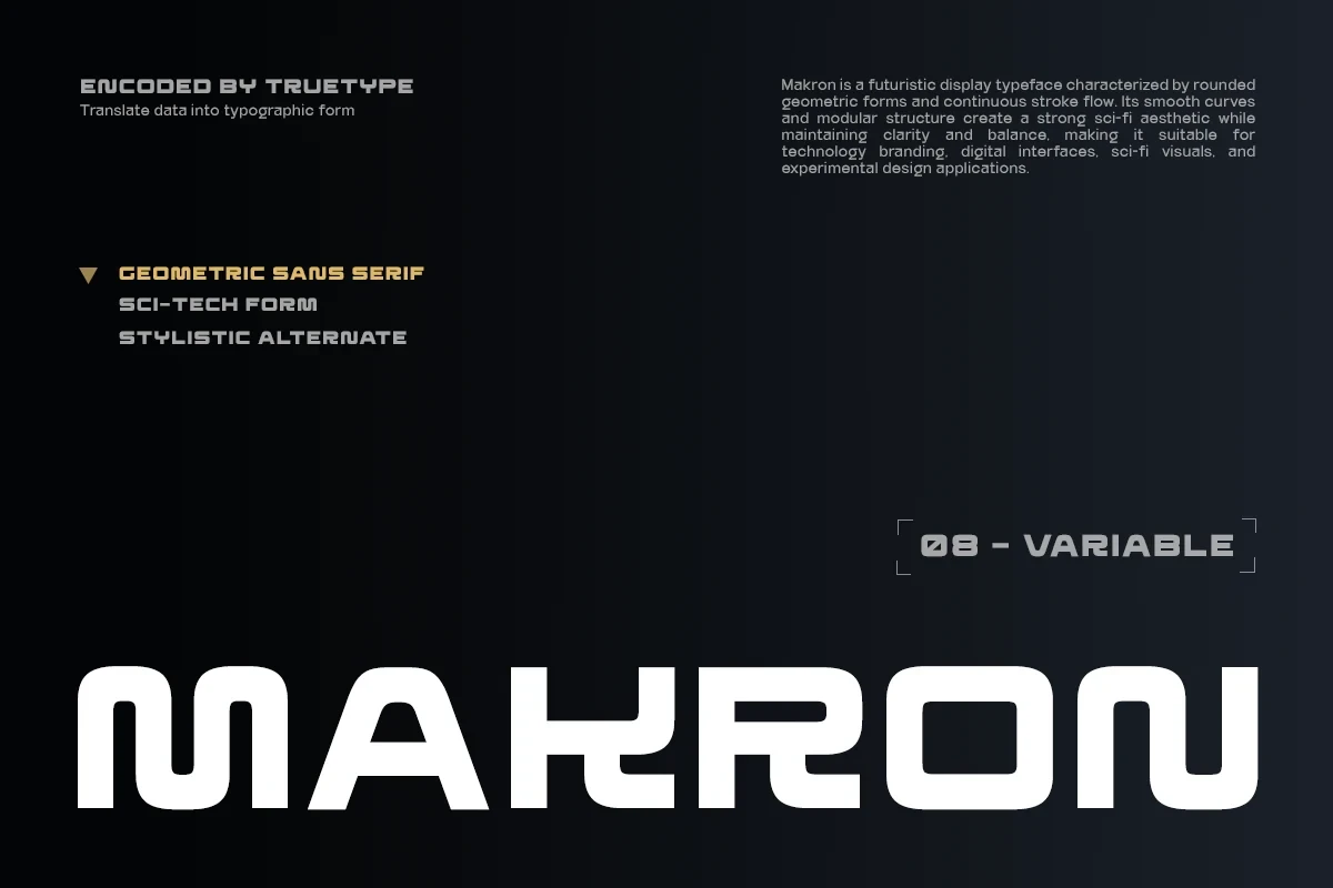
Best For: branding, social media graphics, display text
TRT Makron Font uses heavy modular lettering, rounded corners, wide horizontals, and a continuous-looking stroke flow. Its large-scale construction creates a technological identity, but the thick strokes leave little room for information-dense applications.
Tower Font
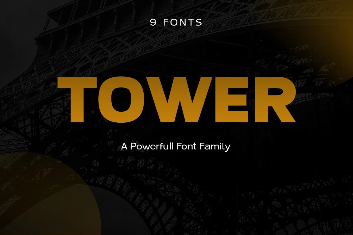
Best For: branding, packaging, headlines, logos
Tower Font relies on flat horizontal terminals and squared wide proportions for a block-like silhouette. Its thick lettering is dependable for signage, packaging, and logos, but offers little flexibility when text must remain small or information-rich.
Pragos Font
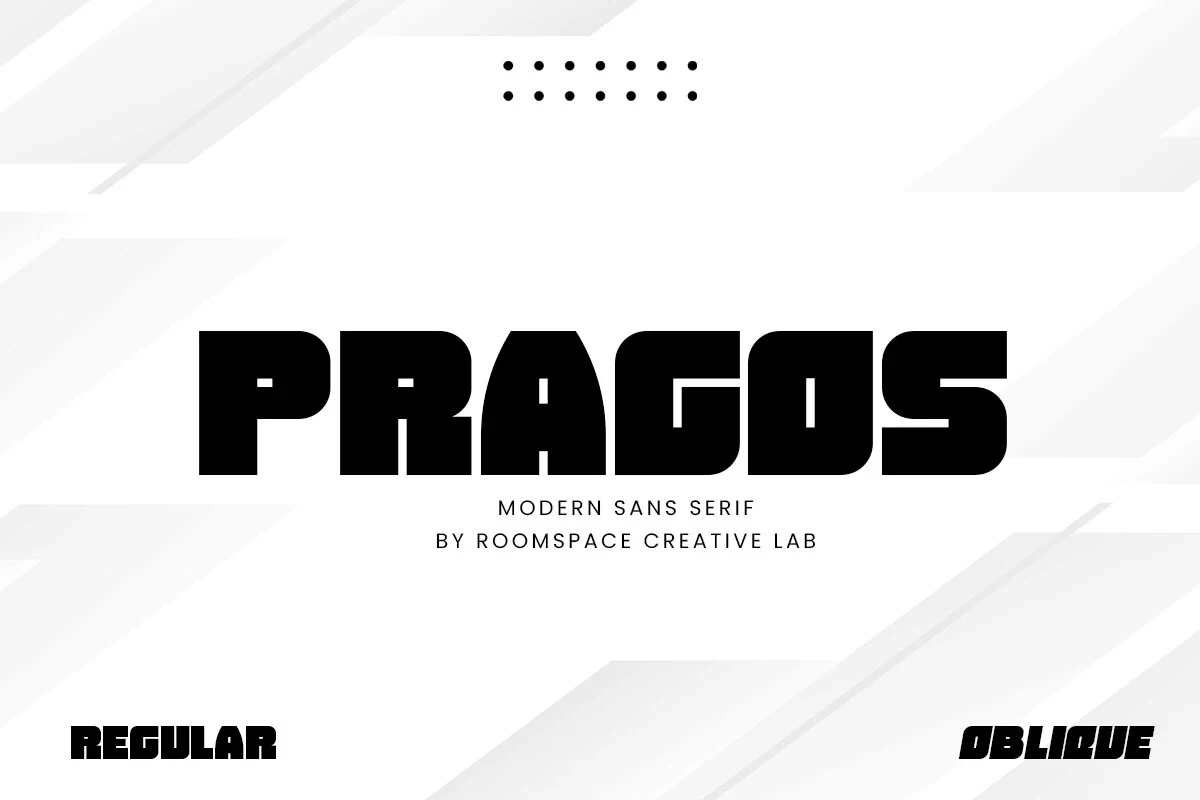
Best For: display text, modern designs, minimal designs
Pragos Font is a Geometric Sans Serif Fonts choice for ultra-bold extended headlines, pairing tight apertures with sharp angular corners and an available oblique. The upright and slanted styles shift the direction of a headline, but need generous sizing.
Bigbold Font
Best For: branding, headlines, logos, social media graphics
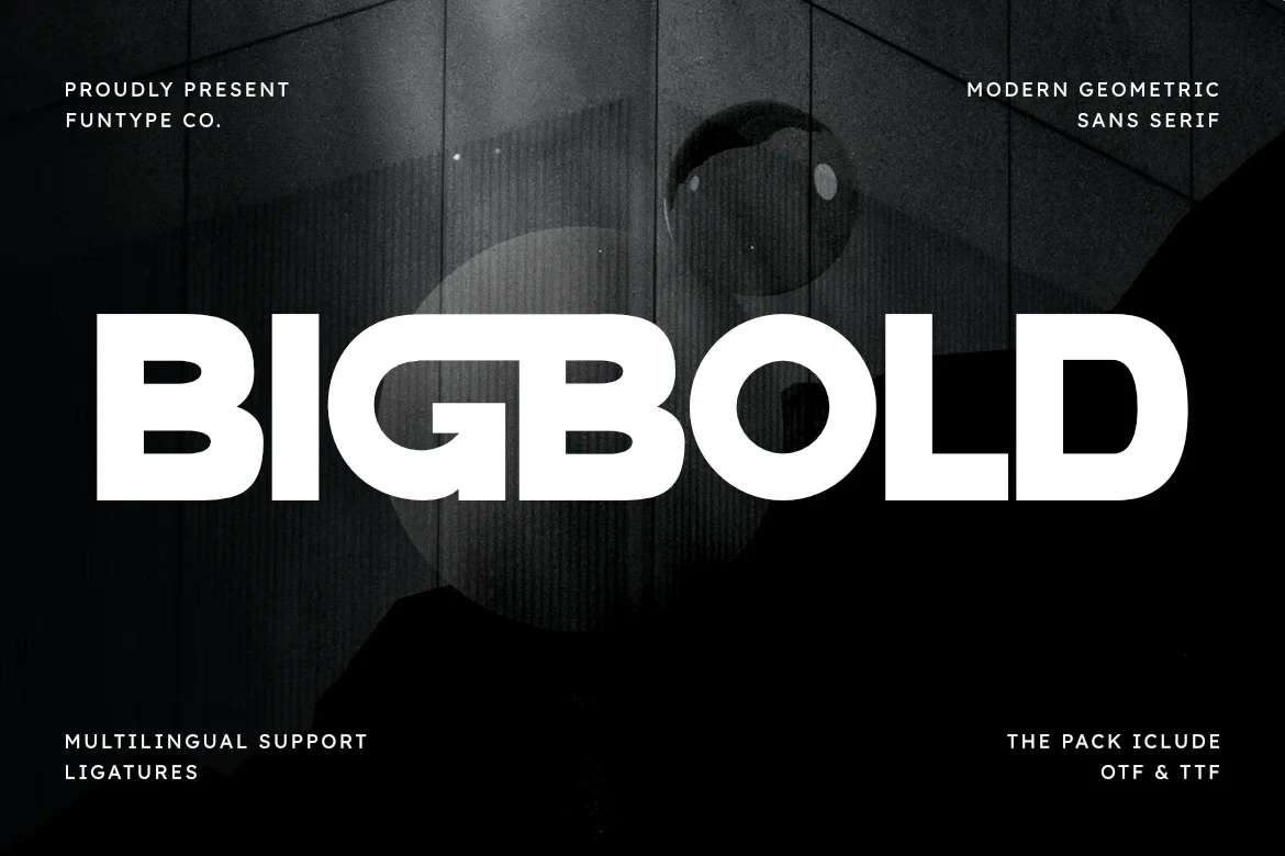
Bigbold Font combines extreme weight, extended proportions, ligatures, and multilingual support. It covers broad branding and headline needs effectively, while its dense construction and rounded exterior corners make large display settings the safest application.
Condensed And Compact Forms
Condensed widths, tall or low x-heights, and tight spacing define these compact faces, preserving headline presence where horizontal room is limited but restricting body-copy comfort.
Minigap Font
Best For: display text, modern designs, minimal designs
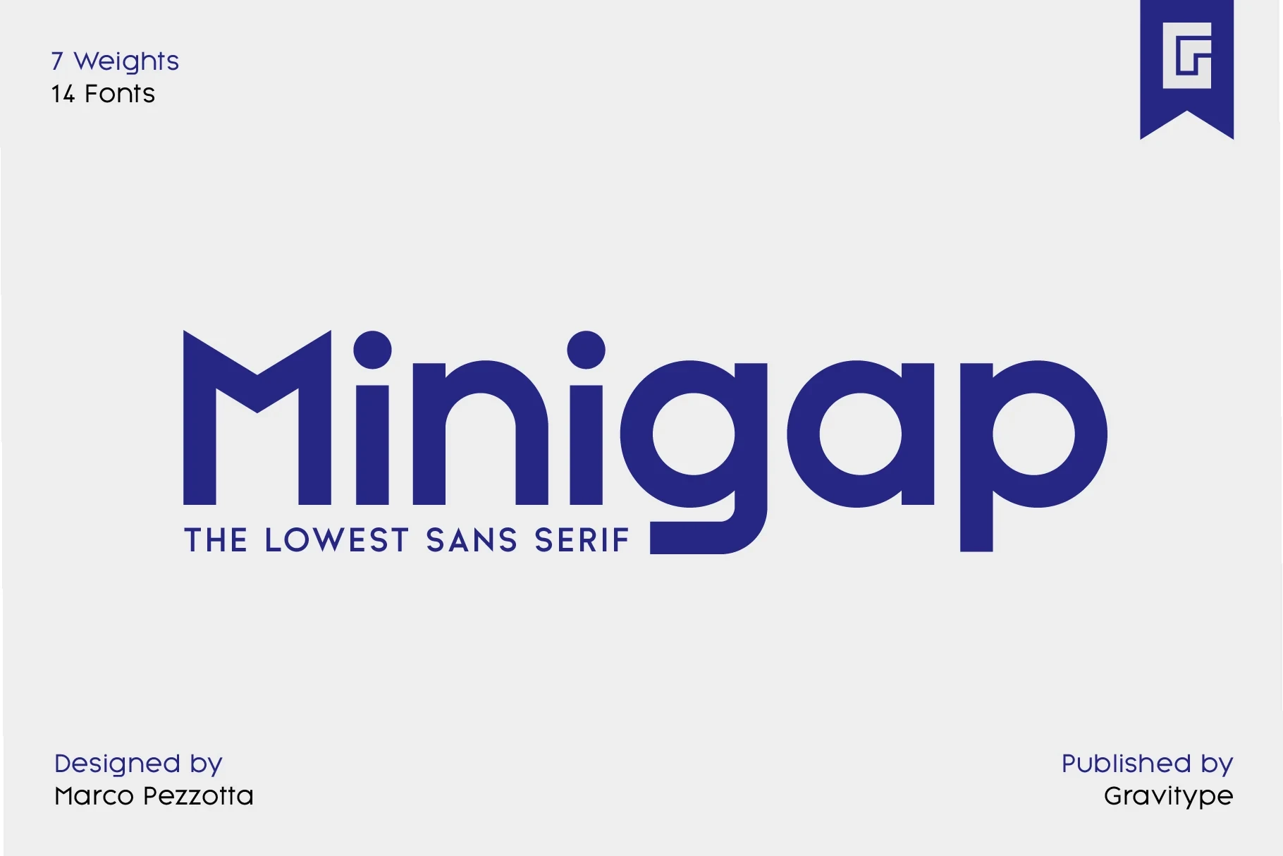
Minigap Font is a Geometric Sans Serif Fonts option with an unusually low x-height, circular counters, and a compact visual rhythm. It works best for oversized titles and short statements; the compressed profile is uncomfortable for long-form reading.
Jugho Font
Best For: magazine covers, branding, packaging, posters
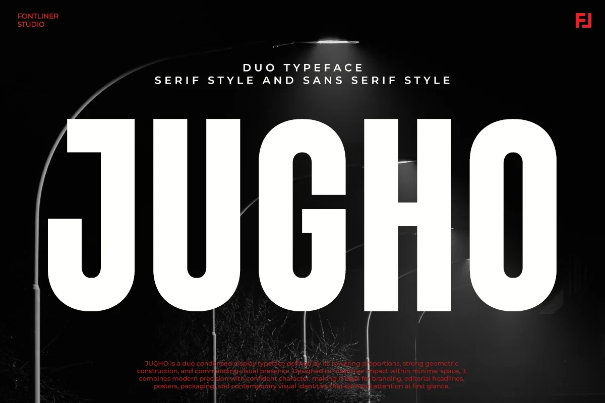
Jugho Font compresses geometric forms into a tall, tightly packed silhouette with a high x-height and heavy strokes. That vertical economy suits covers, posters, and packaging, while its thick construction is better reserved for short display text.
Ecliso Font
Best For: branding, display text, headlines
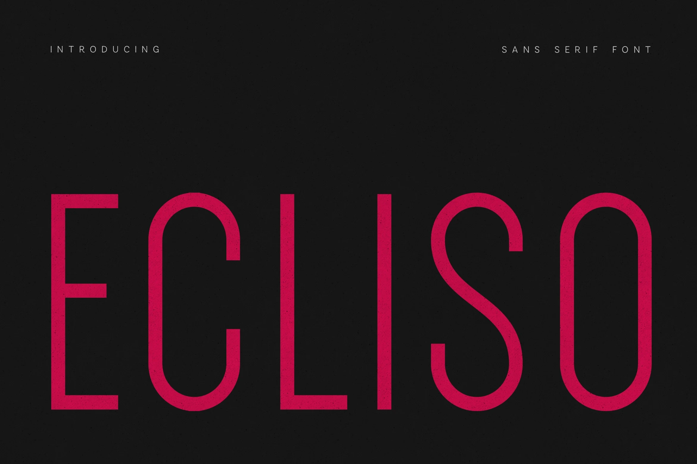
Ecliso Font uses condensed monoline forms, rounded terminals, and close spacing to maximize headline presence in narrow layouts. That compressed rhythm is effective for short titles and branding, but unsuitable for comfortable body text.
Stylized And Flexible Geometrics
These stylized designs bend geometric rules through unusual crossbars, overlaps, slants, modified letterforms, and weight ranges, giving identity work more character than the straightforward groups.
Pimoora Font
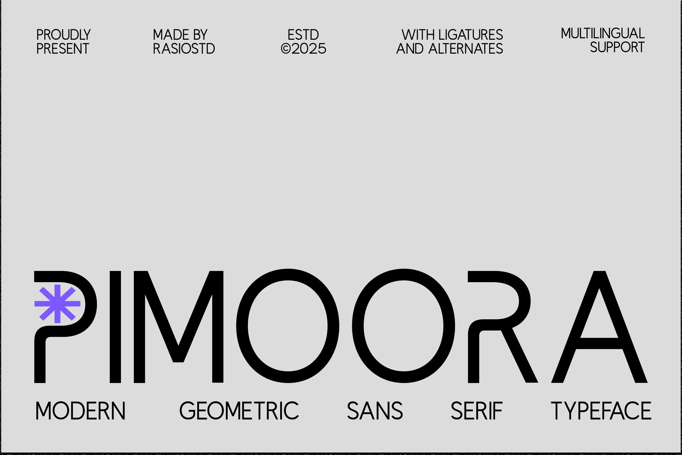
Best For: branding, website headers, display text
Pimoora Font sets thick and thin strokes within a wide geometric structure, with open apertures and a stretched horizontal P bar. It reads best in large branding and headers; the stylized P and structural gaps can reduce small-size clarity.
Drixon Font
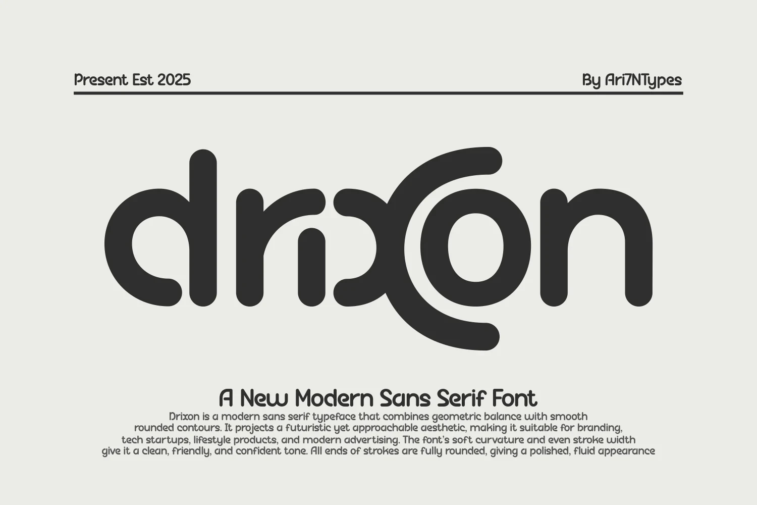
Best For: display text, soft designs, packaging
Drixon Font uses monoline lettering, fully rounded terminals, and deliberately overlapping x and o forms. The middle-letter interaction creates a recognizable signature for packaging and display work, but the overlap can soften clarity when the design is reduced sharply.
Cult Font
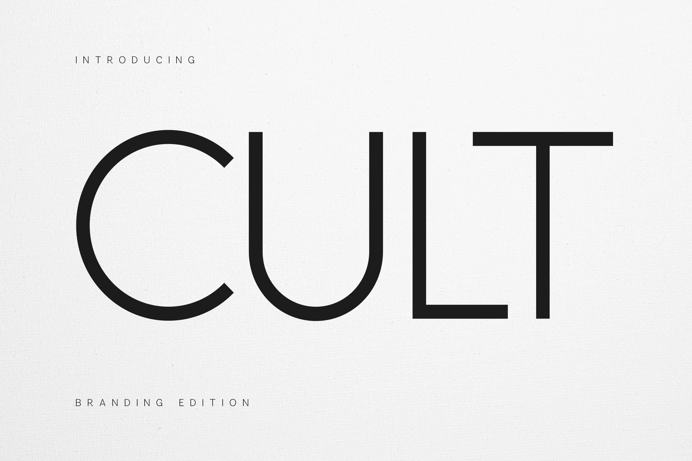
Best For: branding, display text, clean designs
Cult Font is identified by its high T crossbar and extended C and U apertures. Those open side forms preserve display legibility while giving branding a precise signature, achieving distinction through construction rather than decorative additions.
Ragonte Font
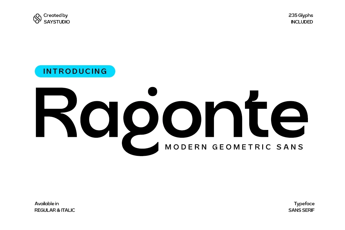
Best For: branding, display text, headlines, modern designs
Ragonte Font combines wide rounded geometry with a right-leaning option and a lowercase g marked by a floating dot. The slant adds movement to headings and identity work, although that unusual g may slow extended reading.
Hugos Font
Best For: logos, branding, headlines, display text
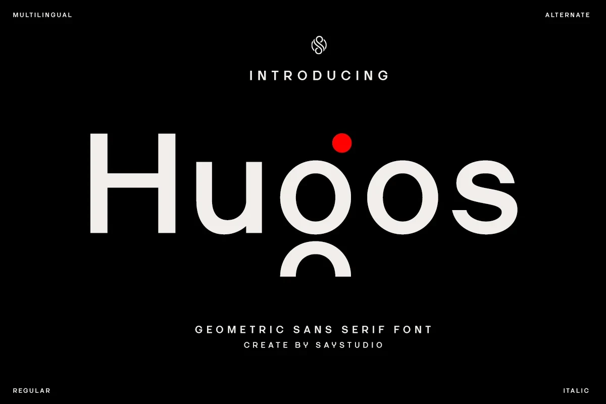
Hugos Font pushes circular geometric forms into an abstract display system. The unusual shaping is most effective when recognition comes from a logo or short headline, not from sustained reading, where its altered characters become demanding.
Sanshiro Font
Best For: headlines, social media graphics, display text, modern designs
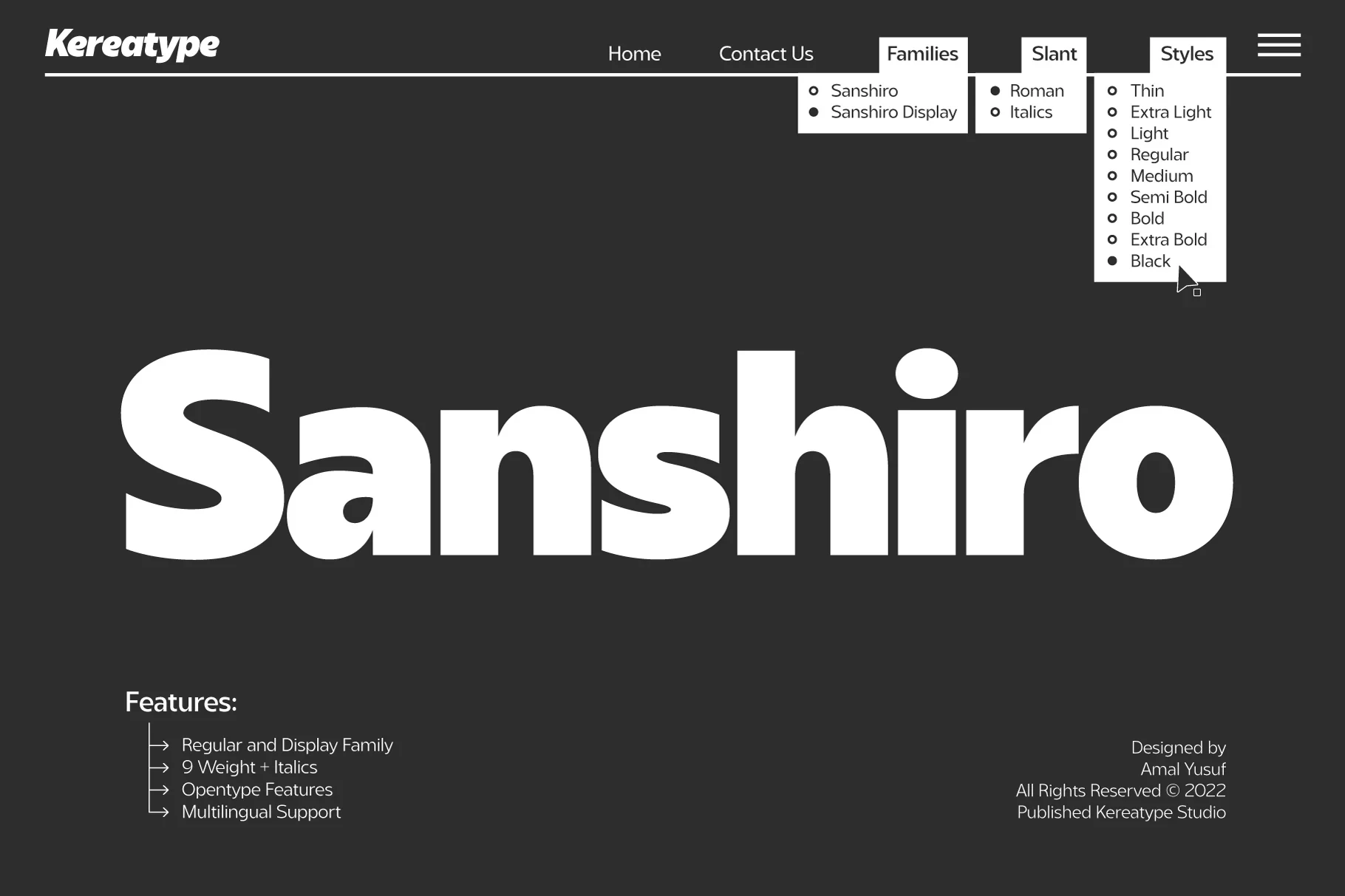
Sanshiro Font expands the Geometric Sans Serif Fonts toolkit with Thin-to-Black weights and slant variations. One underlying construction can move from restrained supporting text to forceful headlines, though the heavier cuts are most reliable at display sizes.
How to Choose the Right Font
Choose open counters, generous spacing, and moderate weight when readability must extend beyond headlines; Etermal, Prompt, and Cenura offer the broadest working range. For impact, move toward wide heavy faces such as Roph or Tower, while condensed and stylized options belong in short, large-scale compositions. Match the Geometric Sans Serif Fonts choice to viewing distance first.