20 Best Luxury Logo Fonts in 2026
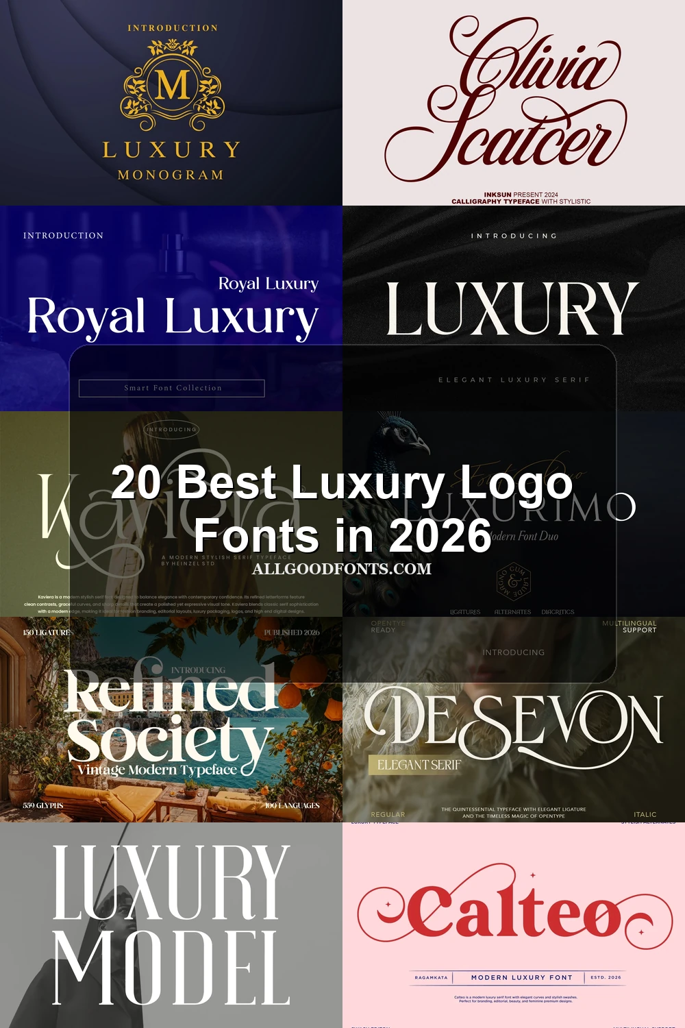
This collection spans high-contrast serifs, sweeping swashes, connected scripts, period-inspired forms, and geometric display faces. These Luxury Logo Fonts serve different identity roles, from readable monograms and product labels to expressive fashion wordmarks that need careful control of scale and spacing.
Looking for more logo fonts? Browse our complete Logo Fonts collection to compare logo-friendly logo styles.
Luxury Logo Fonts: High-Contrast Serif
These Luxury Logo Fonts share upright, high-contrast serif construction, but vary from controlled monogram forms to pointed, slab-like, or ligature-led marks. Their strongest use is large-scale identity work.
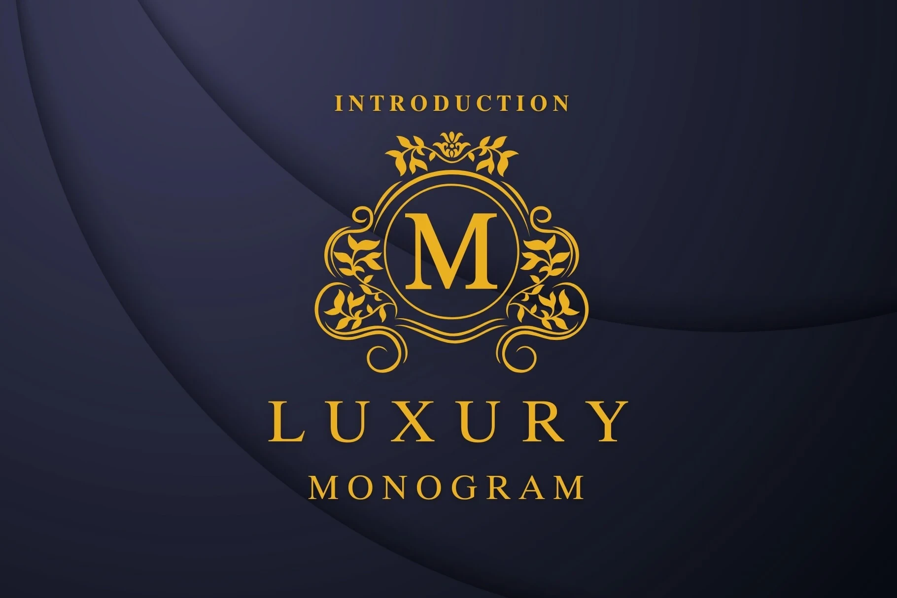
Luxury Monogram Font
Best For: branding, business cards, headlines, invitations
For a controlled monogram or formal identity, Luxury Monogram Font uses consistent uppercase forms, bracketed serifs, and a vertical axis. The letters remain clear in headlines and branding, although fine serif details may disappear when the mark is scaled down.
Papillon Serif – Elegant Modern Luxury Font

Best For: branding, logos, headlines
Papillon Serif – Elegant Modern Luxury Font uses wide all-caps proportions, geometric balance, and pronounced thick-thin contrast. Its large-size clarity suits headline logos and high-end designs, while compact identity applications may lose the delicate stroke separation.
Grandeur – Elegant Classic Serif Font

Best For: logos, magazine covers, display text
Grandeur – Elegant Classic Serif Font sharpens its display structure with pointed serifs and open letterforms. It gives logos and magazine covers an editorial edge, but its thin strokes need generous size; the paired sans treatment is safer for smaller supporting text.
Royal Luxury Font
Best For: high-end designs, logos, product labels, display text
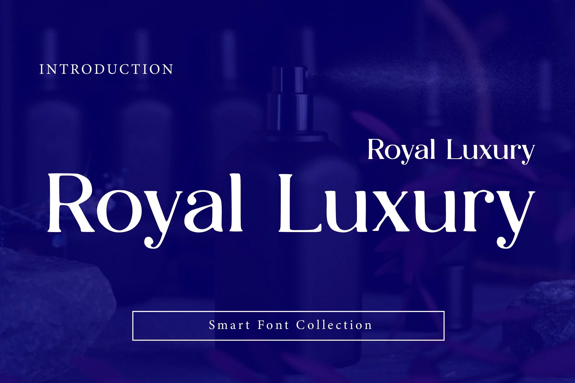
Royal Luxury Font is identified by sharp triangular serifs and a ball terminal on the lowercase y. Its high contrast makes product labels and logos distinctive at large scale, but the specific details are not intended for body-sized applications.
Patcher Font

Best For: fashion branding, logos, branding, packaging
Patcher Font establishes a firm base with wide proportions and flat-bottomed, slab-like serifs. Its high-contrast display presence reads clearly in fashion and packaging logos, but the structure loses usefulness when reduced to small text sizes.
Luxury Font

Best For: logos, display text, elegant designs, luxury designs
Luxury Font offers a clean display structure with disconnected letterforms, sharp bracketed serifs, and high-contrast strokes. Its clear large-scale lines support logo clarity, while the thin strokes still require generous size for reliable reproduction.
Swash-Driven Wordmarks
This group builds its personality through sweeping terminals, unusual letter gestures, and integrated flourishes. Compared with the serif and modern groups, its decorative movement demands more space and slower reading.
Stanza Font

Best For: logos, posters, display text
Stanza Font creates a tightly interlocked wordmark through overlapping swashes on the capital S and A. Its high-contrast serif structure looks striking at logo scale, but the crowded joins can weaken letter recognition when reduced.
Silkydusk Font
Best For: beauty branding, logos, branding
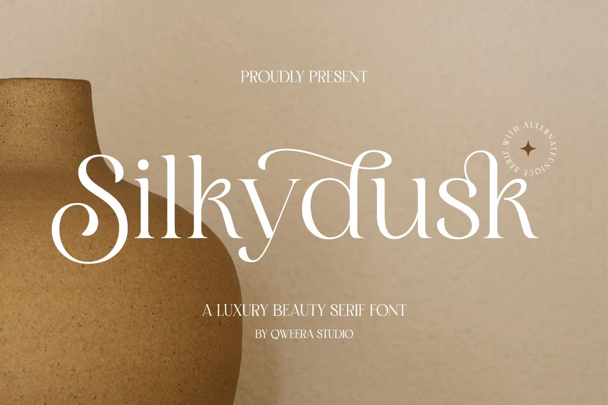
Silkydusk Font combines an upright, high-contrast serif with flowing initial and terminal swashes. Built-in ligatures and alternate characters expand its customization, making it especially useful for beauty branding and short display names rather than sustained copy.
Drose Font
Best For: fashion branding, logos, packaging
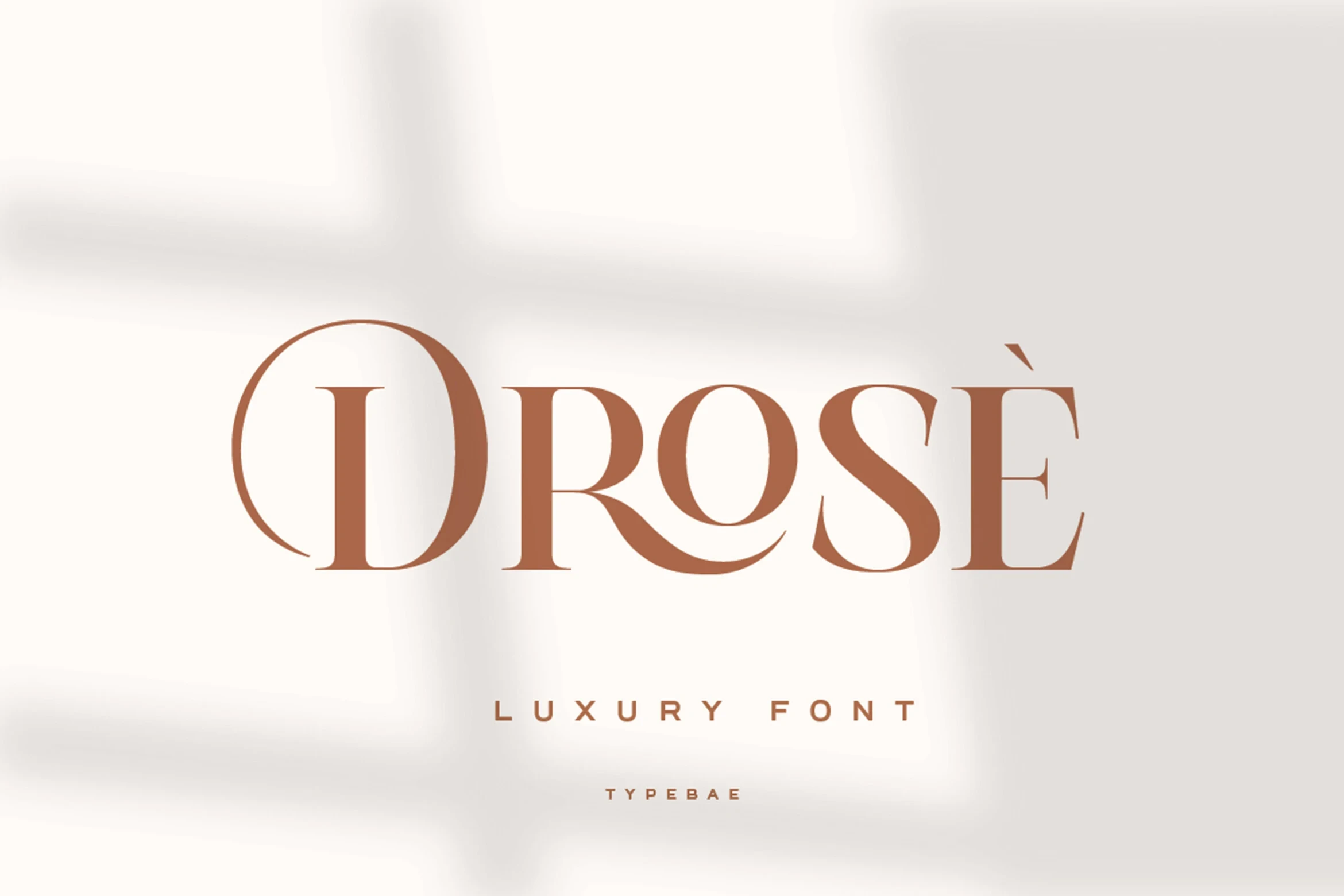
Drose Font makes the wordmark gesture part of the lettering: the R tail extends beneath neighboring forms, while a D flourish reaches outward. Those details support fashion branding at display size but become harder to parse in tiny applications.
Montega Font
Best For: logos, branding, beauty branding, fashion branding
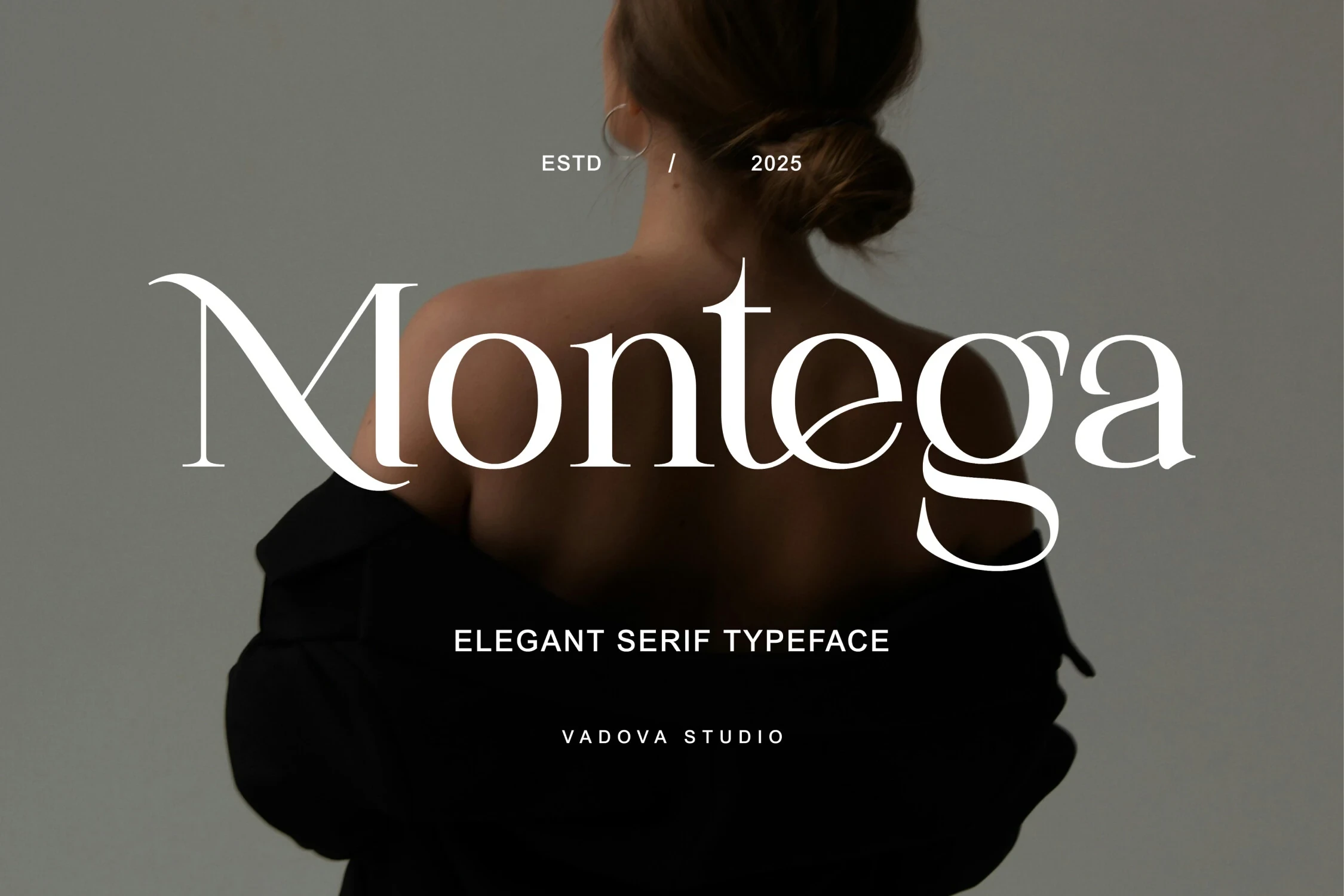
For large identity placements, Montega Font balances sharp elongated serifs with open counters that preserve internal clarity. Its delicate swashes add character to branding and fashion work, though high contrast and fine terminals become less dependable on small labels.
Desevon Font
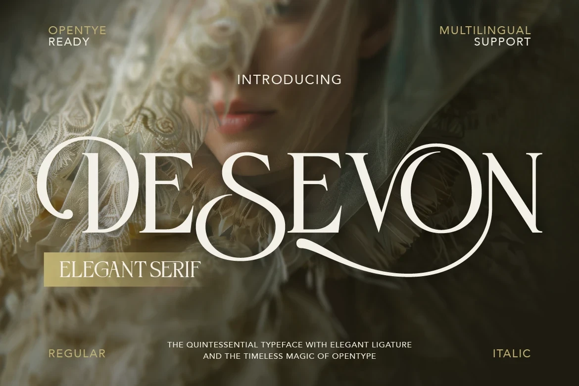
Best For: branding, beauty branding, high-end designs, logos
Desevon Font leans right through thin horizontal serifs and sweeping decorative strokes. Its ligatures allow more customized logos, but the fine flourishes and high contrast need generous reproduction size, making it a display choice rather than a text face.
Kaviera Font

Best For: fashion branding, logos, branding
Kaviera Font gives its swashes room to travel through wide, open proportions and curved terminals. That expanded construction suits broad wordmarks and fashion branding, while tightly constrained labels leave less space for its decorative reach.
Calteo Font

Best For: creative projects, high-end designs, logos, display text
Calteo Font draws the wordmark as one organic gesture, using irregular curves and overlapping end swashes. The connected construction feels expressive in logos and creative projects, though its decorative joins can slow quick reading when the mark is reduced.
Ragam Luxury Font
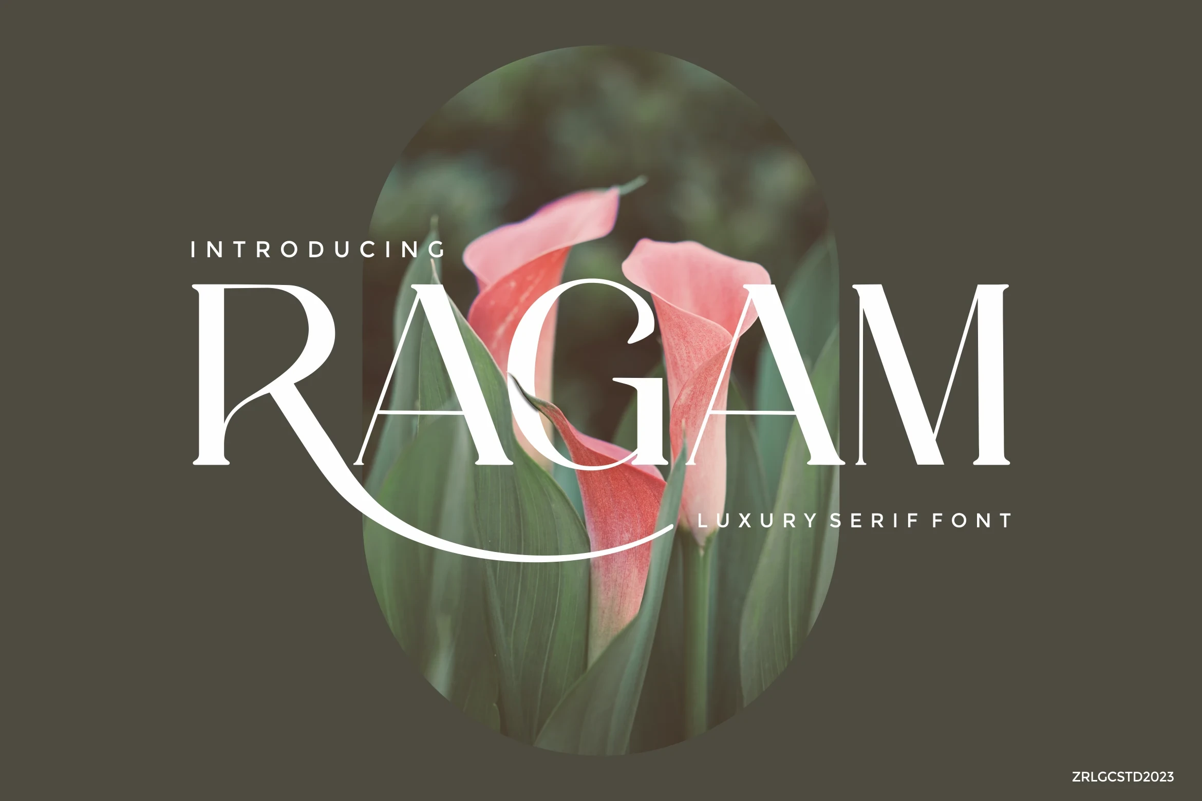
Best For: high-end designs, logos, magazine covers, display text
Ragam Luxury Font keeps an upright pointed-serif structure but extends the R into an editorial swash. It makes a strong title mark for logos and magazine covers; delicate contrast limits its usefulness for small supporting applications.
Modern and Period-Inspired Marks
These faces reinterpret display branding through contemporary geometry or period character. They offer more organized reading than swash-heavy designs while still giving short names a distinctive visual direction.
Luxury Model Font

Best For: logos, packaging, creative projects
Luxury Model Font softens the formal serif category with slender strokes, rounded shapes, and a playful contemporary construction. Its distinctive letters are easiest to judge in names, packaging, and short logo phrases where the display proportions remain visible.
Glamour Luxury Family Font

Best For: branding, packaging, posters, headlines
Glamour Luxury Family Font brings a clear stroke rhythm to expressive display shapes, giving its Luxury Logo Fonts a more organized contemporary read. It is practical for short brand names, packaging fronts, posters, and headline-length wording.
Refined Society Font
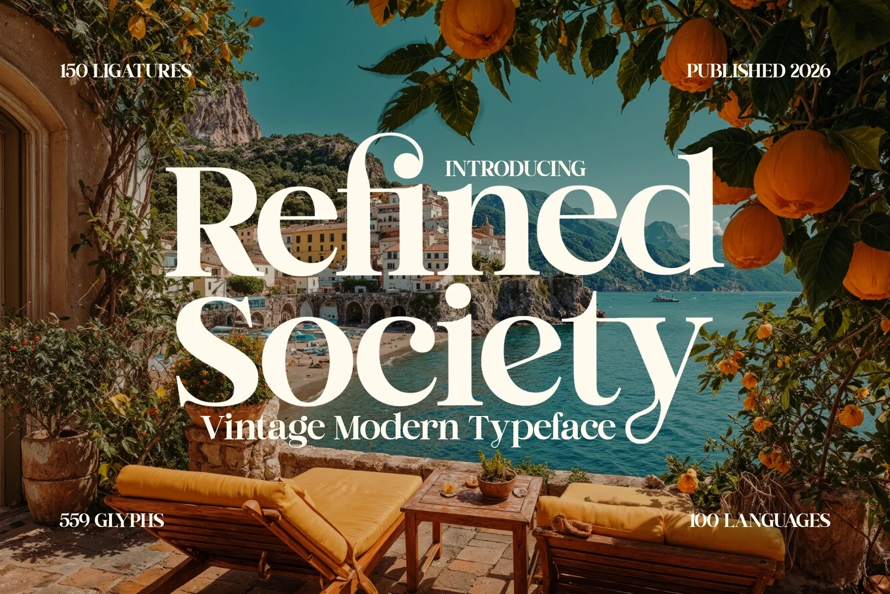
Best For: logos, branding, high-end designs, display text
Refined Society Font introduces a period-inspired direction to Luxury Logo Fonts, with expressive forms and a clear stroke rhythm. Its historical character works best for short branding and display text where personality matters more than neutral corporate reading.
Modern Luxury Font
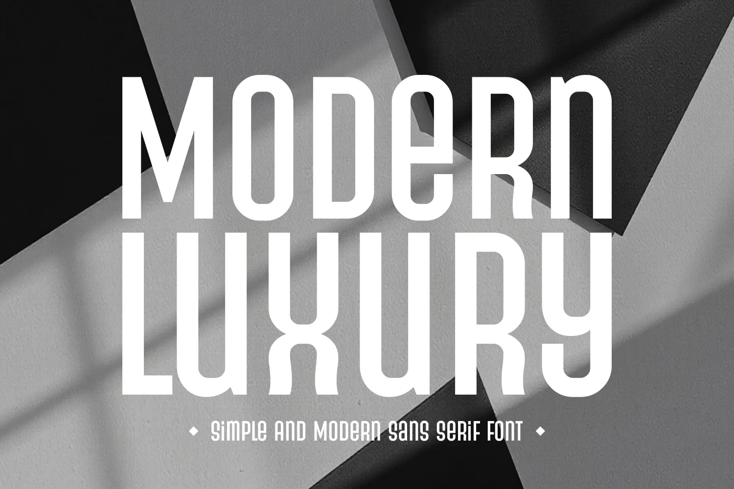
Best For: logos, branding, fashion branding
Modern Luxury Font shifts the category toward a condensed, monolinear display sans. Rounded exteriors, squared interiors, tall proportions, and tight spacing create a technical mark suited to large headings, fashion branding, and structured identity systems.
Connected Script Accents
Connected handwriting supplies movement and personality, either beside a legible serif or as the entire mark. These options are best treated as signatures, names, and accents rather than extended text.
Luxurimo Font

Best For: logos, branding, packaging
Luxurimo Font pairs a readable high-contrast serif with a genuinely connected handwritten accent. The serif can carry the main identity, while the script works better as a secondary signature; its decorative joins should not be asked to handle long wording.
Olivia Scatcer Font

Best For: branding, packaging, personal branding
Olivia Scatcer Font uses bold connected handwriting to create continuous movement without a separate serif pairing. Its substantial display weight works well for names and signatures, but the joined construction is better for short branding than extended reading.
How to Choose the Right Font
Choose first by construction: connected scripts and overlapping swashes need the most space, while monograms and organized display faces offer steadier recognition. Check weight, contrast, joins, and flourishes at the final logo size. For Luxury Logo Fonts used on labels or small digital marks, favor open counters and simpler terminals over delicate decoration.