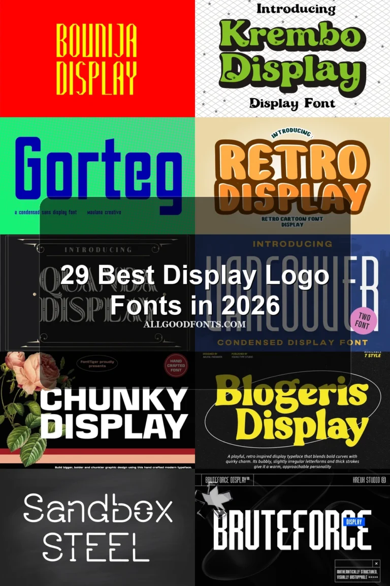
17 Best Bold Logo Fonts in 2026
This collection spans rounded monoline forms, serif and slab structures, period-led lettering, and connected brush or script styles. These Bold Logo Fonts serve different design roles, from readable wordmarks and packaging names to expressive posters, invitations, labels, and social graphics.
Looking for more logo fonts? Browse our complete Logo Fonts collection to compare logo-friendly logo styles.

Bold Logo Fonts: Solid Display Forms
This group centers on heavy sans and rounded display construction, prioritizing quick recognition and clean impact. These Bold Logo Fonts are generally more direct and readable than the serif, period, or connected styles.
Cute Bold Font

Best For: logos, social media graphics, display text
Cute Bold Font pairs heavy monolinear strokes with rounded terminals and corners. Its upright, chunky construction keeps Bold Logo Fonts highly legible at medium and large sizes, making it effective for friendly marks, social graphics, and display accents.
Varsity Bold Font

Best For: logos, branding, posters, headlines
Varsity Bold Font uses a substantial stroke rhythm and period-inspired display letterforms. Its expressive shapes are easiest to judge in short names, headings, and Bold Logo Fonts where the character remains visible without crowding the layout.
Bold Block Font
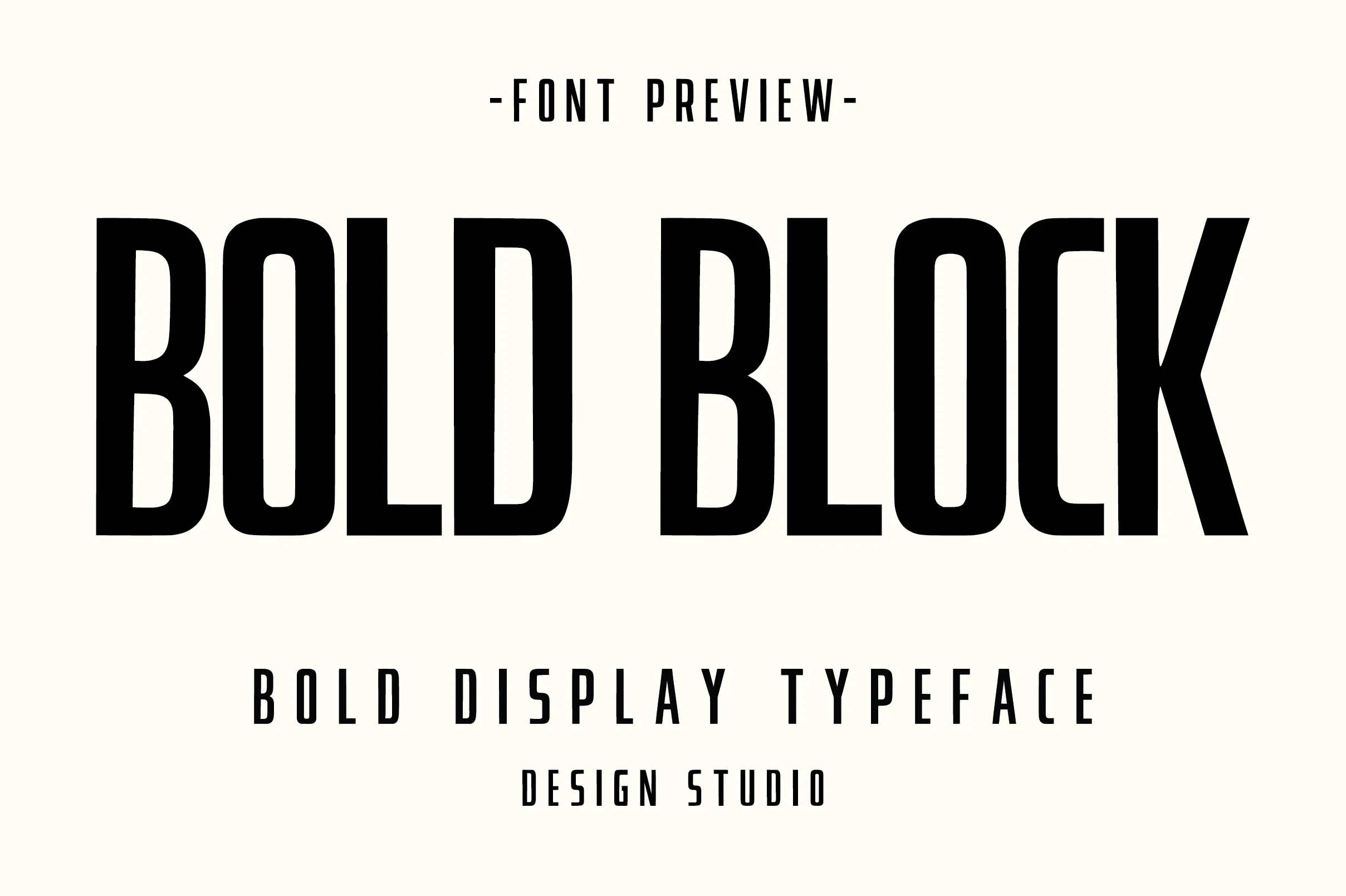
Best For: logos, branding, packaging, posters
Bold Block Font uses a straightforward heavy display construction with a clean contemporary rhythm. Its clear letterforms suit logos, packaging, and posters where a sturdy wordmark needs to be recognized quickly.
Bold Font

Best For: social media graphics, logos, branding, packaging
For short logo and packaging names, Bold Font offers an uncomplicated heavy display profile and dependable clarity. With no specialized serif, script, or texture feature indicated, its strength is direct reading across headings, brand marks, and social graphics.
Ridge 5 Bold Font
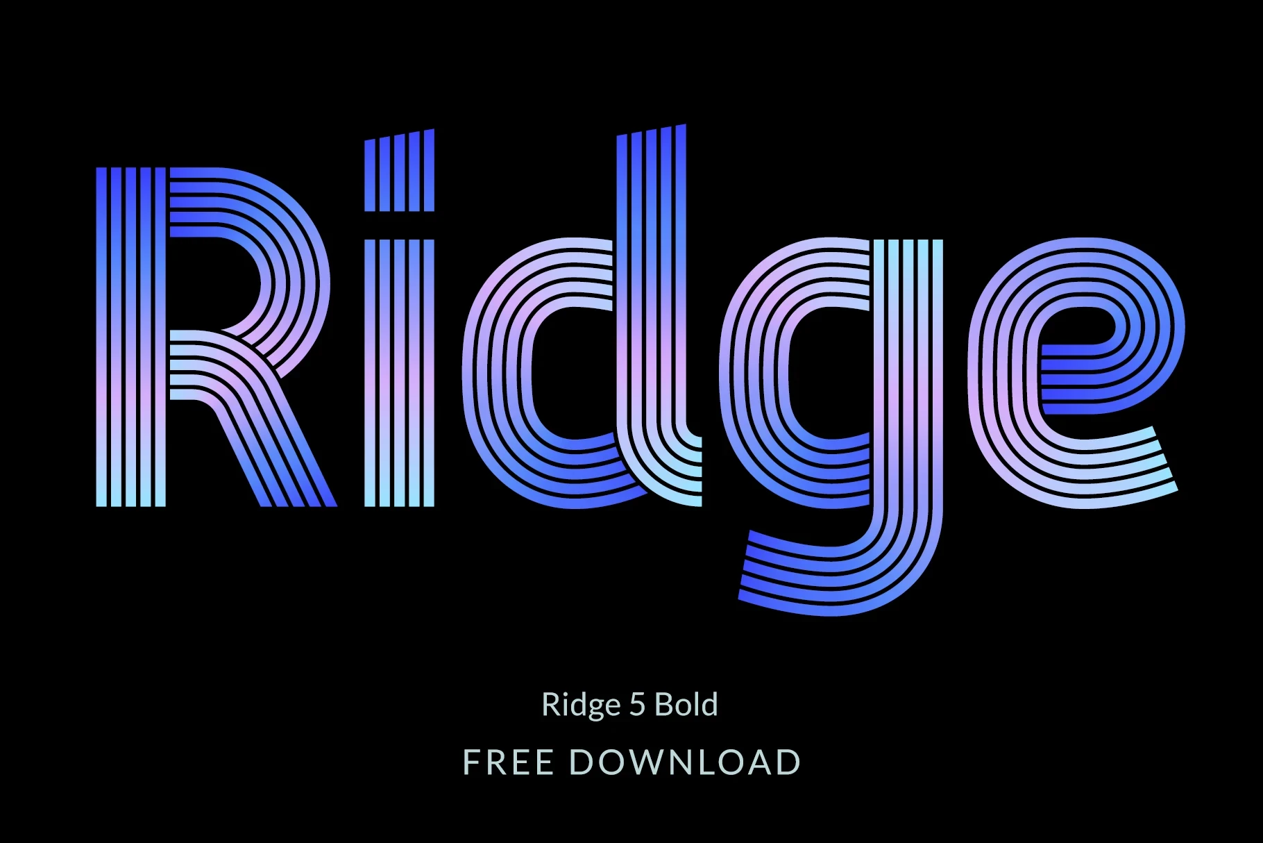
Best For: logos, social media graphics, display text, wall art
Ridge 5 Bold Font builds its expressive heavy foundation around distinctive display lettering and included alternate characters. Those alternates let a logo or wall-art treatment vary its letter shapes while keeping the overall wordmark visually strong.
Line Bold Font

Best For: logos, display text, bold designs, expressive designs
Line Bold Font relies on a heavy display weight and clear stroke rhythm for its expressive identity. It works best in brief logos or headlines, where viewers can compare the distinctive letter shapes easily at a glance.
Bold Sans Font
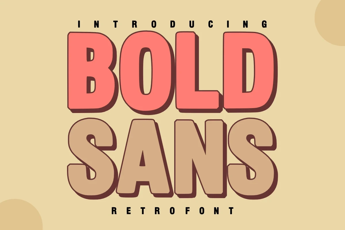
Best For: headlines, logos, display text, modern designs
For readable headlines and wordmarks, Bold Sans Font offers heavy sans-serif construction with a mixed nostalgic-modern tone. The absence of serif or script detailing keeps its display text clean while preserving a noticeable period character.
Bold Fresh School Font

Best For: T-shirts, logos, branding, posters
Bold Fresh School Font grounds its rounded, playful character in clean contemporary construction. The approachable forms fit T-shirts, logos, branding, and posters that need a youthful voice while maintaining clear display reading.
Bold Eater Font
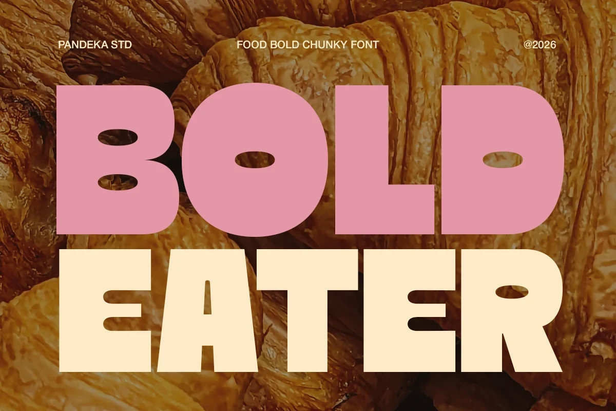
Best For: product labels, branding, packaging, posters
Bold Eater Font uses rounded display forms with a pronounced playful and expressive presence. Its character is particularly useful on product labels and packaging, where a short name can become a recognizable part of the visual identity.
Serif And Slab Logo Forms
Serifs and slabs give these forms stronger structural definition than plain display sans lettering. Their substantial strokes suit prominent wordmarks and large layouts, with a more formal or sturdy presence.
Mini Bold Font

Best For: logos, branding, posters, display text
For short, prominent wording, Mini Bold Font brings a heavy contemporary display serif structure. The serif details give Bold Logo Fonts more formal definition than a plain display face, while its clear rhythm keeps headings, posters, and brand names easy to assess.
Bold Sharp Font

Best For: logos, display text, modern designs, clean designs
Bold Sharp Font places sharp-edged serif styling inside a substantial modern frame. The serif-led construction gives a wordmark more definition than rounded sans lettering and works especially well in clean, high-impact display text.
Bold Chicago Font

Best For: logos, branding, packaging, posters
Bold Chicago Font combines wide, sturdy proportions with prominent block-style slab serifs. Its thick strokes and broad spacing make these Bold Logo Fonts especially readable at large scale, including posters, packaging, and substantial wordmarks.
Period-Led Display Forms
These display faces draw on period character while retaining clear, substantial construction. They bring historical flavor to short branding phrases without relying on the joined movement of script styles.
Bold Grunge Font
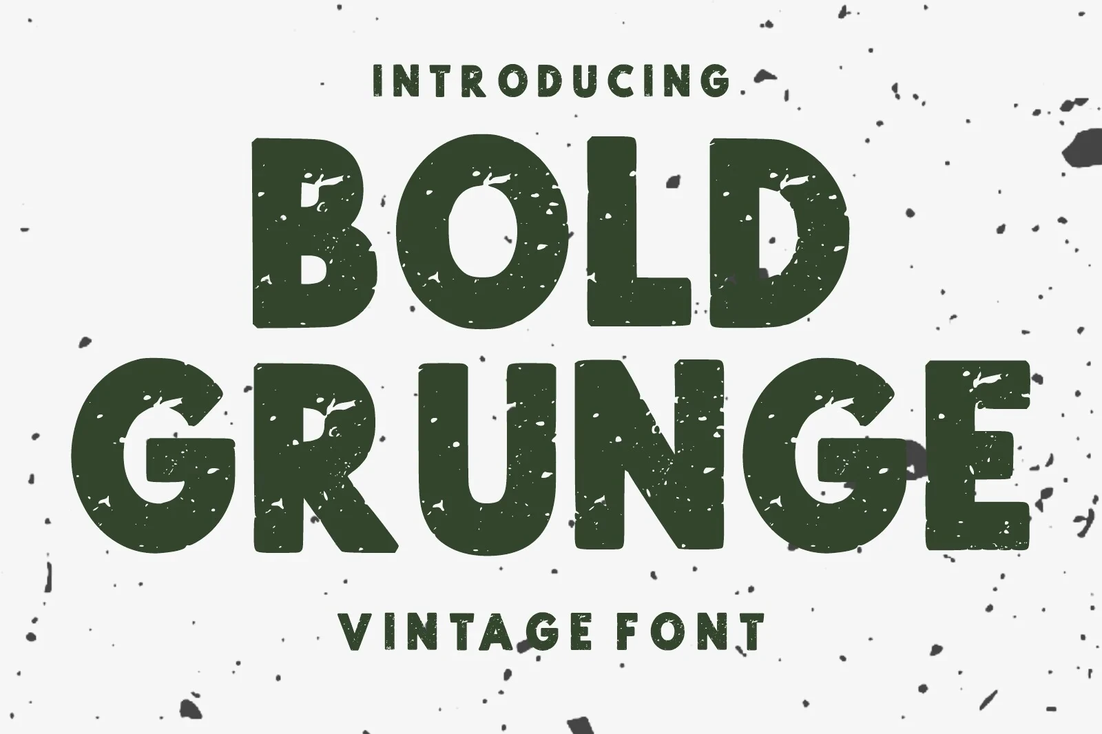
Best For: logos, branding, packaging, posters
Bold Grunge Font balances a nostalgic period character with clean, substantial construction. It adds historical flavor to branding, packaging, and posters, while its strongest readability comes in concise names and short display treatments.
Rough Bold Font

Best For: branding, packaging, posters, headlines
Rough Bold Font has a clean contemporary display construction with an intentionally expressive profile. It is best used for short branding, packaging, and poster headlines, where the letterforms can carry character without overloading the layout.
Retro Bold Font
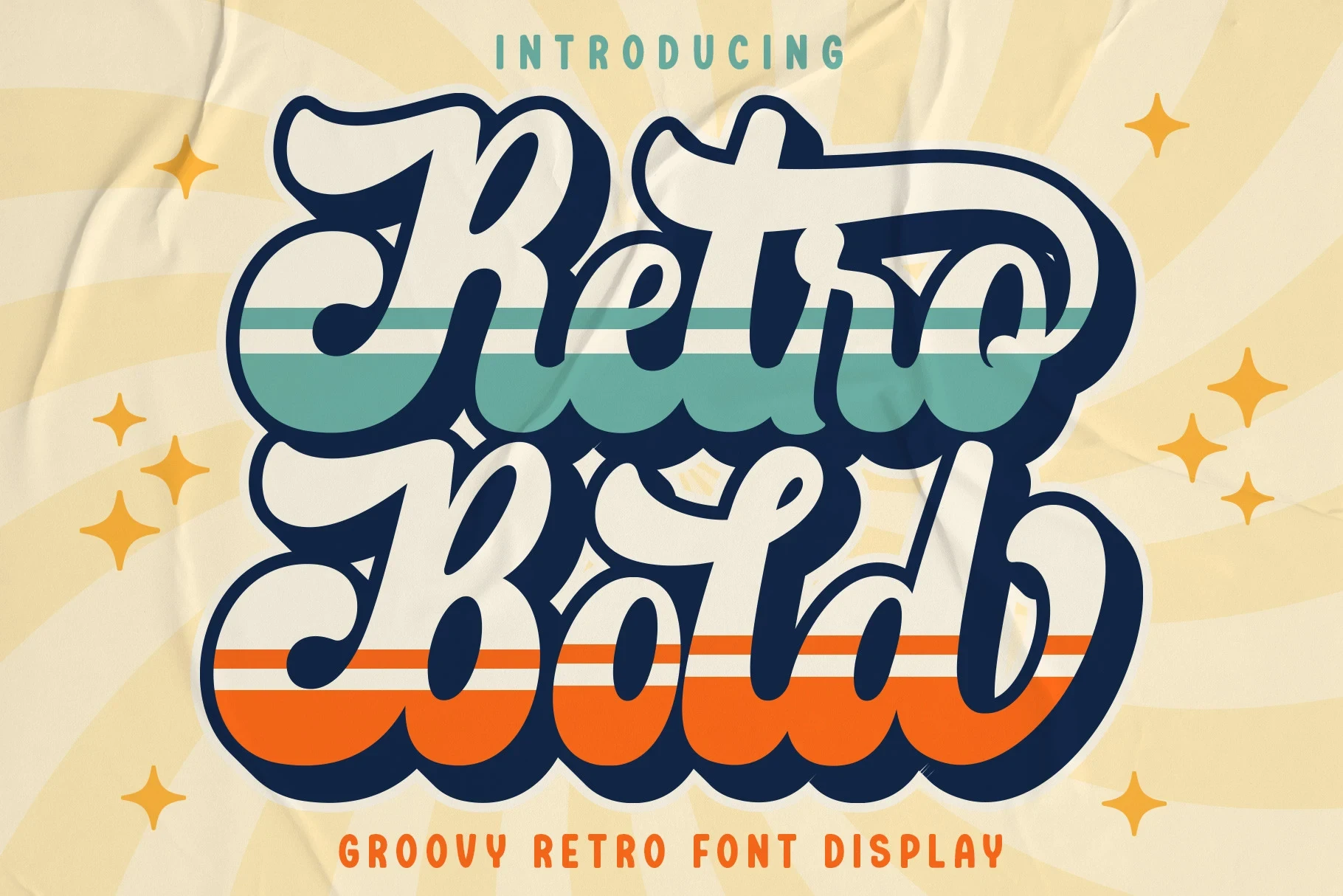
Best For: logos, branding, invitations, wedding designs
Retro Bold Font combines nostalgic period character with a polished, substantial display presence. Its historical cue suits short wordmarks for branding, invitations, and wedding designs, where the lettering can remain prominent and readable.
Brush And Script Movement
Brush rhythm and connected letterforms create visible movement across each word. Compared with the other groups, these styles contribute a more personal signature, so short names and display phrases work best.
Temur Amorak Urban Bold Brush Font
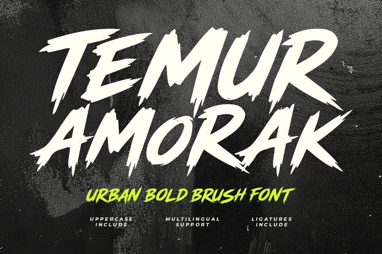
Best For: branding, logos, display text, bold designs
For a gestural brand voice, Temur Amorak Urban Bold Brush Font combines a brush-like stroke rhythm with full uppercase characters, ligatures, and multilingual support. These Bold Logo Fonts gain extra display flexibility, especially in short branded text and bold identity work.
Bold Script Font

Best For: logos, branding, invitations, wedding designs
Bold Script Font uses connected, flowing letterforms to create continuous movement across a word. Its joined construction gives logos and invitations a personal signature, though short names and display phrases will remain clearest.
How to Choose the Right Font
Choose by construction first: rounded sans forms favor approachable clarity, serifs and slabs add definition, while period styles supply historical tone. Brush and connected lettering create more movement but need shorter wording. Check weight, joins, flourishes, and intended scale against the final mark so your Bold Logo Fonts remain readable as well as distinctive.