18 Best Luxury Serif Fonts in 2026
This collection moves from sharply contrasted, spacious serif structures to condensed display faces, decorative swashes, and serif-and-script pairings. These Luxury Serif Fonts are designed primarily for branding, packaging, invitations, covers, posters, and other settings where letter construction carries much of the visual identity.
Looking for more serif fonts? Browse our complete Serif Fonts collection to compare modern, elegant, bold, logo-friendly, and vintage serif styles.
Luxury Serif Fonts: Structured High-Contrast Displays
These Luxury Serif Fonts emphasize upright or lightly slanted structures, pointed serifs, strong thick-thin contrast, and controlled proportions for clear, assertive display branding.
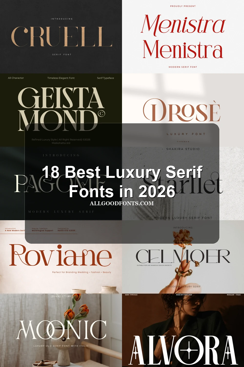
Menistra Font

Best For: branding, editorial designs, display text
Menistra Font builds editorial rhythm by contrasting an italic upper treatment with an upright lower one. Pointed serifs and the elongated lowercase M terminal make it strongest for prominent branding and headlines, not sustained reading.
Velique Font

Best For: logos, branding, packaging
Velique Font combines a heavy, high-contrast serif wordmark with a geometric sans-serif support system. Open counters help the large serif stay clear in logos and packaging, while the smaller sans handles supporting information more reliably.
Cruell Font

Best For: logos, branding, invitations, fashion branding
Cruell Font stands apart with wide proportions, thin horizontal serifs, and a strictly upright stance. Its spacious silhouette suits fashion marks and invitations, but delicate strokes need generous display sizing to retain definition.
Meksron Font

Best For: book covers, T-shirts, logos, branding
Meksron Font combines condensed proportions, elongated pointed serifs, and extreme thick-thin contrast. The narrow frame creates vertical impact on book covers and logos, but its fine hairlines can disappear below comfortable display sizes.
Nedogta Font

Best For: display text, wall art, minimal designs
Nedogta Font uses a tall, narrow, upright structure to create a controlled display silhouette. Its condensed shape works for wall art and minimal marks, while high-contrast fine strokes make body-text use impractical.
Geista Mond Font

Best For: branding, fashion branding, display text
Geista Mond Font uses wide, upright characters and pointed serifs to create an expansive word shape. Its generous proportions remain readable in branding and display settings, although fine hairlines are vulnerable in small body copy.
Ornamental Signature Serifs
This group is connected by signature details: swashes, unusual crossbars, ligatures, flourishes, and altered letter interiors. It is more individually expressive than the structured display group.
Atfagis Font

Best For: magazine covers, logos, branding, packaging
Atfagis Font turns display lettering into a decorative signature through pointed terminals, extravagant swashes, and a star-shaped i dot. Its multilingual support broadens applications, but the nonstandard details are best reserved for large magazine covers, logos, and packaging rather than small text.
Starllet Font

Best For: logos, headlines, invitations
Starllet Font uses geometric lowercase forms and a restrained serif construction, then adds an extended swash to the final t. That contrast keeps short titles recognizable while giving logos and invitations a more customized finish than dense copy can support.
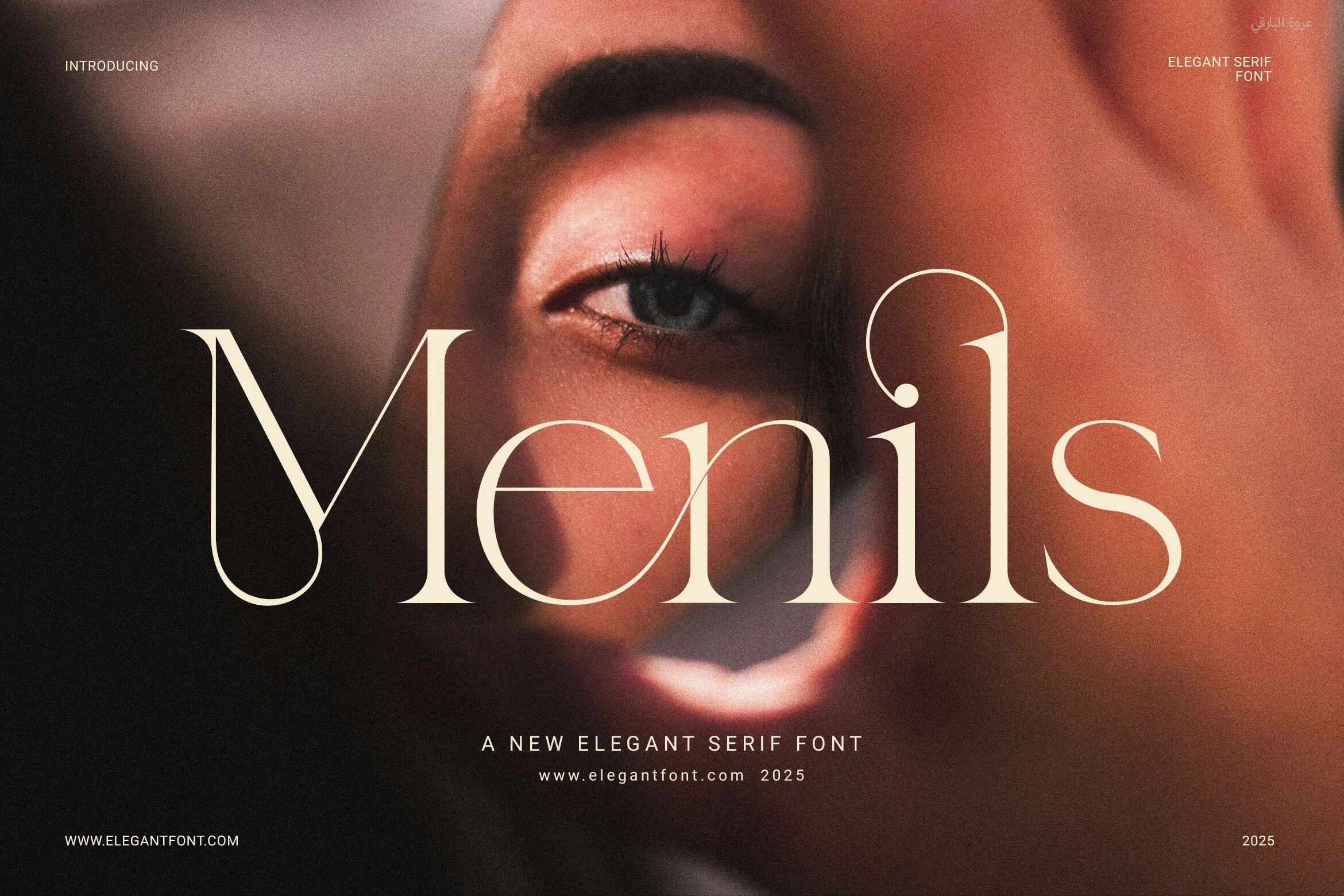
Menils Font
Best For: branding, logos, website headers
Menils Font adds strong ornamental anchors through the extended uppercase M swash and circular lowercase s flourish. Functional ligatures help customize wordmarks, although fine hairlines make small print less dependable.
Roviane Font

Best For: display text, modern designs, elegant designs
Roviane Font is defined by a swashed capital R and a heart-shaped interior in the lowercase a. Those interlocking details give short headlines a customized tone, but they compete with the clarity required for continuous prose.
Moonic Font
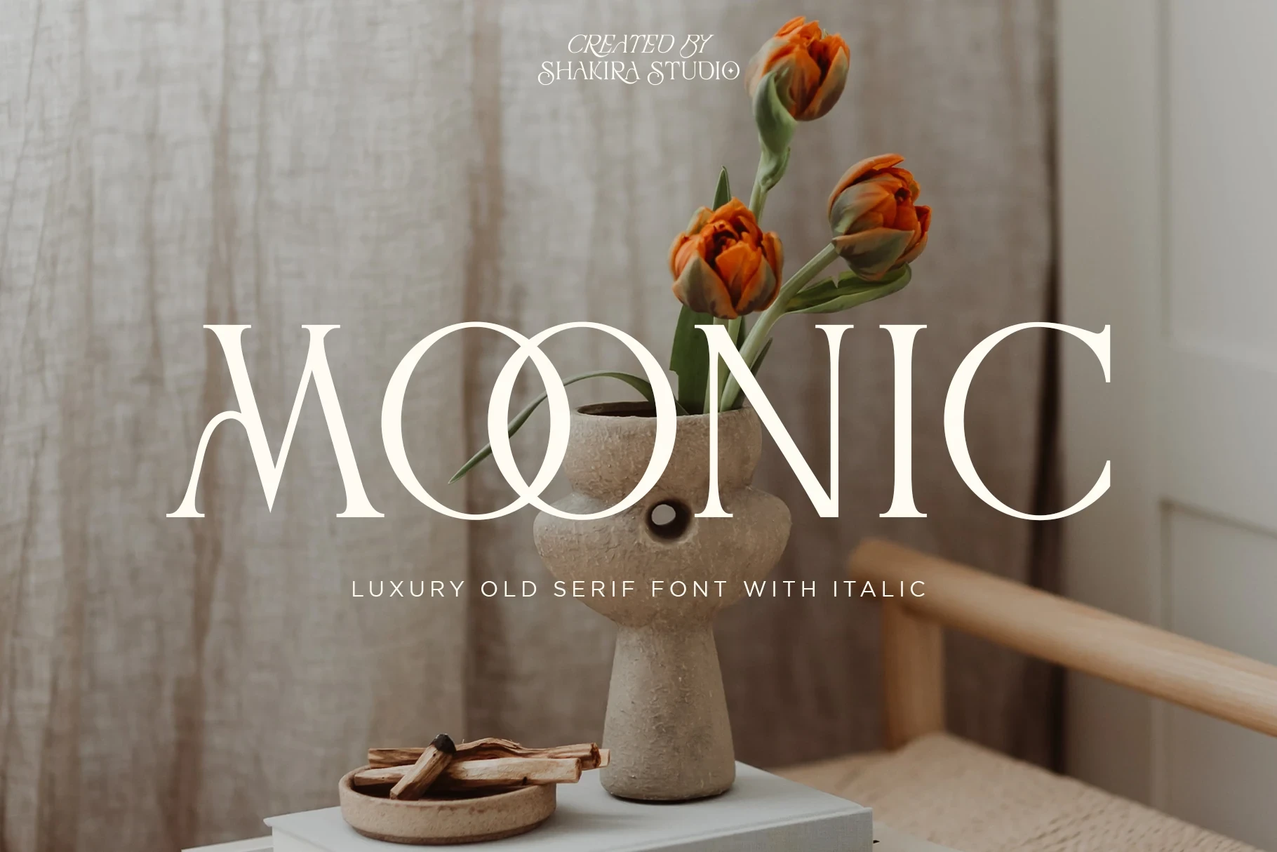
Best For: logos, headlines, invitations
Moonic Font pushes its serif vocabulary outward with exaggerated terminals and an interlocking O structure. The stylized construction is most effective in logos, invitations, and editorial titles, where its forms can be seen clearly rather than read at length.
Beverly Font
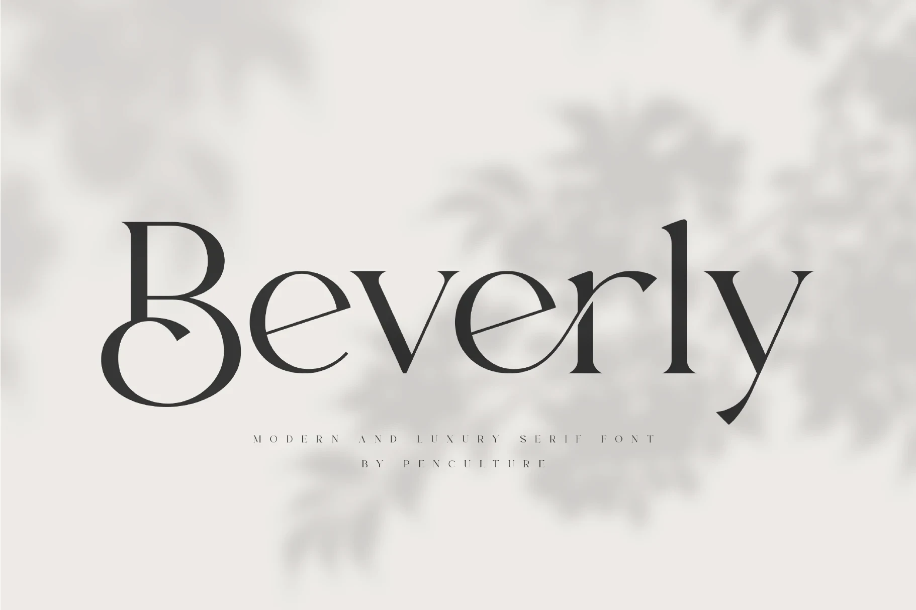
Best For: branding, logos, magazine covers, posters
Beverly Font combines a swash-led capital B, an extended lowercase e crossbar, and sharply tapered serifs. Stylistic alternates and ligatures provide branding control, but the decorative alphabet is intended for headings, posters, and covers rather than paragraphs.
Pagome Font

Best For: logos, branding, fashion branding, high-end designs
Pagome Font uses linked swashes, fluid ligatures, and distorted curving stems to create an unusually experimental display texture. Its wide proportions suit fashion branding, though the nonstandard letters require large sizing for reliable recognition.
Alvora Font

Best For: branding, fashion branding, website headers, display text
Alvora Font places star-like decorative crossbars inside condensed, vertically stressed forms. The narrow structure is useful for headers and fashion branding, but those intricate crossbars can hinder recognition when the type is reduced.
Drose Font
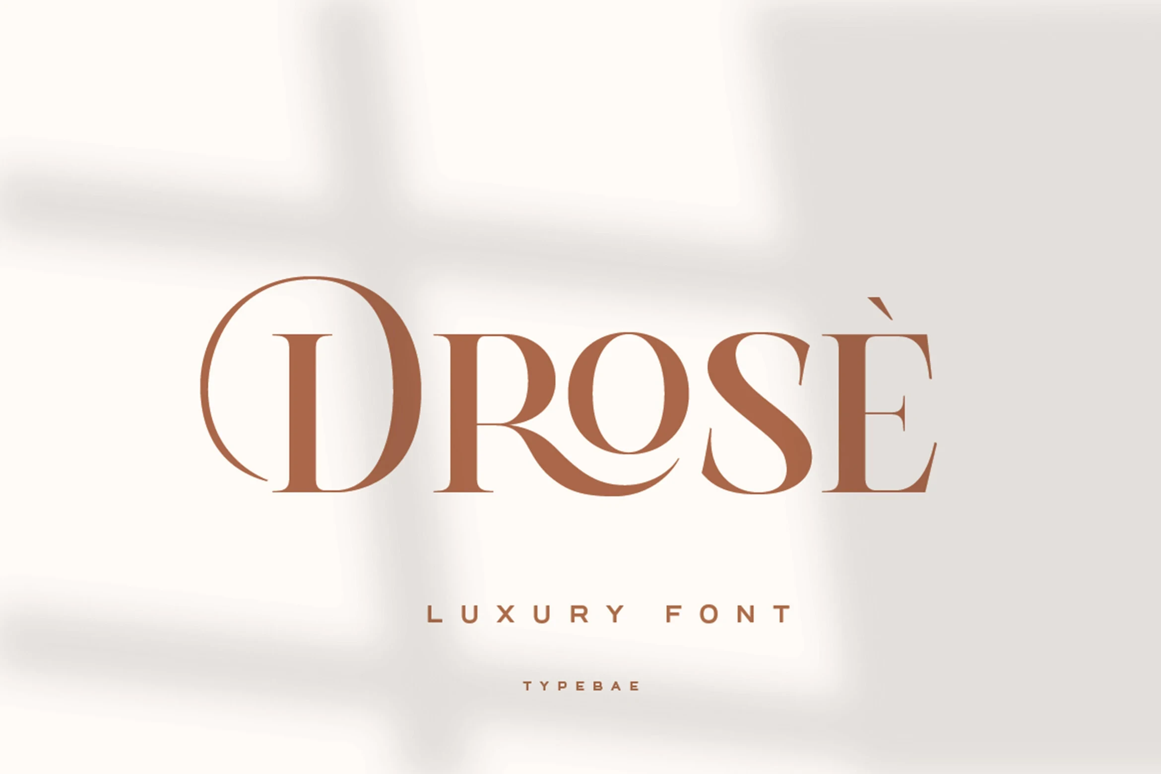
Best For: fashion branding, logos, branding, packaging
Drose Font is marked by a wide circular D and a curving connection between R and O. These linked forms give fashion marks and packaging a custom-lettered feel, while making uninterrupted text less practical.
Period-Inspired and Paired Displays
Period-influenced forms meet cleaner contemporary rhythm here, with one pairing adding handwritten script. These faces offer more adaptable short-form reading than heavily embellished alternatives.
Celmoer Font
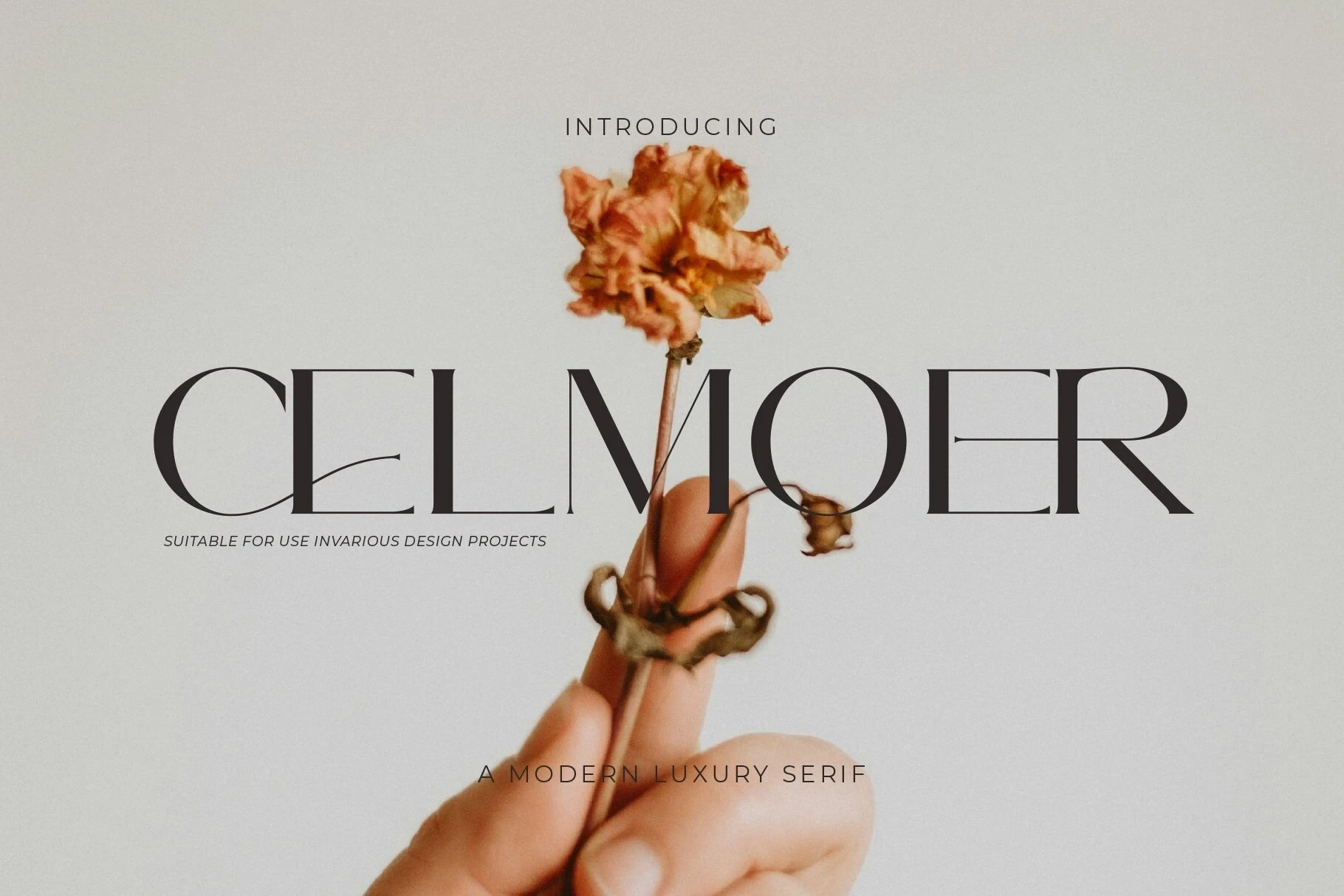
Best For: logos, packaging, social media graphics, website headers
Celmoer Font balances a period-inspired display character with clean contemporary stroke rhythm. Its distinctive letterforms and overlapping ligatures make names and short headings comparatively easy to assess, giving it broader packaging and social graphic potential than more heavily ornamented choices.
Acher Font

Best For: branding, packaging, posters
Acher Font brings a period-inspired display character into a clean contemporary construction with clear stroke rhythm. Its balanced letter behavior works especially well for packaging and posters when short words need personality without elaborate flourishes.
Cornelia Font Duo Font
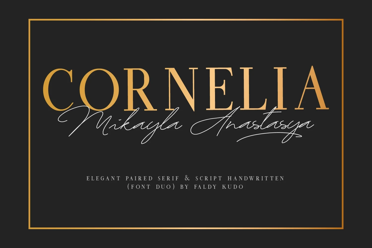
Best For: invitations, social media graphics, eye-catching designs, high-end designs
Cornelia Font Duo Font: Cornelia Font Duo pairs a legible all-caps high-contrast serif with a genuinely flowing handwritten script. The serif can carry the main title while the script adds display emphasis, though its flowing connections and swashes need generous scale to stay clear.
How to Choose the Right Font
Choose among these Luxury Serif Fonts by matching construction to scale: wide, open forms offer stronger clarity, condensed faces create vertical impact, and swashes or ligatures add a custom mark at the cost of reading ease. Use the cleaner period-inspired options for adaptable headings, and reserve the most decorative designs for short, generously sized display work.