12 Best Serif Fonts for Logos in 2026
This collection of Serif Fonts for Logos spans delicate high-contrast lettering, sturdy heritage constructions, distressed textures, and tightly condensed editorial forms. Together, these faces support prominent wordmarks, packaging, fashion branding, posters, and compact identity systems, with readability largely determined by scale and ornamental detail.
Looking for more serif fonts? Browse our complete Serif Fonts collection to compare modern, elegant, bold, logo-friendly, and vintage serif styles.

Serif Fonts for Logos
This Serif Fonts for Logos group combines decorative contrast, swashes, ligatures, and mixed typographic pairings. It is more ornamental and customized than the sturdier heritage faces or narrower editorial styles.
Grandeur – Elegant Classic Serif Font

Best For: logos, display text, elegant designs
Grandeur – Elegant Classic Serif Font uses high contrast, delicate horizontal serifs, and a flowing lowercase r tail. It gives large Serif Fonts for Logos wordmarks a fine, graceful profile, but its thin strokes need generous size to remain clear in reduced applications.
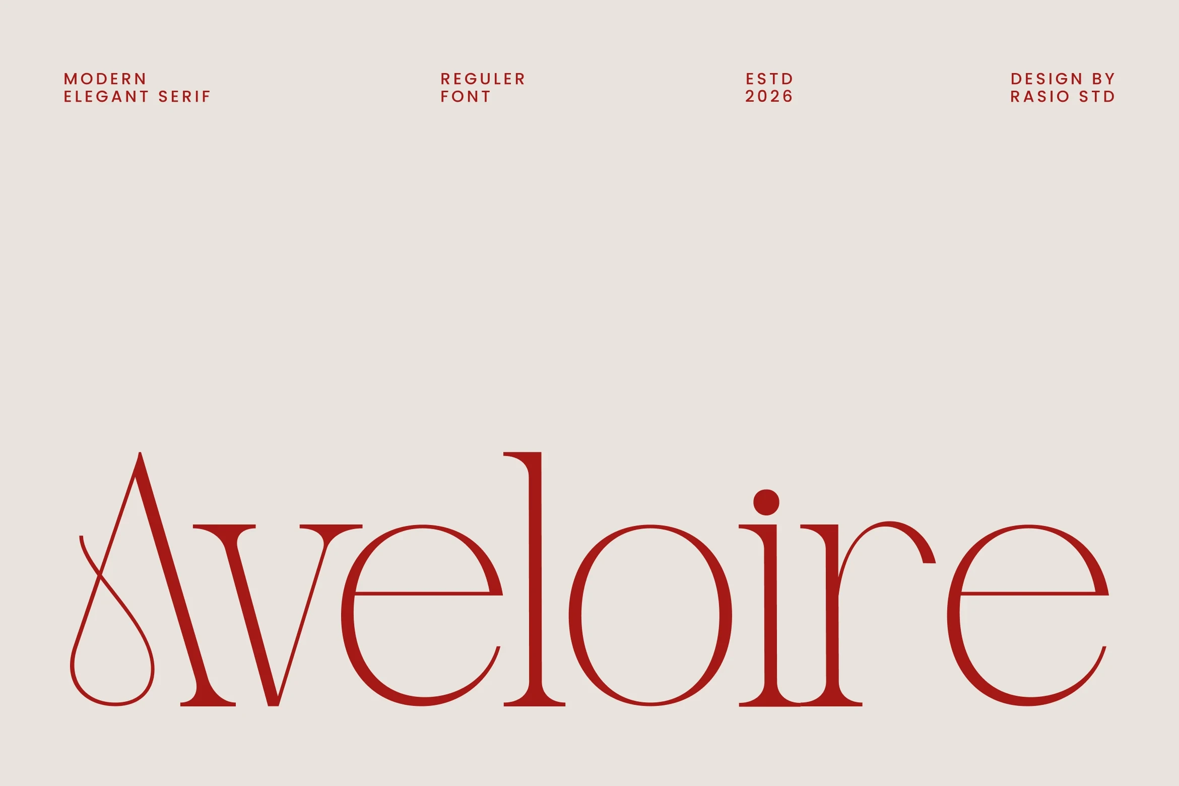
Aveloire Font
Best For: logos, branding, fashion branding
Aveloire Font stands out through its swashed initial A and extended arms on the l and r. The heavy display structure and sharp thick-to-thin shifts create a fashion-oriented signature, while the flourishes require generous logo scale to look deliberate rather than crowded.
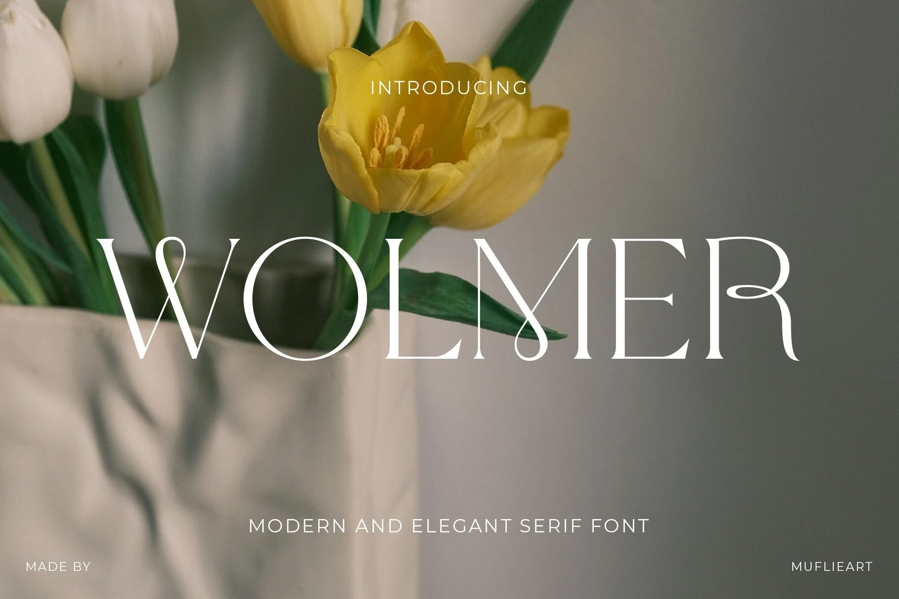
Wolmer Font
Best For: logos, branding, fashion branding
Wolmer Font creates a customized display treatment with a swash terminal on the R and an extended L crossbar. Its high contrast and elongated serifs suit prominent branding, but those ornamental strokes become less dependable when the wordmark is reproduced compactly.
Vogane Font

Best For: logos, branding, packaging
Vogane Font uses high contrast, decorative ligatures, alternate characters, and a curving g descender to build controlled variation. Those connected details can make Serif Fonts for Logos feel bespoke, though short display names will stay clearer than dense wording.
The Paloma Font

Best For: logos, branding, high-end designs
The Paloma Font pairs an all-caps serif with a connected monoline script, giving Serif Fonts for Logos two contrasting structures. Let the serif carry the main name and reserve the looping script for a short decorative accent rather than essential small text.
Bold Heritage Serifs
These broad, weighty serifs use bracketed construction, high contrast, and sometimes distressed texture to create a substantial brand presence. They feel more grounded and forceful than the decorative or condensed groups.
Fontrize Font

Best For: logos, branding, headlines, display text
For authoritative branding, Fontrize Font brings wide all-caps proportions, sturdy bracketed serifs, and forceful high contrast. Its substantial forms hold attention in large wordmarks and headlines, although fine details can lose clarity when the mark is reduced to a very small size.
Strong Font

Best For: logos, branding, packaging
Strong Font pairs a large x-height with bracketed wedge serifs, giving its heavy construction substantial presence in a logo. The bold display structure reads clearly at scale, though its thin serif details need enough reproduction size to avoid disappearing.
Florida Vintage Font

Best For: book covers, T-shirts, logos, branding
For apparel, posters, and heritage branding, Florida Vintage Font adds a distressed, weathered surface to wide, stable serif forms. The texture supplies deliberate roughness, but it also reduces legibility quickly, so the face works best in large logos and display treatments.
Condensed Editorial Serifs
Tall, narrow proportions define this editorial group, helping names occupy less horizontal space. Its pointed or bracketed serifs create sharper silhouettes, but thin strokes and compression demand careful sizing.
Dihot Font
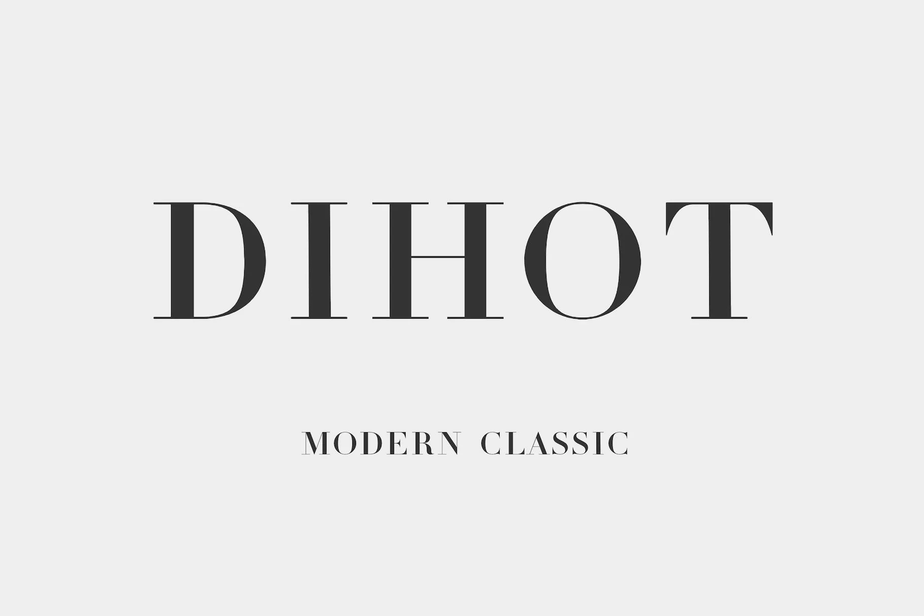
Best For: logos, display text, modern designs
Dihot Font combines high-contrast all-caps forms with bracketed serifs and a broad character presence. It can anchor a formal display mark or modern brand name, but its faint thin strokes make small print applications less reliable than large-scale use.
Fashionable Font
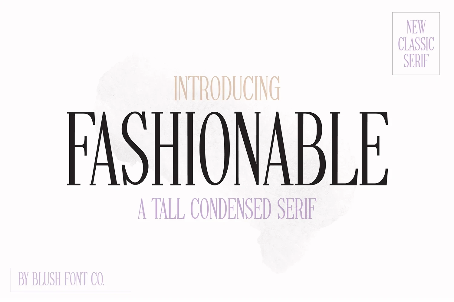
Best For: logos, headlines, display text
Fashionable Font uses tall condensed proportions and sharp, thin serifs to form a narrow editorial silhouette. Its vertical economy suits compact wordmarks and headlines, but the compressed structure and fine strokes lose readability quickly when reduced.
Luxena Font
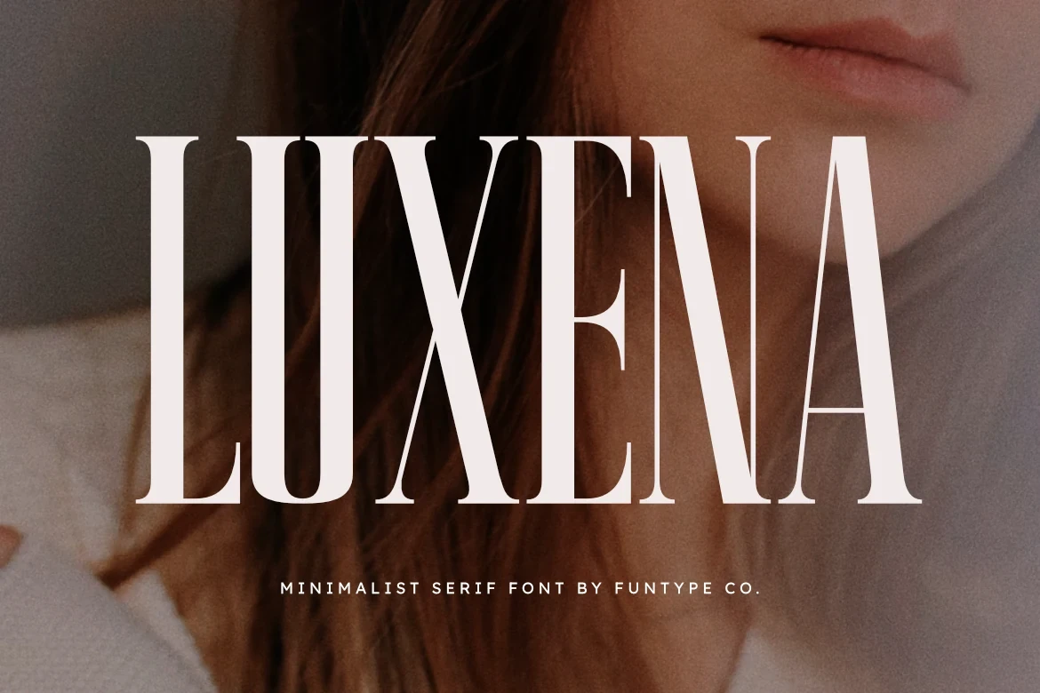
Best For: logos, branding, posters, headlines
Luxena Font is the collection’s most vertically compressed option, with extremely narrow proportions, high contrast, and sharp serifs. It fits space-conscious branding systems and tall layouts, but its structure is unsuitable for long text or tiny marks.
Muzzaro Font
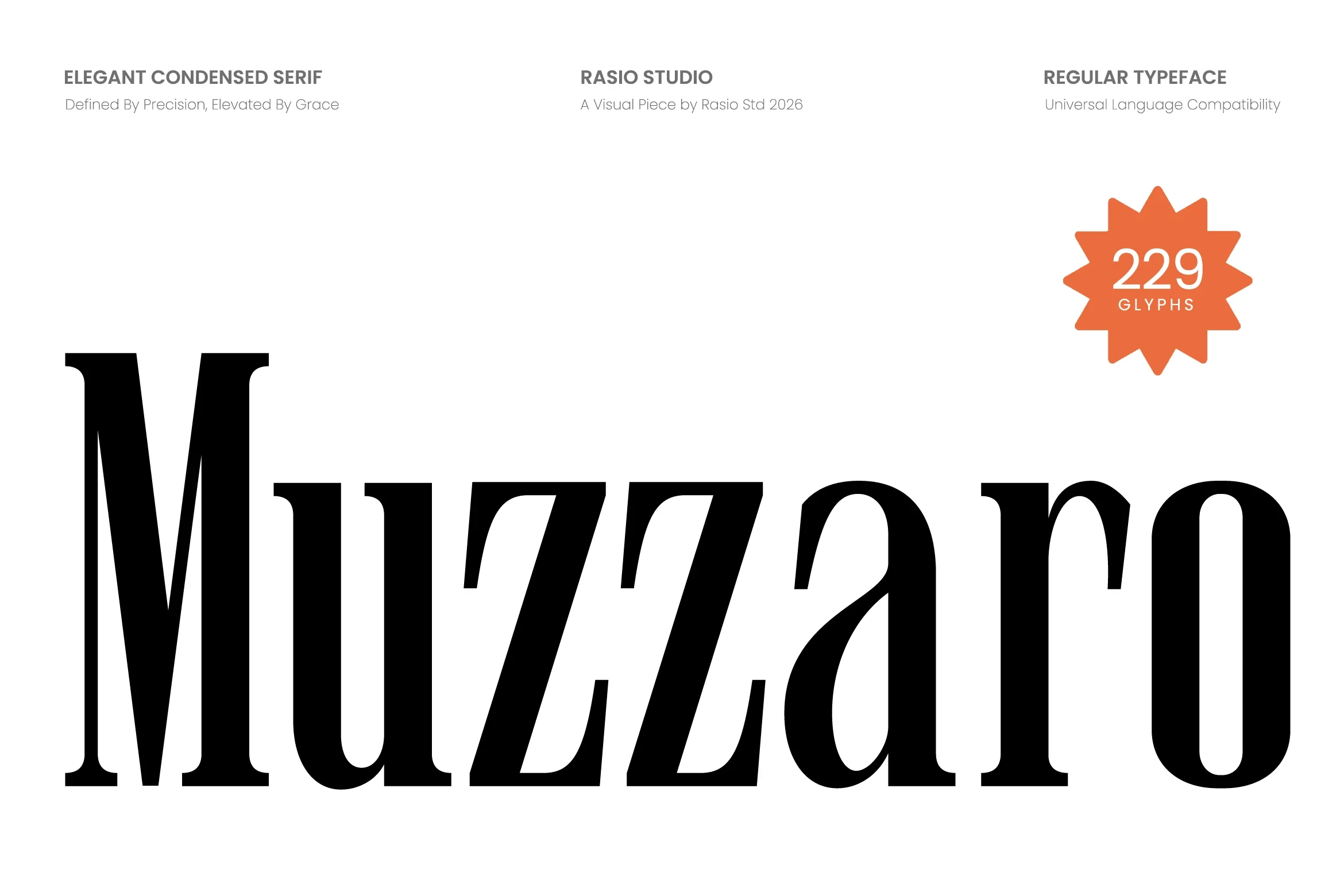
Best For: logos, branding, packaging, headlines
For packaging and headline logos, Muzzaro Font offers an upright condensed construction with pointed bracketed serifs. Its narrow width saves space while preserving a substantial display posture, although high-contrast details can muddy in small settings.
How to Choose the Right Font
Choose based on the job the wordmark must perform: Grandeur, Aveloire, Wolmer, Vogane, and Paloma reward large display scale and ornamental detail, while Fontrize and Strong provide broader, weightier presence. For narrow systems, compare the compression of Fashionable, Luxena, and Muzzaro carefully, and test every Serif Fonts for Logos option at its smallest real application size.