12 Best Elegant Serif Fonts in 2026
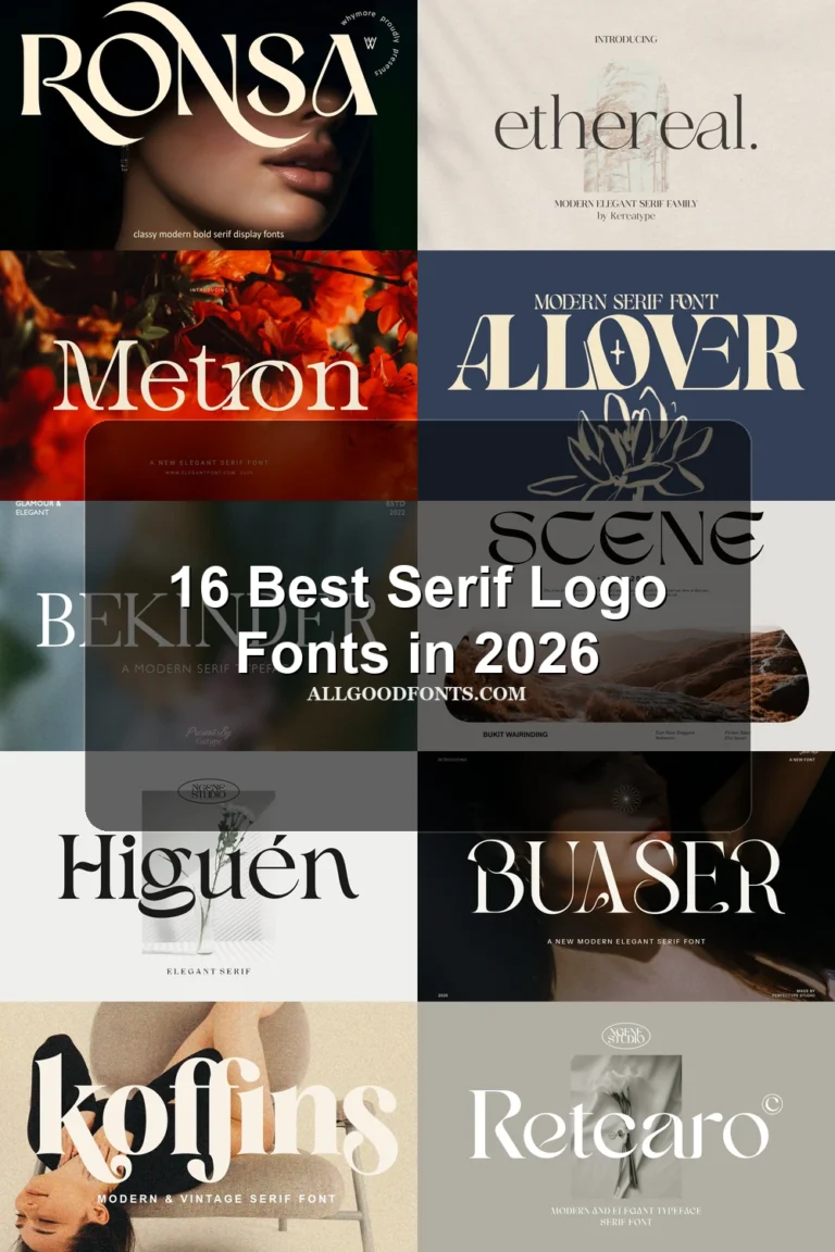
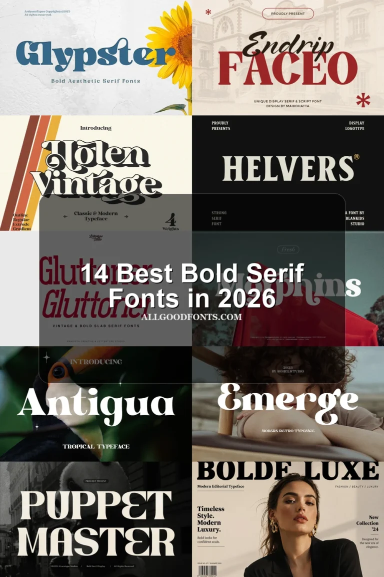
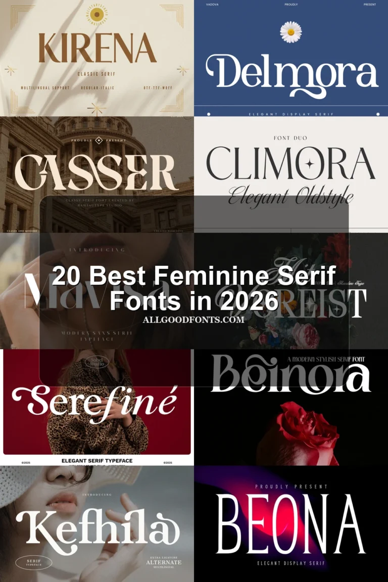
This collection of Elegant Serif Fonts ranges from restrained editorial serifs with delicate hairlines to sweeping swash displays and densely ornamental capitals. Their practical roles differ accordingly: some support readable headlines and fashion branding, while others are best reserved for logos, packaging, invitations, and large-format artwork.
Looking for more serif fonts? Browse our complete Serif Fonts collection to compare modern, elegant, bold, logo-friendly, and vintage serif styles.

Elegant Serif Fonts
These Elegant Serif Fonts use controlled construction, open counters, or distinctive letter details instead of extensive swashes. They feel more editorial and contained than the collection’s highly flourished display styles.
Wolmer Font
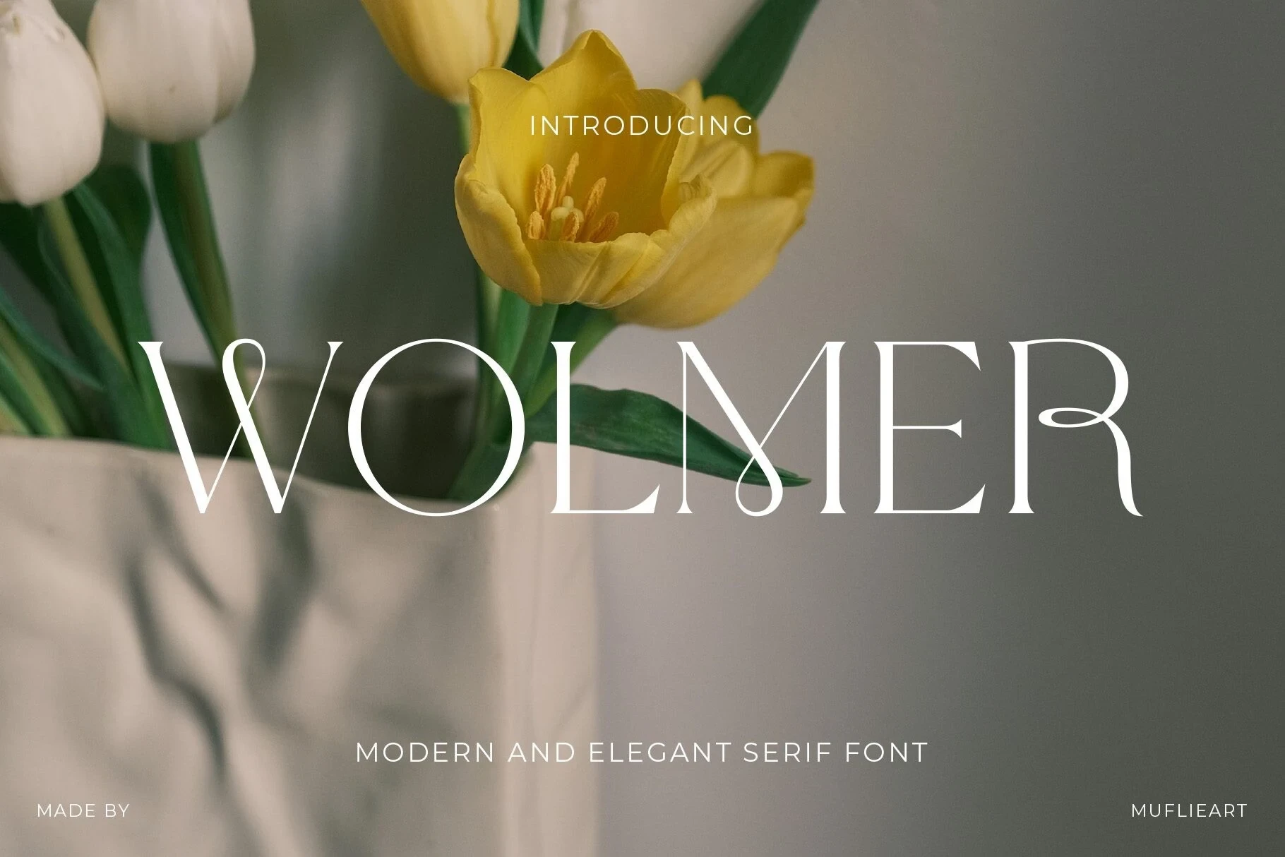
Best For: display text, wall art, modern designs, minimal designs
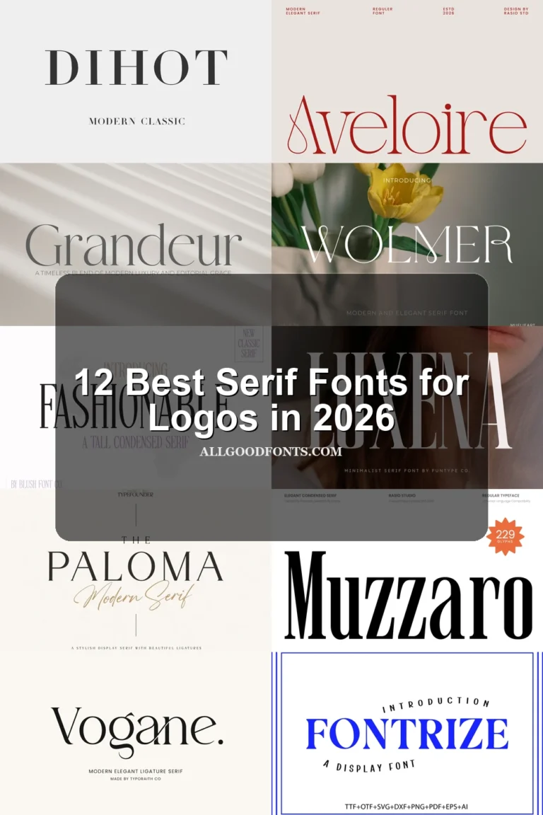
Wolmer Font takes a restrained editorial approach, pairing delicate hairline serifs with a controlled extended terminal on the R. Among these Elegant Serif Fonts, it is a strong choice for wall art and headlines, but its sharp contrast needs large sizing.
Aveloire Font

Best For: branding, headlines, fashion branding, magazine covers
For fashion branding and magazine covers, Aveloire Font offers a clear signature through the teardrop-shaped loop inside its A, high-waisted crossbars, and upright proportions. This member of the Elegant Serif Fonts group depends on large sizing because extreme contrast can weaken smaller text.
De Floria Font
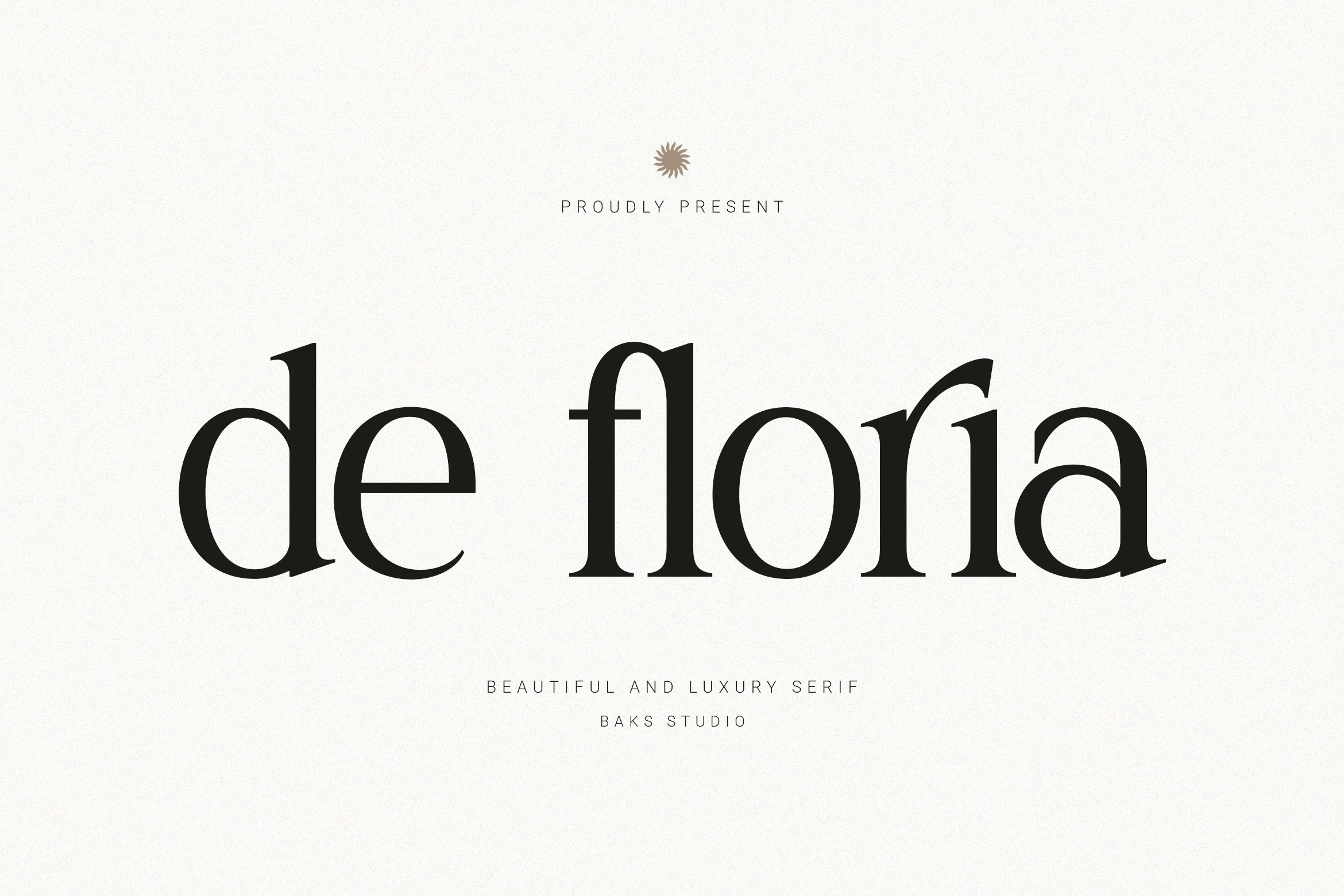
Best For: branding, high-end designs, display text, modern designs
De Floria Font uses pointed, flared serifs, curved transitions, and open counters rather than elaborate swash extensions. These Elegant Serif Fonts qualities make it useful for editorial branding and large headlines, although delicate high-contrast strokes rule out extended body copy.
Sweeping Swash Displays
This group is connected by sweeping tails, elongated terminals, high contrast, and flowing joins. Compared with the restrained serifs, these faces prioritize movement and decorative impact over compact readability.
Astrid Font

Best For: display text, modern designs, clean designs
Astrid Font puts a prominent swash on the S against sharp serifs and strong thick-thin contrast. The decorative structure remains clear in logos and headers, but its heavy display treatment needs large lettering to stay legible.
Salmine Font

Best For: display text, modern designs, elegant designs
Salmine Font builds continuous movement through elongated terminals, swash-like connections, and ligatures. Those joined details suit editorial titles and prominent wordmarks, while the flourishes can compromise recognition when the lettering is reduced.
Bezoria – Elegant Serif Font
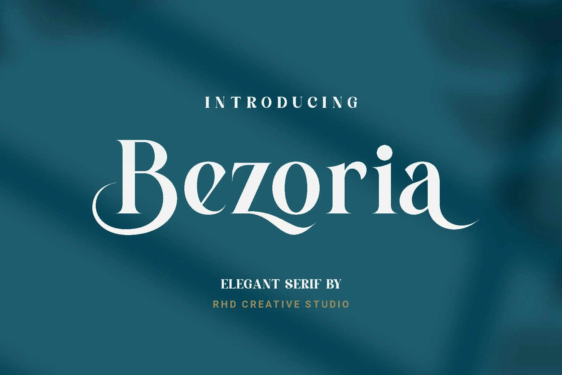
Best For: branding, logos, display text, high-end designs
For branding and logo work, Bezoria – Elegant Serif Font brings a wide, upright structure, high contrast, and extended swashes on the initial B and final a. Its broad proportions create presence, although those long terminals make small-scale applications less dependable.
Rovale Font
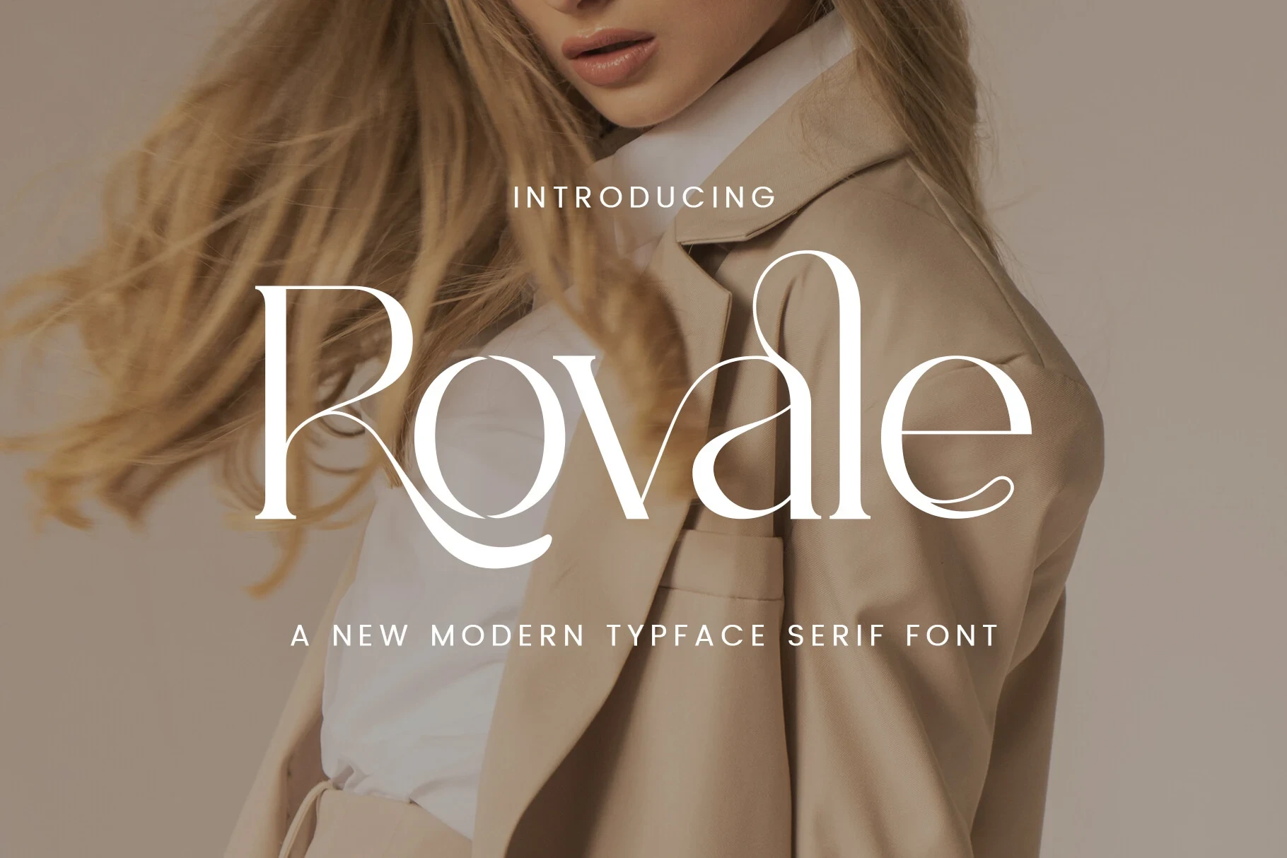
Best For: logos, branding, packaging, social media graphics
Rovale Font gains its visual motion from long sweeping tails on letters such as R and e. The upright serif framework feels contemporary, while the intricate extensions make it better suited to packaging, logos, and social graphics than sustained reading.
Salmine Font

Best For: branding, display text, modern designs
Salmine Font emphasizes wide characters, open counters, and fluid swashes extending beyond the main serif structure. The open interiors help preserve letter shapes in display settings, but its decorative terminals still keep it focused on headlines and branding.
Migroska Font

Best For: logos, display text, clean designs, elegant designs
Migroska Font combines ornamental swashes with floral-inspired counters and tapered terminals, giving titles and logos a distinctly decorative character. Its stylized interiors and complex flourishes are more effective at large sizes than in long passages or smaller supporting text.
Margiona Font
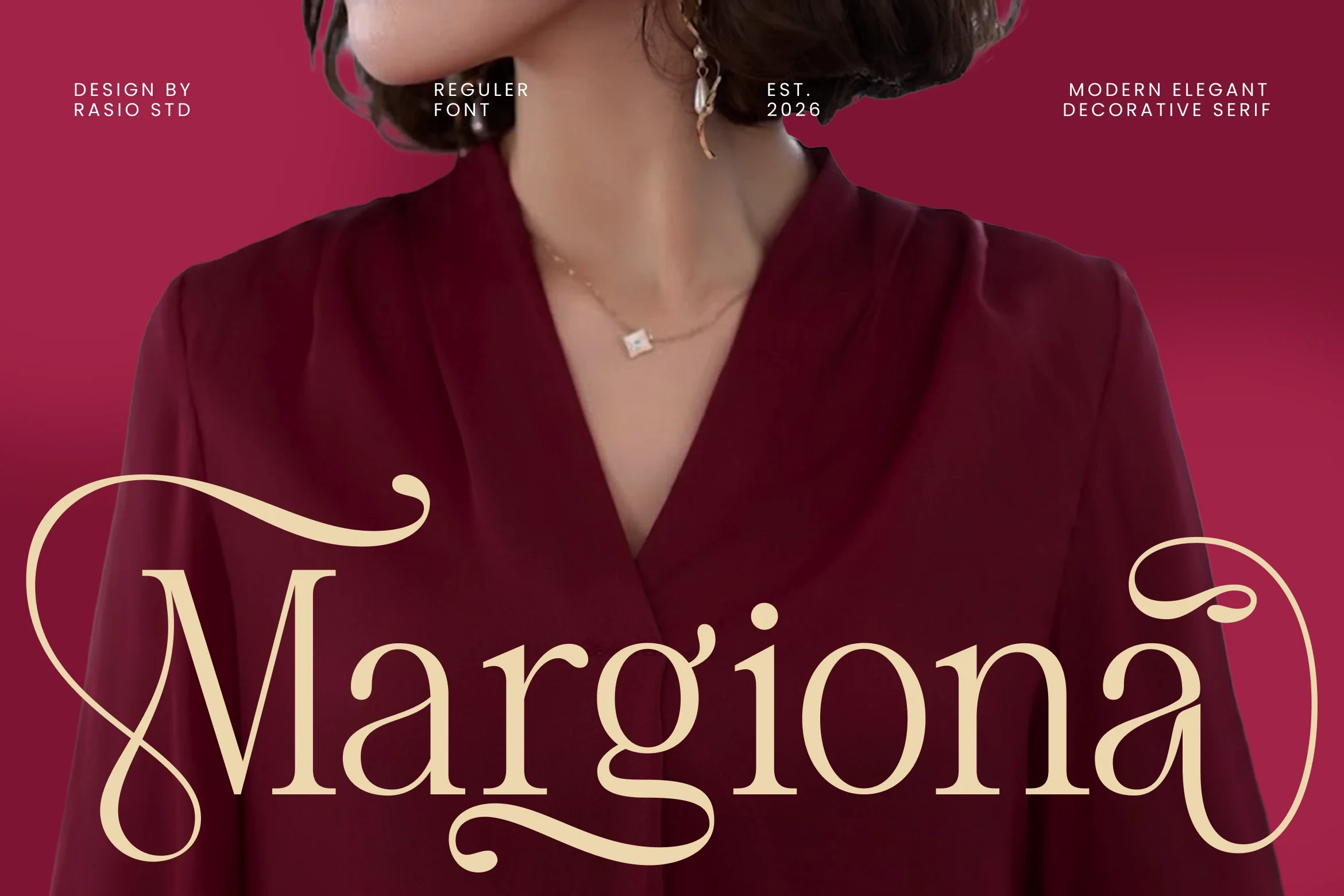
Best For: display text, wall art, modern designs
Margiona Font blends high-contrast serif forms with script-influenced swashes around the opening M and closing a. The hybrid treatment gives logos and wall art a distinctive finish, while extended terminals reduce its usefulness for small text.
Ornamental Statement Lettering
Disconnected capitals and integrated ornament define this category. Its letterforms feel more constructed and emblematic than the flowing swash group, making them effective for prominent labels, invitations, and identity work.
Arches Font

Best For: logos, branding, invitations, beauty branding
Arches Font separates its uppercase forms rather than relying on continuously flowing swashes, adding flared and ball-shaped terminals plus extended horizontal strokes. The construction suits invitations and beauty branding, though thin hairlines and flourishes require generous display sizing.
Proyale Font

Best For: logos, branding, T-shirts, product labels
Proyale Font integrates its swashes directly into all-caps character strokes instead of treating them as separate flourishes. That dense construction works well for product labels, apparel, and branding, but it needs prominent sizing for comfortable recognition.
How to Choose the Right Font
Choose the restrained styles when letter structure and editorial clarity matter most, then move toward swash-heavy options when a logo or headline needs visible motion. Check joins, flourishes, and contrast at the intended size: the best Elegant Serif Fonts for a large wordmark may lose recognition on labels, captions, or body text.