29 Best Modern Serif Fonts in 2026
This collection moves from sharp, high-contrast serifs and spacious editorial forms to condensed title faces, swash-heavy lettering, slabs, and irregular hand-drawn structures. These Modern Serif Fonts are suited to logos, packaging, social graphics, signage, covers, and website headers, with scale and readability determining the strongest role.
Looking for more serif fonts? Browse our complete Serif Fonts collection to compare modern, elegant, bold, logo-friendly, and vintage serif styles.
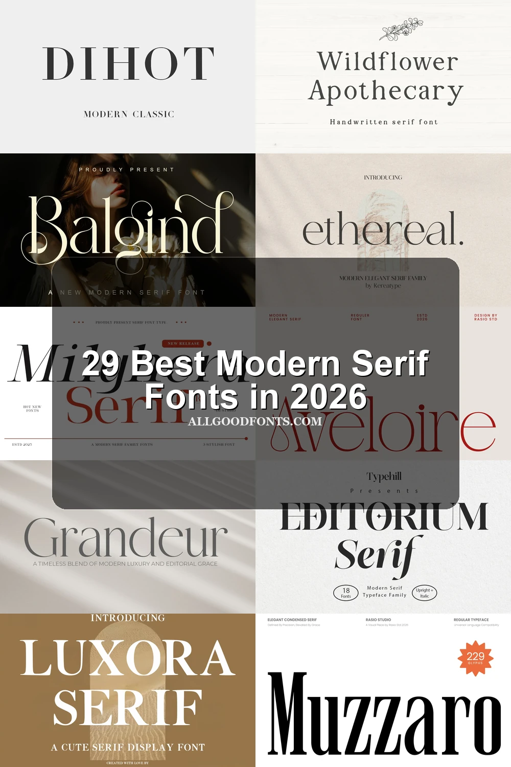
Modern Serif Fonts: High-Contrast Editorial
Modern Serif Fonts in this group rely on high contrast, pointed or bracketed serifs, and display-focused proportions. They feel more controlled and readable than the flourished or condensed sections.
Milghera Serif Font

Best For: logos, branding, signage, fashion branding
Milghera Serif Font builds its presence from sharp pointed serifs, a vertical stress axis, and wide proportions. This high-contrast Modern Serif Font suits logos, signage, fashion branding, and large headlines, but its thin strokes can weaken at small sizes.
Things Font
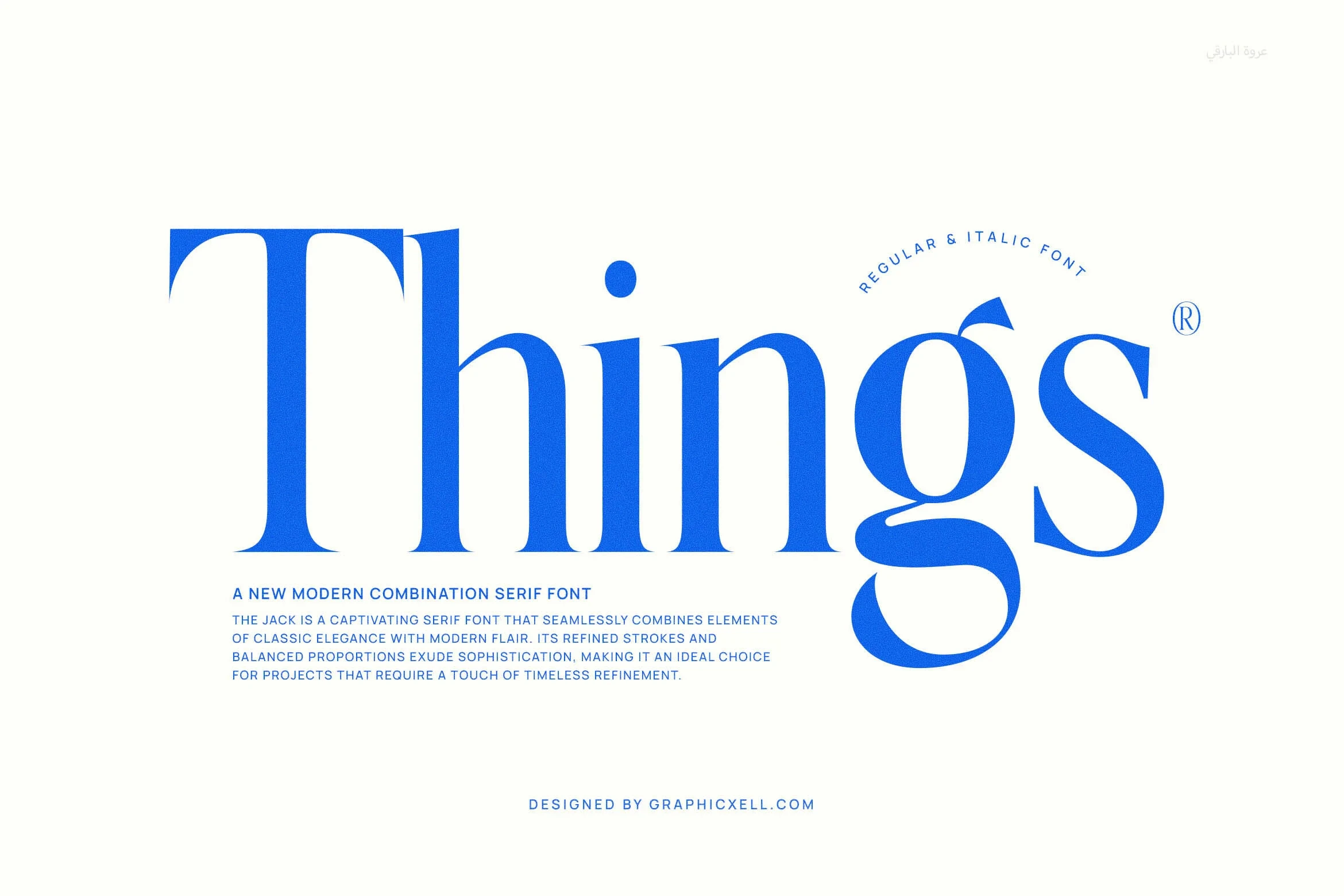
Best For: display text, modern designs, elegant designs
Things Font is defined by long pointed serifs and a closed circular g, giving this Modern Serif Font a distinctive display rhythm. Its high contrast is most effective in prominent titles and short statements, since thin strokes may disappear in small print.
Huntro – Elegant Retro Serif Font
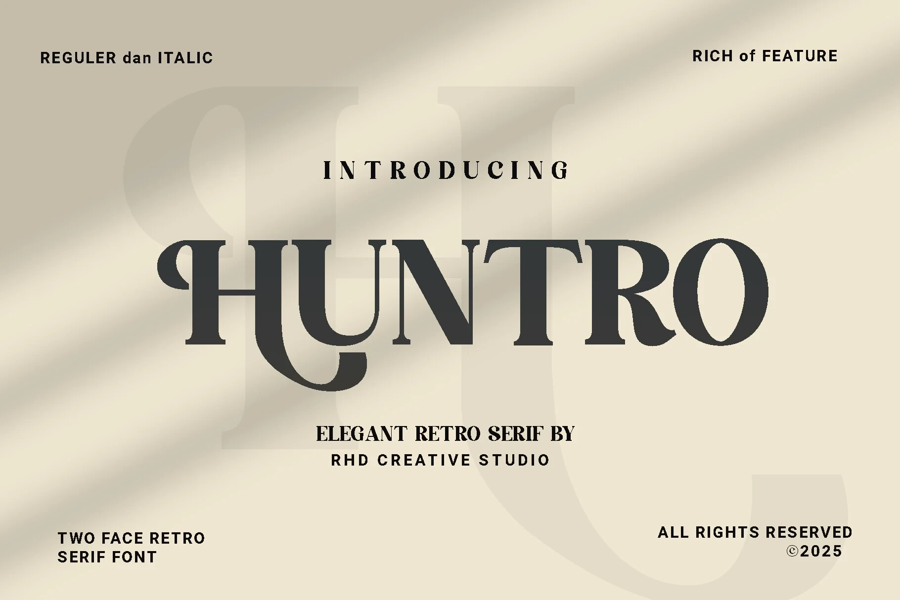
Best For: display text, modern designs, clean designs, elegant designs
Huntro – Elegant Retro Serif Font uses slender strokes and period-inspired letterforms within a clean contemporary construction. Its restrained character is easiest to judge in names, headings, and brief display phrases, where the distinctive shapes remain visible without crowding.
Retpack Serif Font
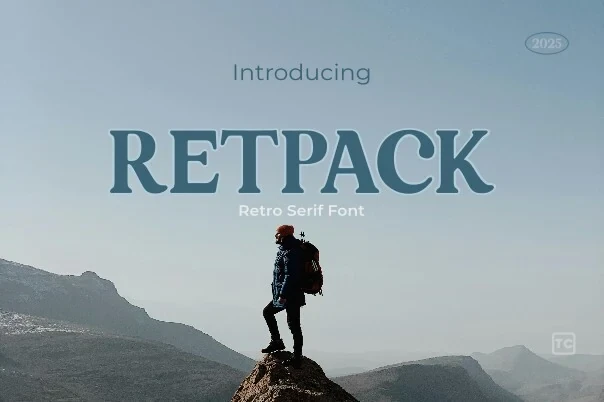
Best For: social media graphics, website headers, display text, modern designs
Retpack Serif Font balances strong contrast with pronounced bracketed serifs and moderate width. Its upright rhythm works well in headers and social graphics, while fine thick-to-thin transitions make it a poor choice for compact body copy.
Dihot Font
Best For: website headers, display text, modern designs, elegant designs
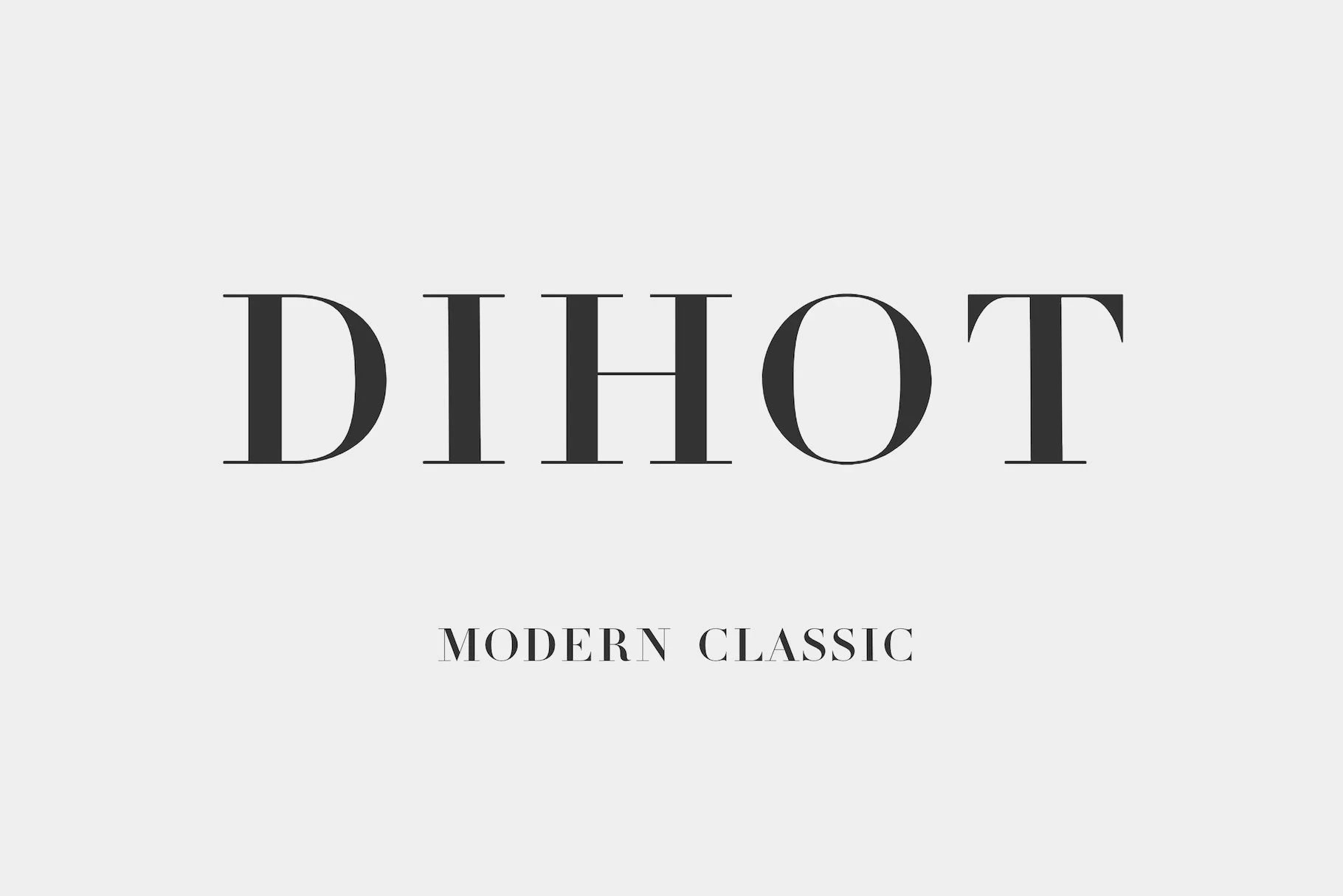
Dihot Font combines sharp horizontal serifs with a geometrically circular O for a controlled display structure. This Modern Serif Font stays readable in website headers and large text, though its thin strokes become vulnerable as the size decreases.
Mirow Serif Font
Best For: logos, branding, signage, social media graphics
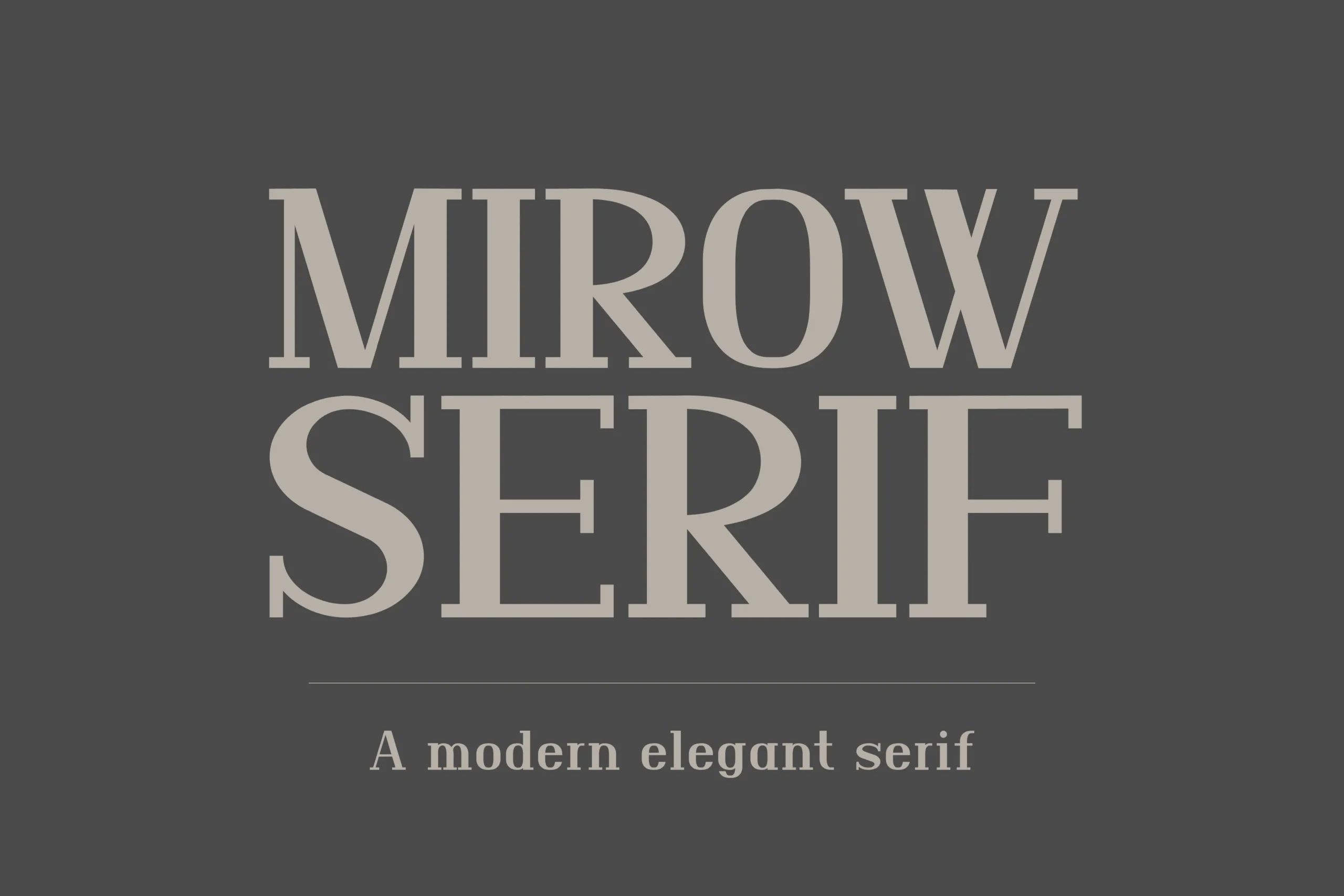
Mirow Serif Font combines a tall x-height and wide proportions with a strong high-contrast structure. As a Modern Serif Font, it supports bold and light branding treatments, signage, and social graphics, with fine details performing best at larger sizes.
Charman Serif Font
Best For: display text, modern designs, elegant designs, luxury designs
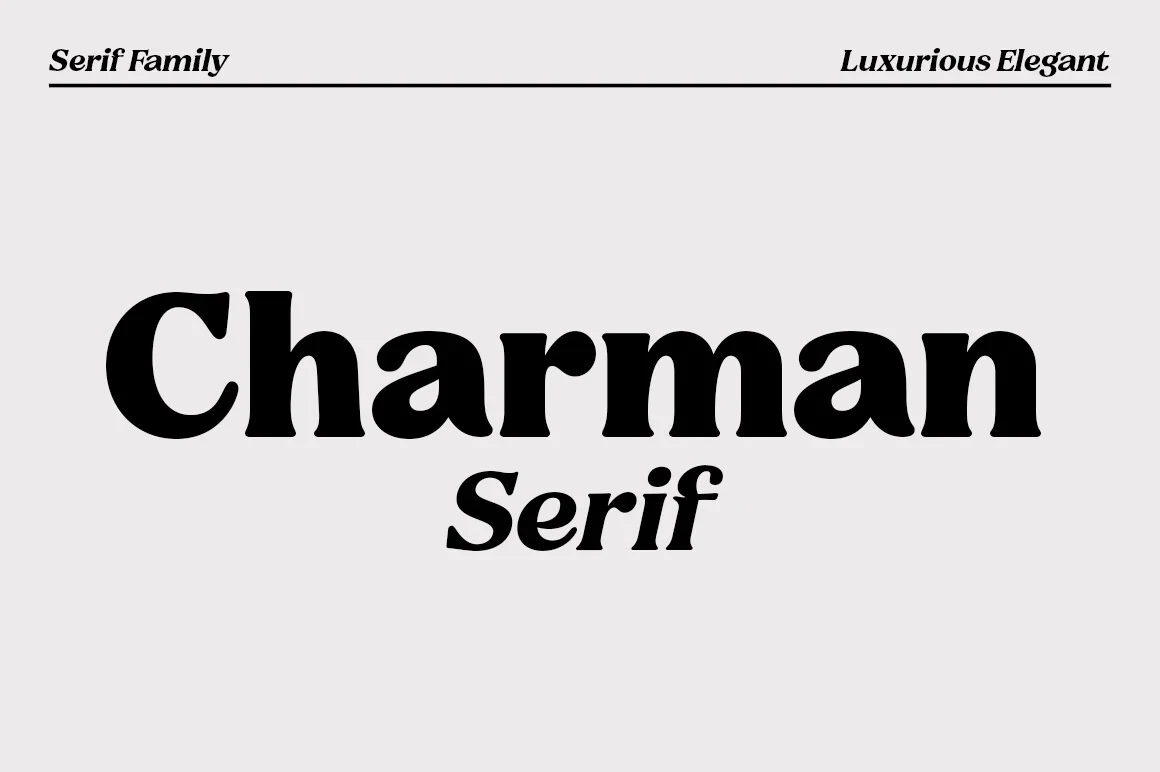
Charman Serif Font offsets heavy, wide letterforms with flared serifs and rounded terminals. This Modern Serif Font keeps substantial display weight while softening the outline, making it comparatively legible in large headings and title treatments.
Montage Font

Best For: display text, modern designs, elegant designs, luxury designs
Montage Font opens up the display structure with triangular serifs and broad geometric proportions. This Modern Serif Font reads strongly in large titles and spacious layouts, but fine hairlines become less dependable when the design is reduced to body size.
Luxora Serif Font
Best For: display text, headlines, modern designs, clean designs
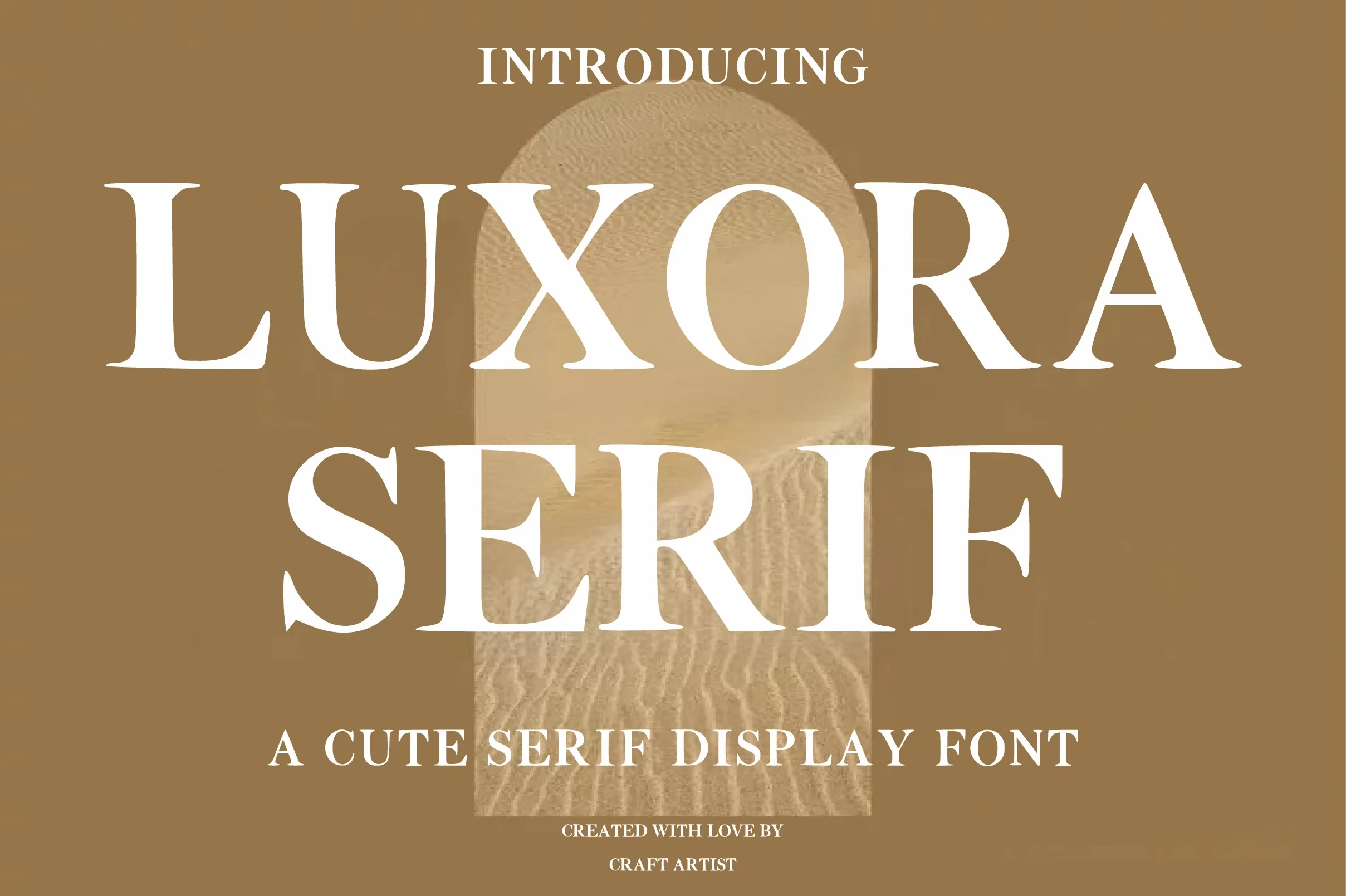
Luxora Serif Font combines bracketed serifs with disconnected upright letters for a controlled display framework. This Modern Serif Font stays clear in large headings, while high contrast and fine strokes make dense small copy a poor fit.
The Foriene Serif Font

Best For: branding, fashion branding, high-end designs, website headers
The Foriene Serif Font offers comparatively clear reading through a large x-height and open counters within its high-contrast construction. This Modern Serif Font can support branding and website headers confidently, though fine strokes still favor display sizes.
Wide And Condensed Display Serifs
These wide and condensed faces use horizontal space selectively: broad letters create substantial title blocks, while narrow forms conserve room. Both prioritize headlines over continuous reading.
Wolmer Font
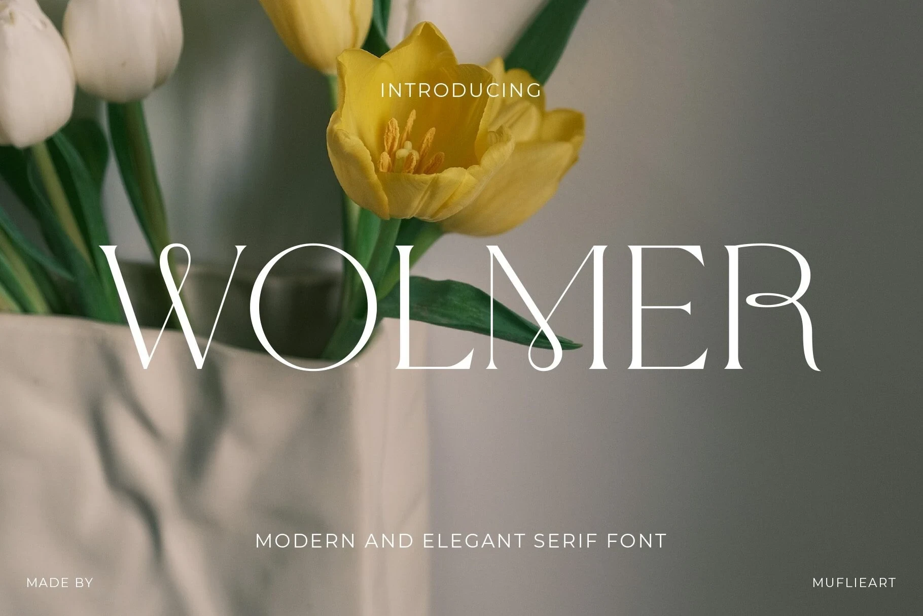
Best For: display text, wall art, modern designs, minimal designs
Wolmer Font combines elongated horizontal serifs, open counters, and a teardrop terminal on the R for a polished display silhouette. Its open construction works particularly well in large titles, wall art, and modern designs, though the contrast is less dependable when reduced.
Patcher Font
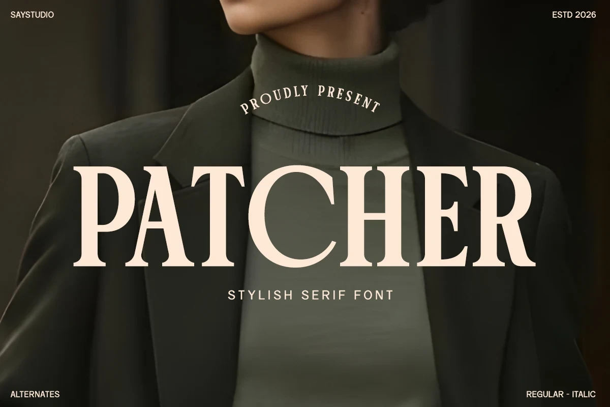
Best For: fashion branding, logos, branding, packaging
Patcher Font uses wide proportions and sharp slab-like or bracketed serifs to form a substantial title block. Its broad footprint is better suited to packaging, logos, and fashion branding than dense text settings where the width becomes restrictive.
Muzzaro Font
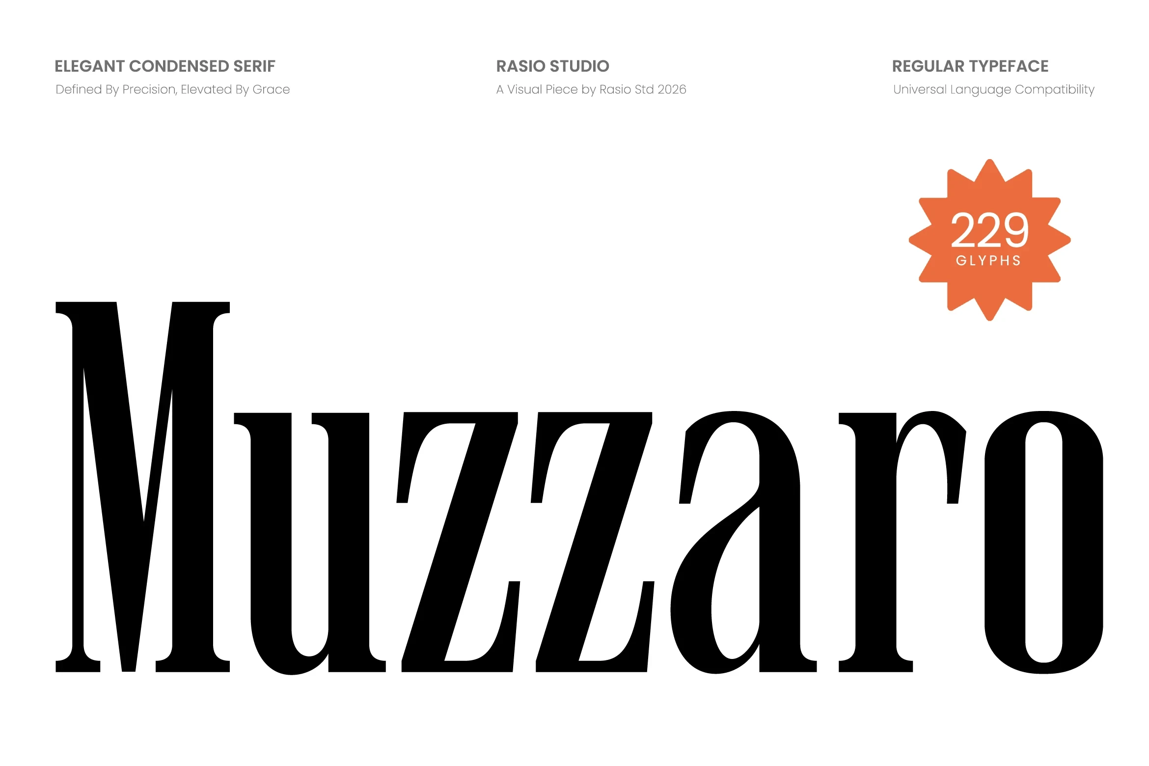
Best For: branding, packaging, headlines, fashion branding
Muzzaro Font creates tall, narrow headline shapes through extreme condensation, vertical stress, and sharp serifs. It conserves horizontal space in packaging, branding, and fashion applications, but the compressed proportions and contrast are unsuitable for sustained reading.
Papillon Serif – Elegant Modern Luxury Font

Best For: branding, high-end designs, product labels, display text
Papillon Serif – Elegant Modern Luxury Font uses condensed proportions, a large cap height, and geometric influence for compact title blocks. Its contrasting thin strokes remain clearest in branding, product labels, and headings rather than small informational copy.
Luxena Font

Best For: logos, branding, posters, headlines
Luxena Font compresses letters into an extremely narrow vertical profile with sharp bracketed serifs and pronounced contrast. It saves space in logos, posters, and headlines, but its demanding proportions make longer or smaller text difficult to scan.
Decorative Flourishes And Ligatures
Flourishes, swashes, ligatures, and alternate characters define this expressive group. Its lettering creates memorable branding and title treatments, but intricate joins require generous size and spacing.
Luxurimo Font

Best For: logos, branding, packaging
Luxurimo Font pairs a pointed, high-contrast serif with a flowing connected script. The serif keeps headlines clear, while the looped script works better for short logos, branding accents, or decorative headers than extended wording.
Grandeur – Elegant Classic Serif Font

Best For: display text, headlines, modern designs, clean designs
Grandeur – Elegant Classic Serif Font pairs needle-like serifs, open counters, and broad proportions with a spaced supporting tagline. Its hairlines need display scale, and the tagline needs generous tracking, making the combination strongest for titles and clean visual layouts.
Editorium Serif Font
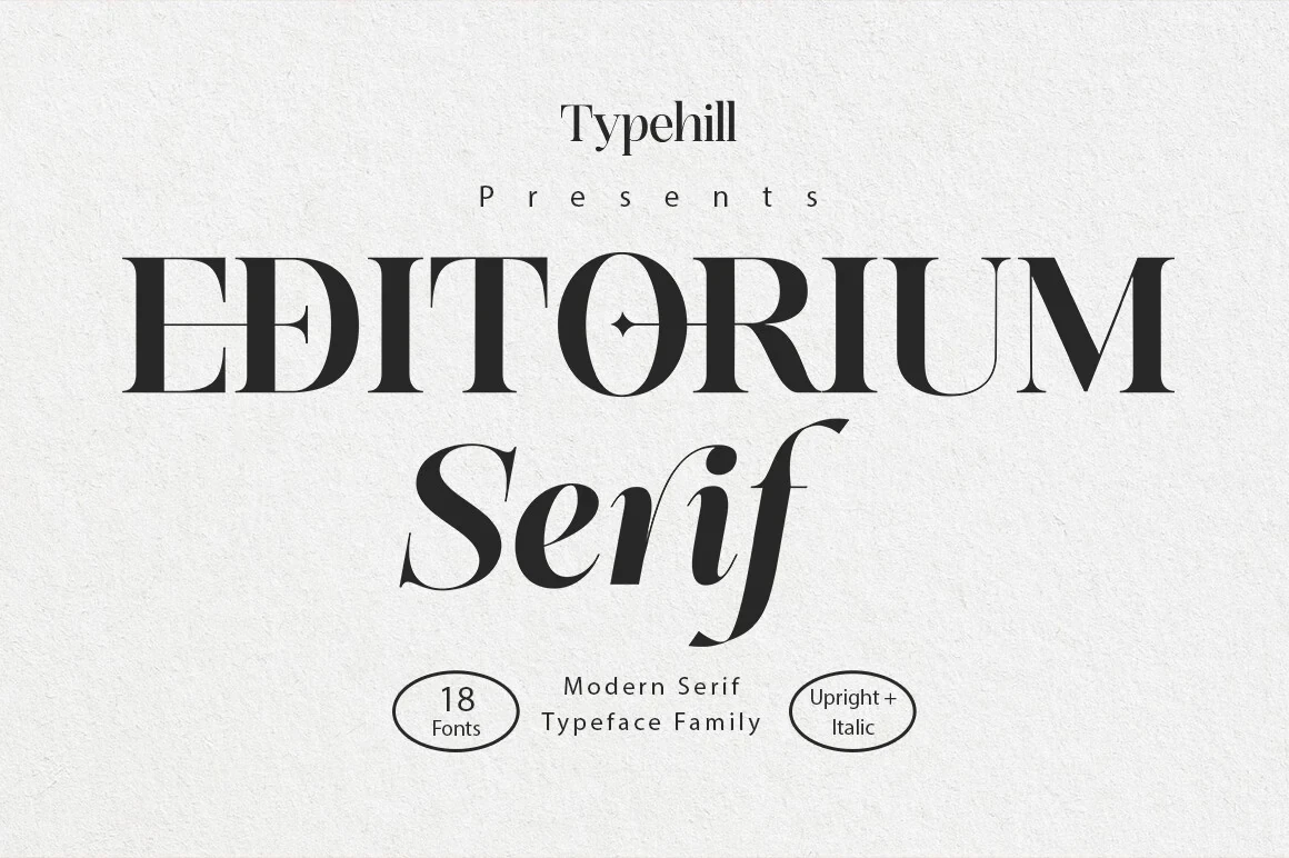
Best For: display text, modern designs, elegant designs, decorative designs
Editorium Serif Font moves beyond a standard high-contrast structure through geometric details, central flourishes, and sweeping high-waisted lowercase forms. Those interventions make it especially effective for headlines, branding, and decorative title treatments rather than long reading.
Bezoria – Elegant Serif Font
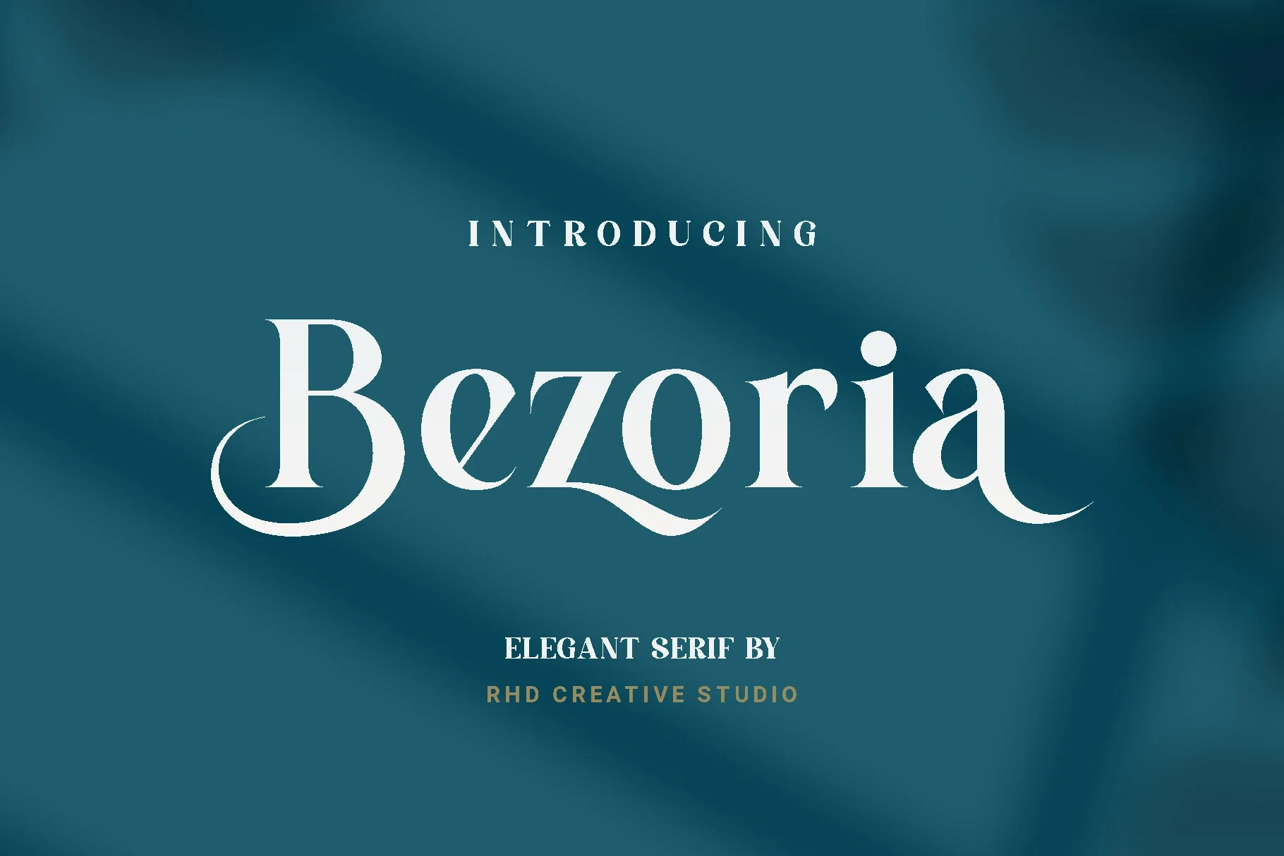
Best For: branding, high-end designs, logos, display text
Bezoria – Elegant Serif Font adds swash-like terminals to a pronounced bracketed serif framework. The moving terminal shapes read most clearly in large logos and titles, while the high contrast and flourishes can lose definition in smaller text.
Aveloire Font
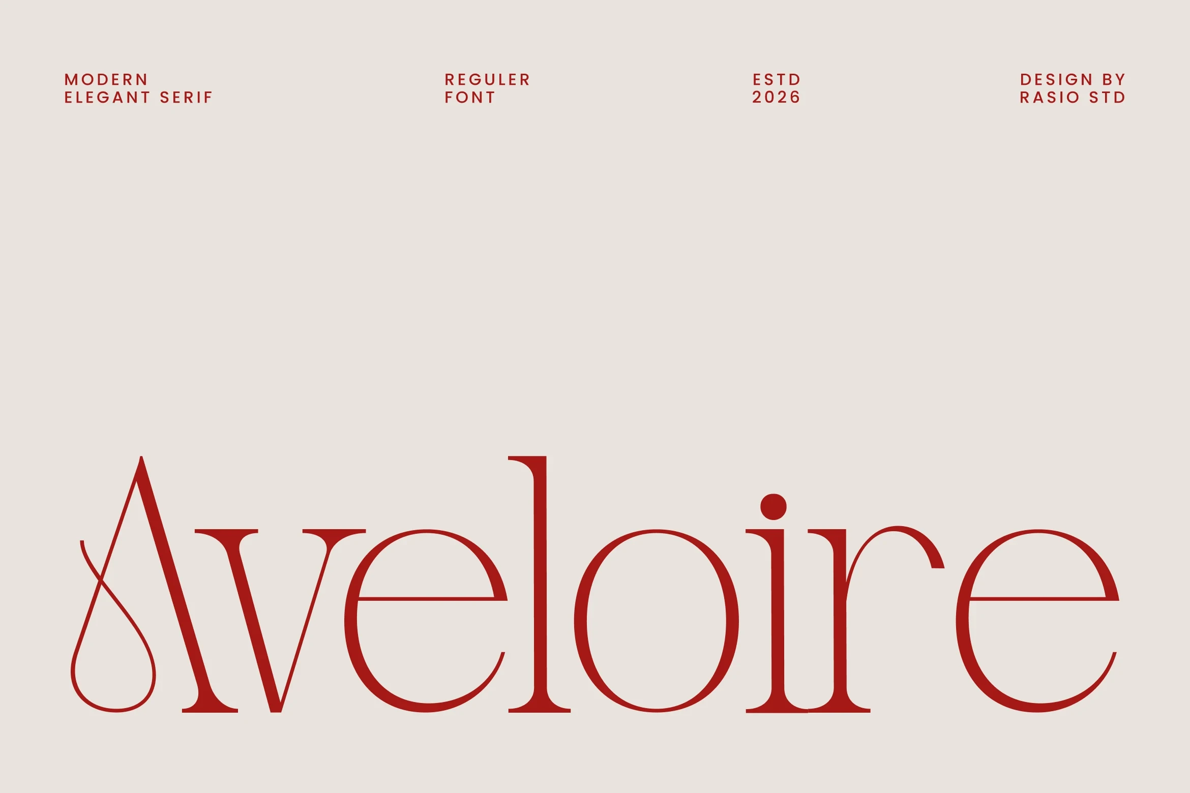
Best For: branding, headlines, fashion branding, magazine covers
Aveloire Font is recognizable through a teardrop loop inside the A and an extended e crossbar. These anchor details help fashion marks, magazine covers, and headlines stand out, but they demand generous scale to preserve easy reading.
Notica Serif Font

Best For: product labels, branding, packaging, posters
Notica Serif Font distinguishes itself with curved swashes on the O and C, plus ligatures and stylistic alternates. Those options broaden its use across product labels, packaging, posters, and branding, while the intricate details call for large sizing.
Vogane Font
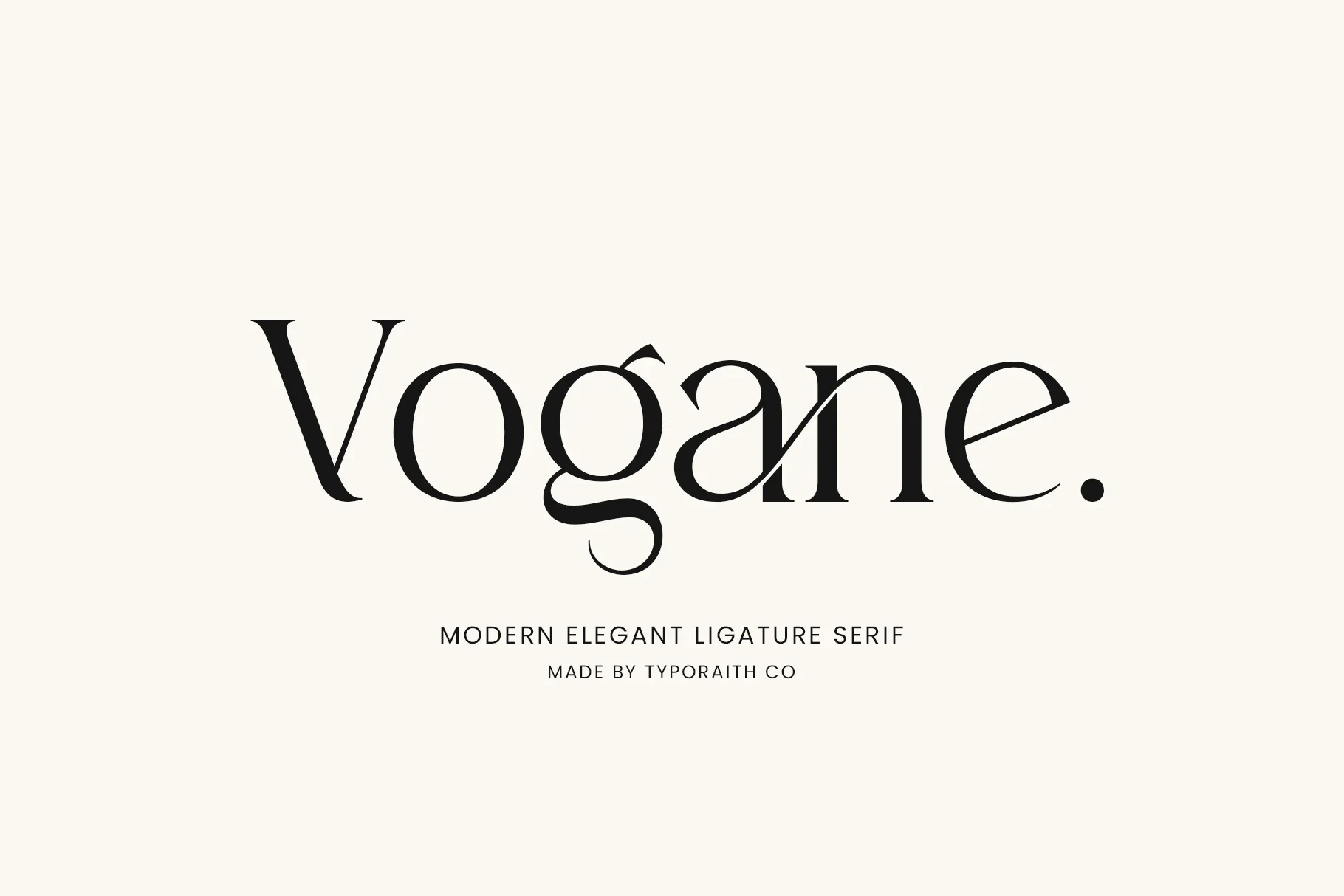
Best For: logos, branding, packaging, invitations
Vogane Font uses character-connecting ligatures, sharp tapered terminals, and a flourished lowercase g to create an especially expressive display texture. Its connected details suit logos, packaging, and invitations, but can slow reading at smaller sizes.
Ethereal Font

Best For: display text, modern designs, minimal designs, clean designs
Ethereal Font uses flowing tails on the lowercase a and l within an open, wide construction. Its swash-like terminals suit logos and titles, while the high contrast and extended shapes need display scale to remain distinct.
Rusilla Serif Font
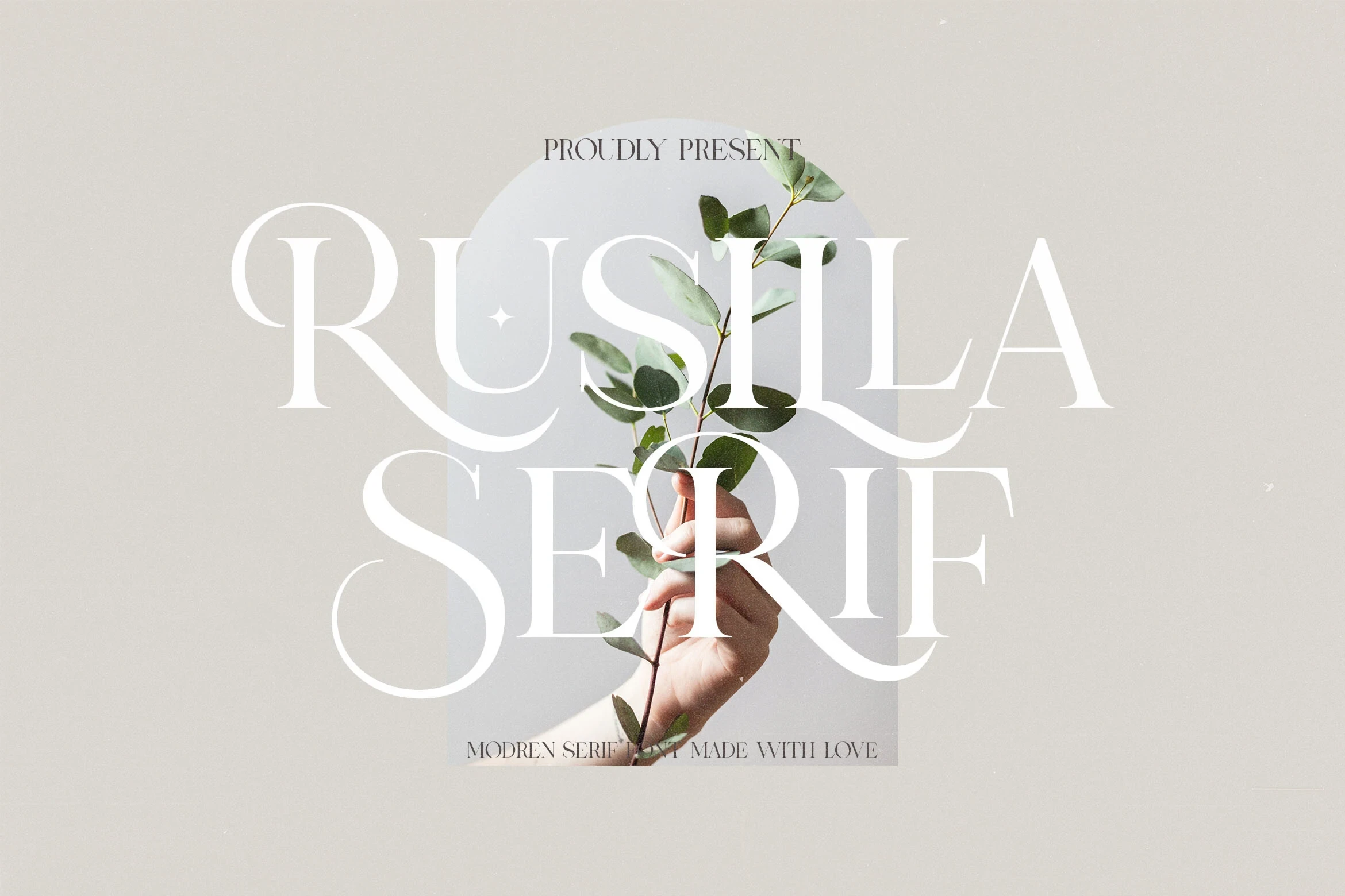
Best For: logos, branding, packaging, invitations
Rusilla Serif Font extends the high-contrast serif with elongated swashes and open rounded terminals. It can carry a logo or invitation headline effectively, but those flourishes reduce its usefulness for continuous wording or compact layouts.
Hermione Modern Serif Font

Best For: branding, fashion branding, high-end designs, display text
Hermione Modern Serif Font adds extended flourishes, ligatures, and alternate characters to its sharp serif skeleton. Those options create useful branding variation and suit fashion branding, but the intricate joins are best reserved for large titles.
Balgind Modern Serif Font

Best For: high-end designs, display text, modern designs, minimal designs
Balgind Modern Serif Font pushes a wide high-contrast structure toward greater movement through elongated terminal swashes. Its ligature support benefits display work and modern layouts, although thin strokes and flourishes lose definition when reduced.
Slab, Organic, And Hand-Drawn Serifs
Slab serifs, uneven strokes, and informal construction give these faces a warmer, less polished surface. They stand apart through tactile personality and short-form display impact.
Nudes Slab Serif Font
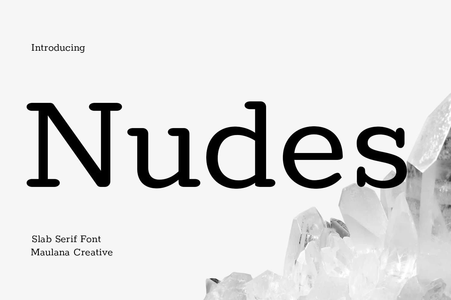
Best For: social media graphics, logos, book covers, short phrases
Nudes Slab Serif Font uses rounded rectangular serifs and clear block forms for a sturdy contemporary structure. Its large-scale lettering handles short phrases well, while ligatures, alternates, and support for more than 100 languages extend its branding and cover applications.
Wildflower Apothecary Font

Best For: T-shirts, logos, branding, invitations
Wildflower Apothecary Font softens its bracketed serif framework with slightly irregular, hand-drawn strokes. That uneven surface adds personality to T-shirts, logos, branding, and invitations, although the imperfections can reduce clarity when the lettering is set very small.
The Serif Hand Font

Best For: display text, modern designs, minimal designs, clean designs
The Serif Hand Font combines uneven strokes, blocky slab-like serifs, condensed proportions, and a right-leaning stance. Its disconnected texture suits short playful statements, while irregular thin details make very small use less clear.
How to Choose the Right Font
Choose by construction first: wide faces create spacious title blocks, condensed styles save room, and slabs or irregular strokes add a more tactile surface. For the clearest Modern Serif Fonts, favor open counters, taller x-heights, and fewer flourishes; reserve thin contrast, swashes, and ligatures for large logos, covers, packaging, and short headlines.