25 Best Playful Cute Fonts in 2027
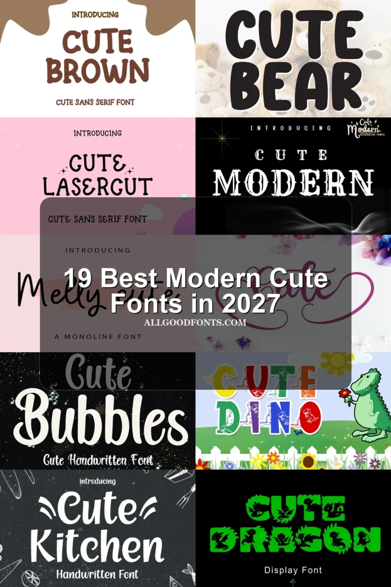
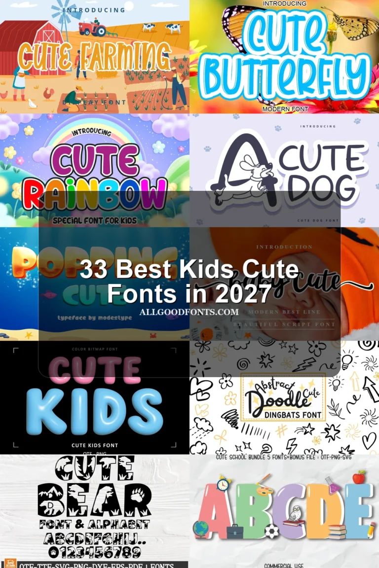
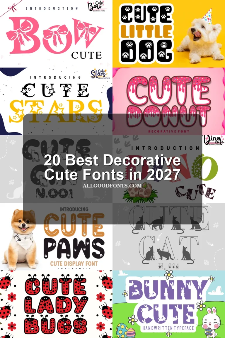
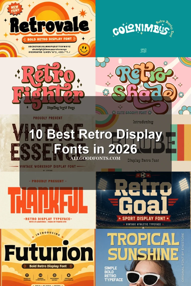
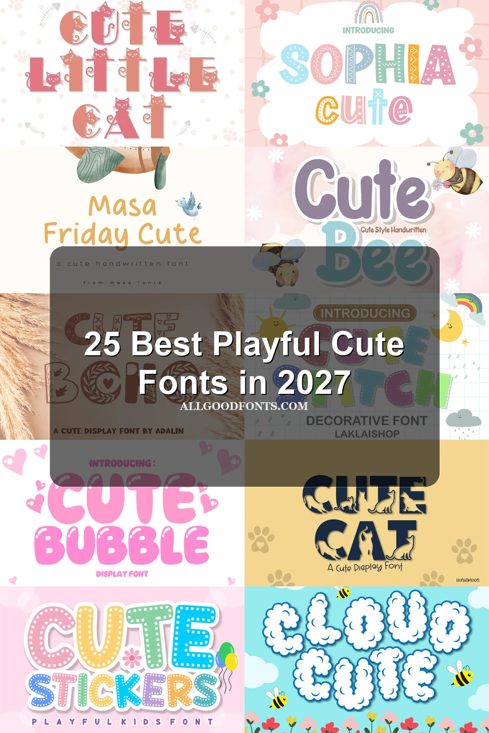
This collection spans rounded monoline lettering, textured block forms, illustrated themes, and expressive serif or script styles. These Playful Cute Fonts are mainly built for headings, invitations, labels, logos, packaging, stickers, social graphics, and other short display applications where personality matters.
Looking for more cute fonts? Browse our complete Cute Fonts collection to compare modern, bold, and cute cute styles.
Playful Cute Fonts: Rounded Lettering
Playful Cute Fonts in this group rely on rounded, approachable construction, from heavy monoline forms to lighter handwritten rhythms. They are generally clearer than the illustrated and heavily textured categories.
Animal Cute Font
Best For: logos, branding, invitations
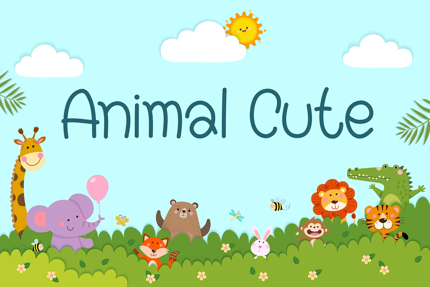
Animal Cute Font uses wide handwritten sans-serif proportions, monoline strokes, rounded terminals, and casually inconsistent shapes. Its low x-height and wide apertures keep Playful Cute Fonts readable in large headings, logos, and child-focused branding, though compact text is a poor fit.
Cute Bee Font
Best For: display text, soft designs, playful designs
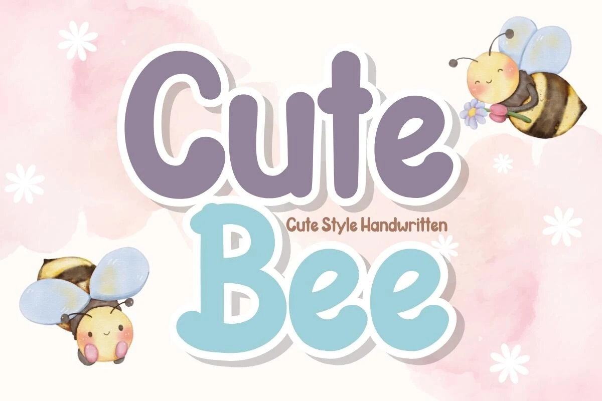
Cute Bee Font is built from upright rounded sans-serif letters with a consistent monoline and heavy stroke. Its clean silhouette is one of the clearer large-label choices here, though the weight becomes excessive for small text.
Masa Friday Cute Font
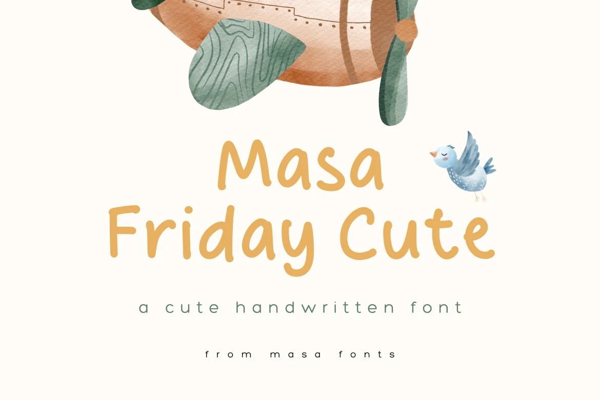
Best For: display text, clean designs, soft designs
Masa Friday Cute Font uses simple upright rounded forms that remain disconnected rather than flowing together. That separation makes approachable headings easier to read and provides a tidier alternative to connected lettering for short phrases.
Cute Cow Font
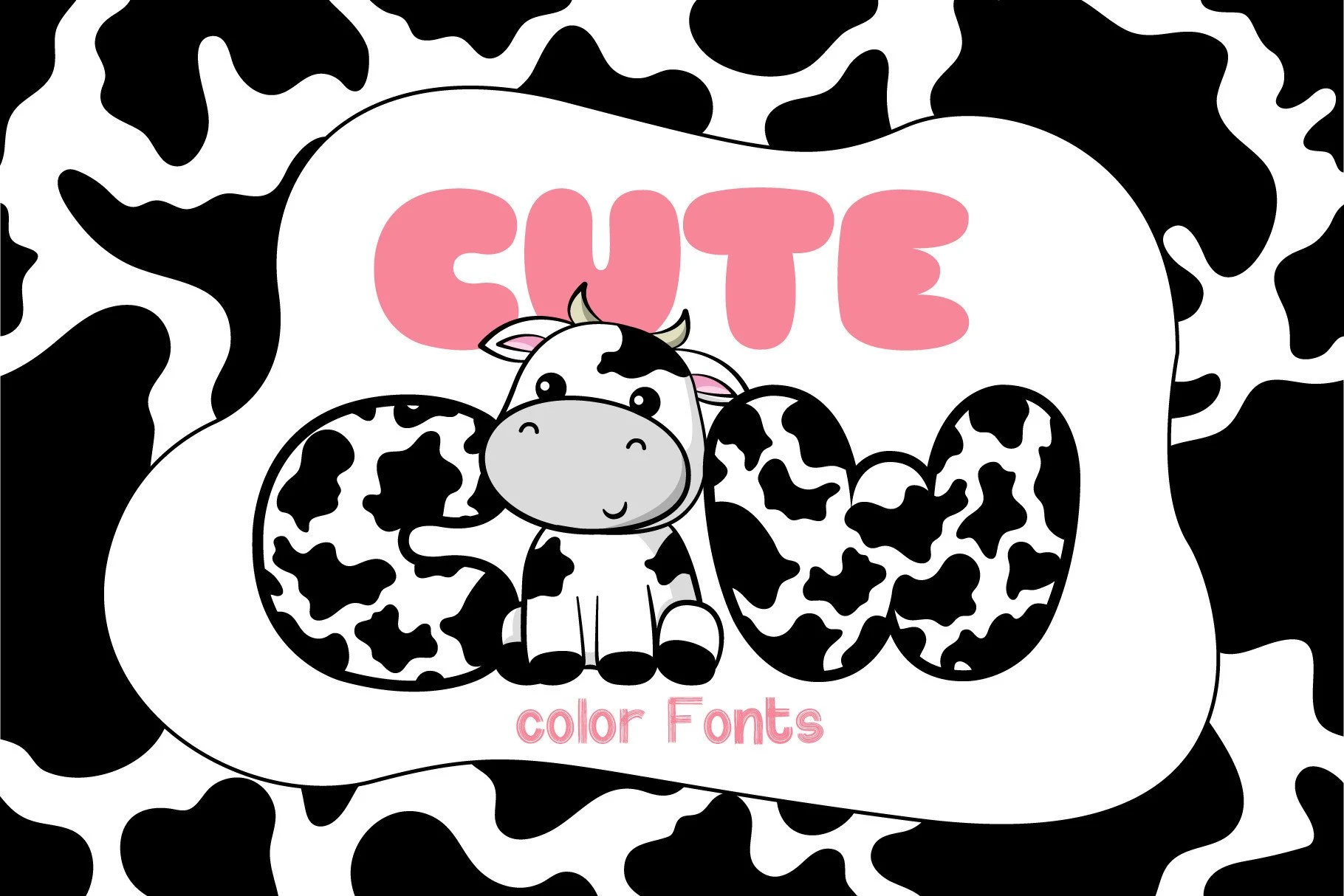
Best For: invitations, social media graphics, display text
Cute Cow Font has rounded display characters and a clearly maintained stroke rhythm. That control helps names and short phrases remain easy to compare, making it a practical choice when a themed display treatment still needs readable letter shapes.
Ballpoint Cute Font
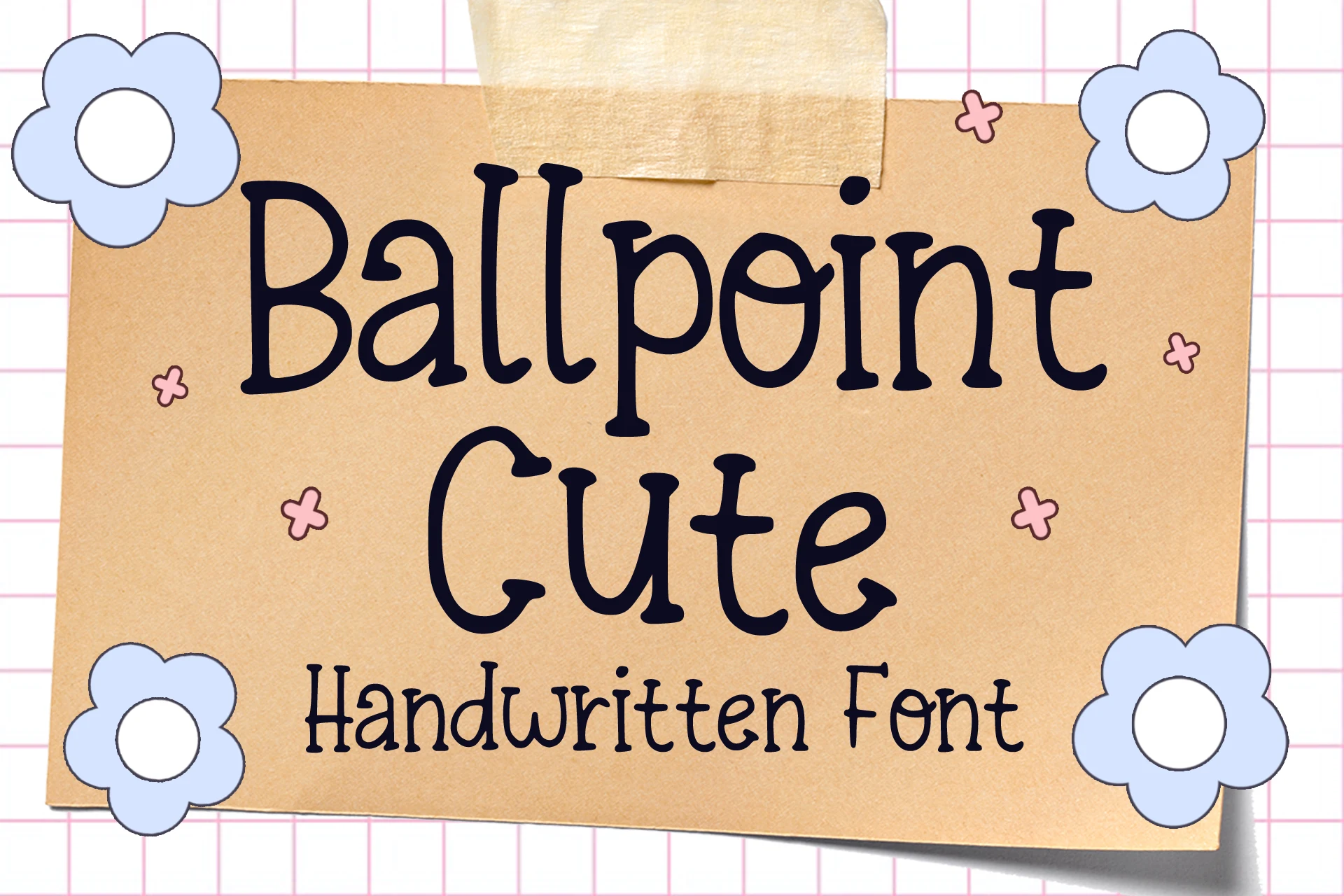
Best For: book covers, stickers, T-shirts
Ballpoint Cute Font uses upright, disconnected ballpoint-style characters on an irregular baseline. Its consistent monoline keeps casual phrases readable on stickers and shirts, while the uneven alignment supplies handmade energy without relying on joined lettering.
Wola Cute Font
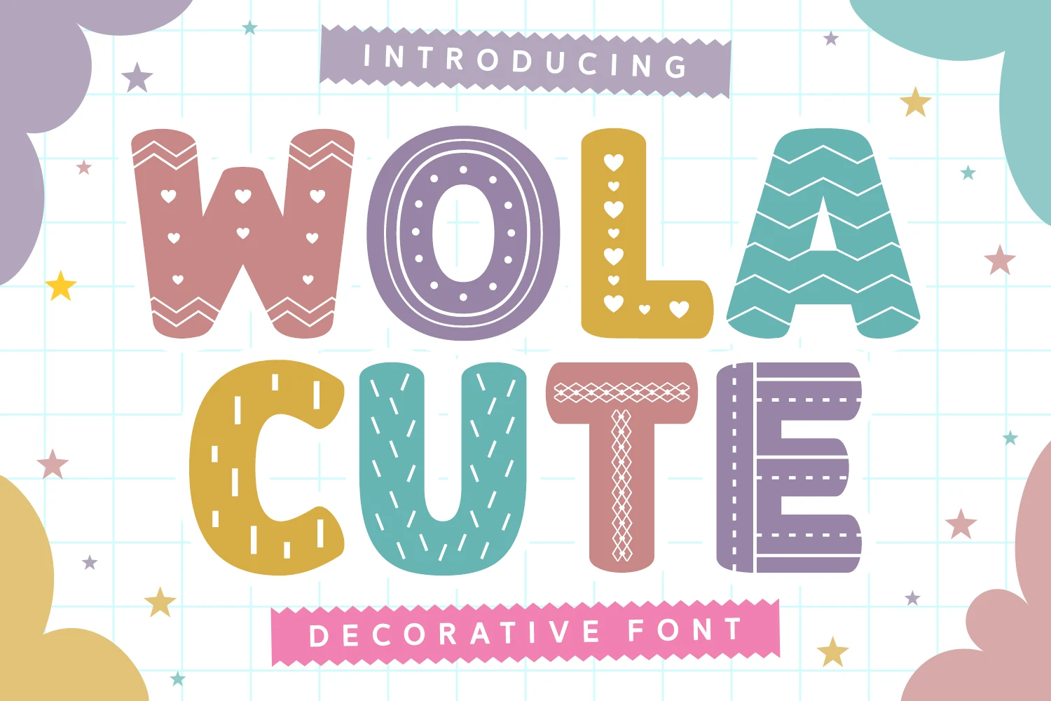
Best For: display text, playful designs, expressive designs
Wola Cute Font has slender strokes and a lighter visual footprint than the collection’s heavier rounded faces. Its refined rhythm suits short expressive headings and names, but the thinner construction needs careful handling at small sizes.
Cute Note Font
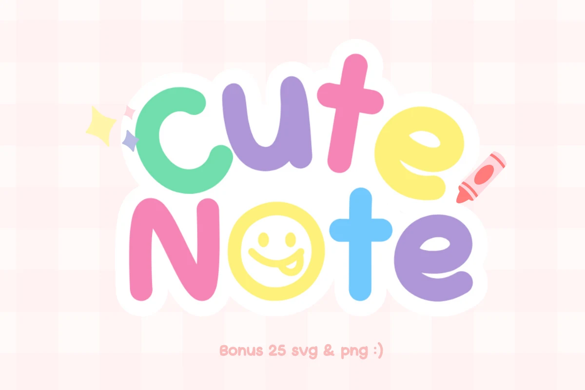
Best For: T-shirts, logos, posters, quotes
Cute Note Font builds soft geometric lowercase forms from bulbous rounded shapes and thick monoline strokes. It stays legible for logos, posters, and quotes, and its supplied SVG and PNG files support flexible graphic workflows.
Patterned Display Lettering
These designs treat each letter as a surface for patterns, stitches, motifs, or changing textures. Their sturdy silhouettes remain effective in titles, but interior detail makes them less suitable for small text.
Sophia Cute Font
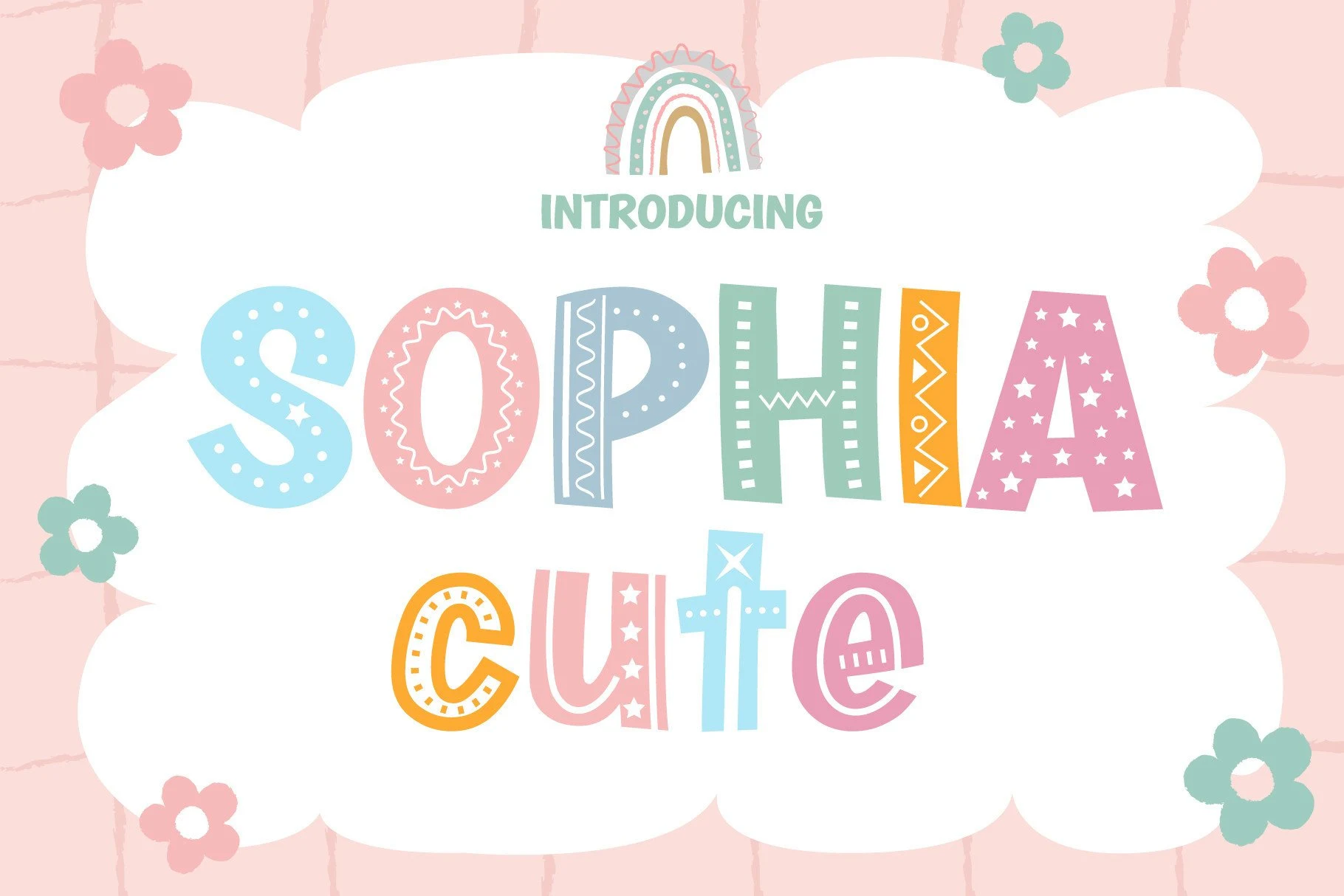
Best For: children’s designs, display text, playful designs
Sophia Cute Font builds heavy block letters with rounded corners, then individualizes them using dots, lines, triangles, and stars. This Playful Cute Fonts choice has a clear title-scale silhouette for short phrases, but its varied interiors are unsuitable for dense copy.
Cute Stickers Font
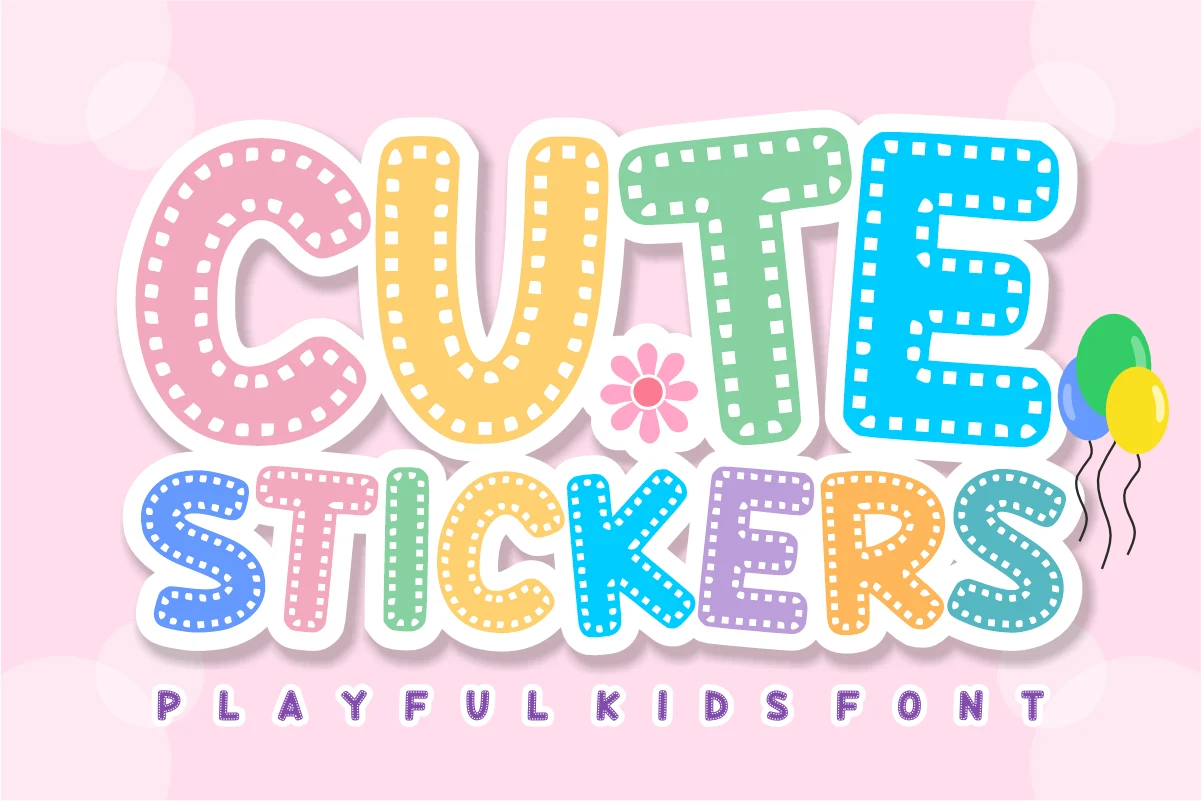
Best For: stickers, display text, clean designs
Cute Stickers Font is a wide, rounded display face with monoline construction and a faux-perforated edge. Among Playful Cute Fonts, it gives stickers and craft graphics a particularly tactile identity; keep it large, because the contour texture can interrupt recognition when reduced.
Cute Bubble Font
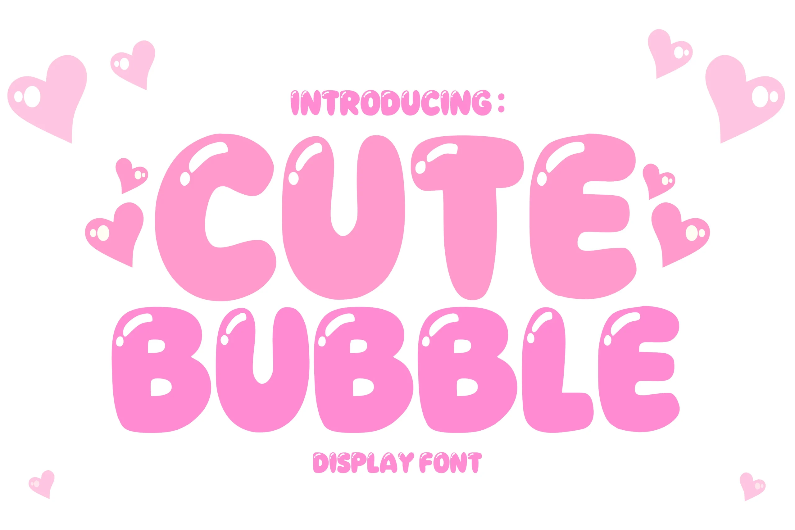
Best For: invitations, social media graphics, display text
Cute Bubble Font uses ultra-heavy geometric forms, pill-shaped terminals, and highlight reflections inside the letters. This Playful Cute Fonts option reads quickly on invitations and social graphics, although those reflections can muddy smaller settings and longer wording.
Luna Cute Font
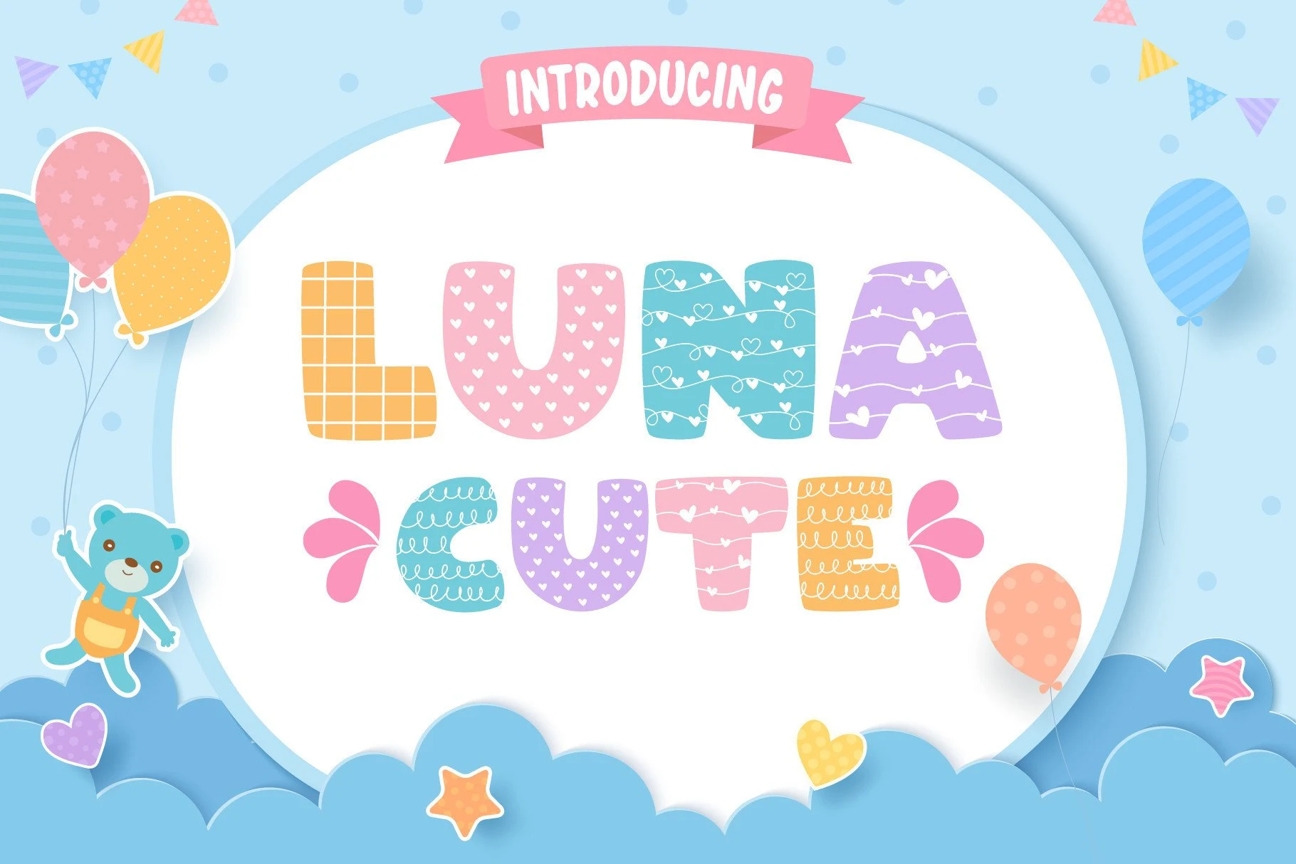
Best For: display text, soft designs, playful designs
Luna Cute Font offers uppercase geometric lettering with rounded terminals and uniform heavy strokes. Its Playful Cute Fonts appeal comes from changing surface patterns across broad letterforms, so it works best for short headings rather than small or information-heavy layouts.
Lora Cute Font
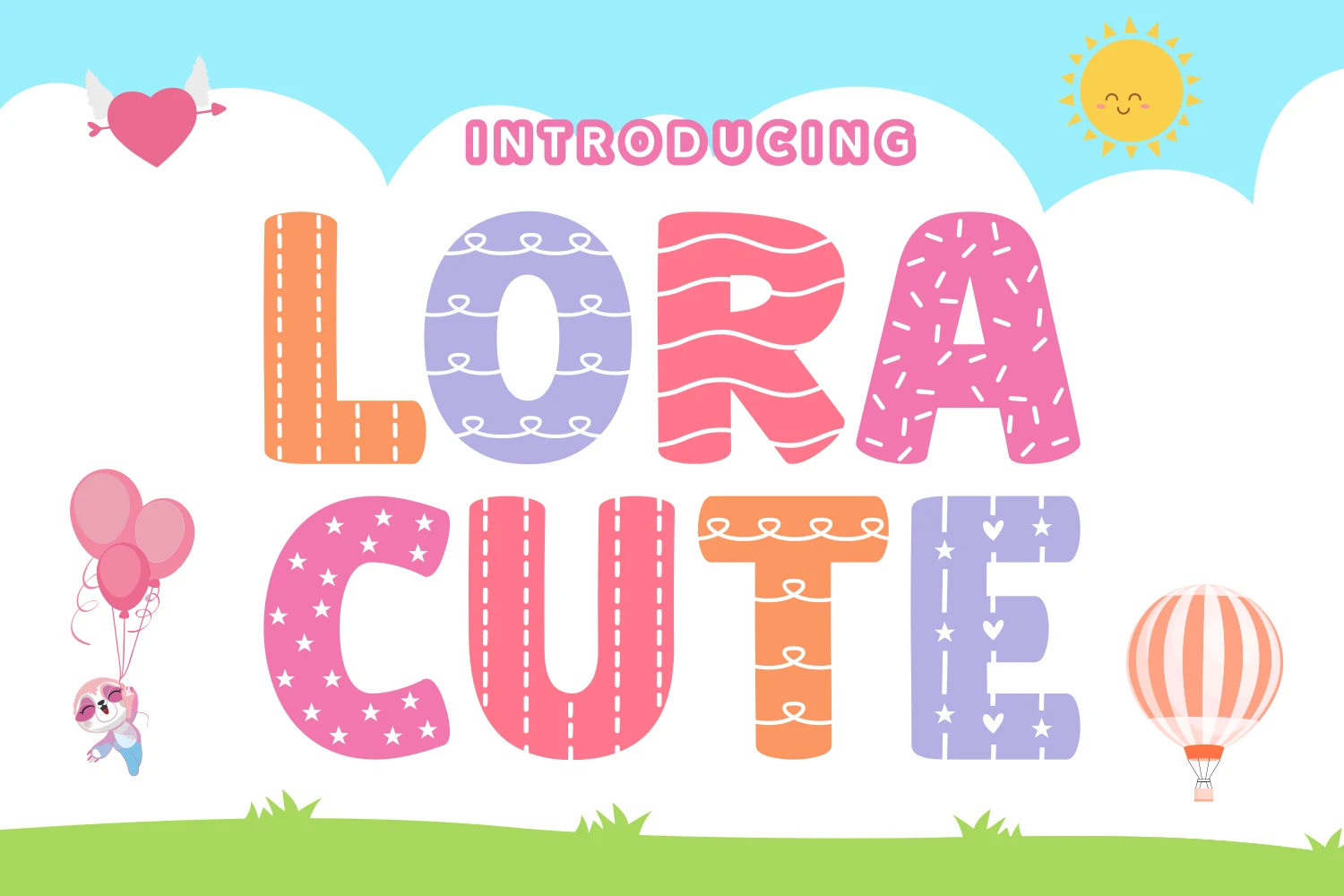
Best For: packaging, display text, playful designs
Lora Cute Font combines rounded uppercase forms, blunt terminals, heavy strokes, and individualized interior treatments. For Playful Cute Fonts packaging headlines, its structure remains readable at large sizes, while the surface detail should be reserved for short display text.
Cute Freya Font
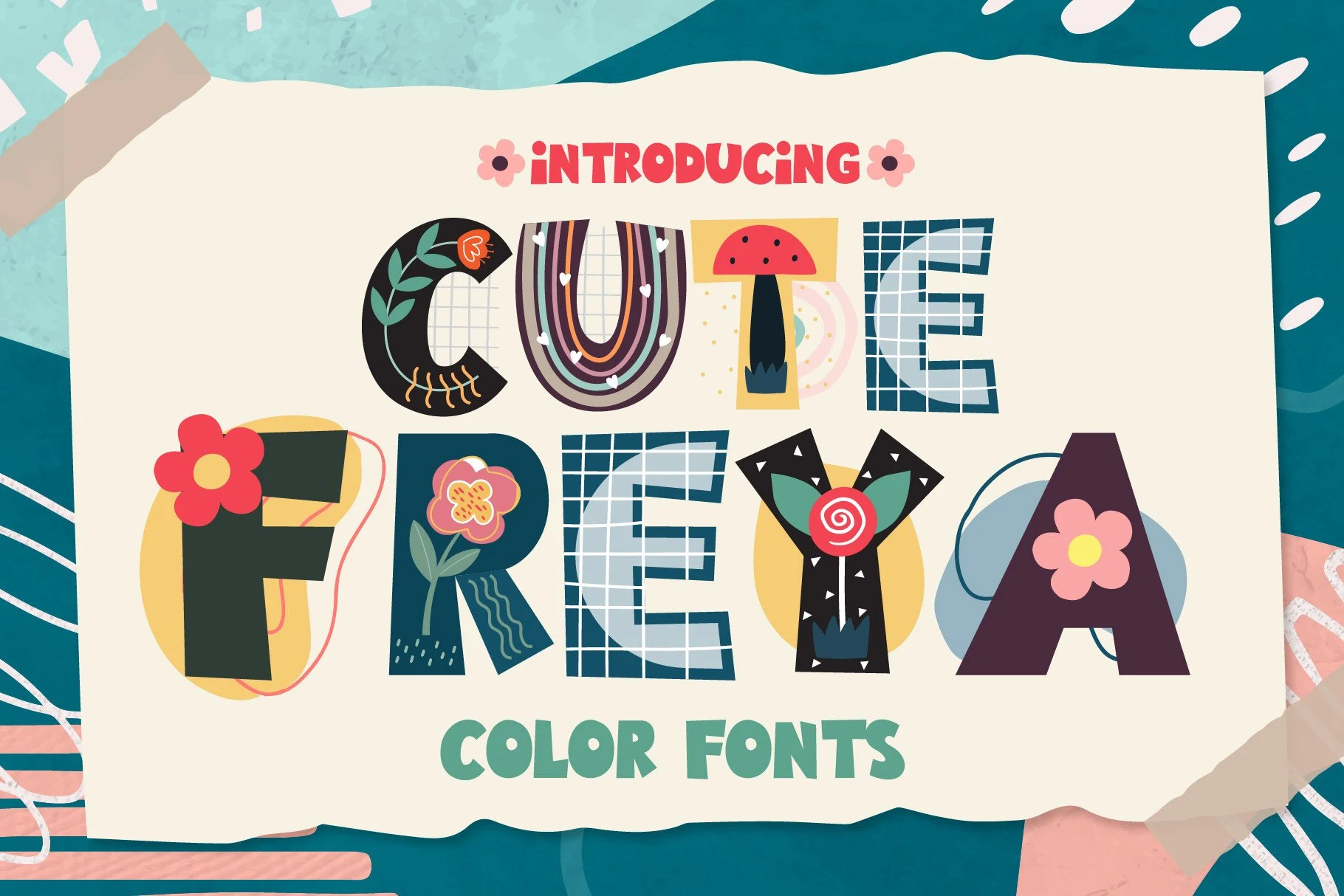
Best For: invitations, social media graphics, eye-catching designs
Cute Freya Font fills bold block letters with different illustrations and motifs, while mixed-case variation adds an informal bohemian flavor. It suits invitations and social graphics, but dense interiors need large sizing and plenty of surrounding space.
Cute Boho Font
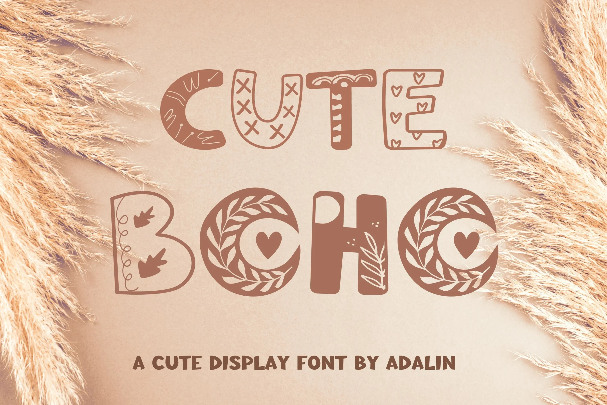
Best For: branding, posters, invitations
Cute Boho Font uses disconnected uppercase-style letters as containers for hearts, leaves, and geometric motifs. The thick forms bring an organic illustrative feel to posters and invitations, while the intricate interiors reduce clarity in dense layouts.
Cute Stitch Font

Best For: book covers, display text, clean designs
Cute Stitch Font pairs thick rounded block letters with faux-stitched outlines. The simple bodies preserve recognition for covers and stickers, while the stitch treatment earns its place visually only when displayed large enough to see clearly.
Cute Camila Font

Best For: invitations, social media graphics, eye-catching designs
Cute Camila Font uses wide monoline letters, rounded terminals, and bold proportions. Its substantial forms create eye-catching invitation and social-media titles, while interior patterns lose detail when reduced, so supporting text should remain simpler.
Themed Illustrative Lettering
Illustration drives this group: cats, dogs, fruit, ladybugs, and cloud-like contours become part of the letterforms. The subject is immediate at display size, though imagery can interfere with recognition when reduced.
Cute Cat Font
Best For: display text, playful designs, cute designs
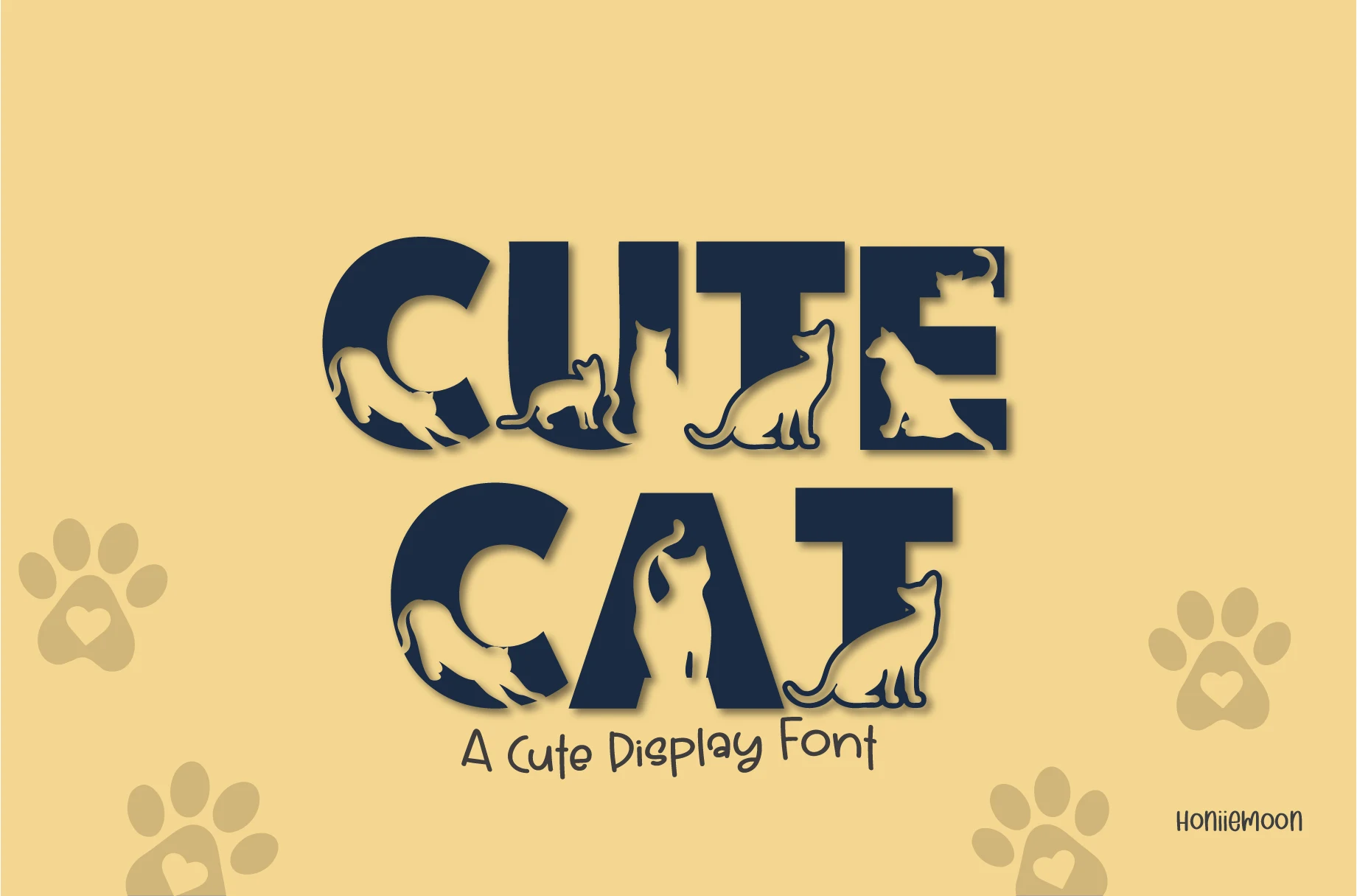
Cute Cat Font uses bold block-letter construction with feline silhouettes cut into the negative space. This Playful Cute Fonts design communicates its subject immediately in large titles, but the internal contours can obscure letter identity when scaled down.
Cute Fruit Font

Best For: invitations, social media graphics, eye-catching designs
Cute Fruit Font turns each chunky letter into a separate fruit-filled graphic, with irregular organic contours, varied textures, and color-filled interiors. It creates an immediate focal point for posters and invitations, but the complex fills rule out body copy.
Cute Dog Font
Best For: display text, classic designs, playful designs
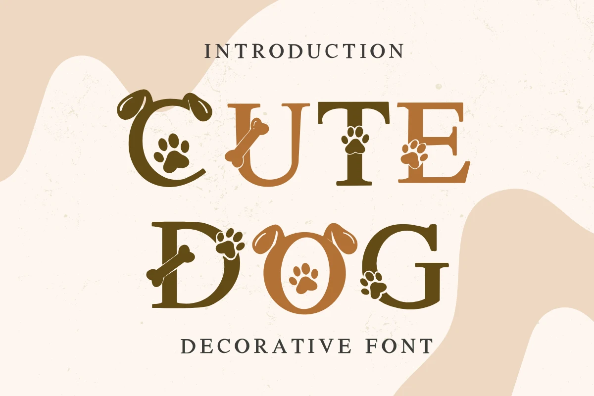
Cute Dog Font uses heavy, right-leaning serif forms with slab-like serifs and dog icons embedded in the letter bodies. The canine subject is unmistakable in headings and branding, but the icons limit it to short titles rather than extended wording.
Cute Little Cat Font
Best For: social media graphics, display text, playful designs
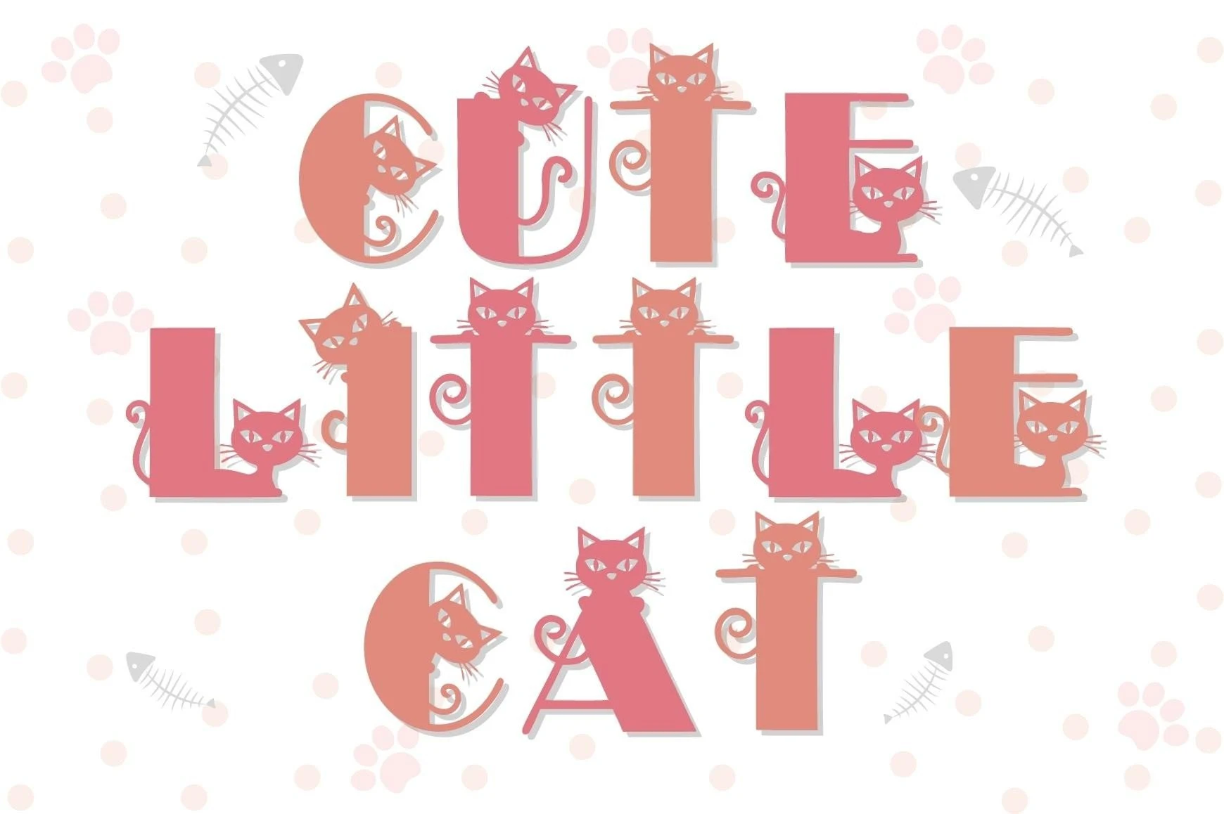
Cute Little Cat Font modifies geometric sans-serif characters with cat silhouettes inside and around the forms. The feline subject is immediate in social graphics, but the integrated illustrations demand large sizing to preserve each letter’s shape.
Cute Ladybug Font
Best For: invitations, social media graphics, eye-catching designs
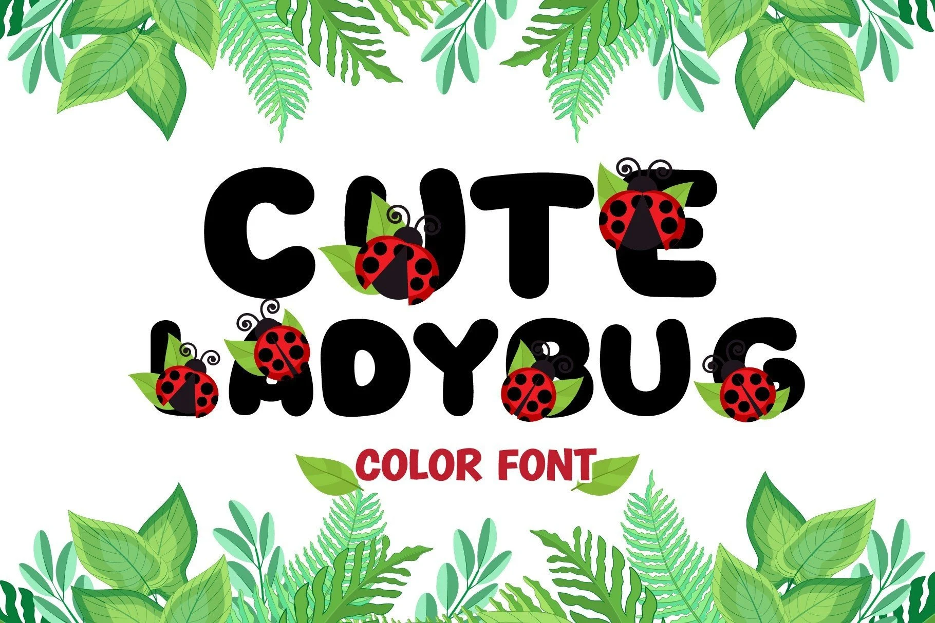
Cute Ladybug Font combines heavy rounded sans-serif characters with ladybug illustrations. The inserts make the subject clear in invitations and social graphics, while the display-only treatment limits the amount of wording it can carry comfortably.
Cute Cloud Font
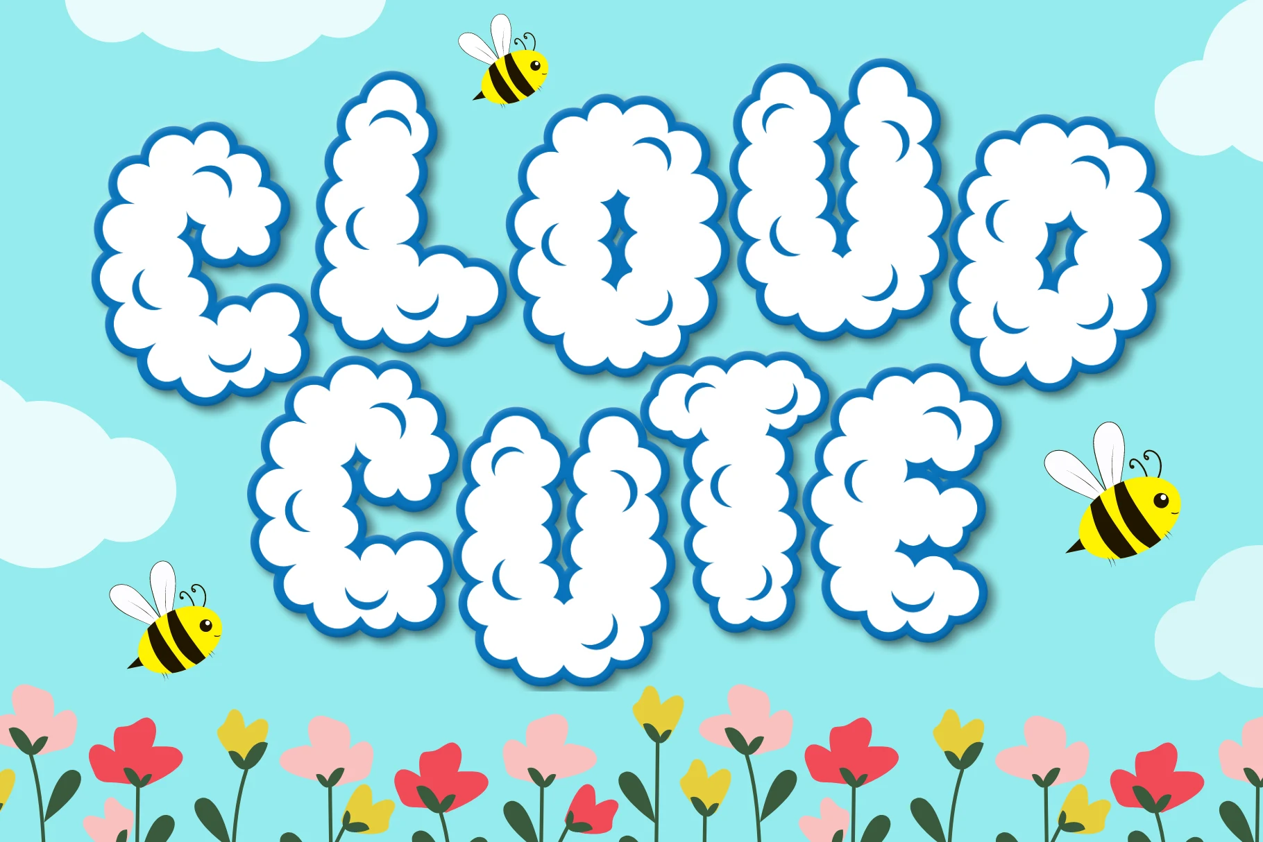
Best For: wall art, T-shirts, display text
Cute Cloud Font uses bulky disconnected forms edged with irregular cloud-like contours. The soft silhouette works well on wall art and shirts, but uneven edges give it only moderate legibility outside large headings.
Whimsical Serif And Script
Serifs, flourishes, and connected movement give these faces a more storybook or label-oriented character. Compared with the rounded sans styles, they offer greater contrast but require more generous sizing.
Cute Face Expression Font
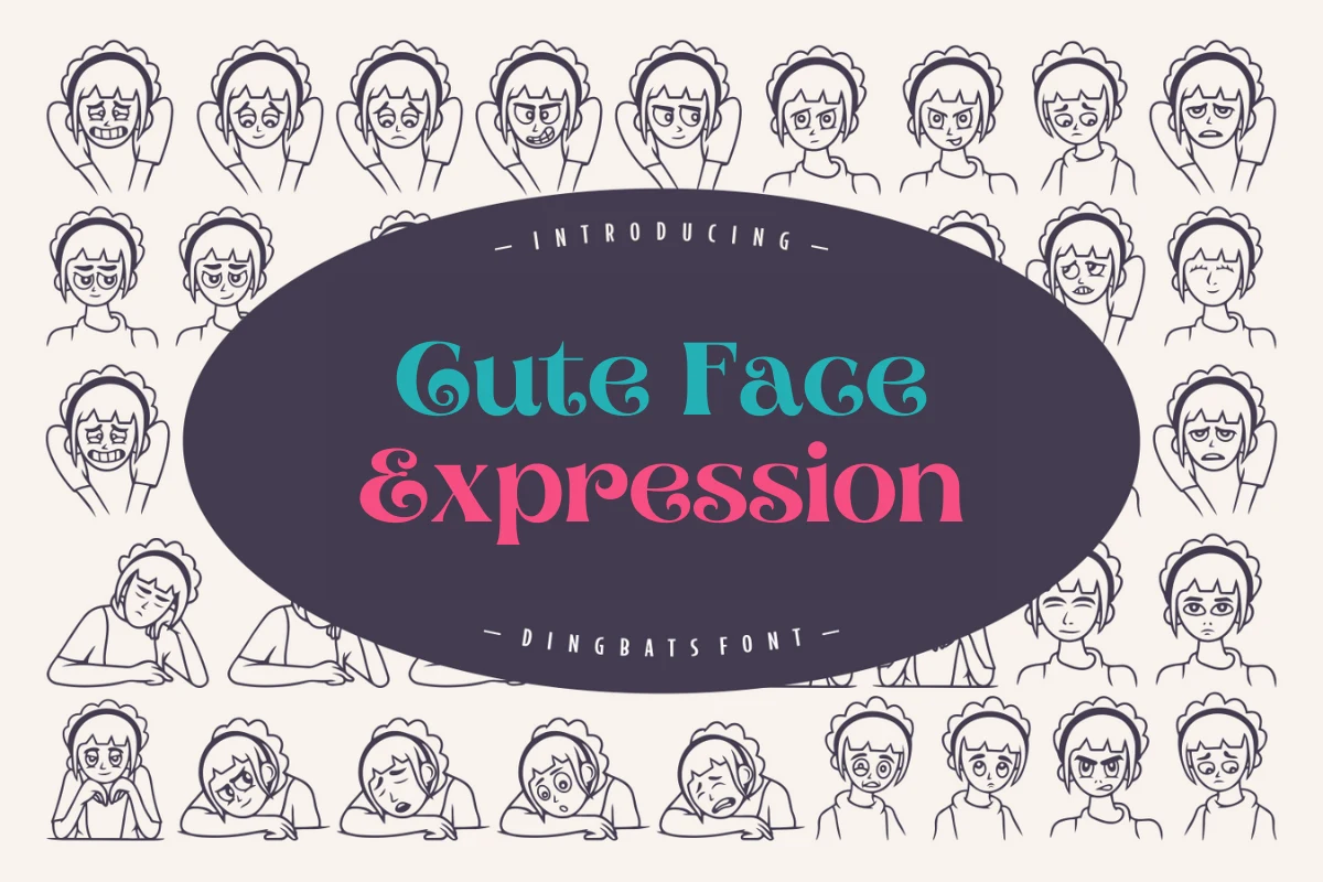
Best For: product labels, display text, clean designs
Cute Face Expression Font brings high-contrast serif construction, ball terminals, extended serifs, and curved stems to a characterful product-label voice. Its fine details reward generous display scale, while smaller settings may lose clarity.
Cute Sign Font
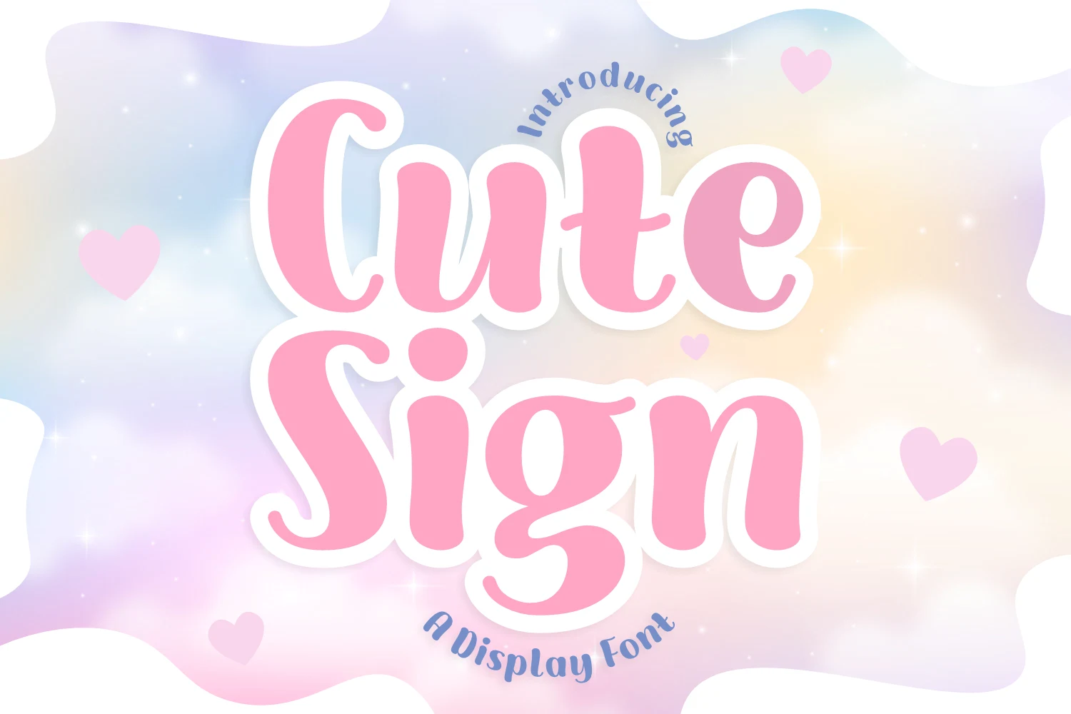
Best For: product labels, branding, packaging
Cute Sign Font is a connected display script with bold, rounded, uniform-weight flow and soft curves. Its continuous movement works well for friendly labels, packaging, and wordmarks, but joined construction makes it unsuitable for long passages.
Fairy Cute Font

Best For: display text, clean designs, soft designs
Fairy Cute Font combines high-contrast serif lettering with flourished swashes extending from the F and e. The result has a storybook title character, though stroke variation and flourishes can compromise reading when the size becomes too small.
How to Choose the Right Font
Choose the cleanest rounded options when readability matters most, especially for labels, logos, and short names. Use patterned or illustrated faces when the lettering is the main visual, and reserve serif or connected styles for distinctive titles and wordmarks. For Playful Cute Fonts at smaller sizes, test joins, flourishes, interior detail, and stroke weight before committing.