10 Best Retro Display Fonts in 2026
Retro Display Fonts span rounded block lettering, interlocking slab forms, rugged sign-inspired structures, and connected script. Their practical roles range from logos and packaging to posters, signage, apparel, and social graphics, with readability depending heavily on construction, spacing, texture, and display size.
Looking for more display fonts? Browse our complete Display Fonts collection to compare bold, vintage, retro, decorative, and playful display styles.

Retro Display Fonts: Rounded Block Forms
These Retro Display Fonts use rounded, wide, low-contrast forms with substantial visual mass. Compared with the other groups, they favor approachable block silhouettes over interlocking details, rugged spurs, or continuous script.
Tropical Sunshine Font

Best For: branding, posters, quotes
Tropical Sunshine Font uses uniform rounded strokes, soft-corner terminals, and slightly wide proportions to form a gentle block presence. It remains clear in posters, branding, and quotes, though its heavy rounded shapes can merge at small sizes.
Grvs Colonimbus Retro Display Font

Best For: logos, display text, soft designs
Grvs Colonimbus Retro Display Font is built from disconnected bubbled letters with irregular hand-drawn edges, not a continuous word construction. Consistent interior spacing helps headlines stay readable, while its chunky surface texture needs display scale to remain distinct.
Retrovale Font

Best For: signage, social media graphics, display text, eye-catching designs
For signs, posters, and logos, Retrovale Font delivers wide, low-contrast forms with rounded terminals and a distinctly chunky silhouette. Its heavy visual mass remains highly visible at large sizes, and the shown drop-shadow treatment adds separation, though the face is less suitable for compact copy.
Futurion Font
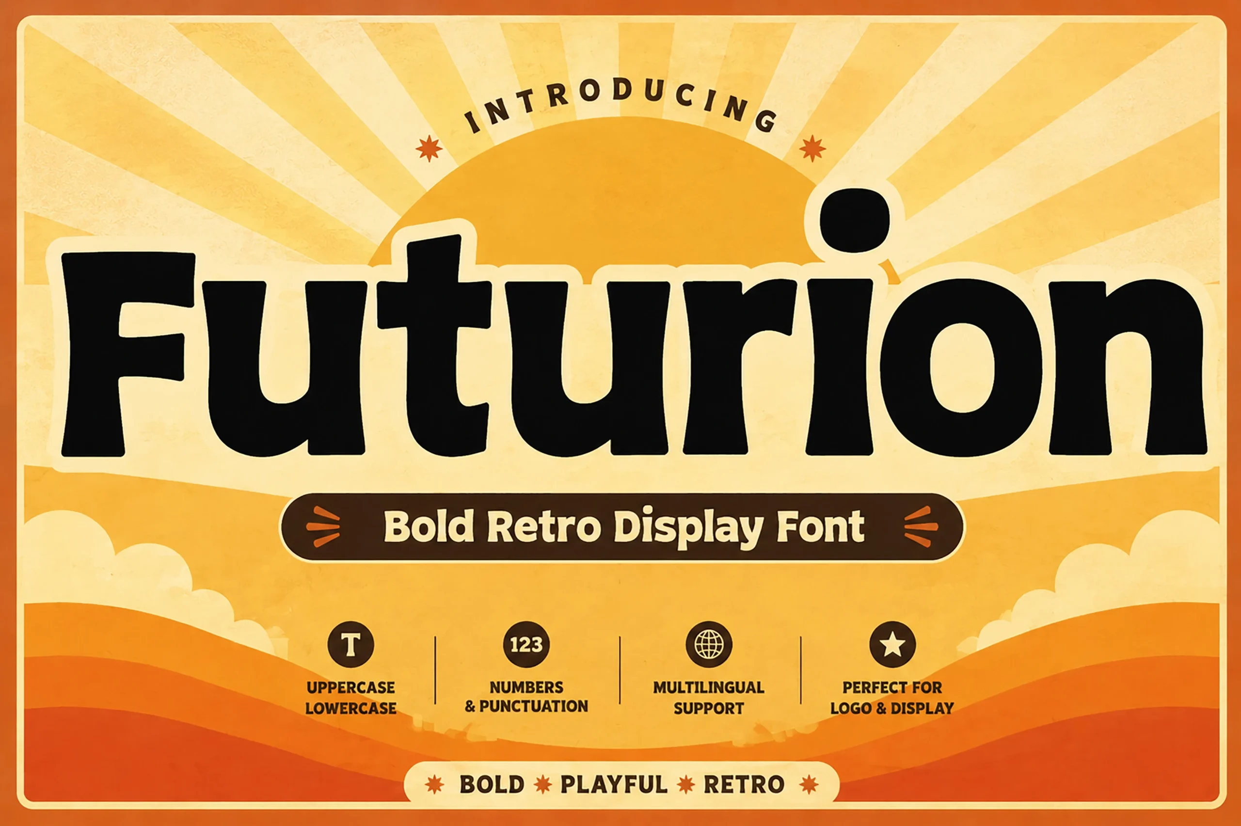
Best For: branding, display text, soft designs
Futurion Font emphasizes wide, rounded letterforms, thick low-contrast strokes, and rounded terminals for a softer modern-retro silhouette. It holds up in headers, branding, and signage, but its substantial forms are better reserved for short text than small copy.
Decorative, Interlocking, and Flowing Forms
This group of Retro Display Fonts creates character through overlap, interlocking joins, ornamental terminals, or connected movement. Their more complex construction separates them from the clearer, standalone block forms elsewhere.
Thankful Font
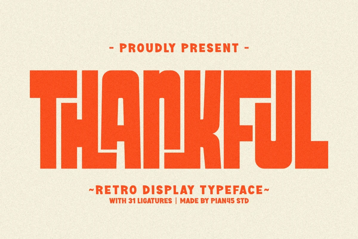
Best For: branding, posters, old-school designs, social media graphics
Extremely tight spacing is Thankful Font’s defining feature: characters overlap frequently, and built-in ligatures reinforce its compressed graphic texture. The bold, low-contrast blocks work for logos, posters, and oversized headlines, but the intentional collisions rule it out for extended reading.
Bloobe Font

Best For: logos, packaging, posters, product labels
For logos, packaging, and product labels, Bloobe Font supplies wide proportions, thick slab serifs, and a visible interlock between the L and O. That connected detail gives the lettering a constructed focal point, while the heavy forms and complex interaction make large-scale use preferable to long text.
Retro Fighter Font

Best For: social media graphics, magazine covers, display text
Retro Fighter Font combines heavy high-contrast strokes with bracketed serifs and curved, swash-like terminals. Its rounded ornamental details suit magazine covers, social graphics, and display text, but tight spacing and intricate curves lose definition when reduced substantially.
Retro Shade Font
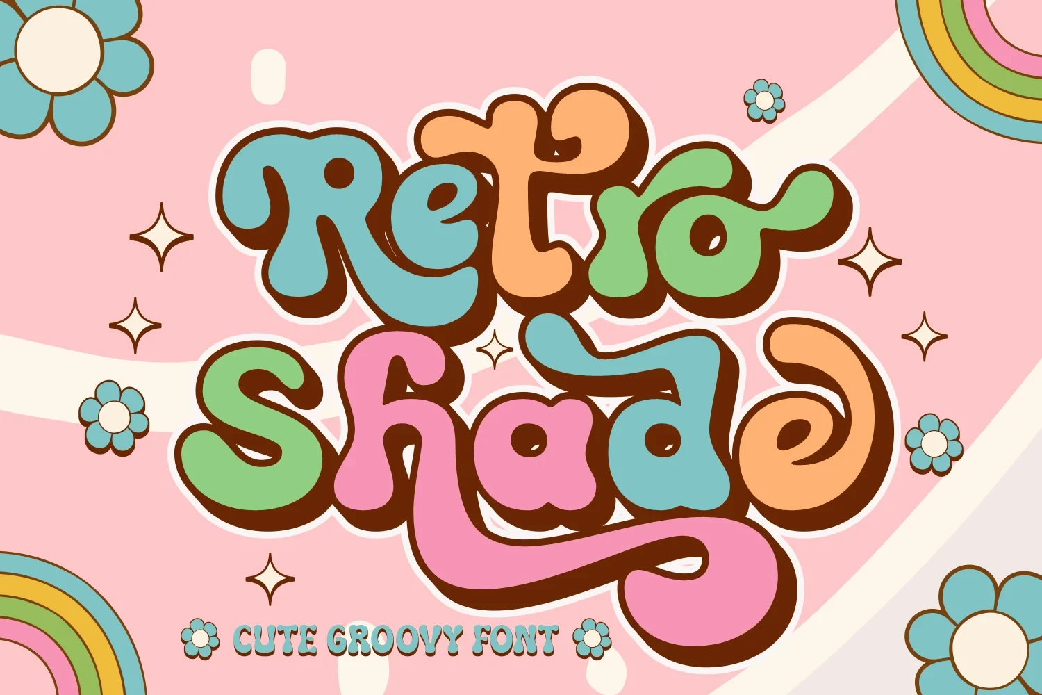
Best For: T-shirts, branding, packaging
Retro Shade Font is the collection’s connected display script, with bulbous terminals, continuous movement, and exaggerated looping descenders. That flowing construction works particularly well for packaging, apparel, and branding, while joined forms make it unsuitable for small body text.
Rugged Slab Structures
These Retro Display Fonts rely on heavy slab structures, wide proportions, and squared or pointed details. They feel more rugged and sign-oriented than the rounded, flowing, or interlocking designs in the other categories.
Vintage Essence Font
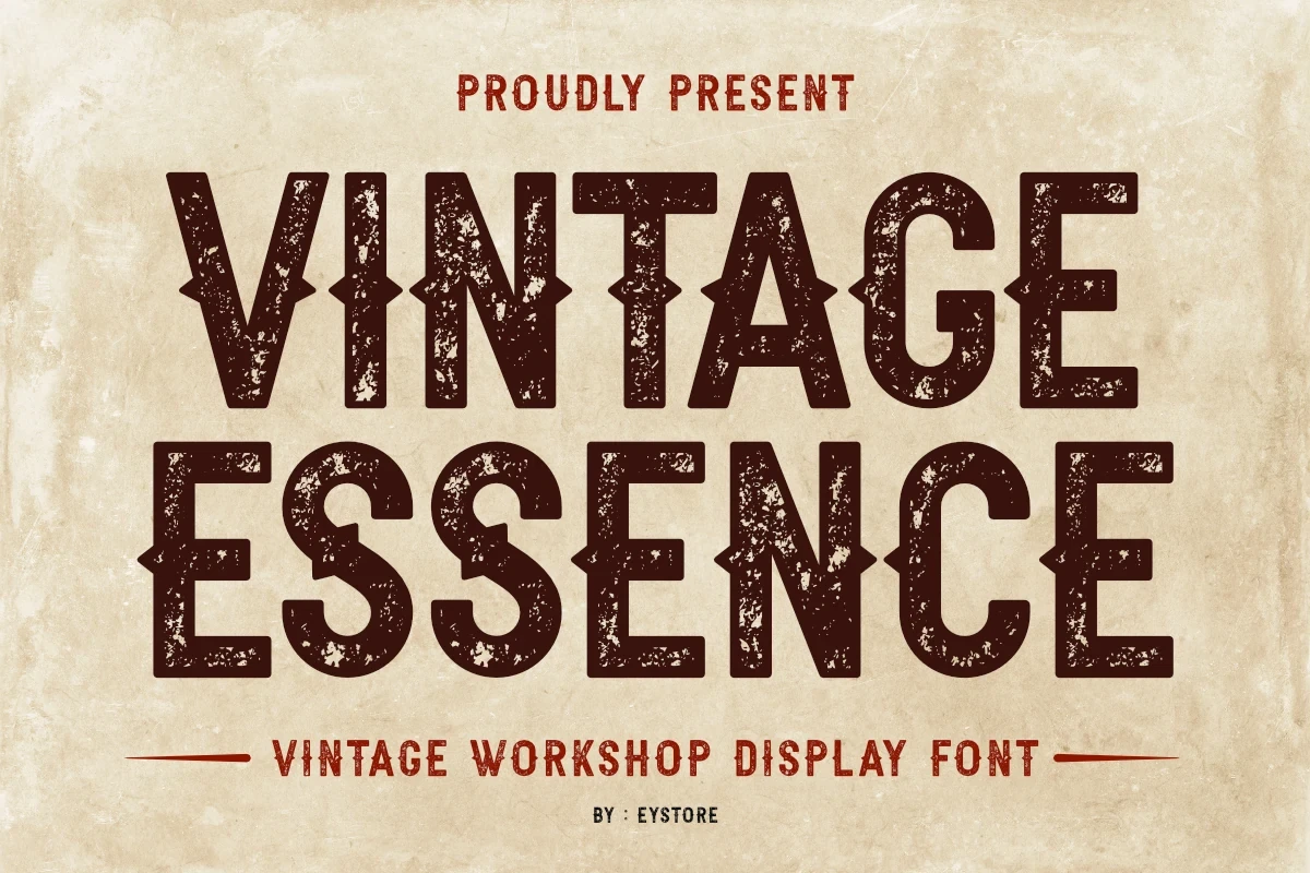
Best For: signage, display text, classic designs
Vintage Essence Font uses all-caps slab forms, heavy uniform strokes, wide proportions, and pointed center spurs. Its rugged structure suits signage and industrially toned titles, although the distressed texture and sharp details need enough display scale to read clearly.
Retro Goal Font

Best For: display text, clean designs, bold designs
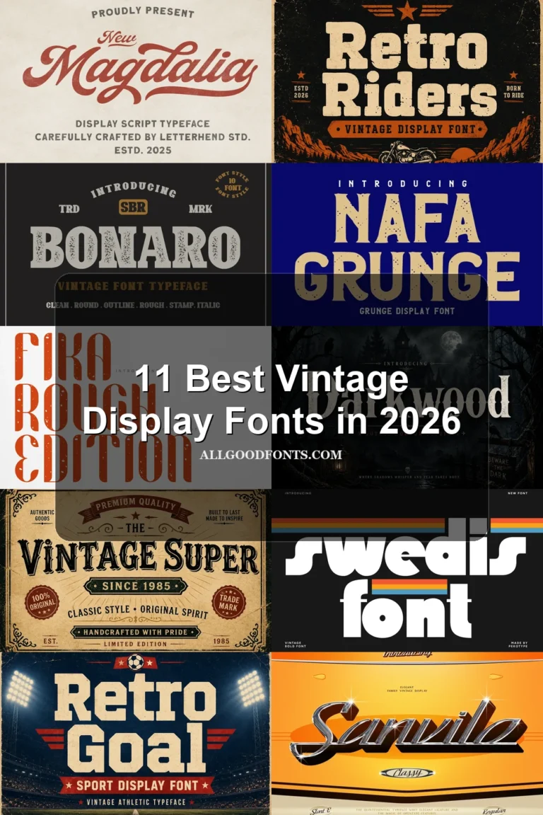
Retro Goal Font uses wide, uniform slab-serif blocks, squared terminals, and a sign-like profile. Its sturdy geometry keeps display lettering legible, but tight interior counters can become cramped when the design is reduced significantly.
How to Choose the Right Font
Choose Retro Display Fonts by construction first: rounded blocks offer clearer large lettering, while overlaps, spurs, joins, and looping terminals demand more space. Use slab structures for sign-like titles, connected scripts for packaging or apparel, and the simplest rounded options when readability must survive modest sizes.