20 Best Decorative Cute Fonts in 2027
This collection ranges from patterned, illustrated glyphs and confectionary shapes to bold rounded forms and ornate, high-contrast serifs. These Decorative Cute Fonts work best as visual anchors for children’s graphics, invitations, packaging, labels, logos, signage, and short social captions rather than sustained reading.
Looking for more cute fonts? Browse our complete Cute Fonts collection to compare modern, bold, and cute cute styles.

Decorative Cute Fonts: Themed Letterforms
These Decorative Cute Fonts build their identity through embedded motifs, including paws, bows, stars, stripes, frosting, cats, and dinosaurs. Their outer shapes vary, but internal decoration consistently drives the design role.
Cute Cat N.001 Font
Best For: children’s designs, social media graphics, display text, soft designs
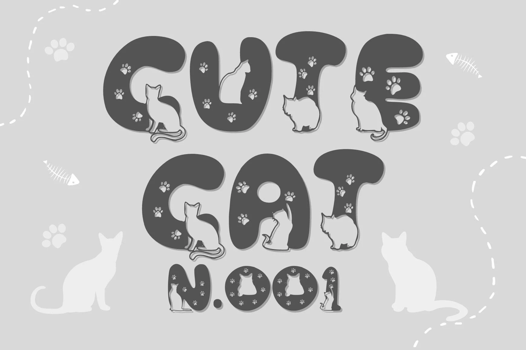
Cute Cat N.001 Font is most effective in short titles where its heavy rounded letters can show their cat silhouettes and paw-print negative spaces. The internal pattern supplies the personality, but also limits clarity for smaller text or longer wording.
Cute Paws Font
Best For: children’s designs, display text, clean designs, playful designs
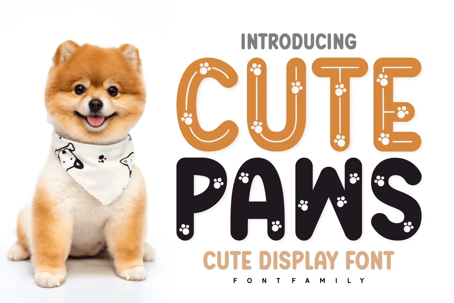
Cute Paws Font builds rounded bold letters around paw-print cutouts, giving the face a clear animal theme. Reserve it for large titles and let the accompanying rounded sans-serif carry smaller supporting information, where the detailed cutouts remain more readable.
Cute Plaid Font
Best For: logos, branding, invitations, display text
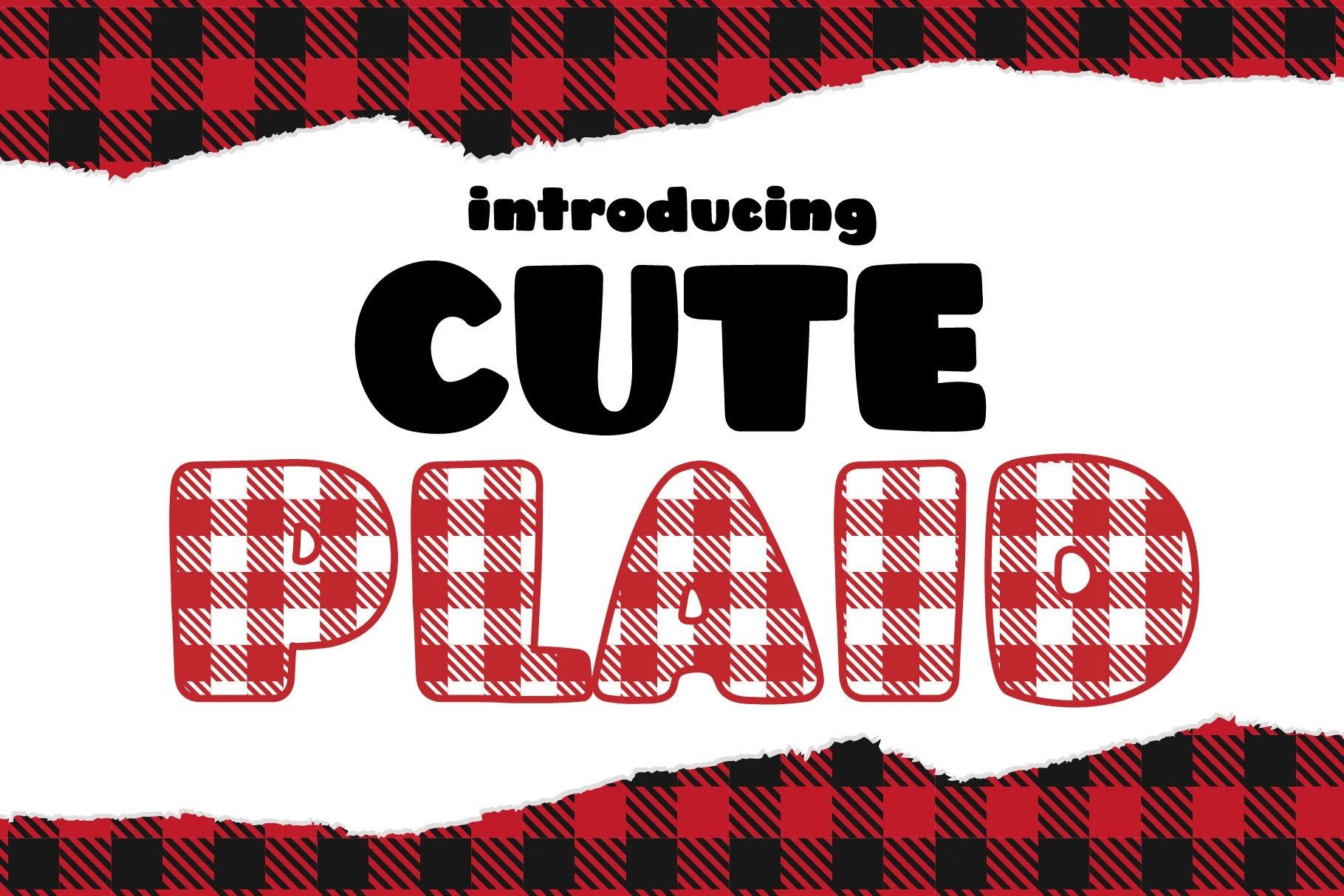
Cute Plaid Font is designed around wide, disconnected bubble characters that carry a plaid fill. The heavy outer construction stays legible in logos and invitations, while the plaid becomes the principal visual material and adds a distinctly youthful finish.
Bow Cute Font
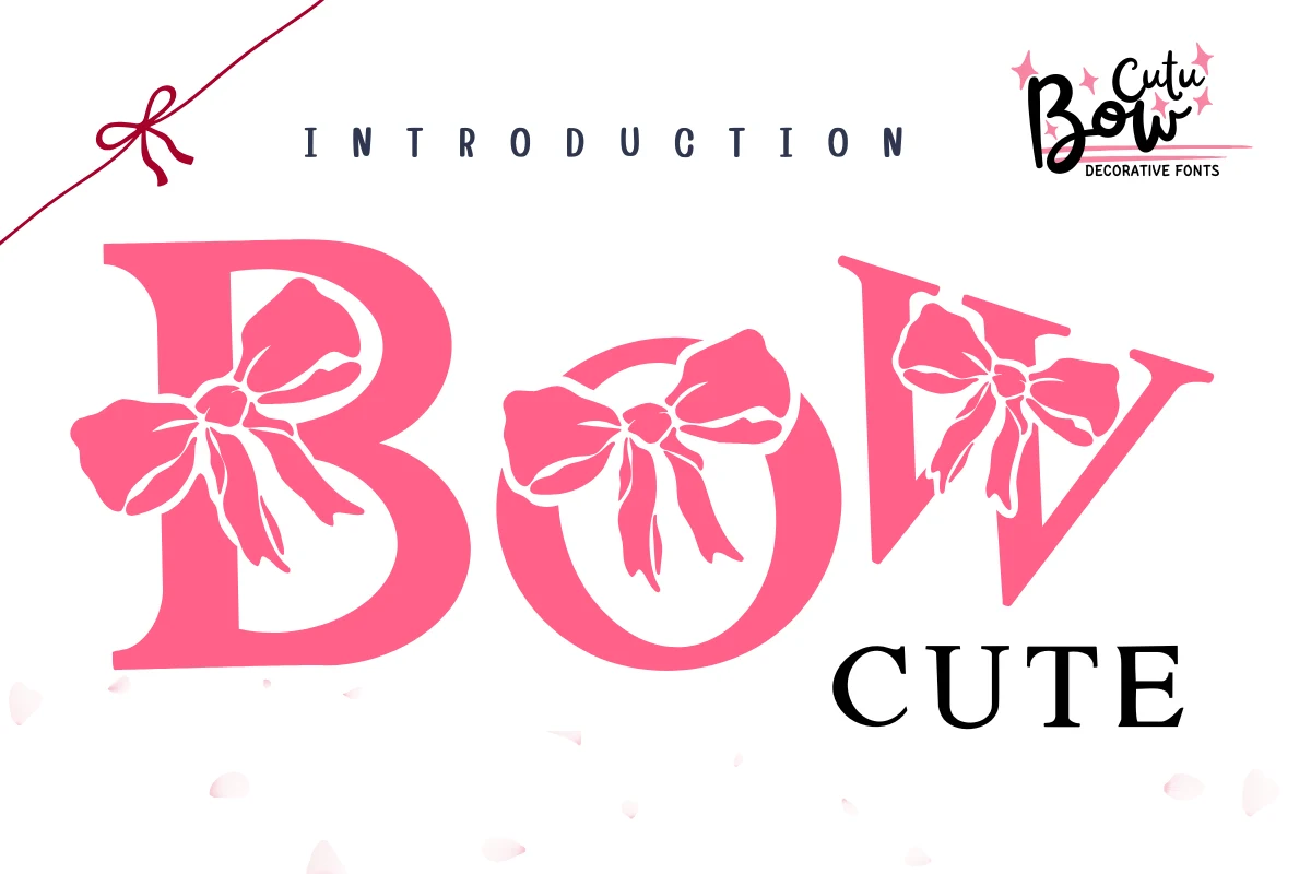
Best For: social media graphics, display text, clean designs, feminine designs
Bow Cute Font places integrated bow illustrations inside high-contrast, bracketed serif letters. The feminine decoration gives headings a clear theme, though the bows can intrude on counters when the lettering is reduced.
Cute Stars Font
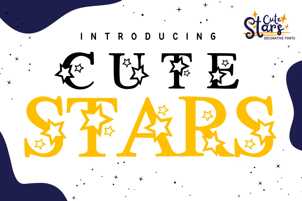
Best For: social media graphics, display text, playful designs, cute designs
Cute Stars Font uses wide, upright serif forms with star shapes built into the letter silhouettes. Stable proportions support large graphics, but the attached stars add enough visual complexity that dependable reading requires display scale.
Cute Candy Font
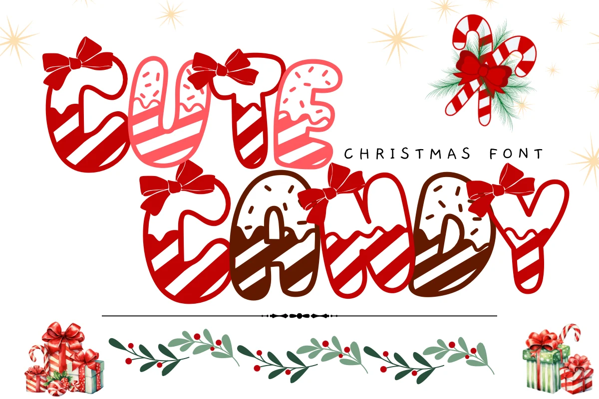
Best For: social media graphics, display text, playful designs, cute designs
Cute Candy Font turns bubbly disconnected letters into a confectionary display treatment with bows and candy-cane striping. Those details bring energy to headlines and signage, but make moderate-size reading less immediate than the underlying heavy shapes suggest.
Cute Donut Font
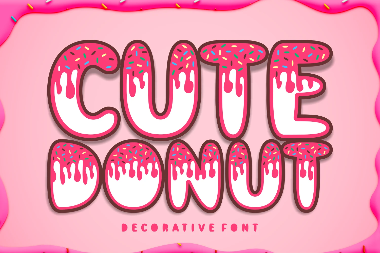
Best For: display text, clean designs, playful designs, cute designs
Cute Donut Font tops rounded display letters with frosting-like drips and sprinkle marks. A consistent heavy stroke protects large-format readability, while the food-themed additions make it better suited to titles and short messages than compact text.
Cute Kitten Font
Best For: packaging, social media graphics, display text, playful designs
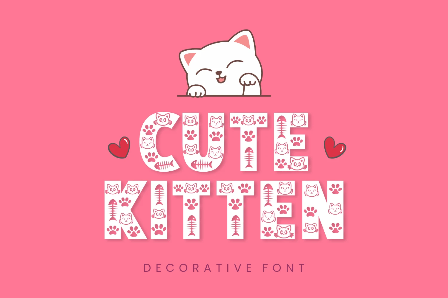
Cute Kitten Font uses wide, blocky sans-serif letters filled with cat-related icons. The stable outer shapes support headlines and packaging, but the internal pattern can weaken letter recognition at very small sizes.
Dinosaur Cute Font
Best For: social media graphics, display text, playful designs, cute designs
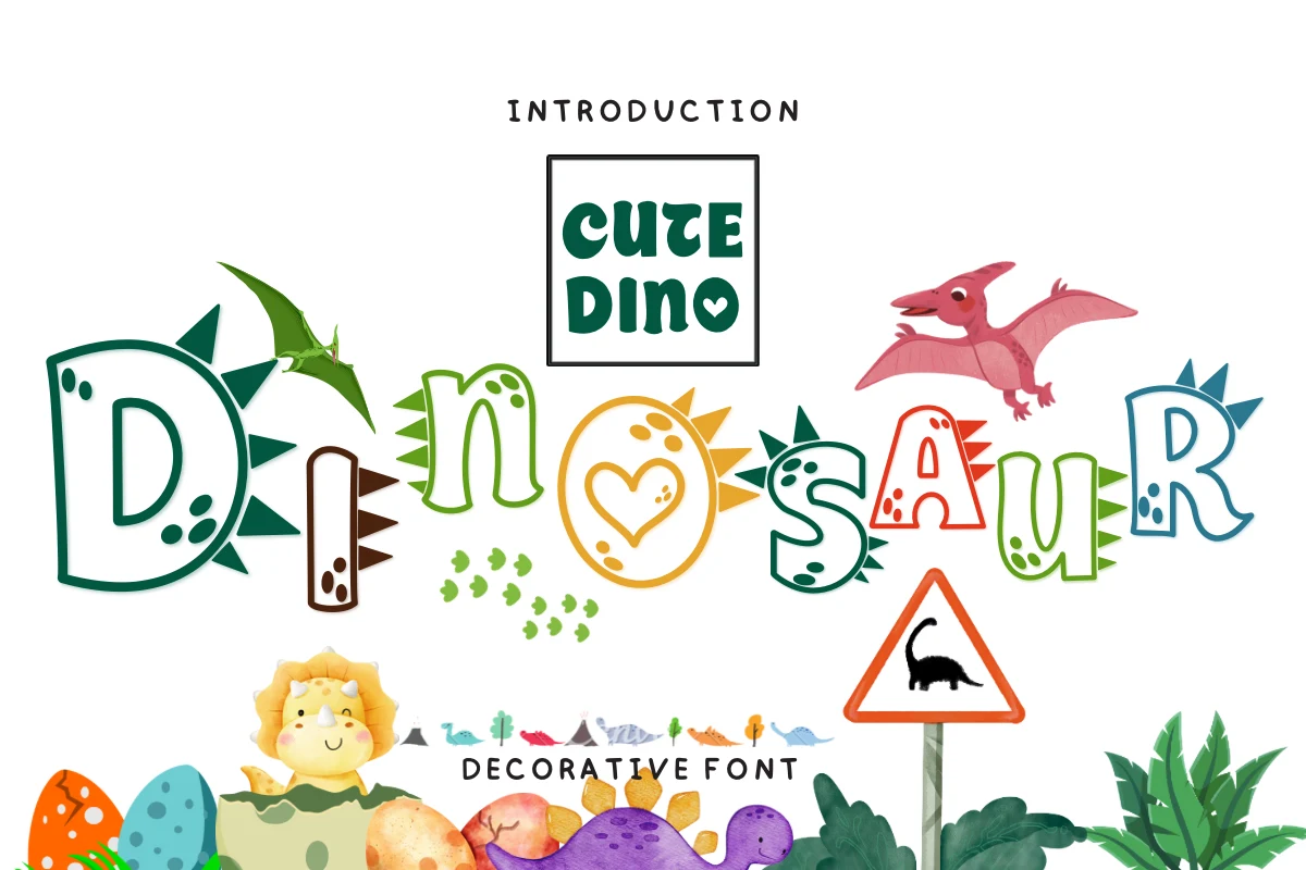
Dinosaur Cute Font gives bold rounded letters irregular organic edges and dinosaur illustrations, making every character feel expressive. The varying widths and imagery suit children’s graphics, but the construction is too involved for sustained reading.
Dino Cute Font
Best For: branding, social media graphics, children’s designs, display text
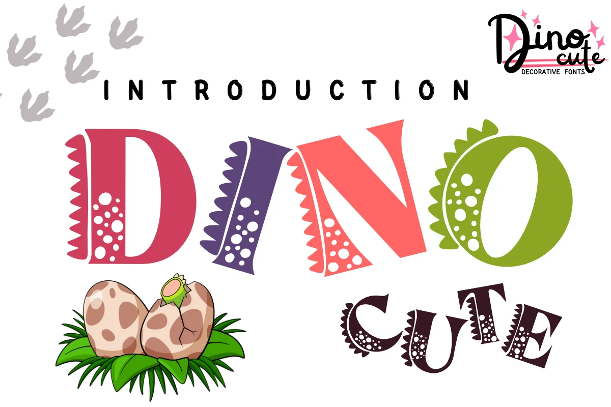
Dino Cute Font distinguishes its blocky letters with serrated edges and circular interior dot patterns. The dinosaur-coded treatment makes branding and children’s displays memorable, but its non-uniform construction needs generous scale to stay recognizable.
Rounded Cute Display Forms
Rounded Cute Display Forms prioritize thick silhouettes, approachable proportions, and readable counters. Compared with the themed group, they rely less on internal imagery and more on weight, shape, and friendly rhythm.
Cute Little Dog Font
Best For: logos, display text, soft designs, playful designs
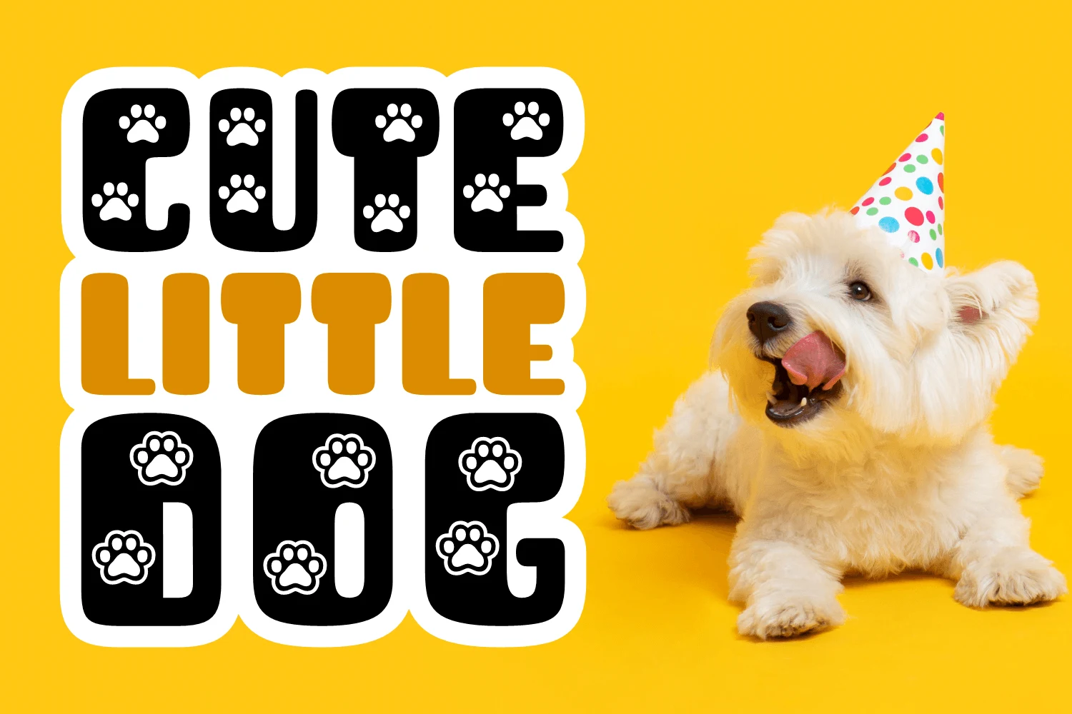
Cute Little Dog Font pairs chunky rounded novelty lettering with a separate bold sans-serif, creating an intentional hierarchy between the main words and supporting text. Thick strokes keep the headline readable in logos and large graphics while the pairing adds role separation.
Cute Lady Bugs Font
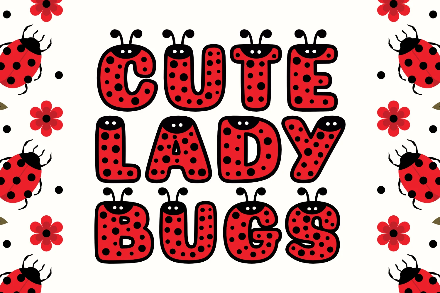
Best For: T-shirts, invitations, signage, display text
Cute Lady Bugs Font uses wide, monoline bubbly forms with closed counters and an even bold weight. Its strong, uncomplicated silhouette holds up on signage, invitations, and T-shirts without depending on intricate decoration.
Cute Animal Font

Best For: social media graphics, display text, clean designs, playful designs
Cute Animal Font combines boxy heavy slab-serifs with regular proportions and an upright stance. Its clean edges make it one of the more dependable choices for banners and headings, balancing a playful subject with comparatively strong readability.
Bunny Cute Font
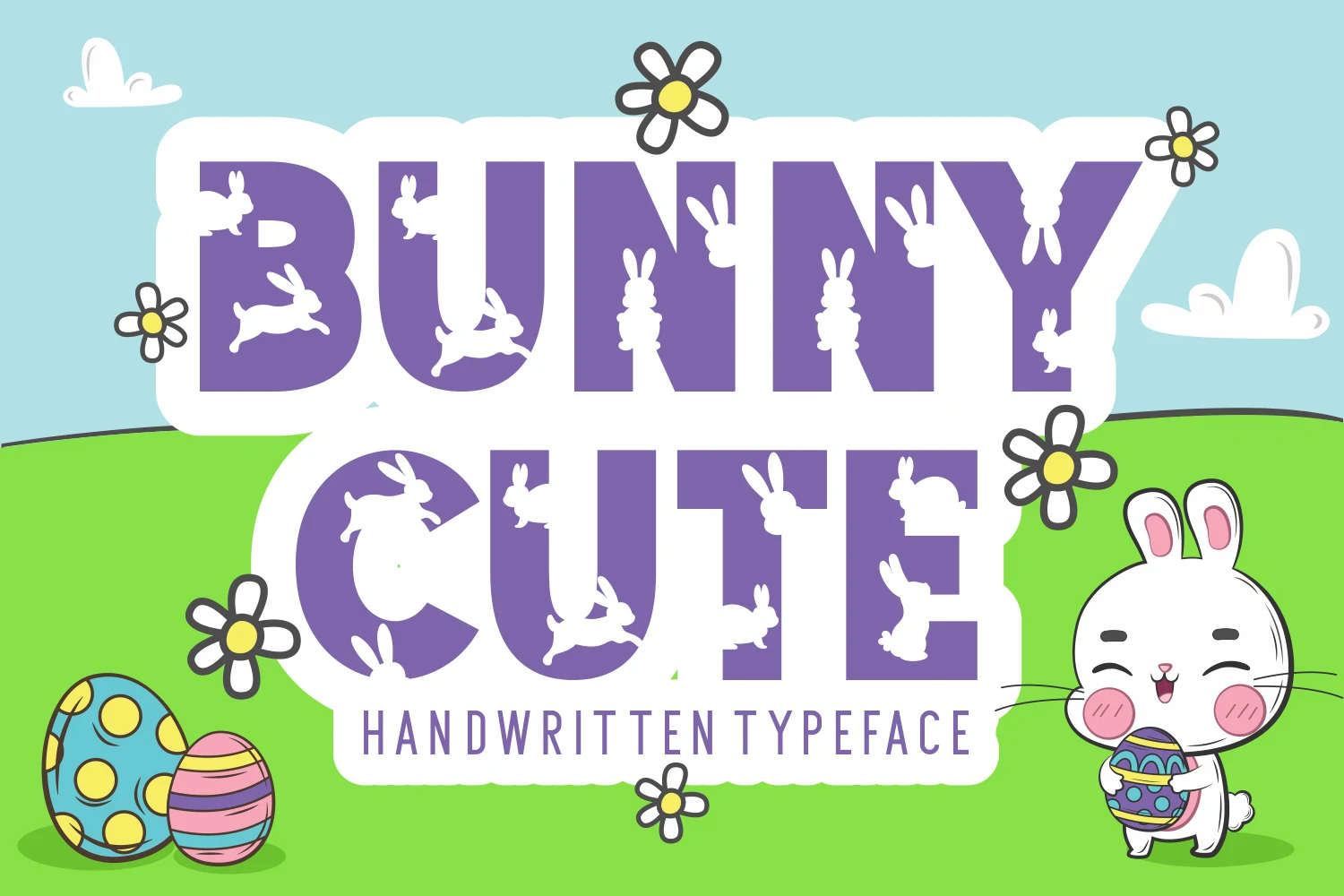
Best For: invitations, social media graphics, eye-catching designs, product labels
Bunny Cute Font combines bold geometric sans-serif lettering, a large x-height, and monoline construction for a strong primary message. It works well on labels and invitations, while its thinner subtitle needs more size to remain comfortably readable.
Cute Be Special Font

Best For: display text, soft designs, playful designs, cute designs
Cute Be Special Font has an informal handwritten rhythm, with uneven baselines and varied letter proportions. Its medium weight feels approachable in display phrases, although the irregular movement becomes less clear when the wording is set small.
Cute Sticker Font
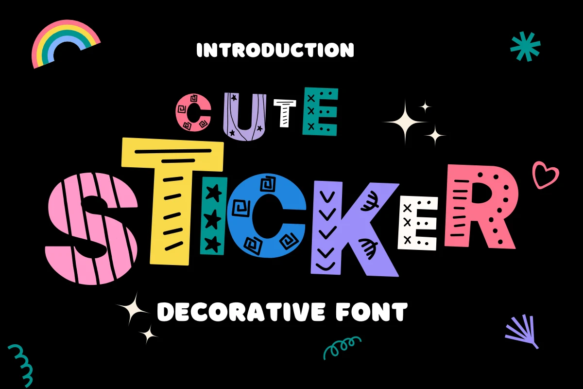
Best For: social media graphics, display text, playful designs, cute designs
Cute Sticker Font offers playful display shapes with a clear, recognizable stroke rhythm. It is a practical option for headings, names, and short phrases, where its expressive forms can remain distinct without carrying the demands of extended copy.
Ornamental Serif Cute Styles
Ornamental Serif Cute Styles combine playful subject matter with contrast, serifs, filigree, or condensed proportions. They feel more formal and title-oriented than the rounded displays, requiring generous size for their details.
Cute Cat N.004 Font
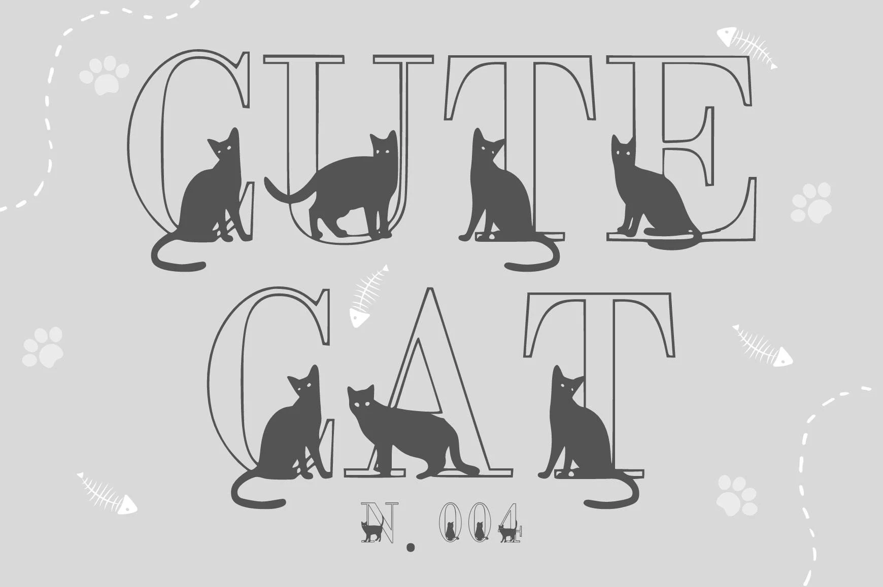
Best For: children’s designs, social media graphics, display text
Cute Cat N.004 Font uses wide, upright serif letters with sharp slab-like serifs and pronounced contrast. Its thin strokes and decorative construction need generous heading size, making it a whimsical choice for display text rather than extended copy.
Cute Cat N.003 Font
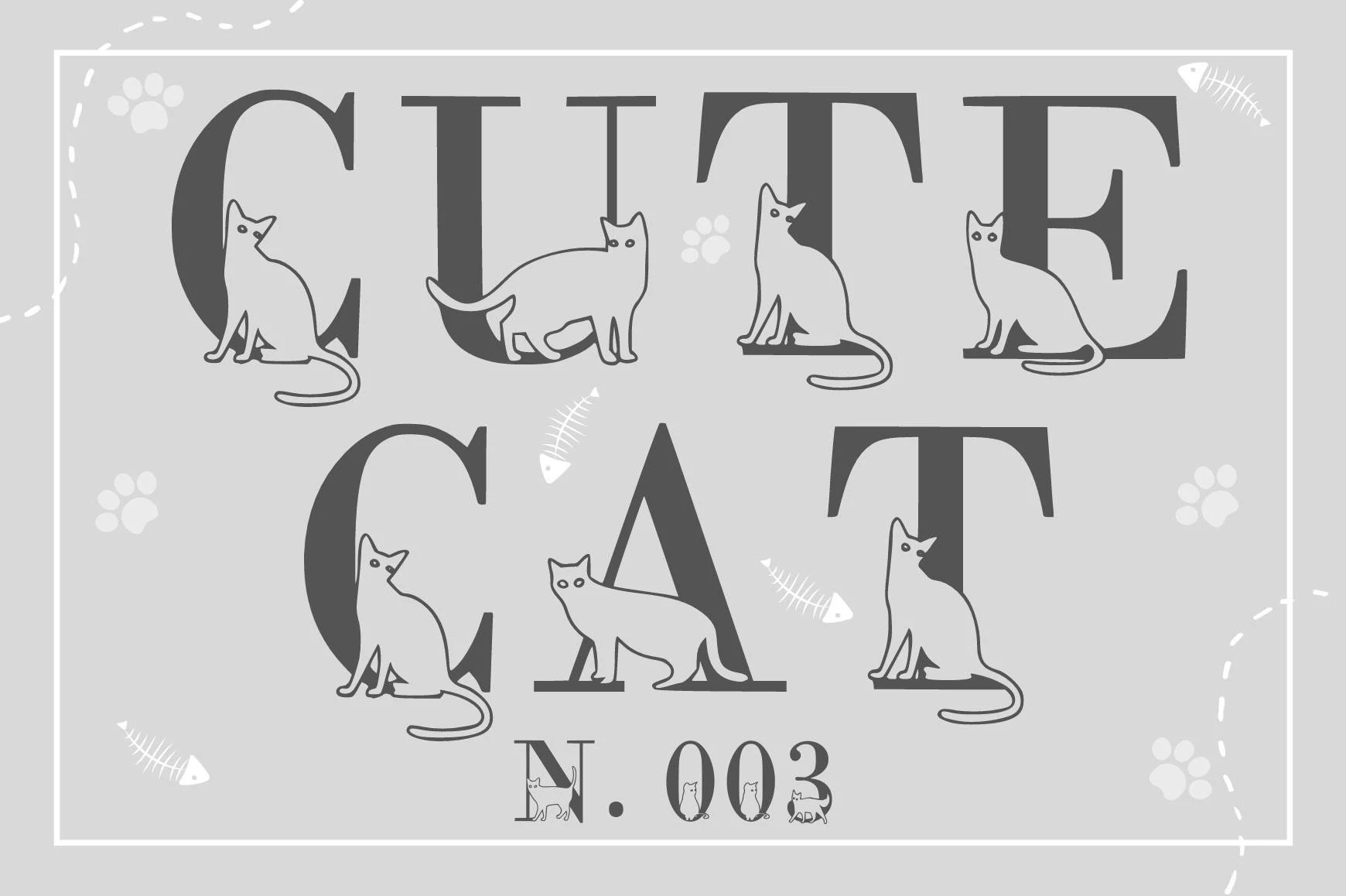
Best For: children’s designs, display text, classic designs, playful designs
Cute Cat N.003 Font makes a strong title statement with heavy uppercase letters, a large cap height, and sharply defined serif details. It reads well at headline scale and suits branding, but reduction can make the fine serif structure harder to follow.
Cute Elements Font
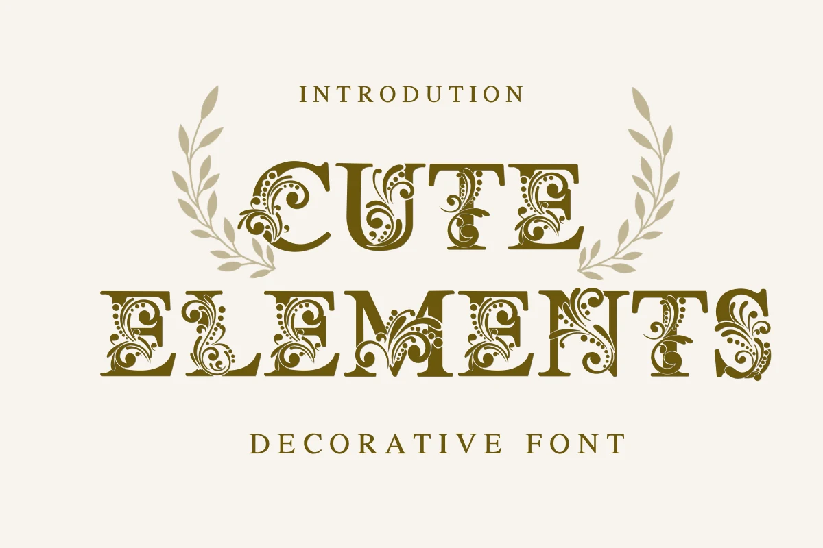
Best For: display text, minimal designs, clean designs, elegant designs
Cute Elements Font threads floral filigree and flourishes through bold upright serif letters, creating a distinctly Victorian ornamental effect. Its intricate structure is most successful in large titles, where the details remain decorative instead of collapsing into noise.
Cute Cat Font
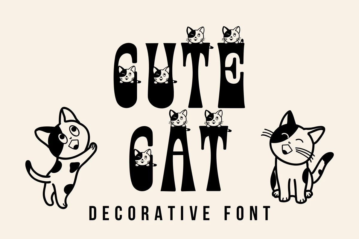
Best For: social media graphics, product labels, display text, clean designs
Cute Cat Font combines condensed heavy serif proportions with strong contrast, helping short labels fit tighter spaces. The decorative serif remains title-focused, however, and loses legibility when scaled down, especially beside the simpler supporting sans-serif.
How to Choose the Right Font
Choose based on the construction you want visible: patterned faces and illustrations create the strongest theme, rounded monoline forms offer the safest readability, and serif styles add contrast or ornament for prominent titles. Test every option at its final size; Decorative Cute Fonts generally belong in short display roles, with a simpler companion face for supporting copy.