23 Best Decorative Display Fonts in 2026
This collection of Decorative Display Fonts spans geometric cuts, rounded bubble forms, graffiti textures, stencil gaps, distressed surfaces, and expressive serif or script details. These styles are built for logos, packaging, posters, apparel, covers, social graphics, and other large-scale design roles where construction matters as much as readability.
Looking for more display fonts? Browse our complete Display Fonts collection to compare bold, vintage, retro, decorative, and playful display styles.

Decorative Display Fonts: Geometric Impact
These Decorative Display Fonts use geometric mass, condensed proportions, rounded blocks, sliced strokes, and angular notches to create immediate logo and headline impact. They are cleaner and more structured than the collection's textured or hand-drawn groups.
North Hype Font
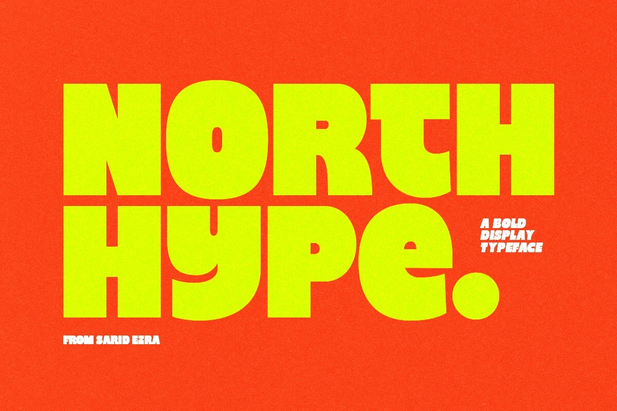
Best For: logos, branding, packaging, headlines
North Hype Font uses an ultra-bold, wide sans-serif structure softened by rounded exterior corners. It delivers immediate youthful impact for logos, packaging, and headlines, but its extreme weight and spacing make extended reading impractical.
JP Sliced Sport Font
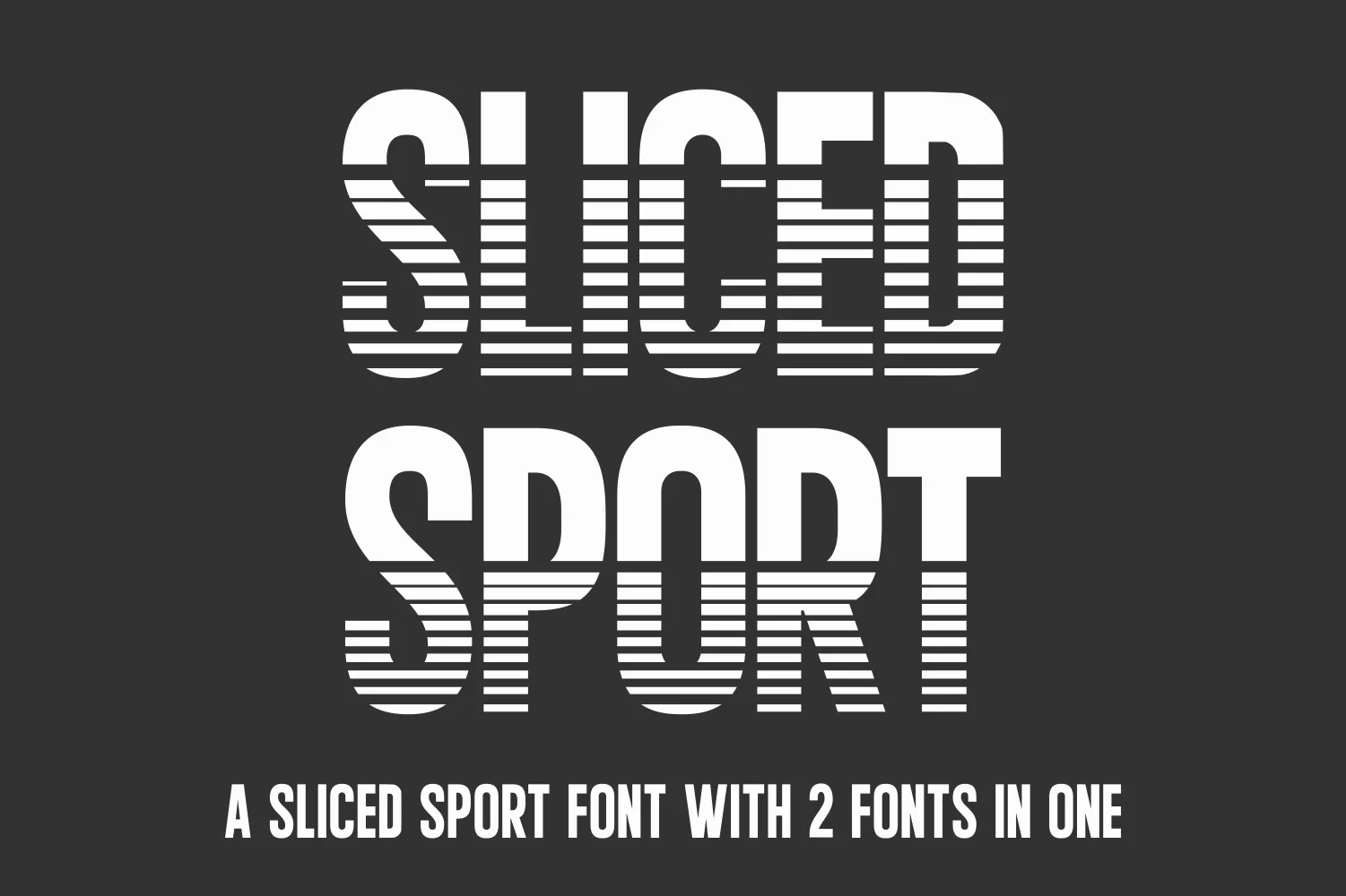
Best For: branding, social media graphics, display text, modern designs
JP Sliced Sport Font interrupts condensed geometric capitals with horizontal cuts, creating a strong sporty motion effect. The breaks need large sizing to remain clear, so this decorative treatment works best in branding, social graphics, and display text.
Nexora Font

Best For: branding, posters, fashion branding
Nexora Font is built from condensed industrial capitals with sharp inward-curving terminal notches. The extreme vertical structure gives fashion branding and posters a technical edge, though its tight construction is better for headlines than body text.
Designer Font

Best For: display text, modern designs, clean designs, decorative designs
Designer Font breaks monolinear geometric capitals into rounded, stencil-like segments. The fragmented construction suits futuristic identities and large Decorative Display Fonts applications, but small settings can obscure character recognition as the gaps and rounded corners compress.
Bold Font

Best For: social media graphics, logos, branding, packaging
Bold Font uses condensed block capitals, heavy low-contrast strokes, and rounded terminals for a stable silhouette. It holds together well in logos and social graphics, while narrow counters make dense or small text less comfortable.
Notre Font

Best For: branding, signage, display text, modern designs
Notre Font gives condensed heavy capitals a distinctive signature through curved, distorted terminals. The unusual ends create personality for signage and branding, but they reduce clarity at smaller sizes where the decorative shapes crowd the counters.
Titan Font

Best For: social media graphics, logos, branding, packaging
Titan Font favors wide rounded block capitals over condensed intensity. Its simple low-contrast structure reads reliably in packaging and logos, though the broad, heavy forms become cumbersome when used at small body-text sizes.
Weird Vault Font

Best For: branding, quotes, posters, display text
Weird Vault Font offers wide, chunky slab-inspired capitals in sharp-cornered and rounded versions. These edge treatments let branding shift between harder and softer retro moods without changing the core structure, while large sizing preserves legibility.
Champion Font

Best For: branding, social media graphics, display text, clean designs
Champion Font uses monumental capitals with dart-like stem notches and high-contrast junctions. These athletic cuts support strong signage and logo recognition, but the aggressive details resist body copy and work best at large display scale.
Retro, Bubble, And Graffiti Styles
This group of Decorative Display Fonts favors retro curves, inflated bubbles, flowing scripts, and graffiti irregularity. Compared with the geometric category, its personality comes from movement, softness, drips, disconnected shapes, and expressive surface rhythm.
Coastal Delight Font
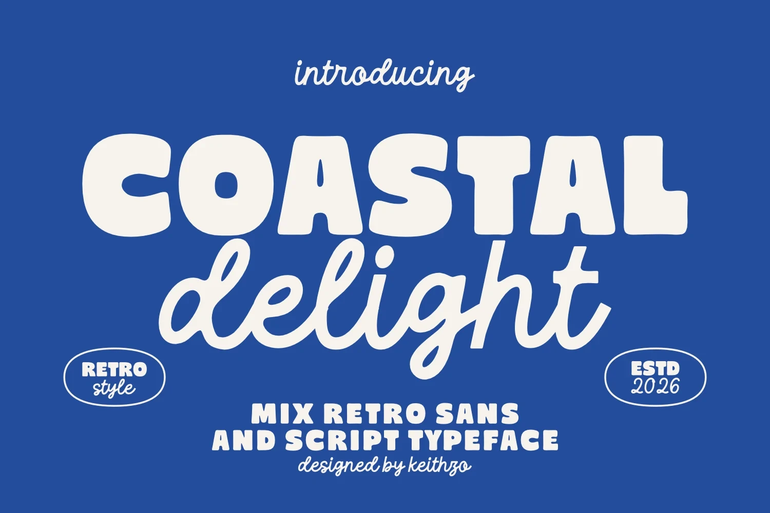
Best For: display text, soft designs, playful designs, bold designs
For Decorative Display Fonts that need contrast, Coastal Delight Font pairs chunky rounded sans letters with a flowing connected script. The sturdy sans anchors headlines and logos, while the softer script adds relaxed movement; neither component is intended for long-form copy.
Laguna Tropic Font
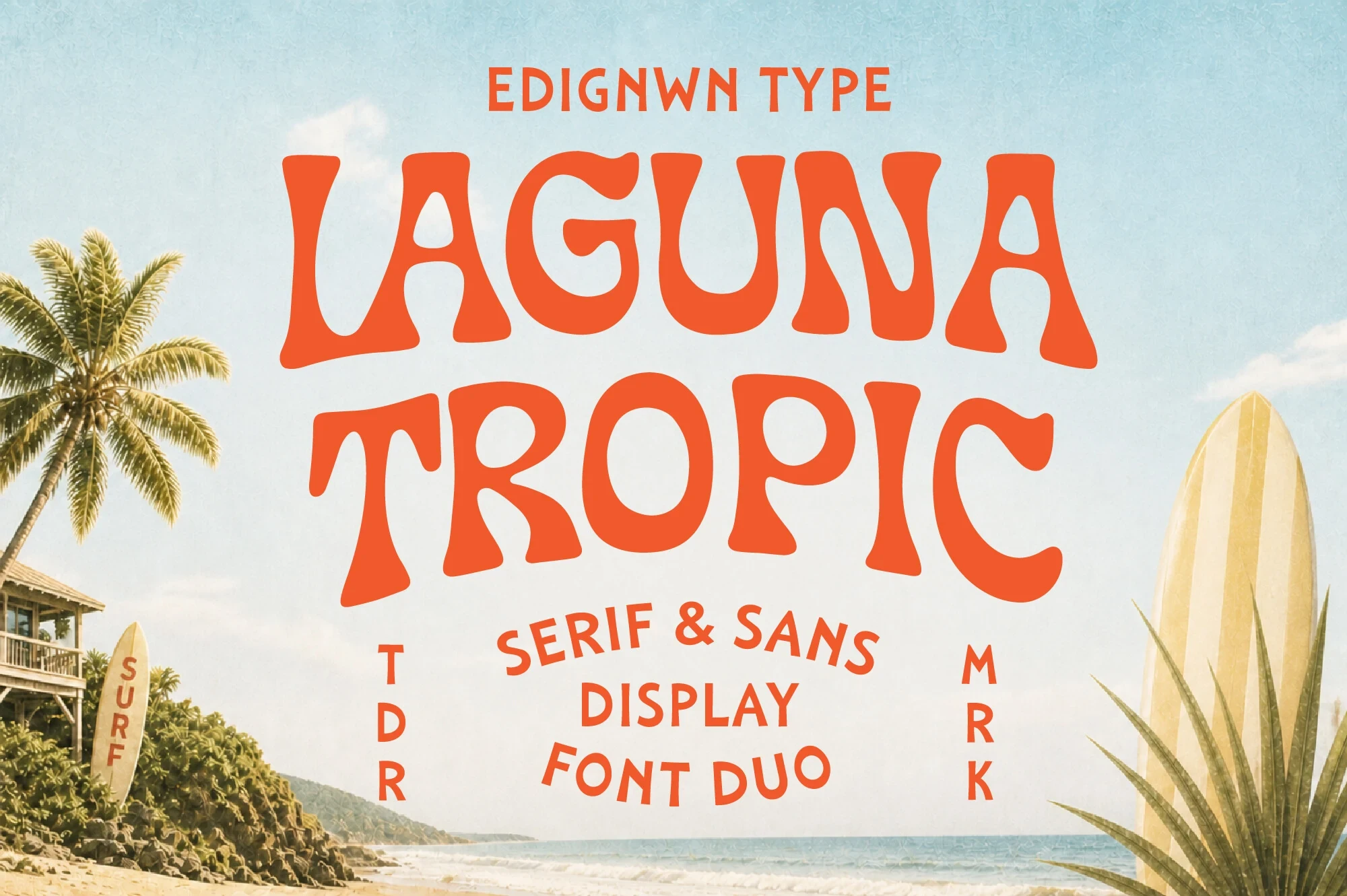
Best For: logos, branding, packaging, posters
Laguna Tropic Font combines curvy serif shapes, heavy strokes, and pronounced thick-thin modulation. Its large headline remains readable while the irregular fluidity gives packaging, posters, logos, and branding more personality than a restrained type system.
Death Subway Graffiti Font
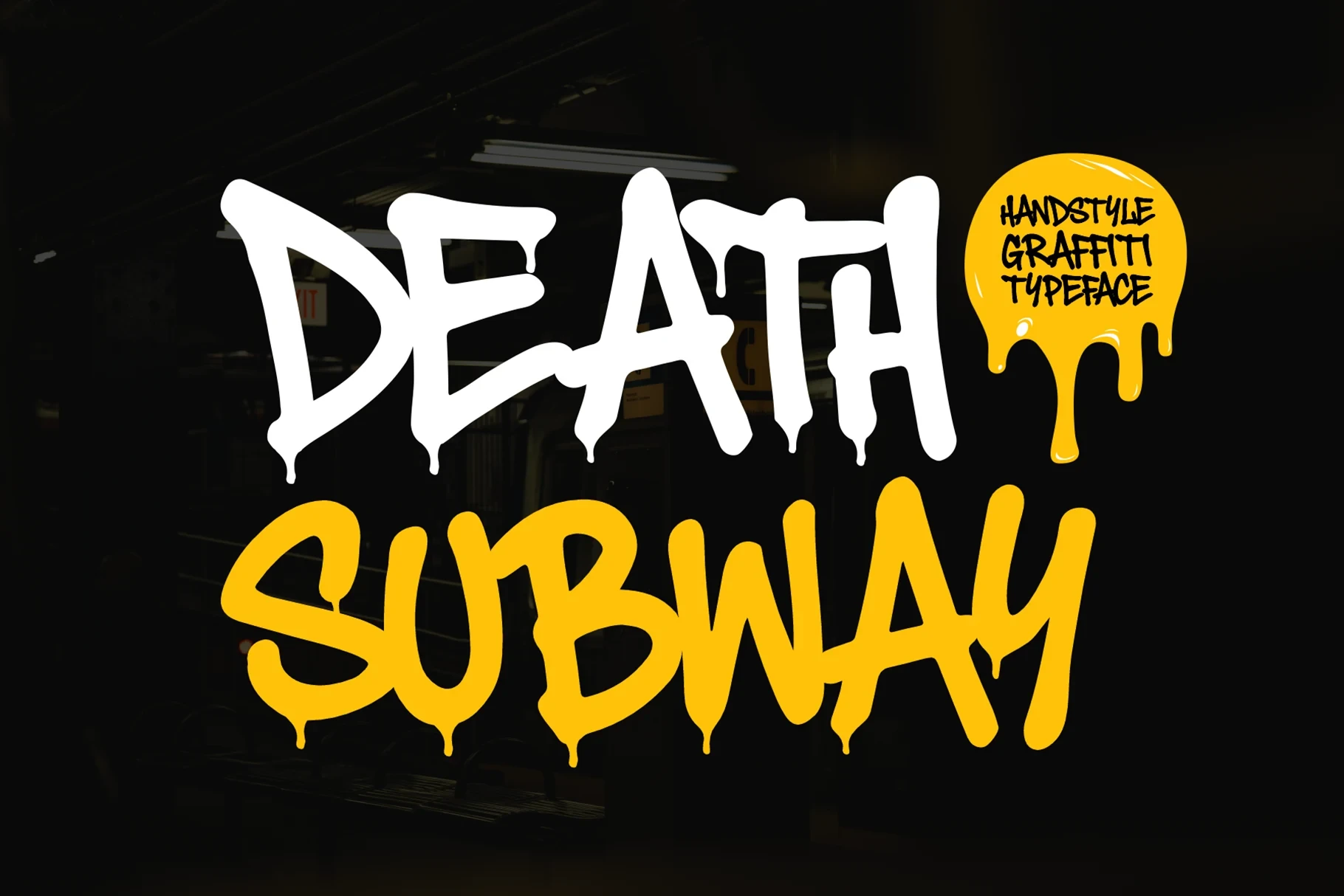
Best For: display text, wall art, bold designs, decorative designs
Death Subway Graffiti Font turns heavy brush capitals into a distinct graffiti voice through dripping terminals, irregular stroke thickness, and tight spacing. The liquid edges read effectively on posters and wall art, but can muddy smaller lettering.
Thankful Font
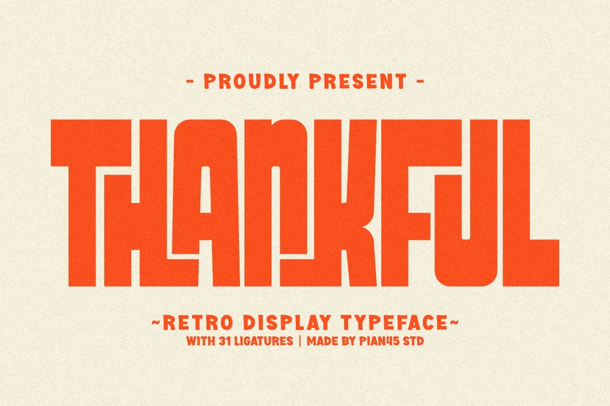
Best For: branding, posters, old-school designs, display text
Thankful Font combines thick condensed geometry with minimalist terminals and built-in ligatures. Its tight construction gives headlines an old-school presence, especially in posters and branding, but the heavy weight is unsuitable for sustained copy.
Street Drips Font

Best For: branding, packaging, product labels, posters
Street Drips Font uses disconnected graffiti capitals with dense organic block shapes rather than continuous joins. The separation keeps large titles readable, while tight spacing and distortion make small product labels or other compact text difficult.
Sugar Peachy Font

Best For: logos, social media graphics, website headers, display text
Sugar Peachy Font offers rounded bubble capitals in a five-weight family, all built with thick uniform strokes. The range supports layered display treatments, while closed counters and low x-height limit readability at small sizes.
Summer Flower Font

Best For: eye-catching designs, T-shirts, creative projects, display text
Summer Flower Font creates an inflated, three-dimensional bubble presence from thick disconnected letterforms. Its simple shapes stay clear on shirts and display graphics, but the dimensional treatment is too dominant for compact functional text.
Stencil, Industrial, And Textured Forms
Stencil gaps, slab-like construction, and distressed textures define these Decorative Display Fonts. Their industrial character comes from interrupted forms or worn surfaces, making them more material and rugged than the smoother geometric and bubble styles.
Volta Font

Best For: creative projects, display text, modern designs, clean designs
Volta Font joins architectural stencil cuts with sharp terminals and a geometric circular O. Its negative-space gaps reinforce modern branding and other Decorative Display Fonts uses, although the interrupted forms lose clarity when reduced substantially.
Military Steel Font

Best For: display text, bold designs, decorative designs, high-end designs
Military Steel Font builds blocky stencil capitals from thick monolinear strokes, clear gaps, and slab-like terminals. Among stencil Decorative Display Fonts, its simple structure remains comparatively legible, making it effective for bold headlines and high-impact display text.
Retro Distressed Font

Best For: T-shirts, logos, posters, headlines
Retro Distressed Font combines condensed slab-like capitals with a deliberately worn surface. The texture supplies an aged industrial effect for posters and apparel, but its imprint-like irregularity reduces clarity when the lettering is scaled down.
Industrial Font

Best For: logos, display text, bold designs, decorative designs
Industrial Font applies a consistent distressed rubber-stamp texture to condensed geometric capitals. The underlying forms remain clear for logos and headers, but the ink wear intentionally rules out small functional text and fine informational labels.
Serif, Script, And Thematic Displays
These Decorative Display Fonts combine pointed serifs, connected brush scripts, and angular thematic lettering. They offer stronger narrative cues than the other groups, but delicate details, swashes, and segmented terminals demand generous display sizing.
Focsio Font

Best For: magazine covers, branding, headlines
Focsio Font is a condensed serif with sharp triangular serifs and pronounced thick-thin contrast. Its fine details need generous sizing, making it better for magazine covers, branding, and headlines than small text.
Raither Display Font

Best For: branding, posters, headlines, book covers
Raither Display Font is a strongly forward-slanted connected brush script with high contrast and prominent swashes. Its aggressive movement suits posters, branding, and book covers, while complex joins require large display scale to remain readable.
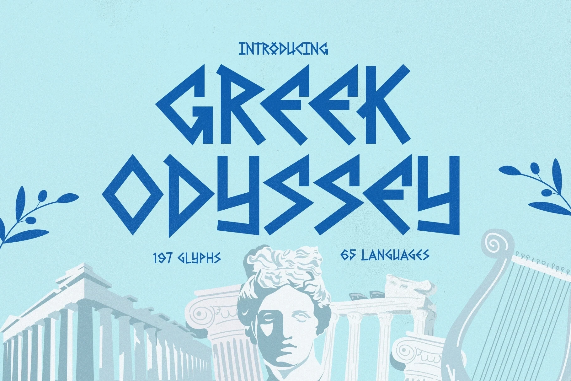
Greek Odyssey Font
Best For: display text, decorative designs, beauty branding, minimal designs
Greek Odyssey Font combines angular geometric capitals, sharp terminals, and selective stencil segmentation. The thematic cue is immediate in titles and beauty branding, but its pointed details and segmented letters need generous sizing for reliable reading.
How to Choose the Right Font
Choose Decorative Display Fonts by matching construction to scale and design role. For clearer branding, start with solid geometric, rounded, or block forms; use stencil gaps and distressed textures when surface character matters; reserve scripts, graffiti drips, sliced strokes, and sharp notches for generous headline sizes. Always test counters, joins, and fine details at the final output size.