19 Best Cartoon Display Fonts in 2026
Cartoon Display Fonts range from rounded bubble constructions and separated comic characters to distressed surfaces, angular blocks, and strong extruded shadows. This collection focuses on how those visible details affect readability, scale, and practical roles in logos, packaging, posters, labels, shirts, and social graphics.
Looking for more display fonts? Browse our complete Display Fonts collection to compare bold, vintage, retro, decorative, and playful display styles.
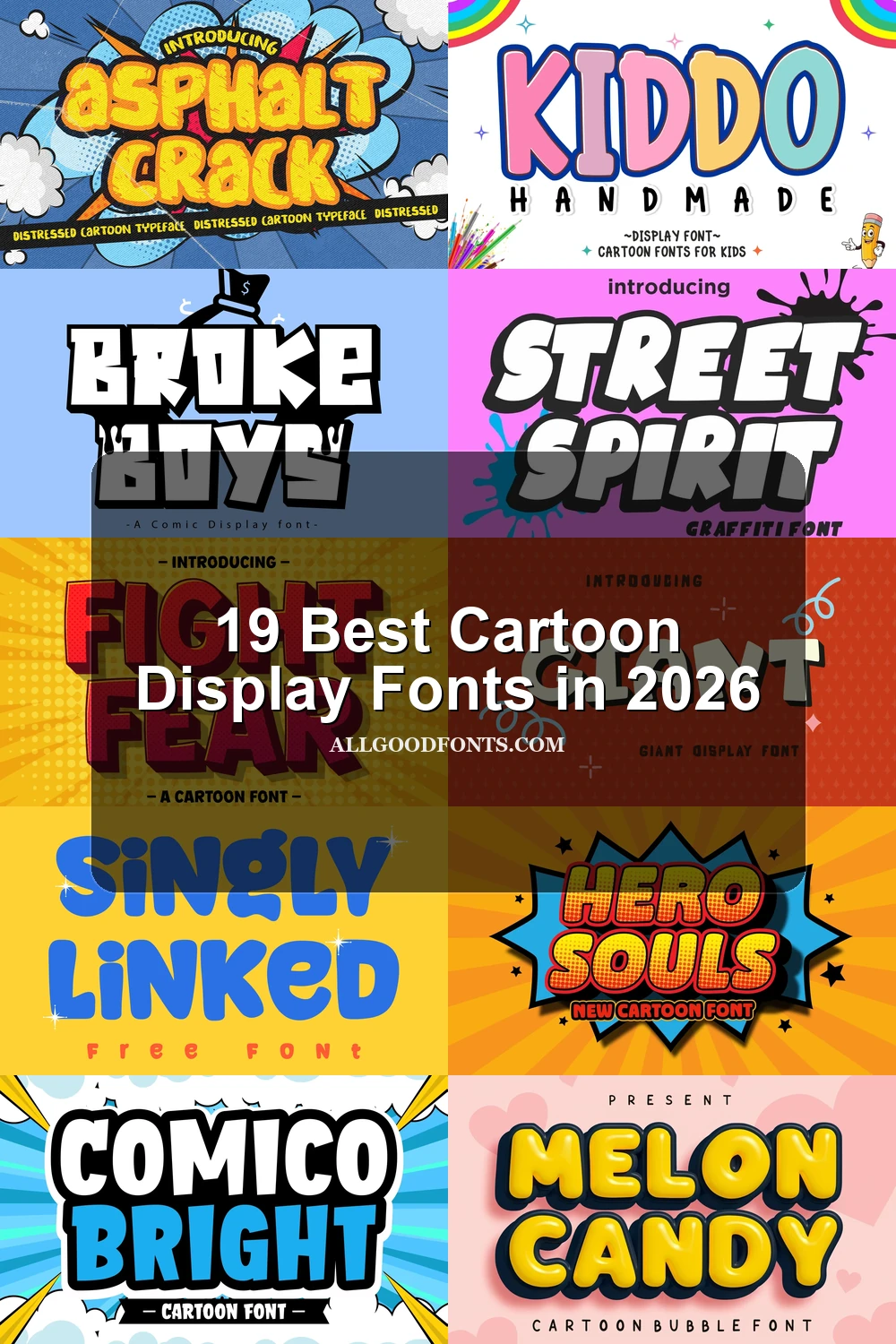
Cartoon Display Fonts: Bubble Forms
Cartoon Display Fonts in this group rely on rounded, heavy silhouettes, soft terminals, and bubble proportions. They feel approachable and spacious, unlike the sharper, textured, or shadow-driven groups.
Puffy Smile Font
Best For: branding, children’s designs, display text, soft designs
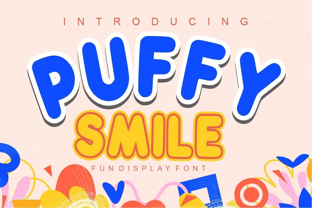
Puffy Smile Font builds wide, chunky bubble forms from soft edges and a heavy stroke, with layered styling that reinforces its display role. For Cartoon Display Fonts, it fits children’s branding and cheerful headlines, although generous sizing helps preserve clarity.
Comic Grizzy Font
Best For: social media graphics, logos, branding, packaging
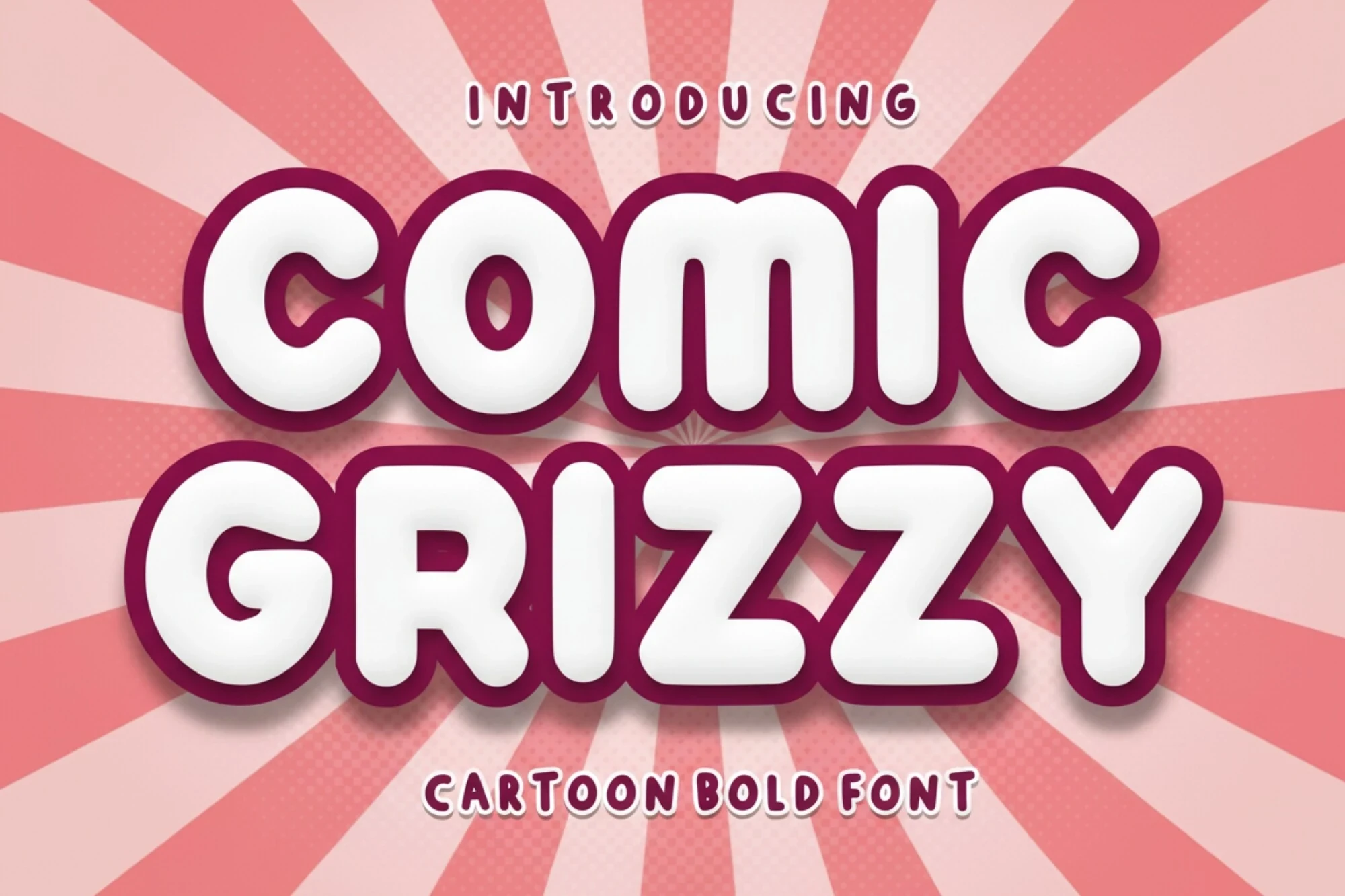
Comic Grizzy Font spreads wide bubble characters across the line, using pill-shaped terminals, thick strokes, and a right-leaning sense of movement. Its expansive silhouette suits logos and social graphics, though short words will read more cleanly than long ones.
Melon Candy Font
Best For: logos, branding, packaging, posters
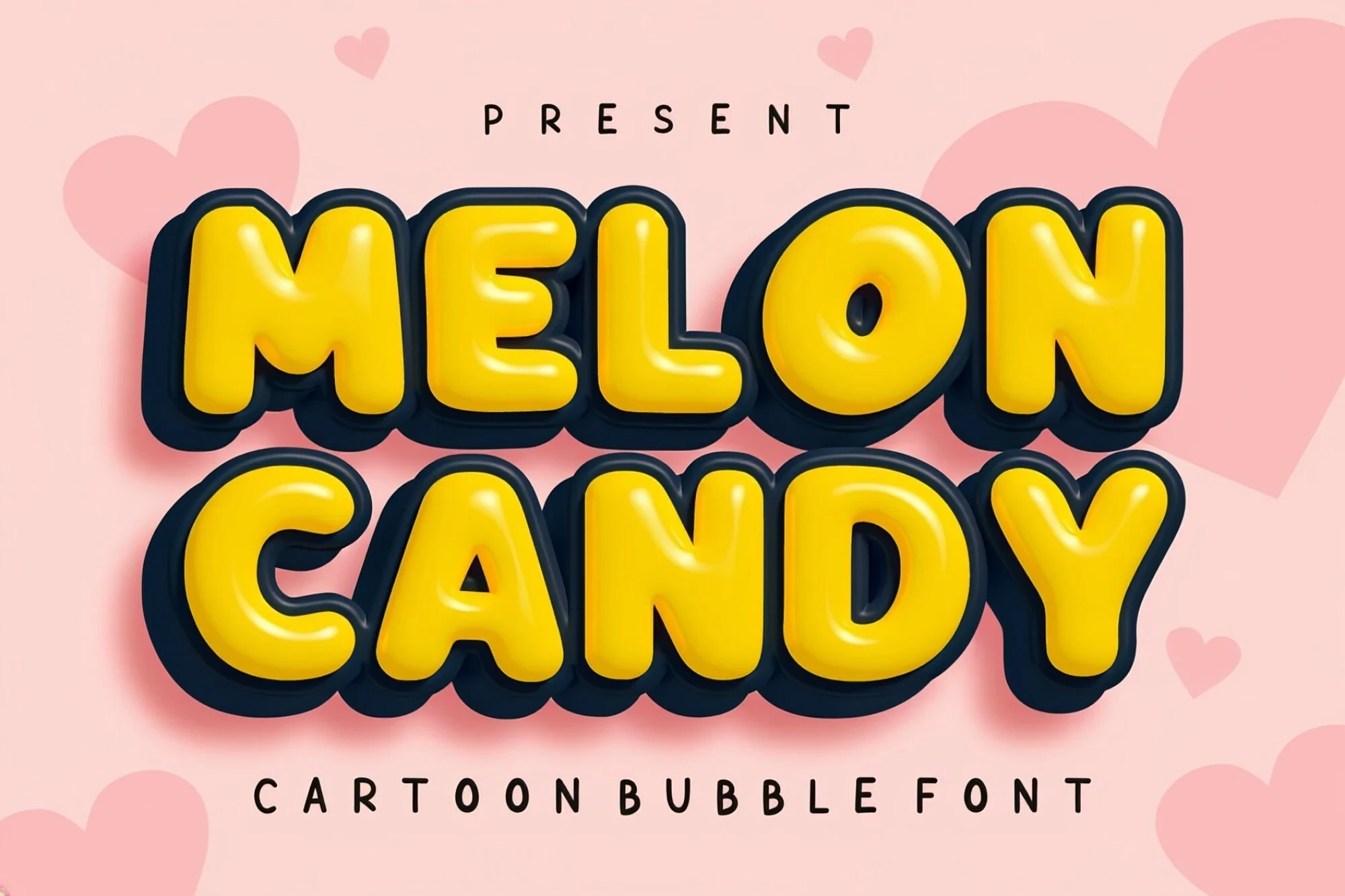
Melon Candy Font pairs bulbous bubble forms with a heavy 3D extrusion. The added depth suits logos, packaging, and posters that need a toy-like presentation, but the layered detail is easiest to read when the lettering receives plenty of space.
Giant Font

Best For: stickers, display text, playful designs, bold designs
Giant Font gives rounded sans-serif letters bumpy outlines and a high-contrast shadow, creating a sticker-like perimeter around otherwise substantial forms. It works for display text and stickers, although small settings can lose the uneven edge detail.
Floppy Font

Best For: creative projects, eye-catching designs, website headers, display text
Floppy Font is a wide, upright bubble face with soft-edged terminals and a consistently heavy stroke. Its broad silhouette suits website headers and creative titles, but reducing the thick construction too far can make counters and separations less clear.
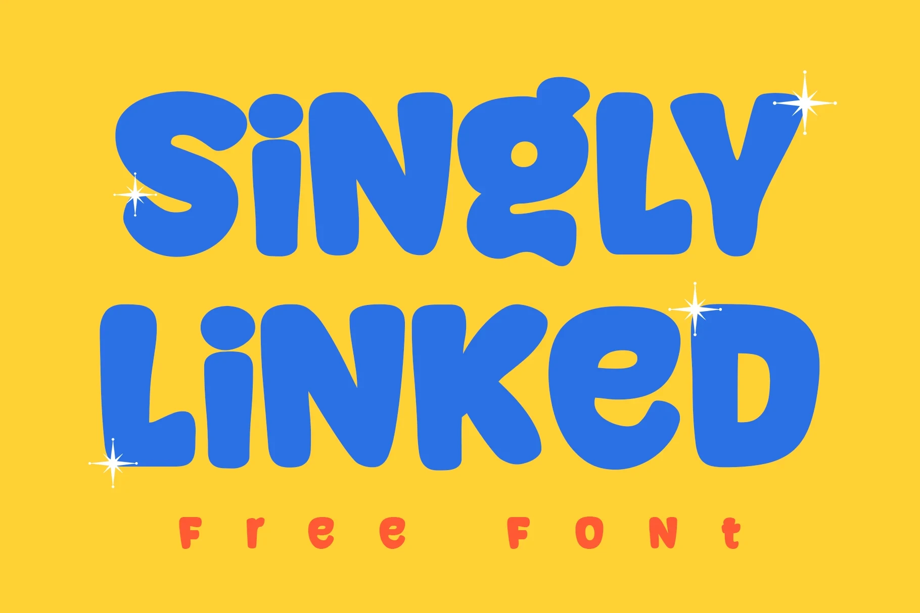
Singly Linked Font
Best For: display text, clean designs, soft designs, playful designs
Singly Linked Font keeps its bubble lettering upright, heavily rounded, and minimally countered. The uncluttered silhouette makes display words clear at headline scale, while its exaggerated thickness limits usefulness for smaller text or longer reading.
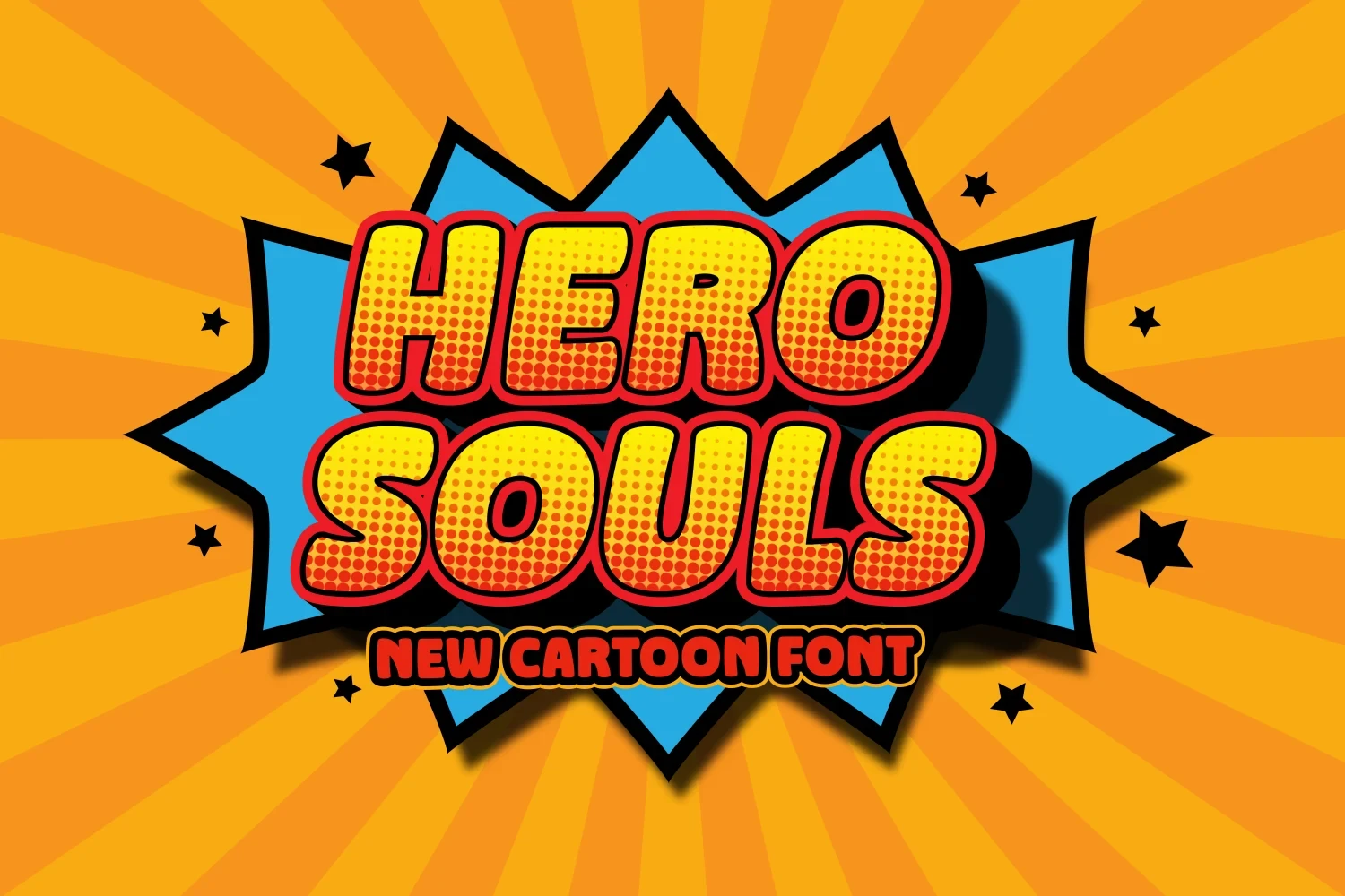
Hero Souls Font
Best For: book covers, headlines, website headers, magazine covers
Hero Souls Font offers compact rounded comic lettering with strong character separation and block-like proportions. It suits covers, magazine covers, and headers where recognition matters quickly, but the heavy shapes are less effective below headline scale.
Kiddo Handmade Font

Best For: children’s designs, display text, soft designs, playful designs
Kiddo Handmade Font combines disconnected bubble characters, soft terminals, and a uniform heavy weight. The clear separation supports children’s titles and display labels, while its dense construction makes large-scale wording a more reliable use than small text.
Comico Bright Font

Best For: T-shirts, posters, headlines, eye-catching designs
Comico Bright Font uses wide monolinear blocks, rounded corners, and substantial visual mass. For Cartoon Display Fonts, this sturdy silhouette offers broader small-size utility than irregular faces, while remaining well suited to headlines, posters, and T-shirt graphics.
Extruded Comic Display
These faces pair sturdy comic or geometric construction with pronounced perspective, extrusion, or drop shadows. Their depth effects separate them from flatter bubble forms and irregular textured lettering.
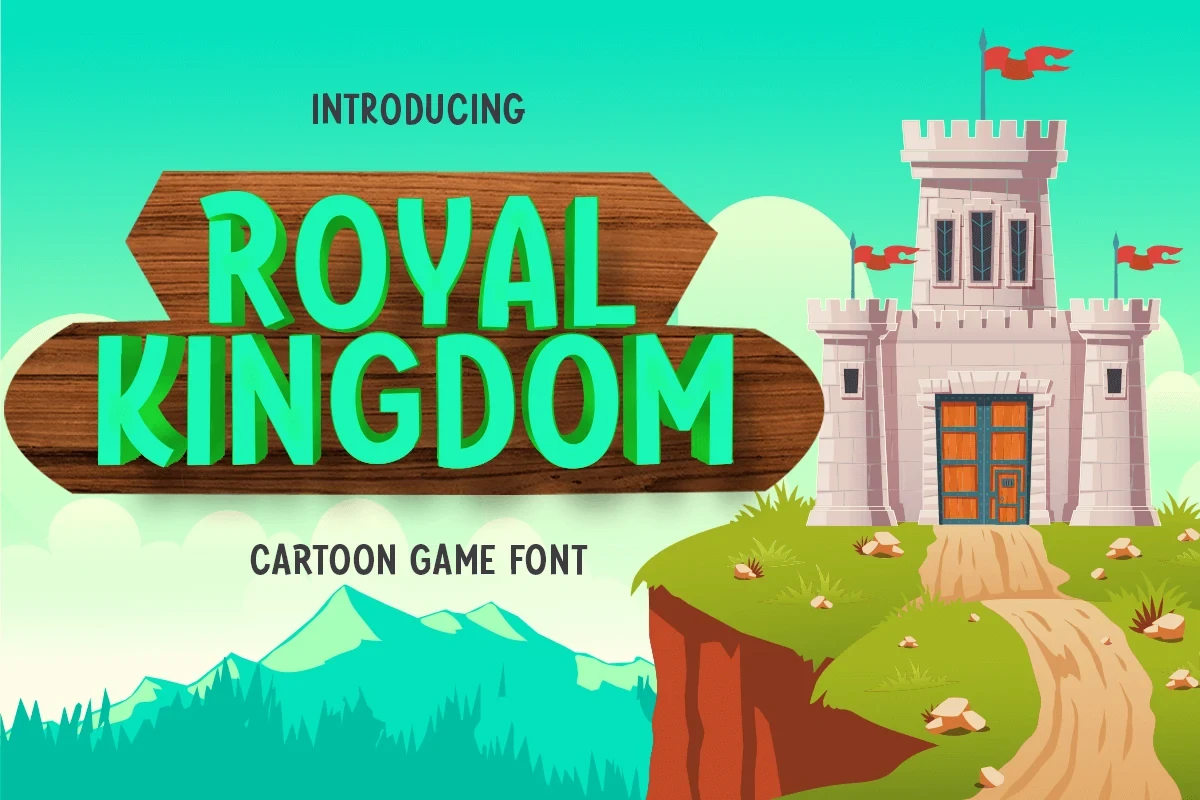
Royal Kingdom Font
Best For: social media graphics, display text, playful designs, bold designs
Royal Kingdom Font uses geometric, heavy lettering with consistent strokes and a pronounced extruded shadow. For Cartoon Display Fonts, that strong contrast supports adventure-oriented social graphics and other short display messages, but its depth reads most clearly when the lettering is set large.
Puppy Hero Font

Best For: T-shirts, posters, signage, book covers
Puppy Hero Font combines blocky slab serifs with a prominent extruded drop shadow. The sturdy structure gives posters, signs, shirts, and book covers a comic title presence, while the shadow and thick strokes work best at large display sizes.
Fight Fear Font

Best For: social media graphics, posters, product labels, book covers
Fight Fear Font uses a large x-height, geometric interiors, and slightly rounded corners, then adds a perspective shadow. The blocky shapes stay readable on labels, posters, and social graphics, with the strongest result in short, large headlines.
Rugged Textured Display
Rugged forms use distressed surfaces, angular cuts, dripping edges, uneven heights, or melting details. They bring stronger texture and thematic irregularity than the cleaner rounded categories.
Asphalt Crack Font

Best For: logos, branding, packaging, posters
Asphalt Crack Font brings a heavy rounded structure together with a distressed surface and irregular terminals. For Cartoon Display Fonts, it is especially useful when logos, packaging, or posters need retro texture, though the surface treatment can soften at very small sizes.
Broke Boys Font

Best For: logos, branding, packaging, posters
Broke Boys Font uses angular block letters, cut-out edges, and dripping lower elements to create an irregular headline surface. Its main strokes stay readable in large settings, making it a practical choice for packaging, logos, branding, and posters.
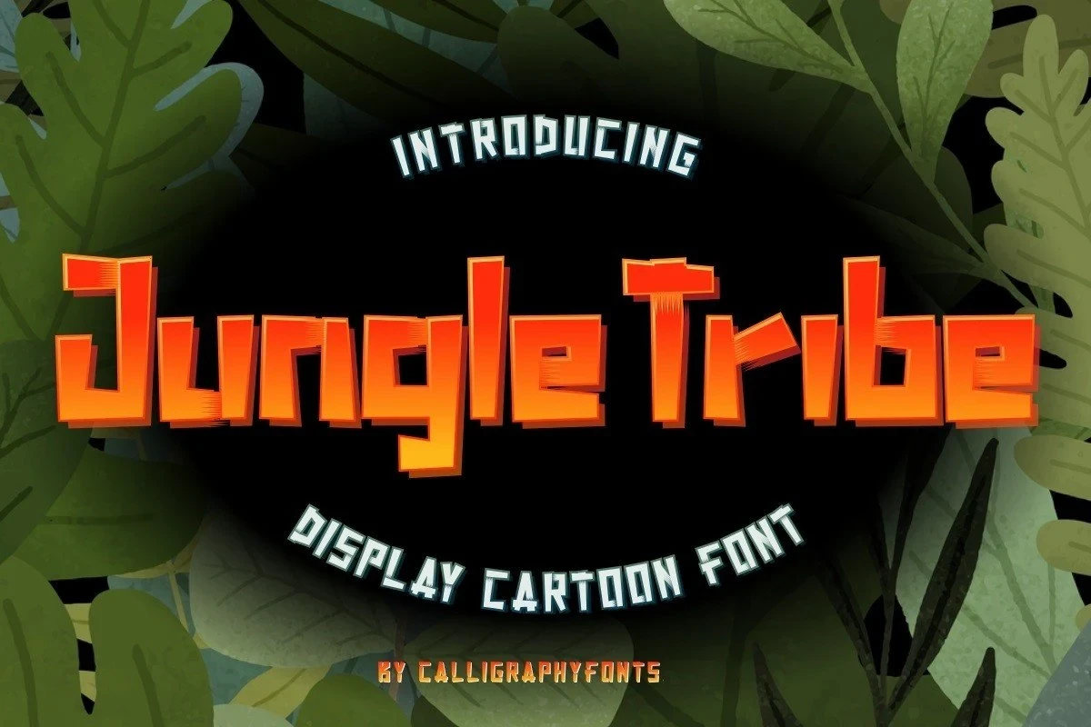
Jungle Tribe Font
Best For: children’s designs, display text, clean designs, playful designs
Jungle Tribe Font is built from primitive angular shapes, uneven stroke heights, and disconnected characters. The irregular baseline gives children’s designs and posters a handmade, rugged edge while the heavy construction keeps large titles readable.
Ice Man Font

Best For: website headers, display text, playful designs, bold designs
Ice Man Font uses wide, slab-like forms with lower edges shaped like melting snow or ice. This clear motif makes it useful for seasonal headers and themed display text, though scaling down may hide the distinctive drip treatment.
Graffiti And Block Forms
This group combines graffiti-like separation, rounded terminals, compact caps, and uneven contours. The letters remain forceful in short titles while carrying more street-influenced or rough character than bubble faces.
Street Spirit Font

Best For: T-shirts, branding, packaging, posters
Street Spirit Font suits T-shirts, packaging, signage, and posters where disconnected, bubbly characters can carry the title. Its upright stance and thick strokes remain readable, but the separated construction is better for short display wording than extended text.
Ouch Sorry Font

Best For: book covers, T-shirts, headlines, social media graphics
Ouch Sorry Font is a caps-only face with uniform-width forms, rounded terminals, and a compact heavy structure. It makes short headlines, book covers, and shirt graphics easy to read, while its display construction rules out body-copy use.
Spondy Boody Font

Best For: posters, display text, clean designs, soft designs
Spondy Boody Font pushes a heavy sans-serif toward cartoon texture through irregular, bumpy contours and an uneven baseline. It adds personality to posters and titles, but reduction can erase the contour distinction that gives the face its identity.
How to Choose the Right Font
Choose Cartoon Display Fonts by matching construction to scale and message. Rounded bubble faces offer approachable titles, while extruded styles need room for their shadows and textured or dripping faces need enough size to preserve detail. For the clearest short graphics, favor thick separated forms; reserve the most irregular options for logos, posters, packaging, and other display settings.