27 Best Groovy Display Fonts in 2026
This collection moves from inflated bubble capitals and dimensional shadows to warped curves, broken modular forms, and connected scripts. These Groovy Display Fonts are designed for headlines, logos, posters, labels, shirts, covers, and social graphics, with readability depending heavily on scale and spacing.
Looking for more display fonts? Browse our complete Display Fonts collection to compare bold, vintage, retro, decorative, and playful display styles.

Groovy Display Fonts
These Groovy Display Fonts share rounded, heavy construction, but range from wide bubbles to condensed capitals and shadowed forms; they are generally steadier than the warped or script groups.
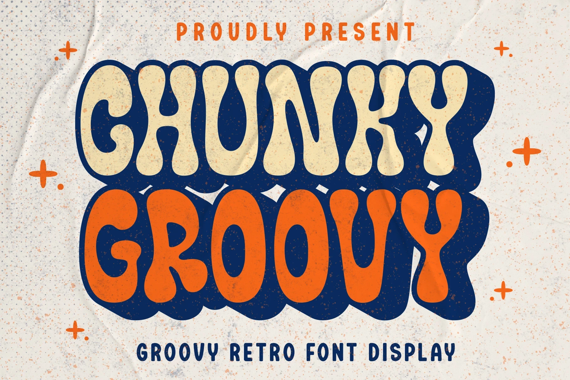
Chunky Groovy Font
Best For: book covers, T-shirts, stickers, social media graphics
Chunky Groovy Font builds bubbly, heavy letters around a pronounced drop shadow. This layered treatment gives Groovy Display Fonts strong presence on covers, shirts, and stickers, though the added depth can reduce clarity when the lettering is scaled down.
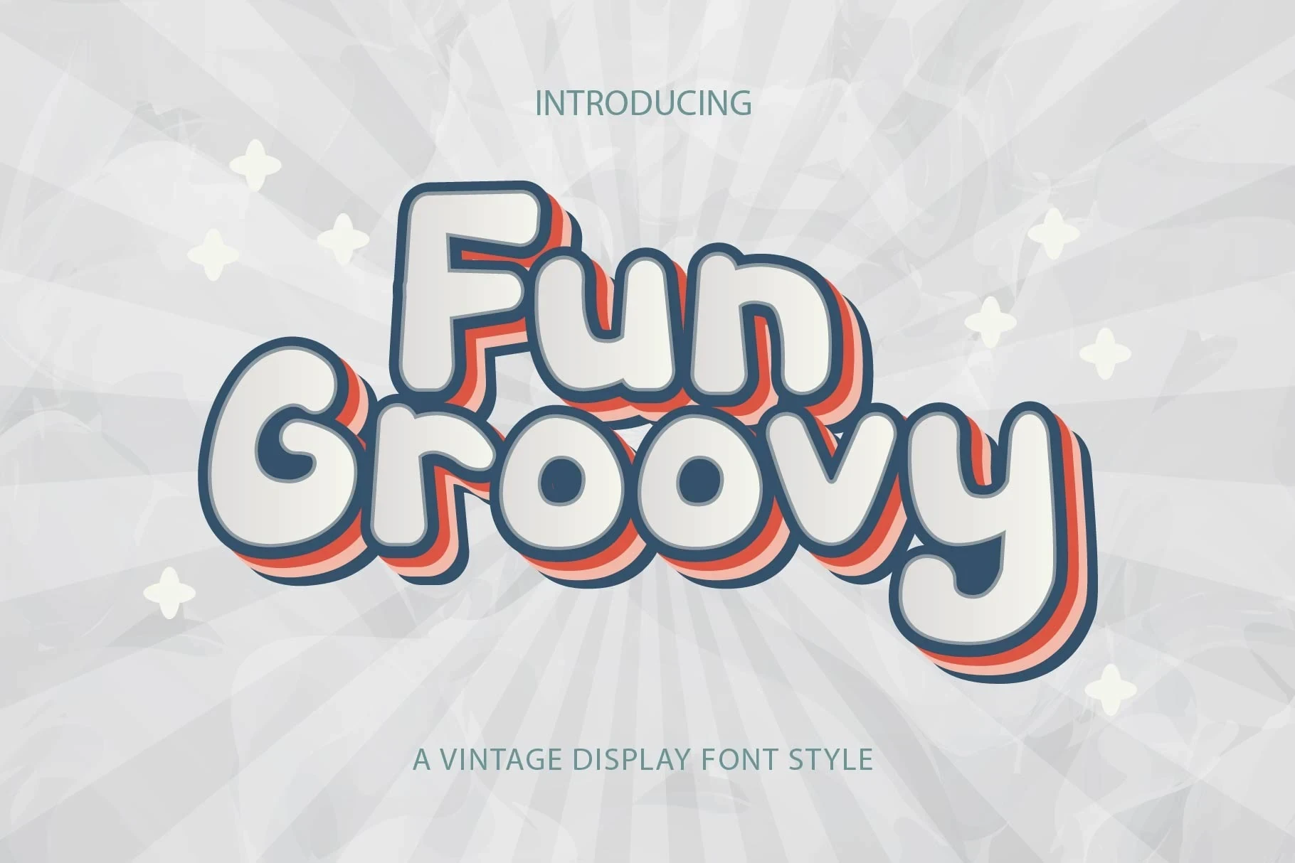
Fun Groovy Font
Best For: book covers, T-shirts, stickers, social media graphics
Fun Groovy Font uses low-x-height bubble lettering, bold uniform strokes, and simple disconnected construction. Among Groovy Display Fonts, its uncomplicated structure stays readable in large logos and posters without relying on script movement or overlapping joins.
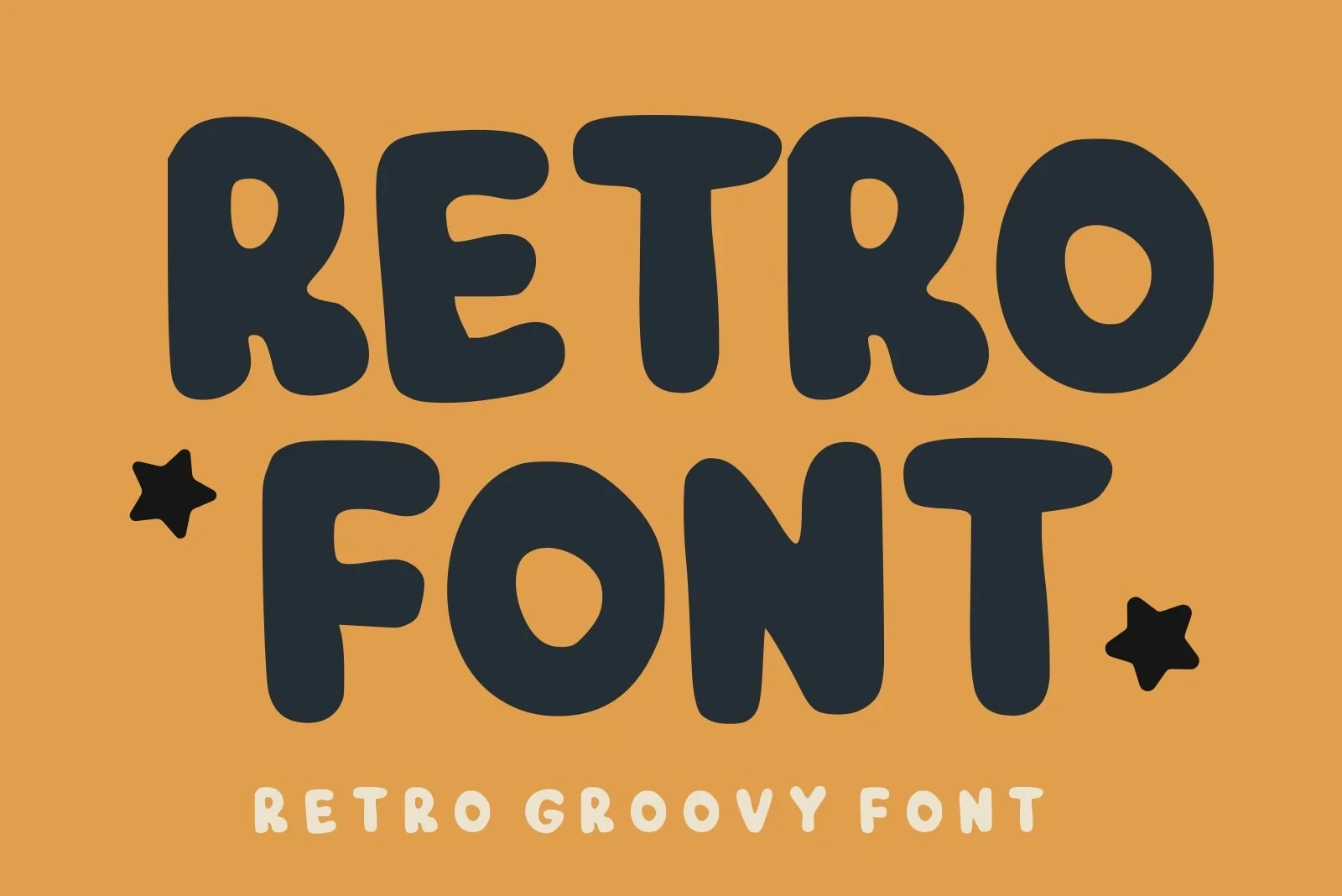
Retro Font
Best For: display text, soft designs, playful designs, bold designs
For prominent display words, Retro Font offers compact block structures, rounded terminals, and low contrast. Its tight build produces a solid visual unit, but the thick spacing and strokes lose definition when reduced significantly.
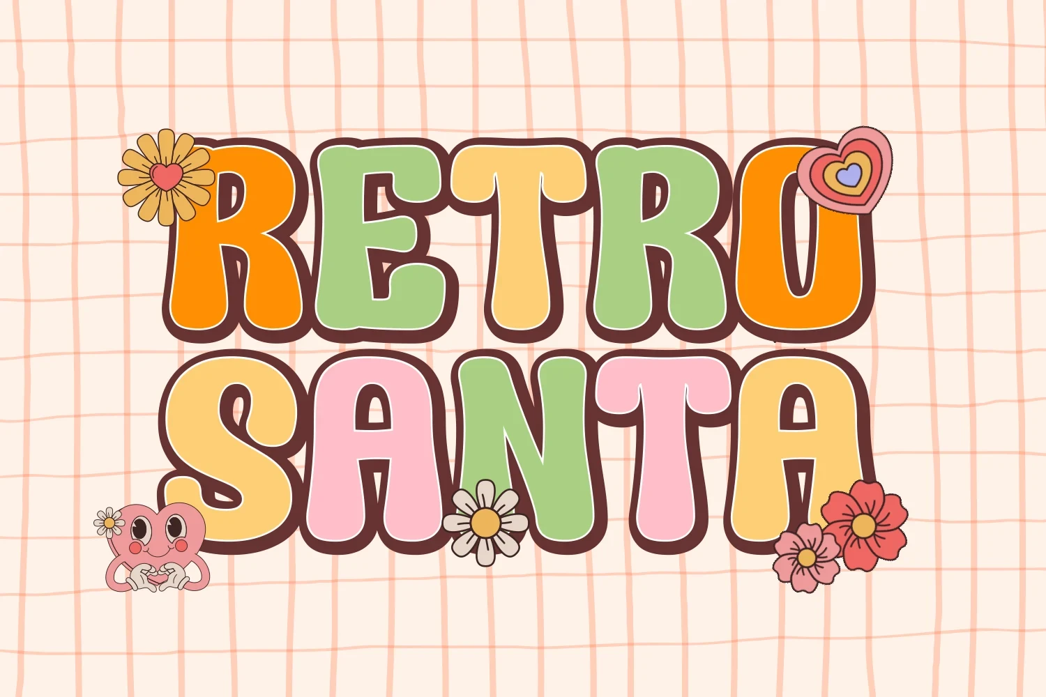
Retro Santa Font
Best For: display text, soft designs, playful designs
Retro Santa Font gives its bubble forms a wide, sign-like footprint through upright proportions and thick strokes. The absence of italic slant keeps headings stable, making it dependable for shirts, posters, and other large display applications.
Thanksgiving Font
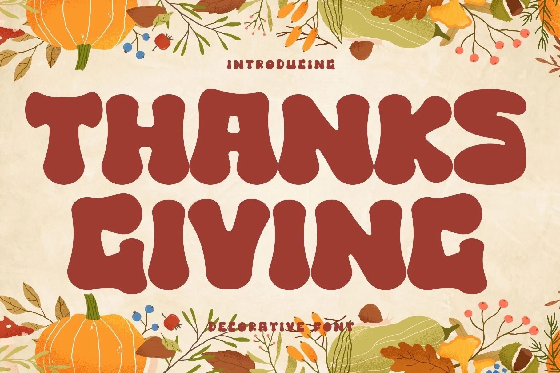
Best For: logos, branding, invitations, display text
Thanksgiving Font uses wide, blobby capitals with an expansive horizontal footprint. This Groovy Display Fonts choice supports logos and invitations with substantial presence, though its breadth consumes space quickly in multi-line layouts or longer headings.
Holiday Sunshine Font
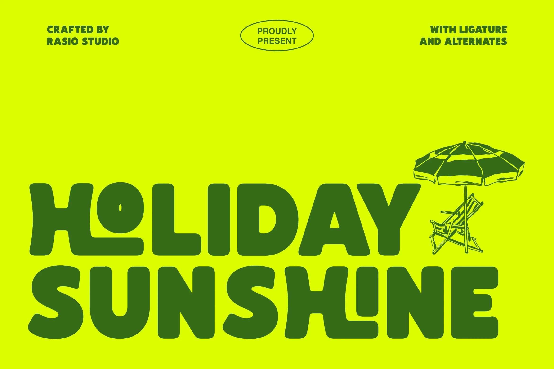
Best For: branding, display text, modern designs, clean designs
Holiday Sunshine Font pairs wide monolinear capitals with ligatures and alternate characters. These options expand branding treatments while preserving the heavy, readable structure expected from Groovy Display Fonts, making it useful for display text and identity work.
Chups Font
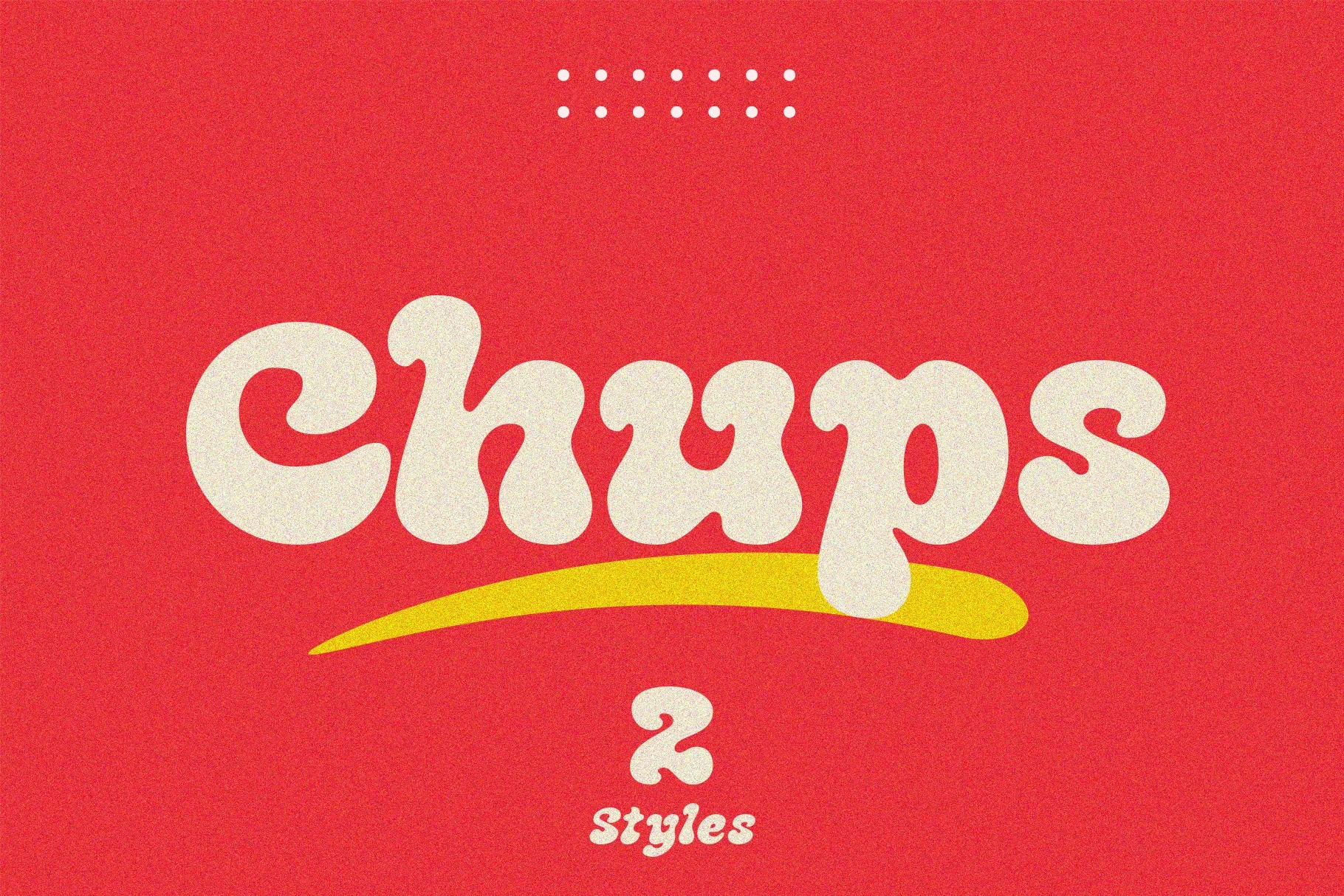
Best For: posters, invitations, book covers, magazine covers
Chups Font compresses negative space into dense, rounded bubble forms with thick monolinear stems. The compact interiors make posters and covers forceful at large size, but leave little tolerance for reduction or body text.
Chunky Smile Font
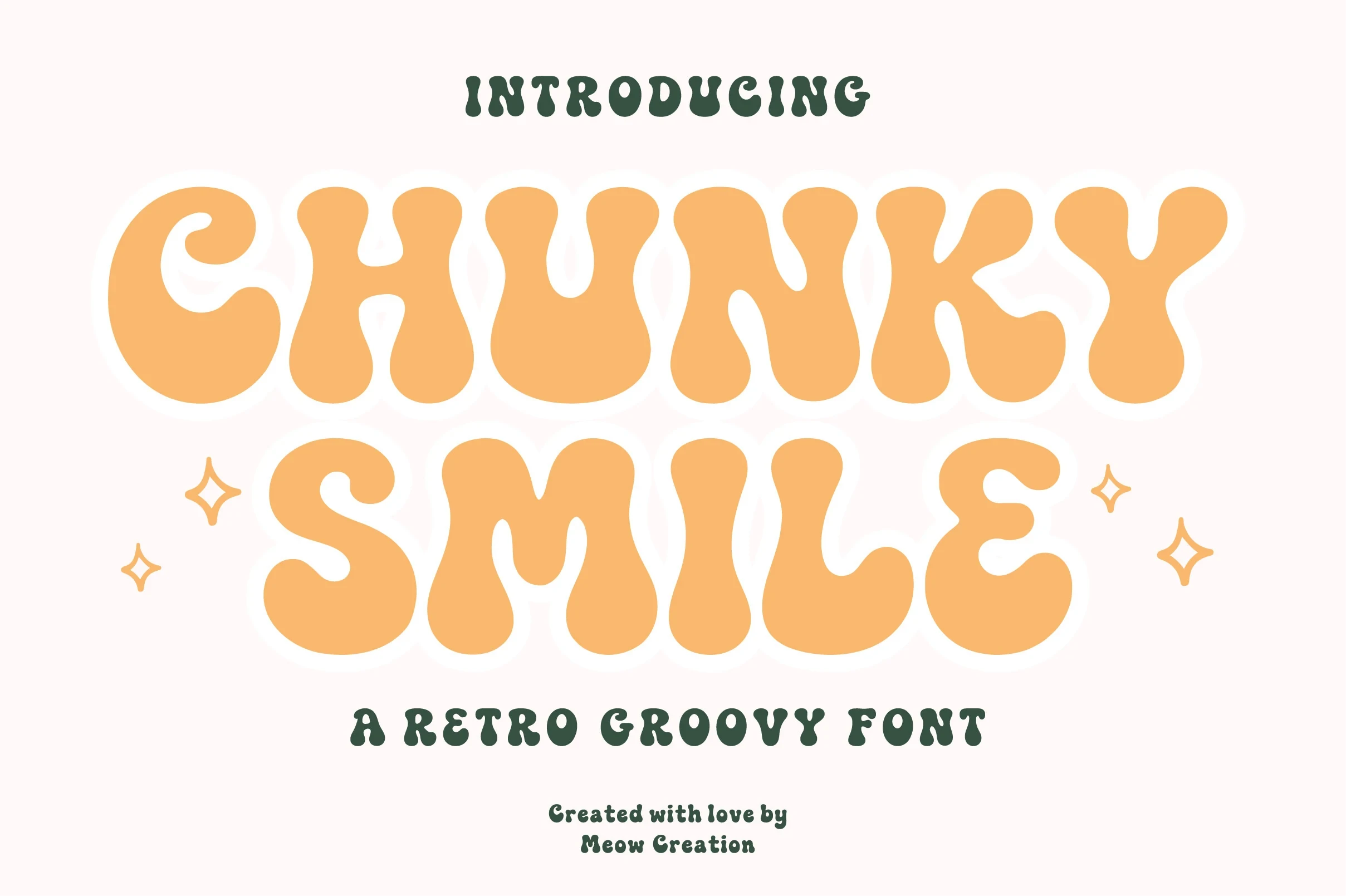
Best For: social media graphics, display text, minimal designs
Chunky Smile Font creates an inflated silhouette through exaggerated weight, soft terminals, and reduced counters. It performs best as a logo or social graphic; the limited interior space makes sustained reading unsuitable.
Holysweet Font
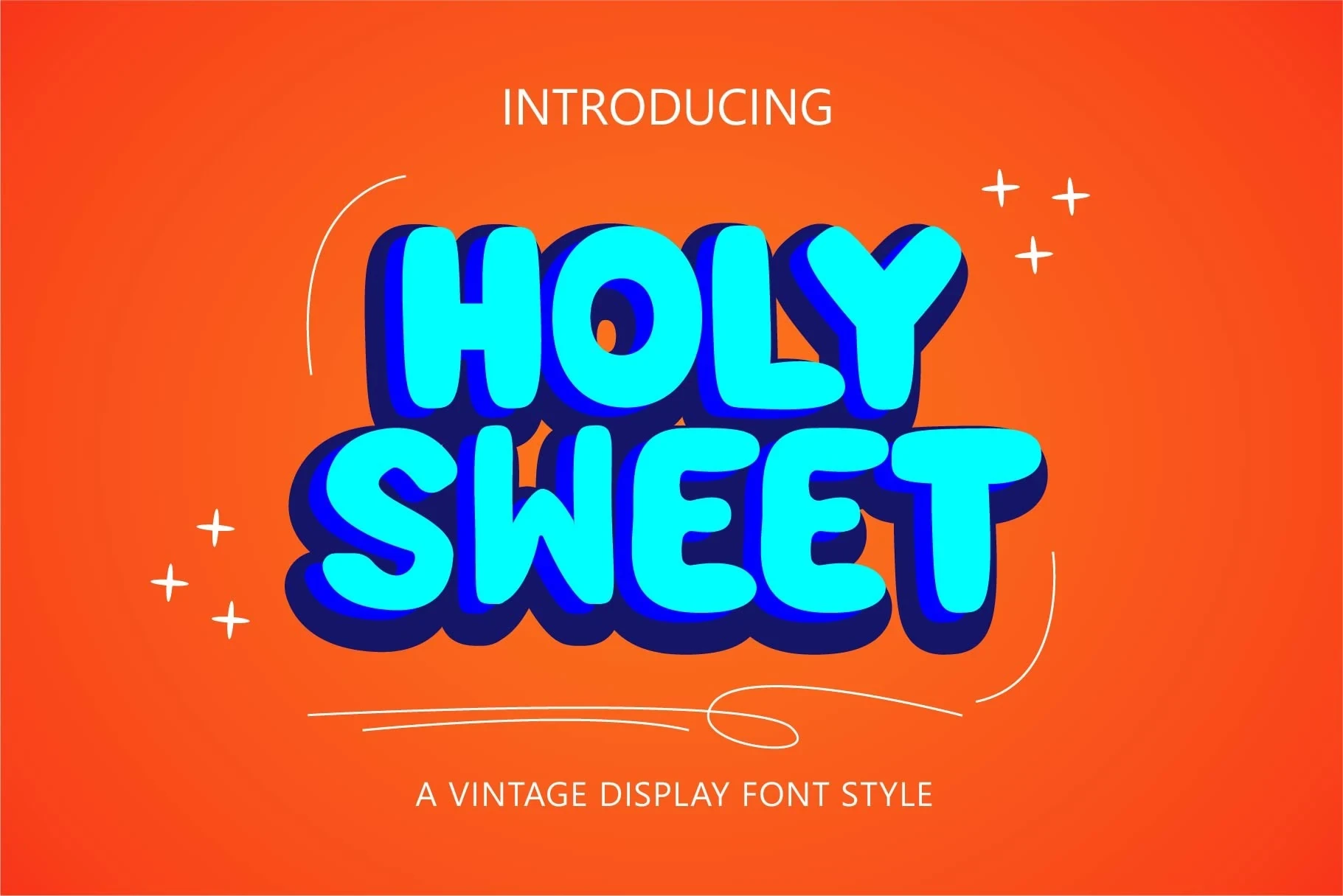
Best For: website headers, posters, display text, classic designs
Holysweet Font extends wide rounded blocks with a heavy three-dimensional extrusion shadow. That depth gives headers and posters substantial display authority, but the layered mass makes long text feel cramped. PUA-encoded characters provide access to its glyphs and swashes.
Sunnyland Font

Best For: logos, branding, invitations, display text
Sunnyland Font packs thick bubble capitals into a condensed footprint, making these Groovy Display Fonts useful when logos or invitations need to conserve horizontal space. Its heavy construction remains size-dependent and can lose clarity in very small print.
Tf Bombass Font

Best For: social media graphics, display text, soft designs, playful designs
Tf Bombass Font rounds every corner and closes its counters into a soft, dense silhouette. The youthful display shape works well in large graphics, but apertures around letters such as O, B, and A may close at small sizes.
Brisker Font
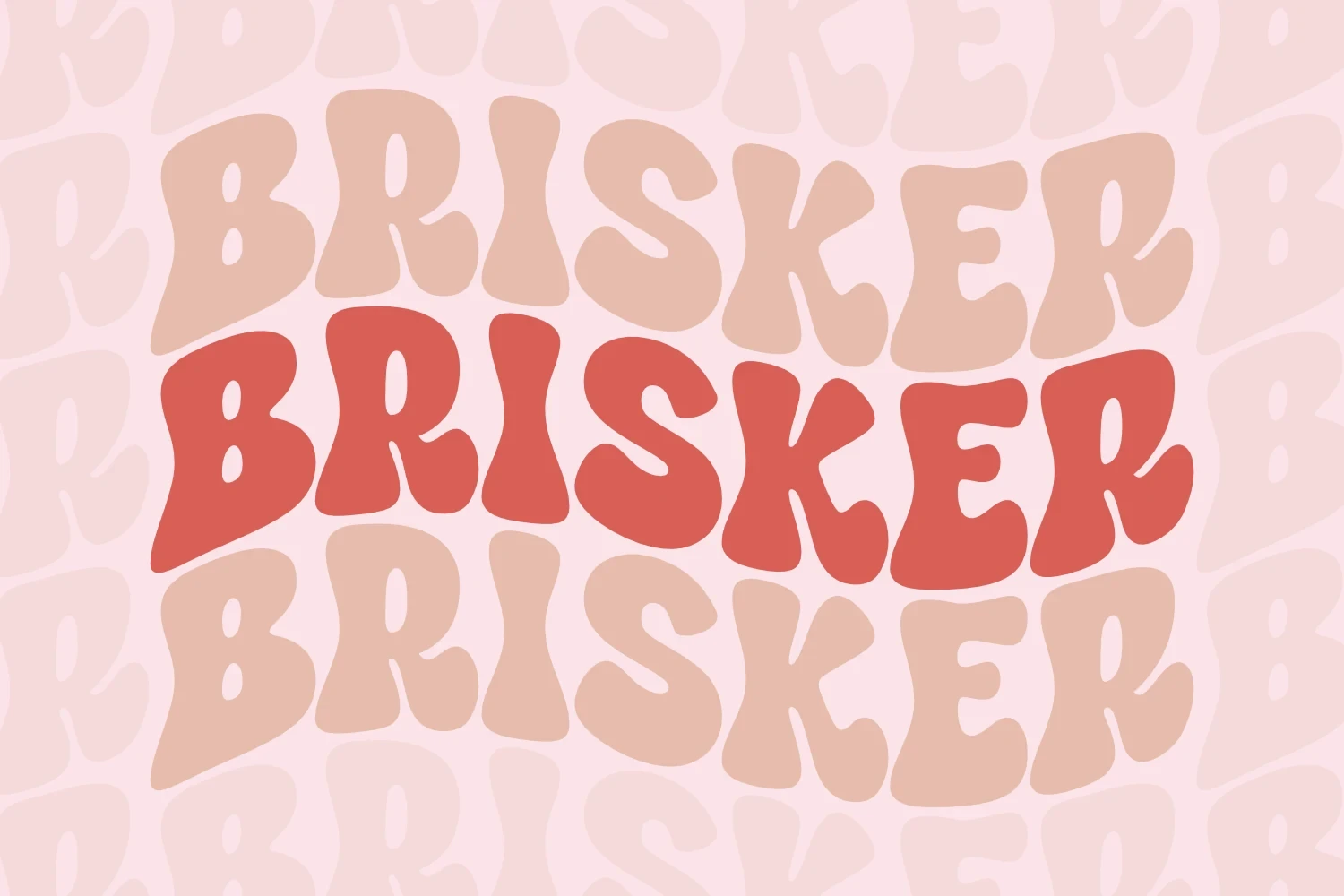
Best For: T-shirts, posters, headlines, invitations
Brisker Font uses soft exaggerated curves and rounded forms without sharp terminals. Its layered, wavy layout gives shirts, posters, and headlines a recognizable Groovy Display Fonts identity, while the warping limits dense copy and smaller text blocks.
Quick Font
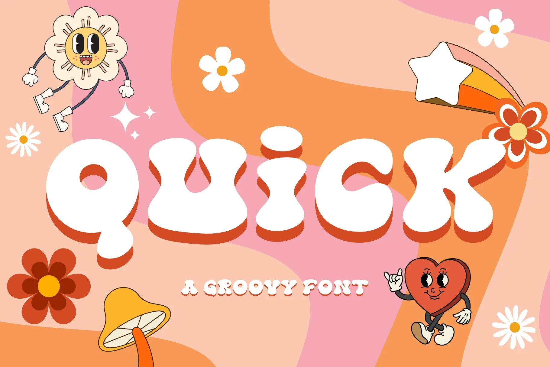
Best For: logos, branding, invitations, display text
Quick Font combines wide disconnected bubble letters with soft terminals and uniform heavy strokes. The broad construction supports branding and invitations, but its visual mass rules out small body text and crowded layouts.
Milayu Font

Best For: headlines, eye-catching designs, display text, classic designs
Milayu Font gives rounded forms smooth, undulating outlines while keeping the letters disconnected. This Groovy Display Fonts option creates a strong headline identity through heavy weight and tight spacing, though very small use can become difficult to read.
Wavy And Warped Letterforms
Wavy And Warped Letterforms rely on undulating baselines, serpentine stems, modulation, or exaggerated curves, creating more movement than the heavier, more stable bubble displays.
Monstra Guthen Font

Best For: branding, packaging, social media graphics, product labels
For labels and branding, Monstra Guthen Font supplies soft undulating curves through thick, consistent strokes. The disconnected characters and tight spacing give Groovy Display Fonts a compact, decorative rhythm, but dense paragraphs and small settings quickly become difficult to read.
Choco Groovy Font
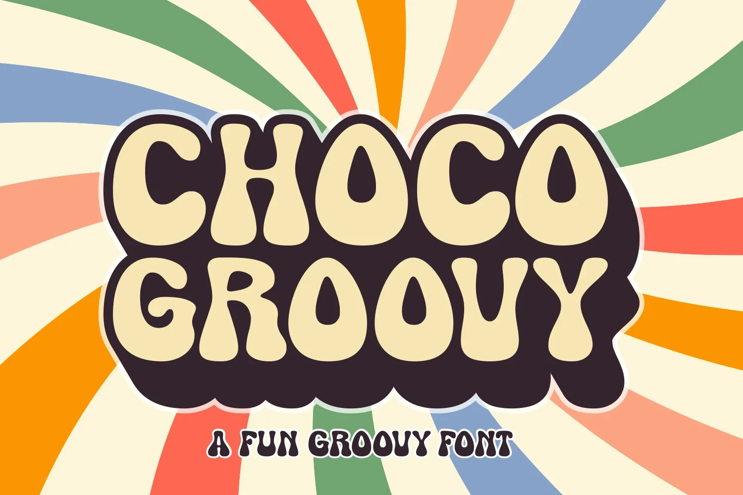
Best For: book covers, magazine covers, display text, headlines
Choco Groovy Font pushes thick monolinear strokes into exaggerated organic curves, producing a strongly psychedelic silhouette. Its dense rounded shapes add character to covers and headlines, but extended text can become cluttered and lose distinct letter separation.
Regisa Font
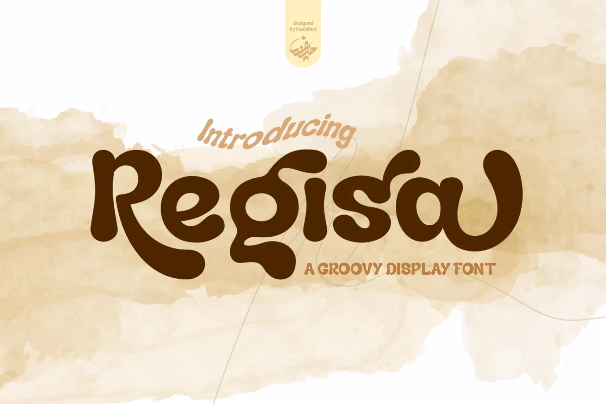
Best For: T-shirts, magazine covers, display text, playful designs
Regisa Font sets high-contrast flowing curves against disconnected letterforms, adding visible motion without connected script. Its decorative structure reads well at display size on shirts and covers, while small text blocks sacrifice clarity.
Sunday Brunch Font

Best For: social media graphics, T-shirts, branding, packaging
Sunday Brunch Font makes the entire word line undulate through a wavy baseline and changing character heights. The distorted forms suit packaging and social graphics, although the irregular movement limits compact applications and small captions.
Groove Tribe Font

Best For: posters, social media graphics, logos, website headers
Groove Tribe Font combines wave-like curves, strong stroke modulation, and tight overlapping spacing. The result is a dense psychedelic texture for logos and headers, with low body-text legibility when the forms are set closely or reduced.
Geumeon Groovy Display Font
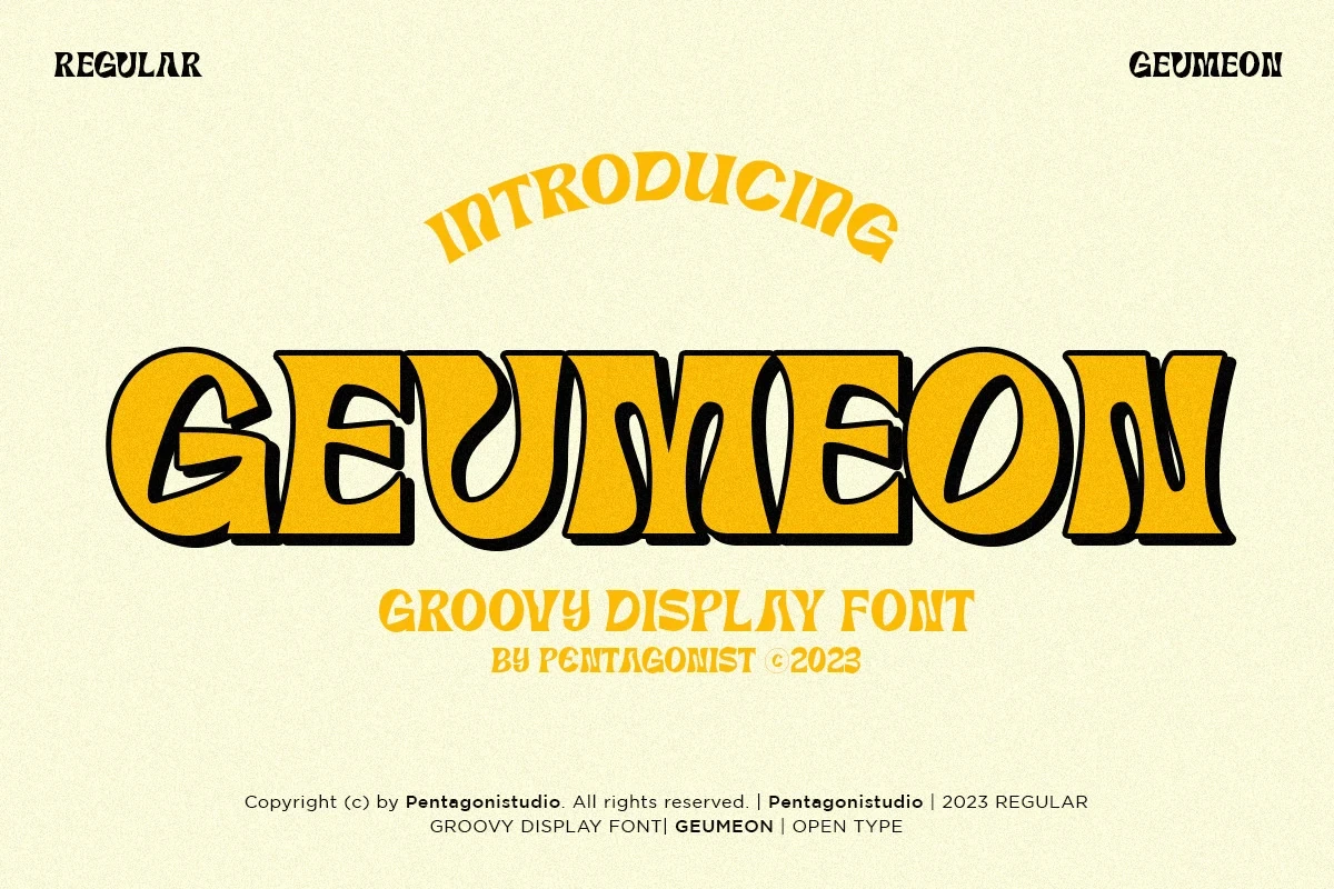
Best For: social media graphics, display text, playful designs, bold designs
Geumeon Groovy Display Font bends heavy capitals with serpentine stems and wavy baselines. The pronounced rhythmic geometry can hold large signage together, but becomes demanding in paragraphs, captions, or other small applications.
Only Monday Font
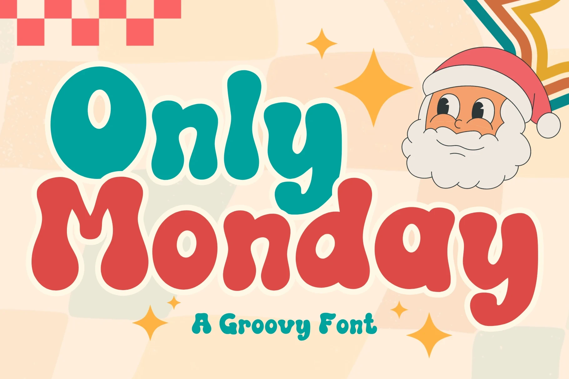
Best For: logos, branding, invitations, display text
Only Monday Font emphasizes exaggerated curves through disconnected monolinear characters rather than continuous joins. Large primary lettering remains readable for logos and invitations, while a smaller geometric sans-serif subtitle can carry practical supporting information.
Connected Groovy Scripts
Connected Groovy Scripts fuse neighboring letters into wordmark-like shapes, using overlap or continuous strokes; that flow separates them from the disconnected display lettering elsewhere.
Stay Funky Font
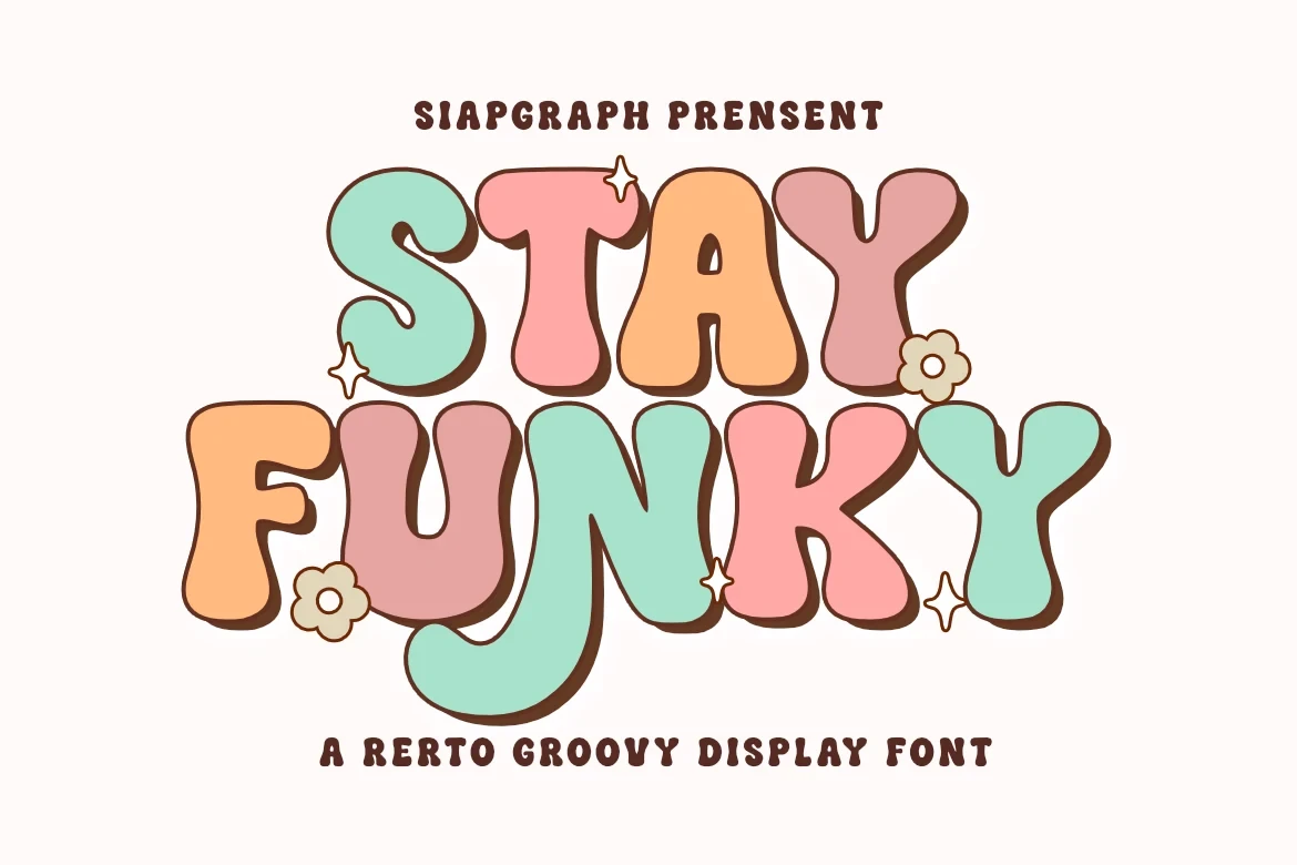
Best For: posters, creative projects, social media graphics
Stay Funky Font creates a tightly fused wordmark through connected, overlapping bubble forms and distorted variable-width proportions. Its ultra-heavy shapes work at large size for posters and creative projects, while the overlap makes body copy impractical.
Classic Night Font
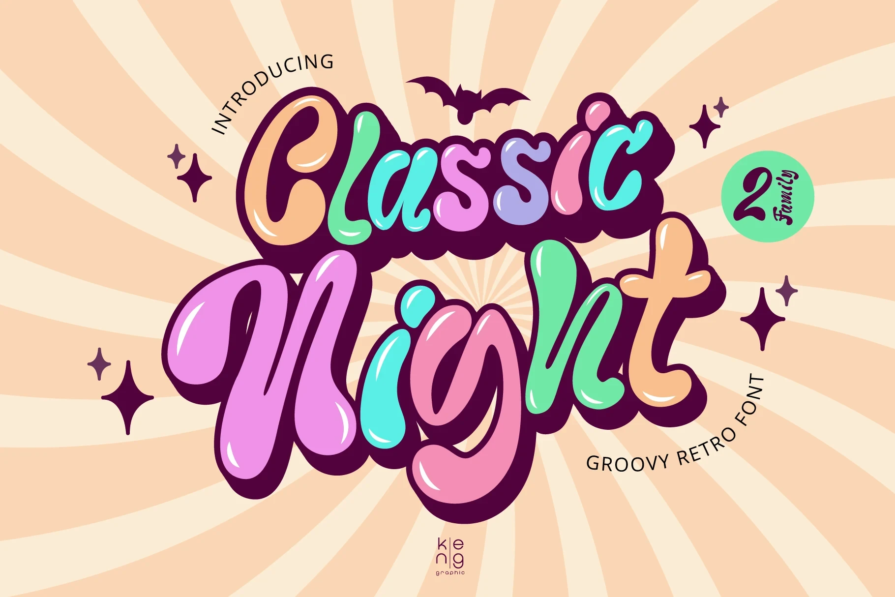
Best For: posters, social media graphics, book covers
Classic Night Font combines fluid connected script with unusually deep shadowing. The heavy layered treatment gives Groovy Display Fonts dimensional headline presence on posters and covers, but its thickness overwhelms small settings and extended text.
Homey Font
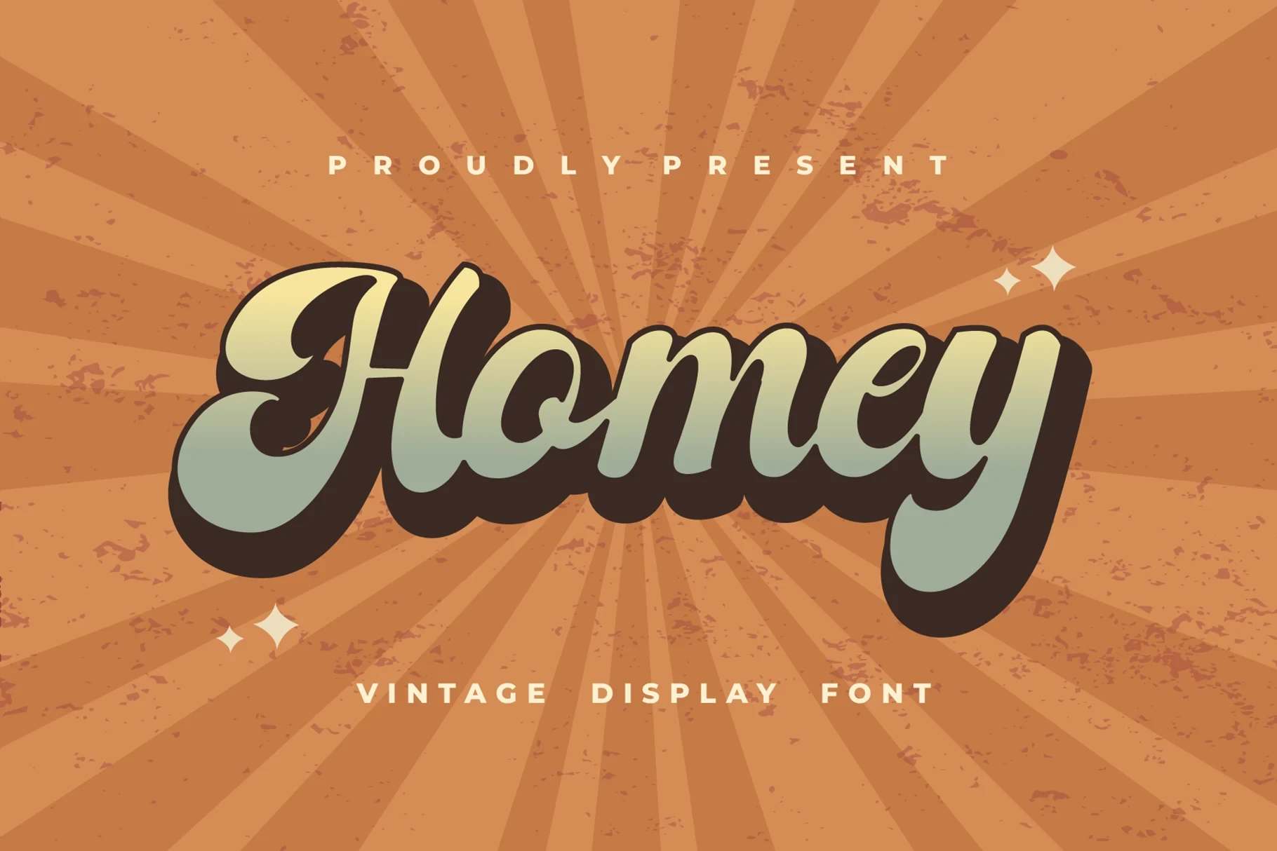
Best For: product labels, display text, clean designs, playful designs
Homey Font is a genuinely connected script with rounded terminals and a steady monolinear stroke. Its continuous movement gives product labels a personal wordmark quality, but like many Groovy Display Fonts, it needs display scale to retain clarity.
Structured And Novelty Displays
Structured And Novelty Displays introduce segmented strokes, condensed slab serifs, or abstract blobs, replacing familiar bubble construction with more geometric or unconventional headline structures.
Funky Yard Font
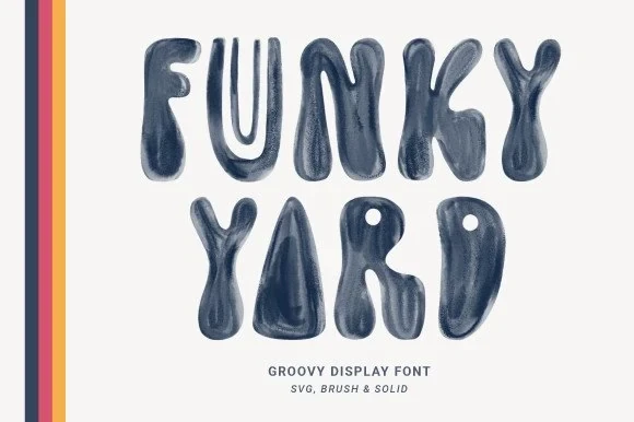
Best For: retro designs, display text, modern designs
Funky Yard Font uses disconnected uppercase blobs with abstract, rounded construction and a watercolor-like texture. Its unconventional shapes prioritize headline impact, so it needs generous scale for posters, logos, and other display text rather than compact supporting copy.
Retro Display Font
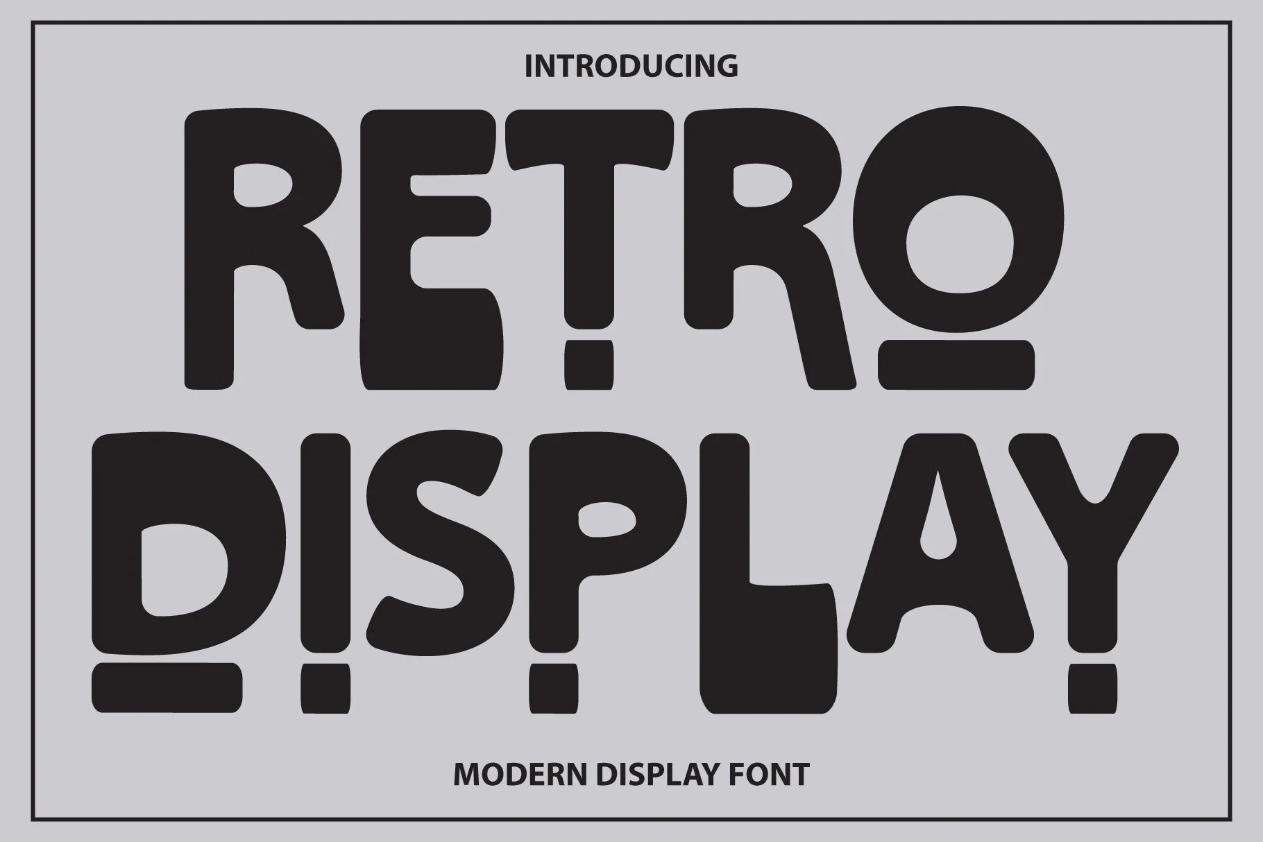
Best For: display text, modern designs, clean designs, playful designs
Retro Display Font breaks its wide letterforms into separated modular stroke segments. That visibly interrupted construction makes the face decorative and unconventional, but readability drops sharply at small sizes, so reserve it for large title treatments.
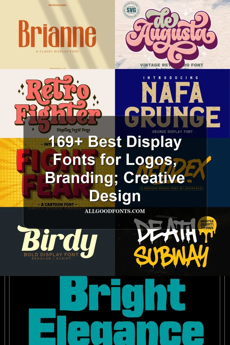
Bright Elegance Font
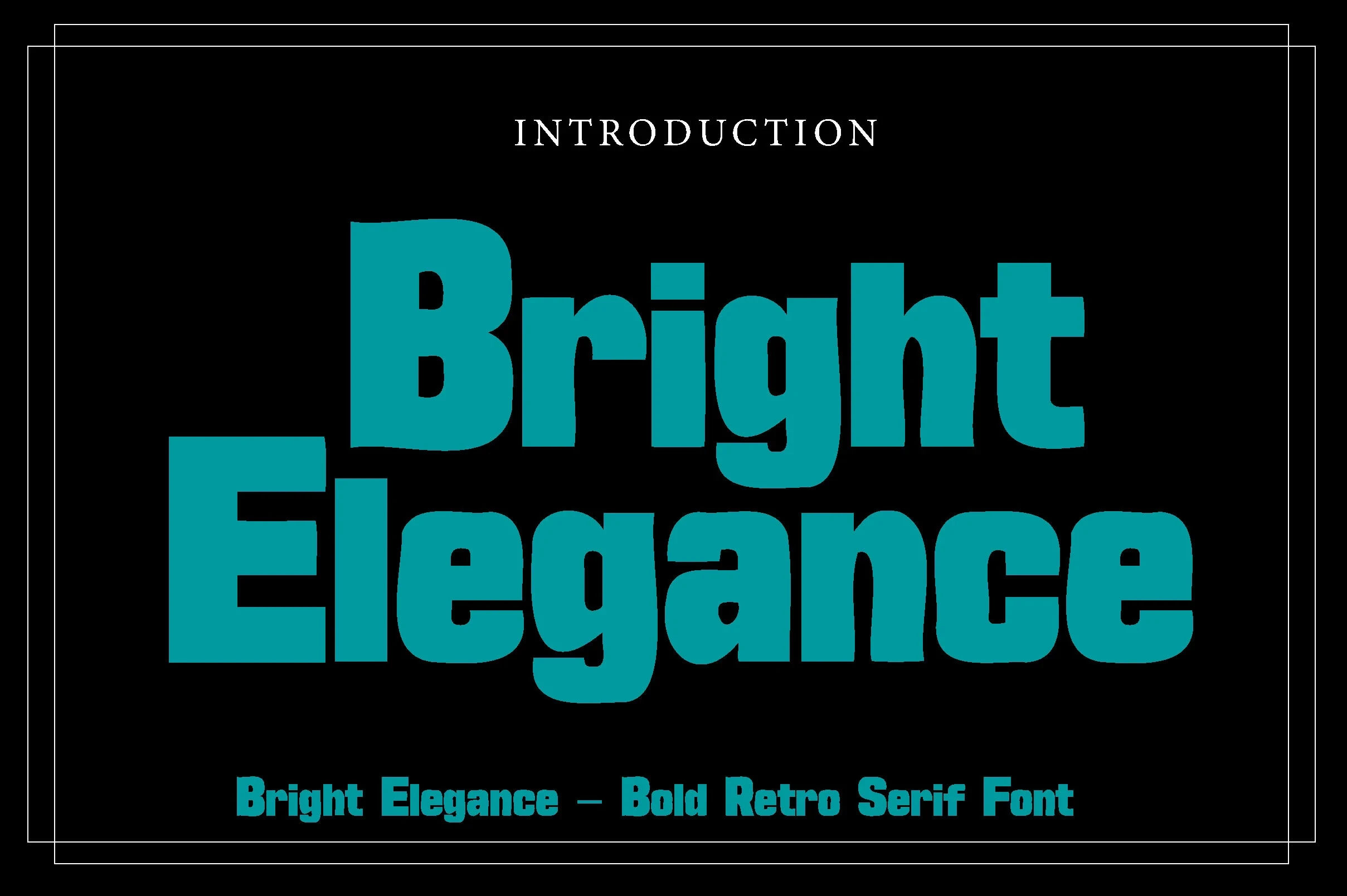
Best For: branding, posters, headlines, social media graphics
Bright Elegance Font takes a different route among Groovy Display Fonts, using condensed slab serifs with squared endings instead of bubble terminals. Its narrow proportions conserve headline width, though tight spacing can weaken clarity in small print.
How to Choose the Right Font
Choose by construction first: use stable, wide bubbles for readable shirts and logos, condensed forms when space is limited, and warped or connected styles when the lettering itself should become the design. Check counters, joins, shadow depth, and spacing at the final size before committing any Groovy Display Fonts choice to supporting text.