33 Best Kids Cute Fonts in 2027
This collection of Kids Cute Fonts spans rounded sans serifs, illustrated creature alphabets, casual scripts, and textured display faces. Together, they cover readable children’s headlines, book covers, labels, invitations, posters, logos, and other short-form designs where letter construction carries much of the visual role.
Looking for more cute fonts? Browse our complete Cute Fonts collection to compare modern, bold, and cute cute styles.
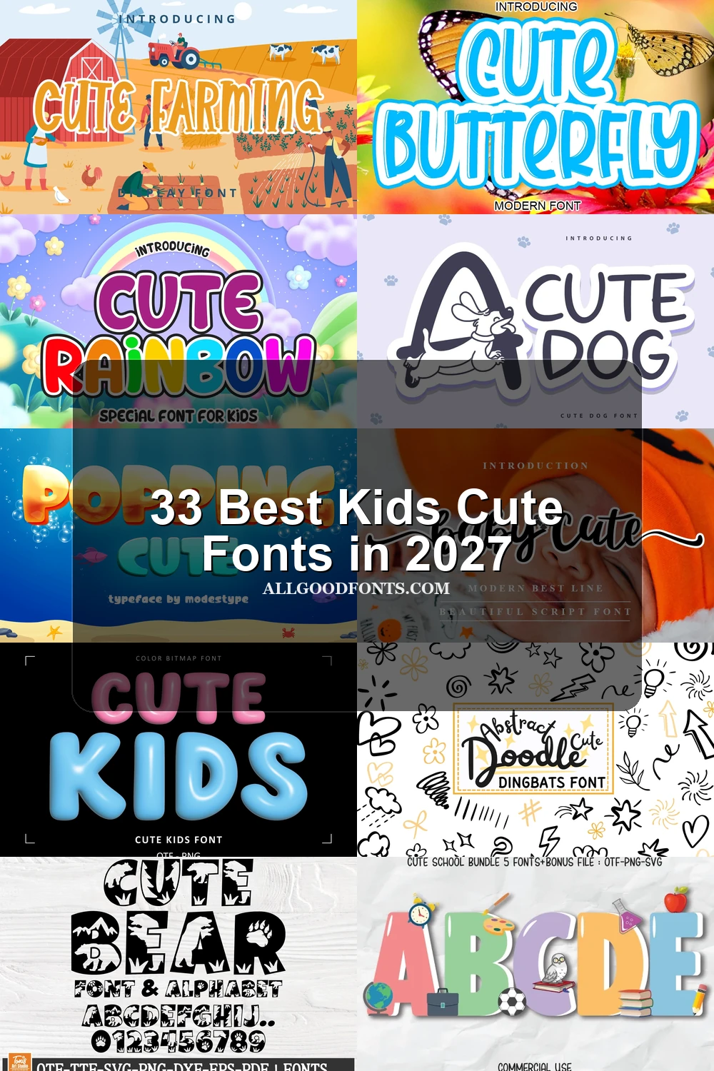
Kids Cute Fonts: Rounded Display Bases
These Kids Cute Fonts rely on rounded, upright, heavy silhouettes and simple monoline construction. They are generally clearer than illustrated or textured styles, especially in large titles and straightforward branding.
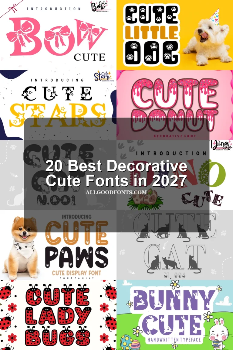
Cute Insect Font
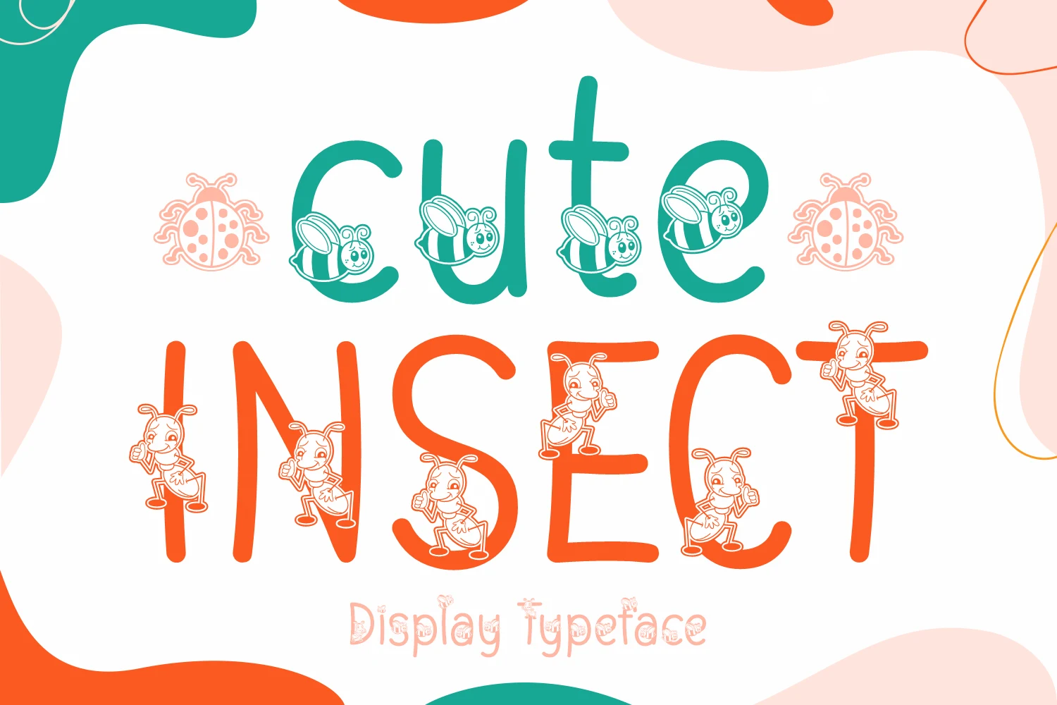
Best For: children’s designs, website headers, display text
Cute Insect Font pairs a bold, rounded monoline sans with a lighter companion style. The main lettering stays clear in headers, while integrated insect illustrations can interrupt small text or extended copy.
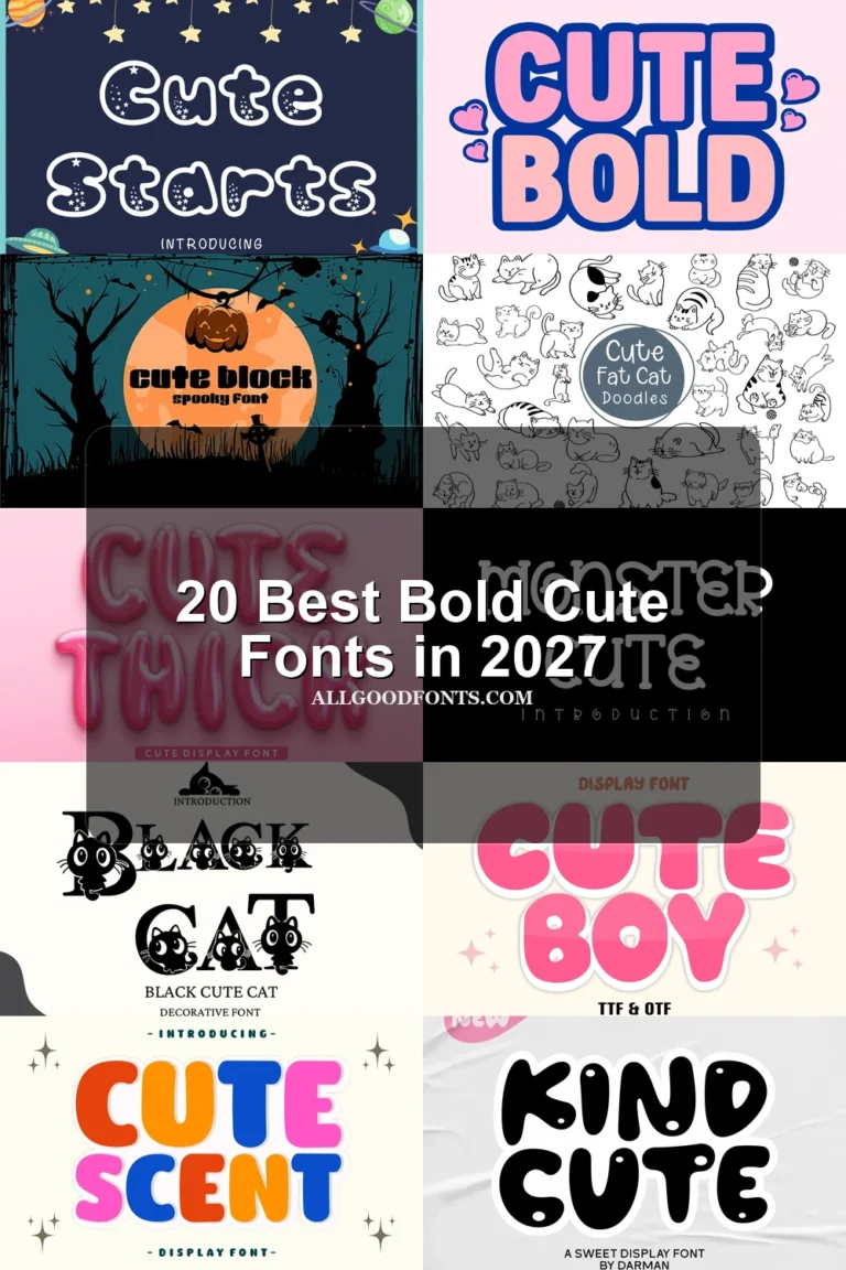
Cute Kids Font

Best For: display text, soft designs, playful designs
Cute Kids Font uses inflated, disconnected letterforms with thick, uniform strokes and unusually simple silhouettes. The heavy forms hold up strongly in titles, while SVG, PNG, and OTF formats support flexible output for display work.
Cute Diana Font
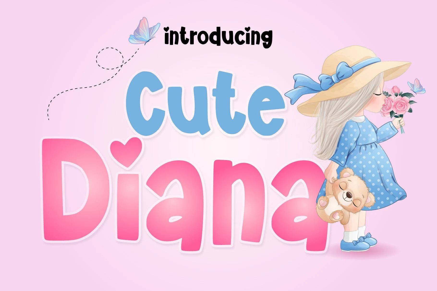
Best For: logos, branding, invitations
Cute Diana Font combines geometric proportions, rounded terminals, and a consistent heavy stroke. It supports clear logos and invitations, although softened corners can lose definition when the lettering becomes very small.
Cute School Font
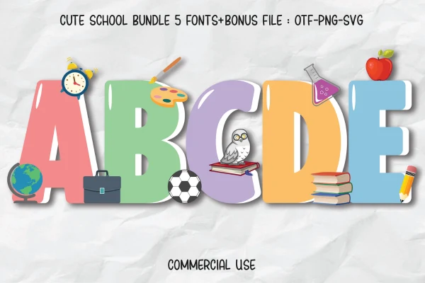
Best For: children’s designs, display text, clean designs
Cute School Font uses wide, squarish proportions with softened corners rather than narrow rounded forms. Its heavy weight gives strong recognition at large sizes, though the broad shapes become less effective when reduced substantially.
Cute Dog Font
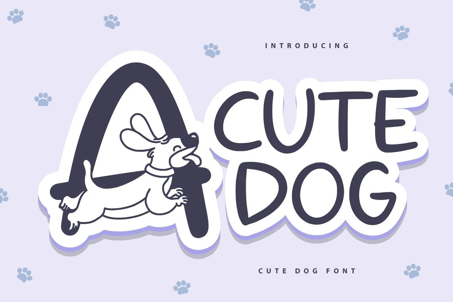
Best For: children’s designs, display text, playful designs
Cute Dog Font introduces an uneven baseline beneath otherwise bold, rounded letters. The simple monoline construction preserves heading clarity, while the informal alignment discourages dense settings or small-scale text.
Cute Farmers Font

Best For: children’s designs, display text, playful designs
Cute Farmers Font keeps upright bold forms but replaces geometric precision with irregular organic edges. It remains legible in large activity titles, although the uneven contours need sufficient scale to stay distinct.
Mermaid Cute Font
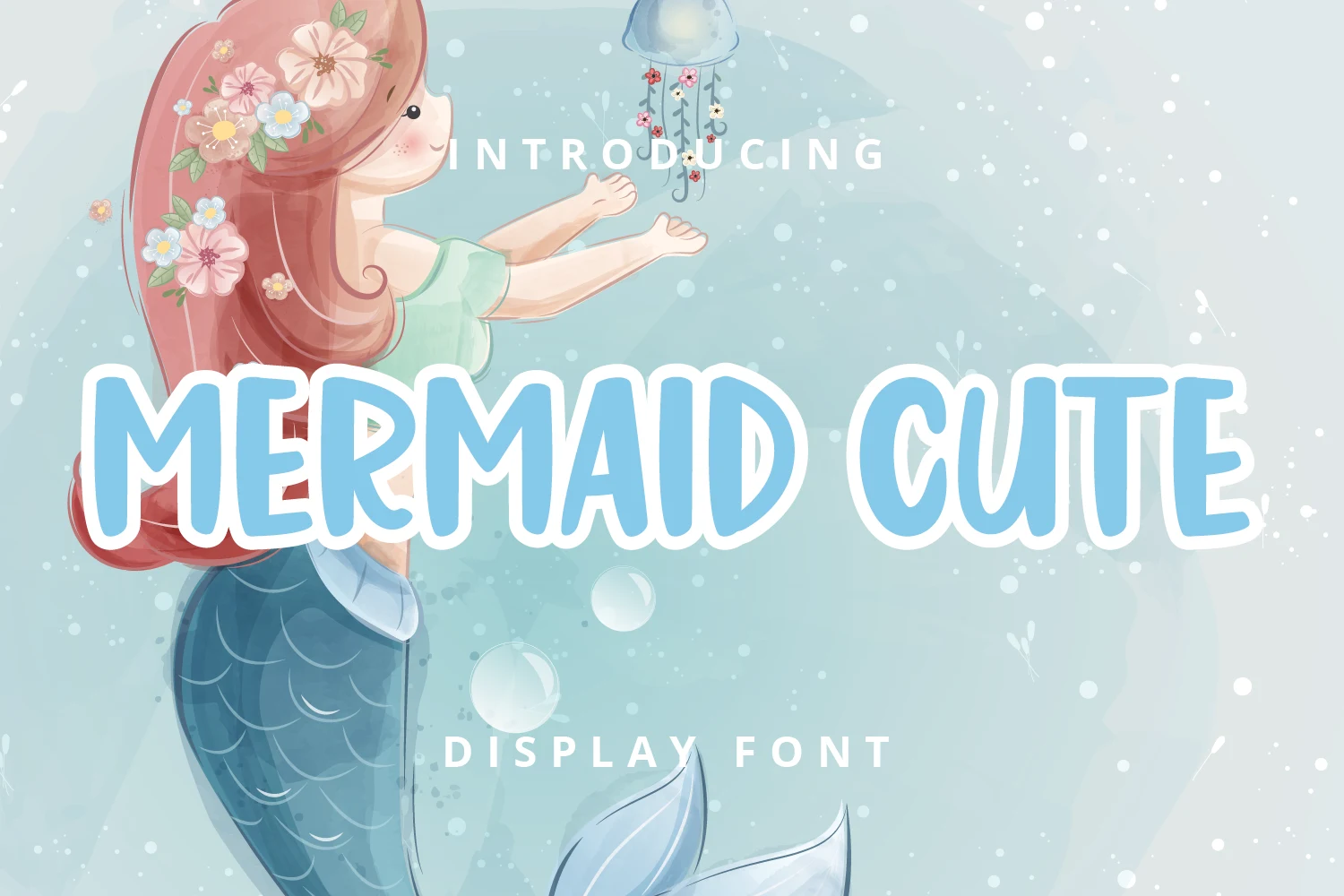
Best For: children’s designs, display text, minimal designs
Mermaid Cute Font uses wide upright lettering, heavy rounded strokes, and an uncomplicated silhouette. It supports prominent titles and minimal layouts, while its width makes compact applications less practical.
Kids Cute Font

Best For: children’s designs, display text, soft designs
Kids Cute Font is a straightforward rounded sans-serif with an upright, monoline frame. Among these Kids Cute Fonts, it is a safer choice for children’s headlines because its simple, bold letterforms remain clear in large-format titles.
Kids Cute Font
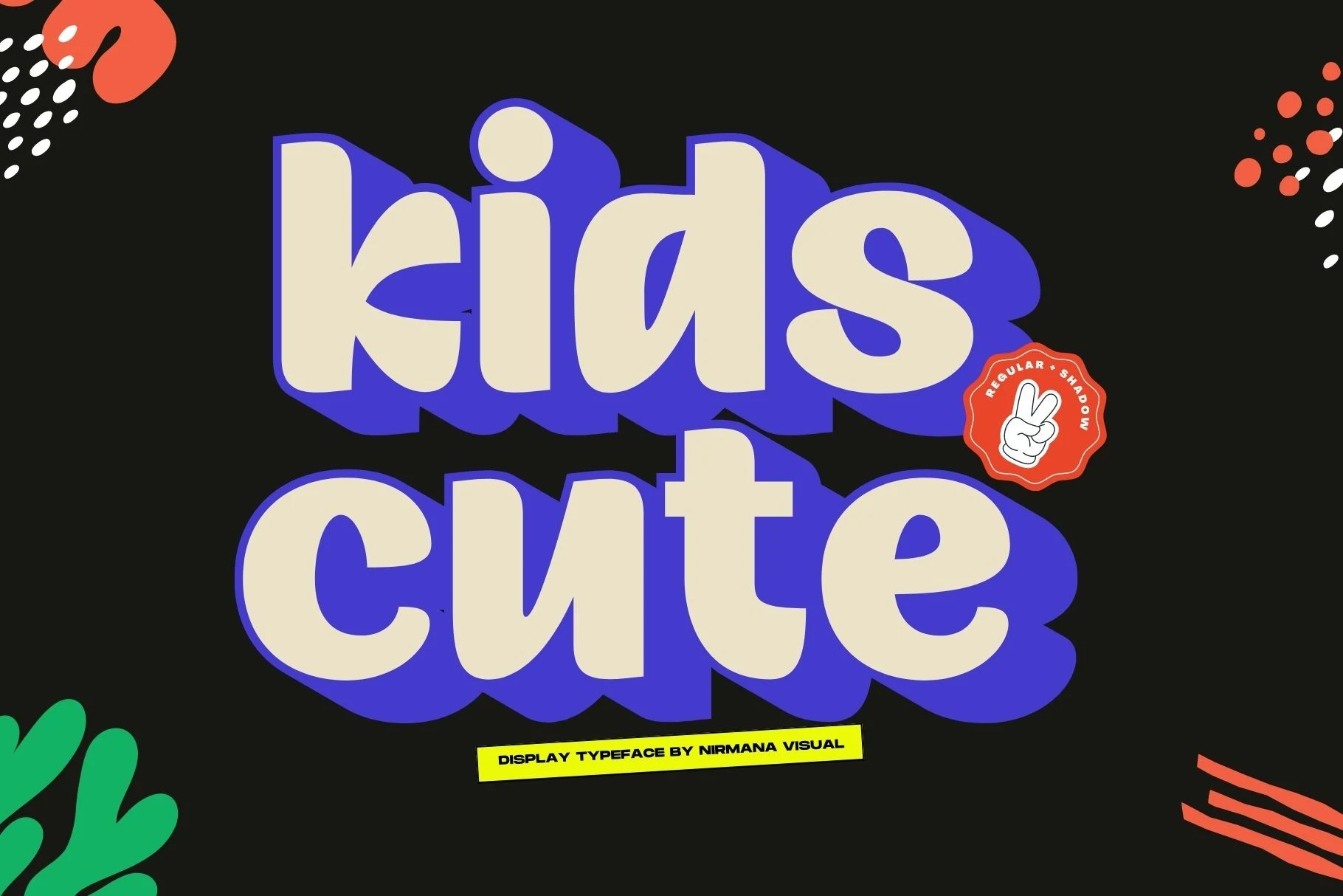
Best For: invitations, children’s designs, book covers
Kids Cute Font adds a stacked drop shadow to wide organic bubble letters. The shadow increases poster and book-cover impact while the underlying letter shapes remain recognizable at display size.
Avocado Cute Font

Best For: children’s designs, product labels, display text
Avocado Cute Font blends a hand-drawn influence with restrained upright novelty sans-serif forms. Its bold rounded construction stays clear on labels and short titles, though the design remains firmly display-oriented.
Cute Rainbow Font

Best For: children’s designs, display text, playful designs
Cute Rainbow Font delivers an upright rounded alphabet through uniform weight and softened corners. It stays clear across medium and large display sizes, making it practical for straightforward children’s titles.
Cute Cat Font
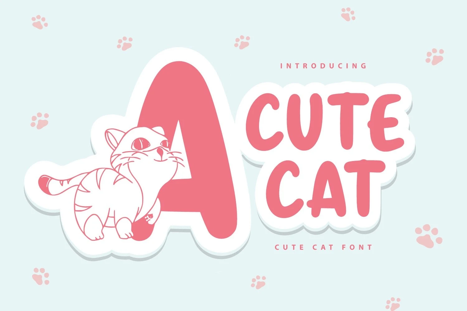
Best For: children’s designs, display text, soft designs
Cute Cat Font keeps its themed identity restrained through simple bold sans-serif curves. With little internal decoration, it offers dependable heading clarity at large sizes without competing details.
Cute Farming Font

Best For: children’s designs, display text, minimal designs
Cute Farming Font creates a connected-style wordmark using heavy organic forms, tight spacing, and internal negative space. It supports large titles, but clarity drops when scaled down.
Illustrated Character Lettering
These Kids Cute Fonts build their identity into the letters through spikes, creatures, borders, silhouettes, or stencil-like interiors. They deliver stronger themes than rounded bases but require more display space.
Cute Dinosaur Font

Best For: display text, playful designs, bold designs
Cute Dinosaur Font uses heavy caps with serrated, spiked terminal edges, giving each letter a dinosaur-like outline. Its irregular construction needs generous sizing for dependable reading, making it strongest in activity titles and display text.
Cute Dinosaur Font

Best For: T-shirts, children’s designs, book covers
Cute Dinosaur Font adds spikes and scale-like attachments to chunky sans-serif letters. Those organic edge details create a stronger themed effect for book covers, T-shirts, and large titles than for reduced text.
Dino Cute Font

Best For: children’s designs, display text, playful designs
Dino Cute Font treats every character as an illustrated creature, combining spines, scales, organic edges, varied colors, and interior textures. The imagery makes large lettering memorable, but it is unsuitable for small copy.
Cute Dino Font

Best For: children’s designs, book covers, display text
Cute Dino Font replaces geometric precision with blobby, cloud-like contours and very low stroke contrast. Among Kids Cute Fonts, it offers a particularly soft mass for book covers and large graphics, but its amorphous interiors hinder small-scale reading.
Cute Decor Font

Best For: display text, headlines, playful designs
Cute Decor Font surrounds rounded sans-serif letterforms with encircled scribbled border lines. The framing turns short headlines into graphic badges, although the surrounding marks can crowd smaller settings.
Cute Dog Font
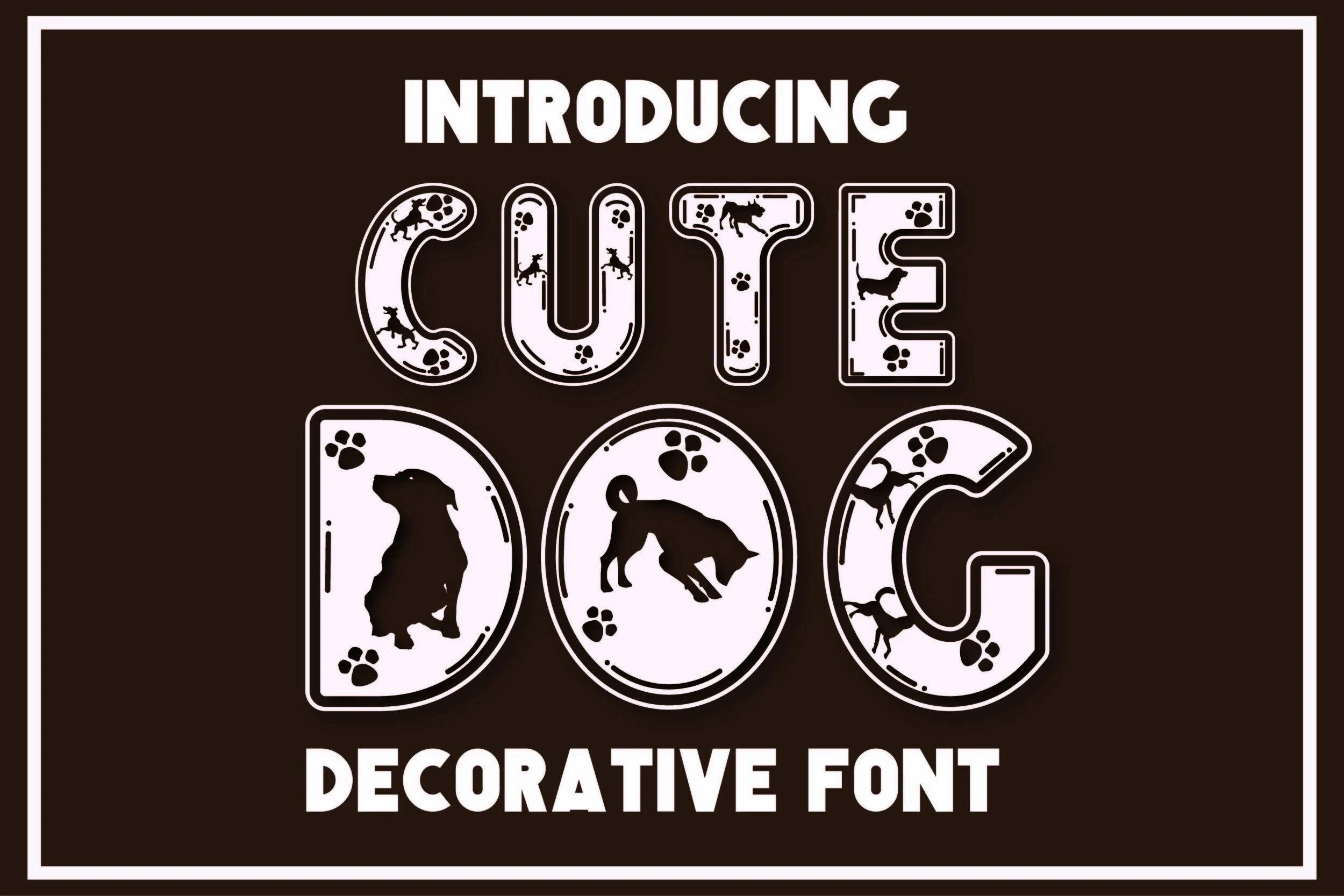
Best For: children’s designs, display text, playful designs
Cute Dog Font embeds silhouette imagery inside the counters of heavy rounded rectangular letters. The internal graphics make the theme immediate in titles, while moderate legibility favors signage over text blocks.
Cute Bear Font
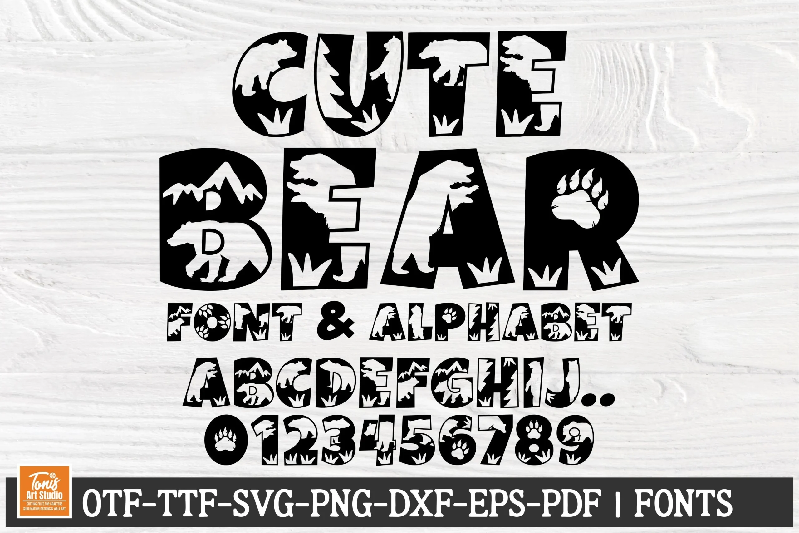
Best For: social media graphics, display text, playful designs
Cute Bear Font cuts bear and forest imagery into the negative spaces of thick slab-like letters. The stencil treatment suits large themed graphics, while intricate interiors make readability strongly scale-dependent.
Casual Handwritten and Script Styles
These Kids Cute Fonts introduce irregular baselines, separated glyphs, brush textures, loops, or connected script. Their handmade rhythm adds personality, though joins and flourishes make long reading less comfortable.
Abstract Doodle Cute Font
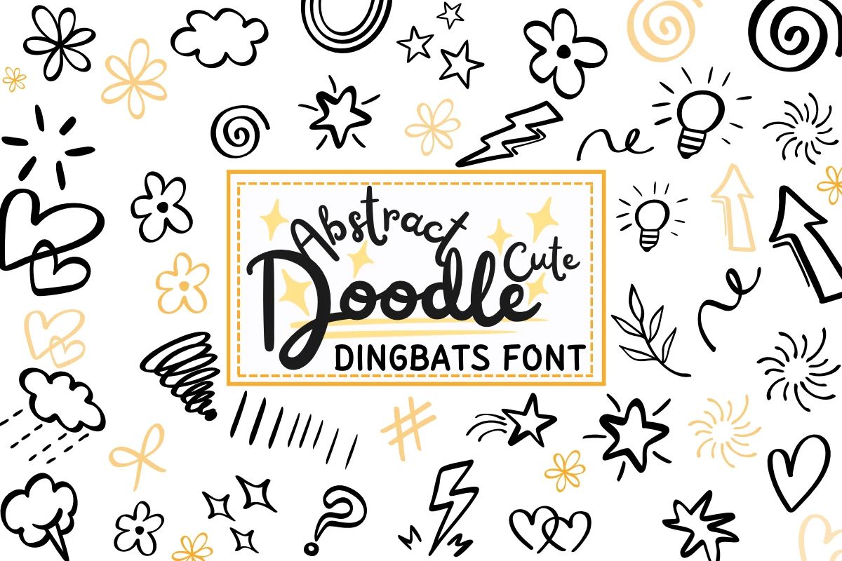
Best For: branding, social media graphics, clean designs
Abstract Doodle Cute Font contrasts a connected casual script with an unadorned uppercase sans-serif partner. Its irregular baseline works as a decorative accent, but the pairing is less comfortable for long-form reading.
Cute Giraffe Font
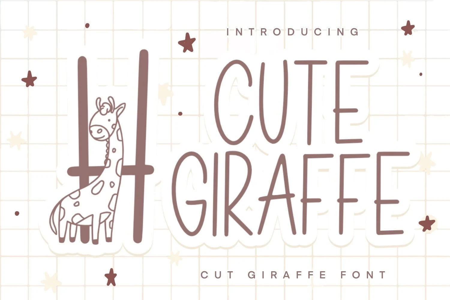
Best For: children’s designs, product labels, display text
Cute Giraffe Font stands apart with tall, narrow proportions and a lighter monoline stroke. Its condensed display build fits product labels well, but thin strokes may fade in very small print.
Cute Pirates Font

Best For: children’s designs, display text, clean designs
Cute Pirates Font combines hand-lettered irregularity with an upright stance and rounded terminals. Its high visual presence suits themed headings, but casual vertical alignment is less appropriate for precise small text.
Cute Butterfly Font
Best For: children’s designs, product labels, display text
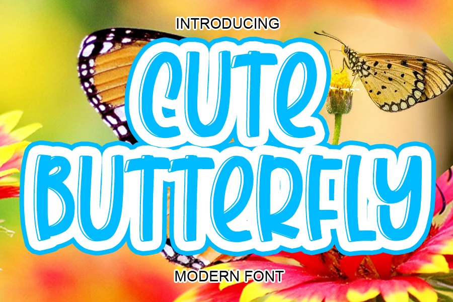
Cute Butterfly Font creates movement through a bouncy baseline and irregular spacing rather than true connected lettering. Its rounded heavy forms remain readable in labels and headers, but not in body copy.
Start Cute Font
Best For: children’s designs, display text, soft designs
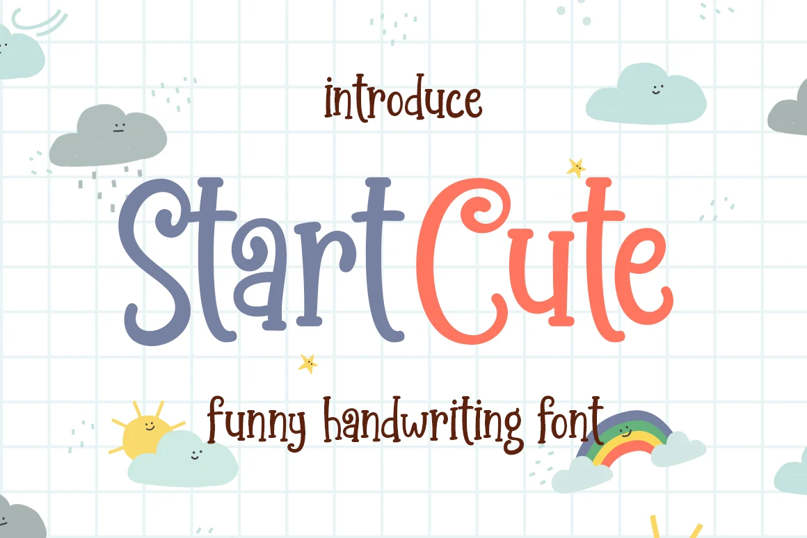
Start Cute Font uses disconnected glyphs, uneven character heights, ligatures, and PUA characters to create an informal heading rhythm. It works well at display scale, but its irregular construction is less reliable for dense copy.
Happy Cute Story Font
Best For: children’s designs, display text, clean designs
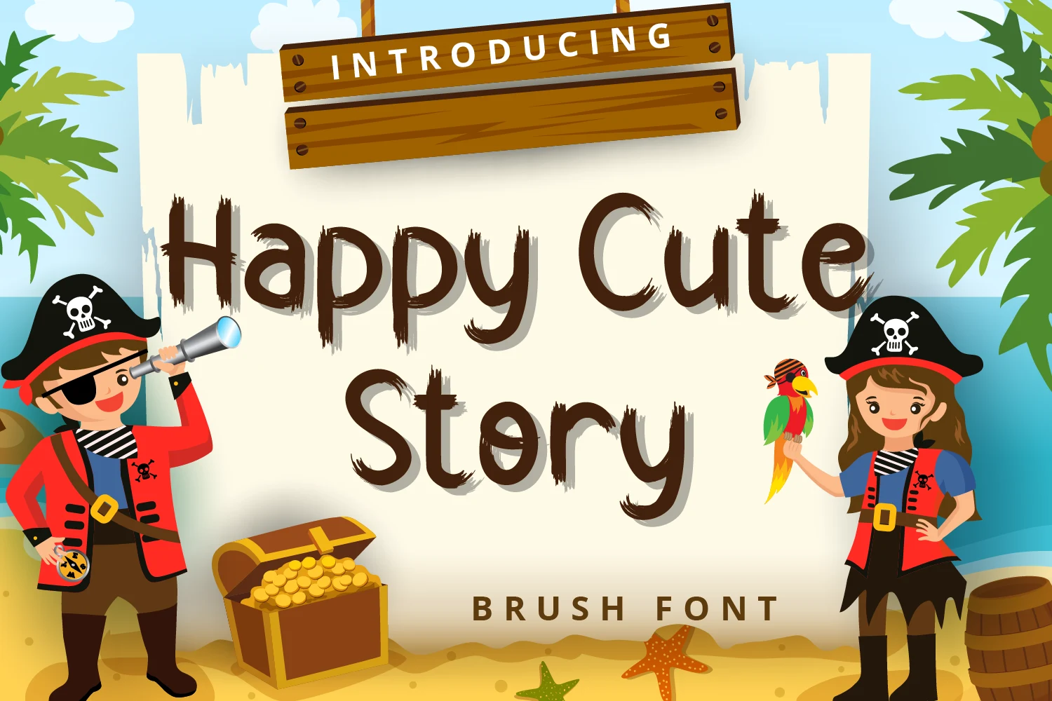
Happy Cute Story Font uses uneven brush texture and disconnected characters instead of continuous script joins. It supplies a handmade title effect, but moderate legibility limits it to headlines and short phrases.
Take Cute Font

Best For: children’s designs, display text, playful designs
Take Cute Font relies on inconsistent letter sizing and separated rounded letterforms for a casual handwritten rhythm. The forms remain readable in large display work, but informal proportions resist long paragraphs.
Qeastera Cute Font
Best For: children’s designs, display text, soft designs
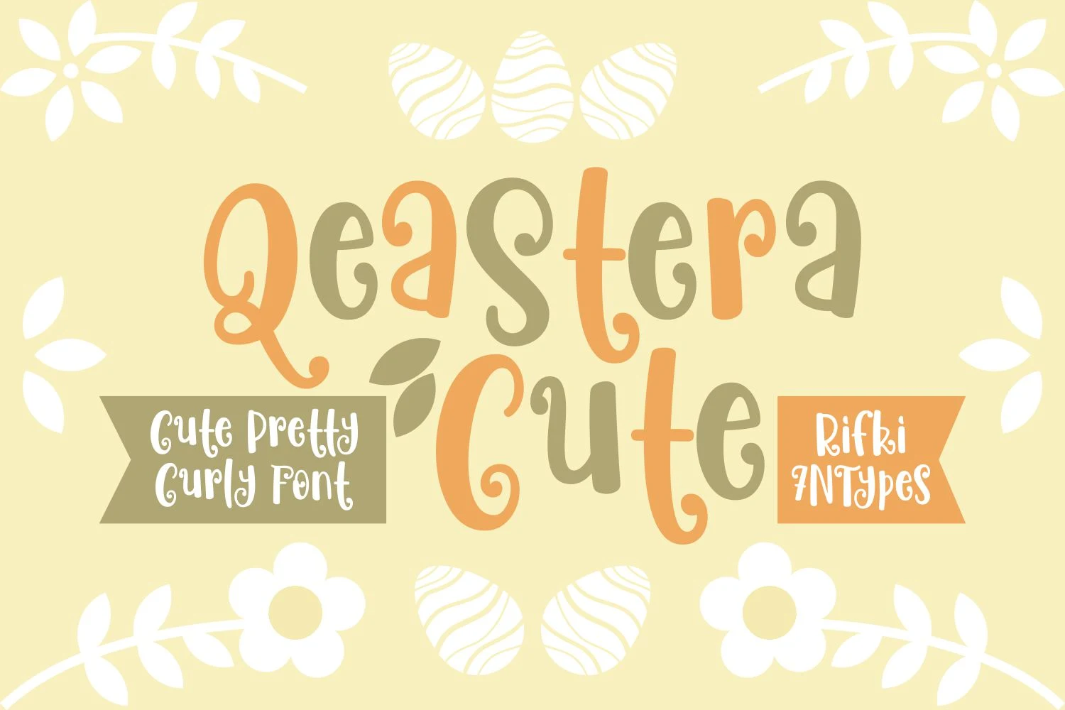
Qeastera Cute Font sends exaggerated loops and curls along a distinctly bouncy baseline. Those flourishes create a strong celebratory headline voice, while reduced-size reading is its main limitation.
Baby Cute Font

Best For: children’s designs, high-end designs
Baby Cute Font provides the clearest connected cursive construction here, combining thick-thin contrast, sweeping swashes, and an integrated heart. These Kids Cute Fonts suit invitations and logos, but ornate joins rule out body copy.
Textured and Patterned Display Faces
These Kids Cute Fonts depend on patterns, brush marks, color blocking, or serif details rather than plain outlines. Their visual effects work best when letters are large enough for interior features to remain distinct.
School Cute Duo Font

Best For: posters, display text, playful designs
School Cute Duo Font offers a heavy upright sans-serif alphabet alongside a thinner outlined style. Patterned fills and stitched details can blur when reduced, so posters, labels, and other large applications are safer.
Cute Paint Font
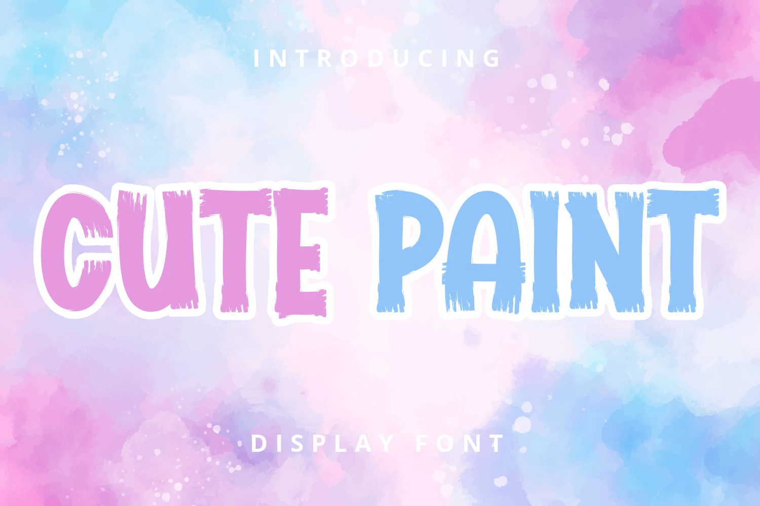
Best For: children’s designs, product labels, display text
Cute Paint Font translates a heavy sans-serif into textured brush strokes with uneven edges. The surface treatment adds an art-making effect to labels and titles, although it can reduce clarity at small sizes.
Kids Cute Font
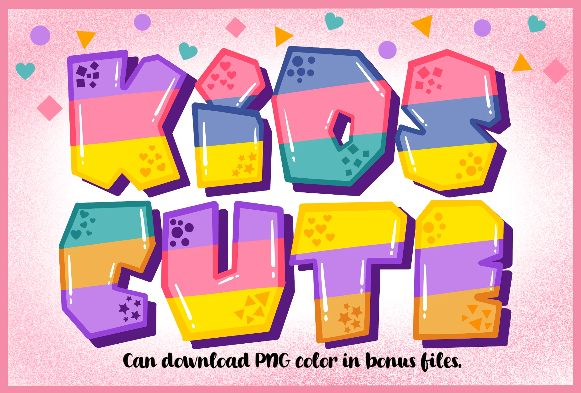
Best For: posters, children’s designs, display text
Kids Cute Font combines chunky block-letter proportions with high-contrast interior color blocking. The outer shapes remain readable on posters, but intricate internal patterns become costly and less clear when reduced.
Popping Cute Font
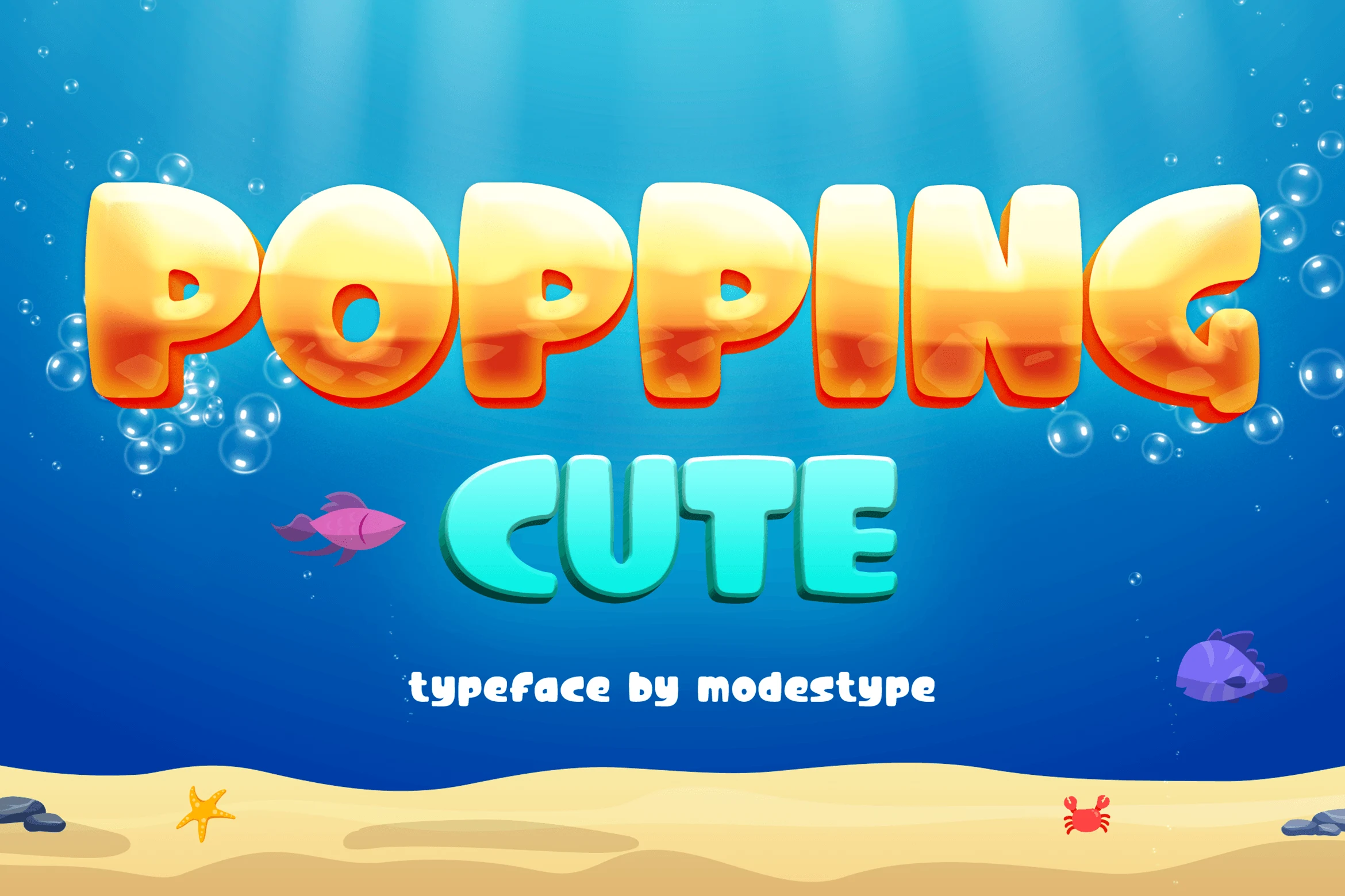
Best For: display text, playful designs, expressive designs
Popping Cute Font introduces a rounded display serif voice to a mostly sans-serif selection. Its distinctive stroke rhythm is best judged in names and short phrases where the serif details remain visible.
How to Choose the Right Font
Choose among these Kids Cute Fonts by starting with scale and reading distance. For dependable headings, favor bold monoline forms with open, simple counters; choose illustrated, patterned, or shadowed styles when theme matters more than compact clarity. Scripts and irregular baselines are strongest for short accents, invitations, logos, and labels—not paragraphs.