13 Best Rounded Sans Serif Fonts in 2026
Rounded Sans Serif Fonts span restrained geometric faces, playful wide designs, condensed display styles, and more distinctive circular constructions. Across the collection, rounded terminals, stroke weight, aperture shape, and spacing determine whether a typeface suits a logo, package, poster, headline, or short promotional phrase.
Looking for more sans serif fonts? Browse our complete Sans Serif Fonts collection to compare modern, elegant, bold, logo-friendly, and geometric sans serif styles.
Rounded Sans Serif Fonts for Friendly Display
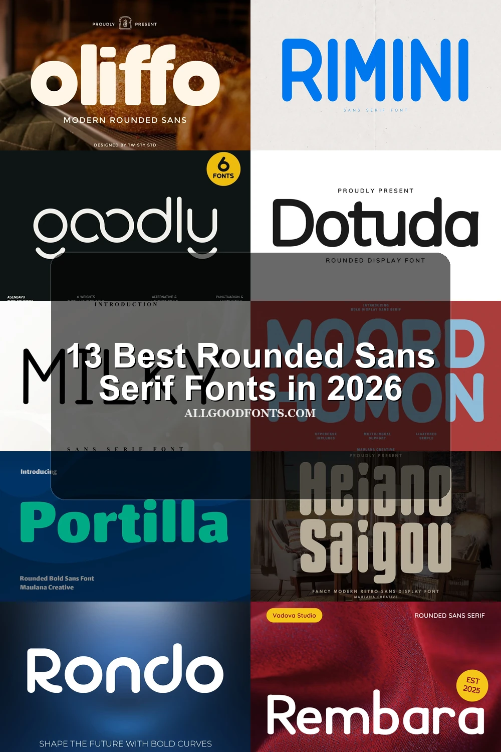
This Rounded Sans Serif Fonts group favors approachable display forms, from minimalist geometric outlines to thick, soft letterforms. Most are strongest in headlines, branding, packaging, and other large-scale applications.
Rembara Font

Rembara Font combines geometric rounded terminals with a monolinear structure and low stroke contrast. Among Rounded Sans Serif Fonts, it has a polished, approachable presence that works especially well for large branding, packaging, logos, and display text rather than extended copy.
Rose Font

Best For: display text, short phrases, playful designs
Wide character proportions and bold, uniform strokes give Rose Font a soft, playful headline character instead of a neutral sans serif voice. Its clean upright forms remain highly legible in large headings and short phrases, although the generous width can consume space quickly.
Moord Humon Font
Best For: logos, branding, packaging, headlines
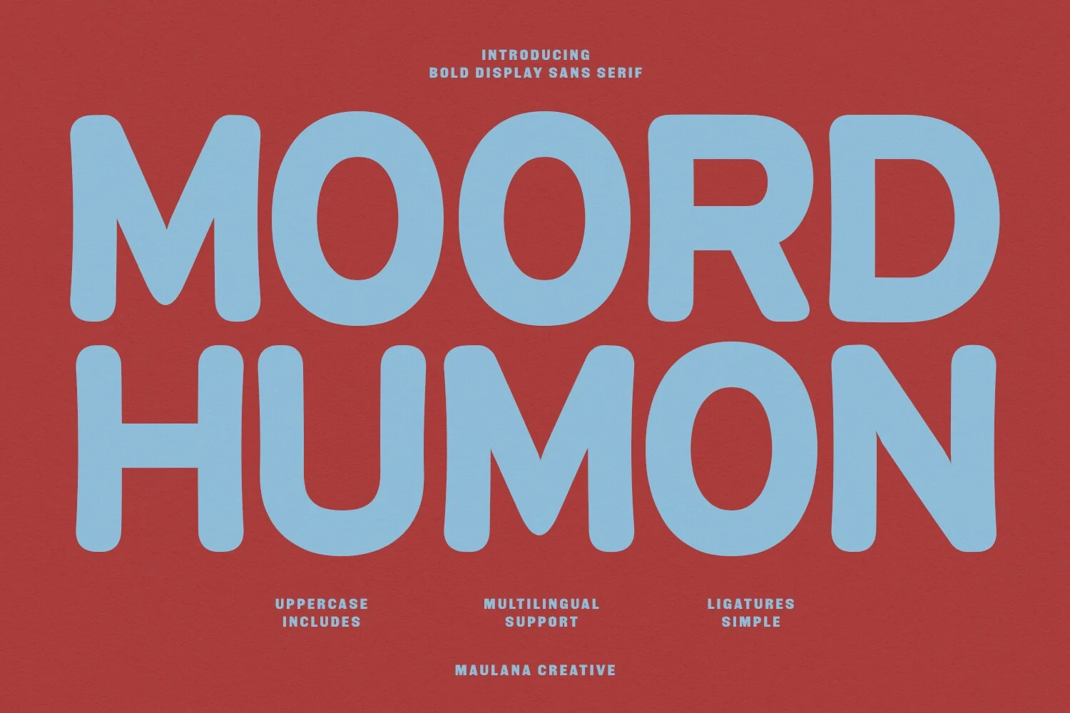
For logos, branding, and packaging, Moord Humon Font offers heavy monolinear construction with strongly rounded corners. The thick, uncomplicated forms stay clear at display scale and create an approachable, casual impression, but their substantial weight makes the face primarily a headline choice rather than a text face.
Portilla Rounded Bold Font
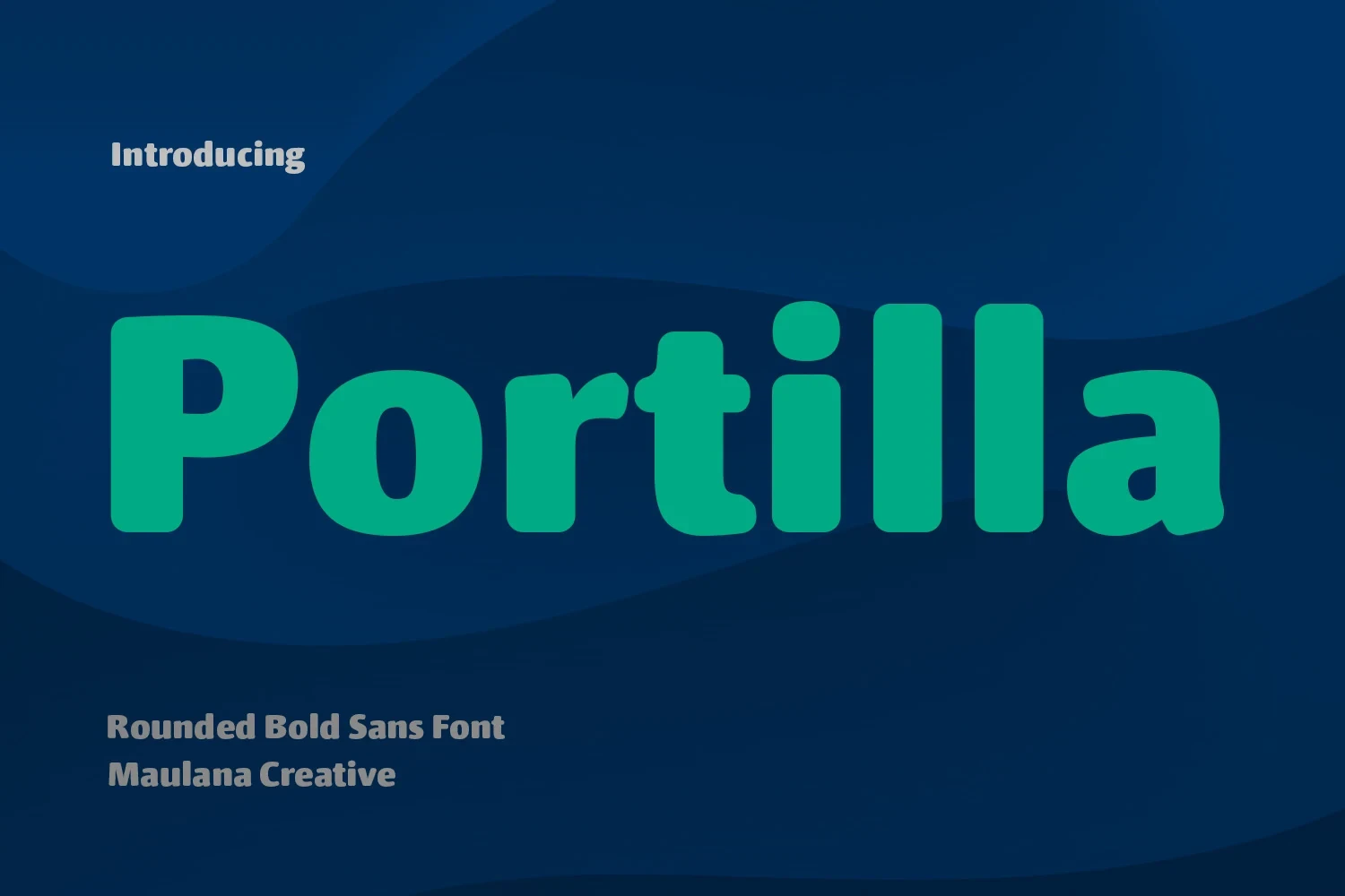
Best For: social media graphics, logos, book covers, display text
Rounded terminals, thick uniform strokes, and generous spacing make Portilla Rounded Bold Font immediately legible in large headlines. Its ligatures and alternate characters add useful variation for logos, covers, and social graphics, while multilingual support extends its practical branding range.
Rondo Font

Best For: branding, headlines, modern designs
Rondo Font reduces rounded sans serif design to minimalist geometric forms with a consistently soft outline and uniform stroke weight. Its uncomplicated character design suits modern branding, headlines, and display text when the layout needs approachable structure without decorative flourishes.
Oliffo Font

Best For: display text, modern designs, soft designs
Oliffo Font combines heavy rounded strokes with geometric lowercase forms and a notably low x-height. That construction produces a soft, substantial presence in large display text and modern designs, while the low x-height can weaken clarity in small print or compact applications.
Dotuda Font

Best For: T-shirts, logos, posters
Dotuda Font uses generous rounded letterforms, low contrast, and uniform stroke width for an immediately readable display texture. Among Rounded Sans Serif Fonts, its open construction suits T-shirts, posters, logos, and branding where large lettering must stay clear at a glance.
Condensed Rounded Forms
These condensed faces combine rounded terminals with narrow, vertically efficient proportions. They save horizontal space in headers and identity work, though compression and heavy strokes make them less suitable for extended reading.
Metha Font
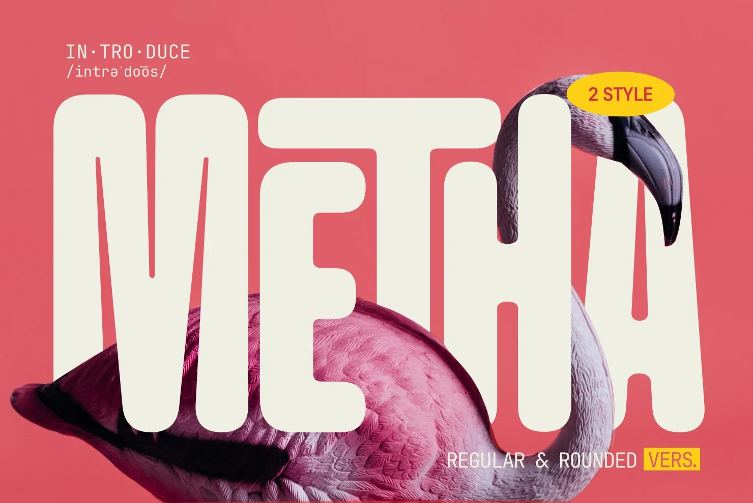
Best For: branding, headlines, display text
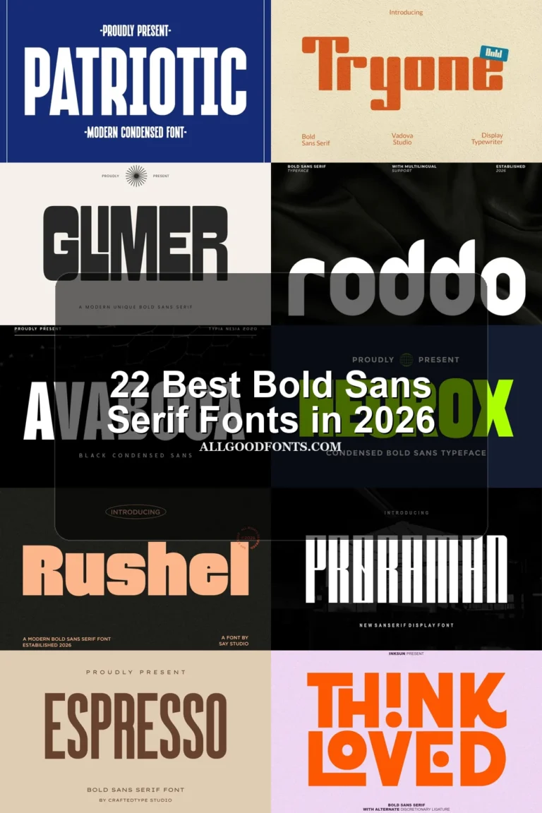
Metha Font creates a compact silhouette by pairing extra-bold rounded construction with condensed proportions. Its narrow width helps fit large words into restricted branding or headline spaces, while thick strokes preserve display clarity. The same density makes it uncomfortable for long-form reading.
Heiano Saigou Font

Best For: display text, modern designs, bold designs
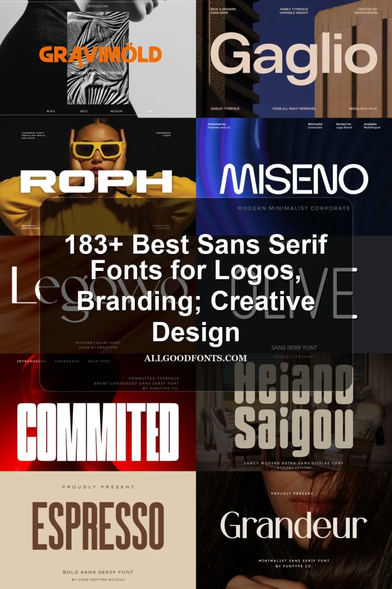
Heiano Saigou Font brings a retro geometric character through vertically elongated, condensed proportions and rounded terminals. Among Rounded Sans Serif Fonts, its narrow structure is efficient for short headers and display text, but compression can reduce readability when the lettering is reduced substantially.
Stylized Geometric Rounded Faces
Stylized geometric faces push rounded construction further through open or closed apertures, circular lowercase forms, and customized terminals. They create distinctive short-form branding but demand more care at small sizes.
Milky Font
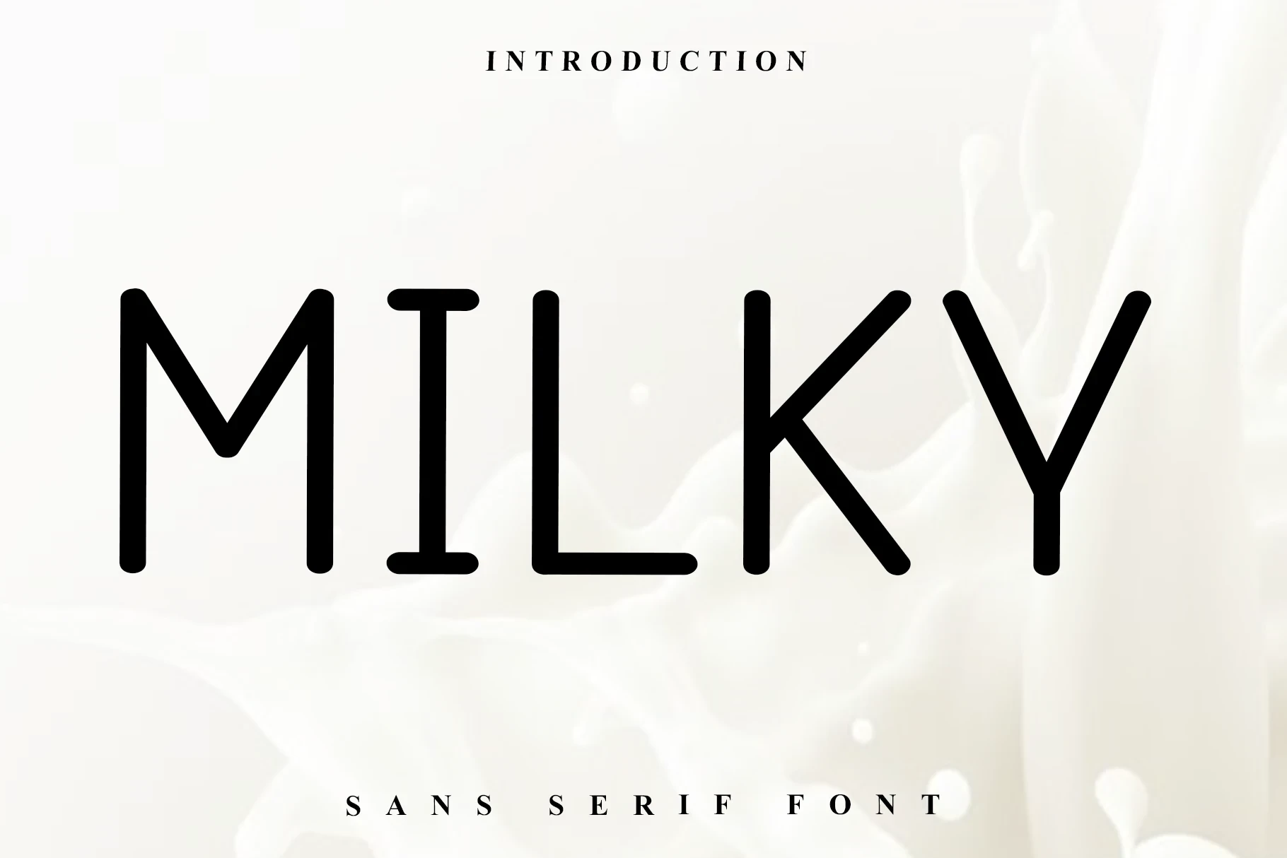
Best For: logos, branding, high-end designs
Milky Font uses a clean geometric frame, upright posture, rounded terminals, and consistent monolinear strokes. Among Rounded Sans Serif Fonts, its restrained construction is particularly effective for logos, branding, and prominent social graphics where a modern, premium-leaning impression matters more than paragraph performance.
Converta Rounded Font
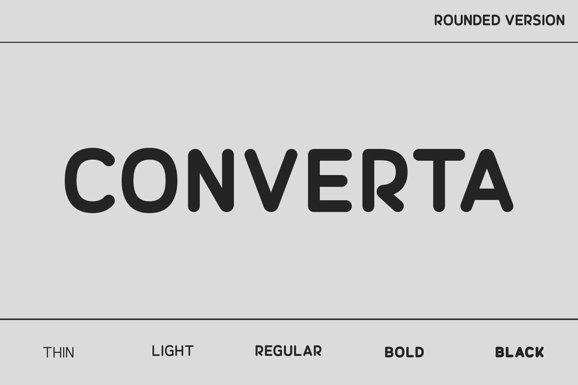
Best For: logos, magazine covers, posters
Converta Rounded Font builds recognition through rounded terminals on every stroke, uniform line weight, and open apertures within a geometric framework. Those open counters help letters remain distinct in headings, magazine covers, posters, and logos, though the evidence favors larger display sizes over small text.
Rimini Font

Best For: branding, packaging, display text
Rimini Font uses heavy, uniform geometric letterforms with rounded terminals and closed apertures. For branding and packaging, those enclosed shapes create a dense, controlled appearance. The tight spacing and substantial weight can hinder recognition when the type is reduced, so it performs best at large display sizes.
Goodly Font
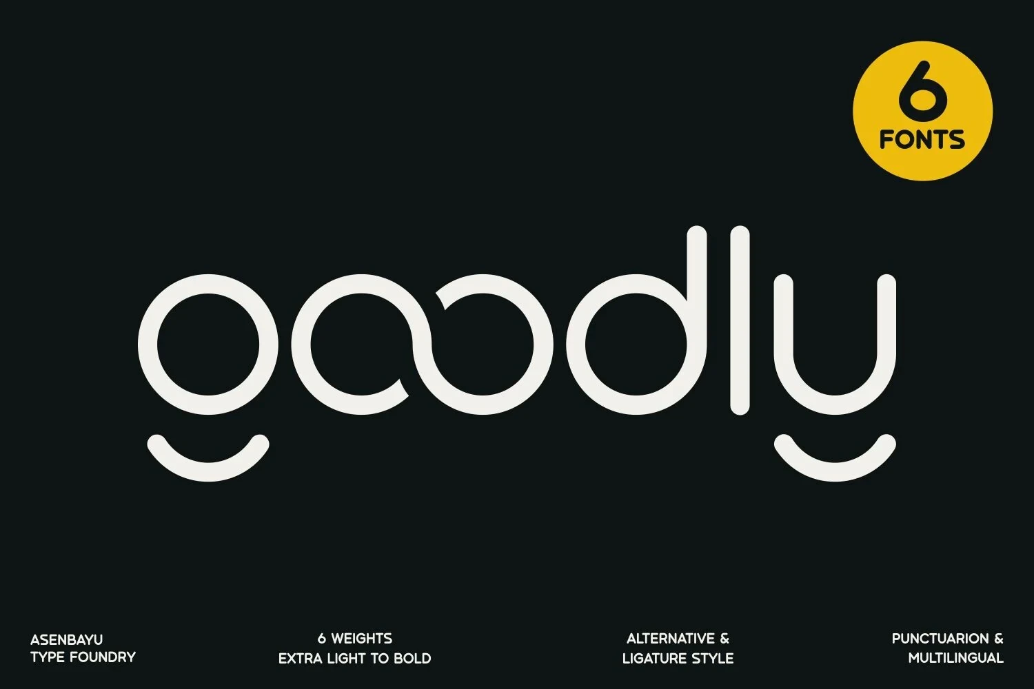
Best For: logos, branding, fashion branding
Goodly Font moves beyond standard rounded geometry with circular lowercase forms and customized open terminals in letters such as g and u. These modifications give short logos and fashion branding a memorable signature, but the stylized details limit comfortable use to brief, impactful text.
How to Choose the Right Font
Choose by construction first: wide or heavy faces suit short, prominent messages, while condensed options conserve space but need generous sizing. Open apertures generally aid recognition, whereas closed shapes, tight spacing, low x-heights, and decorative terminals require more scale. For Rounded Sans Serif Fonts, test the actual wording at its intended size before committing.