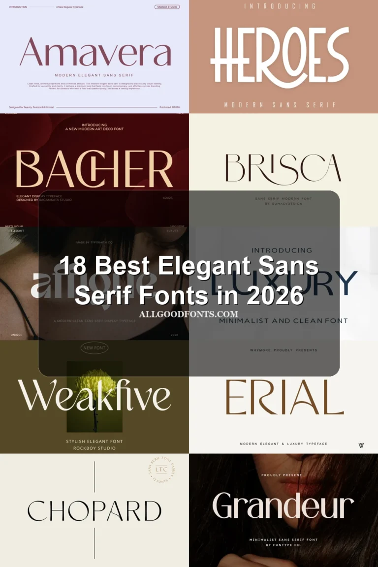
21 Best Modern Sans Serif Fonts in 2026
This collection spans wide rounded geometry, open angular forms, condensed constructions, connected details, and a few deliberately stylized departures. These Modern Sans Serif Fonts are primarily built for logos, headlines, packaging, posters, signage, social graphics, and other design work where visible construction matters.
Looking for more sans serif fonts? Browse our complete Sans Serif Fonts collection to compare modern, elegant, bold, logo-friendly, and geometric sans serif styles.
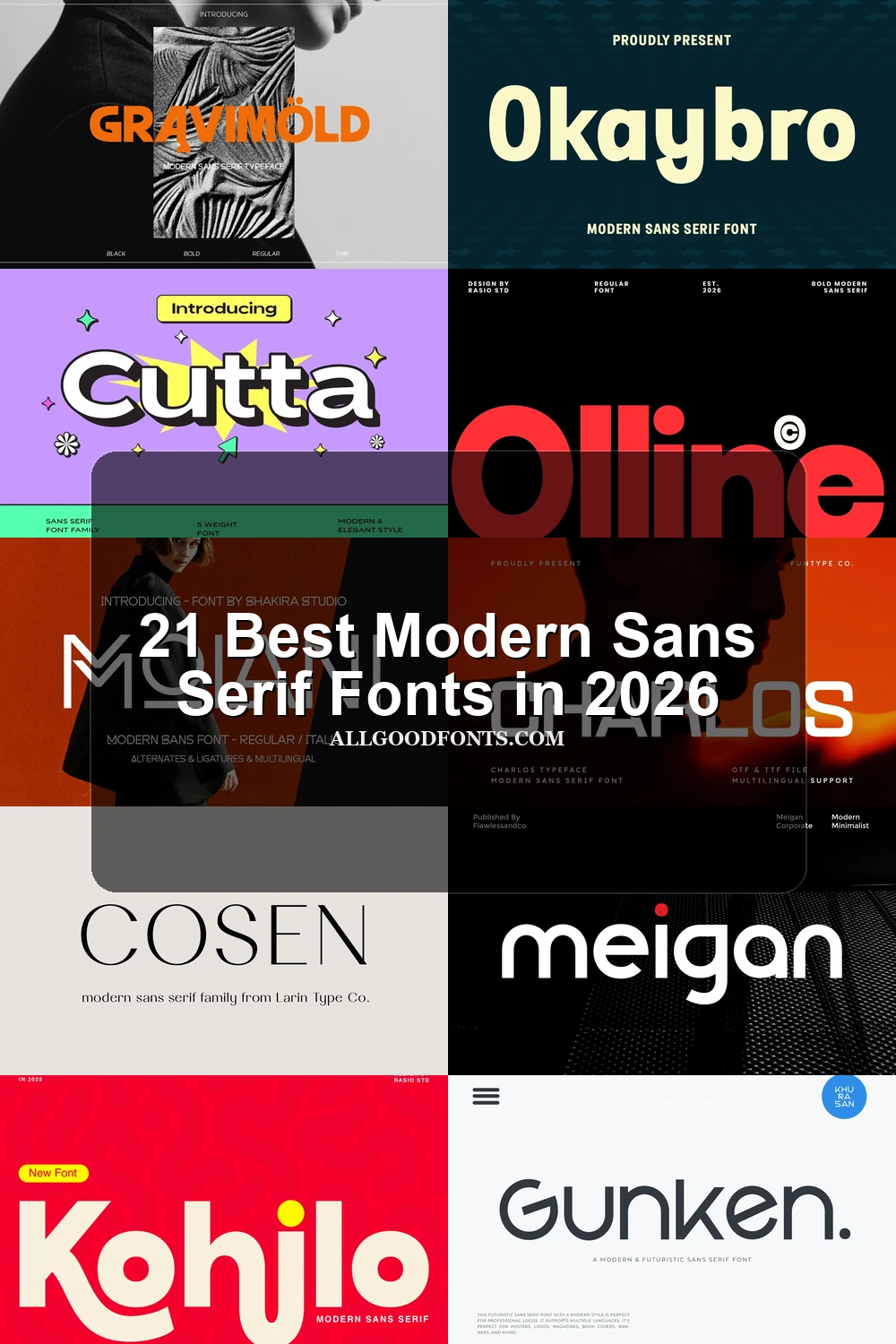
Modern Sans Serif Fonts: Rounded Geometric Display
Modern Sans Serif Fonts in this group use broad proportions, rounded outer forms, and heavy monolinear strokes. They feel approachable and substantial, unlike the sharper or more compressed groups.
Gigamore Font

Best For: website headers, branding, packaging
Gigamore Font uses wide geometric proportions, a heavy uniform stroke, low contrast, and rounded terminals. Its weight gives headers, packaging, and branding immediate presence, while smaller text can feel cramped. Alternate characters provide extra control for contemporary identity work.
Meigan Font
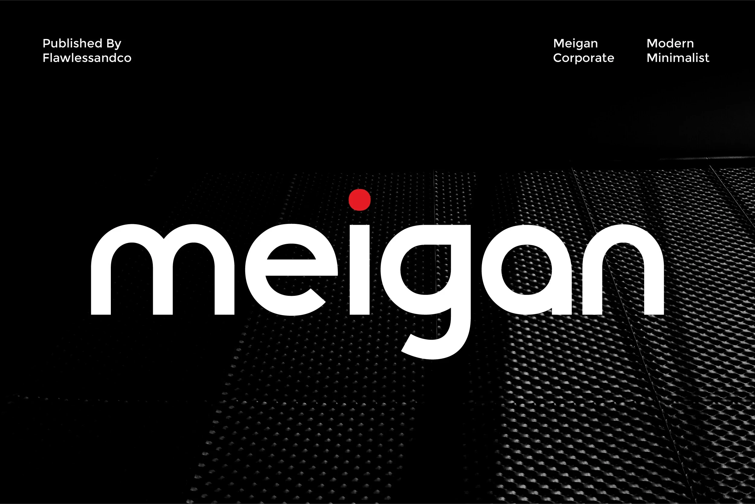
Best For: branding, logos, social media graphics, website headers
Meigan Font combines wide geometric letters, rounded edges, open apertures, and a consistently thick stroke. The clear construction supports logos, prominent website headers, and social graphics, where its approachable voice remains legible without relying on ornate detailing.
Gravimold Font

Best For: product labels, display text, modern designs
Gravimold Font is built from wide proportions, high stroke weight, minimal terminals, and notably closed apertures. That compact interior structure gives product labels and display text a sturdy presence, but it can lose clarity when reduced to small sizes.
Eloise Font
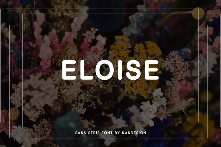
Best For: display text, modern designs, clean designs
Eloise Font uses broad geometric forms, rounded corners, and an even monolinear stroke. Its consistent construction reads clearly in large names and display text, making it a dependable choice for contemporary identities that need a gentler visual rhythm without decorative flourishes.
Cutta Font
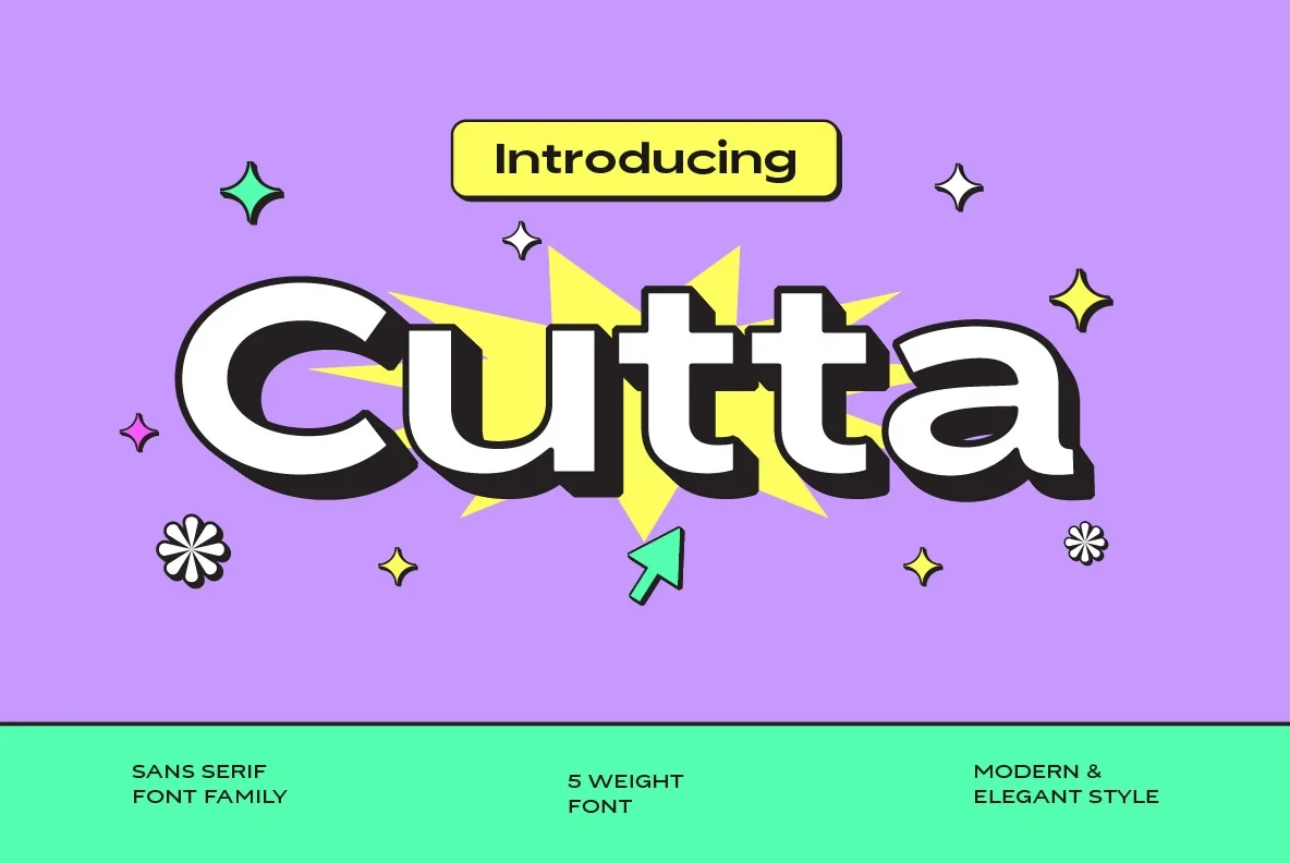
Best For: social media graphics, display text, modern designs
Cutta Font pairs wide rounded geometry with a heavy monolinear build, generous spacing, and a separate drop-shadow display effect. It remains clear in social graphics and large headlines; treat the shadow as an optional layer rather than part of the letter construction.
Okaybro Font

Best For: product labels, logos, posters, headlines
Okaybro Font has thick uniform strokes, rounded terminals, geometric construction, and closed apertures. Its compact shapes hold together well in logos, posters, and product labels, but the dense interiors and heavy weight call for larger display sizing.
Charlos Font

Best For: logos, branding, packaging, posters
Charlos Font contrasts sharp angular interior corners with rounded exterior edges inside a heavy, wide structure. That tension gives logos, packaging, and posters a firm signature, while included TTF, OTF, and multilingual support help with production across applications.
Homush Font

Best For: website headers, logos, branding, packaging
Homush Font relies on wide, unadorned forms, heavy weight, and tight spacing for an authoritative display presence. It works especially well in website headers, logos, branding, and packaging; TTF, OTF, and multilingual support broaden its practical production use.
Mogtan Font

Best For: branding, headlines, posters, display text
Mogtan Font is exceptionally heavy and expansive, with wide proportions, low contrast, and soft-edged terminals. The silhouette reads immediately in branding, posters, headlines, and display text, though tight spacing and weight restrict its usefulness at smaller scales.
Angular and Open-Form Modern Displays
Open apertures, circular counters, angular terminals, and customized letter details define this group. Compared with the rounded set, these faces expose more structural contrast and geometric tension.
Gunken Font
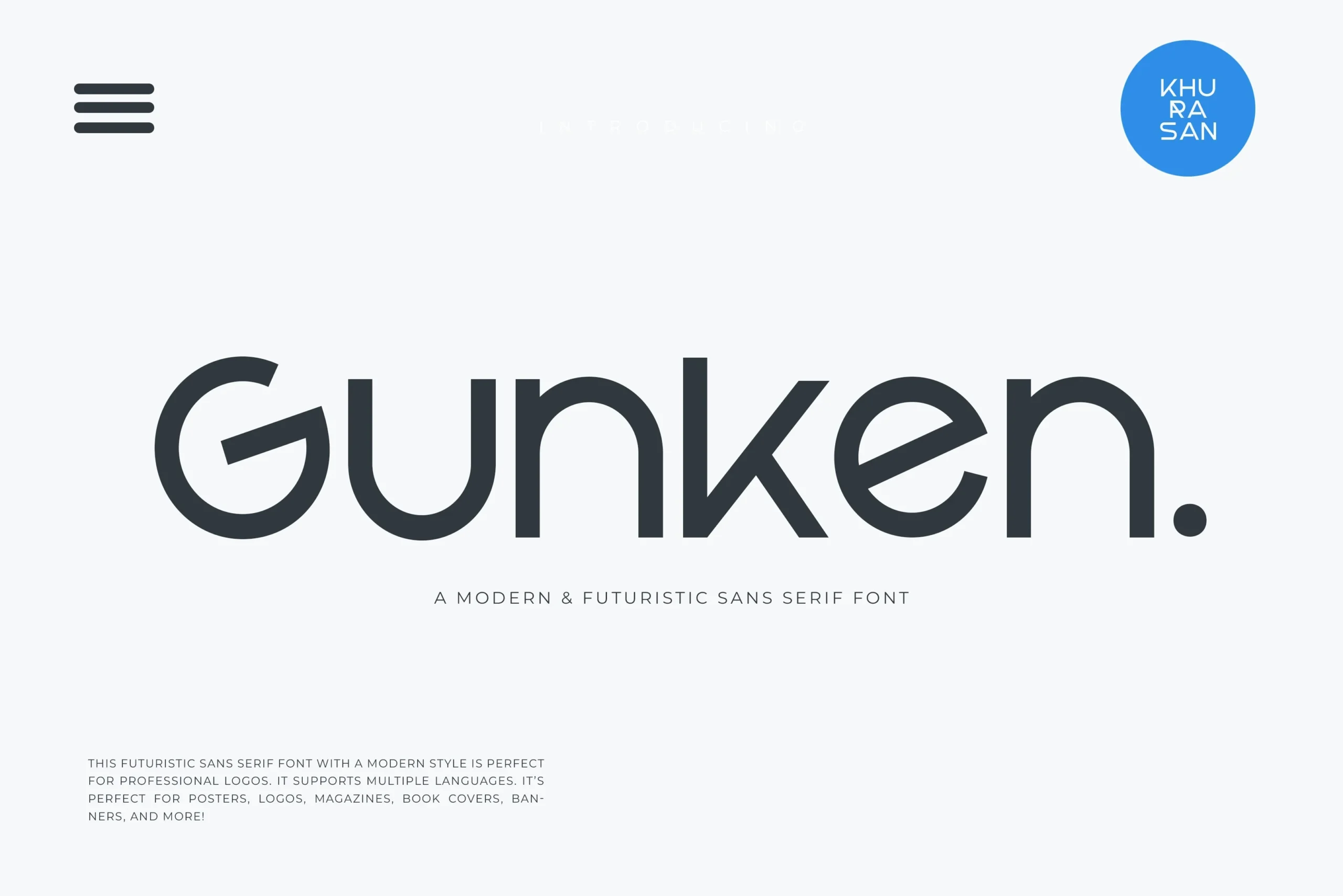
Best For: book covers, logos, branding, posters
For posters, logos, and book covers, Gunken Font offers wide geometric construction, a high x-height, uniform strokes, and unusually open apertures in letters such as G, u, and n. Sharp horizontal and vertical terminals keep the structure visible, though very small text is less reliable.
Aveton Font

Best For: branding, logos, display text, modern designs
Aveton Font builds its identity through an integrated lowercase-t crossbar and arch-like terminals on the uppercase A. Those custom details add personality to branding and logos, while the heavy, high-contrast construction remains clearest at large display sizes.
Gaglio Font

Best For: logos, branding, creative projects, high-end designs
Gaglio Font creates a measured geometric rhythm through circular counters, open apertures, uniform strokes, low contrast, and generous spacing. It suits logos and prominent headings where those shapes can be seen clearly, rather than body text or dense information.
Qurova Font

Best For: logos, branding, display text, headlines
Qurova Font uses circular geometry, open terminals, wide apertures, and a uniform monolinear rhythm. The structure is clear in logos, branding, headers, and display text, but its broad forms need room and are not intended for dense body copy.
Mentho Font

Best For: book covers, logos, posters, creative projects
Mentho Font sets open geometric forms against sharp right-angled terminals and uniform strokes. Its bold uppercase treatment can anchor book covers, logos, and posters, while a lighter, tracked uppercase variation supports contrast within a simple display system.
Olive Font
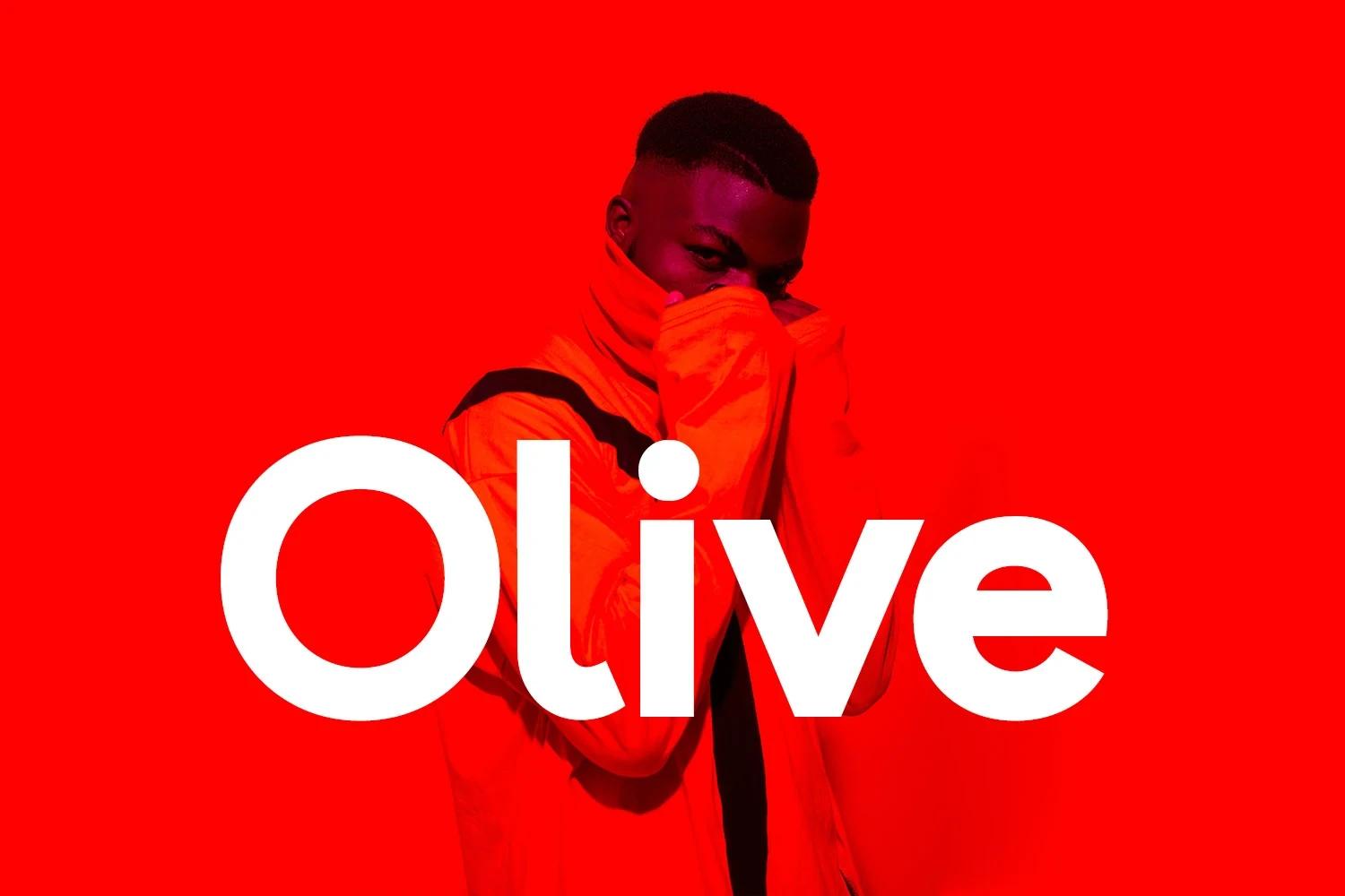
Best For: logos, branding, headlines, modern designs
Olive Font combines circular counters and uniform geometric strokes with closed apertures and generous spacing. Those choices support logos, signage, branding, and large headlines, where the letterforms remain clear, more effectively than they support continuous text.
Molani Font
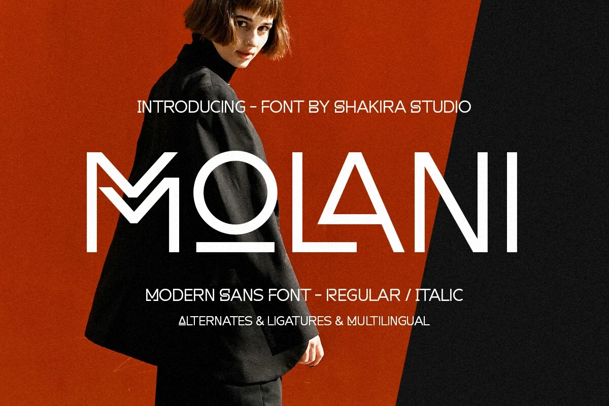
Best For: branding, display text, modern designs, clean designs
Molani Font uses wide angular forms, open apertures, and specialized characters, including a stylized M and A. Ligatures and alternates expand logo customization, while the unusual geometry should be given display scale in branding and headline work.
Compressed and Connected Display Forms
These display faces prioritize compactness or character connection. Condensed spacing concentrates attention, while decorative joins add personality; both choices make them less dependable for small or continuous text.
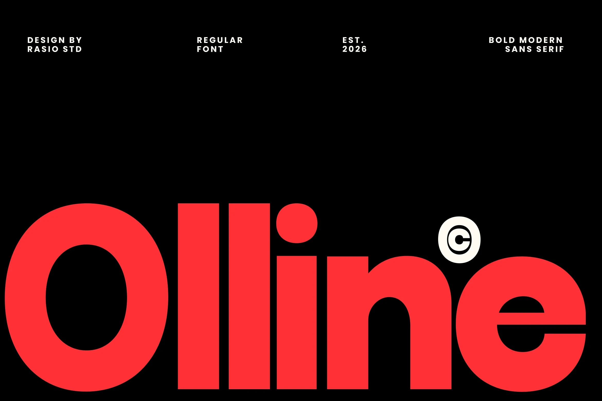
Olline Font
Best For: branding, headlines, product labels
Olline Font turns heavy geometric forms into a compact headline tool. Its condensed width, circular construction, uniform strokes, and tight spacing concentrate attention in labels and short titles, but that same compression makes long-form reading and small settings less comfortable.
Kohilo Font

Best For: product labels, display text, modern designs, clean designs
Kohilo Font adds decorative character connections to rounded geometric forms with open counters and monolinear strokes. The joins give labels and logos extra character, but they can reduce clarity when the face is used too small.
Paired and Stylized Display Exceptions
This mixed group includes a high-contrast serif, altered negative-space forms, and a multi-font family. Each sits outside a straightforward geometric sans approach and works best as a deliberate display accent.
Cosen Font

Best For: display text, modern designs, elegant designs
Cosen Font is the collection’s clear serif exception, with extended proportions, vertical stress, sharp terminals, and pronounced thick-thin contrast. Its delicate hairlines need generous headline sizing, making it more suitable for display text and refined pairings than compact copy.
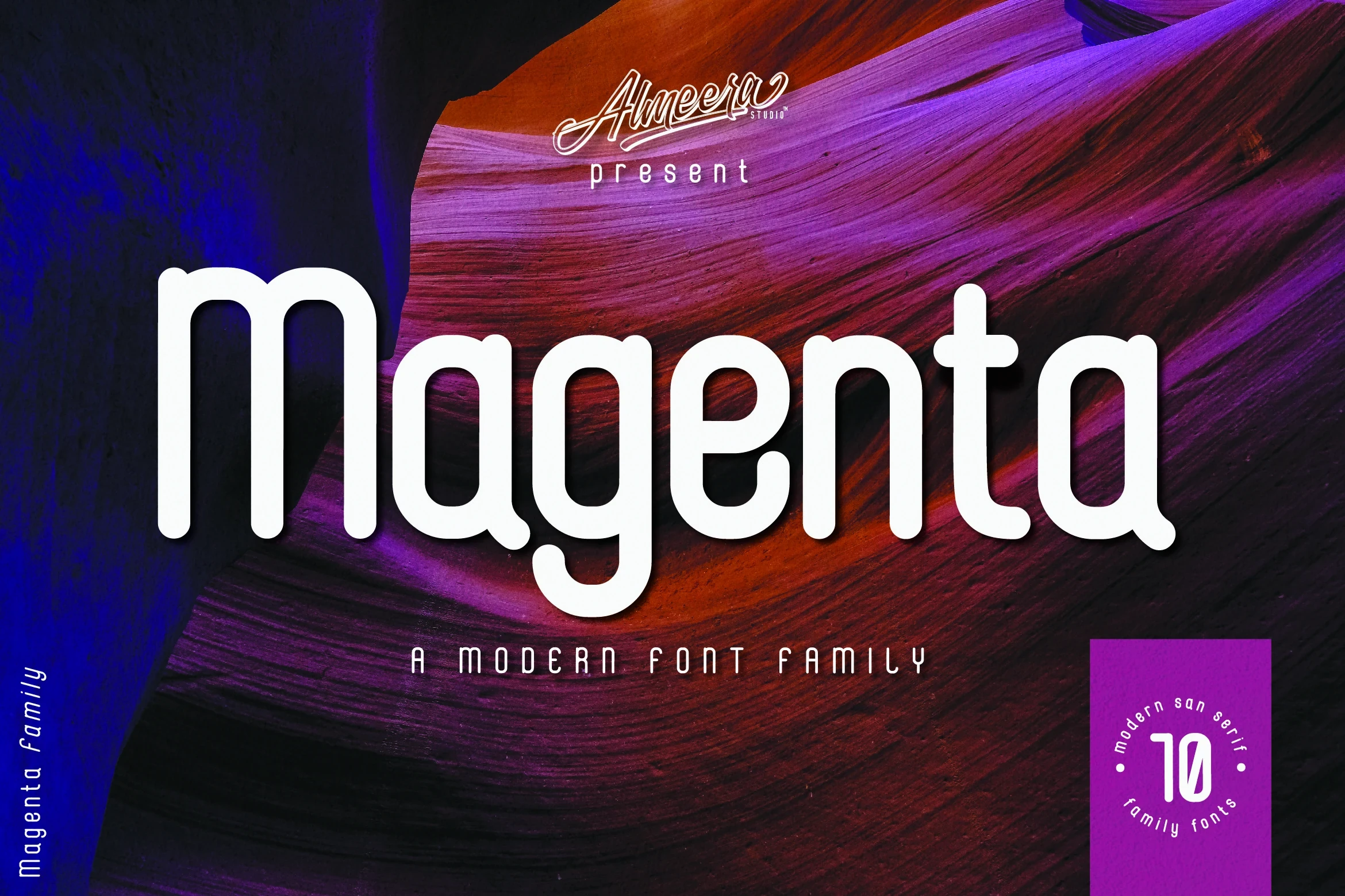
Magenta Family Font
Best For: logos, display text, modern designs, clean designs
Magenta Family Font centers on a tall-x-height geometric sans with rounded terminals, wide spacing, and uniform strokes. Its ten-font family includes black, bold, regular, thin, and outline options, offering useful range for logos, titles, and coordinated display systems.
Raftern Font

Best For: branding, posters, website headers, magazine covers
Raftern Font reshapes negative space inside a heavy, wide geometric frame with rounded corners. The modified letterforms create visual interest for posters, magazine covers, and branding, but their stylization makes the face better for short, large statements than extended reading.
How to Choose the Right Font
Choose among these Modern Sans Serif Fonts by matching construction to scale: open apertures and generous spacing generally support clearer display reading, while closed counters, heavy weights, condensed widths, and connected details demand more room. For branding, also compare rounded versus angular terminals, then reserve alternates, ligatures, shadows, and stylized forms for short focal text.