19 Best Minimal Logo Fonts in 2026
This collection moves from open geometric sans serifs and monospaced structures to tightly condensed capitals and high-contrast display serifs. These Minimal Logo Fonts are suited to wordmarks, packaging, headings, labels, and brand lockups, with readability depending heavily on stroke weight, spacing, and intended scale.
Looking for more logo fonts? Browse our complete Logo Fonts collection to compare logo-friendly logo styles.

Minimal Logo Fonts: Geometric Sans Serifs
Minimal Logo Fonts in this group use geometric construction, open counters, even strokes, or regular spacing. They generally offer calmer, clearer wordmarks than the condensed and serif-led categories.
Gc Allio Font

Best For: logos, branding, packaging, headlines
Gc Allio Font uses geometric lowercase forms, circular o and a structures, and uniform strokes. Balanced spacing makes these Minimal Logo Fonts readable in logos and medium-sized supporting text.
Rimini Font
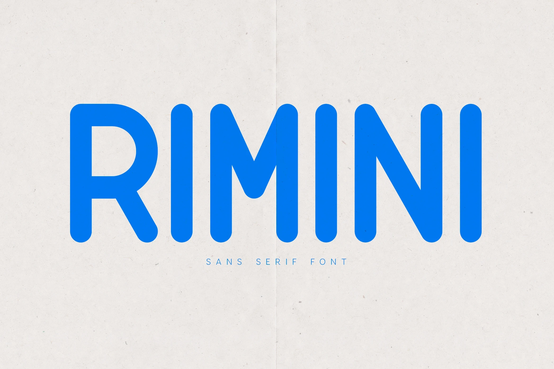
Best For: branding, packaging, logos, website headers
Rimini Font softens its geometric display structure with rounded terminals and a high cap height. The large primary lettering stays clear, while its thin descriptor requires more scale and spacing.
Vector Font
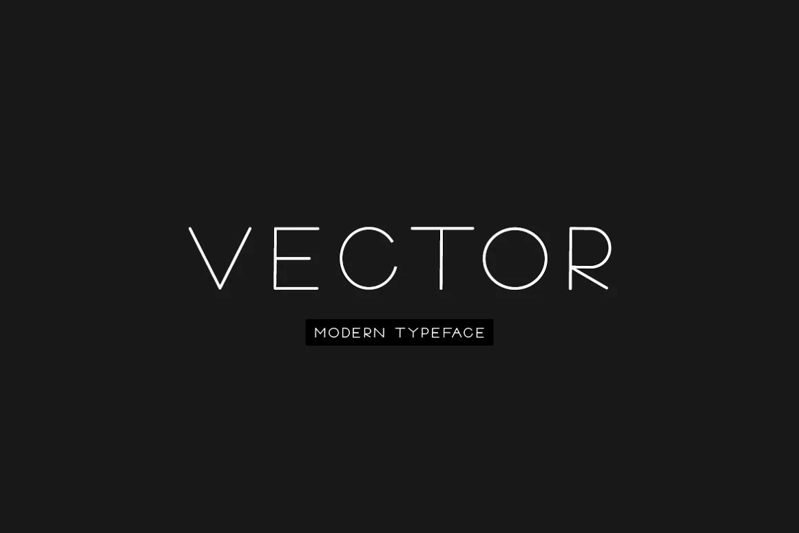
Best For: logos, display text, modern designs, minimal designs
Vector Font builds a wide geometric silhouette from thin monolinear strokes. These Minimal Logo Fonts need large logos or headings, where the open width remains legible without the demands of body text.
Sawith Mono Font
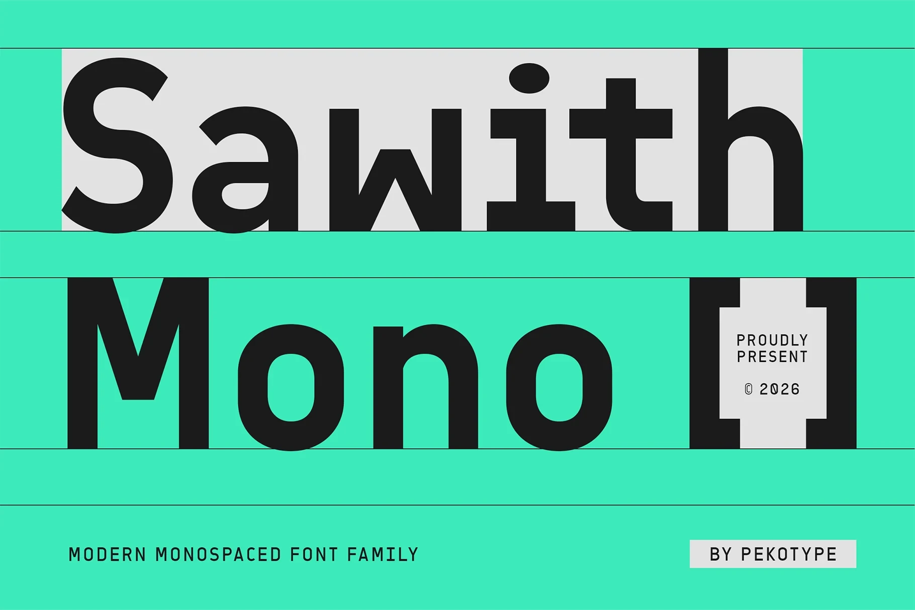
Best For: logos, branding, packaging, posters
Sawith Mono Font uses wide squarish proportions, even spacing, and uniform strokes to create a monospaced logic. That regularity suits structured logos and packaging, with clearest performance at large display sizes.
Noirden Font
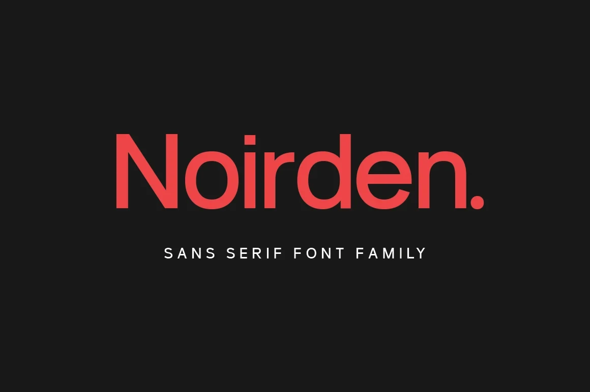
Best For: logos, product labels, display text, modern designs
Noirden Font is defined by open apertures, rounded curve terminals, and a visible horizontal e crossbar. Its geometric clarity works well for short labels and headings without ornate wordmark treatment.
Brooklyn Font

Best For: logos, modern designs, minimal designs, clean designs
Brooklyn Font combines wide geometric proportions with unadorned terminals for a calm wordmark shape. Its open forms support strong display legibility, though the evidence centers on large-size applications.
Colasta Font
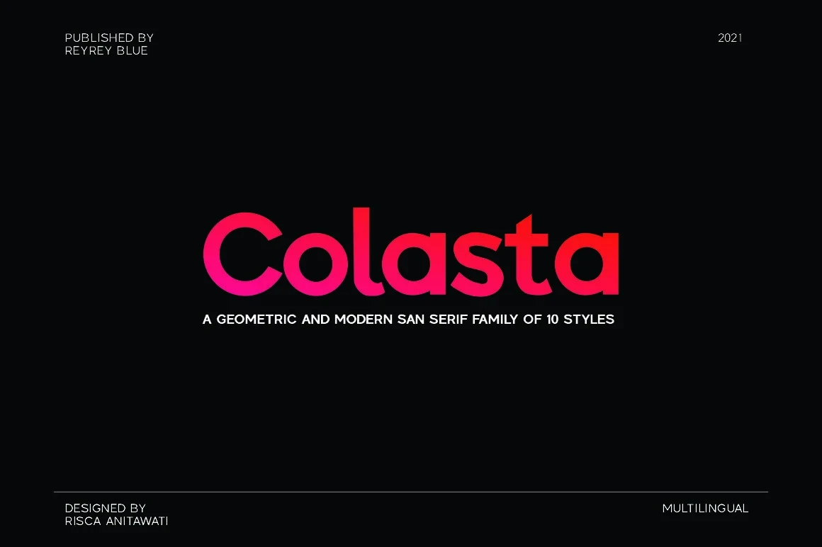
Best For: logos, display text, modern designs, minimal designs
Colasta Font uses large circular apertures and horizontal terminals to keep its geometric construction open. The forms translate well to logos and headings, with no stated advantage for extended text.
Balimo Font
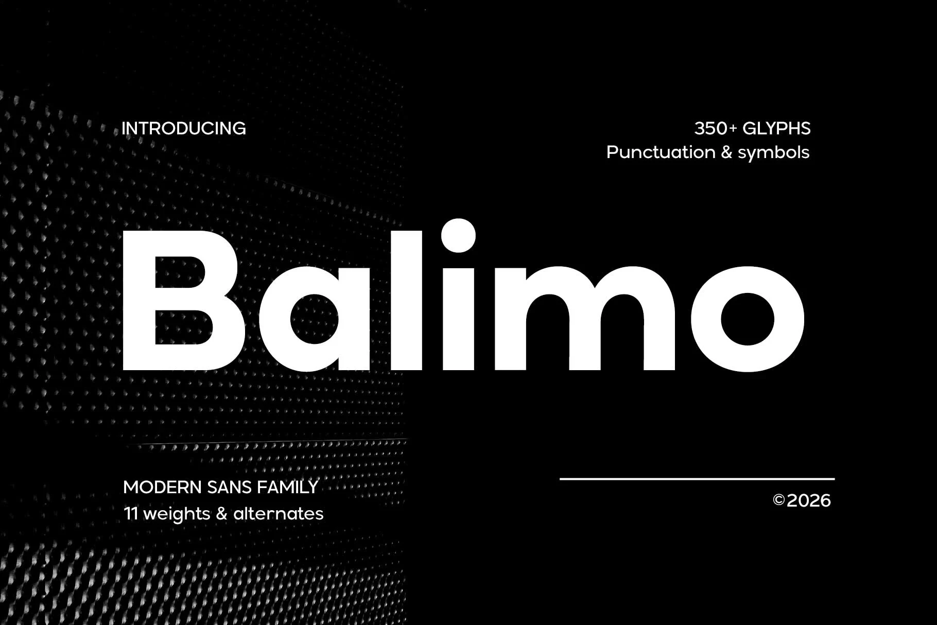
Best For: branding, headlines, professional designs, logos
Balimo Font is the strongest choice here when supporting text matters: its large x-height, open counters, and uniform strokes make these Minimal Logo Fonts readable in headings and smaller brand text.
Condensed Display Marks
These condensed display faces compress tall capitals into compact silhouettes, using slant, squared terminals, or rounded corners to shape the mark. They save horizontal space but need generous sizing.
Hightone Font
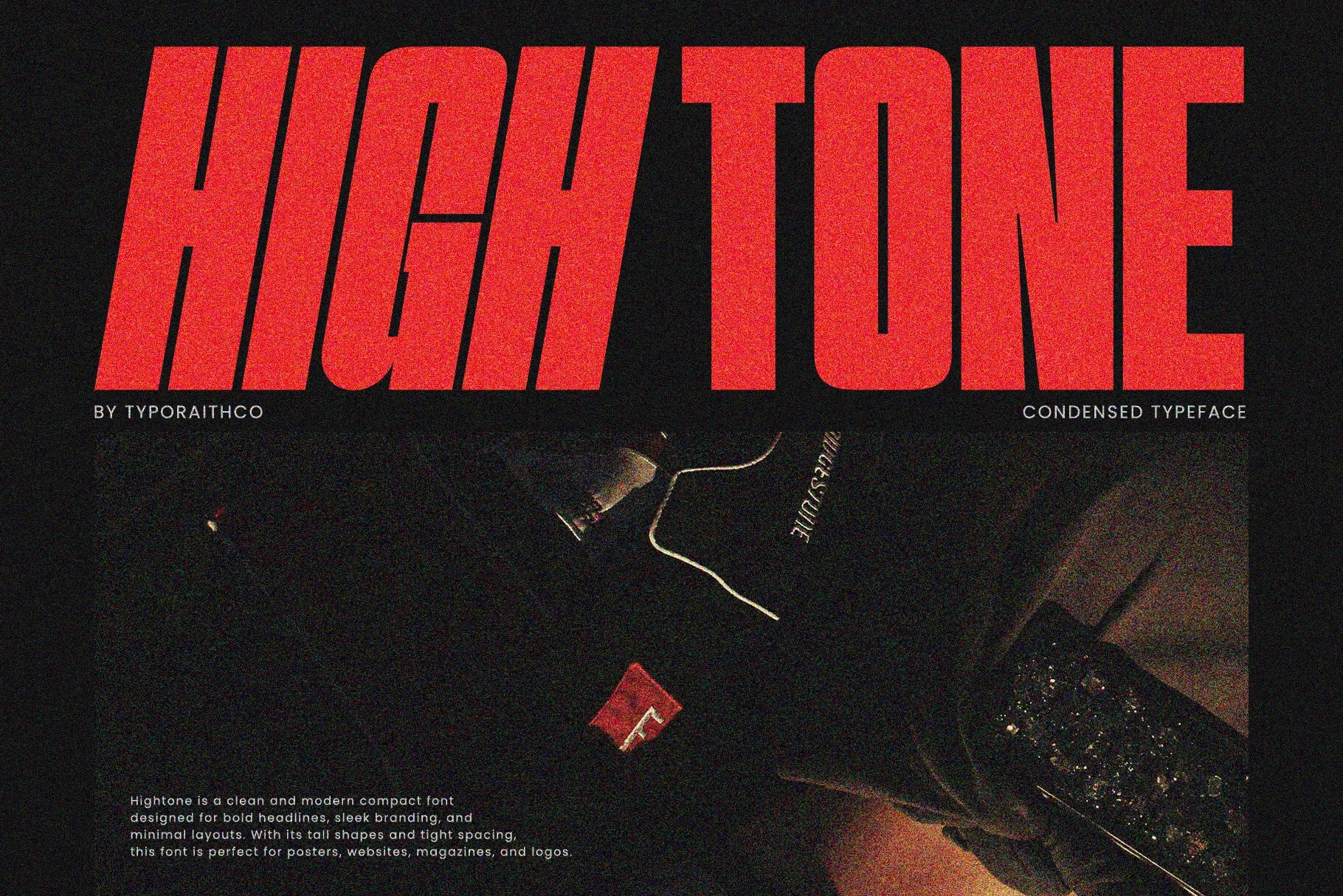
Best For: logos, branding, posters, book covers
Hightone Font combines heavy condensed capitals, sharp angled terminals, and a pronounced rightward slant. This forceful silhouette suits large logos and posters, though extreme compression reduces small-size readability.
Movault Font
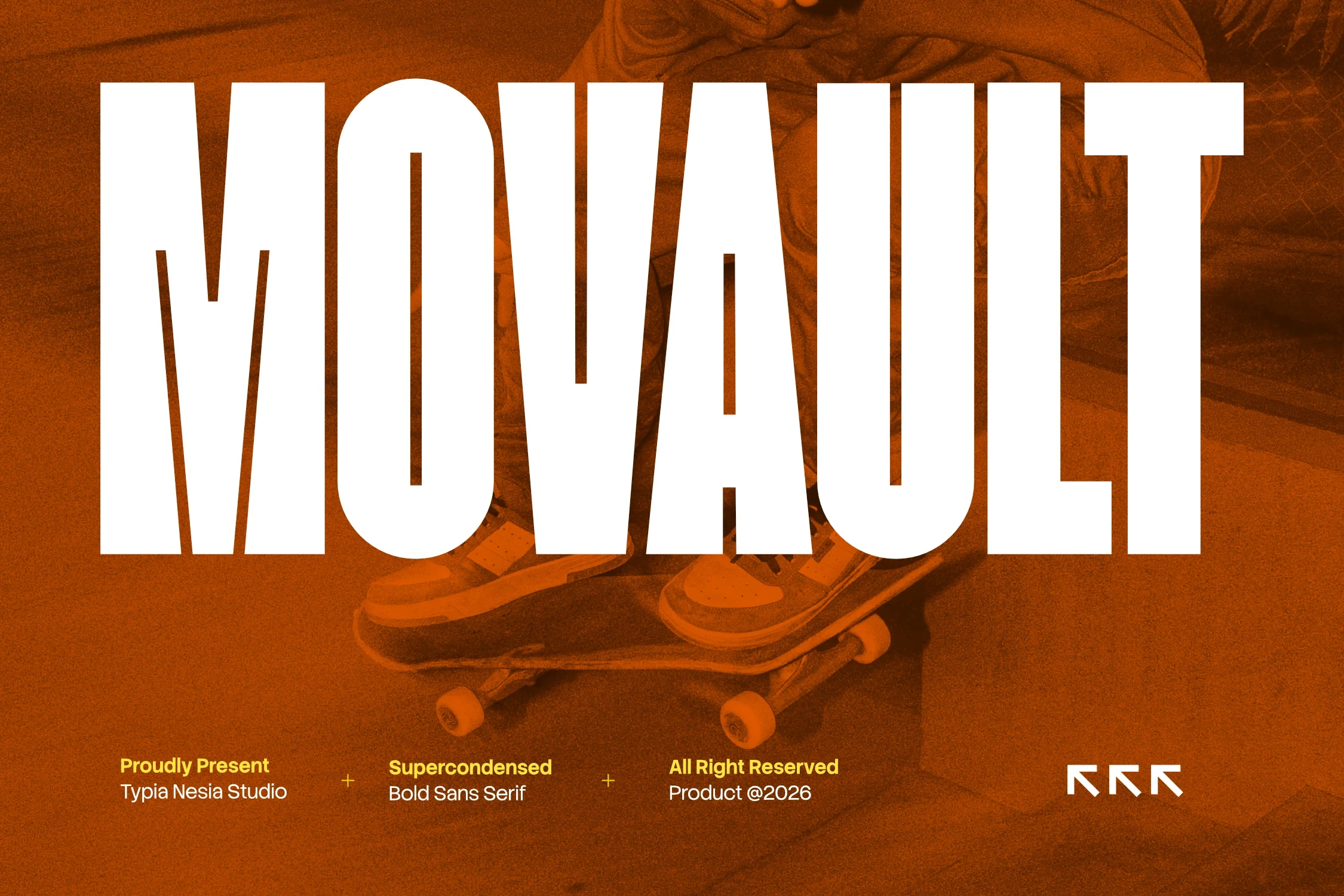
Best For: logos, display text, modern designs, minimal designs
Movault Font gives Minimal Logo Fonts an extremely condensed, upright block structure, with squared-off terminals and uniform strokes. Its compact footprint works at very large sizes, not in small or long-form text.
Minimalist Font
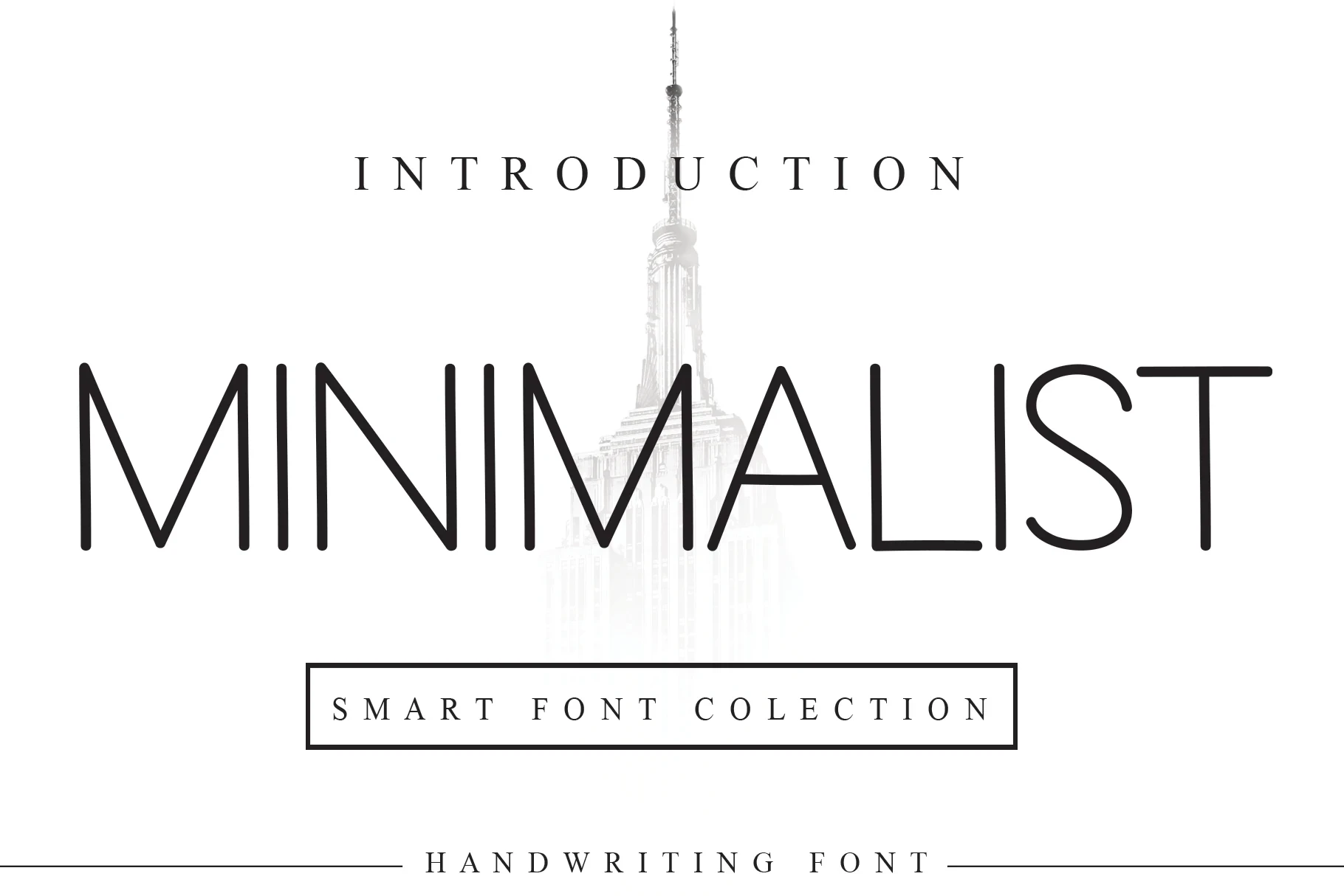
Best For: logos, product labels, display text, modern designs
Minimalist Font pairs tall geometric proportions with narrow width and thin horizontal crossbars. These Minimal Logo Fonts read clearly at large sizes, but their fine strokes can fade when reduced.
Honest Font
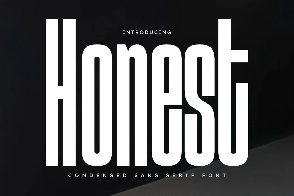
Best For: logos, branding, packaging, posters
Honest Font uses extreme vertical condensation, rounded exterior corners, and uniform stroke thickness for a tightly engineered wordmark. It holds a strong large-scale presence in branding and packaging, but not body text.
Expressive Display Wordmarks
This group relies on display serifs and distinctive contemporary letterforms rather than shared geometric rules. Weight and contrast range widely, so each face works best in short, large-scale brand text.
Runner Font
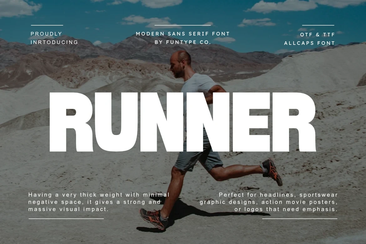
Best For: logos, posters, headlines, product labels
Runner Font is most useful for short names, headings, and product labels, where its substantial display-serif weight and clear contemporary stroke rhythm can be judged without extended reading demands.
Bauhaus Font
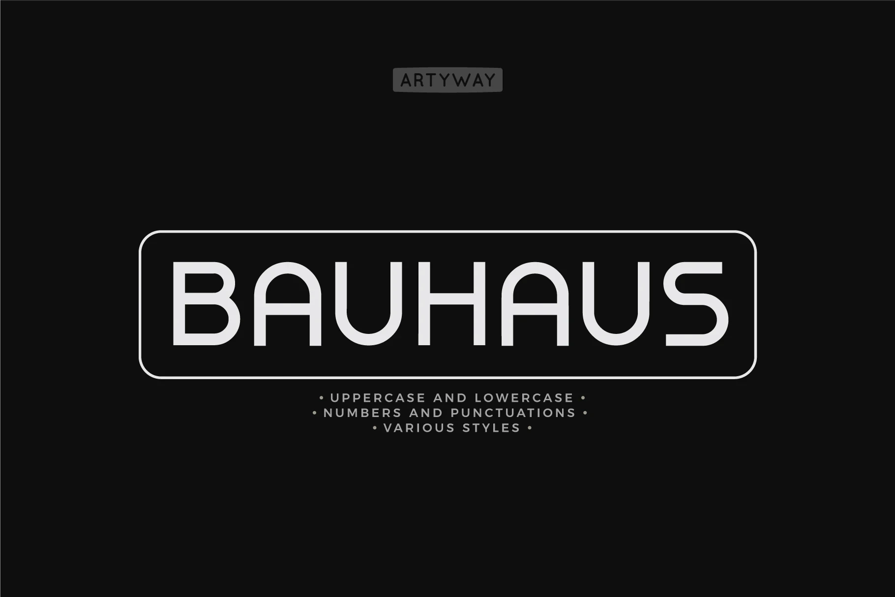
Best For: logos, display text, modern designs, minimal designs
Bauhaus Font organizes distinctive display letterforms through a clear contemporary stroke rhythm. Its construction supports modern minimal marks and short display text, but there is limited evidence for reliable small-text use.
Intrade Font

Best For: logos, display text, modern designs, minimal designs
Intrade Font uses slender display-serif strokes for a lighter visual presence. It suits short headings and restrained wordmarks more effectively than applications that require substantial visual mass or heavy lettering.
Merca Font
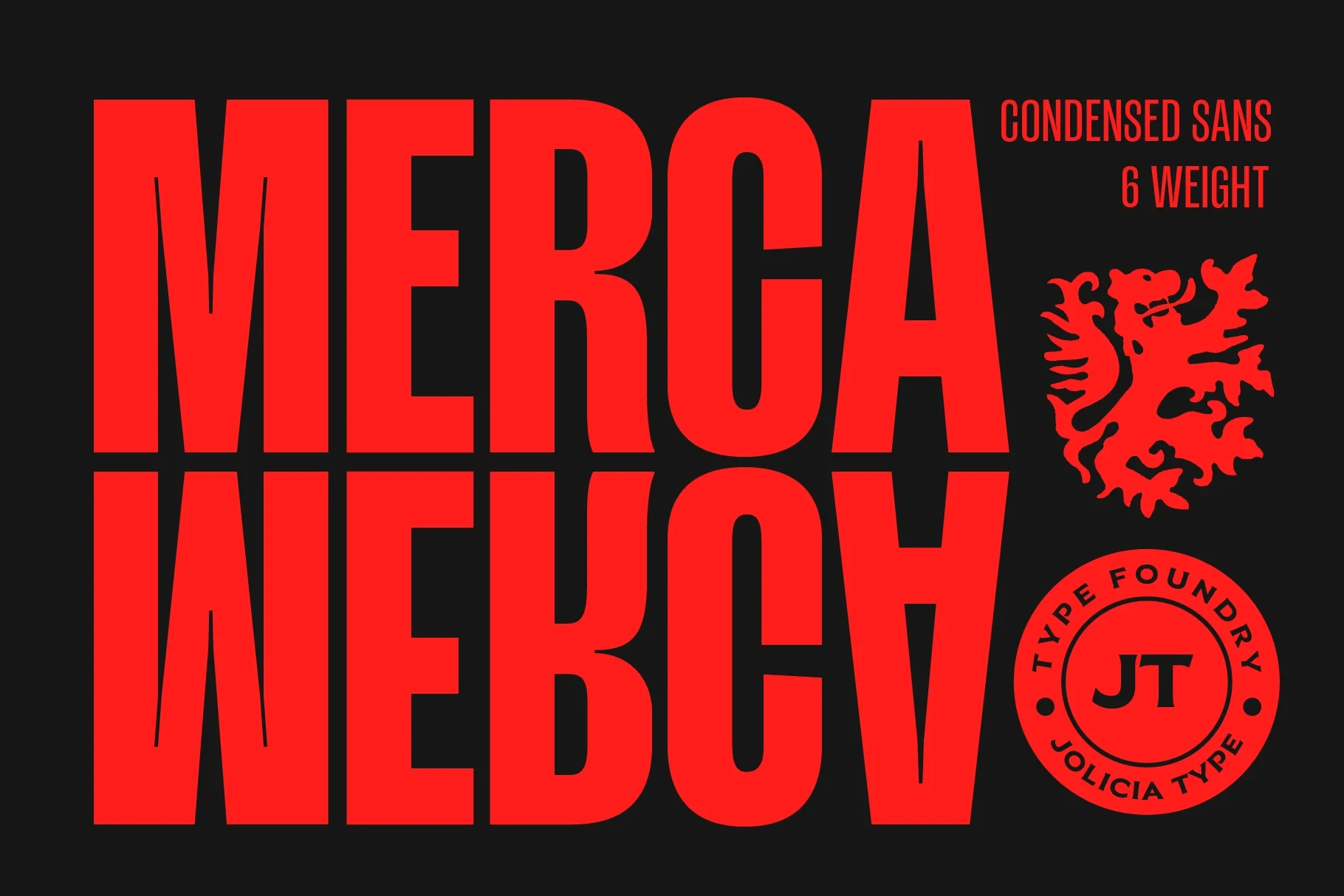
Best For: logos, display text, headlines, modern designs
Merca Font gives a wordmark substantial display weight, making it immediately prominent in logos and headlines. Keep the lettering large so its distinctive shapes remain easy to assess and compare.
Minimal Font
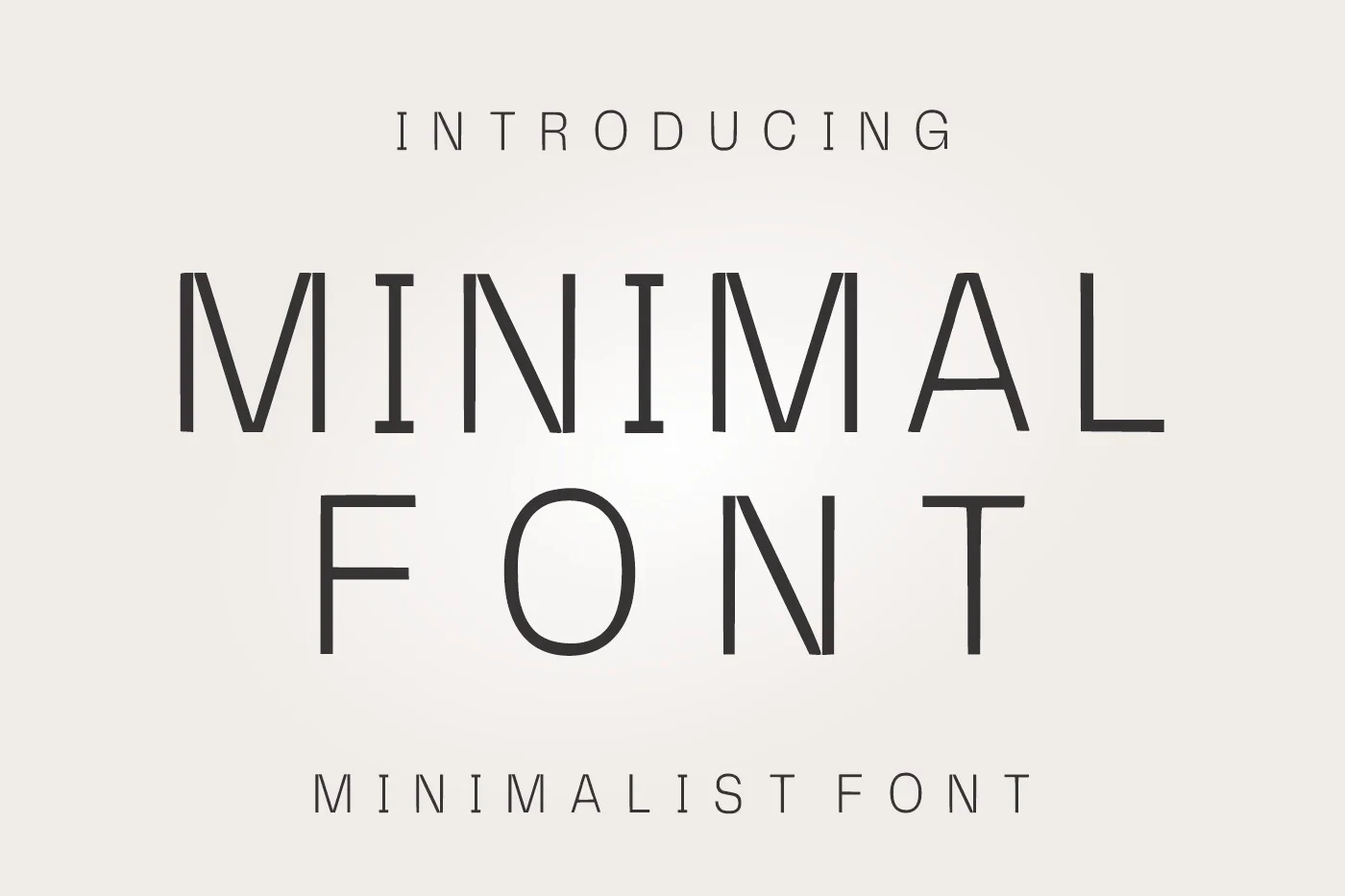
Best For: logos, display text, modern designs, minimal designs
Minimal Font keeps its contemporary display construction visually spare, making it appropriate for short logos and display text. The evidence supports large lettering, rather than a dependable range for small copy.
Friendly Font
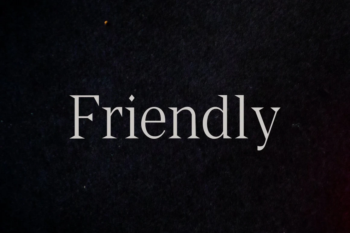
Best For: logos, display text, minimal designs, elegant designs
Friendly Font combines high contrast with pointed triangular serifs and a mostly vertical axis. Its thin strokes need medium-to-large display sizing, making it better for defined marks than tiny applications.
Bourgueil Font
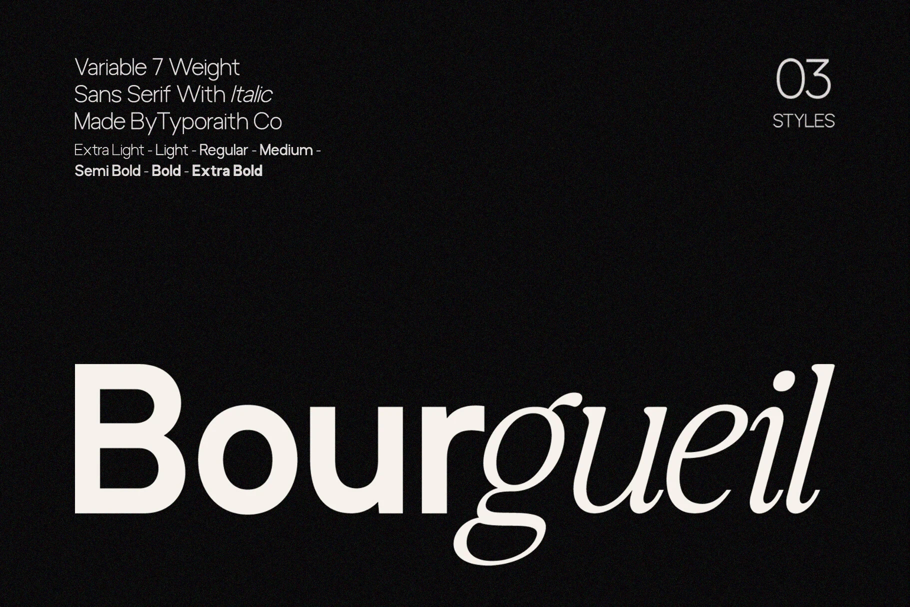
Best For: logos, branding, display text, modern designs
Bourgueil Font arranges contemporary display-serif forms around a clear, controlled stroke rhythm. It is most useful for concise branding and display text, where its letter shapes can be viewed at larger scale.
How to Choose the Right Font
Choose based on the mark’s working size first. For readable lockups and supporting text, favor open geometric forms such as Balimo, Gc Allio, or Noirden; for compact large-scale branding, consider condensed Hightone, Movault, or Honest. Serif options add contrast and character, but thin strokes and pointed details need more display space. Minimal Logo Fonts work best when spacing and scale match the application.