14 Best Poster Display Fonts in 2026
Poster Display Fonts span connected scripts, psychedelic serifs, stencil cuts, distressed textures, and dense geometric blocks. Together, they cover decorative branding, packaging, signage, invitations, and oversized headlines, with construction and scale determining whether each face communicates clearly or functions mainly as visual atmosphere.
Looking for more display fonts? Browse our complete Display Fonts collection to compare bold, vintage, retro, decorative, and playful display styles.

Poster Display Fonts: Flowing and Paired
Poster Display Fonts in this group rely on flowing scripts and deliberate pairings, combining movement and decoration with a supporting sans-serif that keeps key information readable.
Birdy Font

Best For: branding, packaging, product labels
Birdy Font brings a connected, right-leaning script with a curved uppercase B and heavy joins that keep headings and labels moving. Its large-scale clarity suits Poster Display Fonts for packaging and branding, though the connected forms become less dependable as body text.
Summer Fresh Font
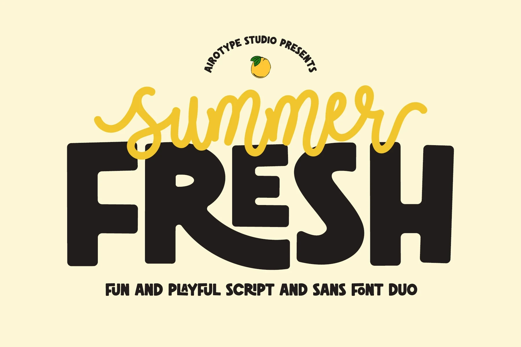
Best For: posters, display text, short phrases, playful designs
Summer Fresh Font pairs fluid script loops and long horizontal connectors with an ultra-bold rounded condensed sans-serif. The sans-serif carries readable information, while the overlapping script supplies decoration for short headings. This division makes it useful for Poster Display Fonts when hierarchy matters more than continuous reading.
Retro Display Forms
These retro display forms use exaggerated curves, heavy weights, wide proportions, and rounded terminals to create nostalgic poster lettering that needs generous space.
Sunspell Font
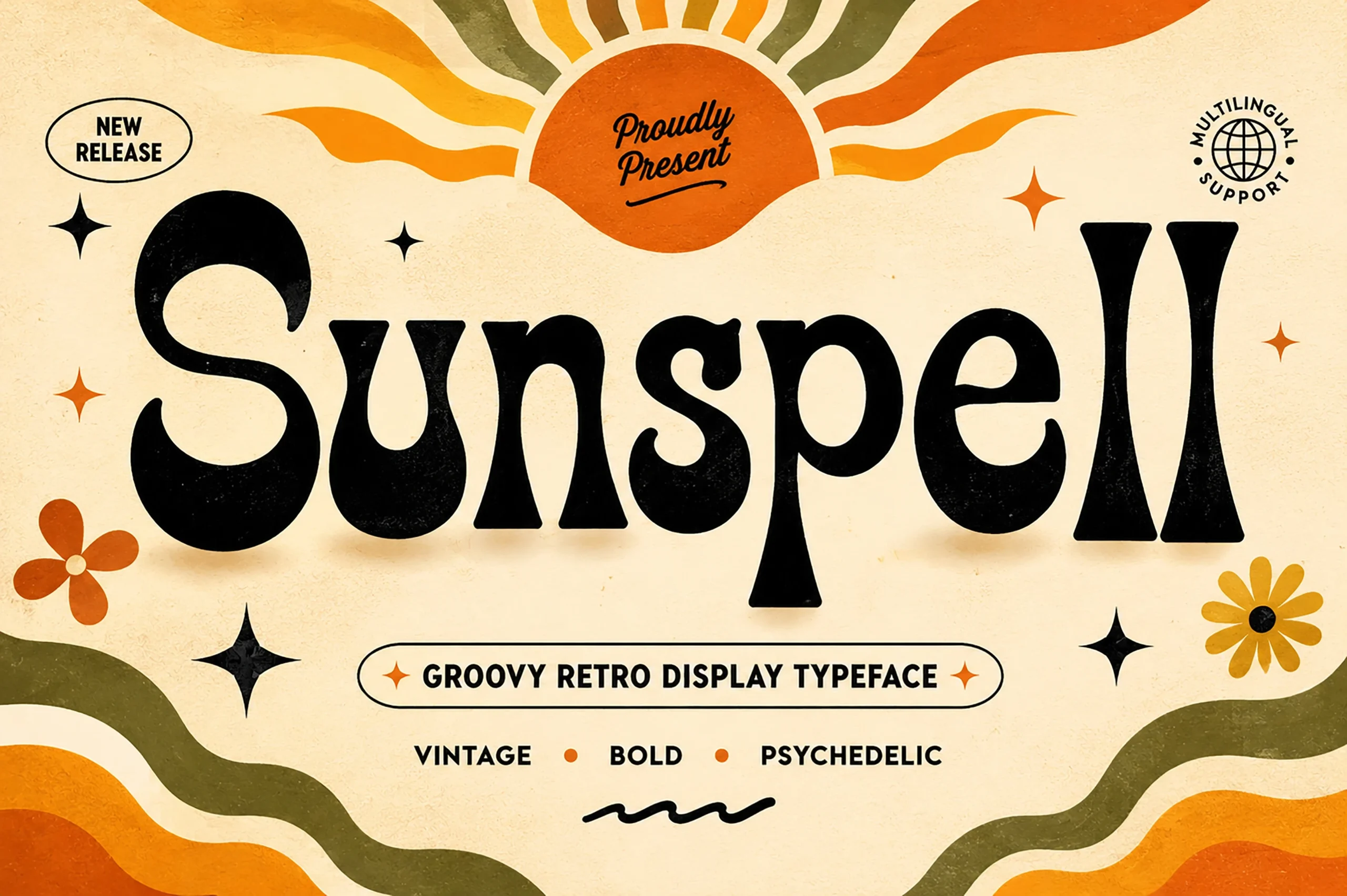
Best For: headlines, posters, display text
Sunspell Font builds its psychedelic voice from exaggerated terminals, organic curves, and pronounced thick-to-thin contrast. The 1970s-inspired serif makes large words memorable across posters and display text, but its finer terminal details can disappear when reduced, so it belongs in spacious headline treatments.
Collins Butter Font
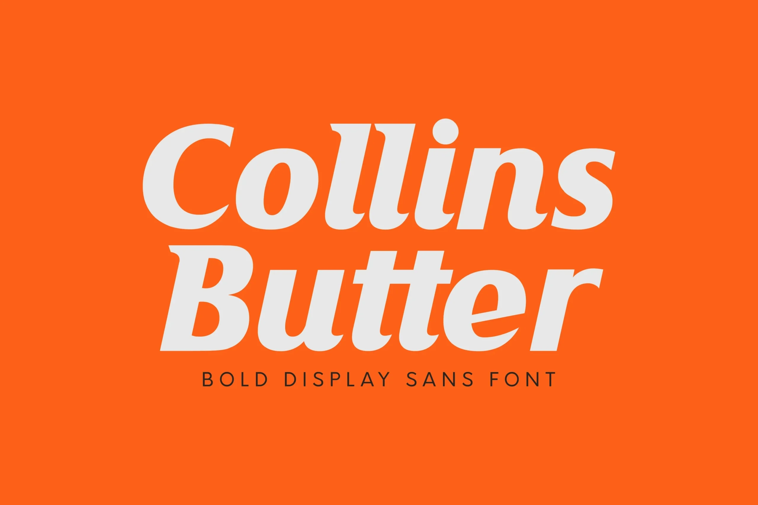
Best For: branding, packaging, website headers, posters
Collins Butter Font gives a right-leaning, wide display form unusual movement through heavy weight, high contrast, and bracketed serif-like terminal curves. Its broad italic presence suits packaging and poster titles, while generous scale helps preserve the complex edges. The solid and hollow versions add useful contrast.
Notre Font
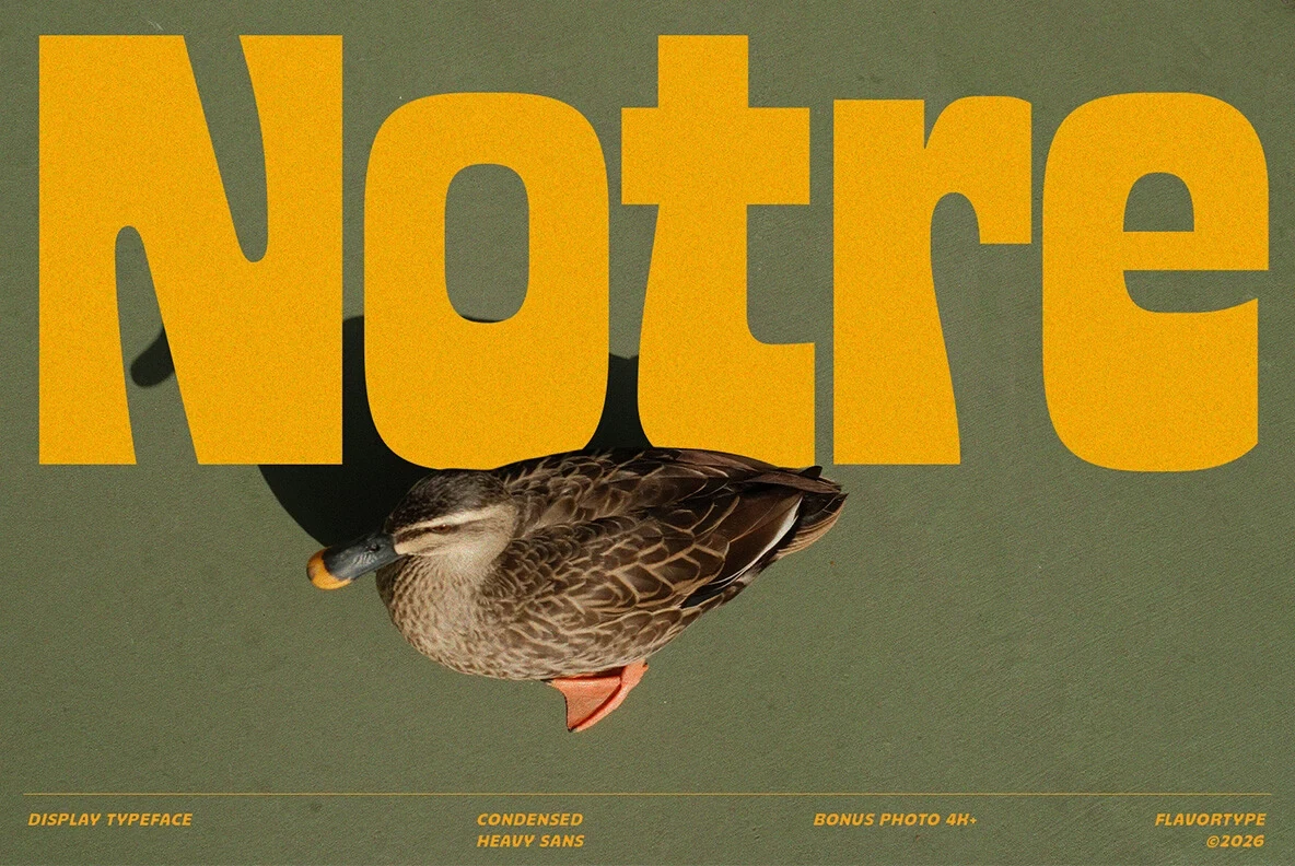
Best For: branding, signage, product labels, posters
Notre Font combines an ultra-heavy condensed build with rounded terminals and irregular outer contours. The softened edges prevent its dense block silhouette from feeling completely severe, making it useful for signage, labels, and large poster titles. Its weight remains too concentrated for small text.
Poster Font

Best For: logos, branding, invitations, wedding designs
Poster Font uses wide geometric letters, rounded corners, and a heavy sans-serif construction to create a nostalgic presence that reads cleanly in titles, invitations, and logos. Its broad proportions provide a substantial visual rhythm, but they can consume valuable space in narrow layouts or tightly packed compositions.
Stencil and Distressed Display
Stencil gaps, distressed grain, irregular outlines, and slab-serif structure define this industrial group, where texture and interruption take priority over extended reading comfort.
Ghostac Font

Best For: branding, logos, posters, display text
Ghostac Font works best for logos, branding, and oversized poster headlines where its geometric, monolinear sans-serif skeleton can be seen clearly. Stencil-like structural cuts interrupt the otherwise orderly construction, creating a technical, fragmented surface; at small sizes, those breaks interfere with word recognition.
Escape Font

Best For: posters, display text, bold designs
Escape Font compresses geometric letters into narrow proportions and interrupts them with stencil-inspired gaps. That condensed structure helps long words fit compact poster layouts, while its monolinear, utilitarian rhythm reinforces industrial themes. The breaks are best reserved for headlines, labels, or short graphic phrases.
Eroder Poster Font
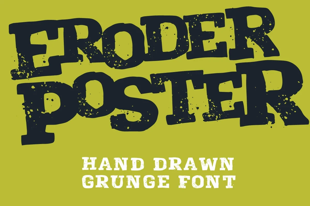
Best For: posters, display text, headlines, bold designs
Eroder Poster Font combines a wide slab-serif skeleton with distressed texture and irregular hand-drawn outlines. The heavy structure keeps Poster Display Fonts readable in large headlines while the grit supplies a raw industrial surface. Automatic ligatures and two distressed all-caps sets add texture, though small use can turn muddy.
Freaky Vibes Font
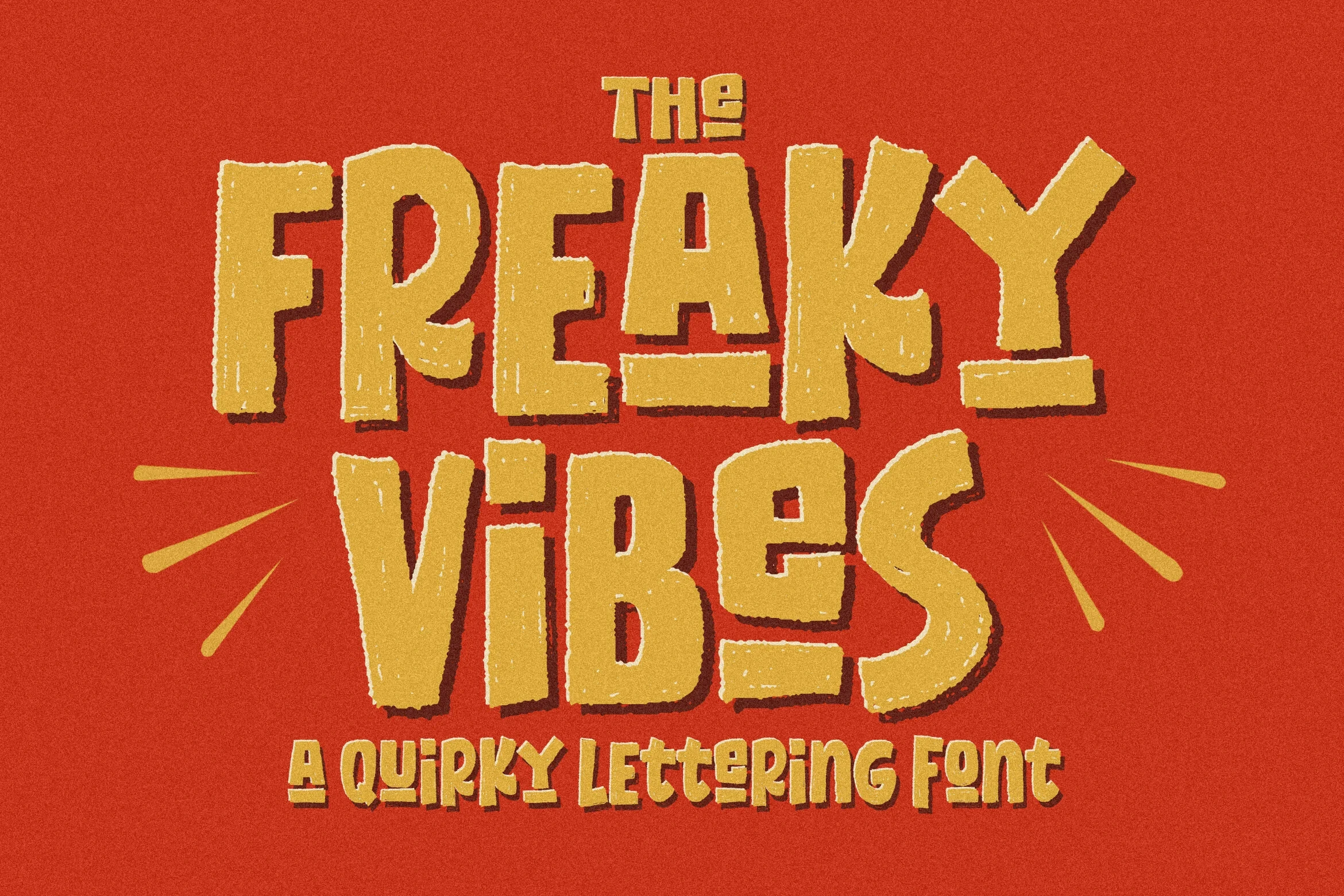
Best For: posters, display text, playful designs, bold designs
Freaky Vibes Font places varied widths and non-uniform block shapes inside a heavy display framework, then adds a distressed grain. The result stays readable for large poster phrases, but the uneven construction makes long wording tiring to parse. Use it where texture matters more than effortless reading.
Bold Block Display
Bold block displays emphasize compact geometry, layered effects, squared joints, shadows, and dense counters, delivering assertive titles that perform best at headline scale.
Quantity Font
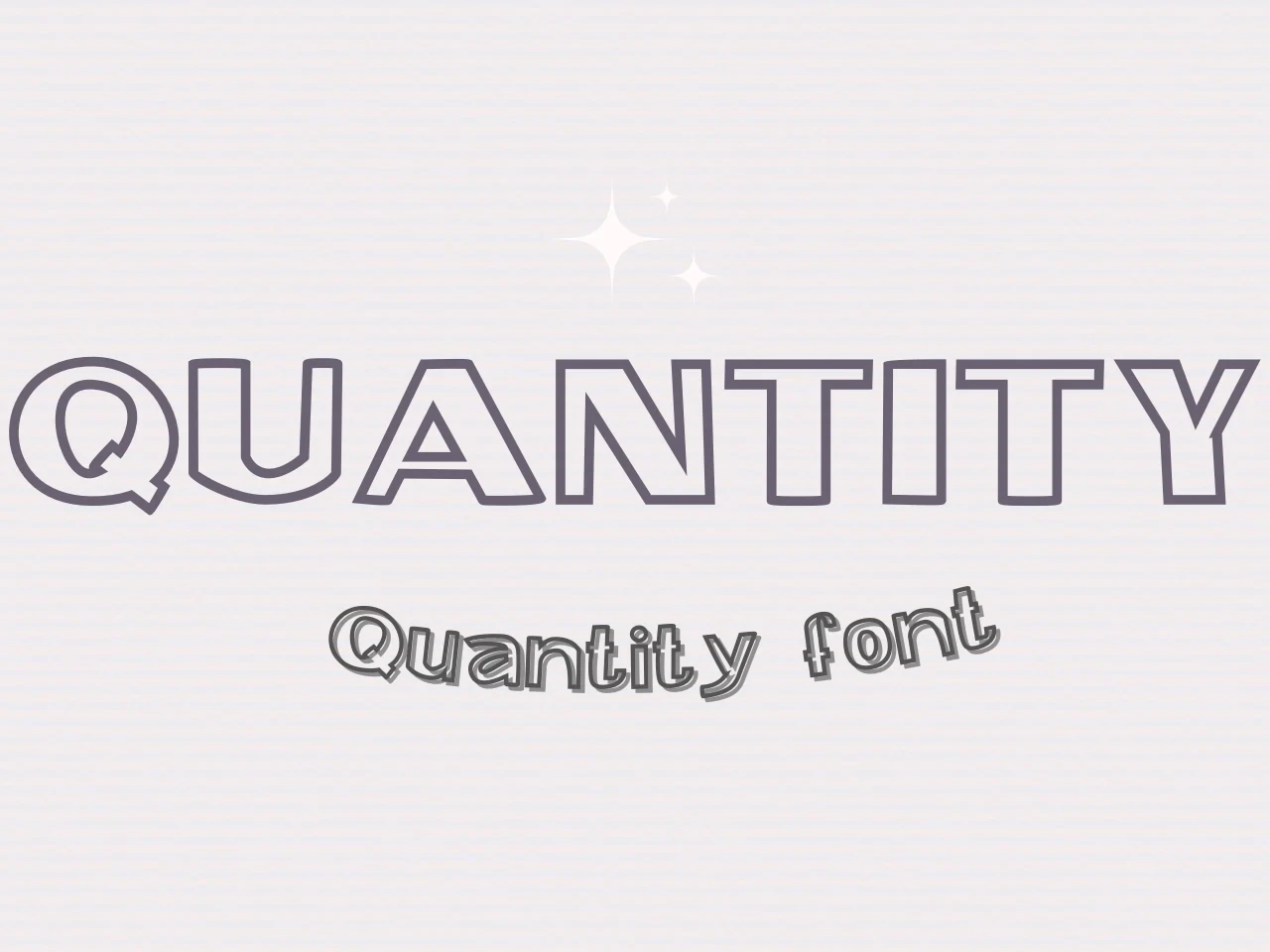
Best For: posters, display text, modern designs, clean designs
Quantity Font keeps its geometric block construction clean while offering outlined and drop-shadowed treatments. That contrast is practical for layered poster titles, signage, and display text, but the effect-led versions are better for short compositions than dense copy. Its monolinear sans-serif terminals keep the structure orderly.
North Hype Font

Best For: logos, branding, packaging, headlines
North Hype Font packs ultra-bold, condensed letters into a tight headline texture with very little negative space inside closed counters. It suits Poster Display Fonts for logos, packaging, and limited-width branding, but reduction can cause counters and neighboring word shapes to merge, so preserve generous scale.
Super Village Font
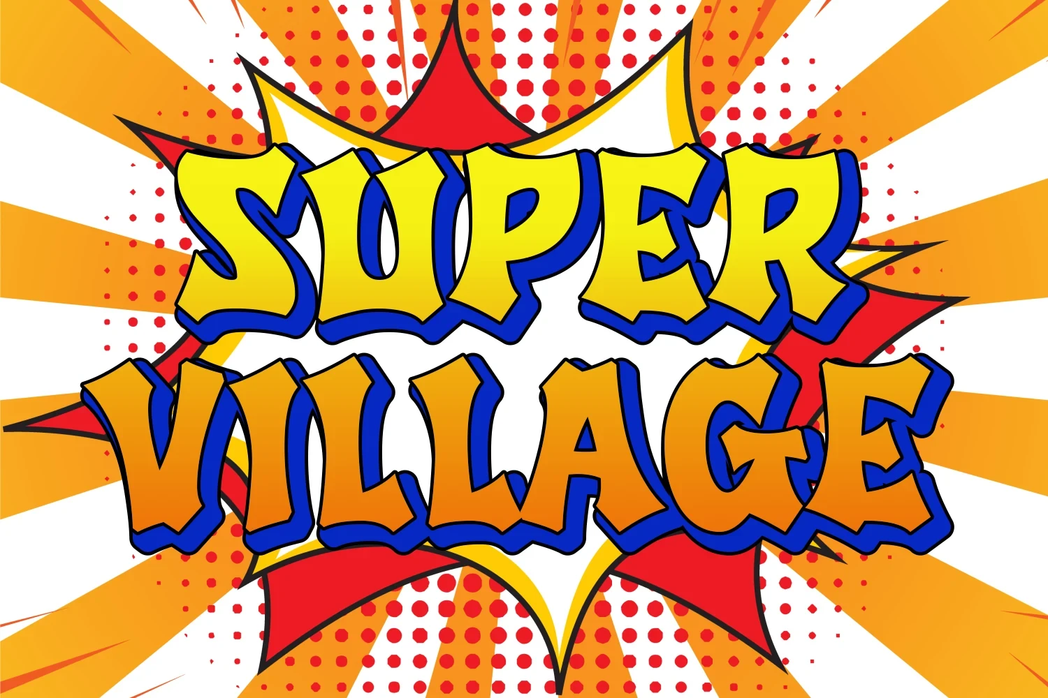
Best For: book covers, posters, display text
Super Village Font uses chunky, irregular contours with a pronounced exterior drop shadow, producing a comic-like dimensional silhouette. The treatment adds immediate depth to book covers and posters, while high contrast supports large-scale reading. At small sizes, the shadow and uneven outline become visually busy and compete with the letters.
Jrock Poster Font
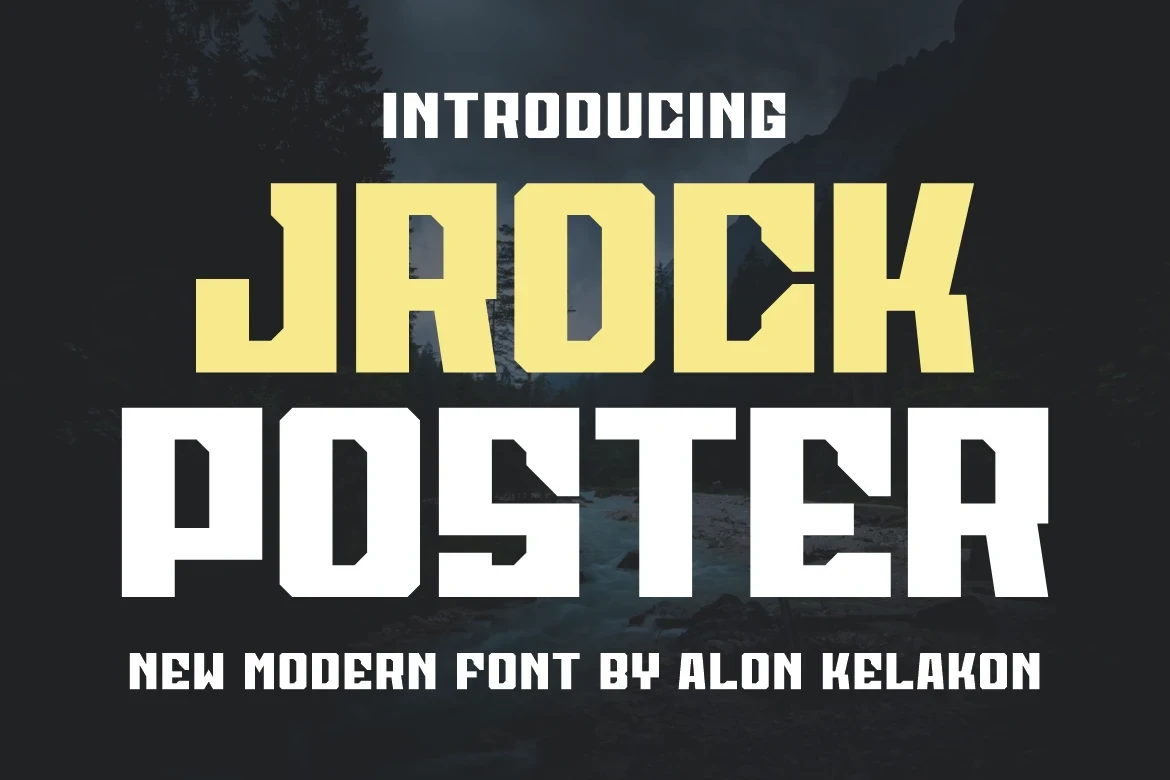
Best For: posters, display text, modern designs, bold designs
Jrock Poster Font relies on wide squared proportions, uniform heavy strokes, and sharp angular cutouts at the joints. Those details give poster titles an industrial edge while the consistent weight preserves clarity at large sizes. In small print, however, the joint cuts can lose their definition.
How to Choose the Right Font
Choose by construction before choosing mood: connected scripts and high-contrast serifs need large scale, stencil cuts and grain require breathing room, while condensed blocks save space but can close counters. For Poster Display Fonts, reserve the most textured or shadowed options for short titles, and let cleaner paired faces carry supporting information.