11 Best Vintage Display Fonts in 2026
This collection of Vintage Display Fonts moves from broad geometric slabs and weathered serifs to tall condensed faces and connected scripts. Their practical strengths are concentrated in headlines, logos, posters, packaging, signage, and branded graphics, where visible construction matters more than extended reading comfort.
Looking for more display fonts? Browse our complete Display Fonts collection to compare bold, vintage, retro, decorative, and playful display styles.
Vintage Display Fonts: Rugged Slabs
These Vintage Display Fonts share heavy slab structures, broad or condensed proportions, and visible surface wear. Compared with the scripts and sharper serifs, they offer steadier upright construction and stronger signage readability.
Swedis Font

Best For: display text, modern designs, minimal designs
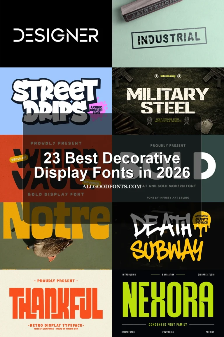
Swedis Font uses wide geometric lettering, rounded terminals, and heavy uniform strokes. Its tightly spaced forms make Vintage Display Fonts clear in large headlines, while different internal stripe treatments add variation; at smaller sizes, the dense construction can blur.
Retro Goal Font
Best For: branding, display text, clean designs, classic designs
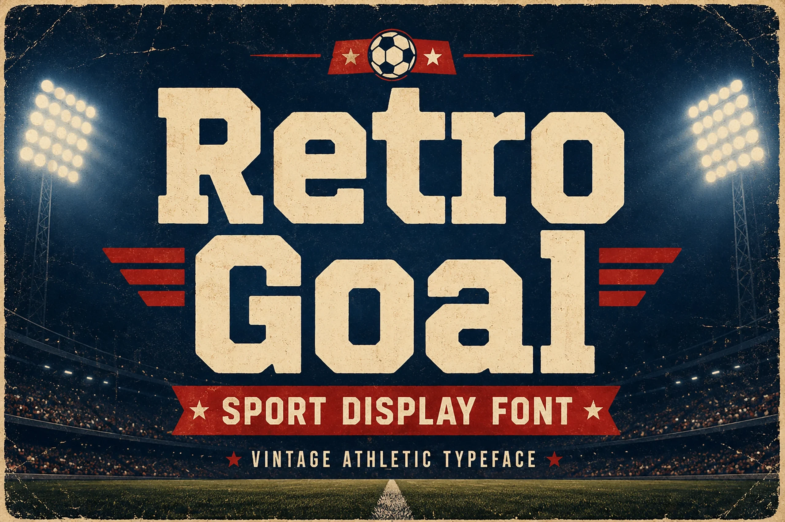
Retro Goal Font is built from wide slab-serif forms, uniform strokes, and square terminals. This straightforward geometry keeps Vintage Display Fonts highly readable across athletic branding and large signage, although its forceful structure is poorly suited to quiet text roles.
Retro Riders Font

Best For: branding, posters, retro designs, product labels
Retro Riders Font combines a condensed slab-serif shape with pronounced stroke contrast and distressed edges. Its compact width helps titles fit posters and product labels, while the rough texture needs enough display size to keep the letter details defined.
Bonaro Family Font
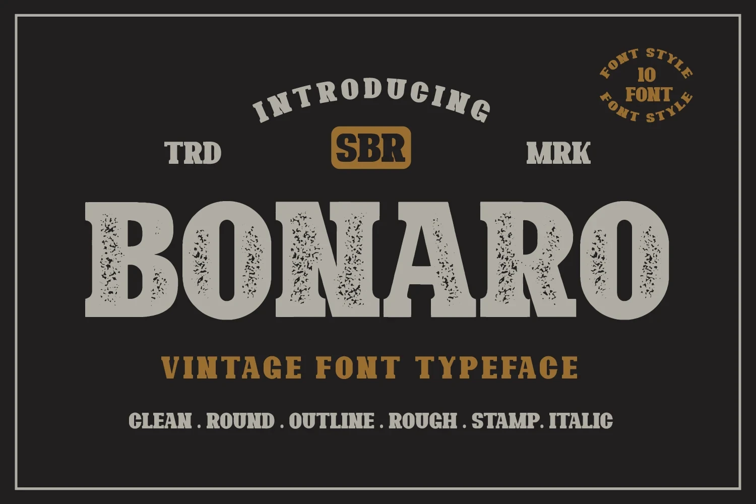
Best For: display text, clean designs, bold designs, vintage designs
Bonaro Family Font supports vintage branding with upright, monolinear slab serifs and an integrated distressed surface. Its even construction preserves readable letter shapes at medium-to-large sizes, but the texture makes it unsuitable for small body copy.
Flowing Retro Scripts
Connected strokes, pronounced slants, extended tails, and decorative joins define this group. Unlike the upright serif and slab faces, these scripts create movement and personality but require larger sizing and shorter wording.
Sanvilo Font

Best For: display text, modern designs, elegant designs, bold designs
Sanvilo Font builds its flowing display rhythm from connected cursive forms, a pronounced slant, extended tails, and included ligatures. It suits large automotive or glamorous titles, but its flourishes and metallic effects reduce clarity in small applications.
Magdalia Font
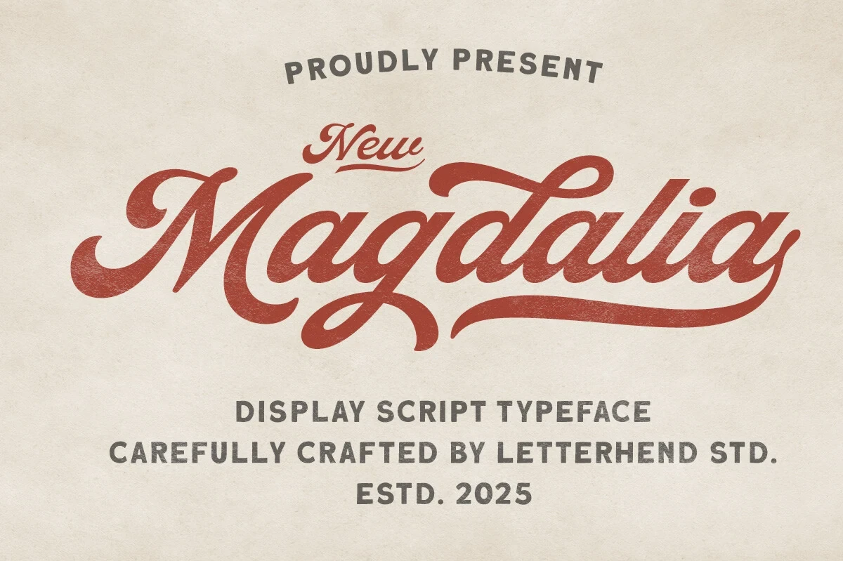
Best For: logos, packaging, posters, display text
Magdalia Font brings a wide connected script, pronounced slant, and an extended lowercase “a” tail to Vintage Display Fonts. Its flowing silhouette fits logos and packaging, but interconnected strokes and flourishes restrict it to prominent display use.
Textured Serif Statements
This group combines serif contrast with rough surfaces, elongated proportions, shadows, or pointed terminals. It delivers more specialized texture and mood than the slabs, while generally demanding generous display scale.
Ruiz Duo Font
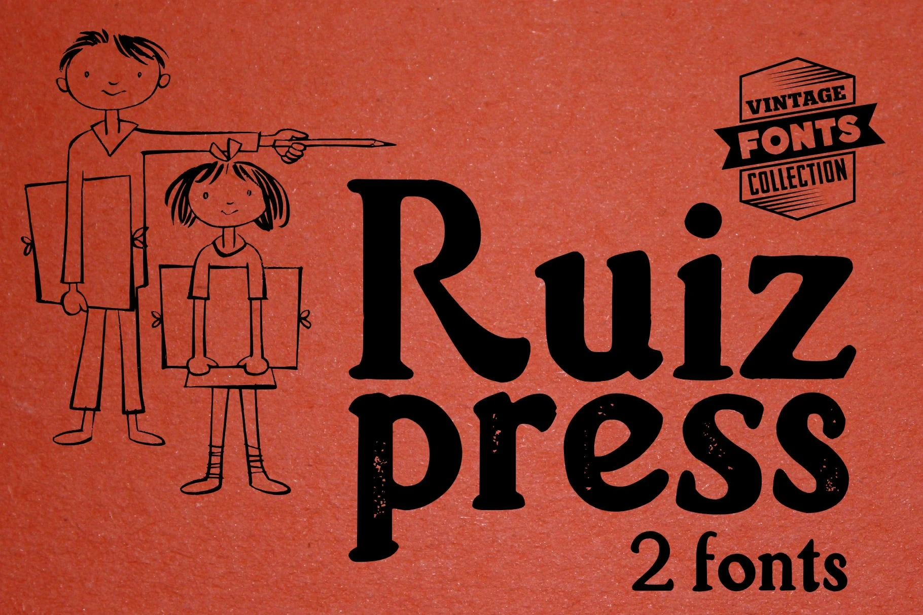
Best For: social media graphics, display text, classic designs
Ruiz Duo Font pairs a roughened, high-contrast serif with a condensed sans-serif companion, creating built-in hierarchy. The textured main style suits titles and social graphics, but its moderate legibility makes it less appropriate for extended reading.
Nafa Grunge Font

Best For: logos, branding, packaging, social media graphics
For branding and packaging, Nafa Grunge Font applies stippled texture and irregular organic edges to heavy, slab-like serifs. The large forms remain readable in headlines, while the distressed surface can obscure finer details when reduced, so it works best with generous scale.
Fika Rough Font
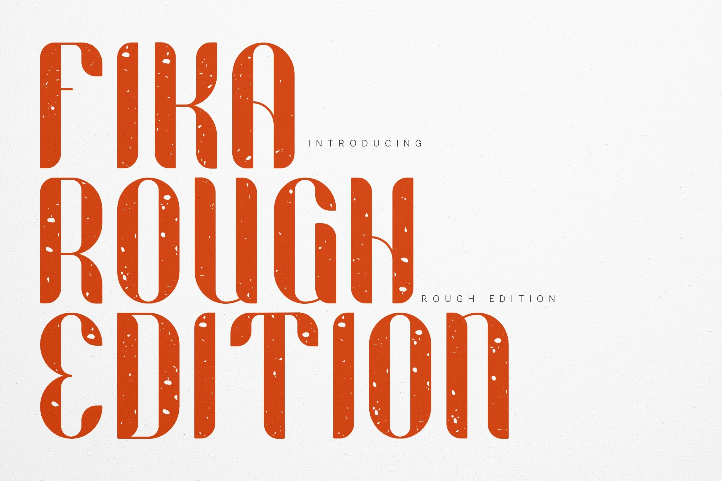
Best For: signage, display text, minimal designs, clean designs
Fika Rough Font creates a tall silhouette through extreme vertical elongation, narrow proportions, high-contrast strokes, and flattened serifs. It can give signage and headlines strong presence, yet its distressed detail requires substantial sizing for dependable clarity.
Vintage Super Font

Best For: logos, packaging, creative projects, eye-catching designs
Vintage Super Font uses Western-style serif forms, a tall x-height, and chiseled dimensional shadows. The built-in depth gives logos and packaging a finished badge-like quality, though its internal styling and shadow effects lose definition when scaled down.
Darkwood Font

Best For: logos, branding, packaging, posters
Darkwood Font gives posters and packaging a tense serif voice through sharp wedge-shaped serifs, strong vertical stress, high contrast, and a distressed surface. The textured construction needs large sizing to preserve dependable character clarity.
How to Choose the Right Font
Choose Vintage Display Fonts by matching construction to scale: broad monolinear slabs are the safest for readable signage, while condensed or distressed faces need more room. Use scripts when joined strokes and flourishes can remain prominent, and reserve high-contrast serifs, shadows, and texture for short headlines, logos, packaging, or posters rather than body copy.