29 Best Cool Gothic Fonts in 2026
Cool Gothic Fonts span heavy display faces, connected scripts, and serif styles that balance period character with contemporary construction. Together, they suit logos, posters, packaging, social graphics, book covers, and short headings where visible letterform detail matters more than continuous reading comfort.
Looking for more cool fonts? Browse our complete Cool Fonts collection to compare bold, vintage, retro, script, and gothic cool styles.
Cool Gothic Fonts for Bold Display Work
Cool Gothic Fonts for bold display work emphasize substantial weight, clear stroke rhythm, and distinctive shapes. Unlike the scripts, these remain unconnected; unlike the serif group, they prioritize graphic impact over period serif detail.
Taylor Gothic Font
Best For: display text, bold designs
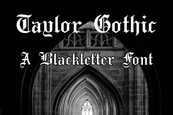
Taylor Gothic Font brings substantial weight and a clear stroke rhythm to short headings, names, and display phrases. Its distinctive letterforms are easiest to judge at larger scale, where the construction remains readable without competing with extended copy.
Plakat Fraktur Font
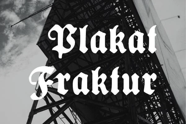
Best For: display text, branding
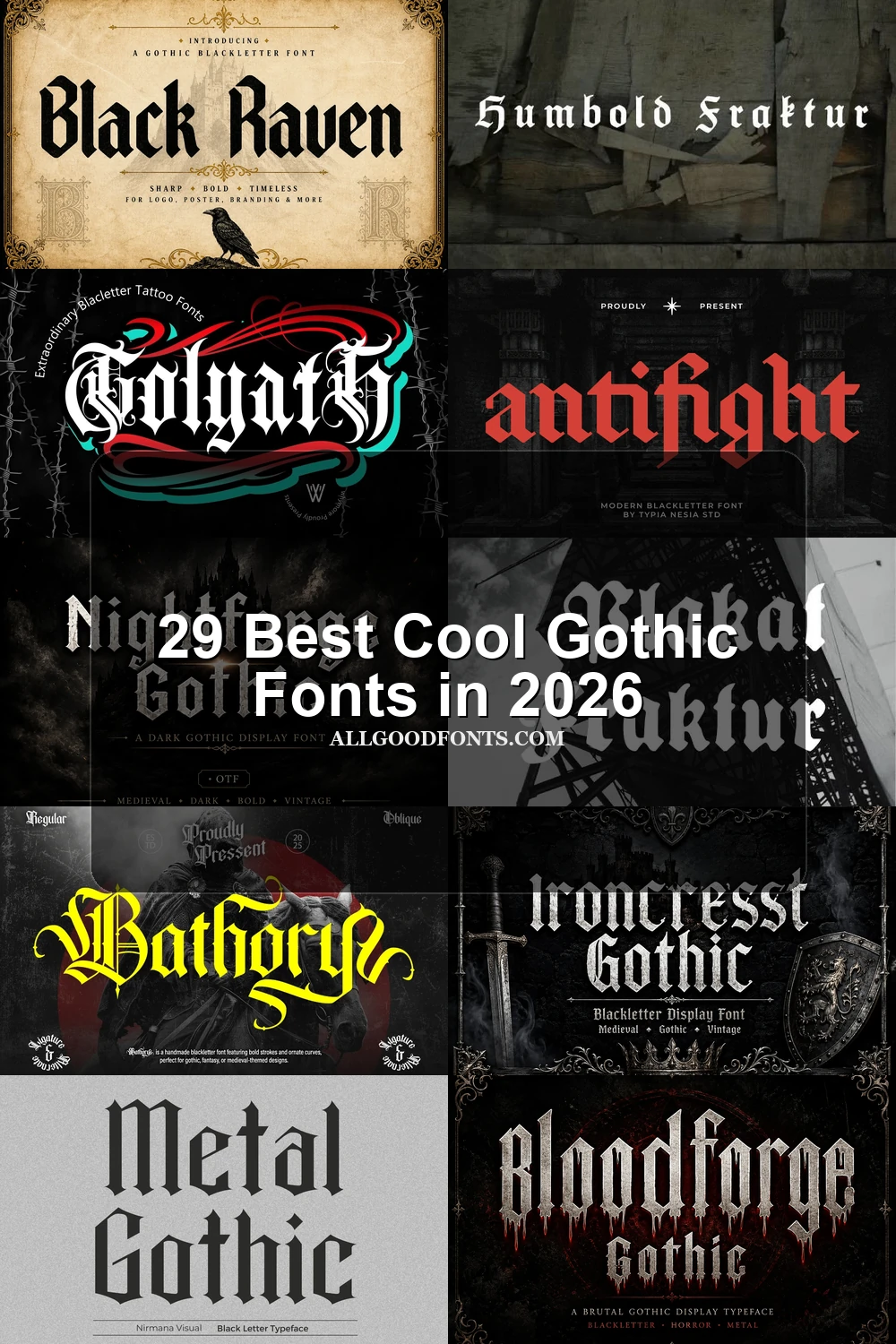
Refined slender strokes sit inside the heavy display presence of Plakat Fraktur Font, creating contrast between fine detail and firm structure. It suits Cool Gothic Fonts projects using short expressive wording; PUA-encoded characters and swashes may require compatible design software.
Void Gothic Font

Best For: modern designs, clean designs, elegant designs
For modern display text, Void Gothic Font offers clean contemporary construction with an elegant bold profile. Its letterforms are best assessed in short headings or names, where the substantial build can read clearly without the density of a paragraph.
Humbold Fraktur Font

Best For: display text, product labels, expressive designs
Humbold Fraktur Font uses a measured stroke rhythm to give headings and product labels a substantial graphic presence. Its display details remain clearest in short wording, while the supplied PUA-encoded characters and swashes add scope for expressive treatments.
Stackwin Font

Best For: display text, modern designs, clean designs
Stackwin Font combines expressive shapes with heavy weight and clean contemporary construction. It fits short bold layouts where the letterforms can carry the design, rather than dense blocks that would reduce the clarity of its display character.
Black Raven Font
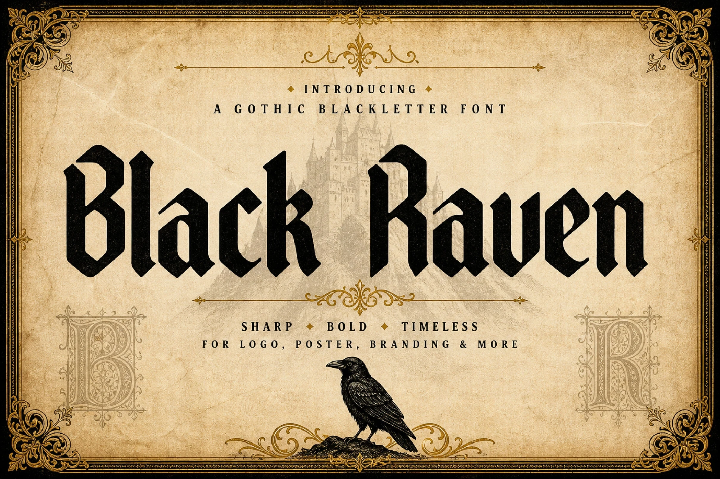
Best For: book covers, display text, expressive designs
Short book-cover titles give Black Raven Font room to show its clear stroke rhythm and expressive display forms. The construction is best compared at heading scale, where its letter shapes remain legible and purposeful without being asked to perform as paragraph text.
Cute Gothic Font
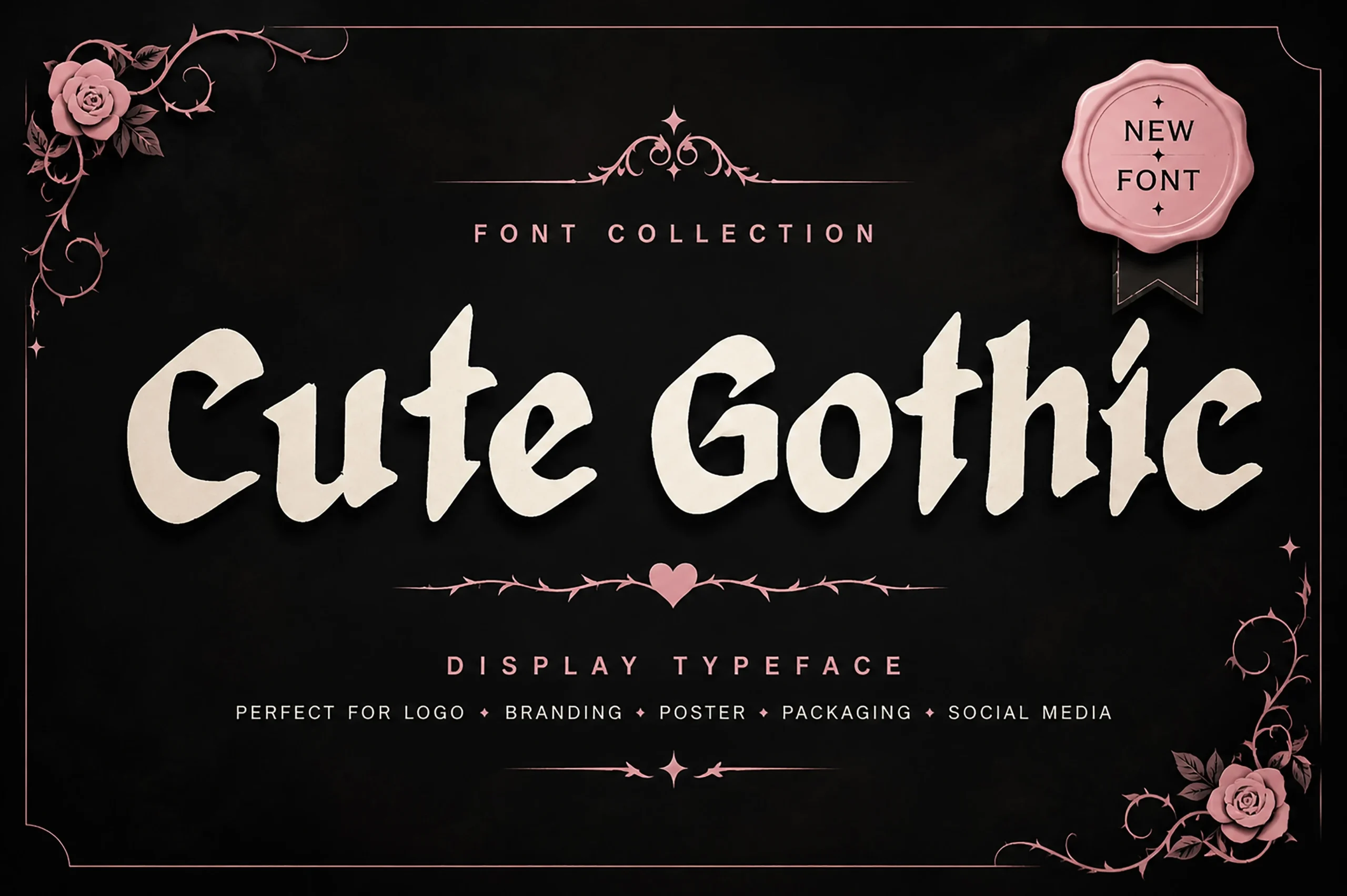
Best For: branding, packaging, social media graphics
Cute Gothic Font softens its substantial build with rounded, playful character. It works well when Cool Gothic Fonts need personality in branding, packaging, posters, or social graphics, especially when the message is brief enough for each unusual shape to remain visible.
Highborne Font

Best For: display text, posters, merch design
Highborne Font gives posters and short headings distinctive display forms with a clear stroke rhythm. Its letter shapes are better suited to compact phrases than paragraphs, allowing the expressive construction to support the layout without sacrificing basic readability.
Metal Gothic Font
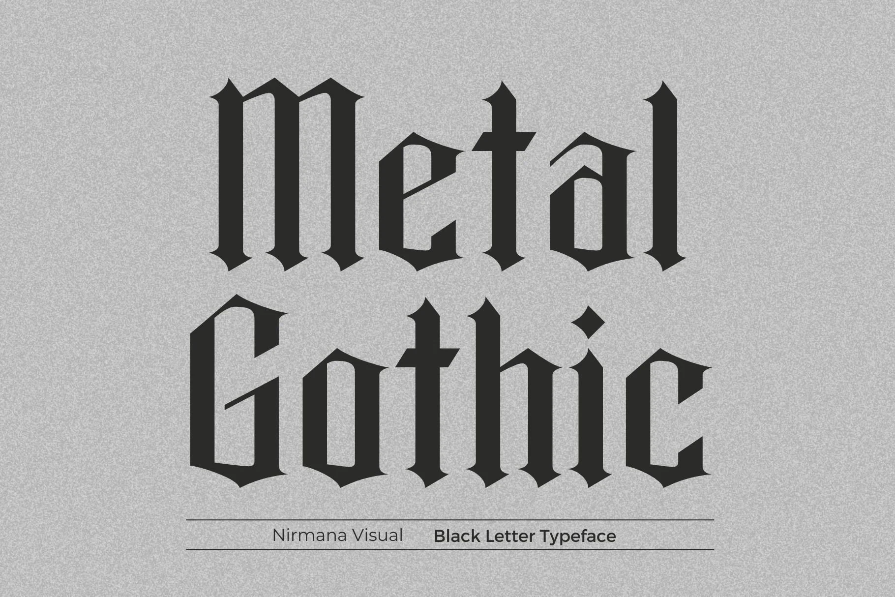
The heavy construction of Metal Gothic Font gives logos, labels, and compact social graphics a firm graphic footprint. Its substantial letters are most effective at display scale, where the stroke rhythm stays clear and the design does not become overly dense.
Brother Gothic Font

Best For: display text, clean designs, elegant designs
Brother Gothic Font relies on clear stroke rhythm and distinctive display letterforms rather than a specified weight. It can support clean or elegant headings, though the available evidence does not establish reliable performance for body text or long passages.
Bathory Font
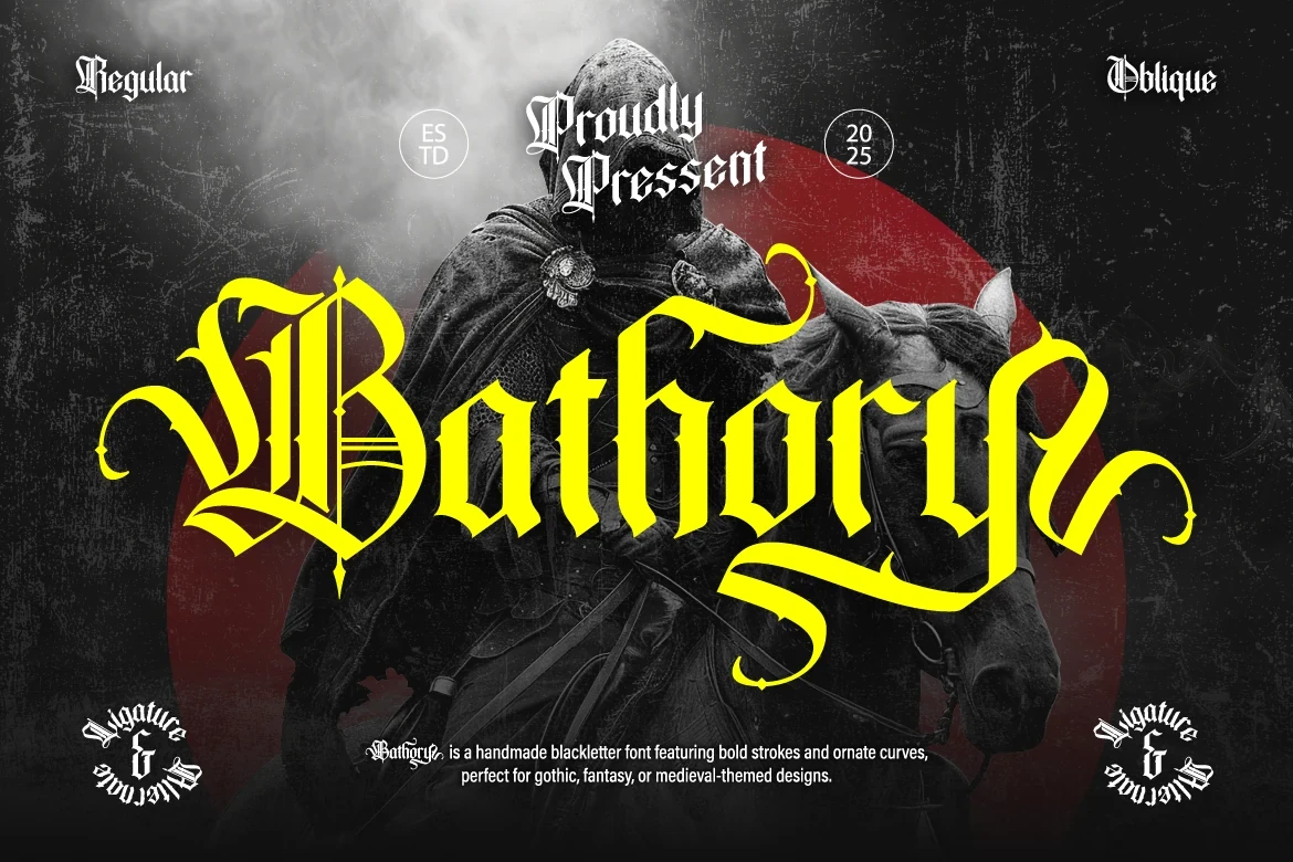
Best For: display text, bold designs, elegant designs
Bathory Font uses substantial weight to make its expressive forms suitable for display scale. Short titles preserve clarity while leaving the elegant character visible, making it a practical choice when Cool Gothic Fonts need a concentrated rather than expansive role.
Gothic Graffiti Font
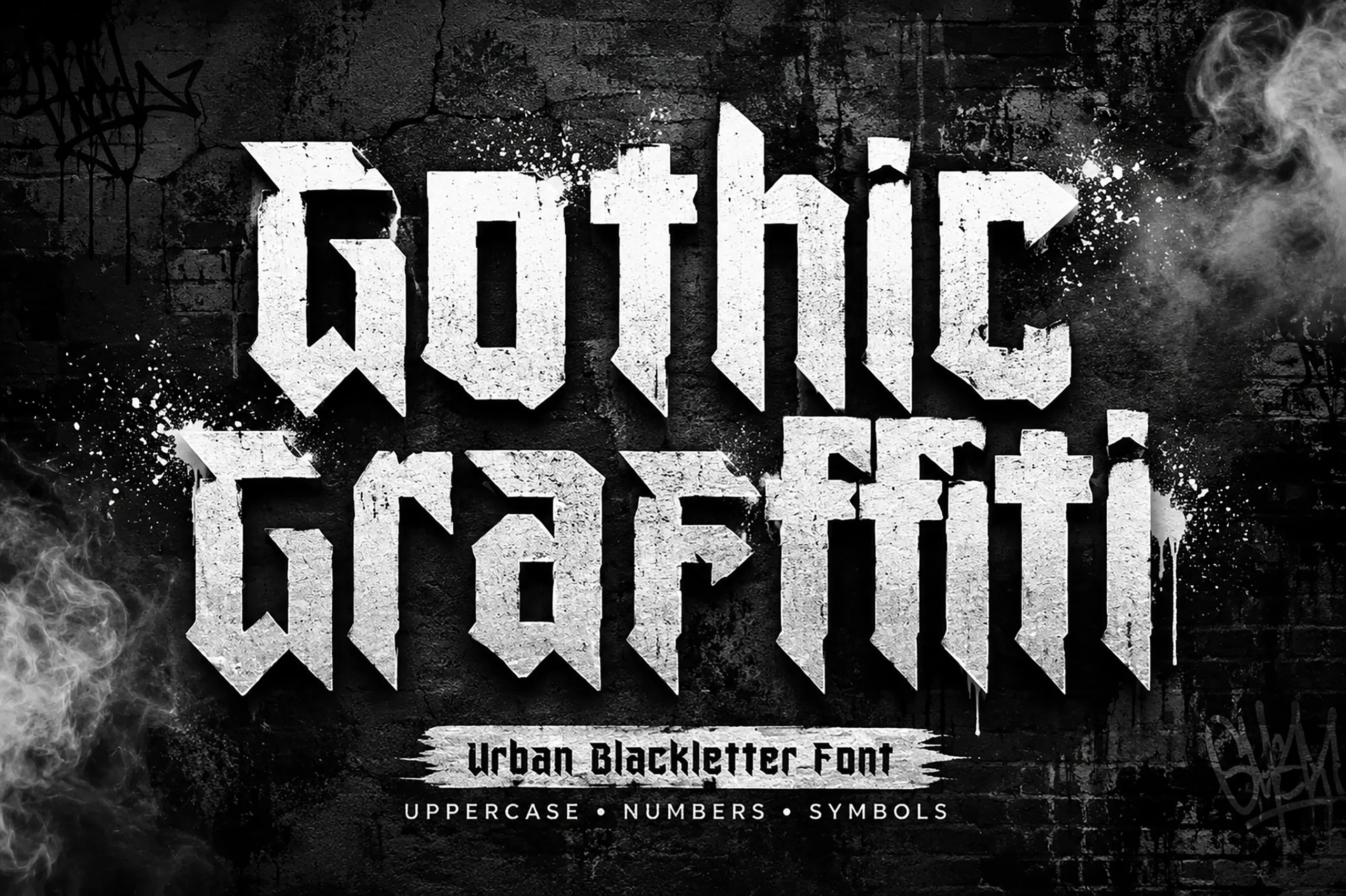
Best For: wall art, modern designs, clean designs
Gothic Graffiti Font bridges clean contemporary construction and period-inspired display character. It can suit modern wall art as well as restrained clean layouts, provided the wording stays short enough for its substantial letterforms to remain easy to assess.
Mournveil Font
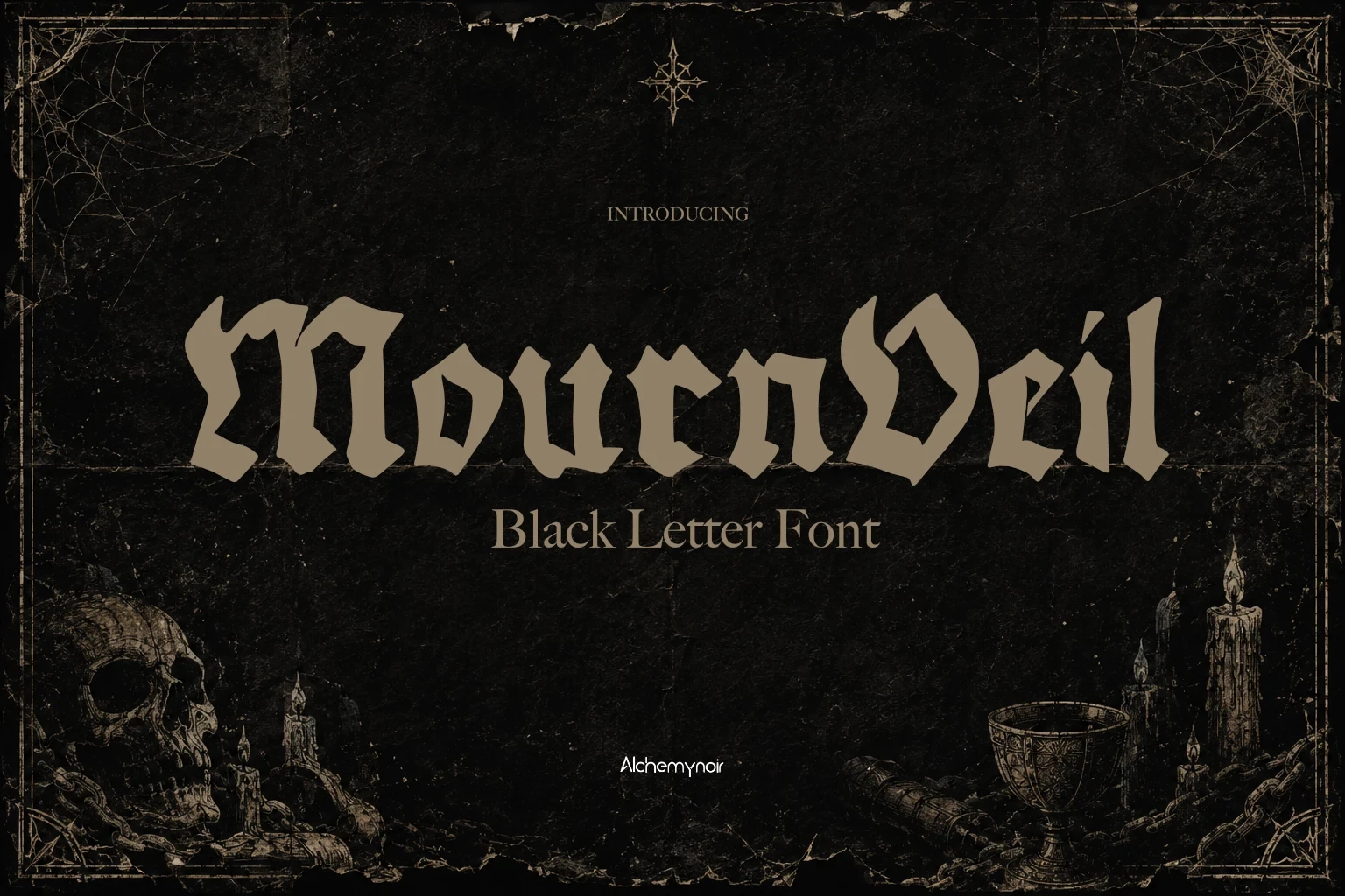
Best For: logos, posters, social media graphics
Mournveil Font gives logos, posters, and social graphics a compact graphic role through distinctive display letterforms and clear rhythm. Its character is better concentrated in short messaging, where the shapes can lead the composition without reducing reading speed.
Antifight Font

Best For: logos, display text, clean designs
Antifight Font sharpens period character through clean contemporary construction without relying on connected lettering. That makes it useful for logos and clean display layouts where you want a historic direction but need separate letterforms for straightforward arrangement.
Bloodforge Gothic Font

Best For: display text, bold designs, romantic designs
Bloodforge Gothic Font makes its display role clear through substantial weight and a steady stroke rhythm. Its romantic tone is best concentrated in short titles, labels, and other bold design elements where the expressive forms remain easy to read.
Golyath Font

Best For: logos, branding, posters
Golyath Font balances refined slender strokes with a bold period-inspired display build. It suits logos, branding, posters, and other Cool Gothic Fonts applications where the letterforms need presence without losing fine detail; supplied TTF and OTF formats add workflow flexibility.
Kingsbridge Font

Best For: creative projects, display text, classic designs
Kingsbridge Font balances bold period-inspired forms with refined slender strokes. It suits elegant or classic display work, especially logos and short creative titles where its expressive construction can remain visible rather than being reduced to small reading text.
Flowing Gothic Scripts
These flowing options are defined by connected joins and handwritten movement, with weights ranging from light to heavy. They bring continuity and personality that the separate-letter display faces and serif styles do not.
Nightforge Gothic Font
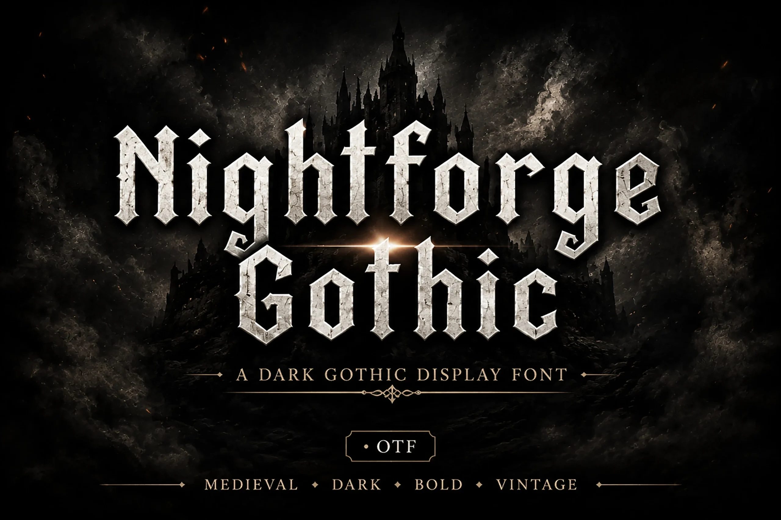
Best For: logos, branding, display text
Nightforge Gothic Font uses connected letterforms to create handwritten movement, supported by a substantial display weight. That combination makes it useful for logos and short branding phrases, while longer copy could obscure the joins that define its character.
Underdove Font

Best For: branding, packaging, posters
Underdove Font joins connected, flowing forms to substantial display weight, keeping short phrases readable in packaging and posters. Its linked construction carries more visual movement than separate-letter faces, but it is better reserved for concise wording.
Divaro Gothic Font

Best For: wall art, display text, old-school designs
Soft joins and period-inspired movement define Divaro Gothic Font. Its connected construction suits wall art and short titles, where the old-school display character can remain legible and the joins can be appreciated without the demands of extended reading.
Nocturne Black Font
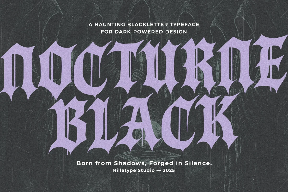
Best For: invitations, branding, display text
Nocturne Black Font takes a lighter approach to connected lettering, using slender strokes for a more restrained display presence. It fits invitations and branding better than heavy poster work, especially when short wording allows its linked forms to remain clear.
Ebon Crest Font

Best For: display text, classic designs, bold designs
Ebon Crest Font combines bold joined lettering with period display character, giving short headings and expressive phrases continuous movement. It belongs among Cool Gothic Fonts for compact applications, where the heavier script treatment stays readable without becoming crowded.
Crownspires Font

Best For: display text, professional designs, expressive designs
Crownspires Font supports connected movement with substantial weight and clearly formed display letters. The heavier script treatment can carry short professional or expressive titles, giving Cool Gothic Fonts a joined alternative to separate-letter display faces.
Mozathia Font

Best For: display text, elegant designs, luxury designs
Mozathia Font uses light connected strokes and period-inspired character for short expressive or luxury-oriented text. Its refined movement is less suited to dense wording, but it can add a controlled nostalgic note when the phrase remains compact.
Ironcrest Gothic Font
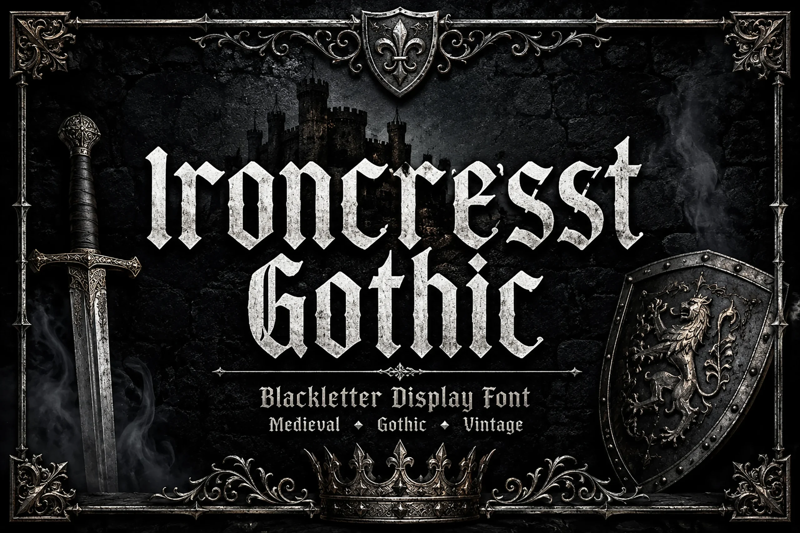
Best For: display text, bold designs, expressive designs
Ironcrest Gothic Font uses connected heavy lettering to create a dense, continuous display presence. Short phrases are the best fit because the joins remain easier to follow, allowing its expressive character to support compact graphics without overwhelming the message.
Period Gothic Serifs
Period Gothic Fonts in this group use serif structures to combine historic character with display weight. Their sharper construction separates them from connected scripts and from cleaner non-serif display lettering.
Drachenveil Font

Best For: display text, classic designs, bold designs
Drachenveil Font combines a substantial display serif structure with period character. Its expressive serif detail gives headings a strong identity, but short wording is the safer choice because continuous text would leave less room for the construction to breathe.
Break Roman Font

Best For: display text, modern designs, clean designs
Break Roman Font pairs heavy display serif forms with clean contemporary construction. It suits short bold designs that need serif definition, but its substantial presence makes it more appropriate for headings and labels than reading-sized copy.
Grave Shade Font

Best For: logos, branding, posters
For logos and posters that need historic and current signals together, Grave Shade Font combines period-inspired cues with a heavy contemporary display serif structure. Its substantial forms work best in short wording, where the contrast remains readable and intentional.
Beltina Font

Best For: classic designs, vintage designs, display text
For period-led Cool Gothic Fonts, Beltina Font supplies nostalgic display character with distinctive letterforms and a clear stroke rhythm. Short wording works best, particularly in classic or vintage treatments where the historical direction should remain readable rather than overly dense.
How to Choose the Right Font
Choose Cool Gothic Fonts by starting with construction: separate-letter displays offer clearer arrangement, connected scripts add movement, and serif styles reinforce period character. Compare weight and joins at the intended size, reserve the most detailed faces for short wording, and test swashes, PUA glyphs, or file formats in your actual design workflow before committing.