19 Best Cool Display Fonts in 2026
Cool Display Fonts range from heavy geometric faces and display serifs to connected scripts, rounded playful forms, and brush-like lettering. Together, they serve headlines, logos, packaging, posters, invitations, social graphics, and other short-format designs where construction and personality matter more than continuous reading.
Looking for more cool fonts? Browse our complete Cool Fonts collection to compare bold, vintage, retro, script, and gothic cool styles.

Cool Display Fonts
Cool Display Fonts in this group emphasize strong blocks, geometric structure, alternate treatments, or serif contrast. They feel more assertive and poster-ready than the connected scripts and playful period styles.
Cooldown Font

Best For: headlines, creative projects, display text
Cooldown Font presents one wide geometric face in solid, outlined, and textured-outline treatments. Heavy strokes, squared terminals with rounded corners, and a large x-height make it effective for Cool Display Fonts headlines; enlarge the textured version when clean reading matters.
Propaganda Font

Best For: posters, display text, expressive designs, magazine covers
Propaganda Font is built for poster-oriented impact, with distinctive display shapes and a readable stroke rhythm in short wording. Among Cool Display Fonts, it is most convincing on brief statements, magazine covers, titles, and other layouts where the lettering carries the message.
Industrial Font

Best For: logos, display text, bold designs, expressive designs
Industrial Font reads as a strong visual block because of its substantial display weight and distinctive letterforms. It is an effective Cool Display Fonts option for logos and assertive titles, but its role is emphasis rather than continuous text.
Ridge 5 Bold Font

Best For: social media graphics, display text, wall art, bold designs
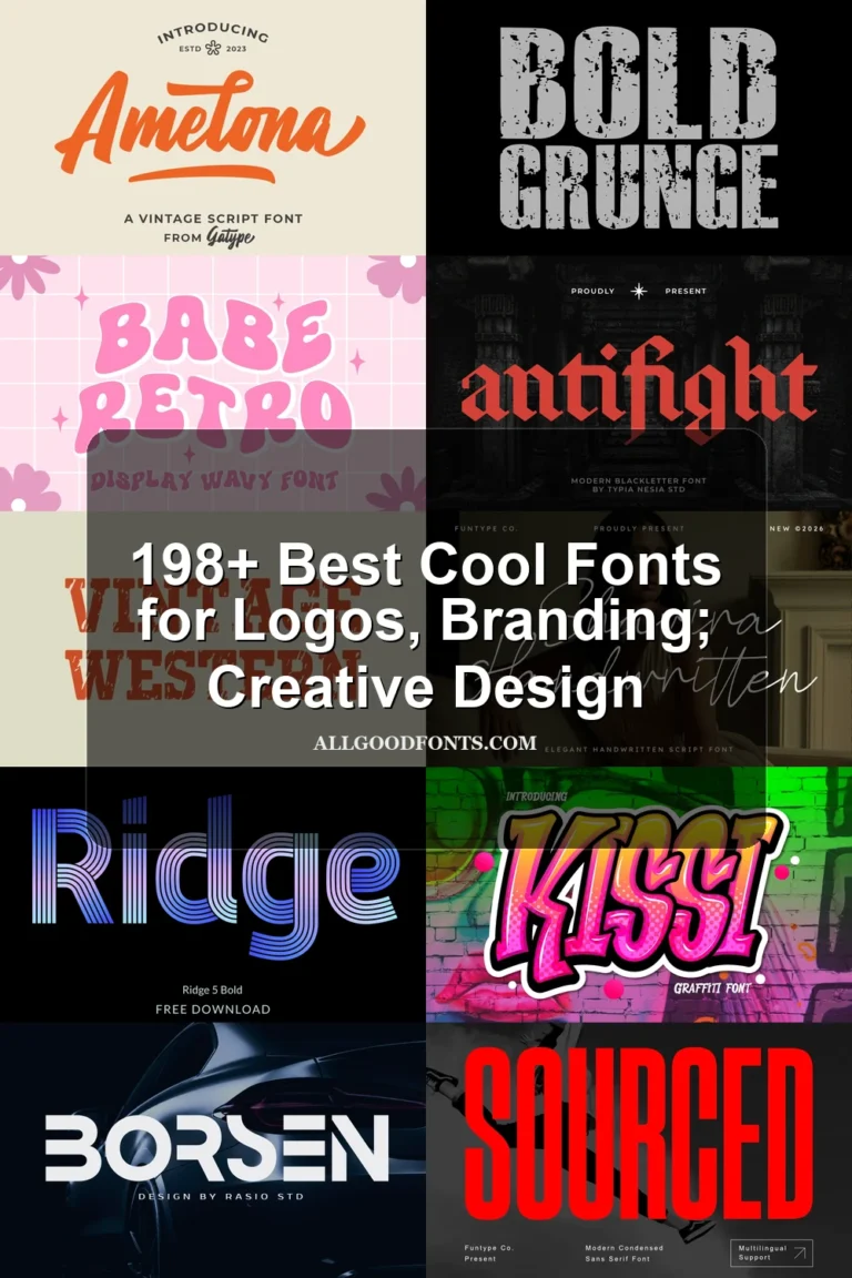
Ridge 5 Bold Font combines substantial weight with alternate characters, giving repeated lettering controlled variation. Those extra forms are especially useful in Cool Display Fonts work for social graphics and wall art, where a bold structure can benefit from small changes.
Zero Hour Font

Best For: display text, expressive designs, decorative designs, elegant designs
Zero Hour Font separates itself from other Cool Display Fonts through a display serif structure rather than script or sans-led construction. Its expressive forms suit decorative titles, while short wording helps preserve clarity in logos, covers, and other prominent placements.
Connected Script Displays
These connected scripts are defined by visible joins and flowing movement, ranging from heavy cursive presence to slender contemporary strokes. They suit names and brief phrases rather than information-heavy layouts.
Gient Font
Best For: display text, modern designs, playful designs
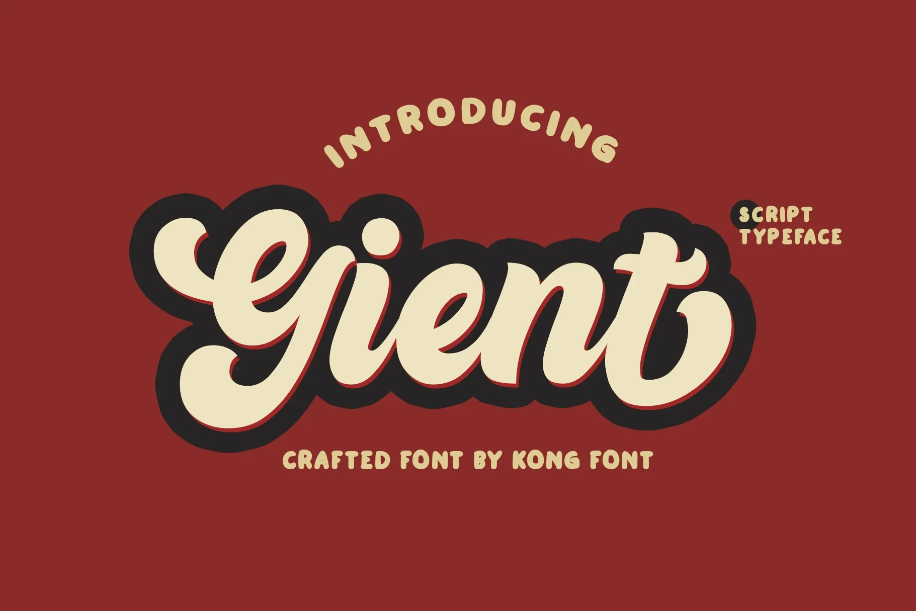
Gient Font combines a heavy connected script with a rounded sans-serif support style, creating a retro, casual pairing. Its thick joins remain legible in large Cool Display Fonts layouts, though small text can lose clarity. Use it for display text, modern designs, or playful designs.
Luxodia Signature Font

Best For: logos, branding, packaging, creative projects
Luxodia Signature Font uses slender, softly joined movement and a clean contemporary construction. Its light strokes give logos and packaging a refined presence, while short wording keeps the connected forms visible and readable.
Bukhari Script Font

Best For: display text, bold designs, expressive designs, website headers
Bukhari Script Font gives cursive lettering substantial display weight, so its flowing joins hold their presence in headers and expressive titles. The bold construction is a stronger choice than a light script when the wording needs to remain visible at a larger scale.
Milkshake Font
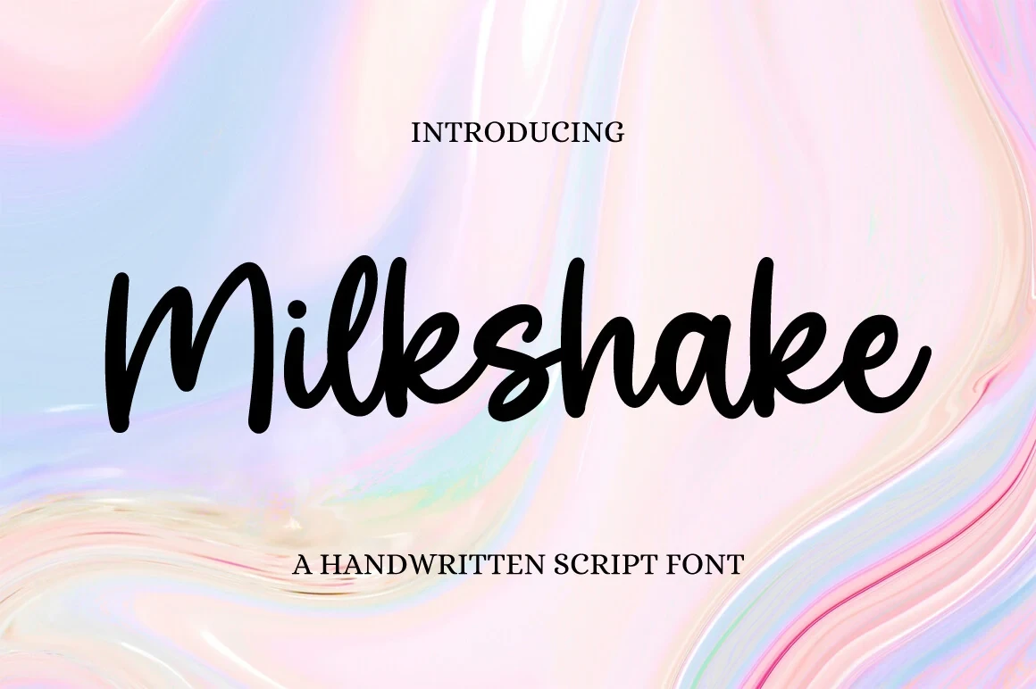
Best For: invitations, social media graphics, eye-catching designs, display text
Milkshake Font brings slender connected movement to invitations, social graphics, and short display wording. Its lighter strokes favor names and concise phrases, allowing the joins to remain visible without the heavier presence of a substantial cursive.
Playful And Period Displays
Rounded, period-inspired, and child-focused forms give this group its approachable display character. Compared with the scripts, these faces rely on shaped individual letters and clear rhythm rather than continuous connection.
Happy Summer Font
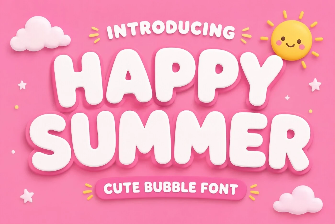
Best For: social media graphics, branding, packaging, invitations
Happy Summer Font is suited to headings, names, and short phrases where rounded, playful letterforms can remain easy to compare. Its clear stroke rhythm gives the display face an expressive identity without relying on connected forms, making it useful for social media graphics, branding, and packaging.
Sugar Peachy Font
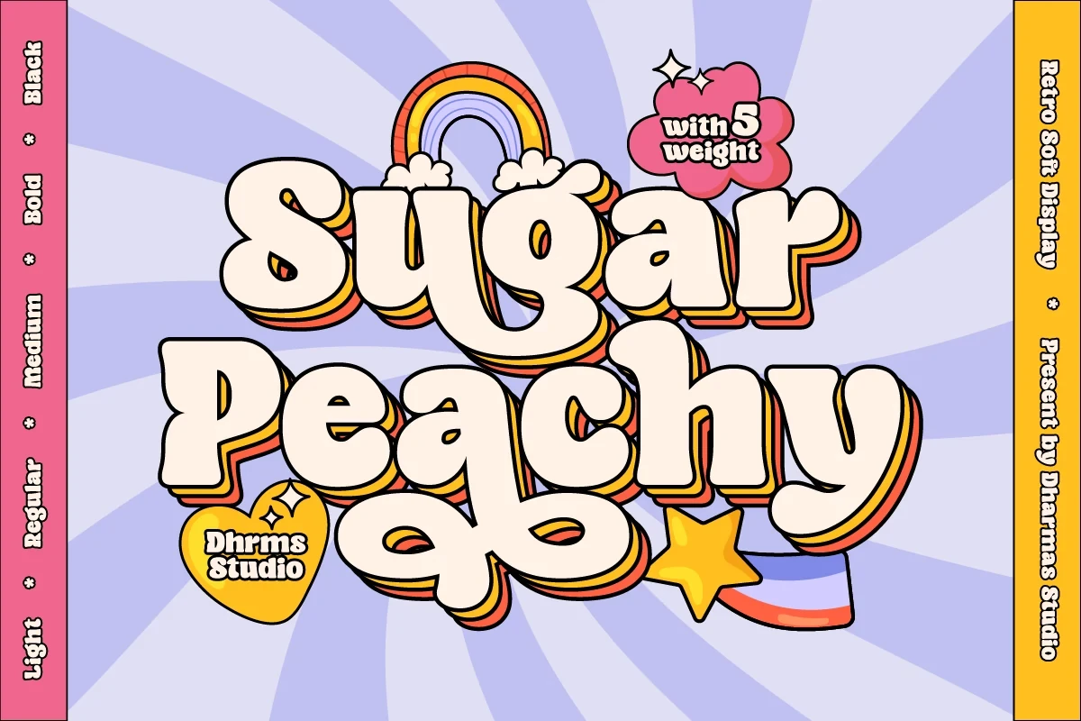
Best For: logos, website headers, display text, soft designs
Sugar Peachy Font brings a period-inspired character to display lettering, establishing a soft nostalgic direction without requiring much text. Use it for logos, website headers, and short titles when the mood should be expressive but approachable.
Folgore Font

Best For: display text, playful designs, expressive designs, fun designs
Folgore Font uses rounded, playful forms and a clear stroke rhythm to create an approachable display personality. Its expressive shapes are easiest to compare in short phrases, making it a practical choice for social graphics, branding moments, and other playful designs.
Super Magic Font

Best For: children’s designs, display text, playful designs, bold designs
Super Magic Font pairs bold weight with rounded, playful forms, giving it a clear child-focused display role. Keep the wording short and energetic so the expressive shapes stay readable and the face does not lose its appeal in restrained or formal applications.
Baltic Beach Font

Best For: display text, expressive designs, decorative designs, minimal designs
Baltic Beach Font can move between expressive and pared-back compositions, provided the wording stays visually simple. Its display letterforms are better suited to brief titles than dense copy, where their character would have less room to register clearly.
Expressive Statement Displays
This expressive group covers distinctive, slender, cutout, and brush-influenced lettering. Its members make short titles or identity-led graphics the visual focus, with less emphasis on supporting long-form copy.
Order Font

Best For: display text, expressive designs, product labels, social media graphics
Order Font builds its expressive effect through distinctive display letterforms and an even stroke rhythm. It works more naturally on product labels, social graphics, and short titles than in extended copy, where the character of the shapes would compete with sustained reading.
Together Font
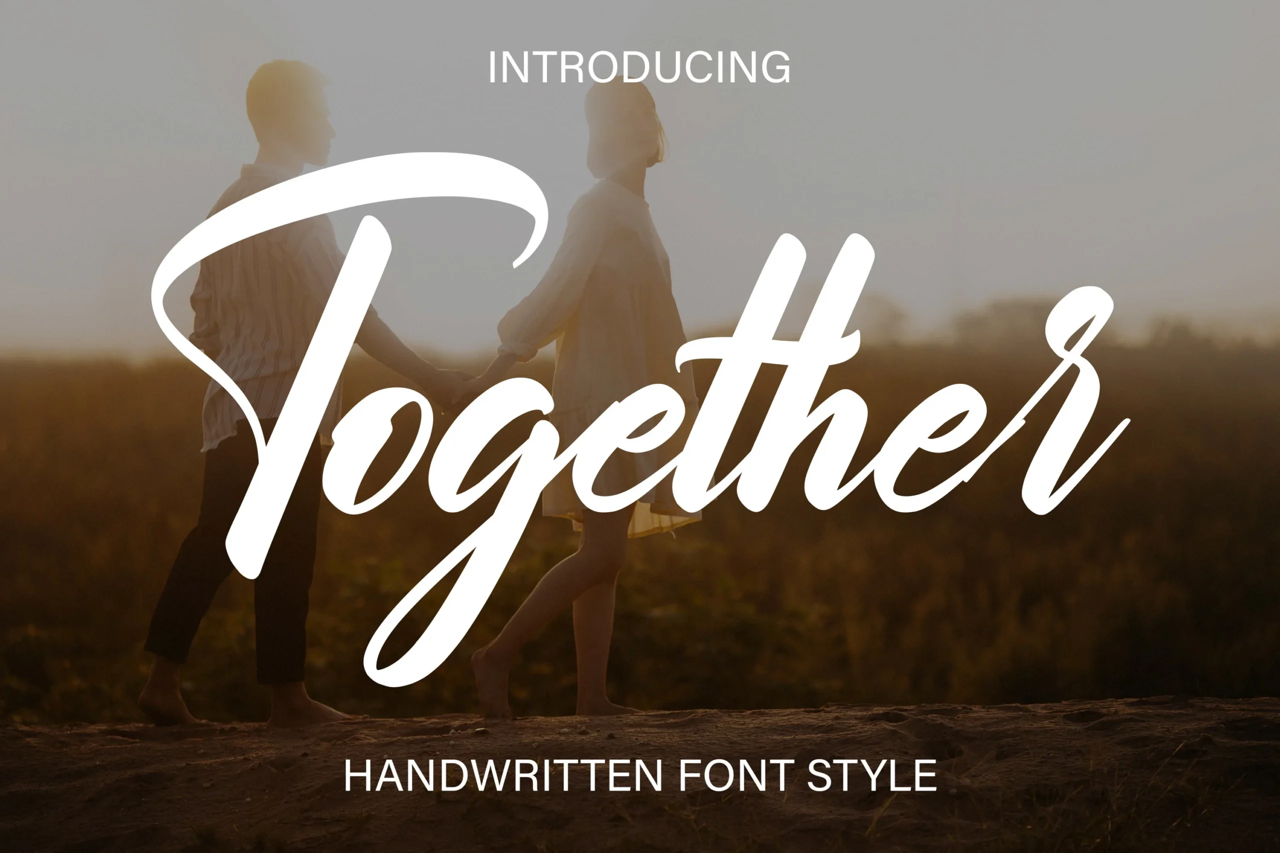
Best For: logos, branding, invitations, display text
Together Font is best for identity-led wording: logos, invitations, branding, and other short compositions. Its distinctive forms and clear stroke rhythm create a recognizable display presence, but the evidence favors brief branded text over paragraphs or layouts packed with information.
Notress Font
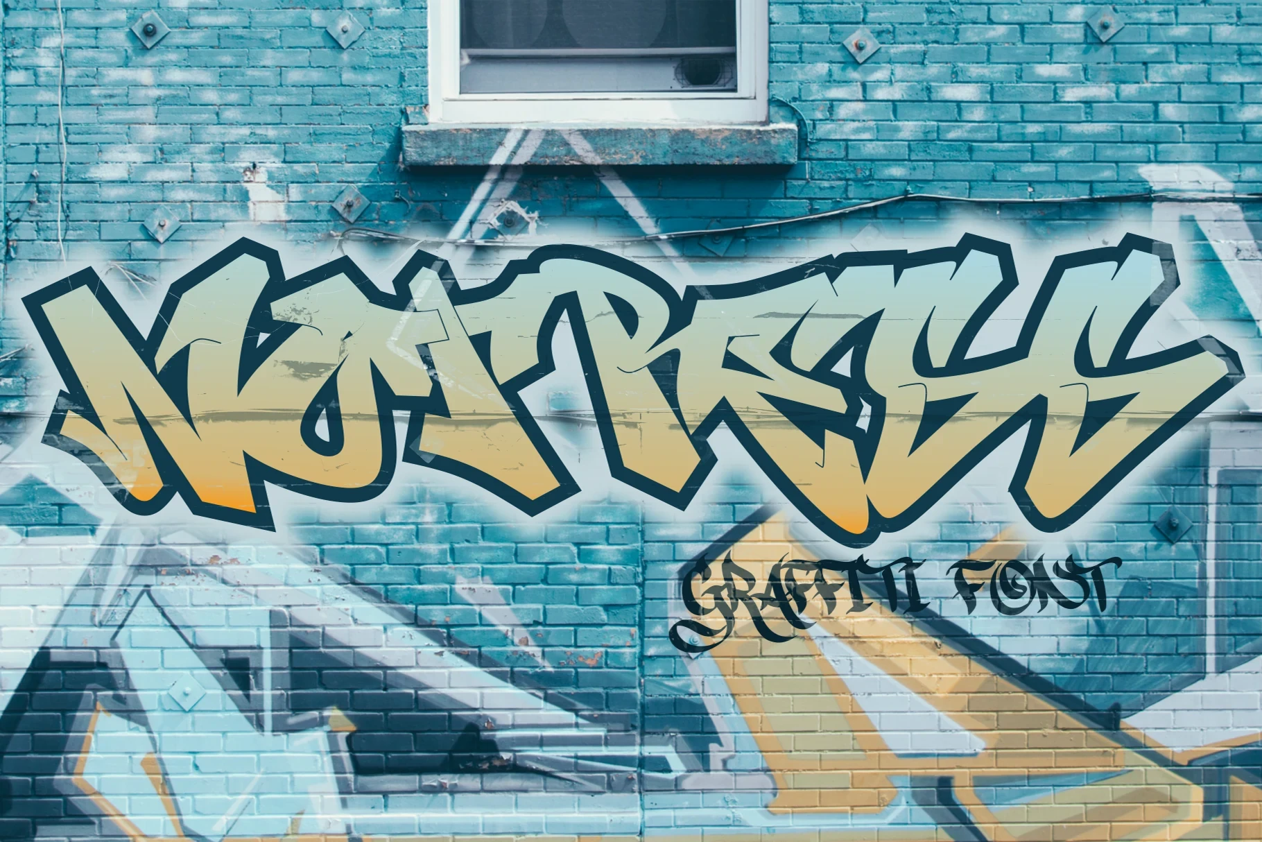
Best For: T-shirts, logos, display text, wall art
Notress Font keeps a lighter visual footprint through refined slender strokes and distinctive display forms. It suits wall art, logos, and short phrases where restraint can remain legible without making the lettering disappear.
Cut out Font

Best For: display text, expressive designs, modern designs, minimal designs
Cut out Font supports short expressive titles through distinctive shapes and a clear stroke rhythm. Its clean, modern presentation is strongest when the lettering remains the main feature, making it appropriate for display text, modern designs, and pared-back compositions.
Gendry Font

Best For: display text, expressive designs, luxury designs, premium designs
Gendry Font uses a brush-like stroke rhythm to give Cool Display Fonts a premium, expressive edge. It can carry luxury-oriented titles and branding, but short display text is the safest scale for preserving its intended impact and keeping the forms readable.
How to Choose the Right Font
Choose by construction first: heavy geometric and bold faces hold up best in large headlines, while slender or connected scripts need short wording and generous scale. Use alternates when repetition needs variation, and reserve textured outlines or highly expressive forms for prominent placements. For reliable Cool Display Fonts selection, compare the joins, stroke weight, contrast, and reading distance before committing.