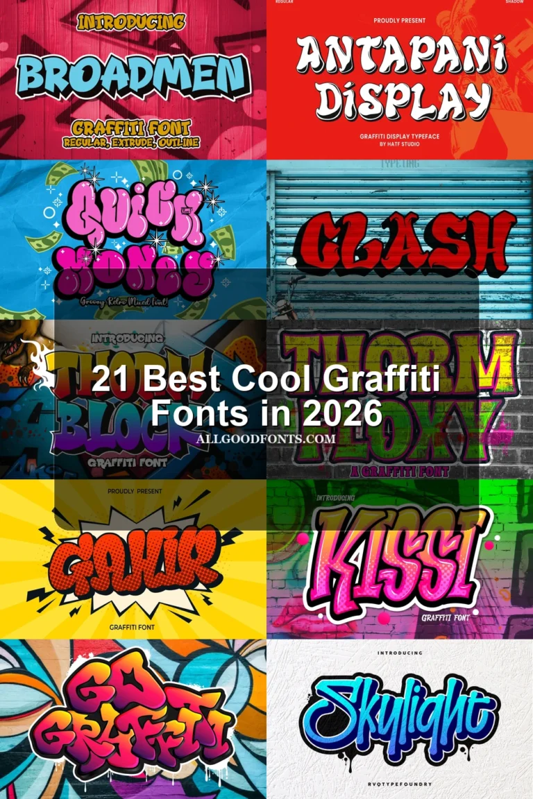
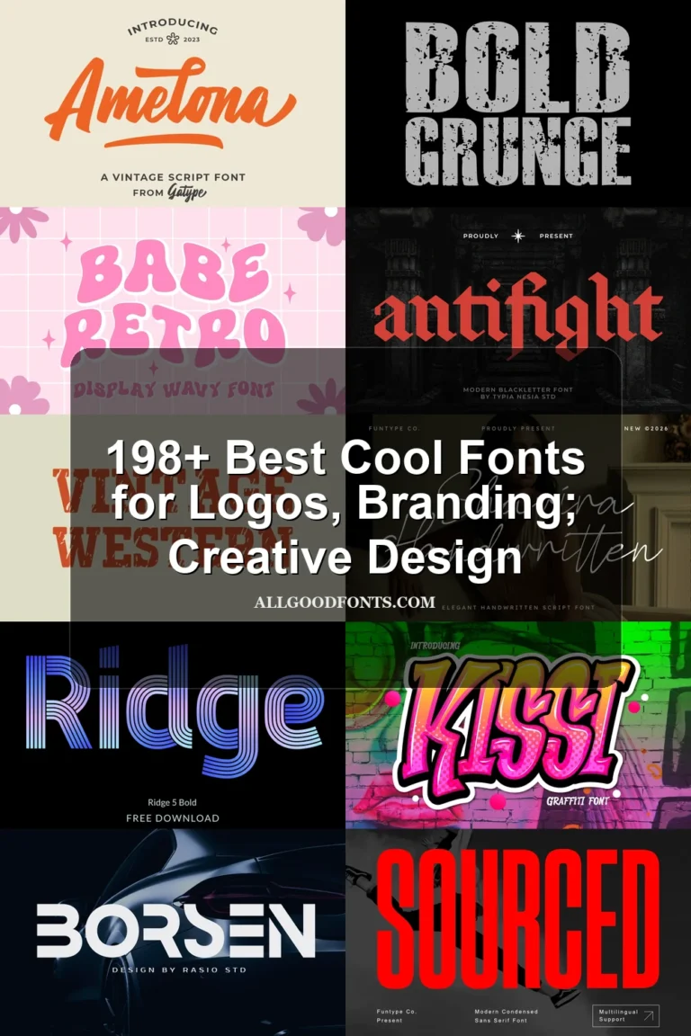
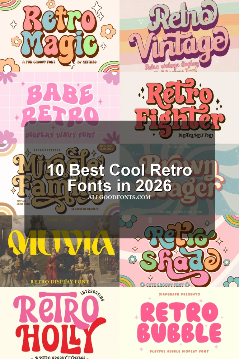
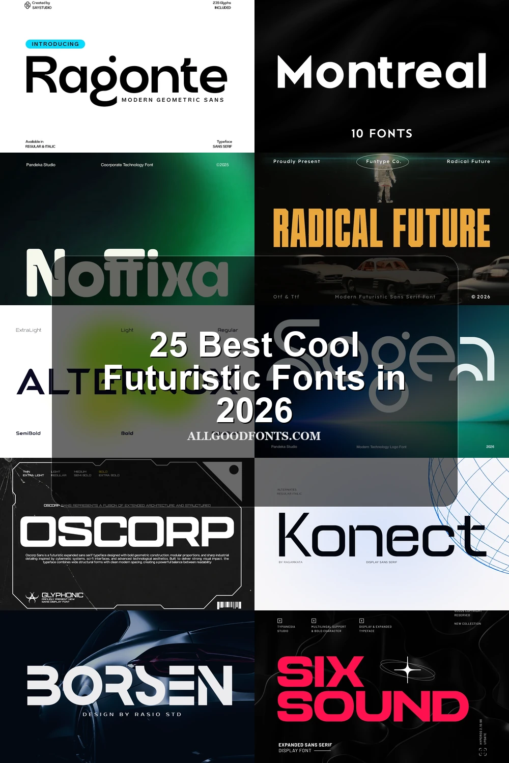
25 Best Cool Futuristic Fonts in 2026
Cool Futuristic Fonts span heavy serif displays, slender headline styles, and expressive letterforms with visible stroke rhythm, alternate characters, and contemporary construction. This collection is geared toward logos, branding, posters, social graphics, covers, labels, and other short-form design work where shape and readability must work together.
Looking for more cool fonts? Browse our complete Cool Fonts collection to compare bold, vintage, retro, script, and gothic cool styles.
Cool Futuristic Fonts: Bold Display Forms
Cool Futuristic Fonts in this group rely on substantial serif weight, clear stroke rhythm, and compact silhouettes. They read more forcefully than the lighter or more expressive categories, making them suited to short headlines and branding.
Radical Future Font
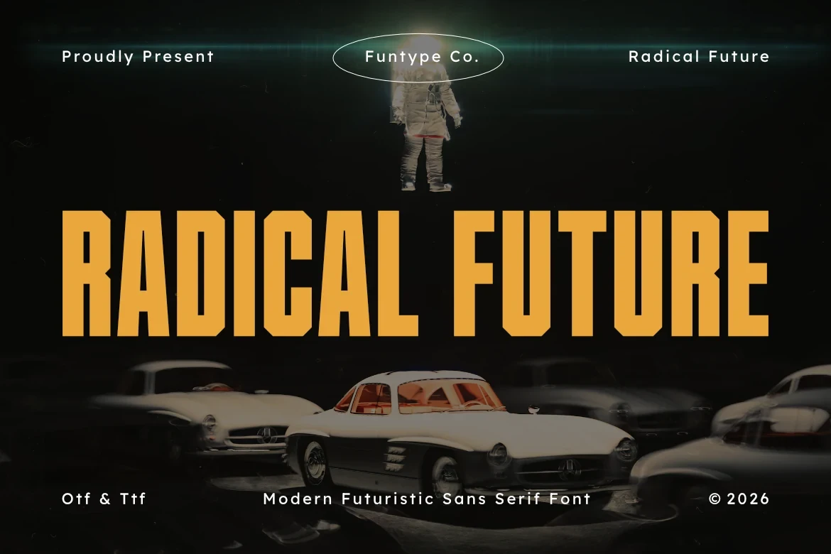
Best For: branding, posters, fashion branding
Radical Future Font pairs bold display mass with refined slender strokes, creating contrast between substantial forms and finer details. That balance suits fashion branding, posters, and headlines, while the display-focused build is better reserved for shorter wording.
Six Sound Font

Best For: logos, branding, high-end designs
Six Sound Font expands its substantial display serif build with ligatures, stylistic alternates, and multilingual support. These options give logos and branding more control over repeated letter combinations, while its heavy construction keeps compact wording more legible than long text.
Moderna Font
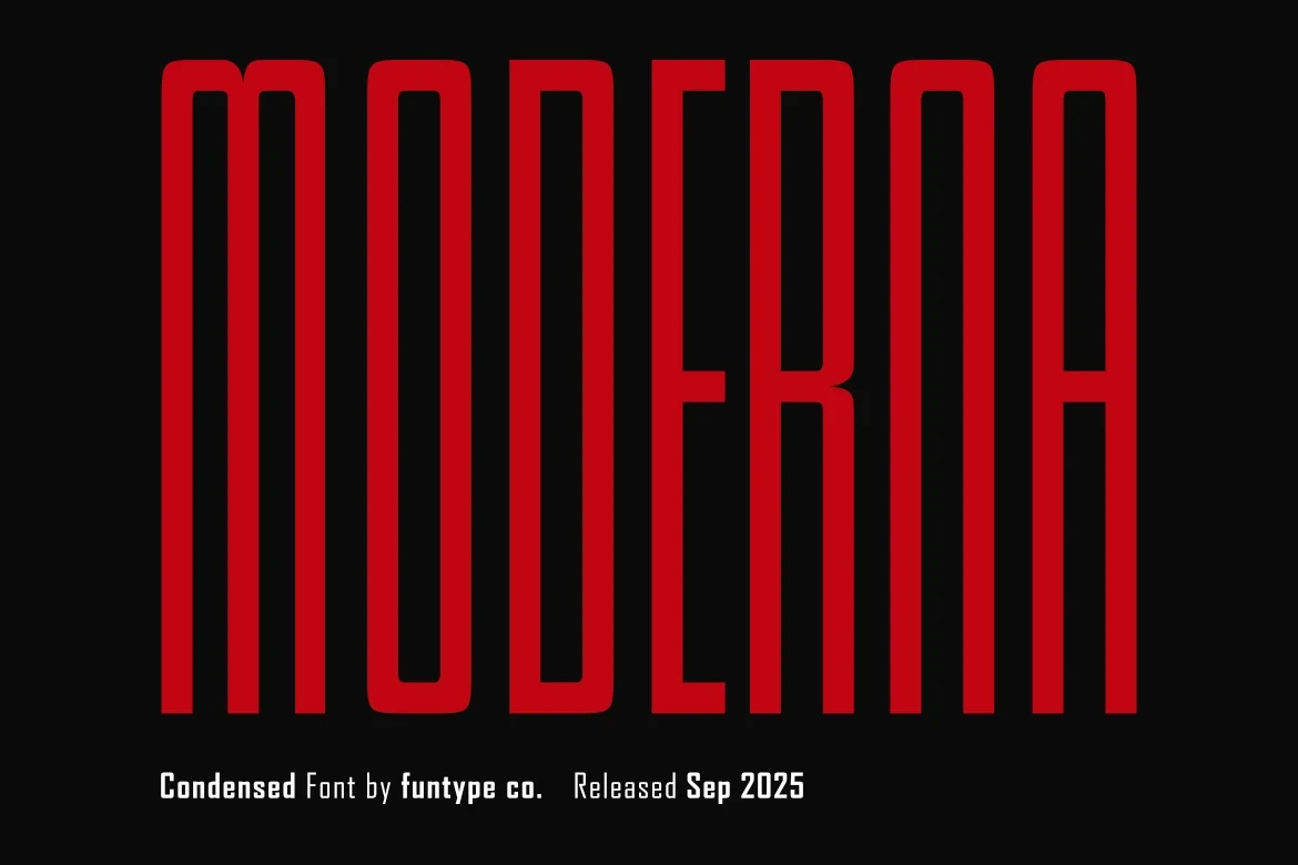
Best For: branding, headlines, social media graphics
Moderna Font gives bold serif forms a clear stroke rhythm and a clean contemporary structure. Its dense silhouette is most effective in headlines, branding, posters, and social graphics, where short wording allows the letter shapes to remain distinct.
Andox Font

Best For: branding, headlines, magazine covers
Andox Font combines a substantial contemporary serif build with ligature support, allowing joined forms to influence branding and magazine-cover lettering. Its heavy display treatment favors short titles, where the added joining options can be seen without overcrowding the composition.
Oscorp Font
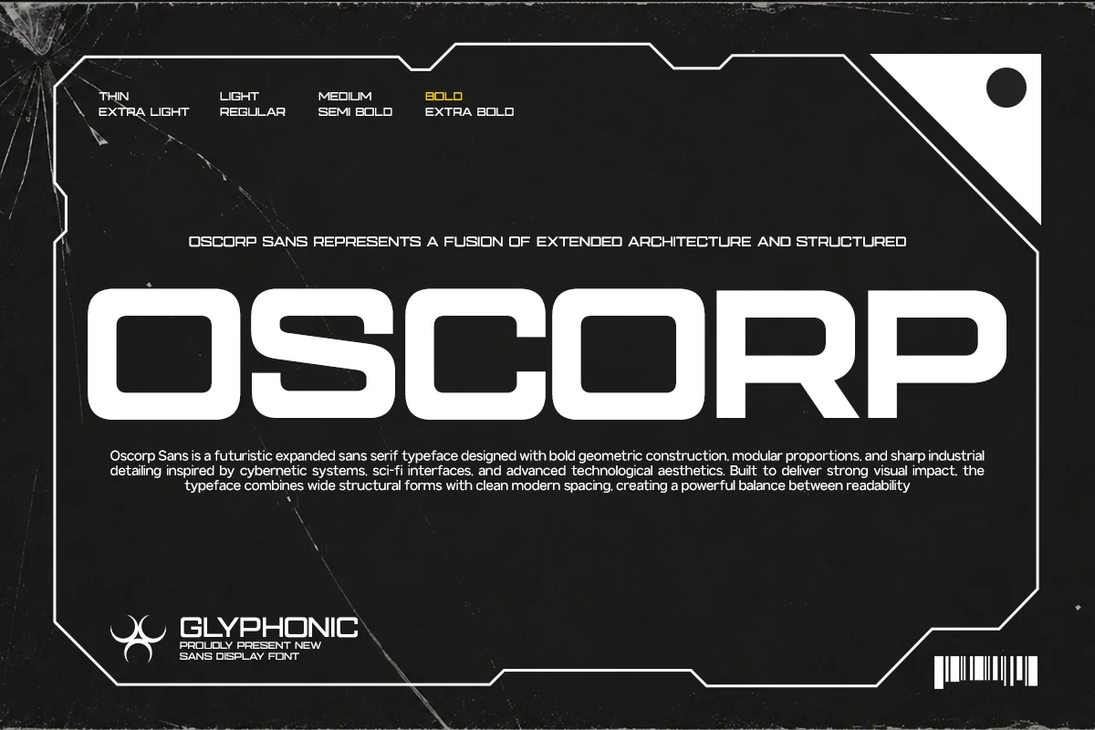
Best For: display text, modern designs, bold designs
Oscorp Font uses heavy display construction and a consistent contemporary rhythm. The weight remains clearest in short display text and bold design treatments, while compact layouts help preserve the distinction between its substantial forms and finer internal details.
Noffixa Font

Best For: branding, display text, clean designs
Noffixa Font organizes bold letterforms around a clear serif stroke rhythm and clean contemporary construction. Its visual density supports branding and display text, but short applications will keep the structure more readable than extended or information-heavy copy.
Fesibel Font

Best For: branding, headlines, social media graphics
Fesibel Font uses bold display construction to establish immediate headline presence. Its substantial weight fits branding, headlines, and social graphics, while short wording will preserve the recognition of its distinctive forms and keep layouts from feeling overcrowded.
Ragonte Font

Best For: branding, display text, clean designs
Ragonte Font combines bold weight with clean serif display construction and a consistent stroke rhythm. The result gives branding and short display phrases a firm silhouette, while longer wording is less clearly supported by its dense treatment.
Konect – Futuristic Tech Sans Serif Font
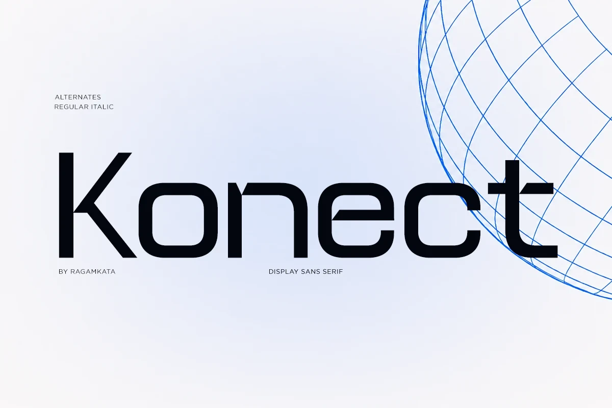
Best For: display text, modern designs, bold designs
Konect – Futuristic Tech Sans Serif Font brings substantial display structure, geometric letterforms, clean curves, and sharp contemporary details, with AI format availability documented. Within Cool Futuristic Fonts, it suits brief graphic text for digital brands, gaming, AI, and technology-led projects.
Prospect Font
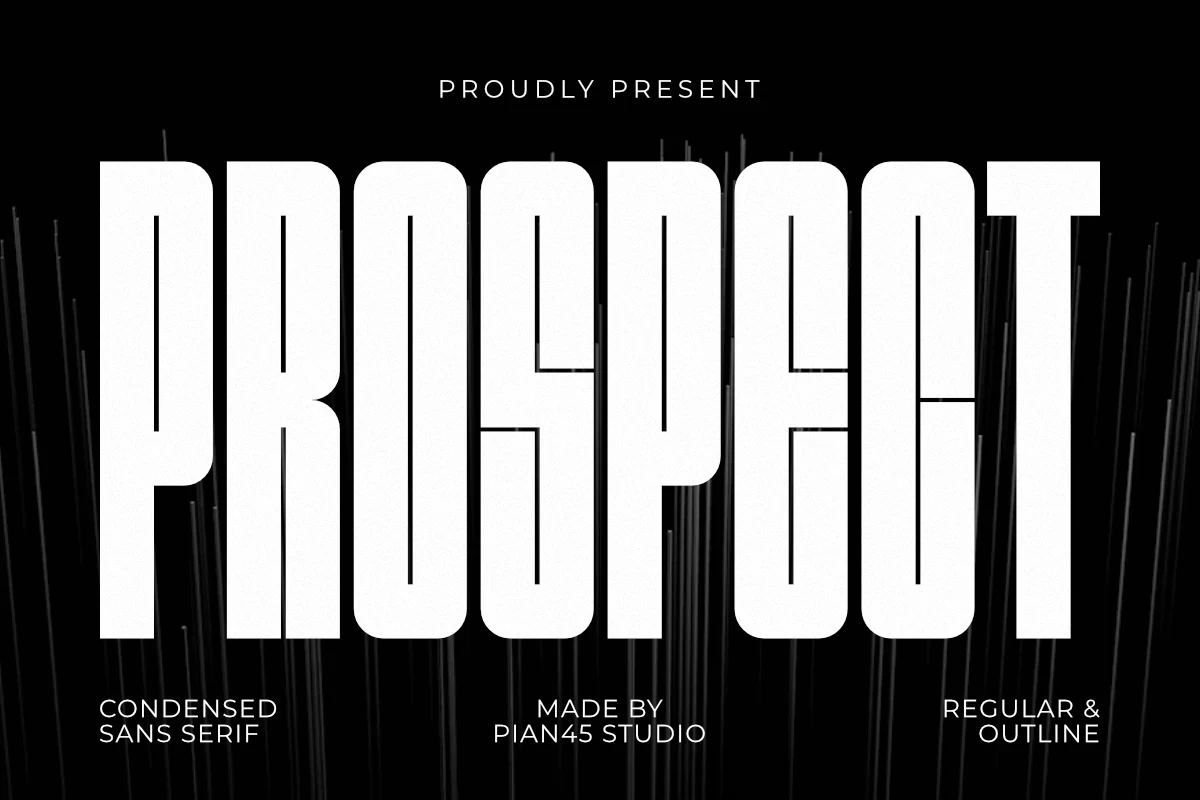
Best For: logos, branding, headlines
Prospect Font gives logos and headlines a substantial serif display weight supported by clear stroke rhythm. Short wording will hold together most effectively, while the heavy treatment may dominate smaller applications or tightly packed layouts.
Movark Font

Best For: display text, modern designs, bold designs
Movark Font uses a bold contemporary serif rhythm for compact display statements. It fits posters and modern design layouts, with short phrases preserving the clarity of its letterforms better than dense blocks of information.
Prime Font
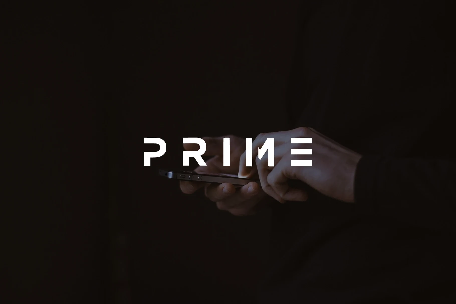
Best For: display text, modern designs, bold designs
Prime Font prioritizes immediate shape recognition through heavy display treatment and clean contemporary construction. It is best suited to bold designs and short display text, where its substantial forms remain legible without overwhelming surrounding information.
Fagor Font

Best For: branding, logos, display text
Fagor Font combines boldness with refined slender stroke detail, creating internal contrast within logos and display text. Compact wording will help those shapes remain readable, especially where the heavier forms and finer lines appear together.
Light, Slender Display Forms
These light display forms use refined slender strokes for a smaller visual footprint. Compared with the bold group, they feel less dense; compared with the expressive group, their main distinction is controlled line weight.
Surfume Font

Best For: logos, product labels, book covers
Surfume Font uses light construction and refined slender strokes to create an elegant outline for logos, product labels, posters, and covers. Because fine details can weaken at small sizes, assess its readability at the final heading or print scale.
Oktural Font
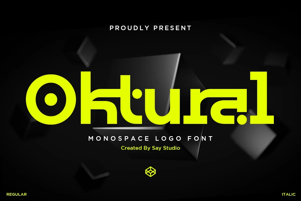
Best For: logos, branding, product labels
Oktural Font uses slender strokes for a lighter visual footprint within the display category. It can suit product labels, logos, and posters, although small sizes or lengthy wording may reduce the clarity gained from its fine construction.
Montreal Font

Best For: display text, modern designs, expressive designs
Montreal Font uses a light display treatment built around refined slender strokes. Its expressive profile suits headings and clean designs, but the fine construction should be checked at the final output size to confirm that details remain readable.
Expressive Display Letterforms
Expressive display letterforms combine clean construction with distinctive shapes, varied weight documentation, and occasional glyph extras. They offer more personality than the restrained light styles, but demand careful testing at the intended display size.
Futuristic Font

Best For: display text, modern designs
Futuristic Font uses clean contemporary construction, a clear stroke rhythm, and an expressive serif display profile. Its shapes are best judged in headings, names, and short phrases, where the letterforms can remain readable and easy to compare.
Rodsak Font

Best For: logos, branding, posters
Rodsak Font centers on distinctive display letterforms and a clear stroke rhythm without a specified weight. That makes it worth testing for logos, branding, and posters, with the intended size determining whether its expressive shapes remain comfortably readable.
Furion Font

Best For: display text, modern designs, expressive designs
Furion Font combines clean construction with expressive display shapes, giving Cool Futuristic Fonts a contemporary option for modern headings and creative marks. Readability is strongest in brief phrases, where its stroke rhythm can support the design without competing with too much text.
Gatecode Font
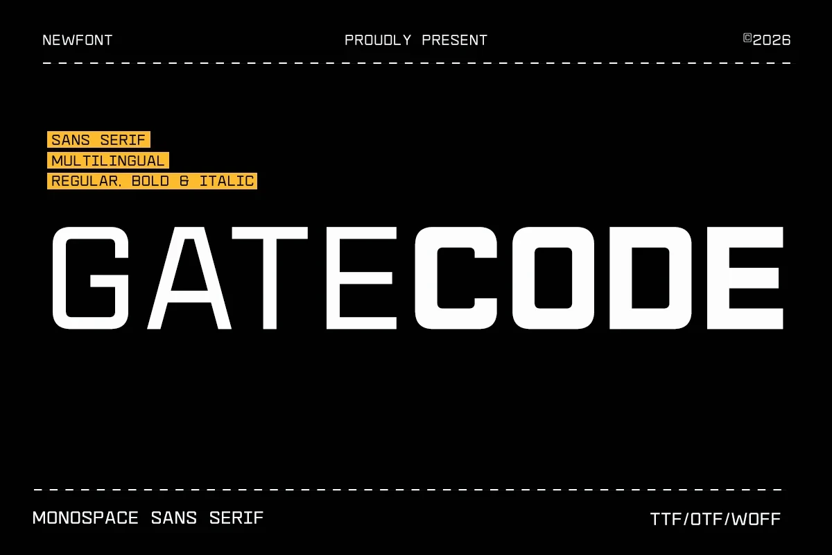
Best For: social media graphics, branding, posters
Gatecode Font is organized by a clear stroke rhythm that gives its expressive display letterforms graphic consistency. It can support posters, branding, and social graphics, but the available evidence points to short display use rather than paragraph setting.
Cenura Font

Best For: display text, modern designs, premium designs
Cenura Font presents contemporary serif display shapes with no specified weight, so short samples are important for judging its visual force. Its clean construction fits headings and modern designs, particularly when the wording is limited and carefully spaced.
Alternox Font
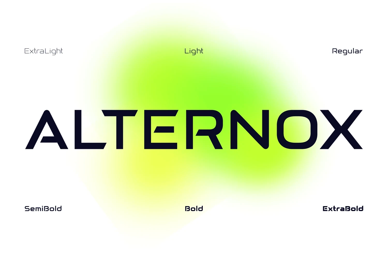
Best For: business cards, logos, display text
Alternox Font adds ligatures and PUA-encoded characters to its clean contemporary display construction. Those glyph options can help shape logos, business cards, and short display text, but PUA access may depend on compatible software or manual character insertion.
Borsen Font

Best For: logos, packaging, product labels
Borsen Font is defined primarily by distinctive display letterforms and a clear stroke rhythm, with no specified weight to guide expectations. Test it directly for logos, packaging, and labels, since the final size will determine its reading character.
Kariwa Font
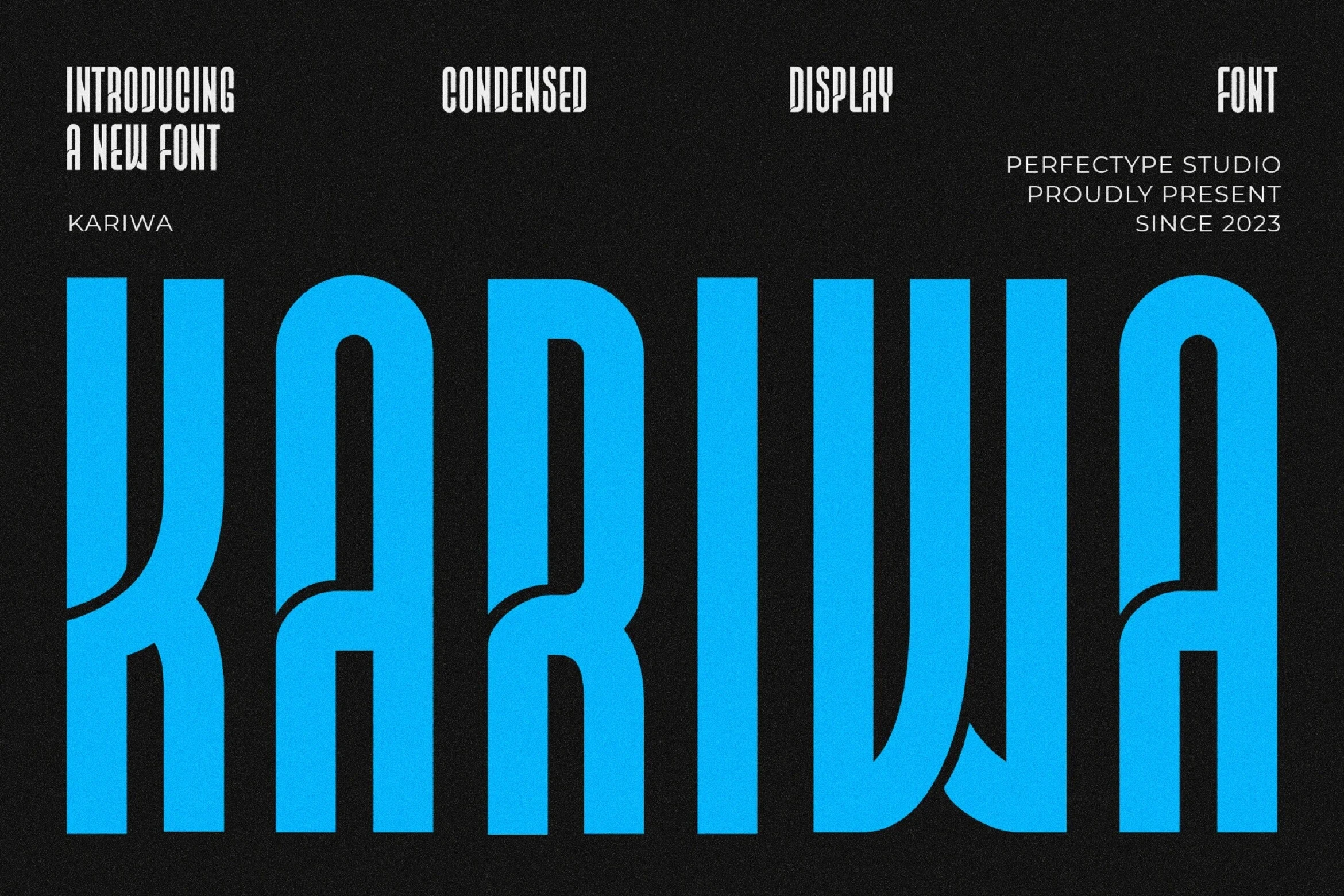
Best For: branding, website headers, posters
Kariwa Font brings contemporary display serif character to header-scale work. Its documented uses favor websites, posters, branding, and other brief applications rather than sustained reading, where its expressive letterforms can remain visible and controlled.
Sogea Font

Best For: branding, logos, display text
Sogea Font combines clean display construction with broad applicability for branding, logos, and short display text. Since its weight is unspecified, compare actual samples at the intended size before deciding how much visual force and readability the design provides.
How to Choose the Right Font
Choose among Cool Futuristic Fonts by first matching weight to scale: bold styles suit short headlines and logos, while light styles need enough size for their slender strokes to survive. Then compare serif rhythm, joins, ligatures, alternate characters, and actual sample readability before committing to a poster, label, website header, or brand mark.