15 Best Cool Vintage Fonts in 2026
This collection spans sturdy display serifs, lighter nostalgic lettering, orderly period-inspired forms, and connected scripts with flowing movement. These Cool Vintage Fonts are suited to logos, packaging, posters, invitations, names, and short headlines where construction and mood matter more than long-form readability.
Looking for more cool fonts? Browse our complete Cool Fonts collection to compare bold, vintage, retro, script, and gothic cool styles.

Cool Vintage Fonts: Bold Heritage Displays
Cool Vintage Fonts in this group use substantial weights, clear stroke rhythms, and serif-led construction to create strong signage, branding, poster, and packaging presence.
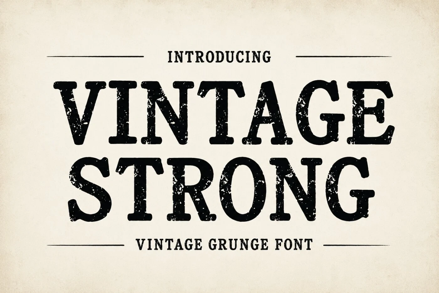
Vintage Strong Font
Best For: branding, display text, classic designs, bold designs
Vintage Strong Font brings substantial bold weight to a sturdy classic display serif profile. Among these Cool Vintage Fonts, it is a direct choice for branding and prominent headings, while its visual force makes it less suitable for quiet supporting text.
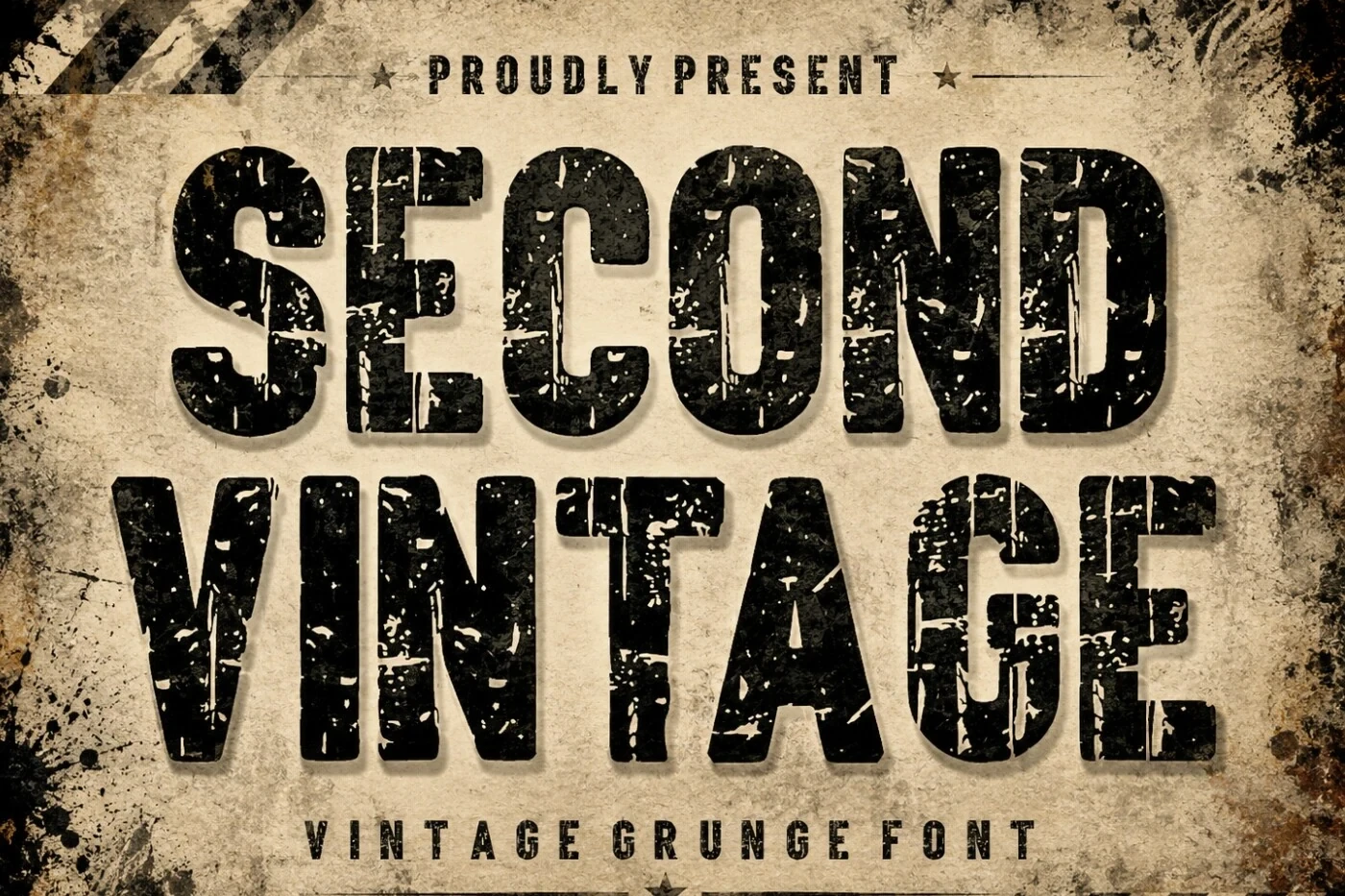
Second Vintage Font
Best For: signage, display text, classic designs, bold designs
For compact classic statements, Second Vintage Font combines bold display weight with a clear stroke rhythm and strong signage presence. Its substantial forms prioritize immediate visual impact, so short headings and marked words will work better than extended reading.
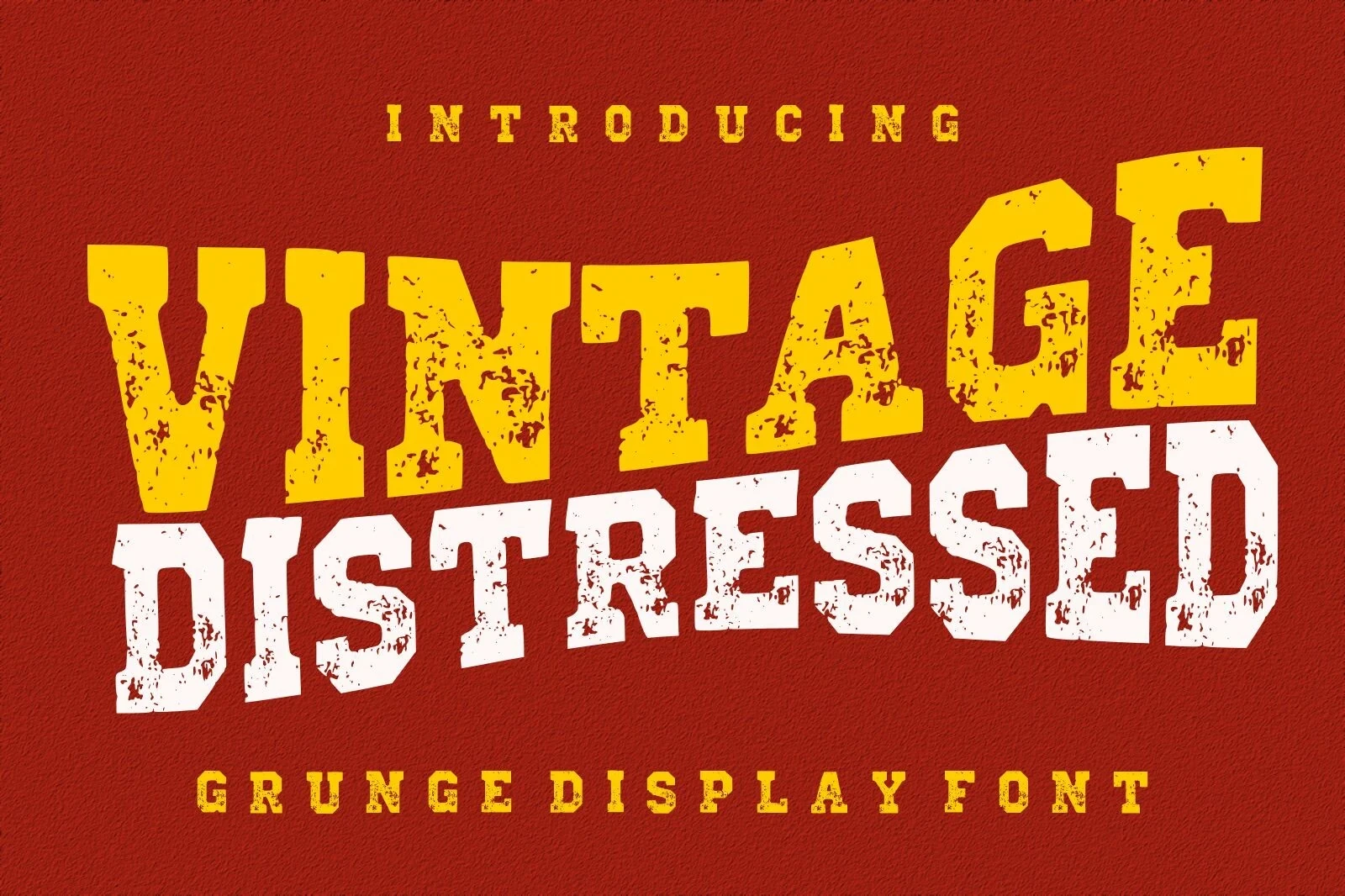
Vintage Distressed Font
Best For: logos, branding, packaging, posters
Vintage Distressed Font gives Cool Vintage Fonts a substantial, distressed-looking treatment suited to logos and packaging. Its heavy display construction can dominate a small composition, so use it as the main mark or title rather than for secondary information.
Vintage Western Font
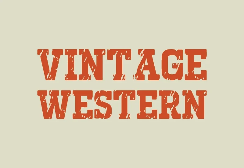
Best For: old-school designs, display text, classic designs, bold designs
Vintage Western Font relies on bold display serif construction to reinforce an old-school Western-leaning classic presence. Its substantial forms are easiest to judge at larger sizes, making it effective for titles and statements that need unmistakable visual weight.
Vintage Magic Font
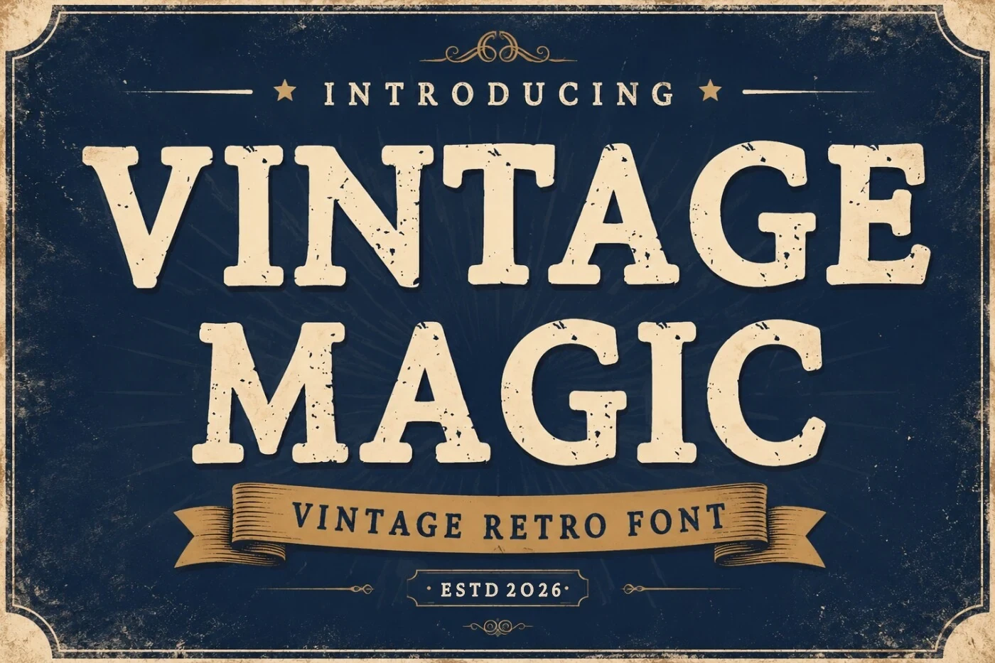
Best For: packaging, posters, display text, classic designs
Vintage Magic Font uses bold display serif forms to create a highly visible vintage treatment for posters and packaging. Its substantial presence makes it strongest for the central message, while smaller secondary information should use a calmer companion style.
Vintage Classic Font
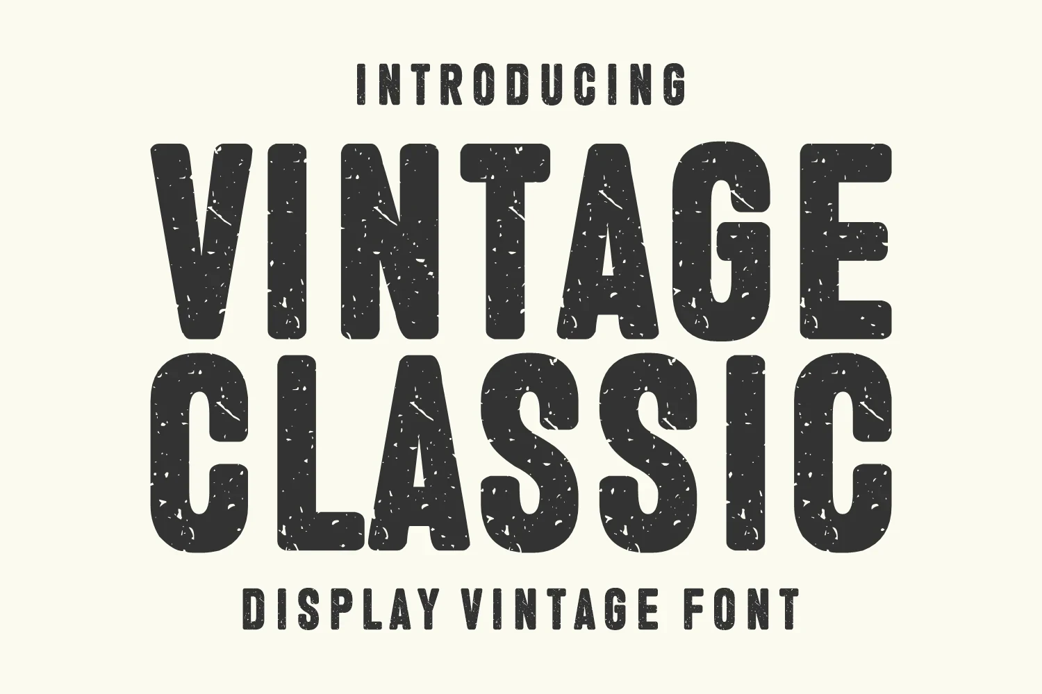
Best For: logos, branding, packaging, posters
For compact marks, Vintage Classic Font offers substantial bold display construction with a direct branding and logo role. Its strong visual footprint lets the letterforms lead the design, provided the name or statement stays short enough to remain legible.
Light and Characterful Vintage Displays
These lighter and characterful displays combine readable stroke patterns with nostalgic, playful, or typewriter-associated shapes, offering more flexibility than the heavier headline styles.
Barbie Vintage Font

Barbie Vintage Font uses refined slender strokes and rounded display shapes to create a playful nostalgic impression. Its lighter construction suits names and brief headings, where the distinctive letters can remain easy to assess without overpowering the design.
Old Game Font
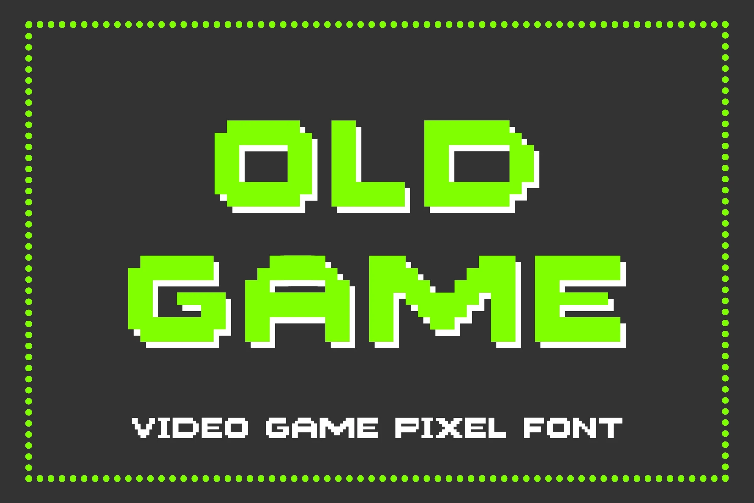
Best For: display text, expressive designs, retro designs, vintage designs
Old Game Font has a clear stroke rhythm that gives its period-inspired display lettering an orderly presence. It is most dependable in short headings, names, and compact retro phrases, where its distinctive shapes stay readable without needing extended text.
The Old Navy Font
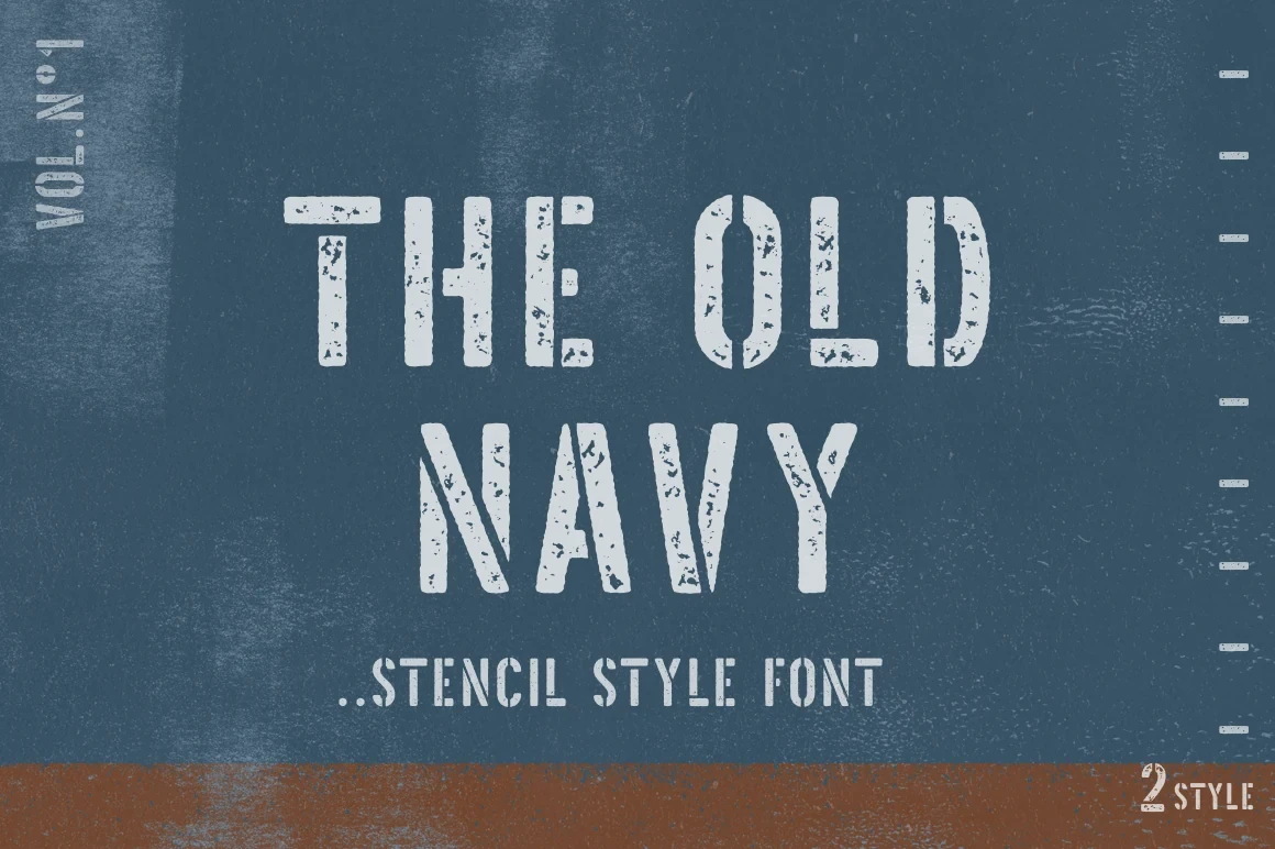
Best For: display text, expressive designs, vintage designs, nostalgic designs
The Old Navy Font delivers a straightforward nostalgic headline style through distinctive display letterforms and a clear stroke rhythm. Keep the wording brief so each character remains easy to distinguish, making it a practical choice for focused vintage headlines.
Brolin Vintage Font
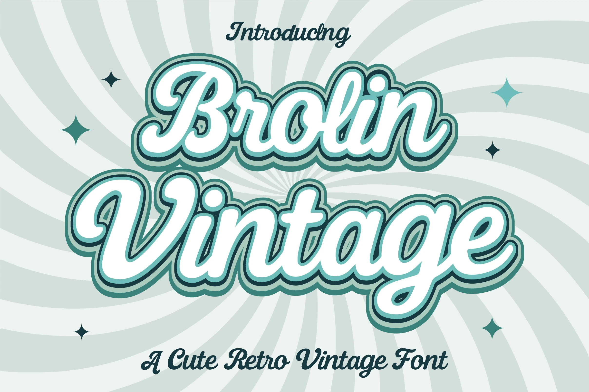
Best For: display text, modern designs, clean designs, playful designs
Brolin Vintage Font tempers its rounded, playful vintage character with a clean contemporary construction. That balance helps it connect retro concepts with newer display layouts, especially when you want personality and clarity without depending on heavy visual weight.
Back to Vintage Font
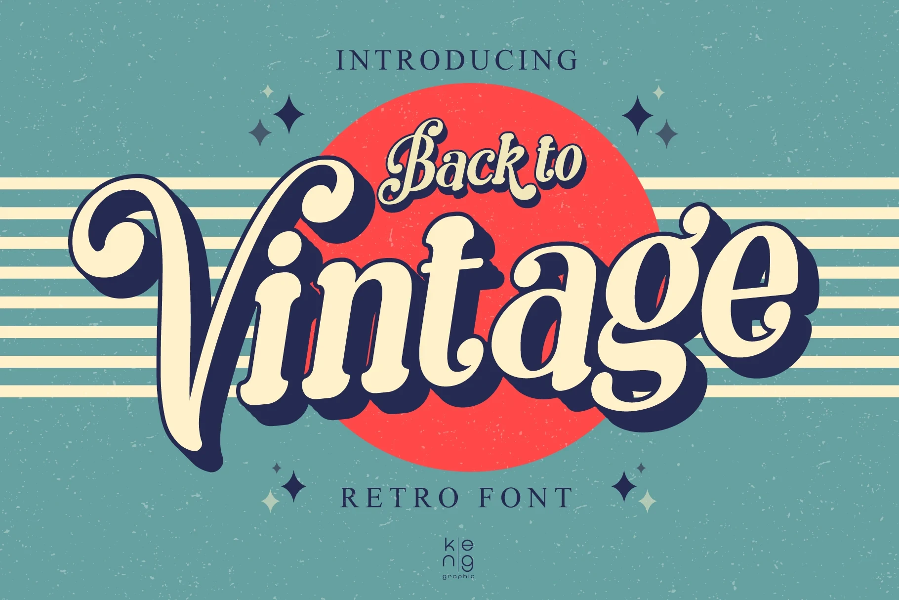
Best For: display text, expressive designs, retro designs, vintage designs
Back to Vintage Font uses refined slender strokes for a lighter, expressive nostalgic finish. It suits short retro phrases and display text where the letterforms can breathe, but it will not provide the forceful sign-like block created by heavier options.
Old Typewriter Font
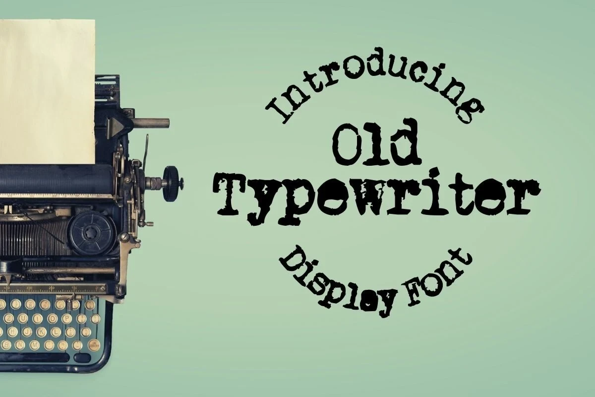
Best For: display text, expressive designs, vintage designs, nostalgic designs
Old Typewriter Font builds its nostalgic identity through a clear stroke rhythm and period-inspired display character. It works best as a short headline treatment, bringing vintage context without being intended for continuous reading or lengthy copy.
Flowing Vintage Scripts
Connected letterforms define this script group, creating continuous movement and expressive personality; they feel more ceremonial or personal than the collection’s structured display faces.
Vintage Melinda Font

Best For: display text, expressive designs, retro designs, vintage designs
For short expressive titles, Vintage Melinda Font offers connected letterforms that carry continuous flowing movement across a word. Its softly joined construction supplies nostalgic personality and works especially well when the lettering is the visual feature rather than dense supporting copy.
Retro Vintage Font

Best For: logos, branding, invitations, wedding designs
For logos, ceremonial names, and invitations, Retro Vintage Font combines connected script movement with an elegant nostalgic tone. The joined construction creates a continuous flow, but wording should remain short so the expressive letterforms do not become difficult to compare.
Magical Vintage Font
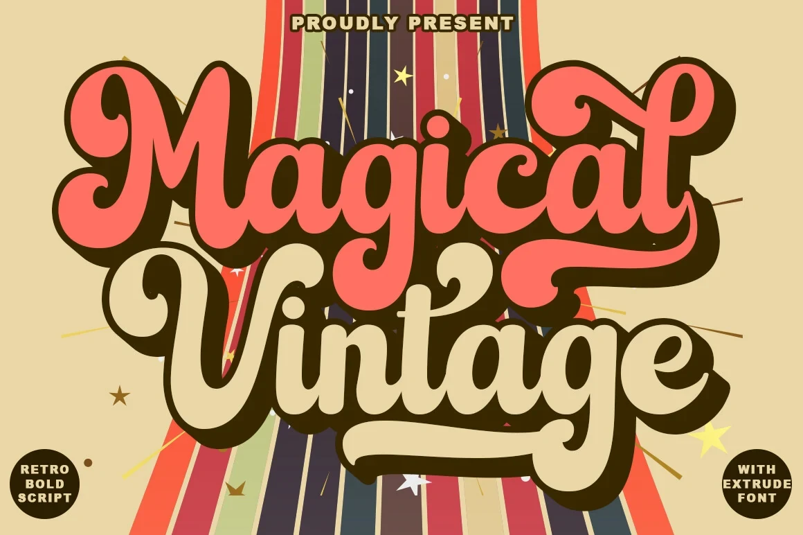
Best For: logos, branding, social media graphics, product labels
Magical Vintage Font gives Cool Vintage Fonts a softly joined, flowing rhythm with expressive display character. It can add personality to labels and social graphics, particularly when the wording is brief enough for its connected forms to remain clear.
How to Choose the Right Font
Choose lighter styles when names, short phrases, and readable character comparison matter; choose bold serifs when a logo, poster, package, or sign needs immediate impact. Connected scripts add movement for invitations and expressive marks, but demand shorter wording. Within these Cool Vintage Fonts, size and word length are as important as mood.