21 Best Cool Graffiti Fonts in 2026
Cool Graffiti Fonts span rounded forms, slender strokes, connected movement, and substantial display weight. Together, they support short phrases, logos, posters, merchandise, covers, and other design roles where distinctive construction matters more than extended reading comfort.
Looking for more cool fonts? Browse our complete Cool Fonts collection to compare bold, vintage, retro, script, and gothic cool styles.
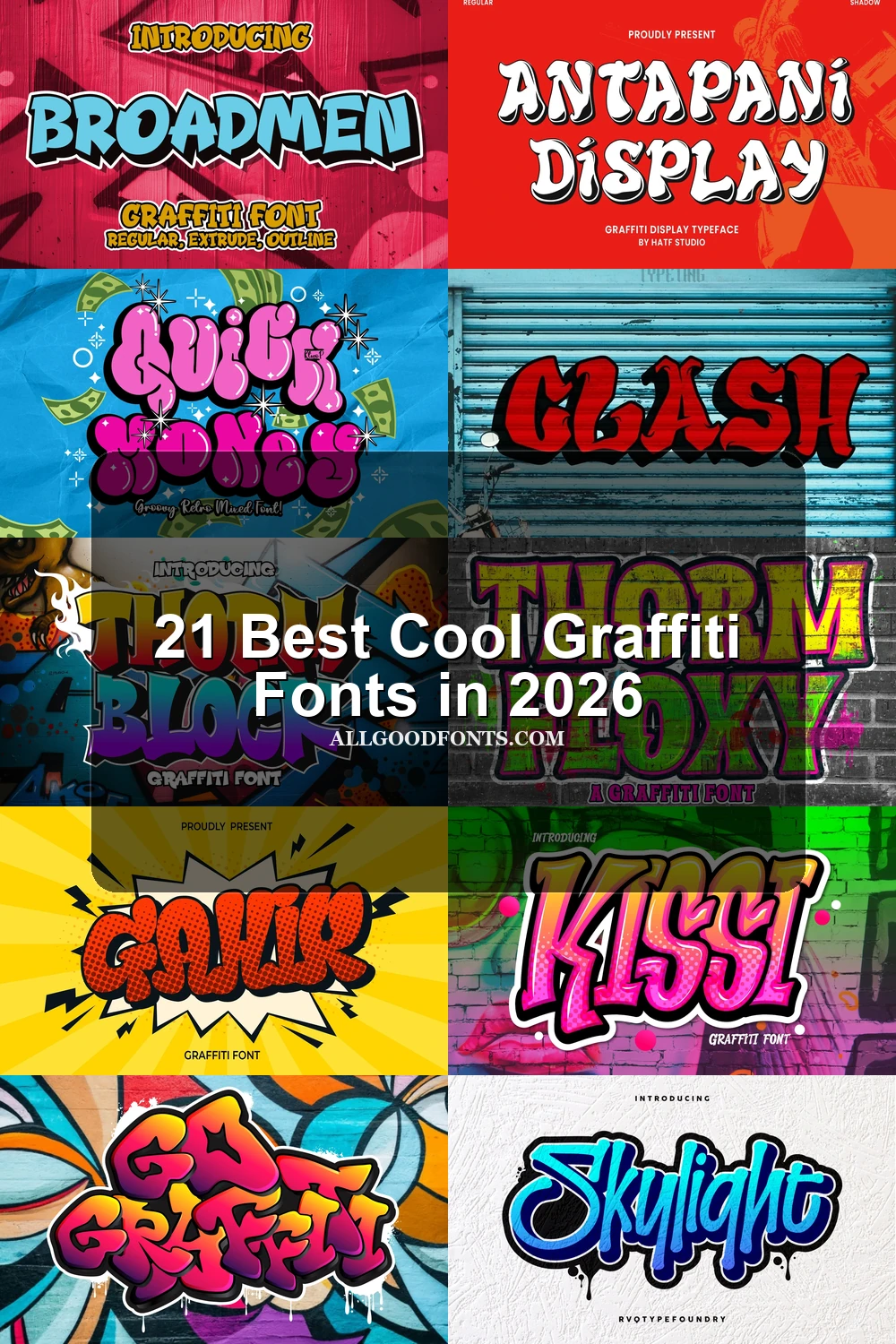
Cool Graffiti Fonts: Expressive Display Forms
These Cool Graffiti Fonts emphasize individual display shapes and perceptible stroke rhythm, prioritizing expressive visual emphasis over the connected movement or heavier mass found elsewhere.
Boy Graffiti Font
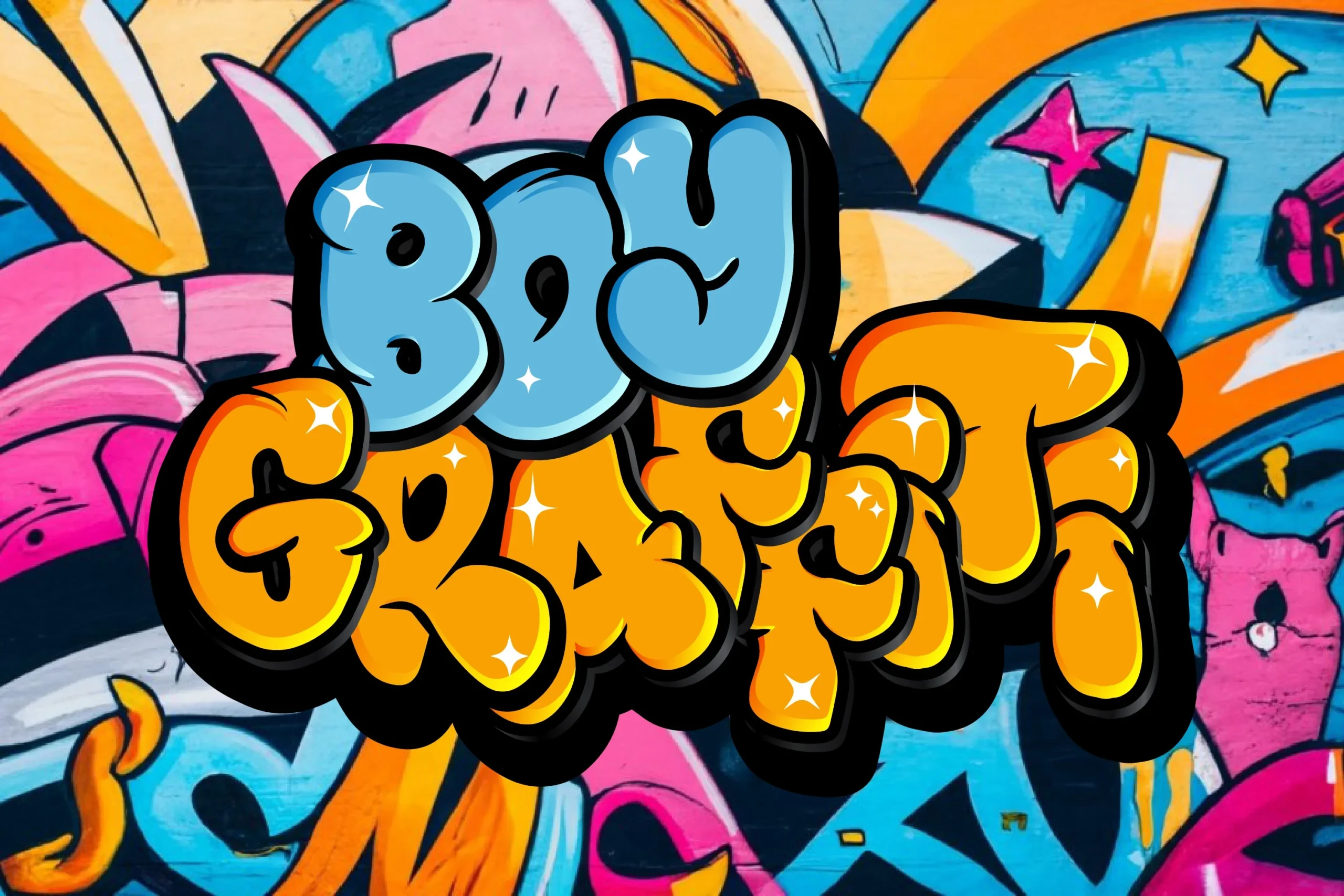
Best For: display text, book covers, magazine covers
Boy Graffiti Font is a strong candidate for Cool Graffiti Fonts when the letter shapes need to carry the composition. Its distinctive forms follow a clearly perceptible stroke rhythm, making it useful for headings, covers, and short expressive phrases rather than continuous reading.
Antapani Font

Best For: display text, wall art, magazine covers
Antapani Font relies on individual display letterforms rather than a documented connection style. That gives short compositions a clear visual emphasis, with wall art and magazine covers providing room for its expressive shapes to remain the main design feature.
Go Graffiti Font
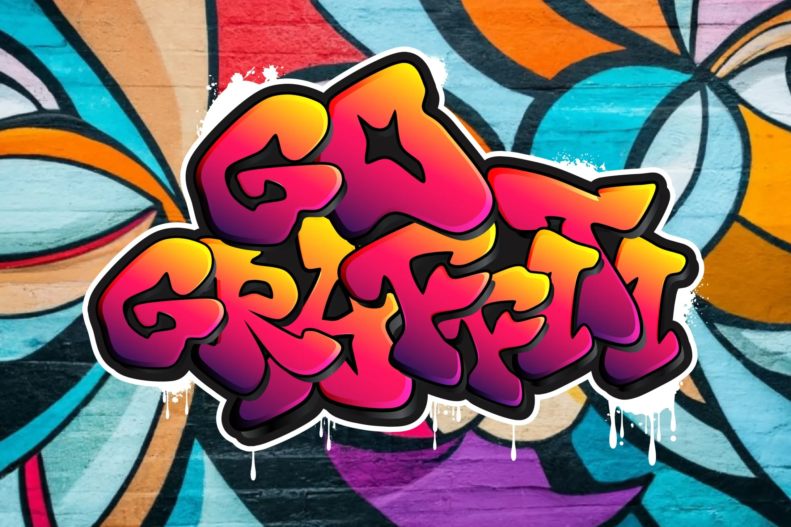
Best For: display text, posters, merch design
Go Graffiti Font uses a consistent stroke rhythm to give its expressive shapes a readable visual pulse. It suits posters and merchandise, while short display wording is the safer choice than body text.
The Summer Bright Font
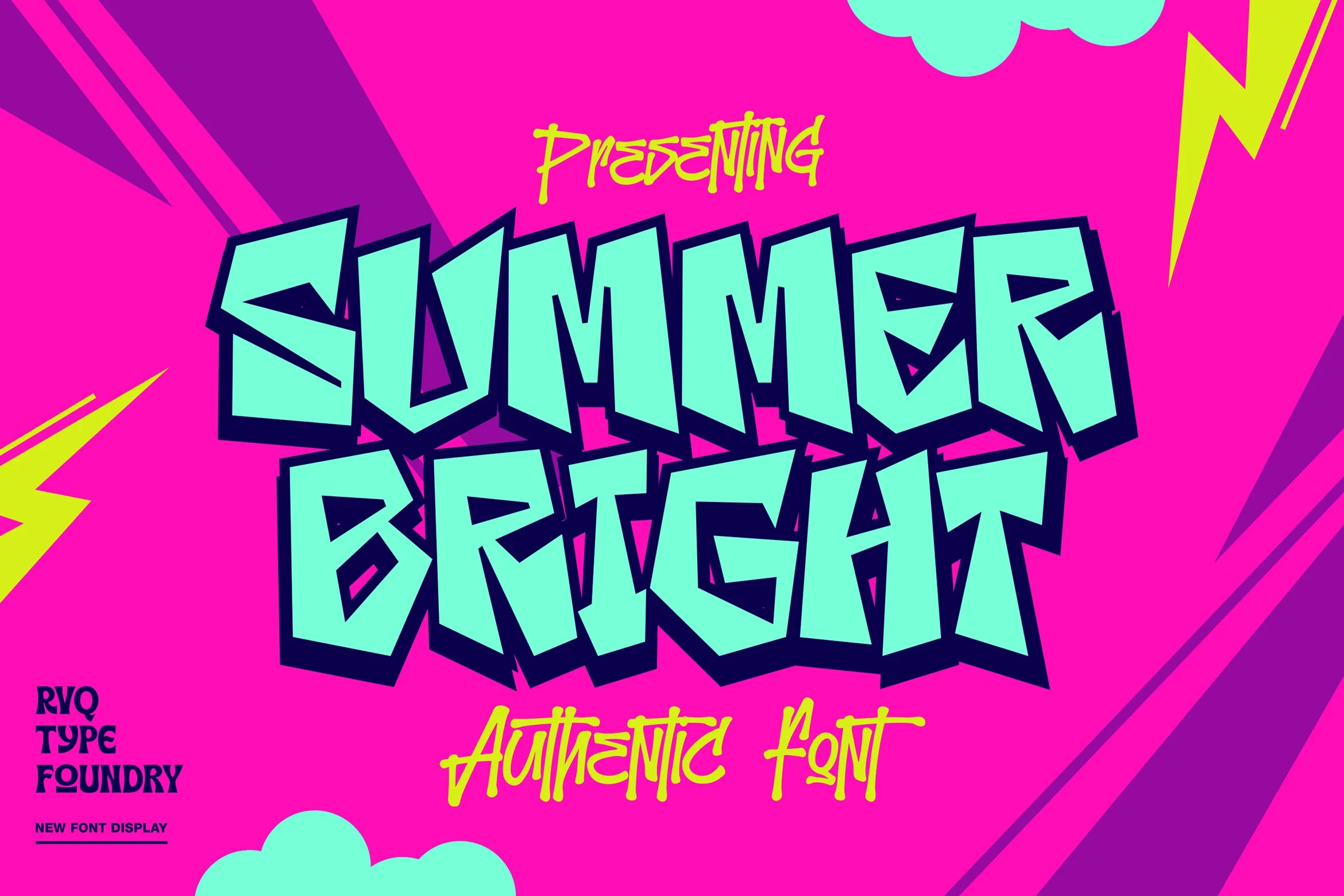
Best For: creative projects, display text, clean designs
The Summer Bright Font uses distinctive display shapes without a documented heavy or connected construction. It fits short creative projects and clean expressive designs, where individual letters can provide the visual emphasis.
Flowing, Slender, and Refined
This group combines flowing joins, light weights, and refined slender strokes. It feels more linear and restrained than the rounded or substantially weighted display forms.
Thorm Block Font
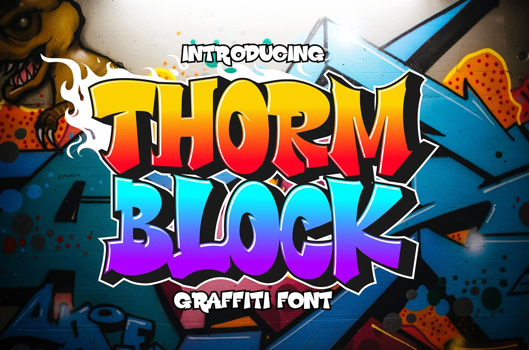
Best For: branding, invitations
Connected or softly joined letters give Thorm Block Font a continuous handwritten movement. This Cool Graffiti Fonts choice works well for names, labels, and brief branding lines, provided the joins remain clear at the intended size.
Vandal Lineros Font
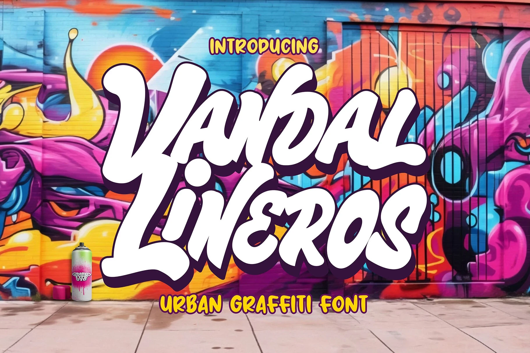
Best For: display text, artistic designs, product labels
Vandal Lineros Font uses a light, slender stroke treatment for a fine-lined display profile. It fits artistic designs and product labels especially well, but its lighter construction is better reserved for prominent short text than dense information.
Funky Dream Font
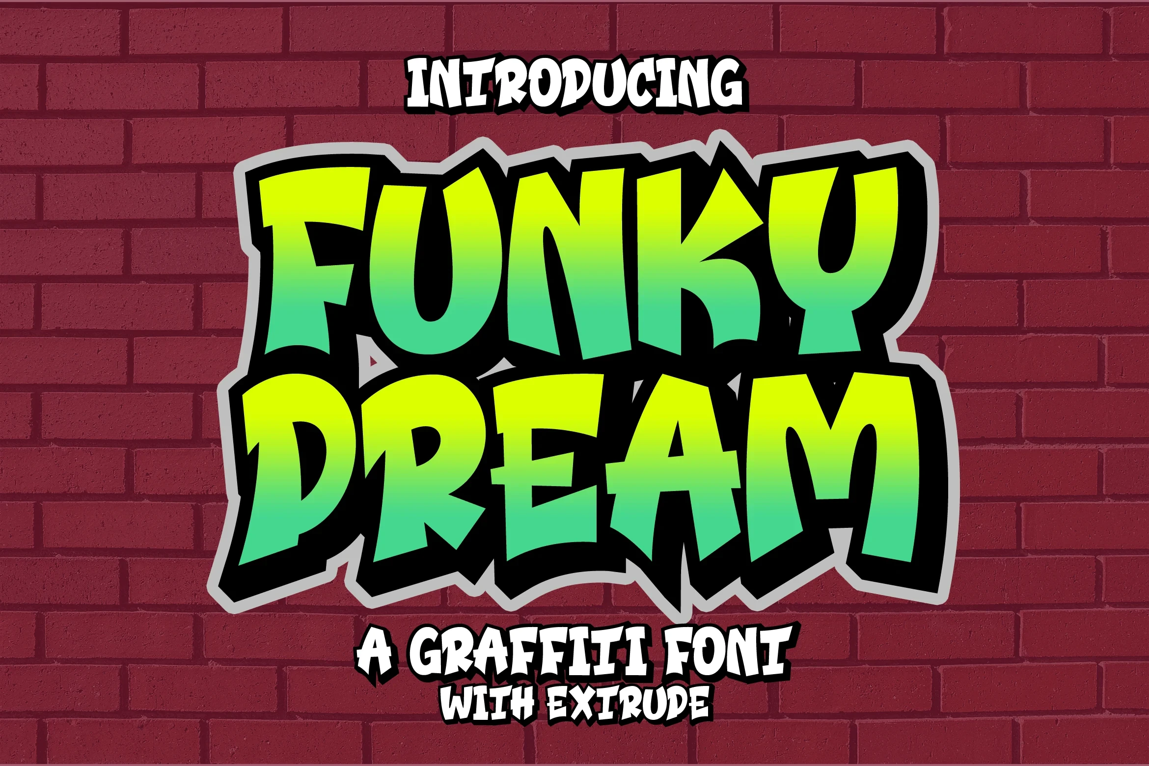
Best For: T-shirts, logos, playful designs
Funky Dream Font combines a light display build with slender strokes and rounded, playful forms. It can work on shirts and marks, but its visual construction points toward short display use rather than dense text.
Kissi Font

Best For: T-shirts, logos, wall art
Kissi Font uses light construction and refined slender strokes to create a narrow visual weight. Logos, shirts, and wall art can benefit from that profile, especially when the wording is concise and given enough size for the strokes to hold.
Broadmen Font

Best For: T-shirts, logos, expressive designs
Broadmen Font keeps its expressive construction visually light through refined slender strokes. It is a sensible fit for logos, shirts, and concise treatments, while information-heavy layouts would ask more of its lighter display weight.
Gear Four Font
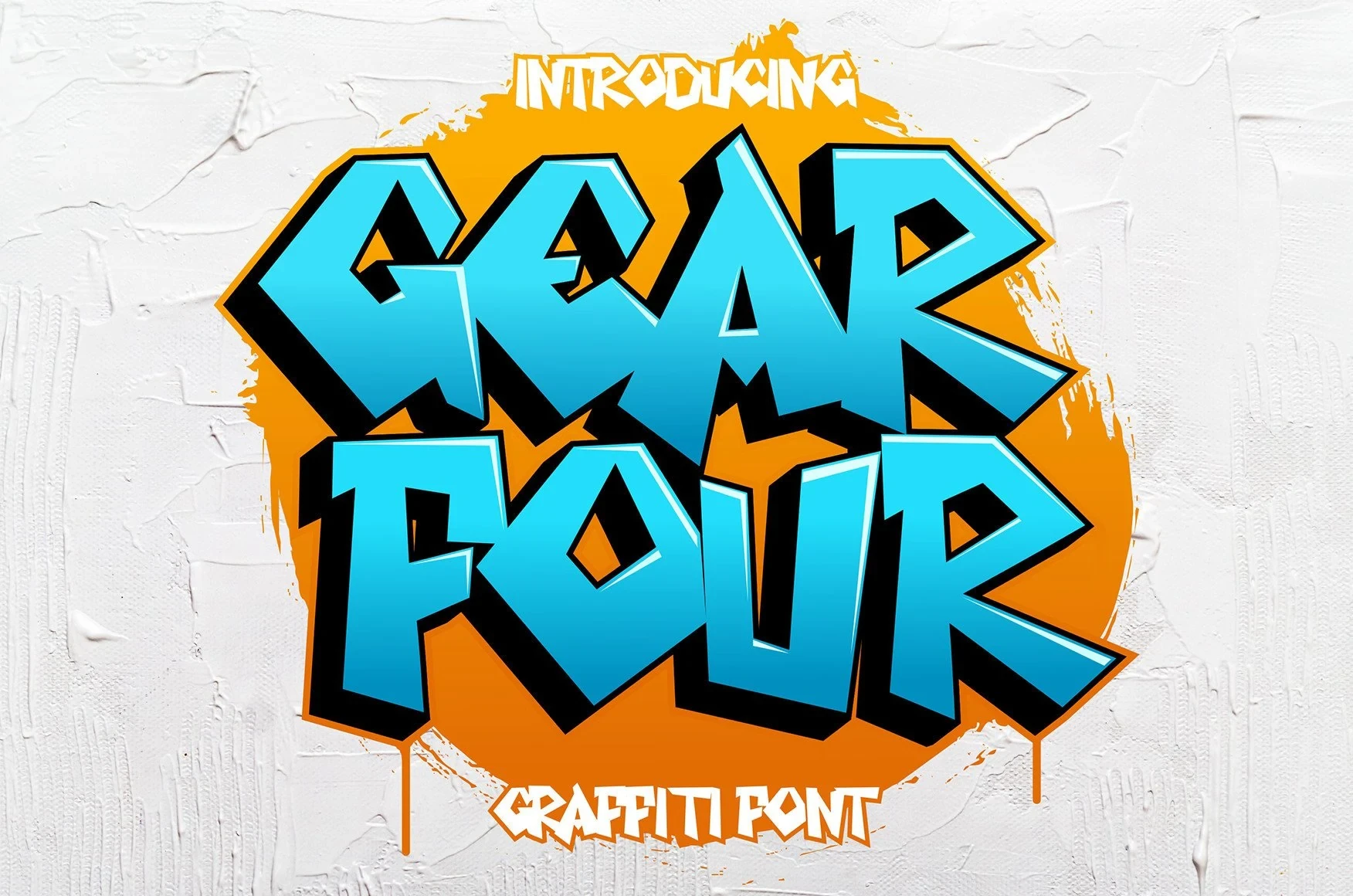
Best For: branding, invitations, product labels
Branding, invitations, and product labels can use Gear Four Font for its clear rhythm and expressive tone. The evidence does not establish a specific connection style, so its appeal rests on individual display forms and short-form readability.
Quick Money Font
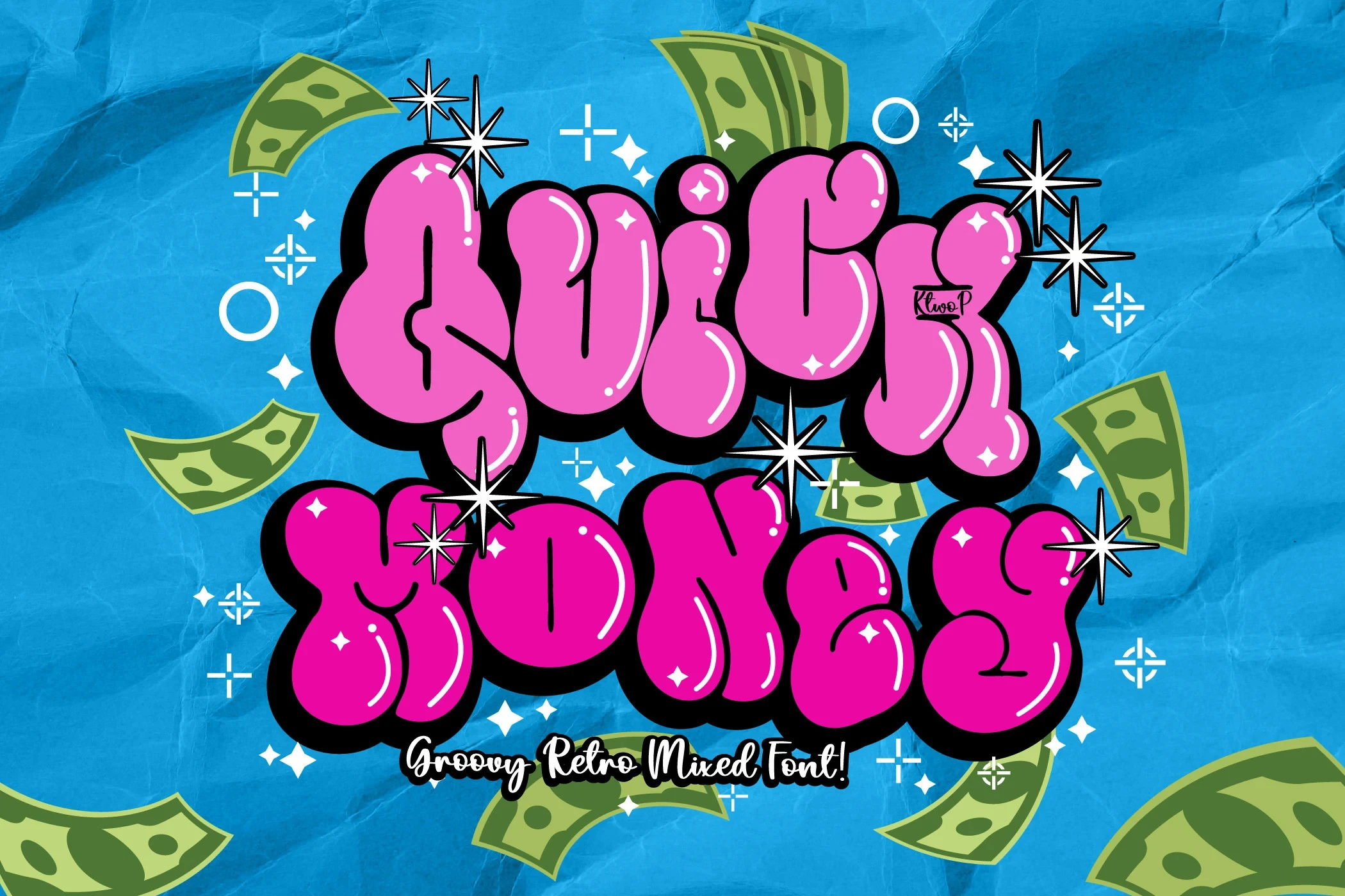
Best For: T-shirts, logos, wall art
Quick Money Font gives its display letters a slender silhouette through light, refined strokes. It can carry concise wording on shirts, logos, or wall art, but the lighter weight limits its usefulness in dense text.
Slime Font
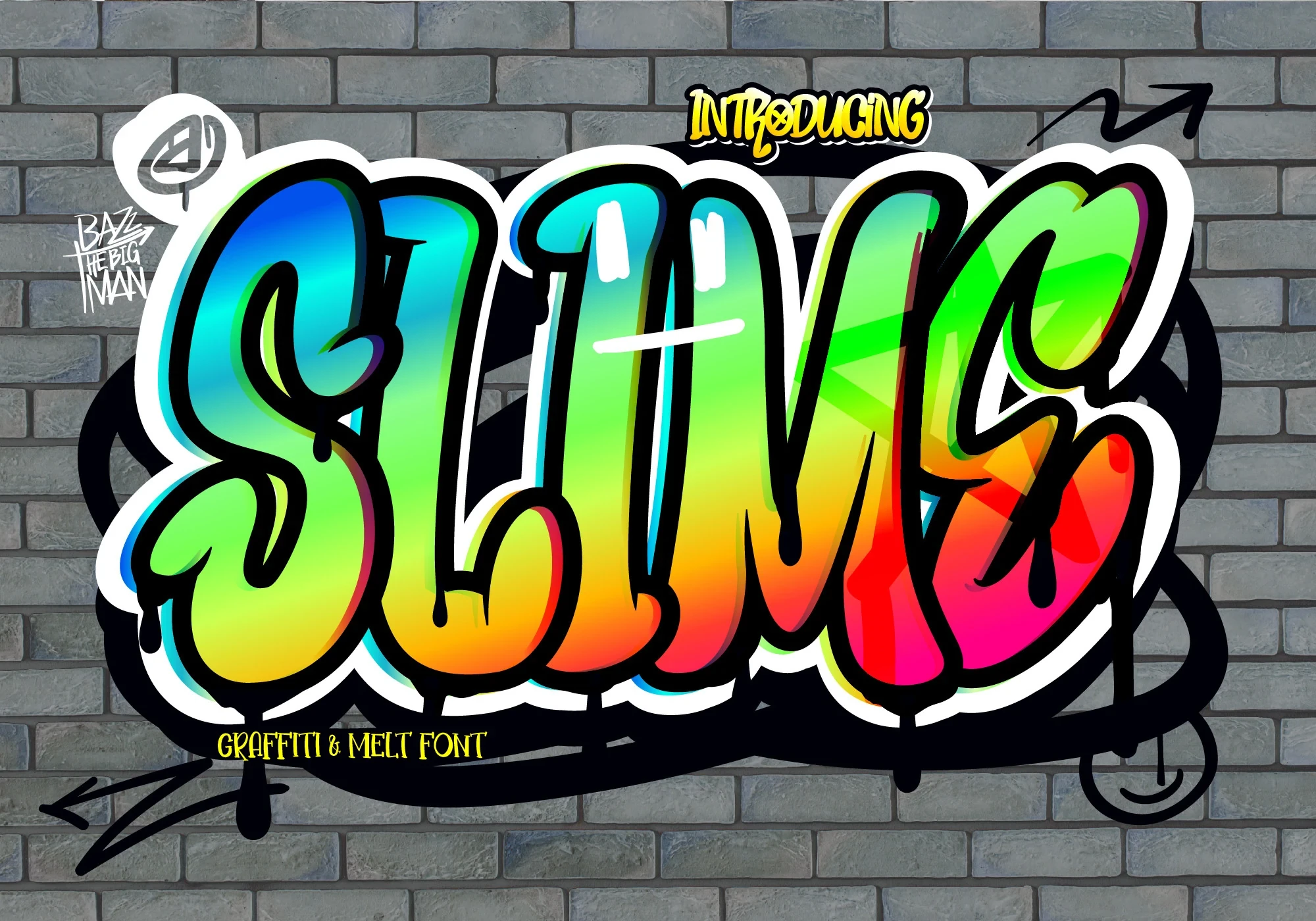
Best For: T-shirts, logos, wall art
Slime Font is defined by refined slender strokes and a light display character. Shirts, logos, and wall art are logical applications, especially when the text is brief; there is limited evidence for use beyond short phrases.
Bold, Rounded, and Playful
Rounded playfulness and bold construction define this category, giving it more visual mass and approachable rhythm than the lighter, finer-lined selections.
Super Graffiti Font

Best For: book covers, posters
Super Graffiti Font brings a rounded, playful character to short display phrases. Its clear stroke rhythm and distinctive letter shapes suit names, headings, and covers, where the forms can be read at a glance without carrying extended copy.
Skylight Font
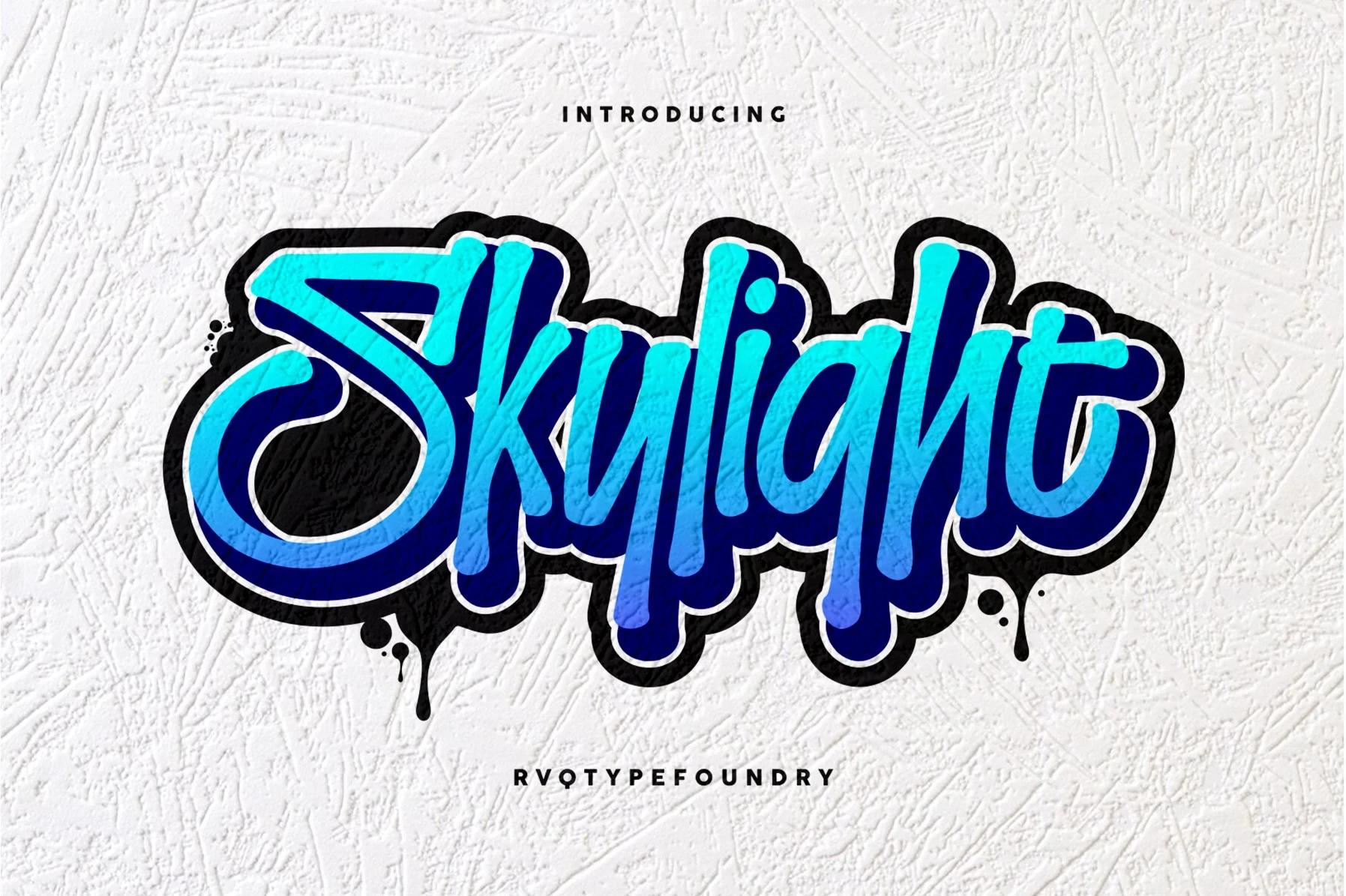
Best For: logos, posters, display text
For posters and logos, Skylight Font pairs substantial display weight with refined slender strokes, creating contrast within its letterforms. The combination gives short headlines a firm presence, though longer wording deserves a careful readability test before use.
Blockbomb Font
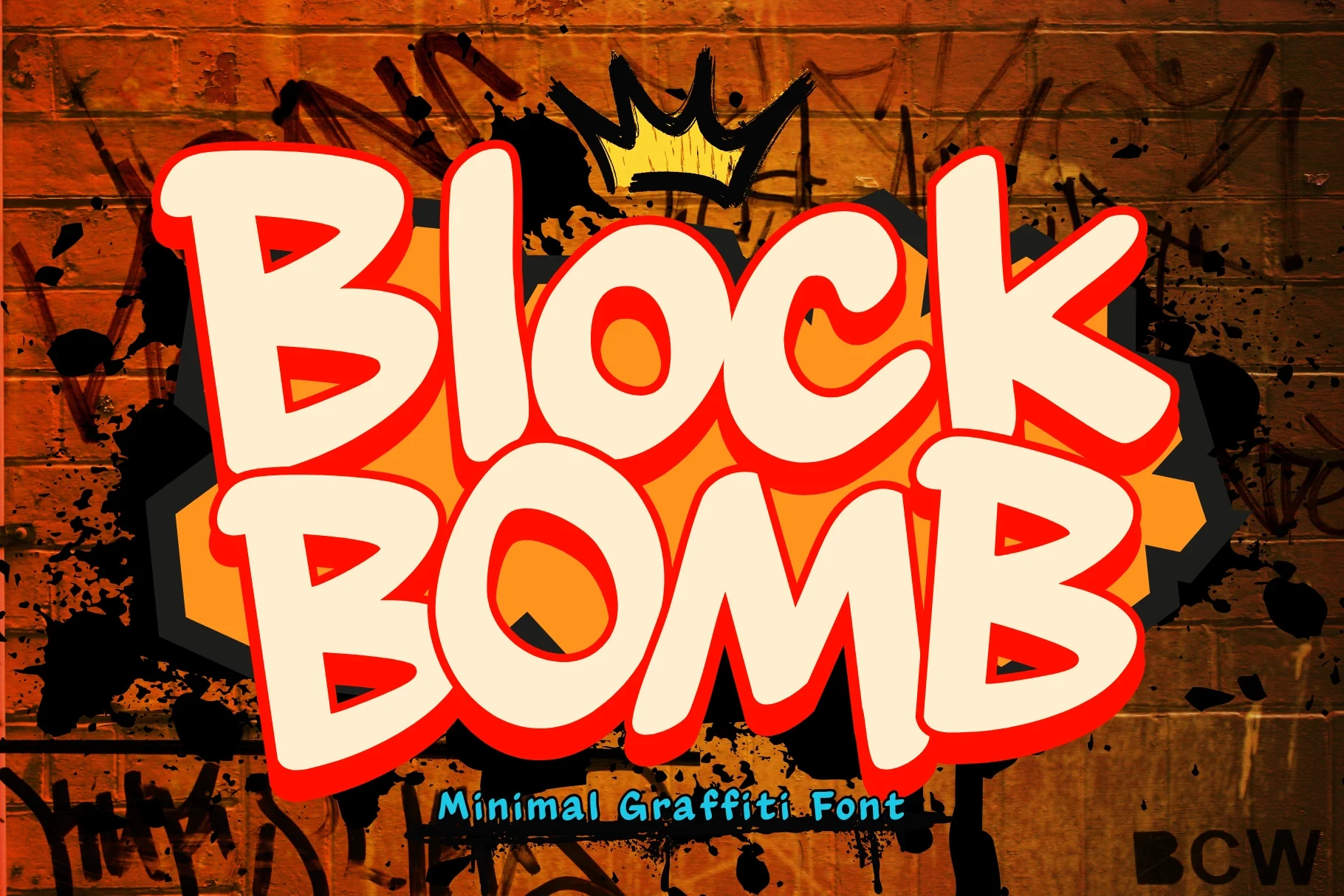
Best For: logos, branding, invitations
Blockbomb Font builds its rounded playfulness through distinctive display shapes and a steady stroke rhythm. The compact character is well suited to logos, invitations, and brief identity-led wording where personality matters more than paragraph-length clarity.
Gangstown Font
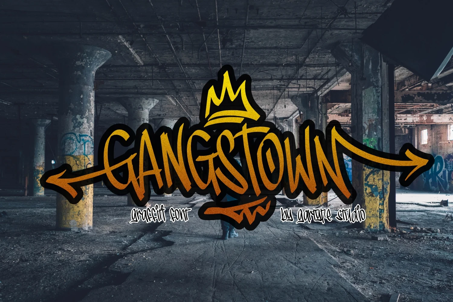
Best For: display text, playful designs, business cards
Rounded, playful forms set Gangstown Font apart from more severe display treatments. Its personality fits brief phrases on business cards and other playful designs, where the letter shapes can support the identity without requiring extended reading.
Clash Font
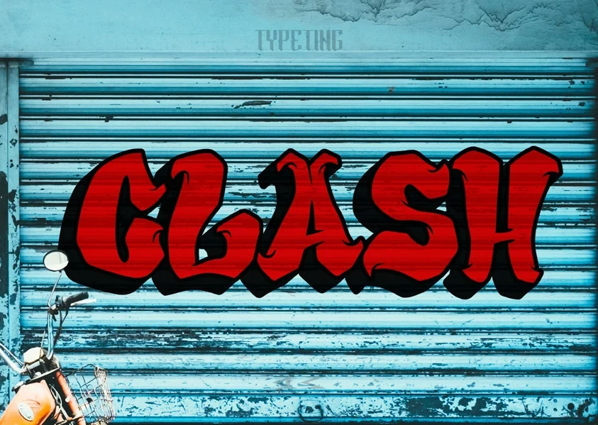
Best For: display text, bold designs, headlines
With substantial display weight, Clash Font gives Cool Graffiti Fonts a firm headline presence. It is suited to bold designs and expressive headings, but readability should be judged on short lines because heavier shapes can crowd longer wording.
Gahir Font
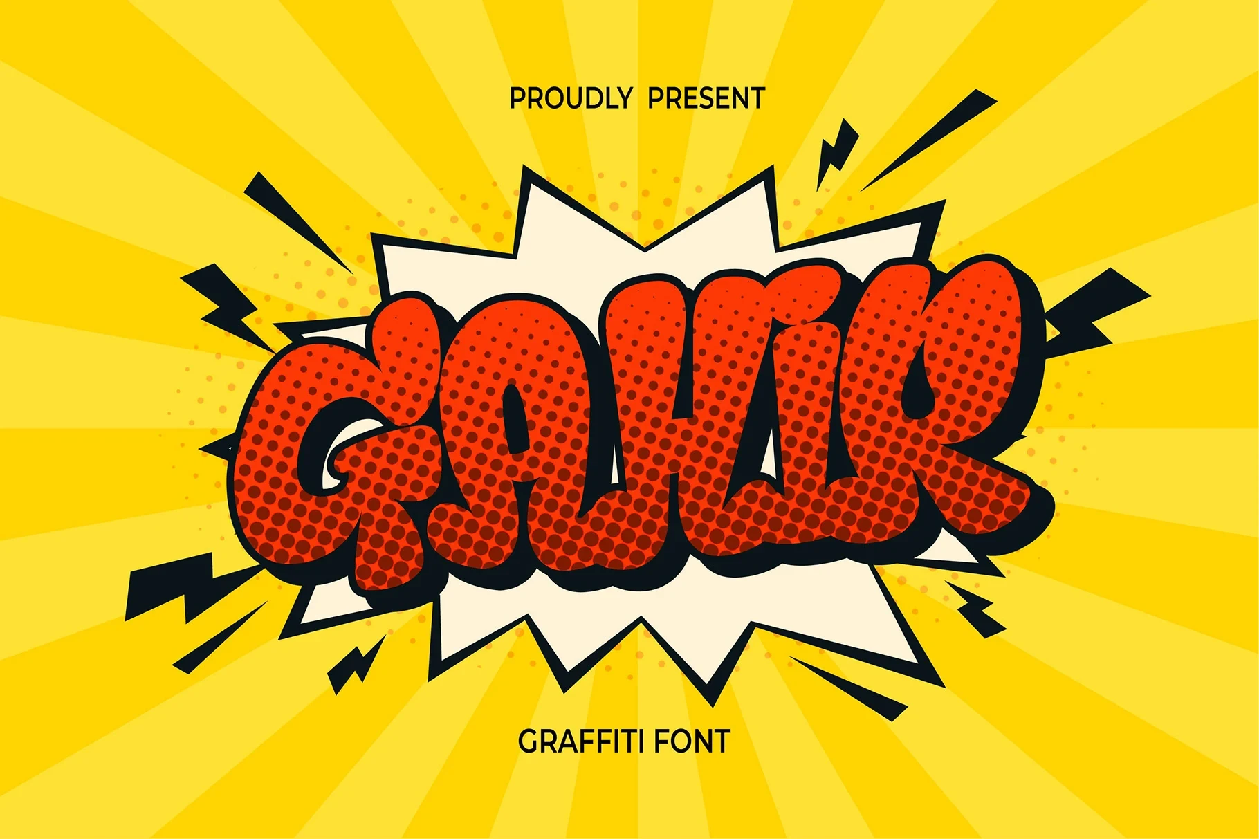
Best For: T-shirts, logos, bold designs
Gahir Font combines bold display weight with a hint of refined stroke variation, adding texture without losing its short-form focus. It can work on shirts and logos, provided the wording remains brief enough to preserve clarity.
Thorm Floxy Font
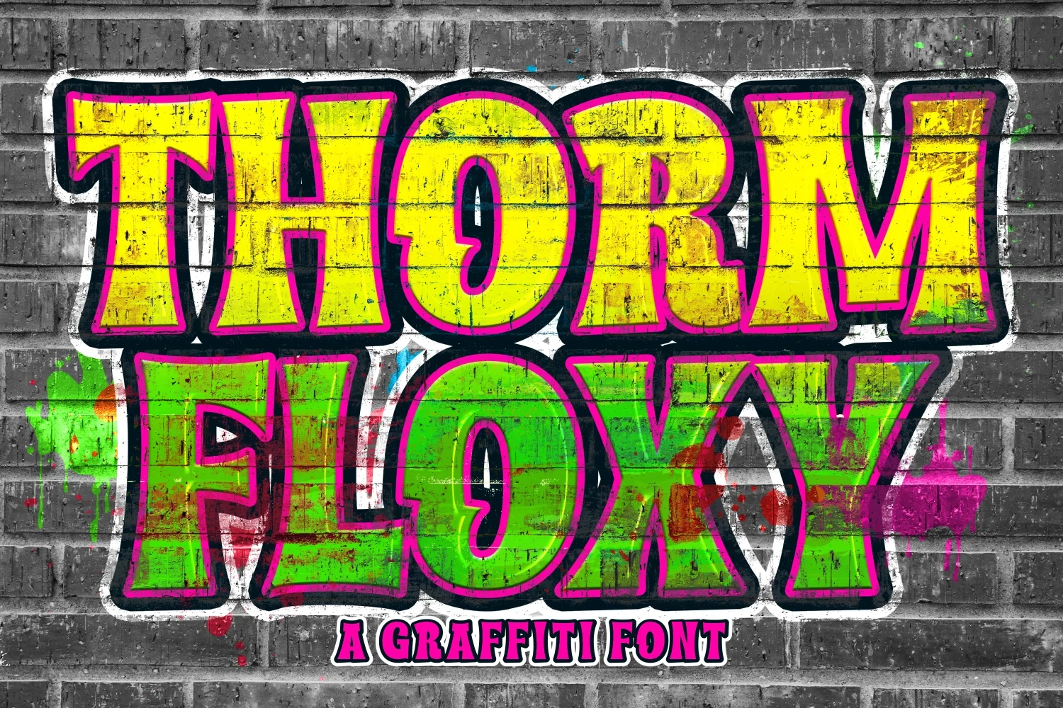
Best For: display text, modern designs, clean designs
Thorm Floxy Font tempers bold weight with a clean contemporary construction. That balance makes it useful for modern display work when you want substantial letterforms but a more orderly finish than highly irregular treatments provide.
Gemoy Font
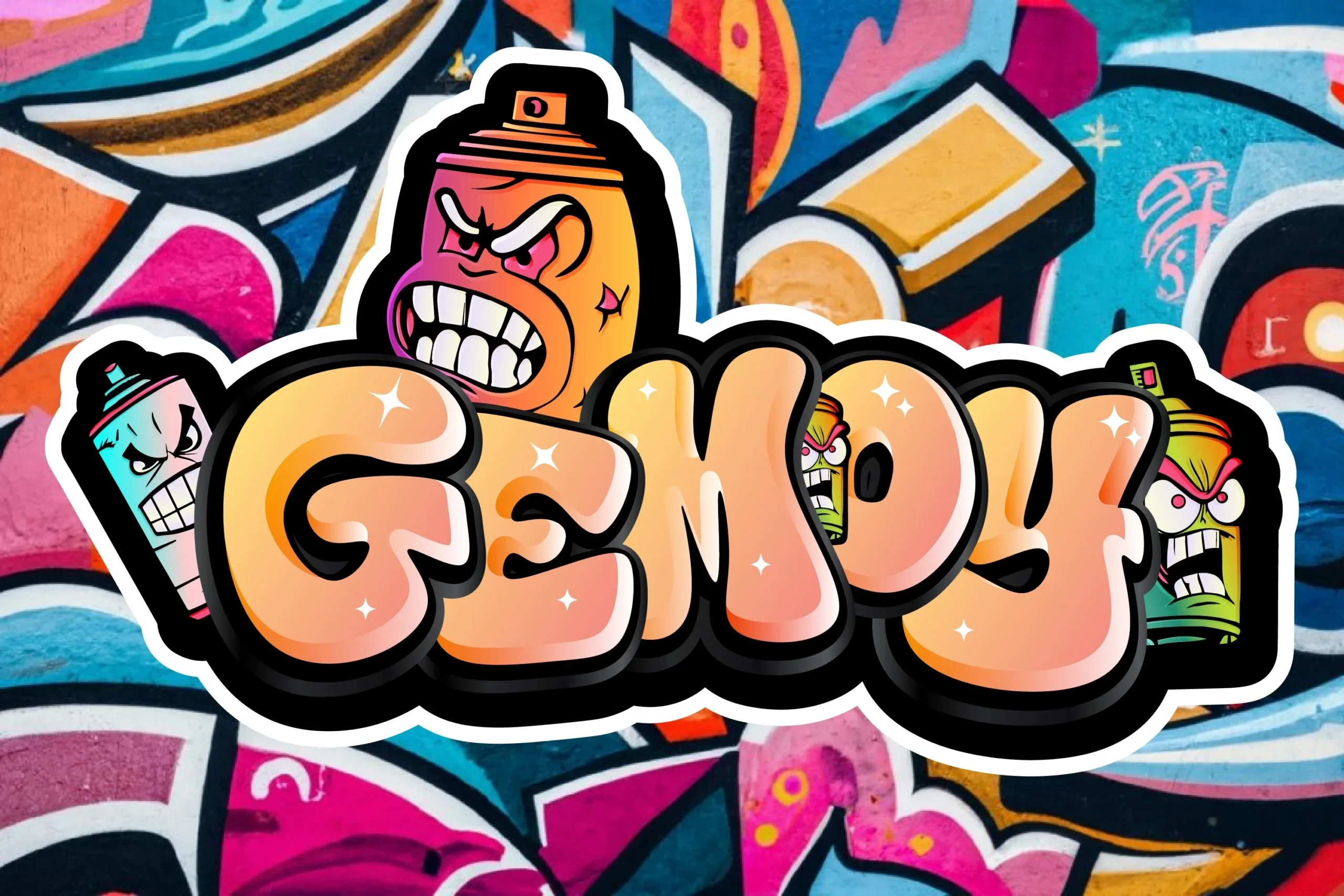
Best For: posters, book covers, magazine covers
For posters, covers, and magazine work, Gemoy Font uses substantial display weight to create large-format emphasis. This Cool Graffiti Fonts option is safest with short wording, allowing its mass to register without reducing phrase-level readability.
Hype Dope Font

Best For: social media graphics, wall art, bold designs
Hype Dope Font gives Cool Graffiti Fonts a bold construction with strong visual mass. It supports social graphics, wall art, and other bold designs, but test the actual phrase at size to ensure its distinctive shapes remain readable.
How to Choose the Right Font
Choose connected forms when names or labels need continuous movement; choose light, slender styles for concise marks; and choose bold or rounded options when scale and visual mass lead. Compare joins, stroke rhythm, and letter spacing at the final size, then keep Cool Graffiti Fonts to short wording when readability is uncertain.