24 Best Retro Script Fonts in 2026
This collection spans connected cursive, brush-led lettering, monoline scripts, signature forms, and high-contrast swash styles, moving from restrained rounded strokes to dense display flourishes. These Retro Script Fonts are suited to logos, posters, signage, packaging, invitations, apparel, covers, and other prominent design roles.
Looking for more script fonts? Browse our complete Script Fonts collection to compare modern, elegant, bold, signature, and retro script styles.
Retro Script Fonts With Bold Connected Forms
These Retro Script Fonts rely on thick connected forms, rounded terminals, and noticeable movement, creating readable headline presence with more weight and directness than the lighter monoline group.
Bucky! Font
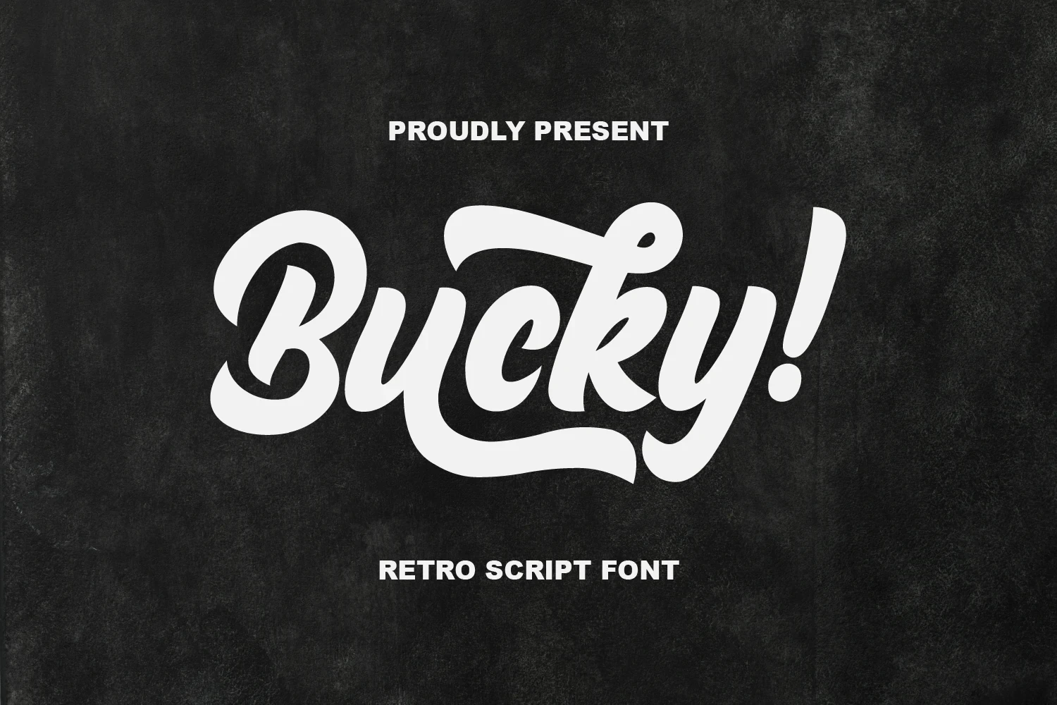
Best For: signage, old-school designs, display text
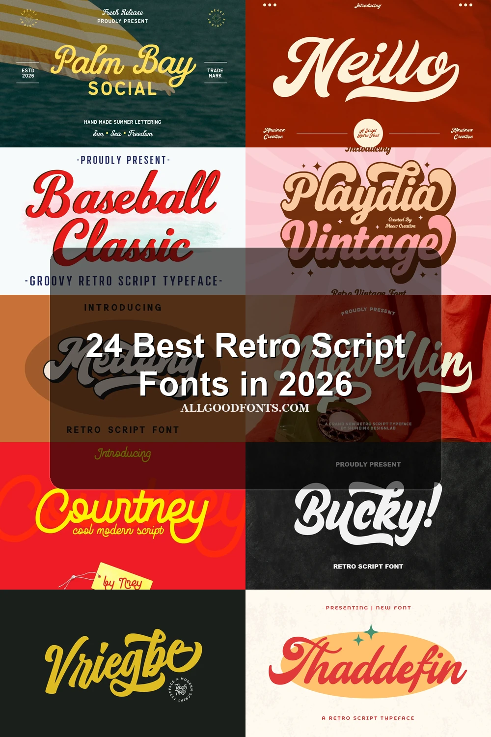
Bucky! Font uses heavy connected lettering, a moderate slant, and extended horizontal swashes for immediate signage presence. This Retro Script Fonts choice works especially well in old-school layouts and large display text, but its flourishes become restrictive when wording is reduced or densely set.
Dusklight Font
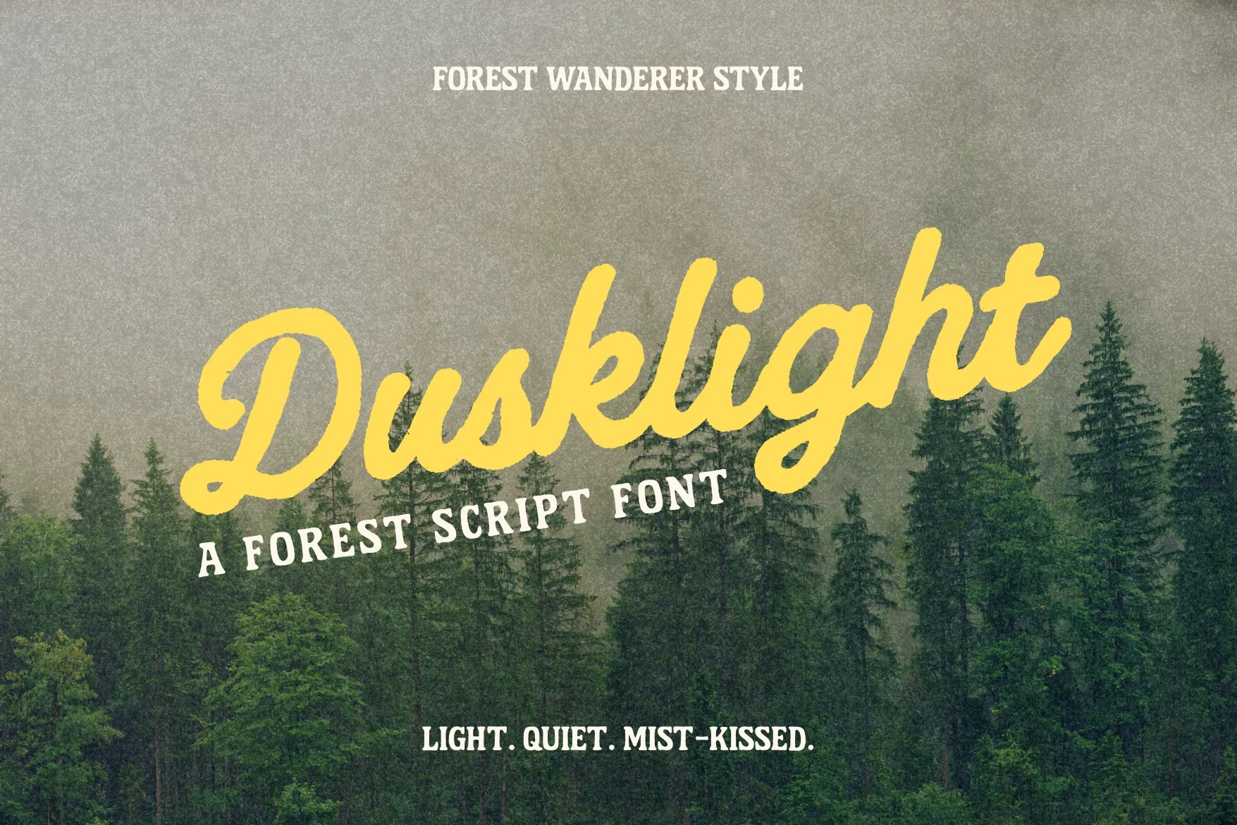
Best For: display text, clean designs, bold designs
Dusklight Font suits large titles that need a relaxed, whimsical lift without sacrificing headline clarity. Its bold monoline construction, connected letters, rounded terminals, and consistent stroke width make it easier to read than more contrast-heavy Retro Script Fonts, especially in clean display compositions.
Sunday Chillin Font

Best For: logos, branding, invitations
Sunday Chillin Font gets its movement from a pronounced rightward slant and tight, loopy connections. The bold uniform strokes support logos and invitations at generous sizes, while compact words can lose separation as the rounded joins and close spacing become harder to parse.
Vintage Children Font
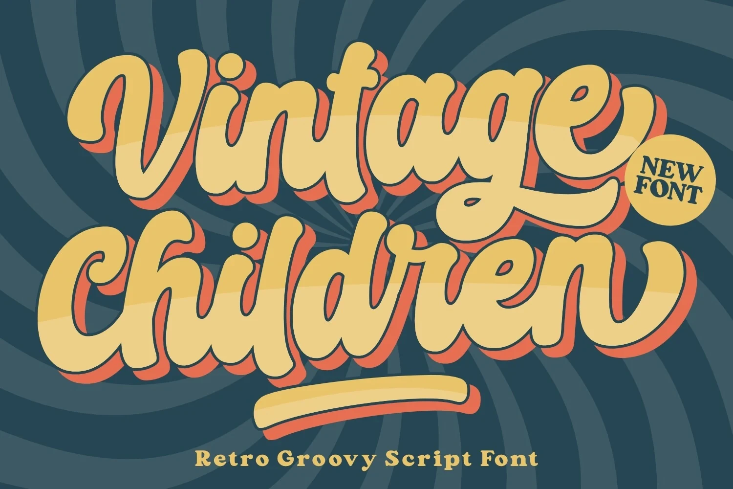
Best For: posters, social media graphics, book covers
Vintage Children Font builds its youthful tone from thick connected strokes, rounded terminals, and a slight slant. It delivers immediate impact on posters, social graphics, and covers, but the dense construction is intended for prominent display rather than extended reading.
Medang Font

Best For: display text, modern designs, bold designs
Medang Font combines a heavy connected structure with strong thick-thin contrast and a clear rightward slant. Its sharper silhouette energizes display titles, while decorative joins and rounded terminals make it a poor fit for body copy or information-heavy layouts.
Baseball Classic Font
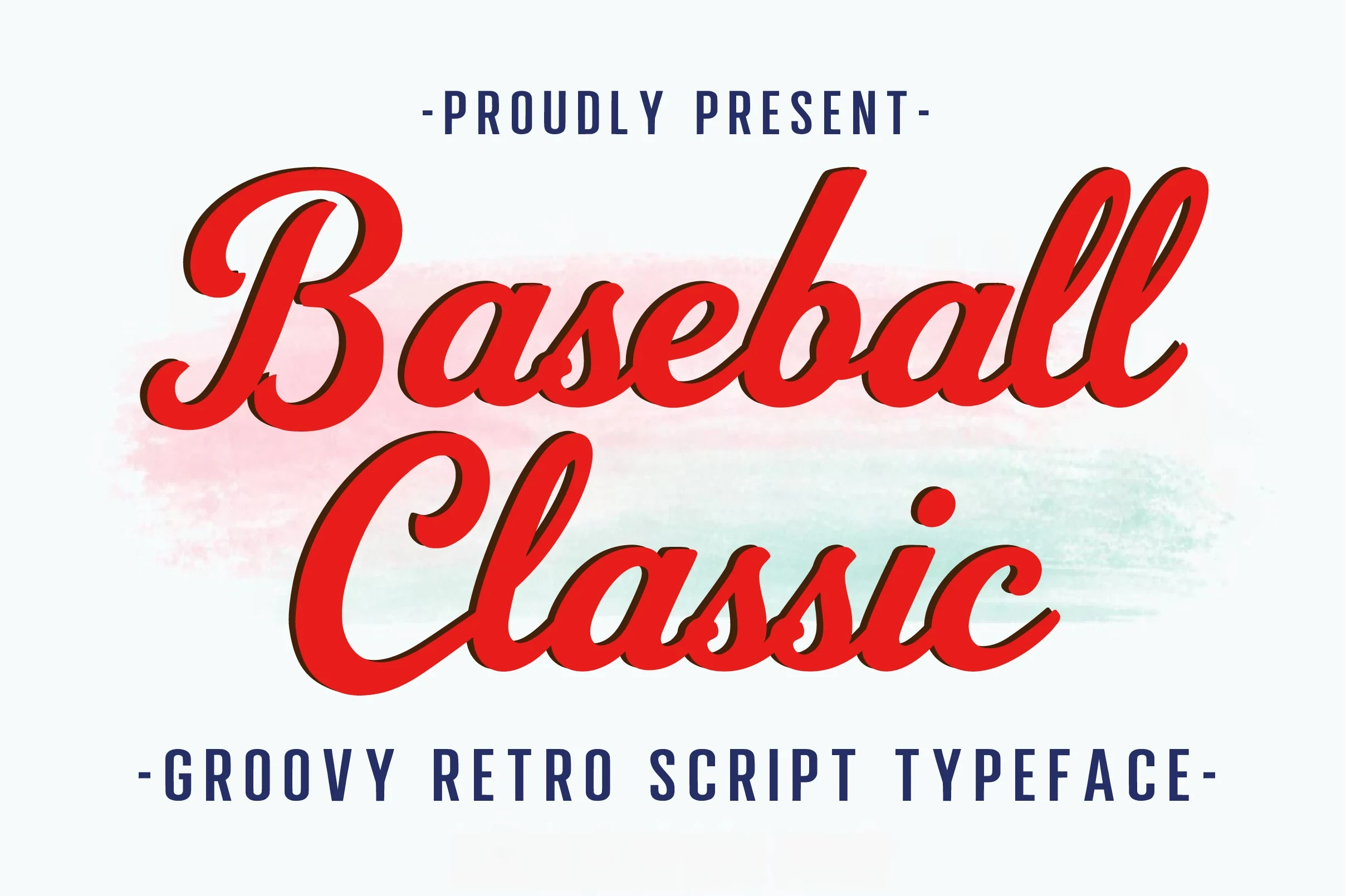
Best For: T-shirts, logos, branding
Baseball Classic Font keeps strongly slanted connected lettering unusually clear through uniform heavy strokes and rounded terminals. Its motion translates naturally to shirts, logos, branding, and posters, though the display construction is not intended for dense text or small supporting information.
Playdia Vintage Font
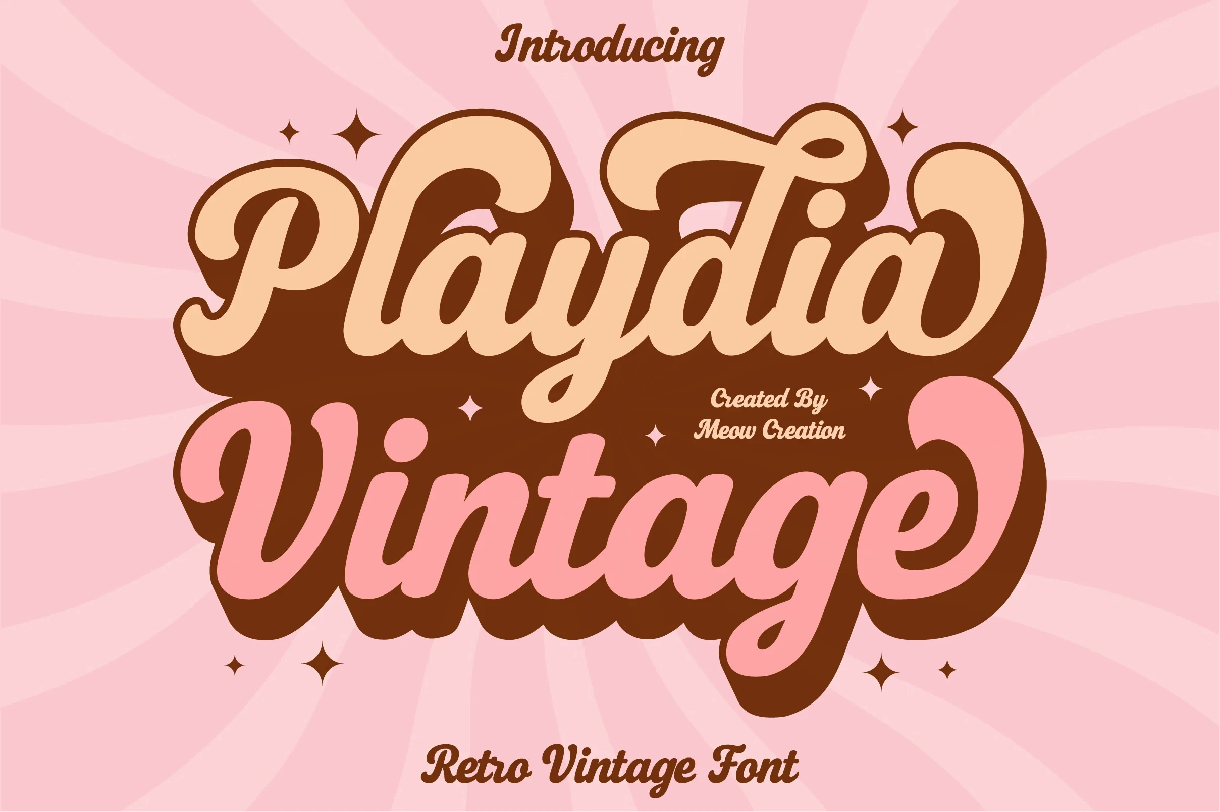
Best For: display text, minimal designs, playful designs
Playdia Vintage Font keeps its heavy connected lettering nearly upright, using exaggerated rounded terminals rather than a strong slant. That vertical axis gives headlines stability in minimal layouts, while the consistent weight supports display clarity without making it suitable for long-form text.
Retro Butterfly Font
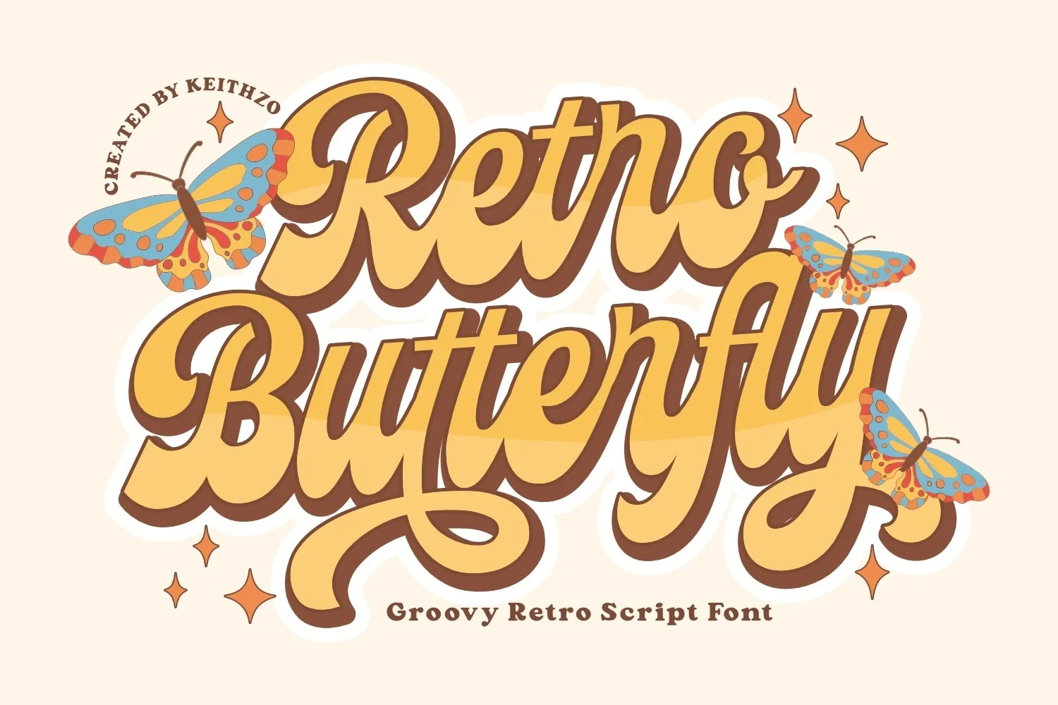
Best For: posters, book covers, magazine covers
Retro Butterfly Font uses bulbous terminals, thick strokes, and exaggerated curves to create a distinctly seventies-inspired silhouette. It remains readable on posters, book covers, and magazine covers at large scale, but its rounded forms need room to retain their shape.
Bright Miracle Font
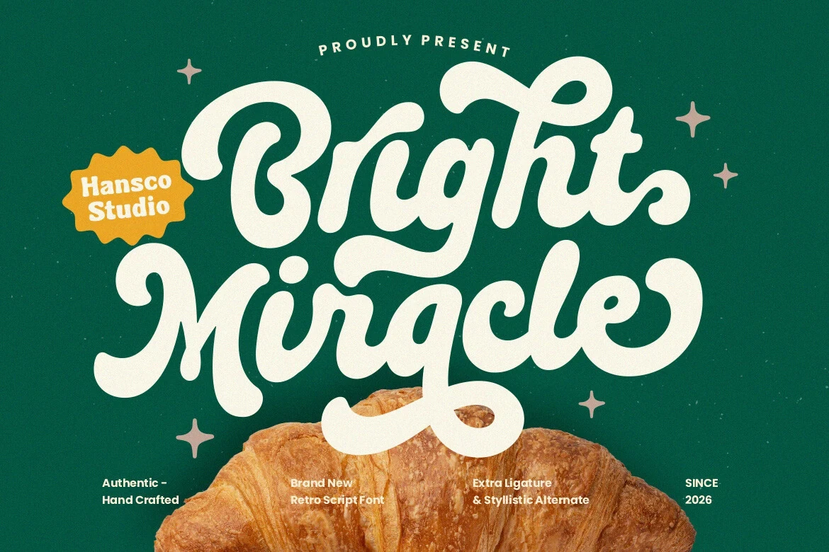
Best For: display text, minimal designs, bold designs
Bright Miracle Font combines an upright axis with heavy high-contrast strokes and prominent swashes. Its steadier orientation grounds display titles, but the flourishes make it better for short, spacious compositions than for information-heavy layouts.
Standley Font
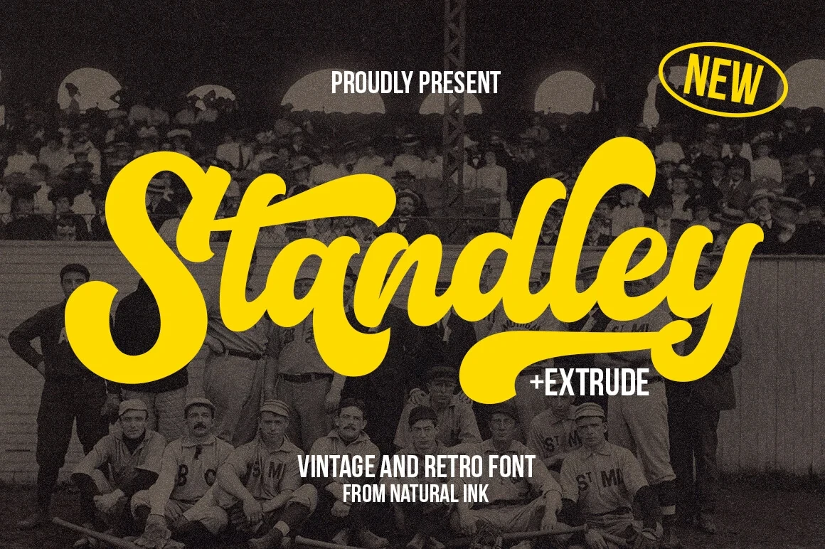
Best For: branding, logos, display text
Standley Font forms a heavy connected wordmark through strong thick-thin contrast and multiple swashes. It delivers immediate vintage-athletic branding impact in logos and large headings, while its identity depends on giving the cursive details enough scale to remain clear.
High-Contrast Swash Scripts
High-contrast strokes, sweeping entries, and extended flourishes define this group. Compared with the other categories, these faces prioritize decorative wordmarks and formal display impact over quick reading.
Mavellin Font
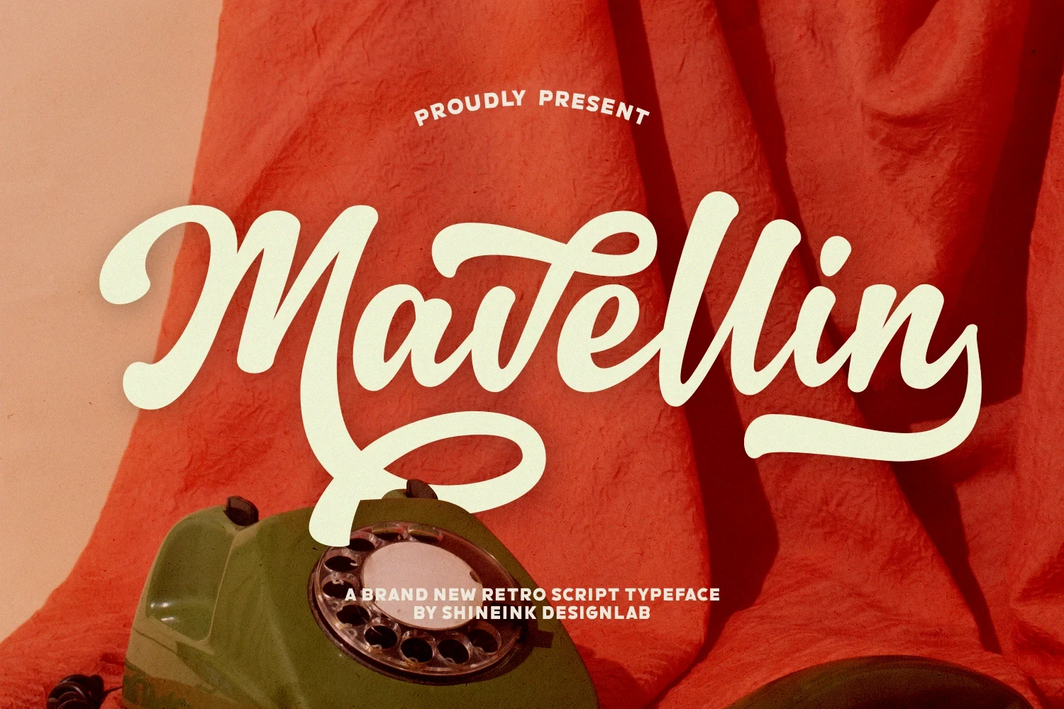
Best For: display text, modern designs, clean designs
Mavellin Font is built around high-contrast connected strokes, a large initial M swash, and a baseline flourish extending from the final letter. The bookend treatment can turn a short word into a finished wordmark, but its Retro Script Fonts detailing loses clarity quickly when reduced.
Thaddefin Font

Best For: signage, high-end designs, display text
Thaddefin Font opens with a sweeping capital T and high thick-thin contrast, giving its connected lettering a formal entry point. It suits large signage and display text, but the pronounced slant and delicate contrast need generous sizing to preserve clarity.
Pregnant Font

Best For: eye-catching designs, display text, elegant designs
Pregnant Font combines heavy connected forms with high contrast and curved, swash-like terminals. The complex silhouette can anchor a large title or eye-catching design, but those curves compete with quick reading and make small body copy unsuitable.
Vacation Sunday Font
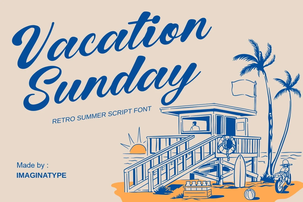
Best For: signage, clean designs, expressive designs
Vacation Sunday Font brings brush-like contrast together with sweeping entry and exit strokes, creating strong directional movement for signage. Its Retro Script Fonts character is most effective at large scale, since the internal shapes and connected details lose clarity in smaller lettering.
Hasmuter Font
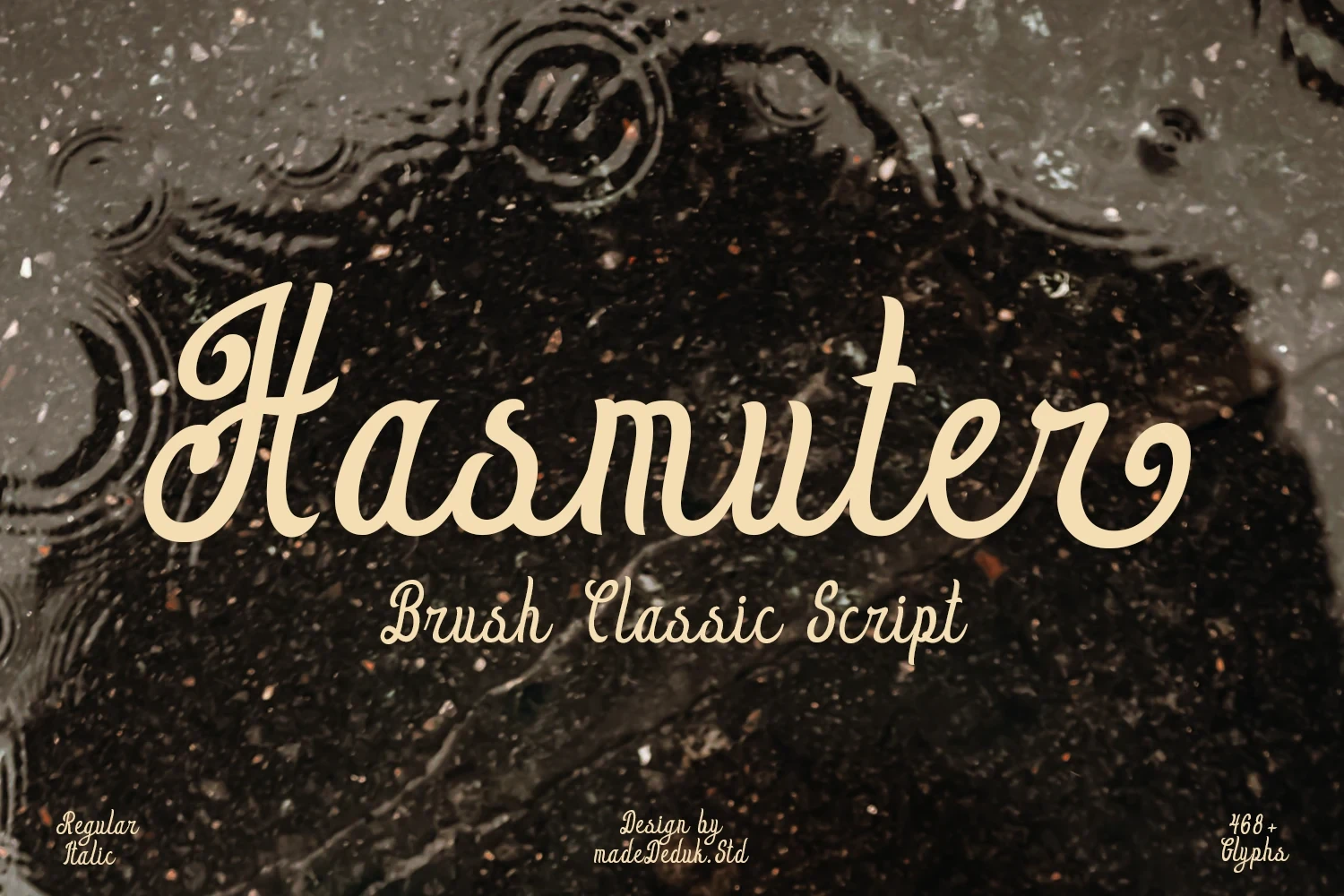
Best For: clean designs, classic designs, decorative designs
Hasmuter Font uses decorative connected lettering, pronounced contrast, and prominent swashes while remaining mostly upright. That controlled axis can steady a vintage layout, but its ornamental details take priority over rapid reading, so it belongs in large display treatments.
Vriegbe Font

Best For: packaging, posters, product labels
Vriegbe Font creates a dense, rhythmic texture through high-contrast connections, a rightward slant, and overlapping flourishes. It can carry packaging, posters, and product labels with concentrated movement; at smaller sizes, the crowded strokes reduce legibility. PUA-encoded characters provide access to its glyphs and swashes.
Neillo Font
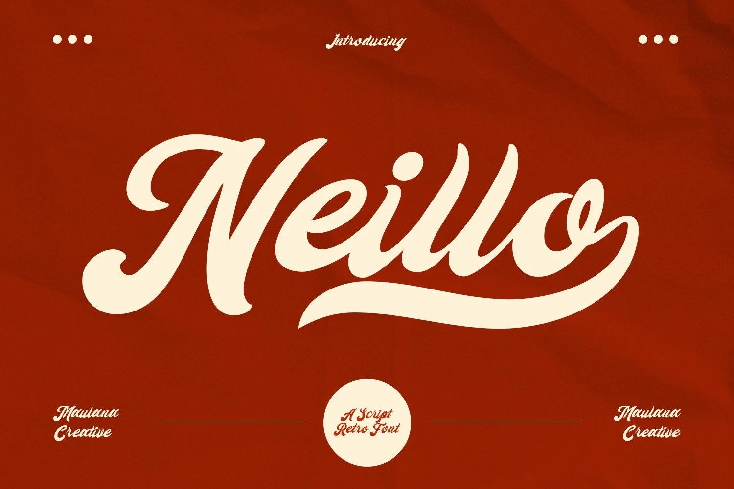
Best For: product labels, display text, clean designs
Neillo Font extends its heavy high-contrast script with a long under-swash from the final letter. That finish can turn a short word into a complete logo shape, but the connected detail quickly overwhelms small applications or longer information blocks.
Monoline And Rounded Scripts
Monoline or rounded constructions keep stroke behavior more consistent and approachable. They generally feel less ornate than the swash scripts, though long underscoring strokes and connected joins still need display space.
Palm Bay Social Font
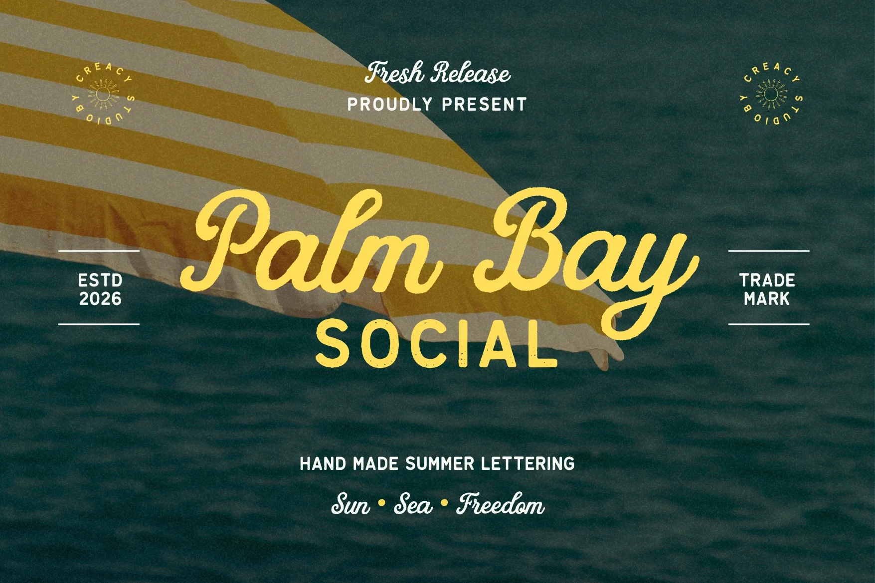
Palm Bay Social Font pairs connected cursive lettering with a distressed geometric sans serif, giving Retro Script Fonts a worn-in, summery surface for branding and posters. The script handles headlines well, while the monoline sans serif is clearer for smaller supporting copy.
Starlake – Retro Script Font
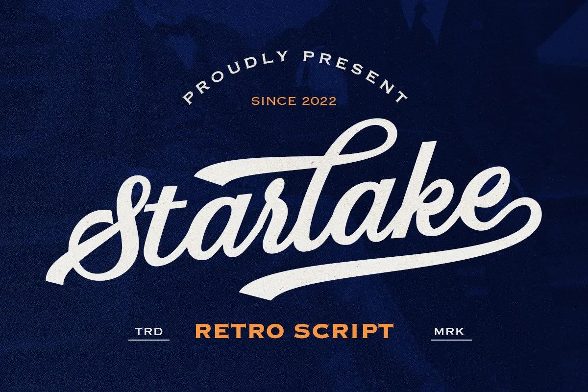
Best For: branding, signage, logos
Starlake – Retro Script Font has a wide connected footprint and an underline swash rising from the initial S, making it effective for badges, logos, and signage. Alternate characters and multilingual support add production flexibility, while the stylized width still calls for large display sizing.
Recordo Cinema Font
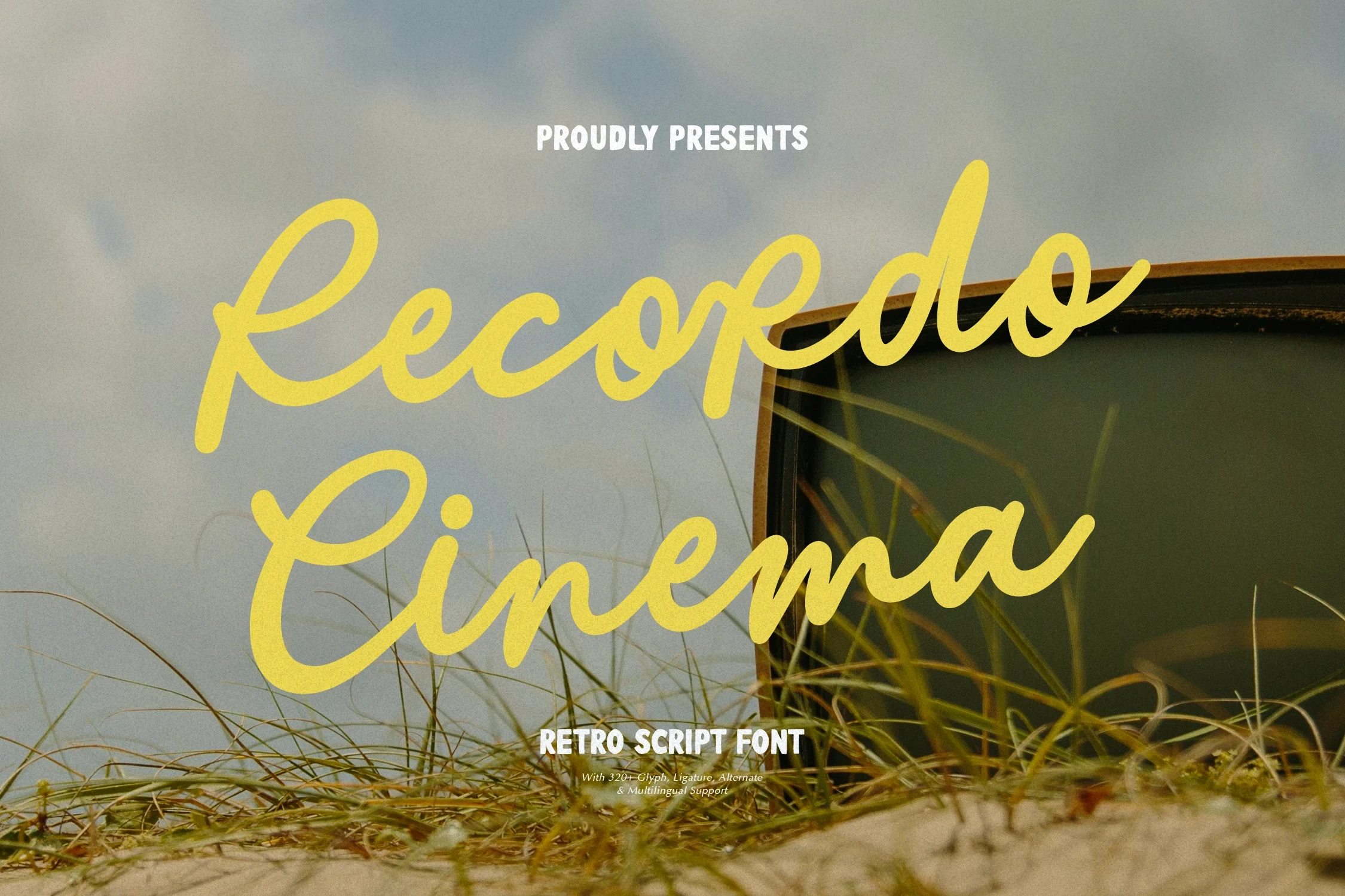
Best For: posters, product labels, clean designs
Recordo Cinema Font uses a monoline connected script with a pronounced slant and rounded terminals, creating a strong poster-header presence. Its condensed supporting treatment helps form compact label compositions, but the stylized script becomes less dependable at smaller sizes, like many Retro Script Fonts.
Pattas Signature Font
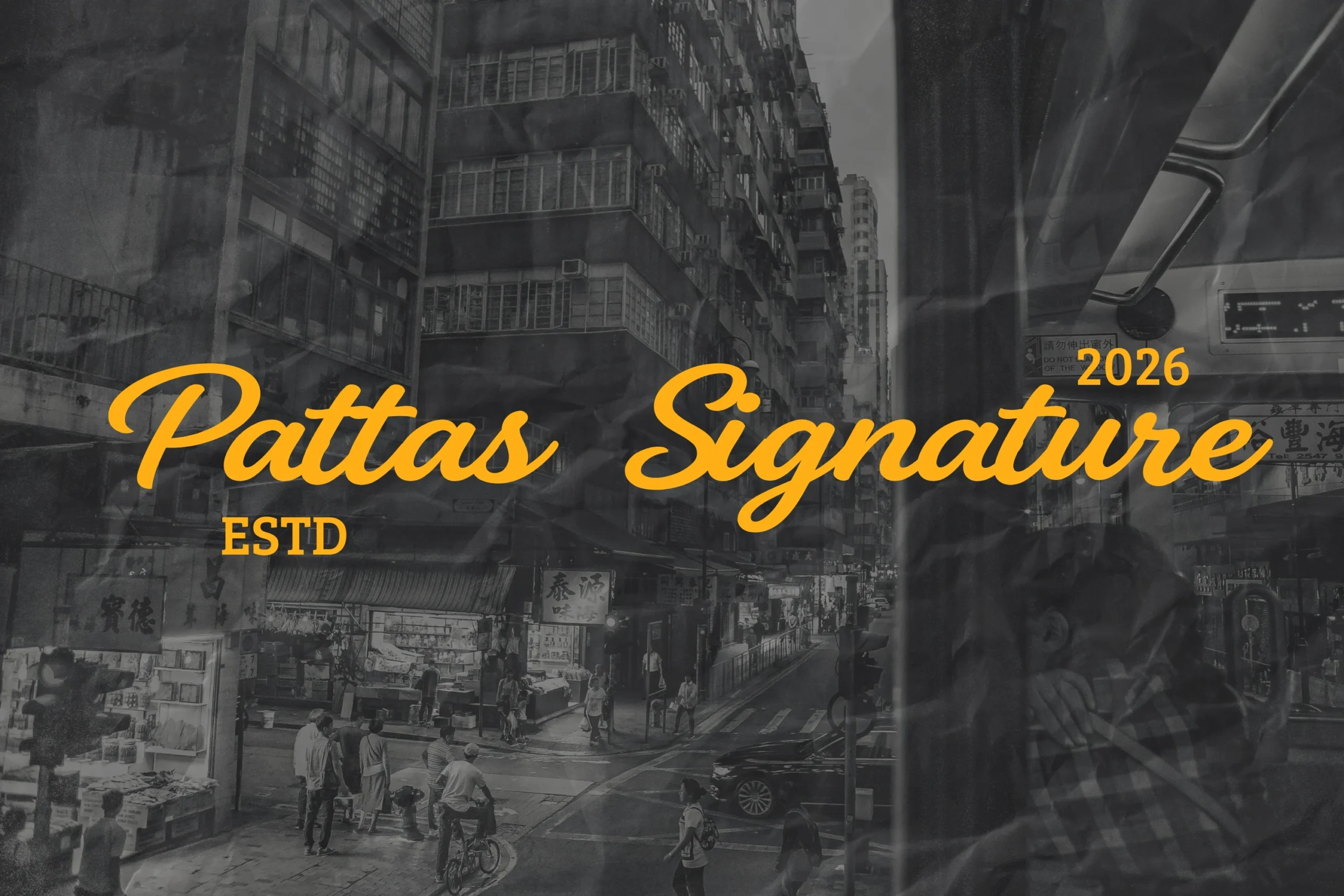
Best For: signage, classic designs, soft designs
Pattas Signature Font has a monoline structure, soft rounded terminals, and a slight slant that gives identity work a warm signature character. It performs well in signage and classic layouts, though connected strokes become harder to parse when the lettering is substantially reduced.
Violetta Font

Best For: clean designs, elegant designs, romantic designs
Violetta Font pairs rounded monoline connections with a sweeping underscore from the final letter. The construction suits approachable identity work and romantic compositions, while the swash requires careful spacing and word-length control when used below headline scale.
Courtney Font

Best For: headlines, display text, soft designs
Courtney Font uses monoline connected lettering, a moderate forward slant, and soft-edged terminals for approachable headlines and logos. The restrained construction is easier to place than a heavily flourished face, though the joins can become less dependable at tiny sizes.
Cluster Heritage Font

Best For: branding, invitations, product labels
Cluster Heritage Font is an upright monoline script distinguished by elongated swash descenders. Uniform strokes support clear branding and product labels, but the extended tails need generous vertical and horizontal room. Among Retro Script Fonts, it is a measured option for structured display identities.
How to Choose the Right Font
Choose by construction first: monoline faces offer steadier readability, while high-contrast scripts and extended swashes create stronger wordmark drama. Check slant, joins, and flourishes against the intended scale, then reserve dense Retro Script Fonts for short titles, logos, packaging, or signage and pair them with a clearer secondary face for supporting information.