22 Best Feminine Script Fonts in 2026
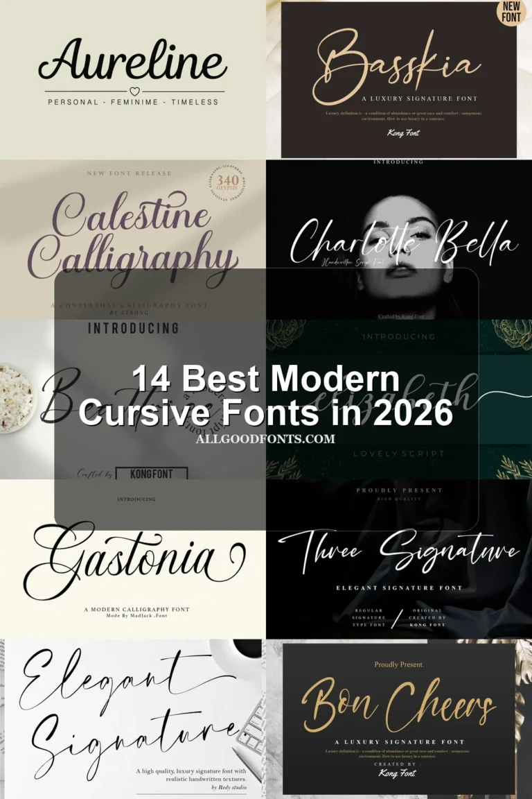
Feminine Script Fonts range from high-contrast calligraphy and polished signatures to textured brush lettering and open, disconnected handwriting. Together, these styles cover logos, invitations, packaging, beauty branding, social graphics, and other display-led work where tone and silhouette matter more than long-form readability.
Looking for more script fonts? Browse our complete Script Fonts collection to compare modern, elegant, bold, signature, and retro script styles.
Feminine Script Fonts: Flourished Calligraphy
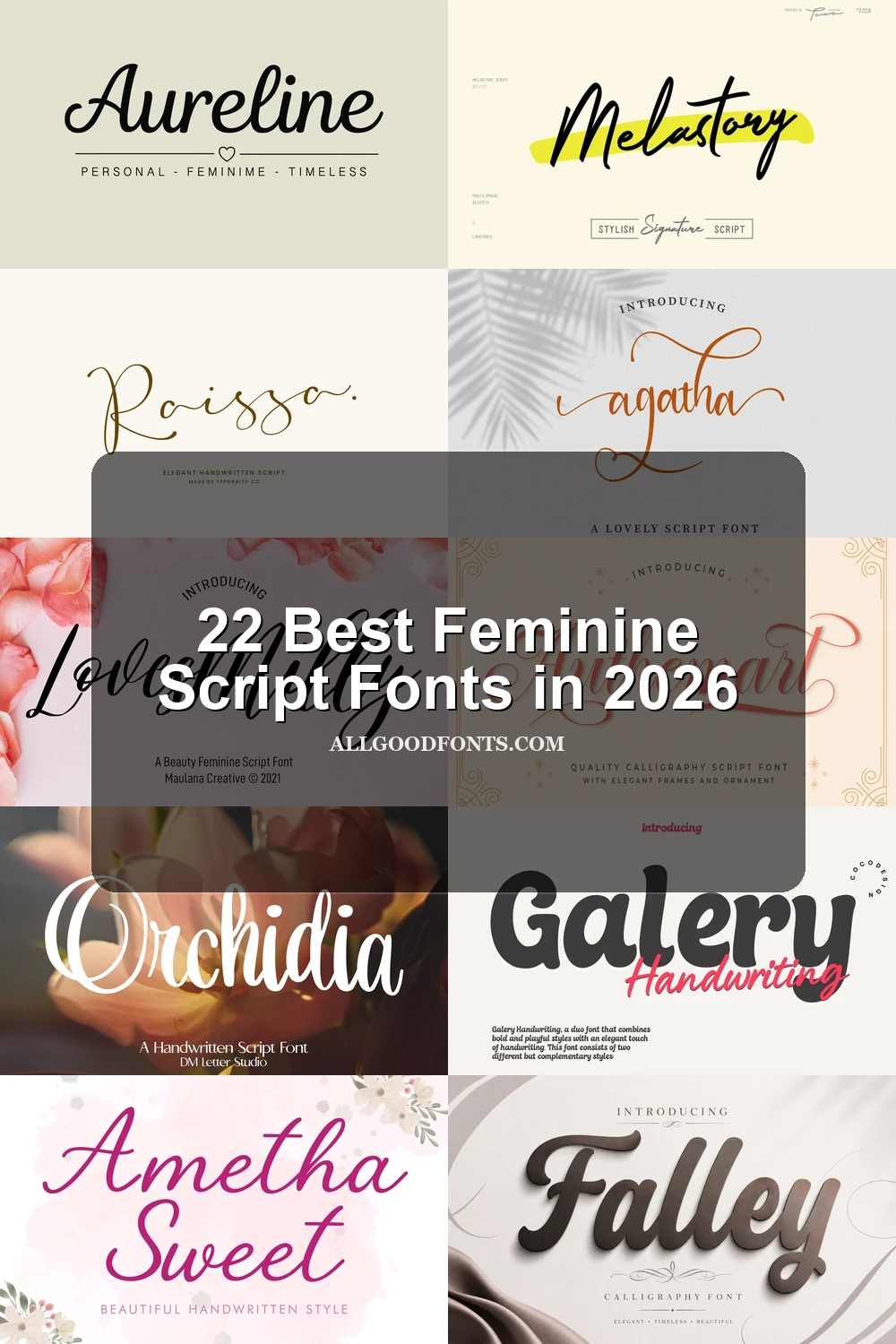
These Feminine Script Fonts emphasize high contrast, connected construction, sweeping terminals, and formal calligraphic movement. They are the most ornamental group, favoring large-scale identity work over compact text.
Ambriana Font
Best For: creative projects, website headers, display text
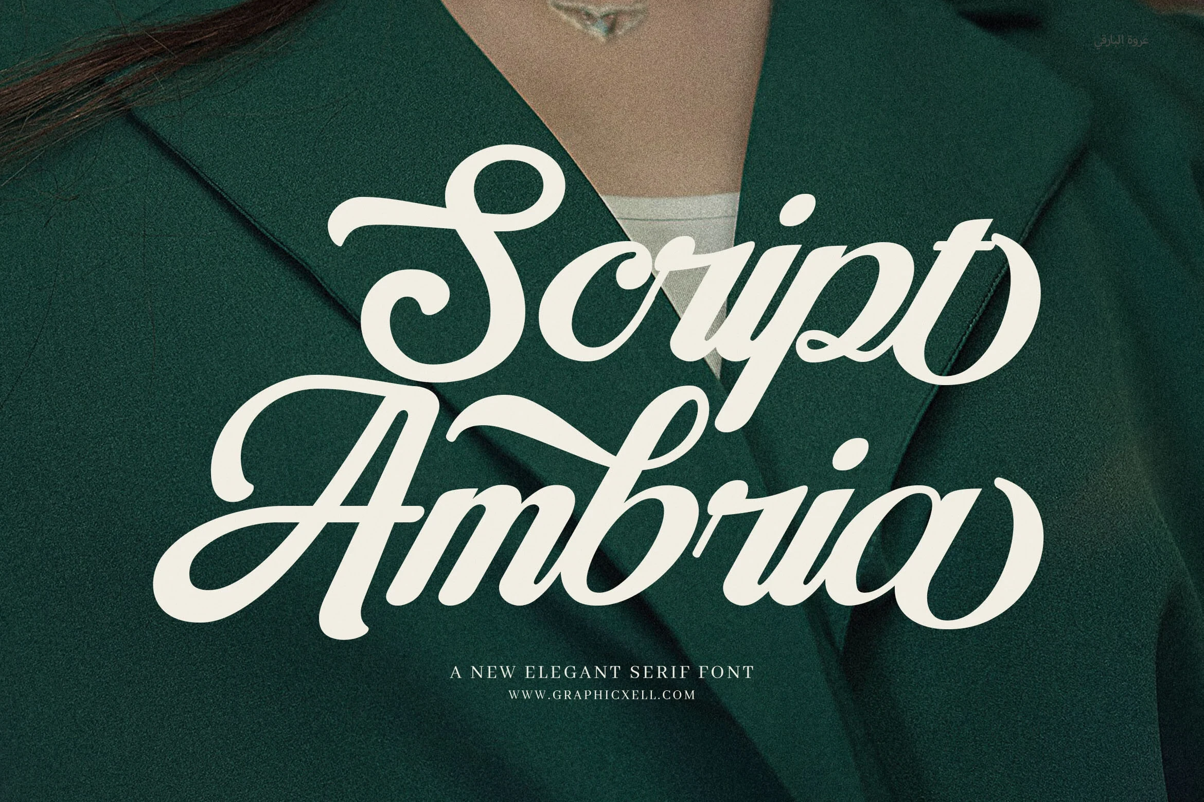
Ambriana Font combines connected cursive forms with high contrast, pronounced entry strokes, a strong forward slant, and flourished terminals. Its intricate construction makes it a persuasive choice for large branding, website headers, and display text, but extended reading will quickly become difficult.
Amellia Font
Best For: logos, branding, packaging, invitations
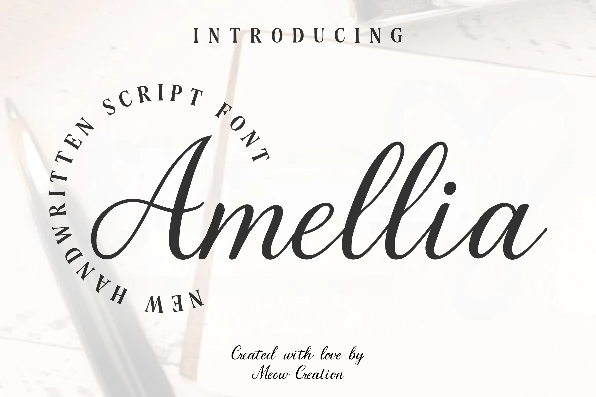
Amellia Font is built for logos, packaging, and invitations, where its heavy connected calligraphy can command attention. High contrast, a slight rightward slant, fluid movement, and included ligatures give the lettering a finished, crafted character, but the dense joins are not suited to continuous copy.
Dolcetto Script Font
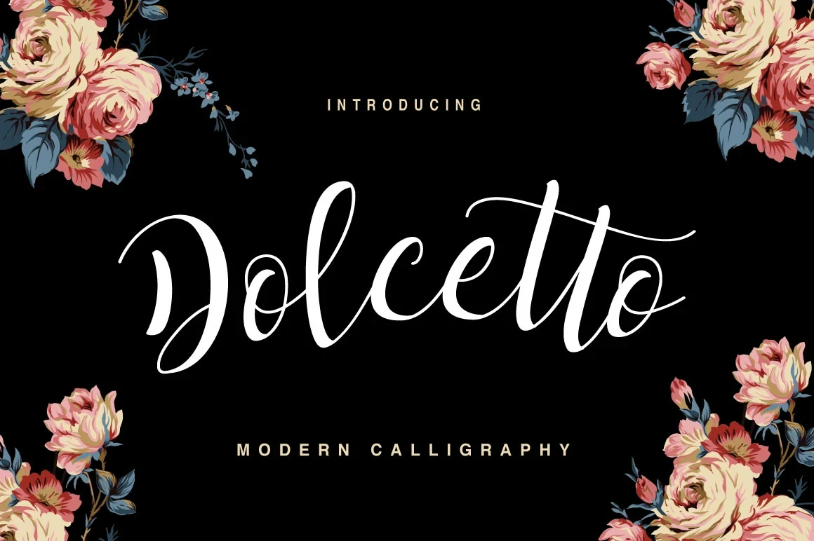
Best For: display text, modern designs, elegant designs
Dolcetto Script Font leans right with connected calligraphy, high-contrast strokes, and elongated, flourished terminals. Those extensions give invitations and logos a pronounced display presence, while also making the design impractical for paragraphs or tightly packed compositions.
Authemart Script Font
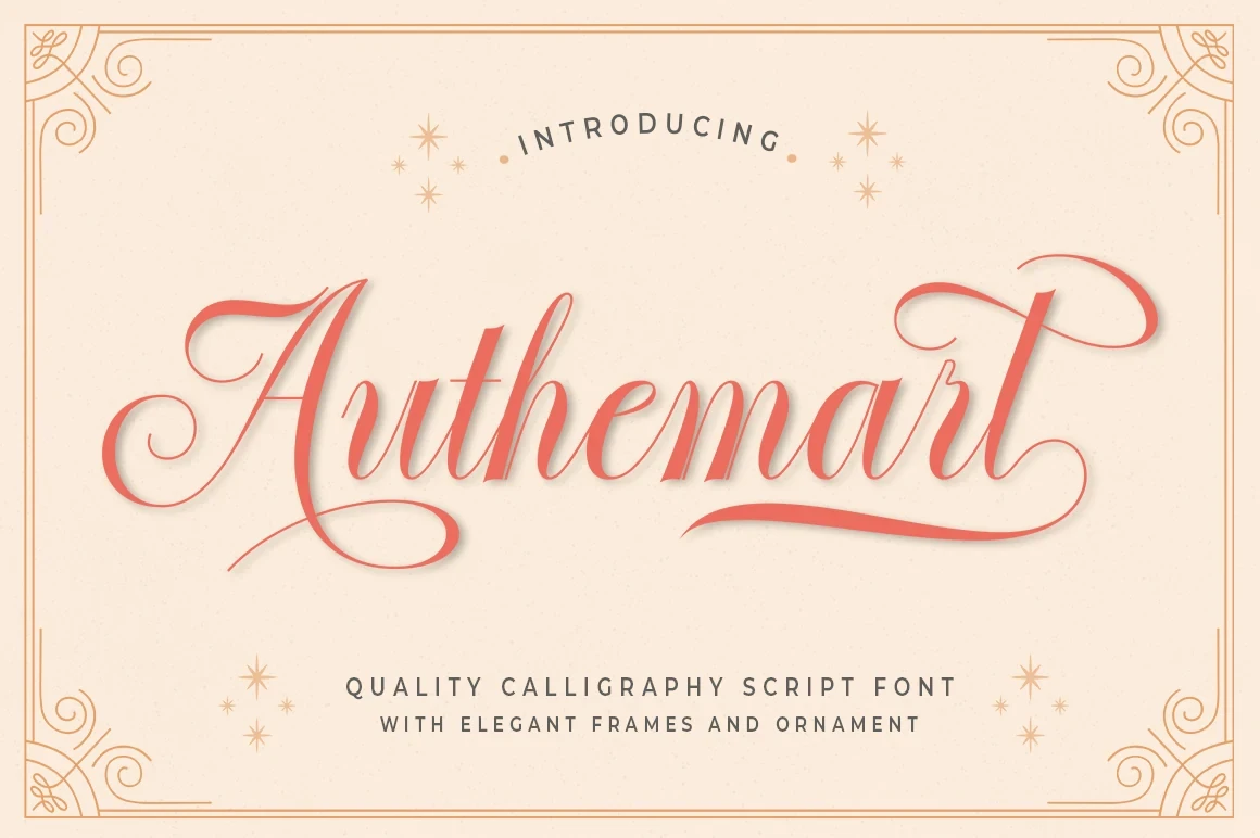
Best For: modern designs, clean designs, classic designs
Authemart Script Font pushes connected cursive toward a vintage statement style through high contrast, a pronounced slant, and exaggerated sweeping swashes. It commands attention in large headings, though its flourishes can overwhelm narrow layouts and become difficult to manage at smaller sizes.
Panda Font

Best For: modern designs, clean designs, elegant designs
Panda Font animates connected calligraphy with variable-axis strokes, rhythmic slant, high contrast, and extensive flourishes. The result supports formal display work with plenty of movement, but its dense decorative construction needs substantial size and clear surrounding space.
Agatha Font

Best For: branding, high-end designs, clean designs
Agatha Font closes the collection with connected letters, looping terminals, long flourishes, and high contrast that create an organic signature effect. Its decorative extensions suit branding and high-end designs, but the lettering needs substantial size and open spacing to keep those details clear.
Flowing Signature Scripts
Flowing signatures rely on continuous connections, slant, swashes, and handwritten rhythm. Compared with the calligraphic group, they feel more personal and fluid, though most still need generous display sizing.
Vionettay Font
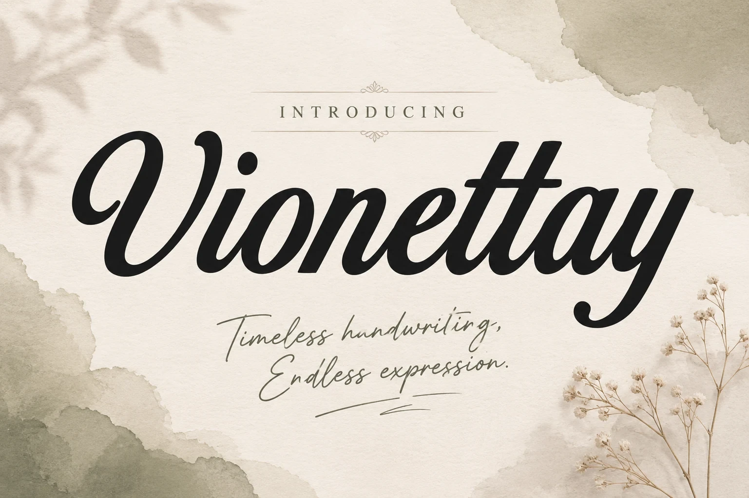
Best For: logos, branding, packaging, beauty branding
Vionettay Font makes a confident primary mark through bold connected letters, looping terminals, high contrast, and a rightward slant. The thinner companion style is useful for a secondary line, but it needs medium-to-large sizing, while the main script remains strongest in brand identities and beauty-focused work.
Aureline Font
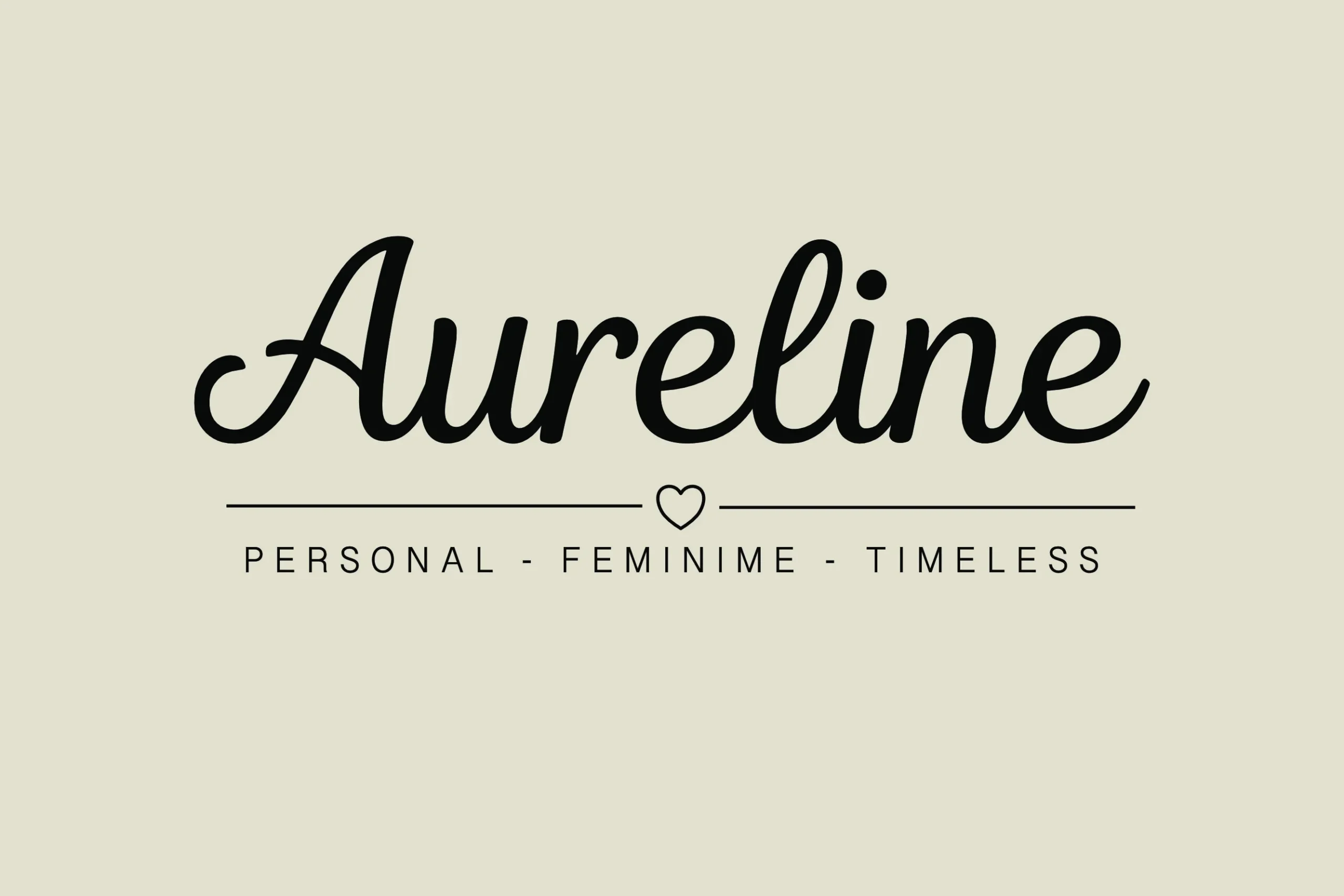
Best For: logos, branding, personal branding, beauty branding
Aureline Font has a wide, heavy connected structure with a slight rightward lean and sweeping swashes on its initial letters. It reads clearly as a large display mark for beauty or personal branding, although its thinner strokes can weaken noticeably when the lettering is reduced.
Lovesmilly Feminine Font

Best For: website headers, clean designs, elegant designs, feminine designs
Lovesmilly Feminine Font builds its identity around continuous curved connections, high contrast, and a flowing rightward movement. The uninterrupted rhythm works especially well in headers and decorative titles, but the same ornamental flow makes it a poor choice for body-sized text or long passages.
Raissa Font

Best For: display text, minimal designs, clean designs
Raissa Font combines connected calligraphy with a visibly slanted baseline, creating directional movement across a word. That shifting rhythm adds personality to logos and display text, but it interrupts paragraph flow and is best kept to short, prominent phrases.
Aurelia Font

Best For: product labels, modern designs, clean designs, elegant designs
Aurelia Font offers light connected strokes, variable width, a slanted baseline, and a finely drawn calligraphic texture. That restrained construction suits product labels and refined display work, but its thin details and intricate curves lose definition quickly when used small.
Ametha Sweet Font

Best For: modern designs, clean designs, feminine designs, soft designs
Ametha Sweet Font uses soft rounded forms and a mostly monoline connected structure to create an approachable handwritten rhythm. Its limited contrast feels gentle in invitations and soft branding, though it carries less formal weight and becomes harder to read below display sizes.
Flaura Font
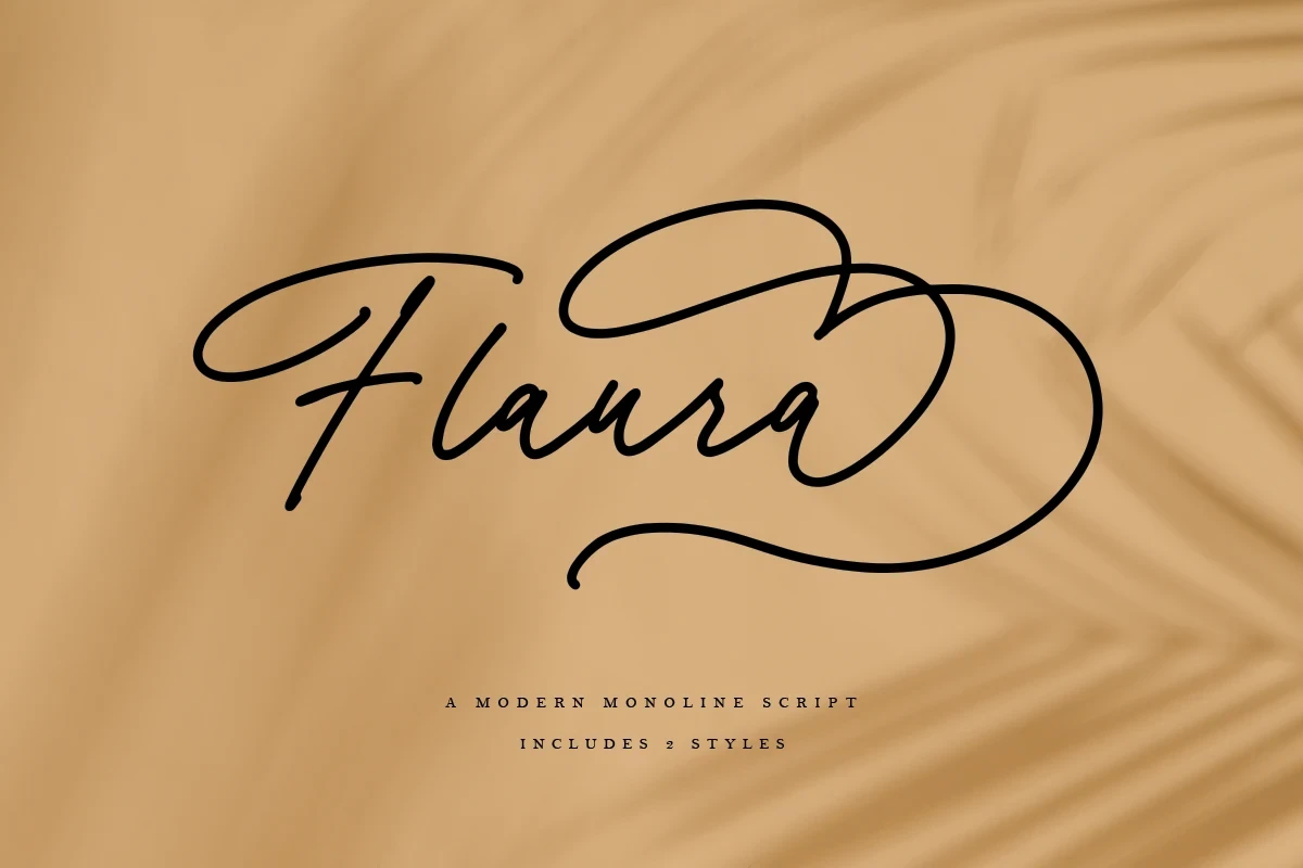
Best For: minimal designs, elegant designs, feminine designs, decorative designs
Flaura Font contrasts a connected monoline foundation with extended decorative swashes and a rightward slant. That balance can support minimalist feminine branding when the lettering has room to breathe, but the terminals should remain at display scale rather than entering small supporting text.
Emelia Font

Best For: logos, branding, invitations, quotes
Emelia Font pairs consistent monoline strokes with a strong rightward slant and prominent swashes on its initial and terminal letters. It works naturally for logos, invitations, quotes, and branding; multilingual support and file formats add practical flexibility, while the swashes still demand display sizing.
Heroic Trouble Script Font

Best For: invitations, magazine covers, modern designs, feminine designs
Heroic Trouble Script Font deepens its connected lettering with included ligatures, alternate characters, rightward slant, and varied fluid line weight. It suits invitations and magazine covers where expressive details can be shown generously, but the swashes and contrast require large display treatment.
Bold Organic Display Scripts
These bold organic scripts use heavier weight, irregular motion, brush texture, or controlled monoline forms. They bring more visual force and casual energy than the finer signature styles.
Clementine Font

Best For: soft designs, expressive designs, decorative designs
Clementine Font uses a connected, right-leaning brush construction with changing stroke weight and a tactile textured surface. Decorative swashes reinforce its informal, organic tone, making it effective for expressive headings and other large display moments; at smaller sizes, that texture reduces clarity.
Belita Font
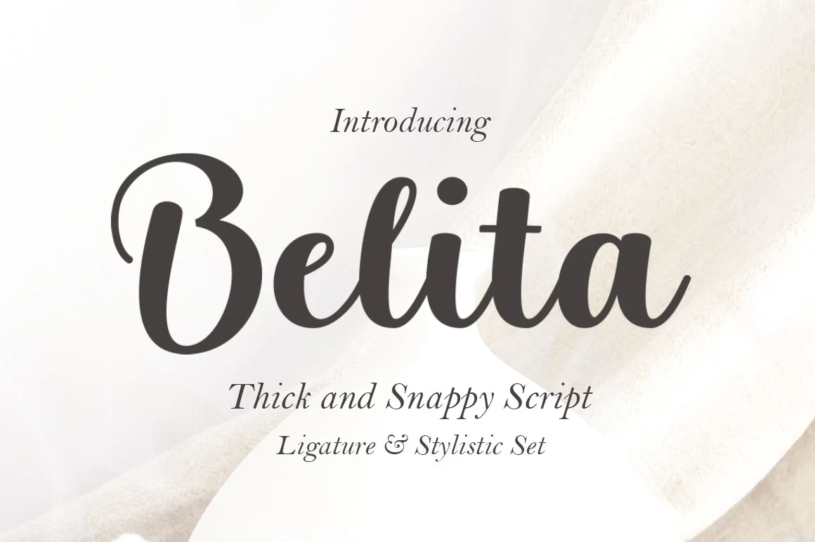
Best For: branding, packaging, invitations, wedding designs
Belita Font gives Feminine Script Fonts a more upright, forceful option through heavy connected letters, high contrast, and minimal slant. Its thick weight remains legible in medium-to-large display settings, making it practical for branding, packaging, invitations, and wedding designs, though sharp reduction costs clarity.
Melastory Script Font
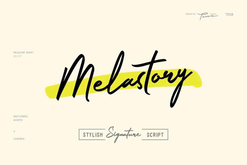
Best For: product labels, modern designs, clean designs, feminine designs
Melastory Script Font uses connected cursive forms, a rightward lean, irregular baseline, and changing stroke weight to create spontaneous personal motion. That instability energizes labels and branding, but it also disrupts dense reading, especially when the lettering is reduced or arranged in long lines.
Falley Font

Best For: social media graphics, logos, branding, packaging
Falley Font uses bold monoline connections and rounded terminals to create a controlled, steady script silhouette. It is a strong option for readable logos and packaging, offering dependable weight at display sizes, though its uniform strokes provide less calligraphic contrast than more expressive alternatives.
Open Handwritten Displays
Open handwritten displays separate characters or combine script with rounded display lettering. Their looser construction feels approachable and readable in titles, while remaining unsuitable for dense body copy.
Orchidia Font

Best For: product labels, logos, branding, packaging
Orchidia Font separates its pen-like letters rather than relying on conventional cursive joins, giving its organic script a distinctive open rhythm. The looped capital O can become a memorable logo or label detail, while the heavy, high-contrast forms need display scale to stay clear.
Galery Handwriting Font
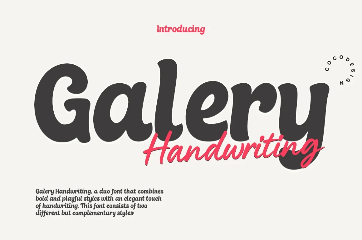
Best For: logos, branding, packaging, headlines
Galery Handwriting Font combines disconnected monoline script with bold rounded display lettering, creating a deliberately playful two-part system. The rounded companion improves headline legibility across sizes, while the script is better treated as a short accent for logos, packaging, or title work.
Andelina Font

Best For: social media graphics, branding, invitations, beauty branding
Andelina Font brings Feminine Script Fonts an informal brush voice through thick upright strokes, disconnected characters, and irregular proportions. Its bold title remains readable in social graphics and branding, while the uneven forms feel less polished when reduced or used for small secondary information.
How to Choose the Right Font
Choose among Feminine Script Fonts by matching construction to the job: high contrast and flourishes suit large identity work, monoline or bold forms improve display readability, and disconnected lettering adds a more casual voice. Test every choice at its intended scale, reserving the most intricate scripts for short headlines, logos, labels, and invitations.