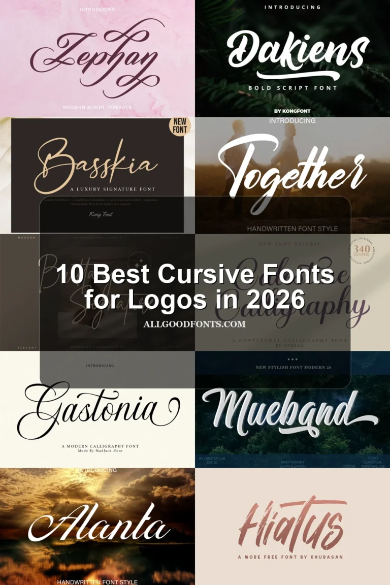
14 Best Modern Cursive Fonts in 2026
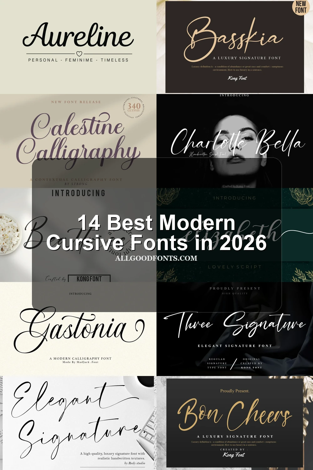
This collection moves from thin, high-contrast lettering and elaborate swashes to heavier connected scripts, monoline curves, and controlled signature forms. Modern Cursive Fonts work best as display lettering for logos, invitations, packaging, headers, apparel, and personal branding rather than extended reading.
Looking for more cursive fonts? Browse our complete Cursive Fonts collection to compare modern, bold, wedding, logo-friendly, and Cricut-ready cursive styles.
Modern Cursive Fonts: Flourished Display Scripts
Modern Cursive Fonts in this group emphasize high contrast, pronounced slant, loops, and decorative entry or terminal swashes, creating stronger display impact than the cleaner monoline selections.
Beattrice Font

Best For: headlines, modern designs, elegant designs
Beattrice Font pairs connected, high-contrast lettering with fluid curves, a varying baseline, and an extended uppercase B swash. It creates strong headline and logo presence, but its decorative movement is less dependable in small text or longer lines.
Gathering Day Font

Best For: headlines, modern designs, elegant designs
Thin strokes, pronounced rightward movement, and long entry and exit swashes define Gathering Day Font. This high-contrast script brings strong visual direction to short titles and logos, while its delicate flourishes need generous display scale for clear reading.
Together Font
Best For: logos, branding, invitations, personal branding
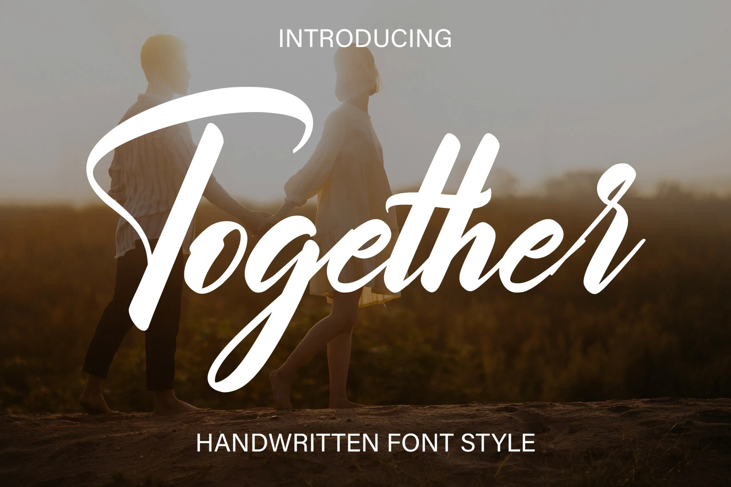
Together Font makes an immediate impression through its strong calligraphic slant and pronounced lead-in and terminal swashes. The dramatic movement suits invitations, logos, and personal branding, but the stylized joins make rapid reading difficult outside large display settings.
Elegant Signature Font
Best For: modern designs, clean designs, decorative designs
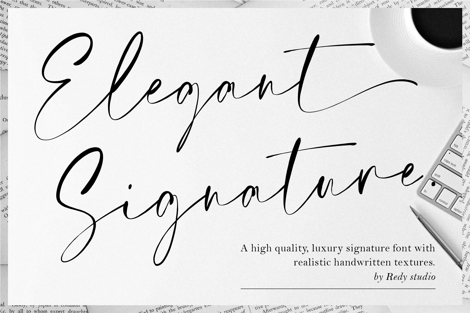
Heavy strokes and high contrast give Elegant Signature Font substantial presence, while long entry strokes and terminal flourishes add movement. It is most effective in large branding treatments, not long copy; PUA-encoded characters provide access to its glyphs and swashes.
Basskia Font
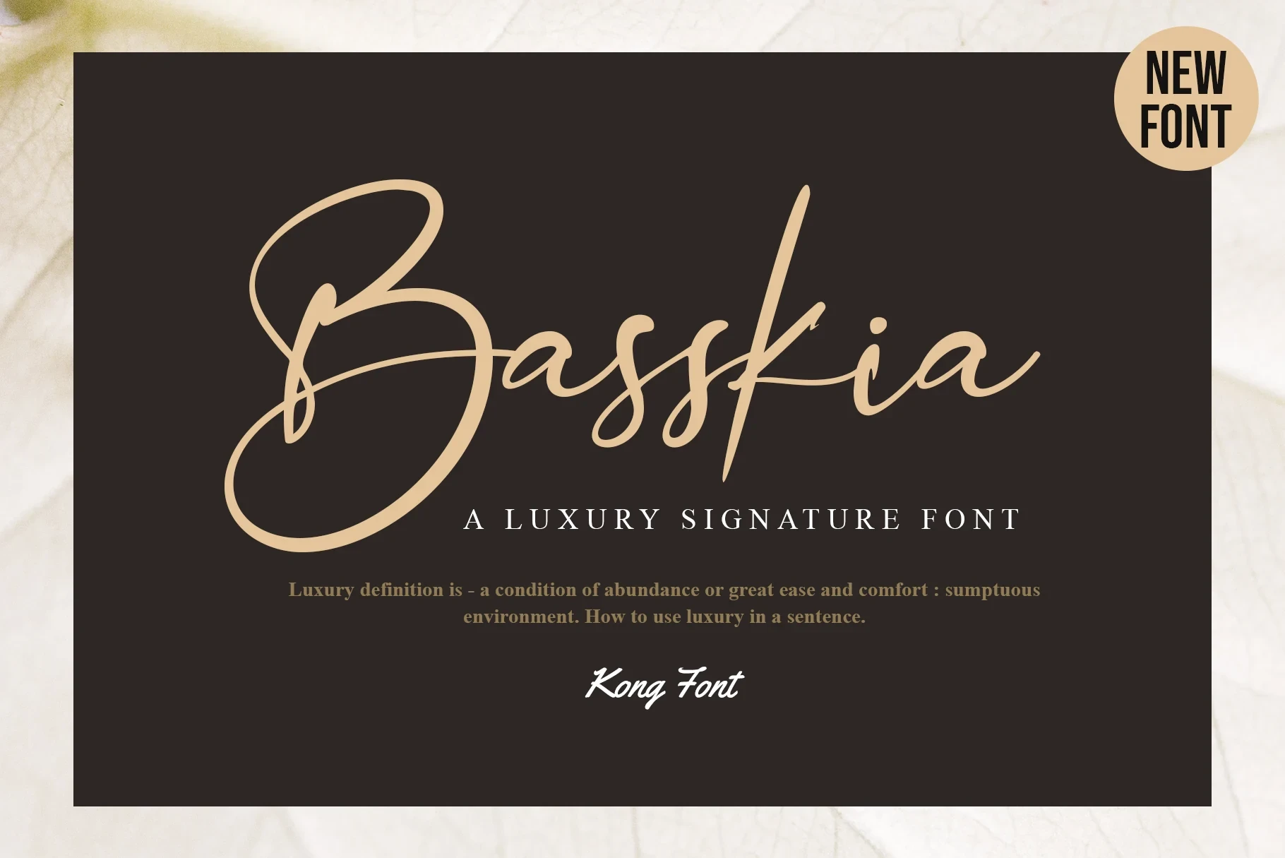
Best For: creative projects, website headers, modern designs, clean designs
For Modern Cursive Fonts used in website headers, Basskia Font combines a forward slant with heavy contrast and looping swashes that grow from its opening and closing characters. Its ornate terminals reward display-scale branding, while smaller applications lose clarity quickly.
Elizabeth Font

Best For: product labels, website headers, modern designs, clean designs
Elizabeth Font builds its connected forms from varied line weight and long terminal swashes, making a single word feel like a polished focal point. It suits product labels and headers, though its decorative endings are less reliable at small sizes.
Gastonia Script Font
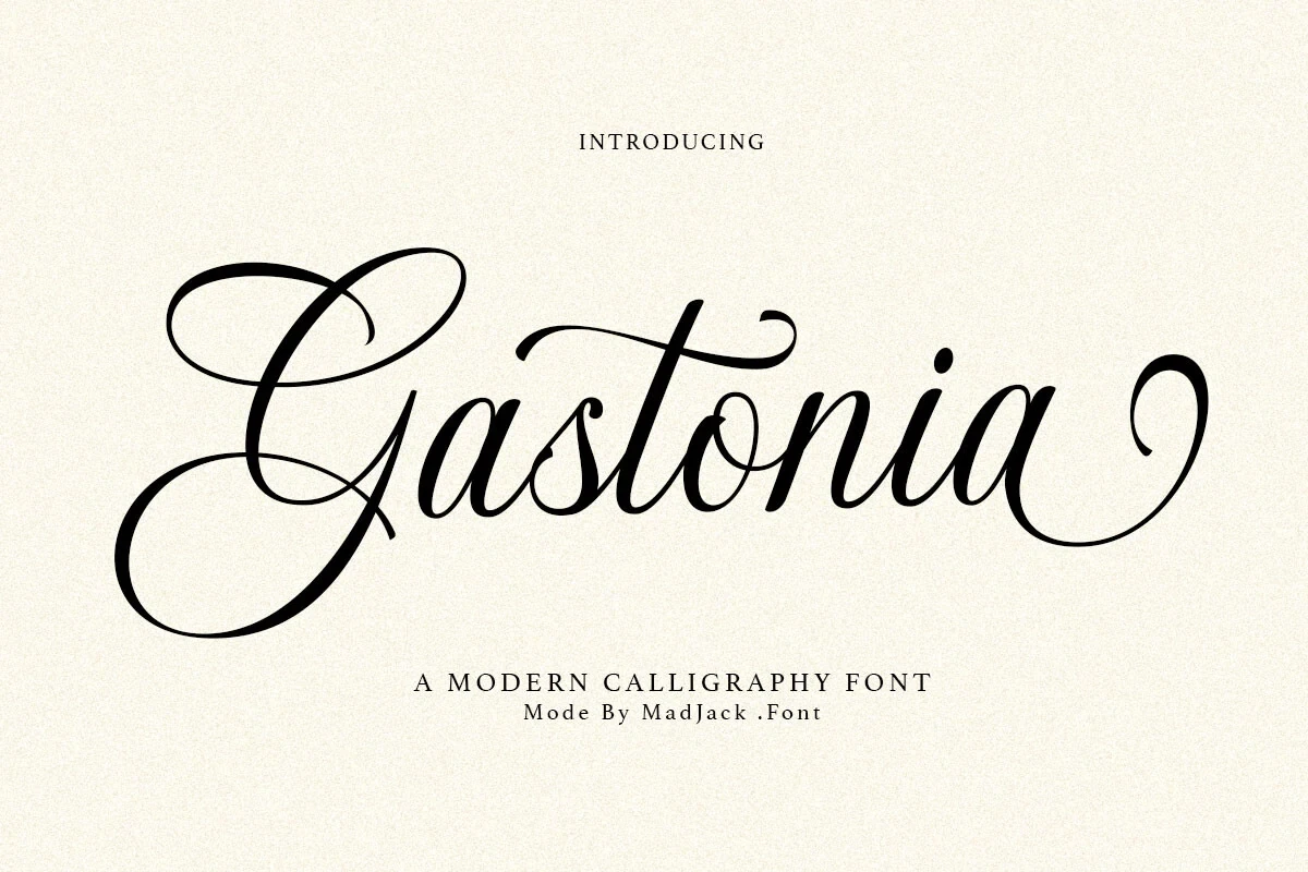
Best For: branding, packaging, editorial designs, invitations
Gastonia Script Font brings a heavy connected structure, pronounced rightward slant, and flourished entry and exit strokes to display lettering. Its directional energy fits packaging, invitations, and branding, but the complex swashes make extended copy impractical.
Aureline Font

Best For: logos, branding, personal branding, beauty branding
Looped lowercase ascenders and descenders set Aureline Font apart from flatter signature styles. Its heavy connected forms and slight forward slant keep the movement controlled for logos and beauty branding, while the decorative detail still favors titles over small text.
Calestine Calligraphy Font
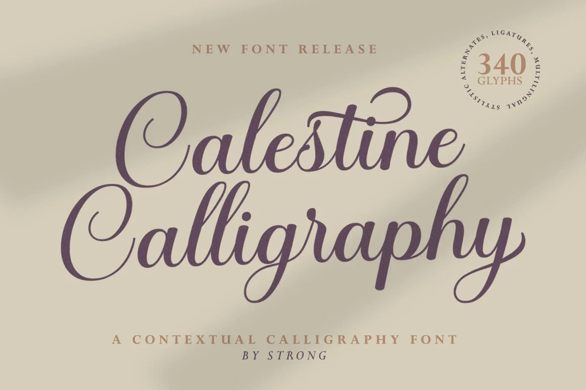
Best For: modern designs, clean designs, elegant designs, decorative designs
For Modern Cursive Fonts with formal calligraphic energy, Calestine Calligraphy Font combines high contrast, a rightward slant, and ornamental swashes on uppercase and final letters. Those dense details suit ceremonial or decorative headings, but not long-form reading.
Charlotte Bella Font
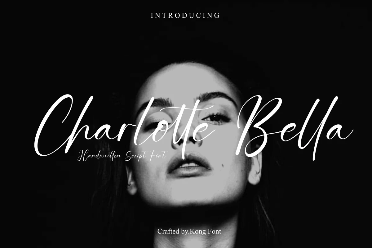
Best For: logos, branding, T-shirts, personal branding
Charlotte Bella Font leans strongly right through extended loops, thin-and-thick contrast, and ornamental swashes. The connected silhouette works on logos, apparel, and personal branding, but delicate strokes and flourishes weaken clarity when the lettering is reduced.
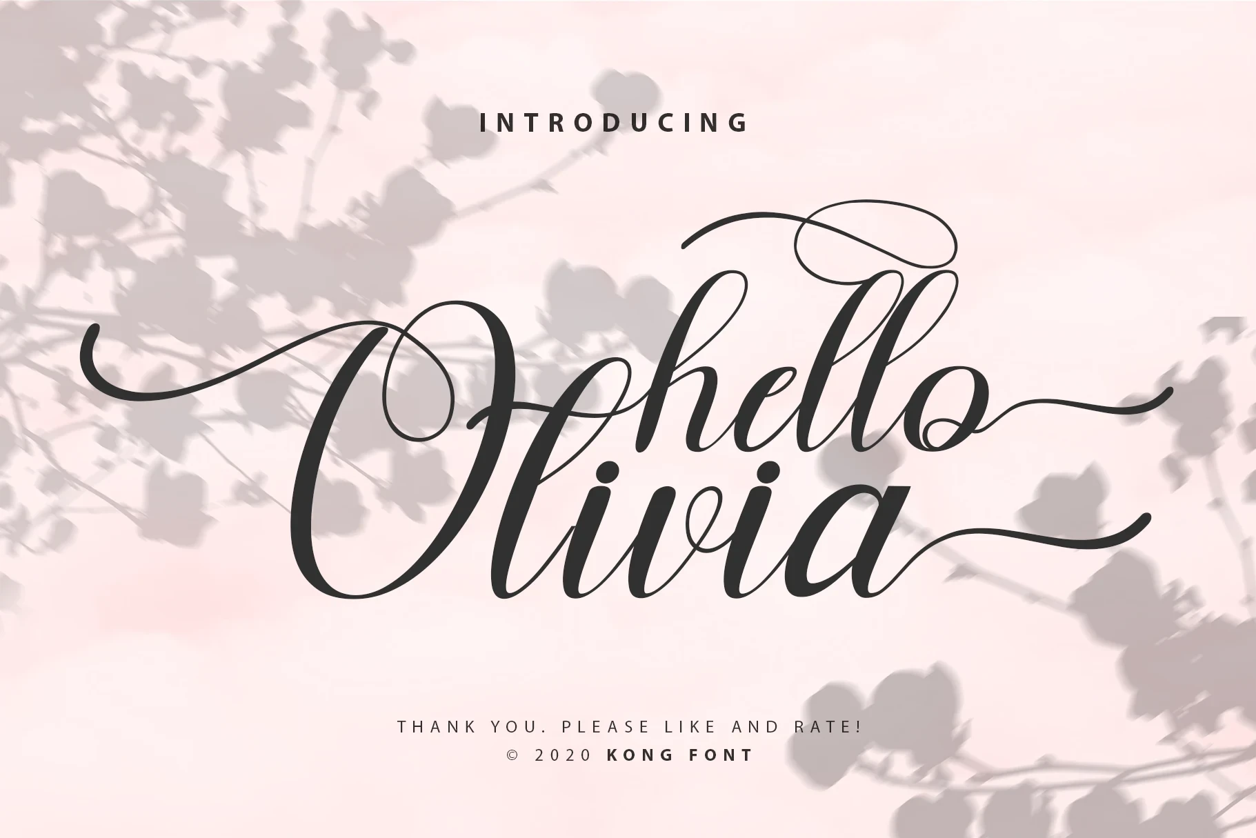
Hello Olivia Font
Best For: branding, creative projects, modern designs, minimal designs
Hello Olivia Font balances high-contrast connected lettering with monoline loops and flourishes at its initial and final strokes. The combination creates a decorative branding accent for large words, while delicate details become harder to read when reduced.
Monoline Signatures and Flowing Curves
These connected scripts use steadier monoline strokes, condensed proportions, rounded curves, or a restrained axis, giving them a cleaner signature rhythm than the more flourished display faces.
Bon Cheers Font

Best For: creative projects, modern designs, clean designs, elegant designs
For Modern Cursive Fonts with a signature-led feel, Bon Cheers Font offers a condensed footprint, even monoline construction, and a distinct rightward slant. Its connected rhythm feels personal and clean at display sizes, though the narrow width can blur in small print or tight web columns.
Elatina Font

Best For: product labels, modern designs, clean designs
Elatina Font uses monoline connected forms, exaggerated loops, and sweeping swashes against a mostly upright axis. That restrained slant gives its ornament a distinctive vertical character, although the flourishes keep it best suited to short titles and labels.
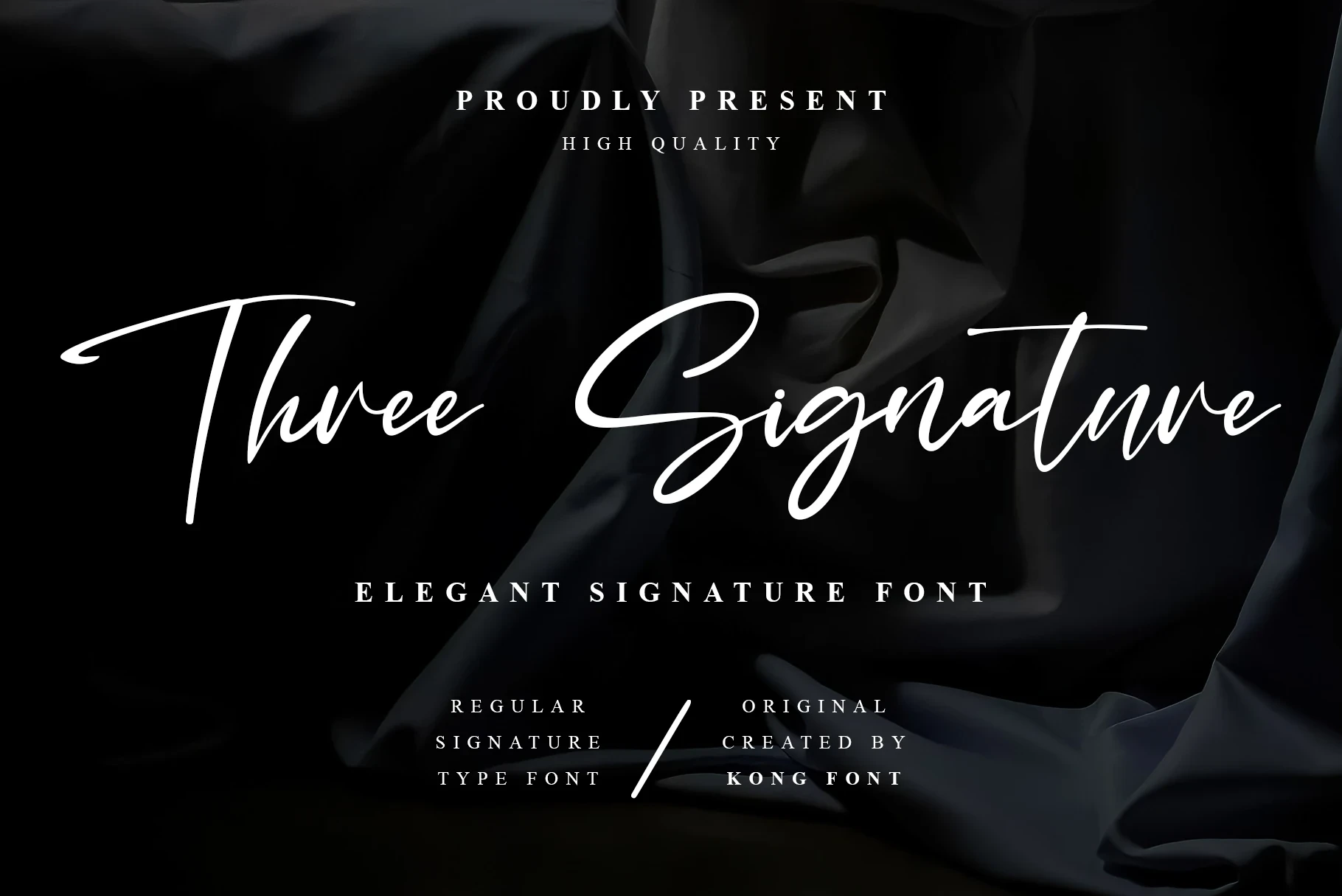
Three Signature Font
Best For: modern designs, elegant designs, playful designs, personal branding
Three Signature Font offers Modern Cursive Fonts a softer alternative through rounded curves and a consistent monoline stroke. Its right-leaning axis supports personal branding and headings, though continuous joins can blur at smaller sizes; PUA-encoded characters include its glyphs and swashes.
How to Choose the Right Font
Choose heavier, high-contrast faces when a logo or header needs immediate presence, and favor monoline or more upright options when you want a cleaner signature rhythm. Check joins, swashes, and thin strokes at the final size: Modern Cursive Fonts are strongest for short display text, not dense paragraphs.