
14 Best Cursive Fonts for Cricut in 2026
This collection moves from even, connected monoline lettering to high-contrast scripts shaped by loops, slant, swashes, and changing stroke weight. These Cursive Fonts for Cricut are best suited to display projects such as logos, labels, invitations, packaging, posters, and short phrases rather than extended reading.
Looking for more cursive fonts? Browse our complete Cursive Fonts collection to compare modern, bold, wedding, logo-friendly, and Cricut-ready cursive styles.

Cursive Fonts for Cricut: Flowing Signatures
These Cursive Fonts for Cricut emphasize continuous monoline movement, rounded endings, pronounced slants, and underline or terminal swashes, creating approachable display lettering with comparatively even weight.
Brittany Signature Script Font

Best For: logos, branding, decorative designs
Brittany Signature Script Font uses monoline connected lettering with a pronounced rightward slant and ornamental entry and exit swashes. For Cursive Fonts for Cricut, it works best in large logos or display words, since its fluid joins become difficult to decipher when reduced.
Barack Script Font
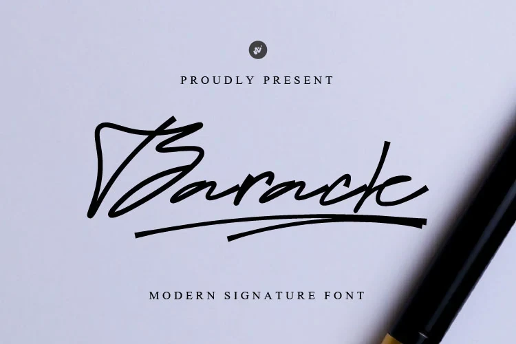
Barack Script Font carries a slightly varied connected stroke into a dedicated underline swash, giving short words a finished, self-contained effect. Its ligatures add alternate connections, while the pronounced slant and decorative treatment make it more suitable for labels and wordmarks than extended text.
Anindhita Font
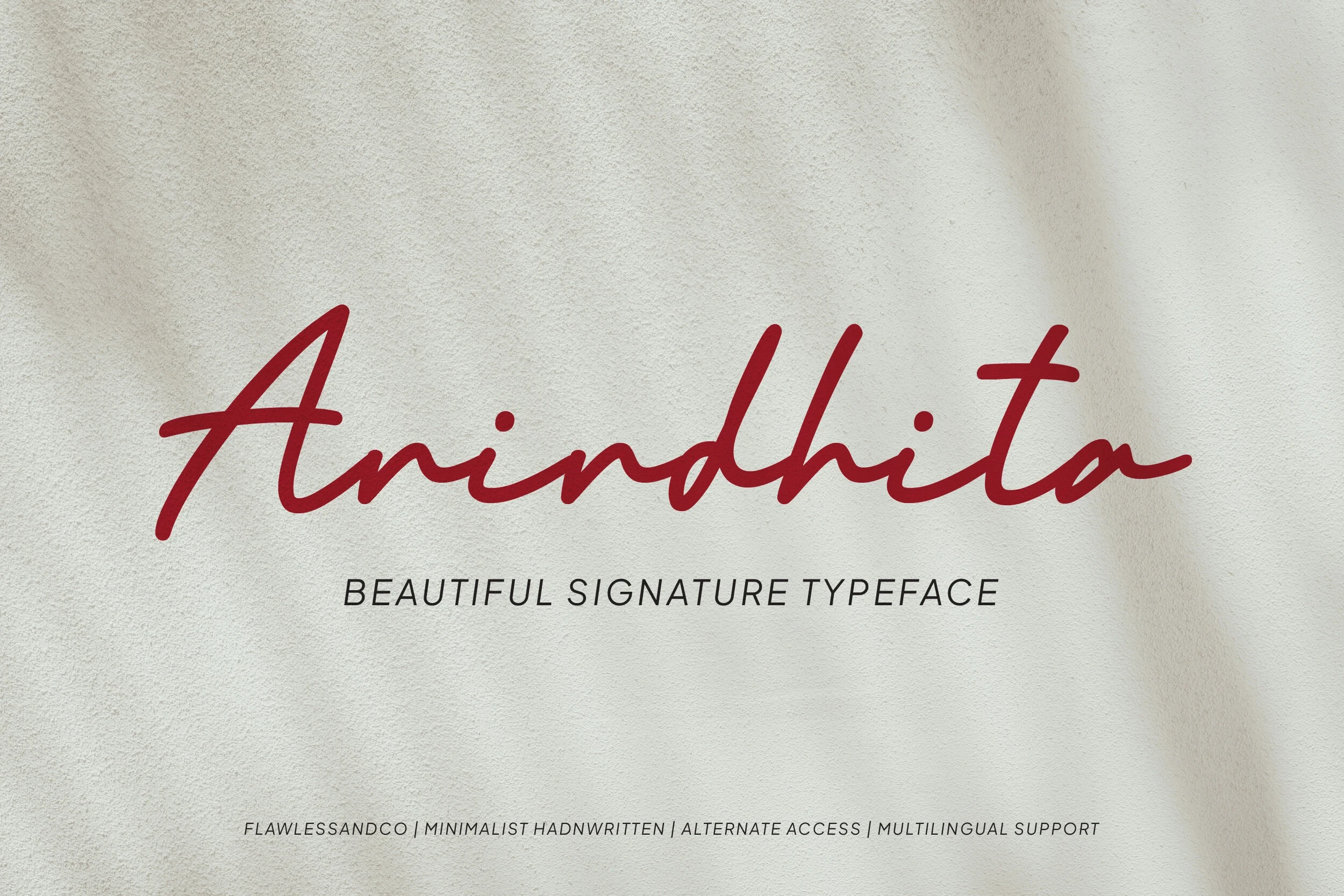
Best For: logos, branding, packaging, invitations
Anindhita Font pairs connected monoline lettering with a slight rightward slant and rounded endings, giving the script an organic, approachable finish. Among Cursive Fonts for Cricut, it is a useful option for logos, packaging, and invitations, provided reduced sizes are avoided.
Monoline Font
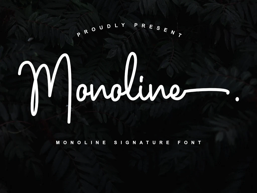
Best For: clean designs, elegant designs, luxury designs
Monoline Font has an even stroke and rounded terminals, but its pronounced vertical slant gives the otherwise steady flow extra direction. It can support clean, high-end marks, although dense curves become harder to read at very small sizes.
Daxar Signature Font

Best For: business cards, logos, branding, posters
Daxar Signature Font lets extended flourishes travel beyond the connected word, creating a pronounced outward gesture. That movement translates well to business cards, posters, and logos, while the highly stylized construction rules it out for long-form copy.
Signora Font

Best For: logos, branding, packaging, invitations
Signora Font maintains uninterrupted movement through fluid baseline connections and a connected monoline structure. Its decorative density makes it effective for logos, packaging, and headings where the joins can be seen clearly; smaller applications may lose the intended continuity.
Shadyspeed Script Font
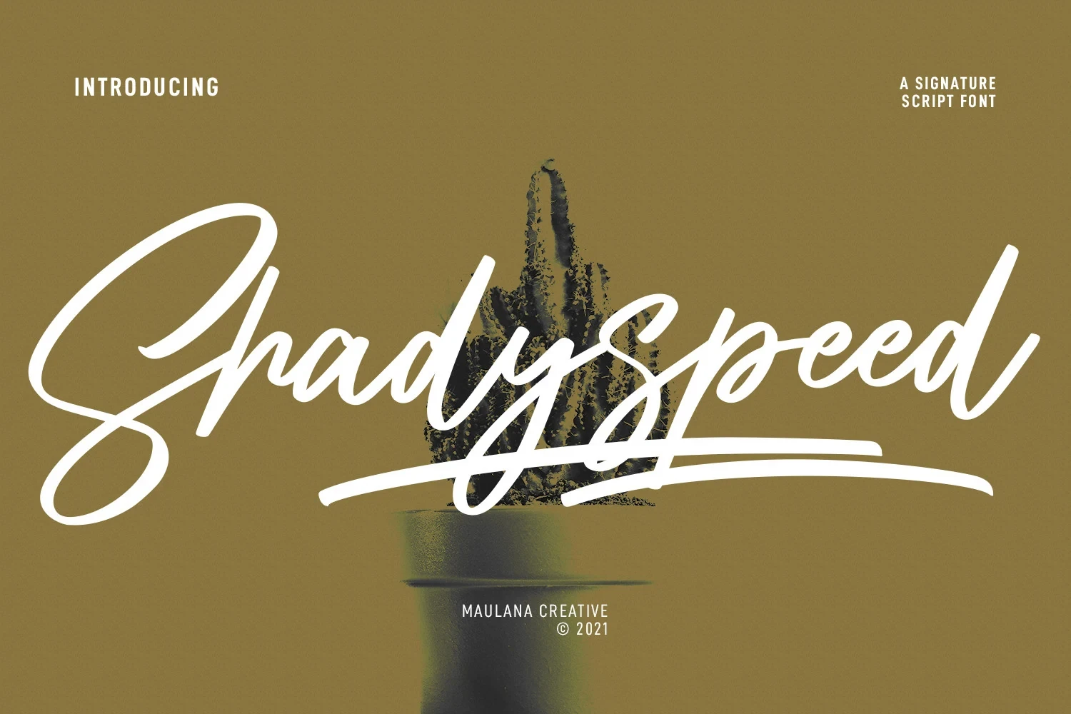
Best For: social media graphics, logos, book covers, display text
Shadyspeed Script Font combines a connected monoline form with a long underline swash, ligatures, and alternate characters. It offers moderate readability for headings and short phrases, but the extended underline and joined strokes make it unsuitable for body text.
High-Contrast Flourished Scripts
This group uses stronger thick-thin contrast, looping joins, dramatic tails, and oversized flourishes, producing more calligraphic movement and requiring larger display sizes than the steadier monoline scripts.
Caboms Font
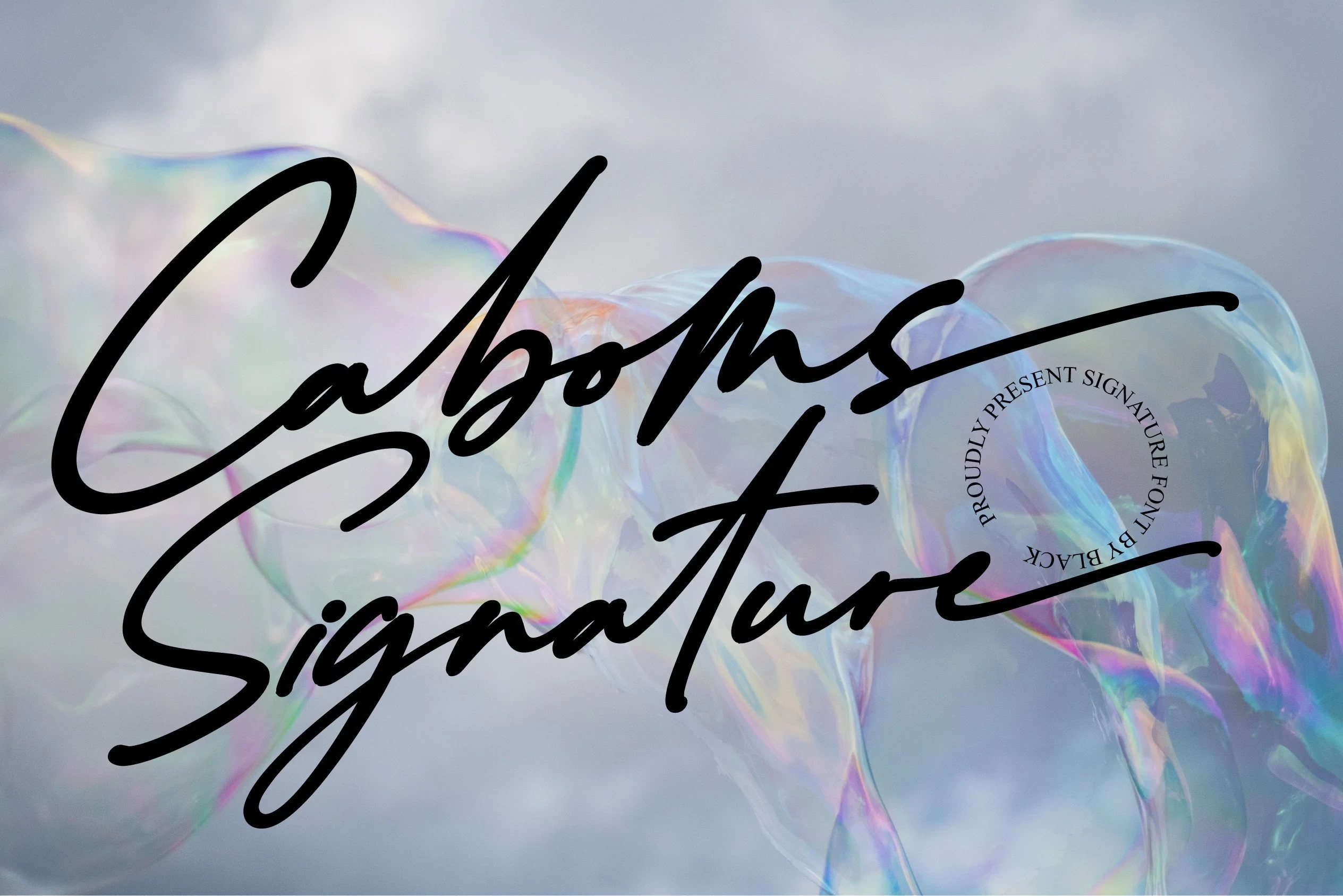
Best For: expressive designs, decorative designs, modern designs
Caboms Font builds its expressive rhythm through high stroke contrast, looping connections, varied widths, and a lively baseline. The shifting forms reward prominent display lettering where calligraphic movement matters more than instant character recognition, making it a strong choice for expressive or decorative compositions.
Villargio Font

Best For: personal branding, elegant designs, decorative designs
Villargio Font is especially effective for branding and invitations because its oversized initial V and terminal o swashes frame the word with a distinctive outline. The connected, right-slanting construction has strong visual identity, but those flourishes can compromise clarity when the lettering is reduced.
Sallutos Font
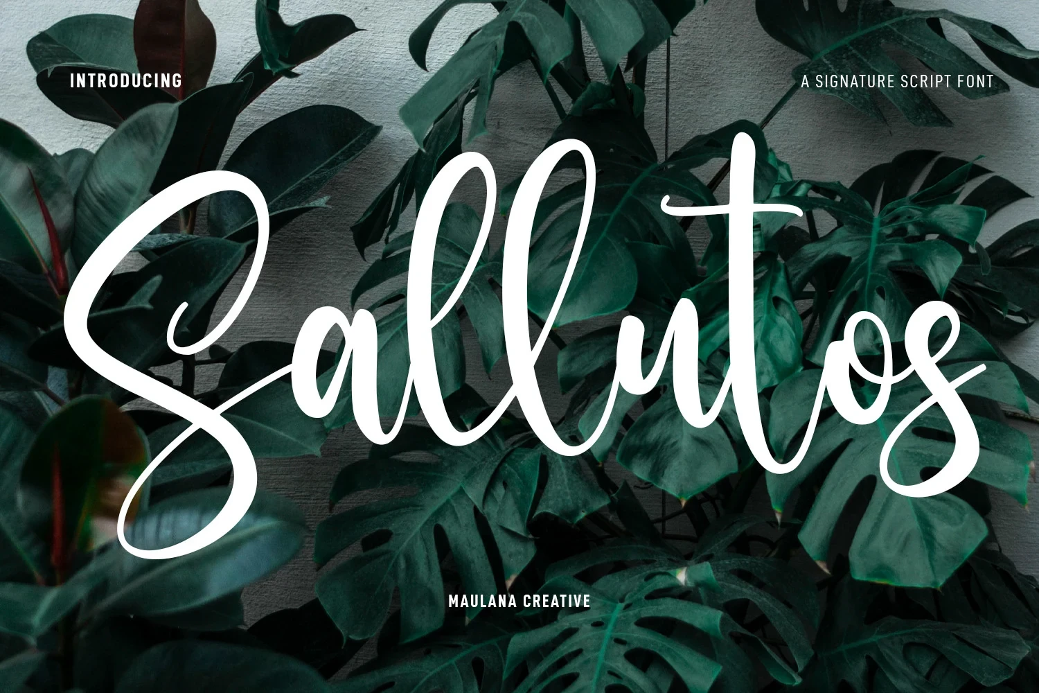
Best For: social media graphics, logos, book covers, short phrases
Sallutos Font combines heavy connected lettering with sharp thick-thin contrast, looped terminals, ligatures, alternates, and support for more than 100 languages. It suits short phrases, logos, and covers, but overlapping strokes need generous display sizing to stay clear.
Hindyloft Signature Script Font

Best For: personal branding, high-end designs, decorative designs
Hindyloft Signature Script Font drives the eye along a slanted axis and baseline, extending that direction through long tails and complex swashes. Its high-contrast connected forms suit personal branding and high-end identity work, while thin links and decoration make body-sized text impractical.
Queensytrix Signature Script Font
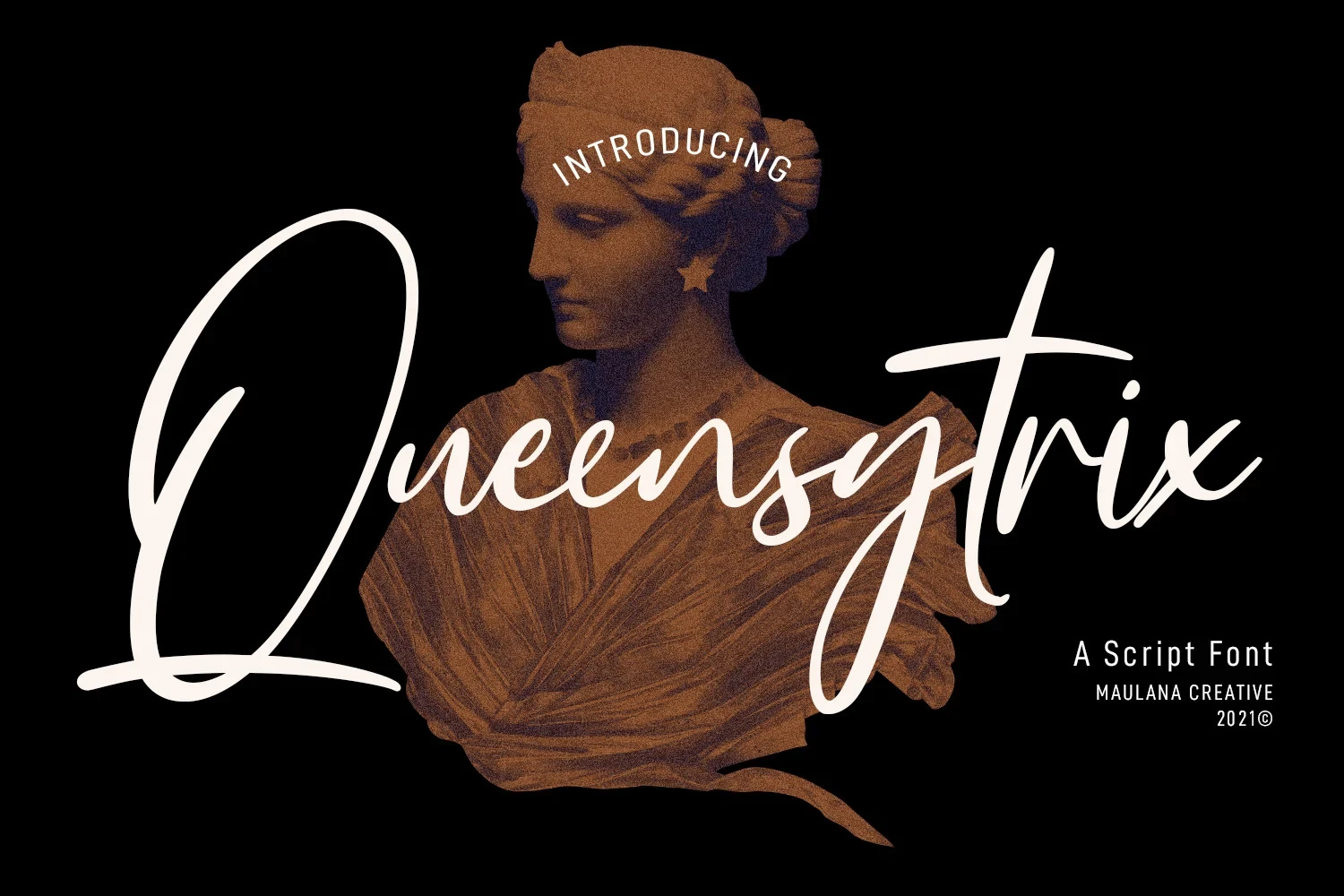
Best For: branding, minimal designs, clean designs
Queensytrix Signature Script Font keeps its connected construction light, placing emphasis on long entry and exit strokes instead of visual weight. It can give clean branding an airy heading treatment, but thin links and swashes need substantial scale for reliable reading.
Citadels Signature Script Font

Best For: expressive designs, personal branding, playful designs
Citadels Signature Script Font uses changing stroke thickness to suggest a felt-tip rhythm within its connected, right-leaning forms. That variable weight brings expressive energy to personal branding, though smaller sizes can obscure individual letter shapes.
Solovista Signature Script Font

Best For: modern designs, clean designs, elegant designs, decorative designs
Solovista Signature Script Font balances heavy connected lettering with strong thick-thin contrast and pronounced initial and terminal swashes. Ligatures and alternates broaden its decorative display options, but intricate joins demand larger lettering to preserve clarity.
How to Choose the Right Font
When choosing Cursive Fonts for Cricut, start with scale and readability: monoline options generally give steadier joins, while high-contrast styles add stronger movement and visual drama. Check whether you need ligatures, alternates, or swashes, then test the actual word at finished size before cutting, especially for thin links and dense flourishes.


