10 Best Cute Cursive Fonts in 2026
This collection moves from rounded, continuous lettering to upright mixed-join forms and more ornate, high-contrast scripts. These Cute Cursive Fonts suit logos, invitations, labels, social graphics, wall art, and short display phrases, with readability and scale varying according to each design’s joins, weight, and decorative detail.
Looking for more cursive fonts? Browse our complete Cursive Fonts collection to compare modern, bold, wedding, logo-friendly, and Cricut-ready cursive styles.
Cute Cursive Fonts: Rounded Flow
Cute Cursive Fonts in this group use rounded curves, monoline strokes, and softened joins for an approachable flow. They are generally cleaner and more readable than the ornate scripts elsewhere.
Snapdragons Font

Best For: invitations, creative projects, short phrases, wall art
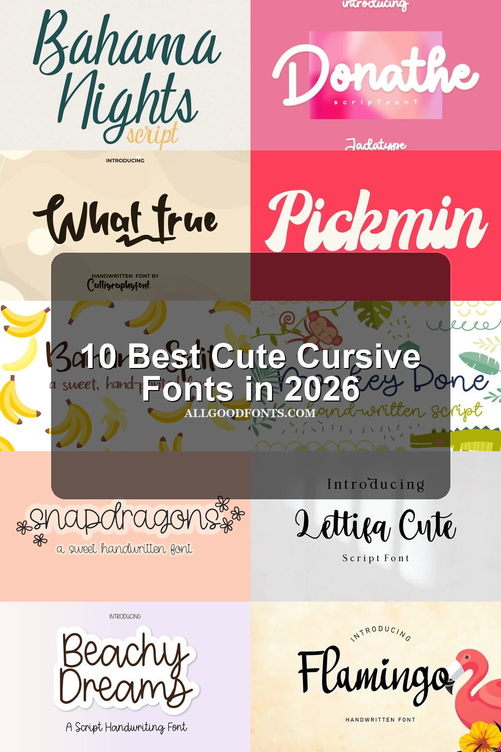
Rounded, loopy terminals give Snapdragons Font an approachable rhythm, while connected and disconnected joins keep the writing from feeling overly uniform. Its irregular baseline is most effective at display scale, making it a strong choice for invitations, wall art, and short phrases rather than compact text.
Monkey Bone Font
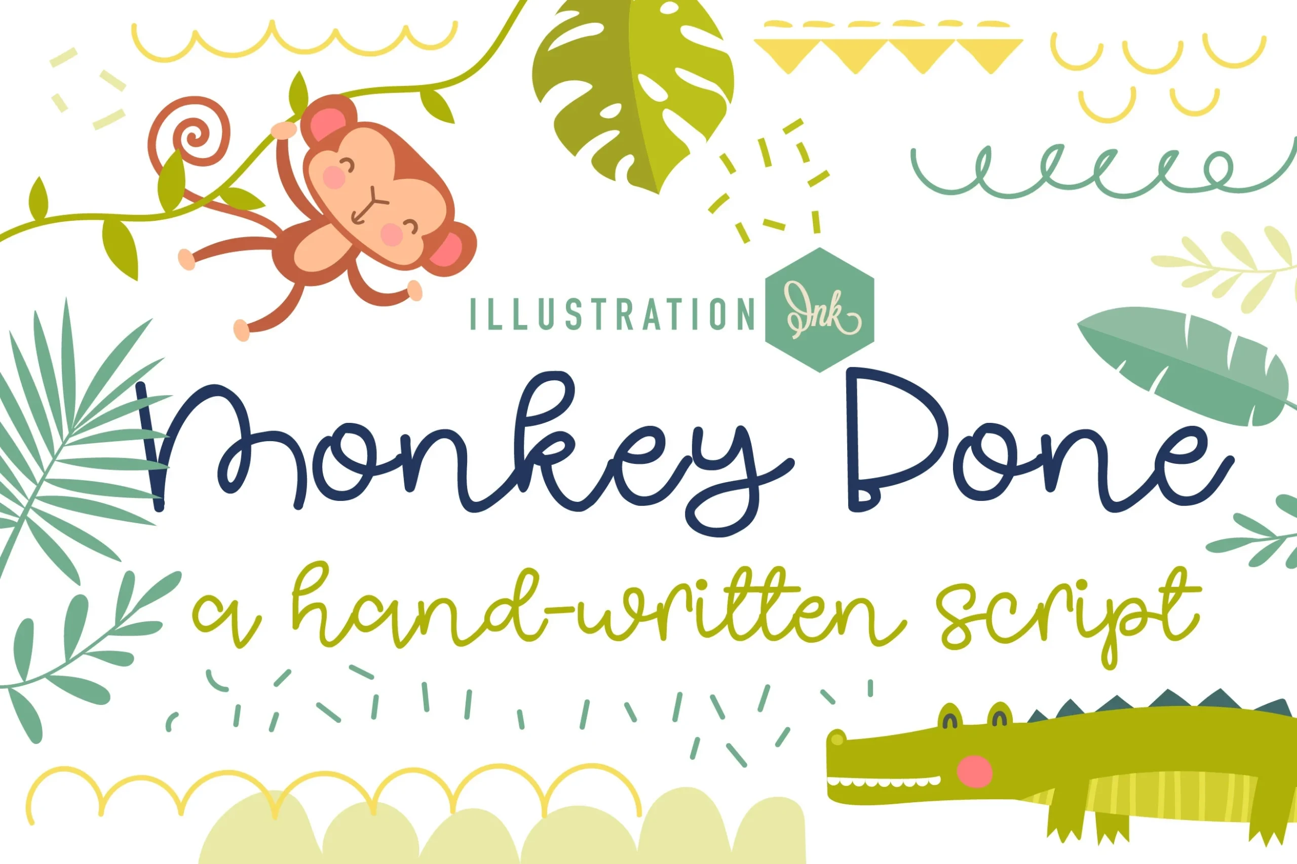
Best For: social media graphics, clean designs, soft designs, playful designs
Monkey Bone Font delivers one of the clearest flowing silhouettes here: a monoline structure, continuous baseline, rounded terminals, and informal shapes. Those consistent strokes make it useful for headings and social graphics, while retaining the soft, accessible character expected from Cute Cursive Fonts.
Pickmin Font
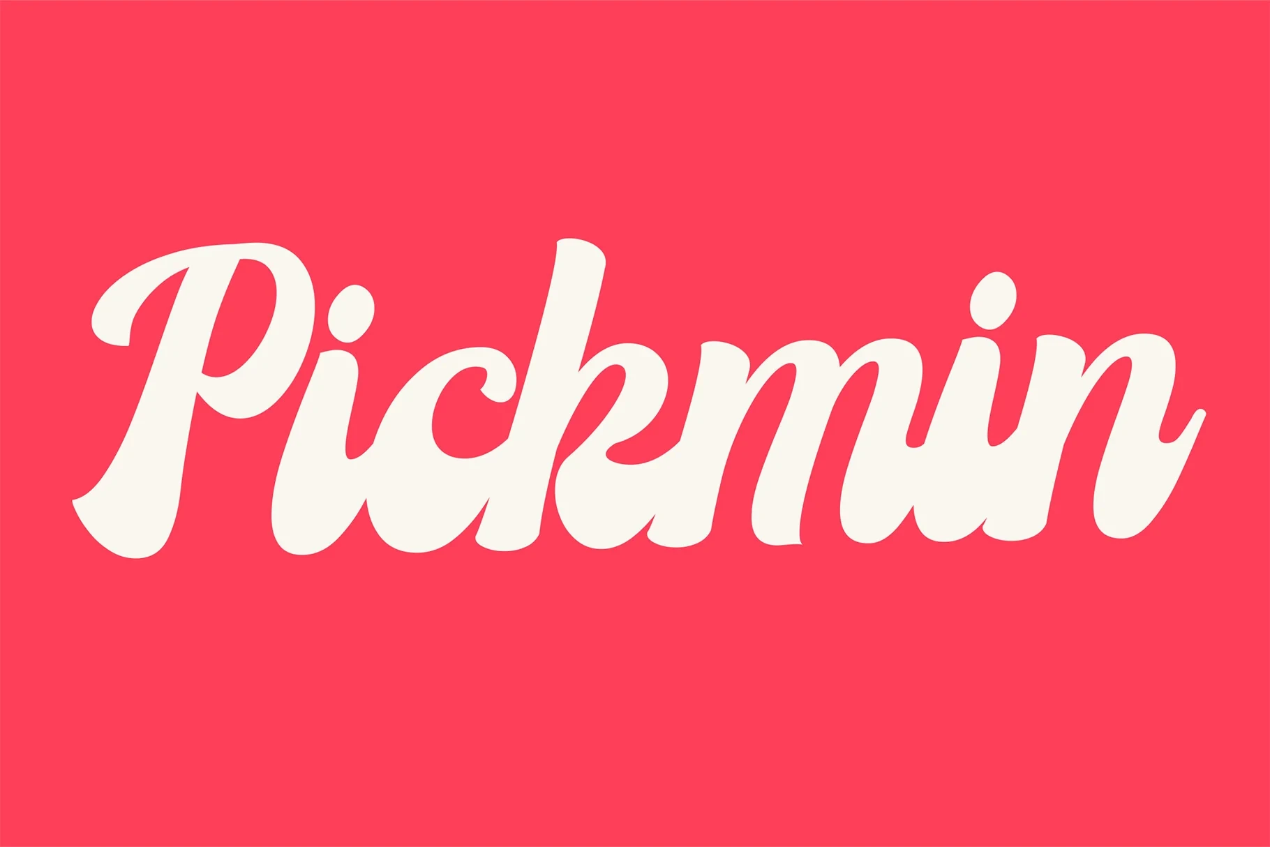
Best For: display text, soft designs, playful designs, cute designs
Pickmin Font uses medium monoline strokes and connected rounded curves to create a retro display presence. The joins stay clearest at medium to large sizes, where its flowing shape can support titles and headings without being asked to carry dense or small text.
Beachy Dreams Font

Best For: branding, invitations, social media graphics, display text
Beachy Dreams Font balances an upright posture with partially connected letters and a consistent monoline stroke. The incomplete joins create a flowing impression without dense connections, making it practical for branding, invitations, social graphics, and other medium-to-large display uses.
Donathe Font
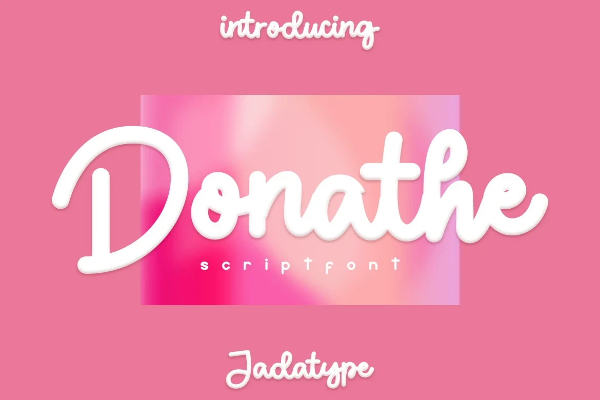
Best For: product labels, social media graphics, display text, playful designs
Donathe Font keeps its connected script unusually immediate through bold uniform strokes, rounded terminals, and an upright construction. It works especially well on prominent labels and social graphics, but its display-focused form is not intended for long-form reading.
Slanted and Ornate Cursive
These scripts add stronger slant, contrast, loops, or flourishes to create a more decorative finish. They carry greater visual drama than the rounded group and need generous display sizing.
Flamingo Font
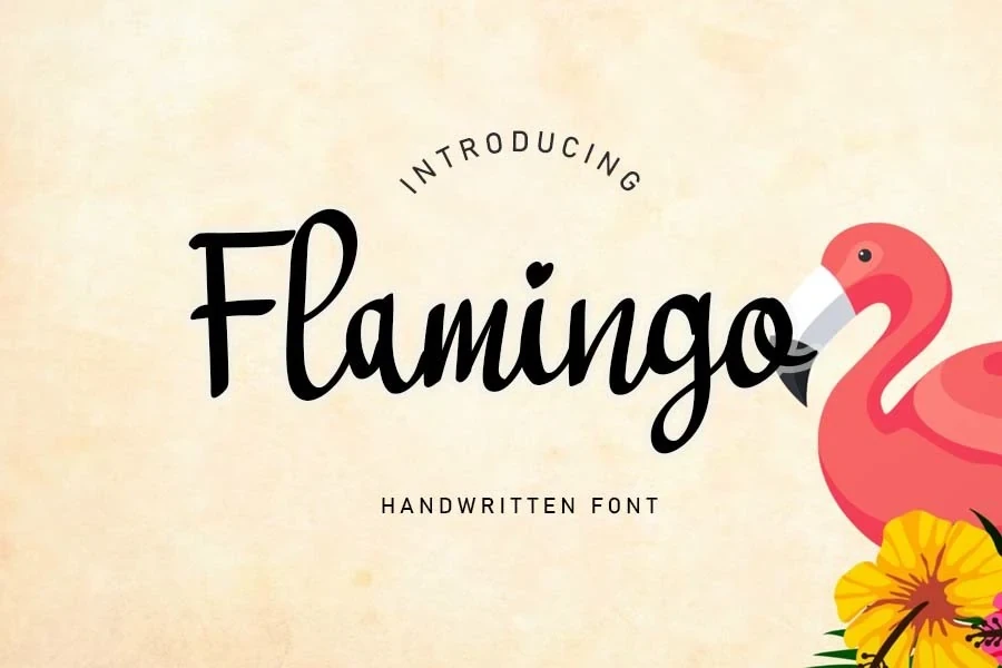
Best For: product labels, minimal designs, clean designs, feminine designs
For prominent labels and other short display text, Flamingo Font brings bold connected strokes, a slight rightward slant, and a distinctive heart-shaped dot over the i. Its intricate joins and variable stroke width can lose clarity when reduced, so generous sizing preserves the detail.
Bahama Nights Font

Best For: logos, packaging, invitations, social media graphics
High stroke contrast sets Bahama Nights Font apart from lighter slanted handwriting styles. Its connected letters remain upright, giving logos, packaging, and invitations a more composed structure; however, the thin strokes need generous display sizing to remain distinct and readable.
Lettifa Cute Font
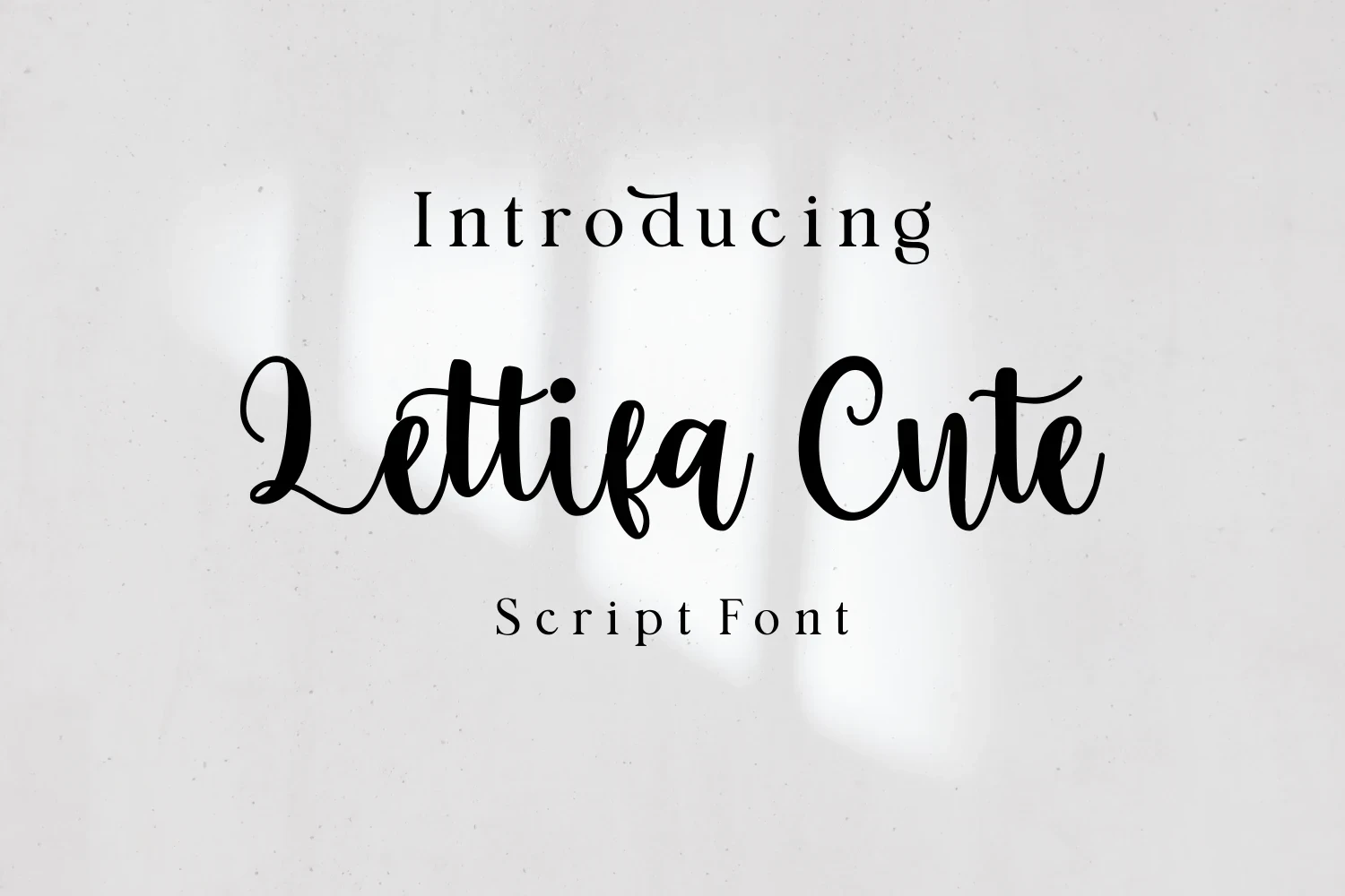
Best For: fashion branding, branding, invitations, product labels
Lettifa Cute Font supplies the collection’s most decorative finish with high-contrast brush-pen strokes, connected lowercase letters, and ornate initial capitals marked by loops and flourishes. It suits branding and invitations at generous sizes, while its detail can overwhelm extended text or small applications.
Mixed-Join Playful Scripts
Mixed-join designs combine disconnected letters, uneven baselines, and rounded terminals for an organic hand-drawn effect. Their irregularity separates them from the smoother continuous scripts and favors short text.
What True Font
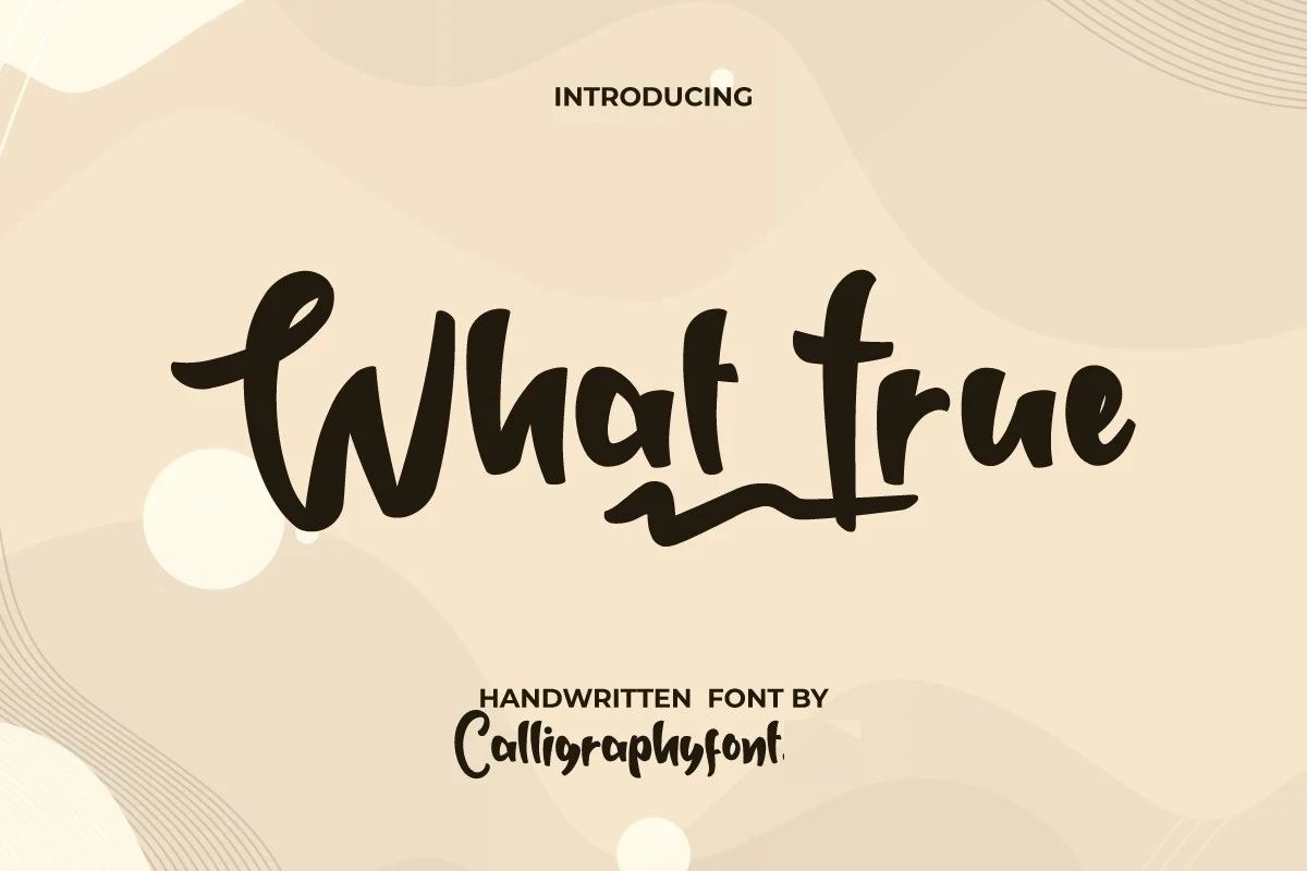
Best For: business cards, logos, creative projects, product labels
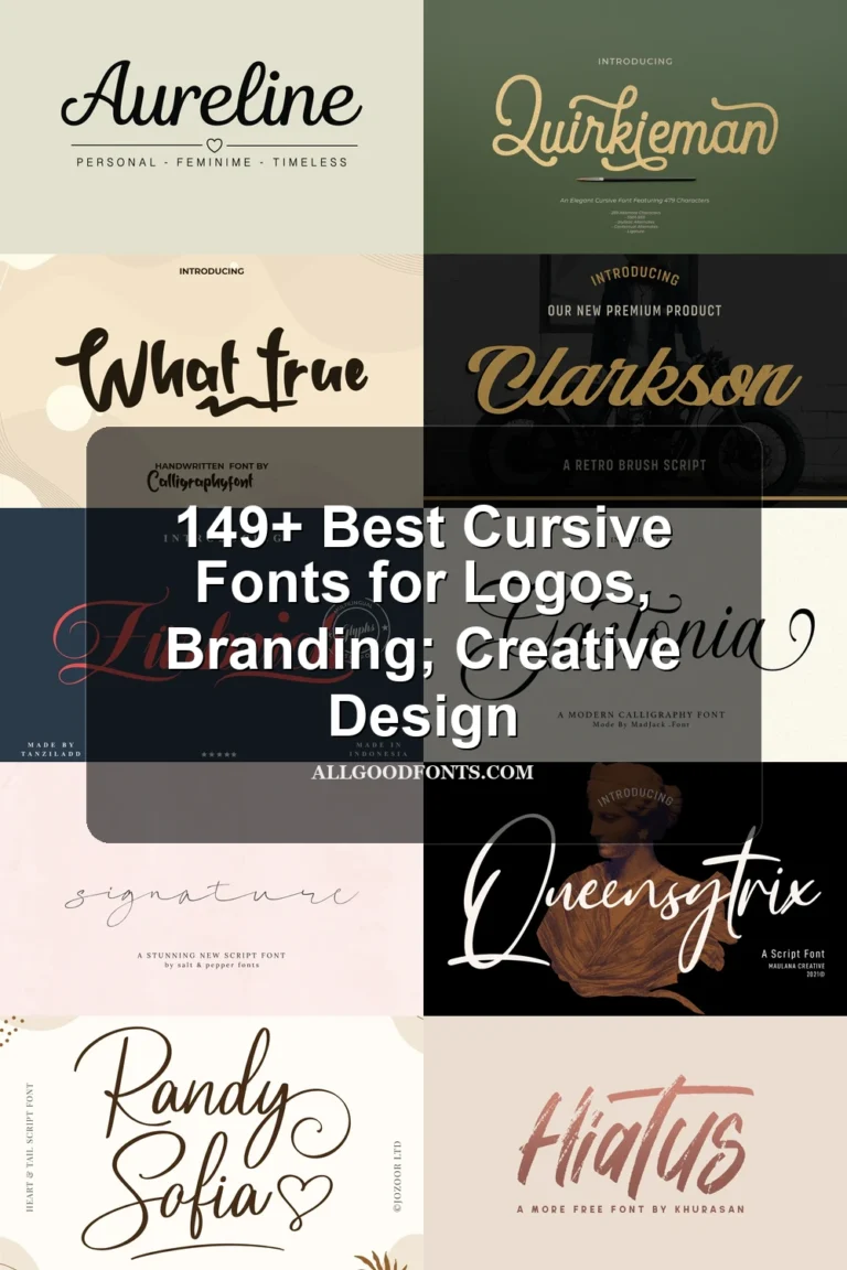
What True Font has a fluid, irregular baseline and a prominent underline swash that gives short lettering a hand-drawn logo character. Its disconnected lowercase construction favors large logos, labels, and brief phrases over fully connected cursive applications or small text.
PN Banana Split Font
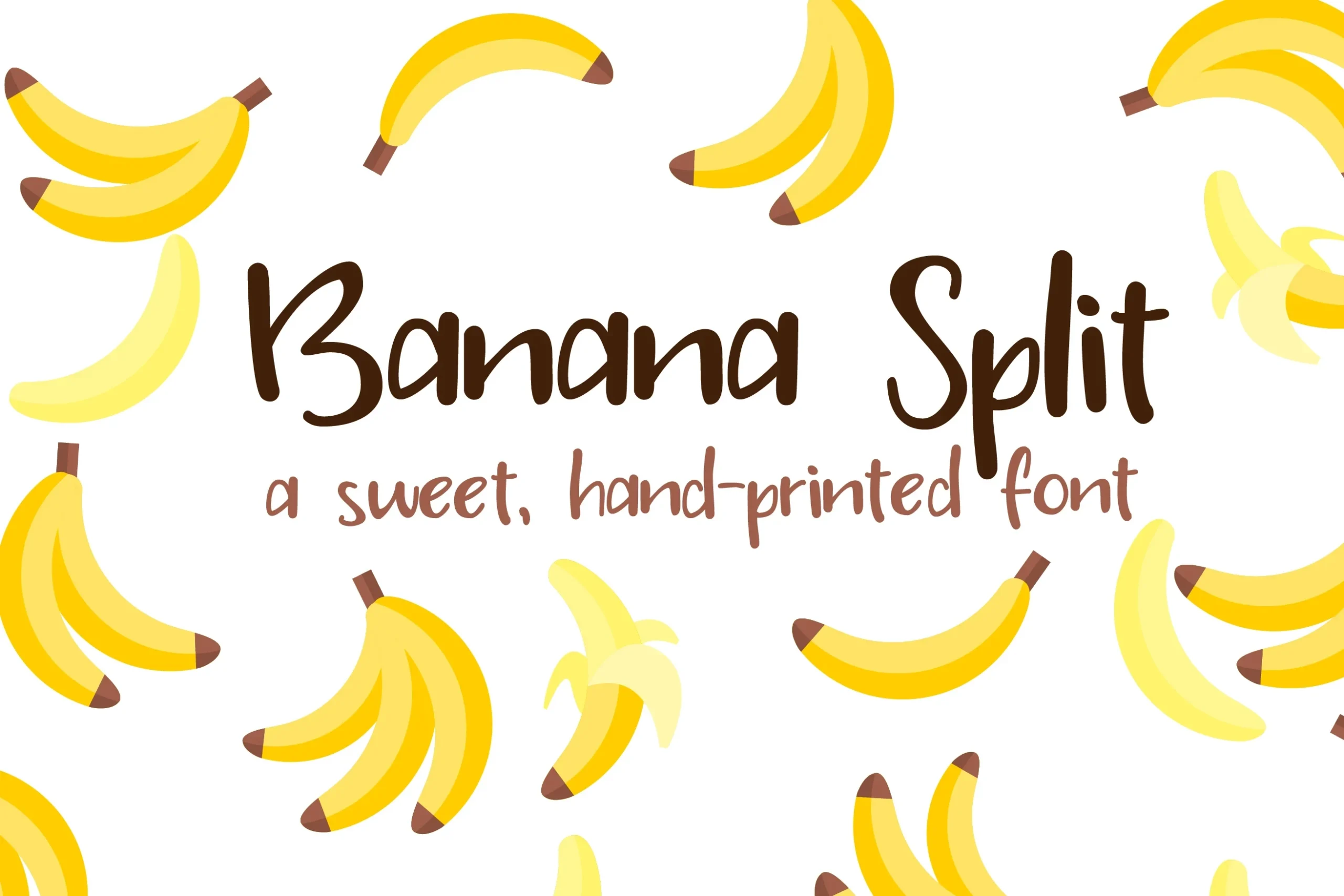
Best For: headlines, playful designs, cute designs, fun designs
For short headlines, PN Banana Split Font offers a hand-printed impression through disconnected letterforms, rounded terminals, and an irregular organic baseline. Its monoline construction stays clear at useful display sizes, though the uneven forms become harder to read when reduced substantially.
How to Choose the Right Font
Choose a cleaner monoline option when readability and quick recognition matter, especially for social graphics, labels, or headings. For more personality, compare the irregular baselines and mixed joins with the upright connected styles. Reserve high-contrast strokes, heart details, and flourished capitals for larger applications where their decorative features will not collapse.