20 Best Signature Cursive Fonts in 2026
Signature Cursive Fonts span polished monoline signatures, airy casual joins, and high-contrast display scripts with loops, slant, swashes, and varied baselines. They are most effective for logos, invitations, packaging, social graphics, names, and short headlines where continuous movement can remain readable at display scale.
Looking for more cursive fonts? Browse our complete Cursive Fonts collection to compare modern, bold, wedding, logo-friendly, and Cricut-ready cursive styles.

Signature Cursive Fonts: Refined Signatures
Signature Cursive Fonts: Refined Signatures bring controlled joins, rightward movement, and ornamental terminals together for polished names, logos, and invitations. They feel more composed than the casual group and less forceful than expressive display scripts.
Whisper Belle Font

Best For: modern designs, decorative designs
Whisper Belle Font uses connected monoline letters with subtle pressure changes, a rightward lean, and flowing loop terminals. The polished personal quality suits modern or decorative titles, though its fluid joins need large display sizing to stay clear.
Saintine Font
Best For: logos, branding, invitations
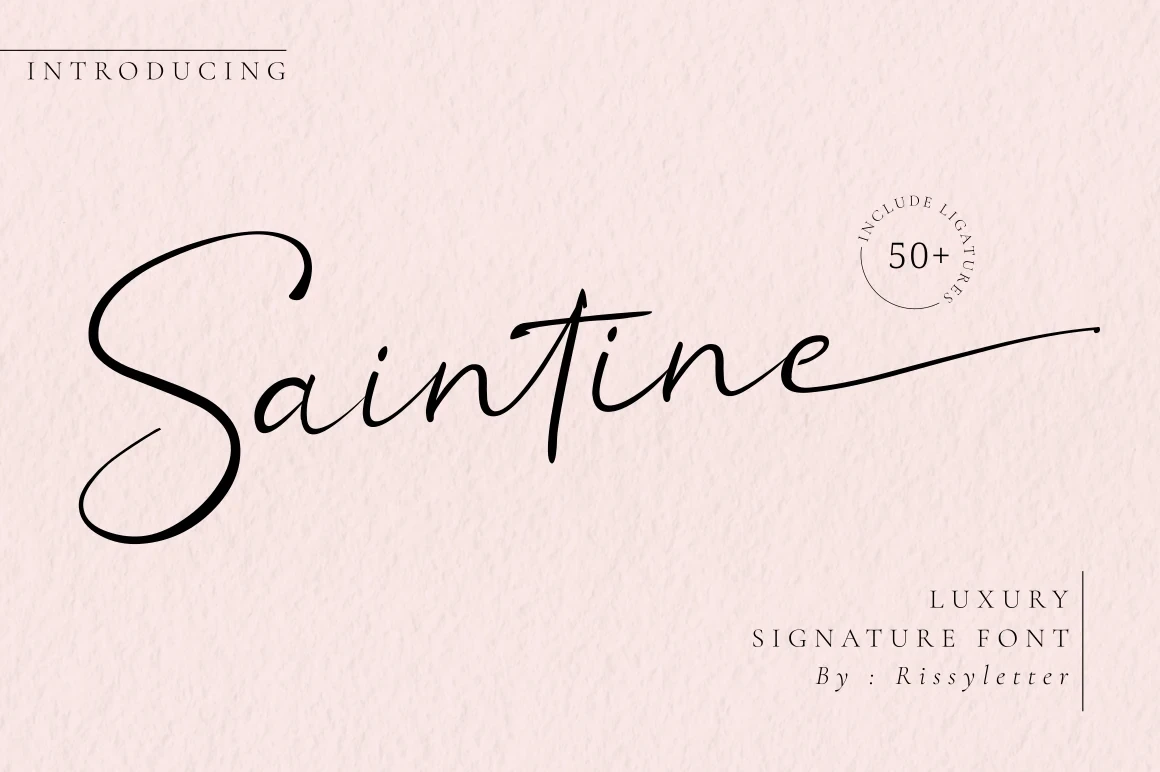
Saintine Font stands out through a pronounced slant and extended terminal swashes that turn its connected cursive into an ornamental signature. It makes a strong logo or invitation treatment, but the fluid joins are better reserved for large display text than body copy.
Margita Signature Font

Best For: logos, packaging, invitations, product labels
Margita Signature Font adds built-in variation through ligatures, alternate characters, horizontal swashes, and changing letter slants. Those options can make packaging or labels feel tailored, but the swashes need generous display space and should not carry long copy.
Joseph Watson – Signature Script Font
Best For: branding, invitations, personal branding
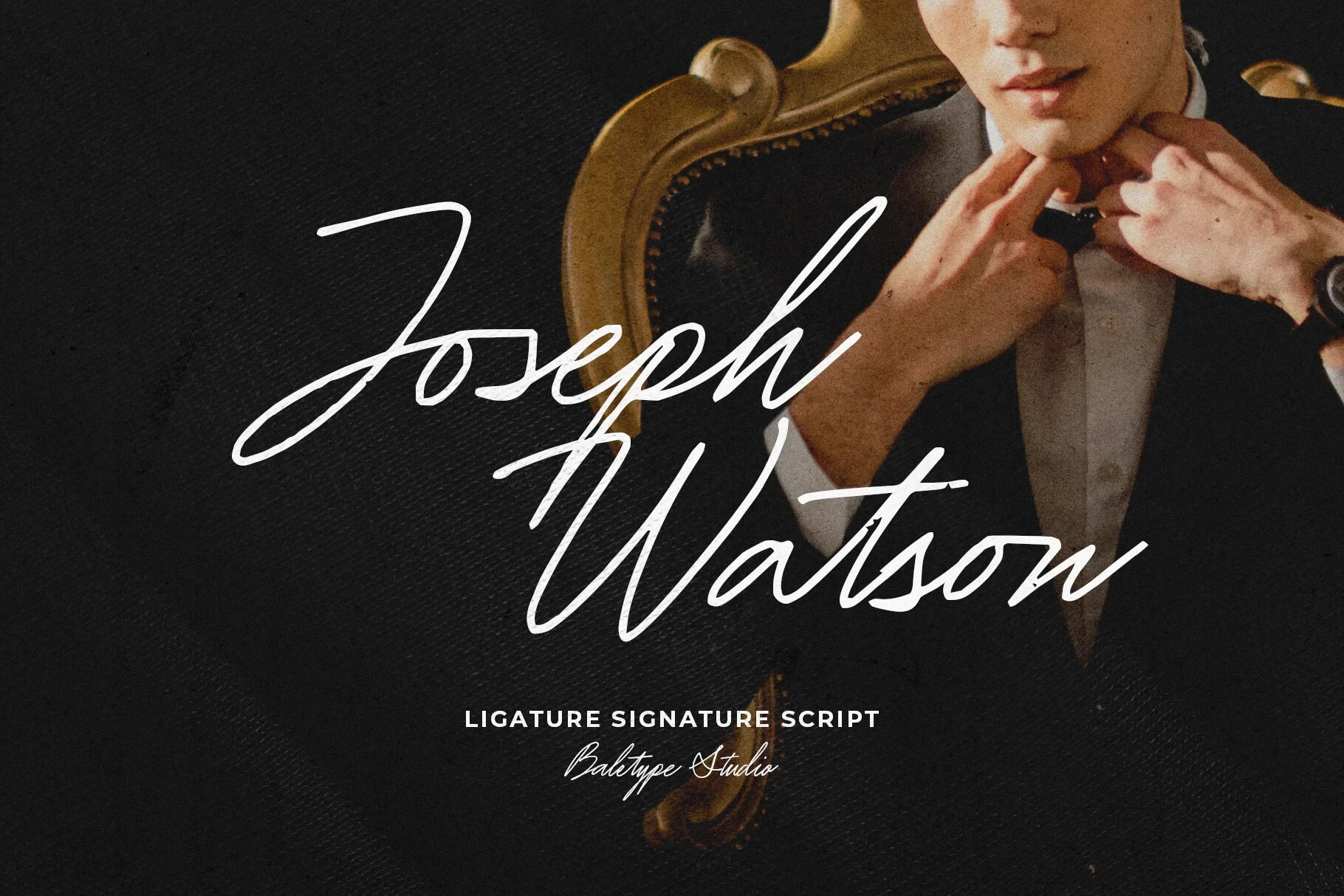
Joseph Watson – Signature Script Font relies on pressure-sensitive thick-and-thin variation for a high-impact connected finish. Its ligatures strengthen branding and invitations, but thin details and complex joins make large headings safer than small lettering.
Aurelia Font
Best For: display text, modern designs, elegant designs
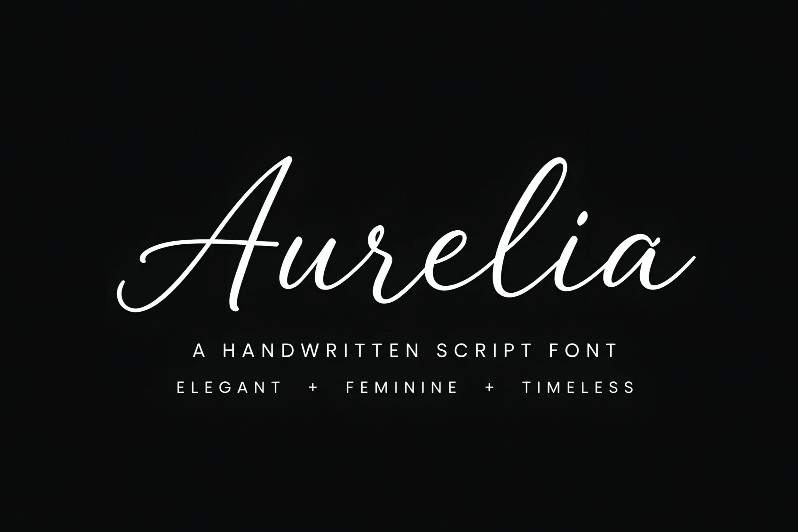
Aurelia Font gives connected cursive a wide, composed presence through flowing baselines, monoline strokes, and a pronounced rightward slant. It holds together well in large headings, while the accompanying readable sans serif is the safer choice for tiny captions or supporting information.
Brittany Signature Script Font
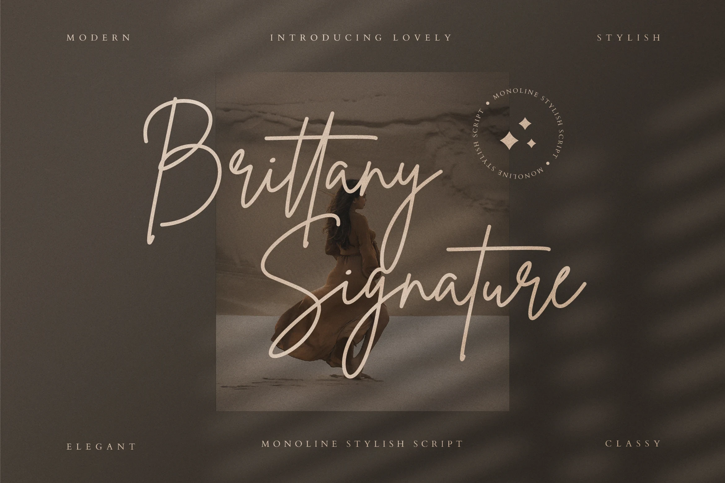
Best For: high-end designs, clean designs, decorative designs
Brittany Signature Script Font extends its monoline joins with elongated swash terminals, adding a distinct ornamental gesture to logos and headings. The flourishes reward short, spacious phrases but make longer copy and reduced-size settings less practical.
Villargio Font
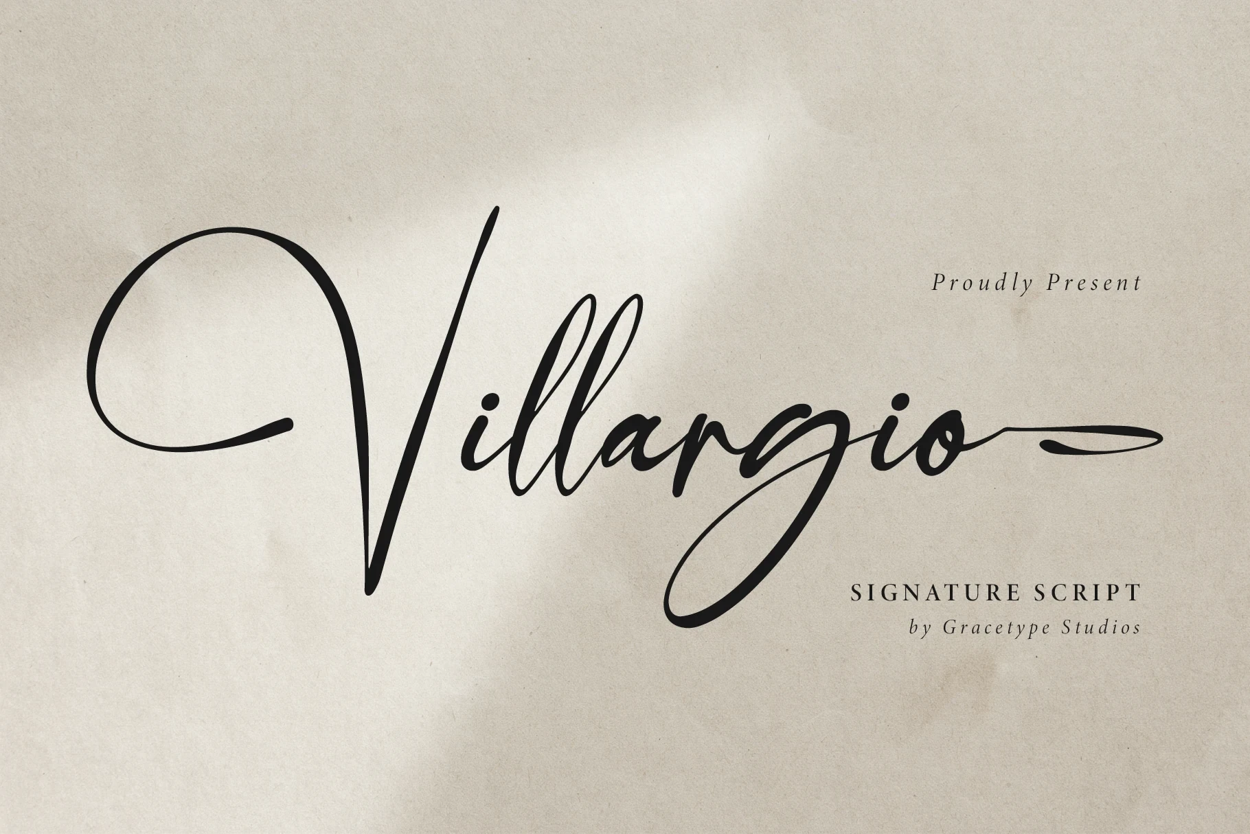
Best For: display text, elegant designs, personal branding
Villargio Font emphasizes flowing movement through slender strokes and softly joined connected forms rather than heavy contrast. Its distinctive shapes work well for names and short phrases, where the display character can be appreciated without forcing it into body text.
Bayside Stanleigh Font
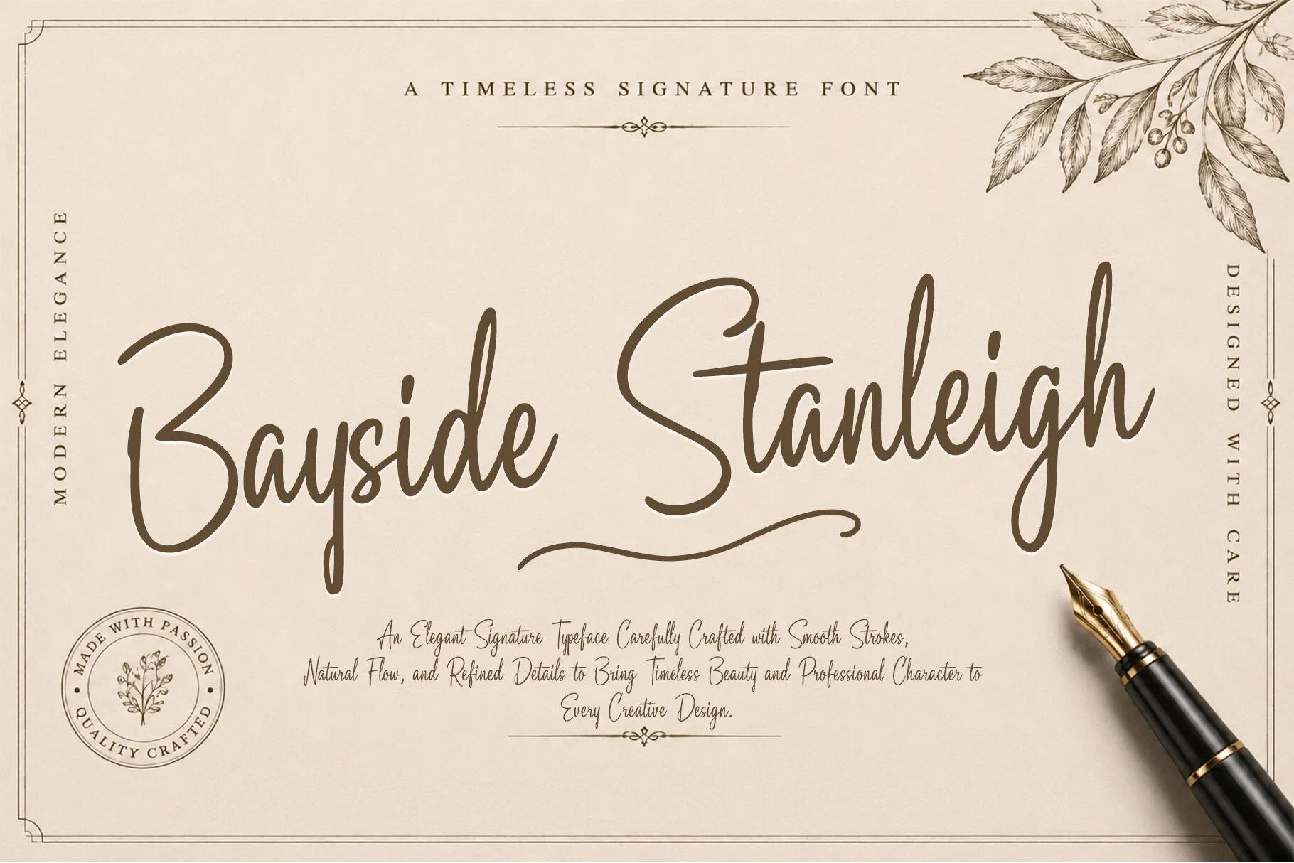
Best For: modern designs, elegant designs, expressive designs
Bayside Stanleigh Font pairs refined slender strokes with connected movement and a restrained contemporary finish. Its controlled shapes suit elegant modern designs, while display sizing remains the safest range for preserving the letter connections and distinctive forms.
Monoline Handwriting and Casual Joins
These monoline styles use relaxed slants, irregular baselines, rounded terminals, and casual joins to suggest personal handwriting. Compared with the refined group, they feel less formal; compared with expressive scripts, they keep contrast and flourishes restrained.
Amsahoney Font
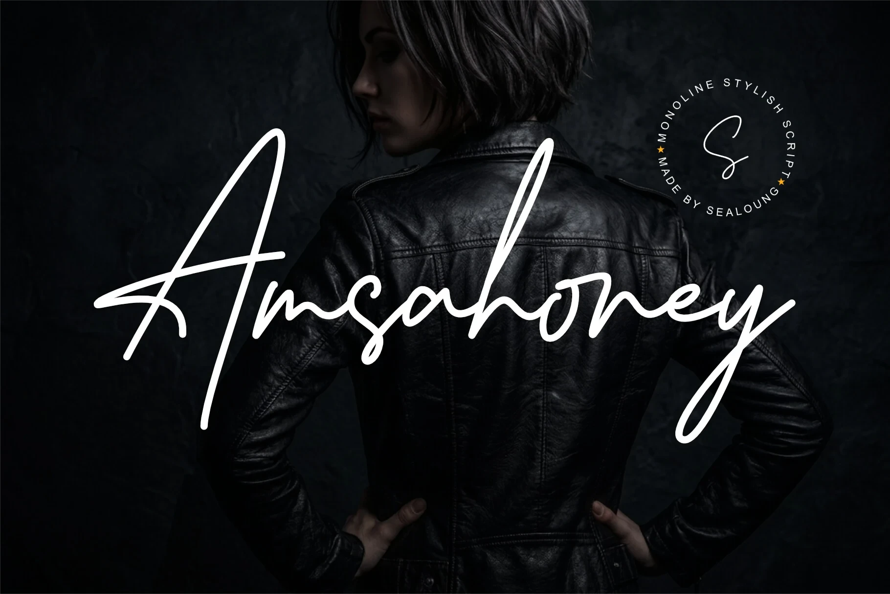
Best For: branding, personal branding, modern designs
Amsahoney Font keeps its connected monoline construction casual and fluid rather than formal. The rightward slant and extended ascenders and descenders add branding presence, but those long forms can crowd short phrases when the size is too small.
Tember Ameristo Font
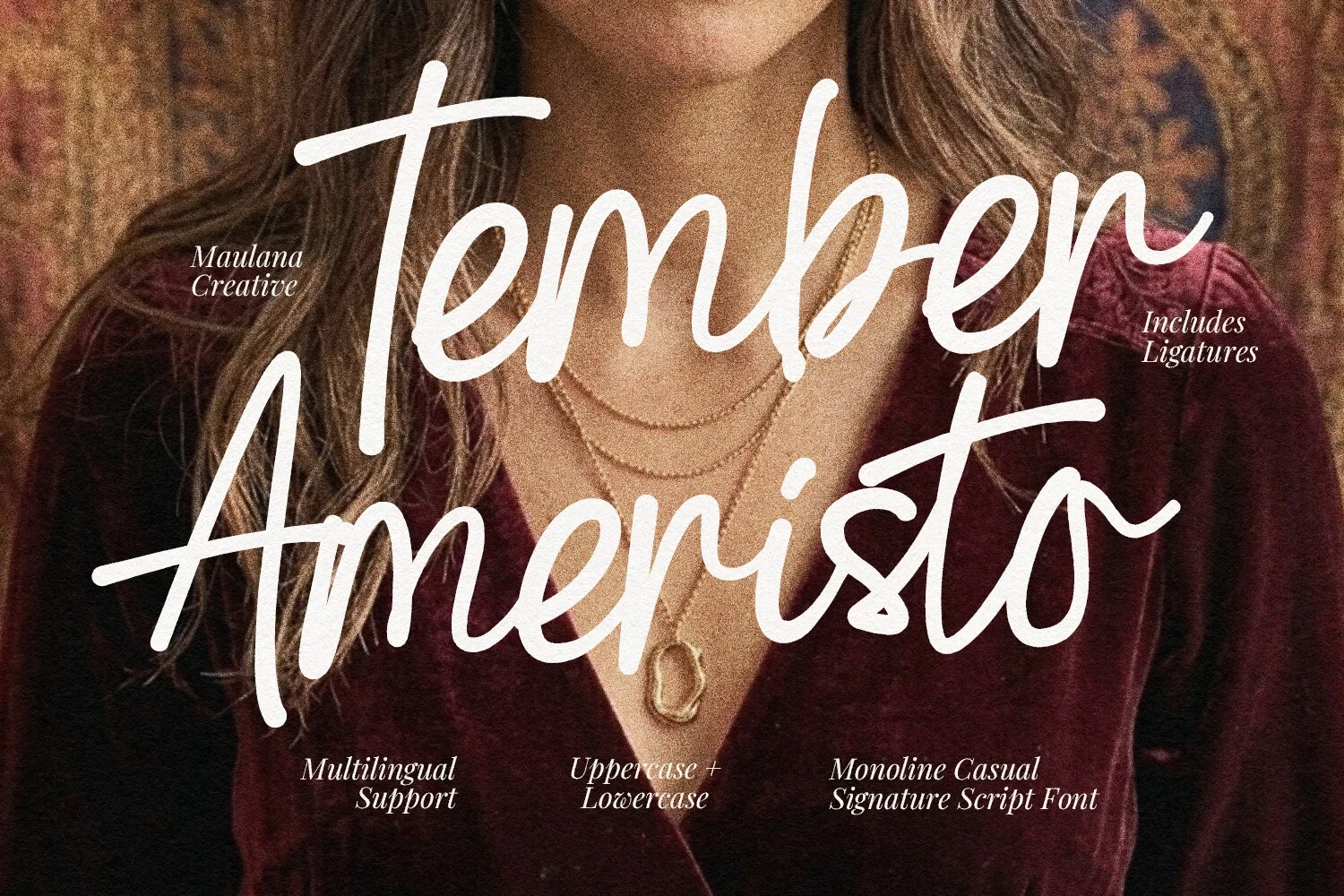
Best For: social media graphics, branding, packaging, invitations
Tember Ameristo Font has a relaxed connected rhythm, with a slight rightward slant and varied baseline. Natural ligatures and multilingual support extend its usefulness for packaging, invitations, and social graphics, although its flowing strokes still need display sizing.
Signature Script Font
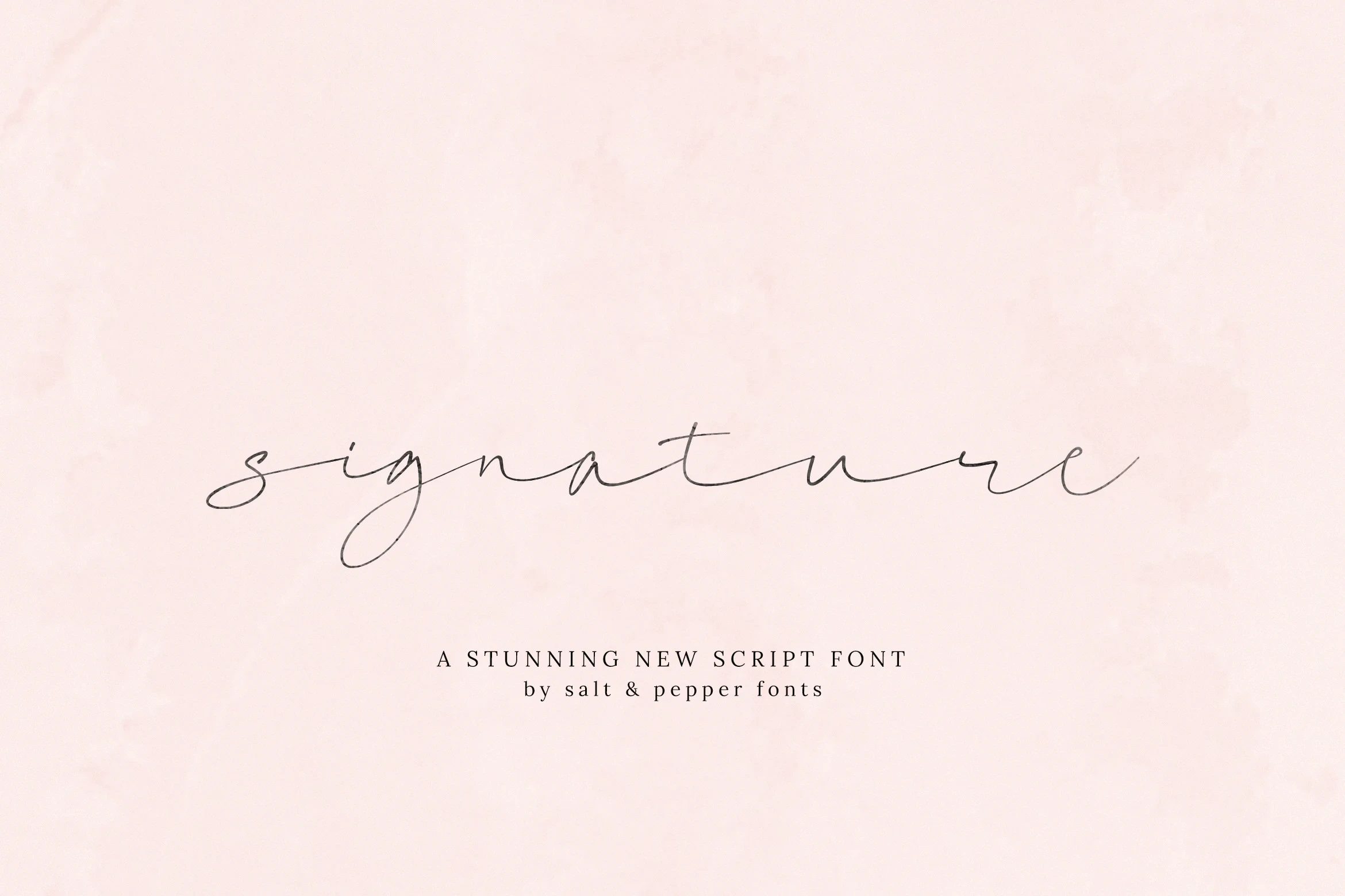
Best For: logos, invitations, clean designs
Signature Script Font pairs wide proportions with a light monoline construction, creating an unusually airy profile. Its irregular baseline keeps logos and invitations natural, yet the delicate strokes can disappear at small sizes, so use it for spacious headings or marks.
Twicelights Signature Script Font
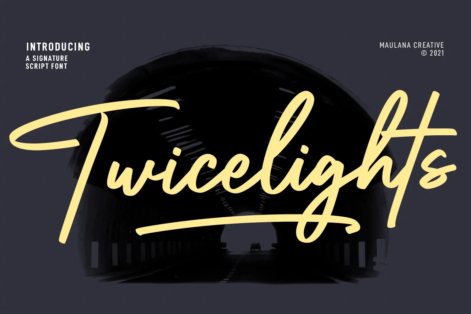
Best For: branding, social media graphics, personal branding, logos
Twicelights Signature Script Font uses a rightward slant and irregular baseline to create an informal personal-mark quality. Its connected, ornamented forms add character to branding and social graphics, but they need generous sizing to remain legible.
Honeycomb Font
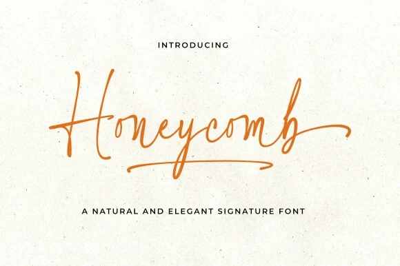
Best For: creative projects, display text, modern designs
Honeycomb Font keeps a monoline connected structure but adds a long swash beneath the baseline, giving each phrase a clear signature gesture. Its casual tone suits creative display work, while fine interconnected lines call for large sizing.
Restday Signature Script Font
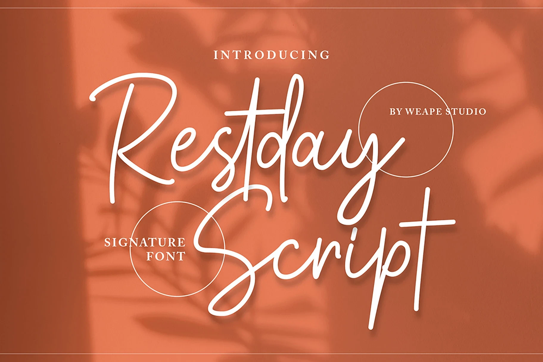
Best For: branding, personal branding, fashion branding
Restday Signature Script Font softens its connected loops with rounded terminals and a slight rightward slant. That approachable rhythm works for personal or fashion branding, while the flourished joins make short display text a better fit than extended wording.
Monoline Font
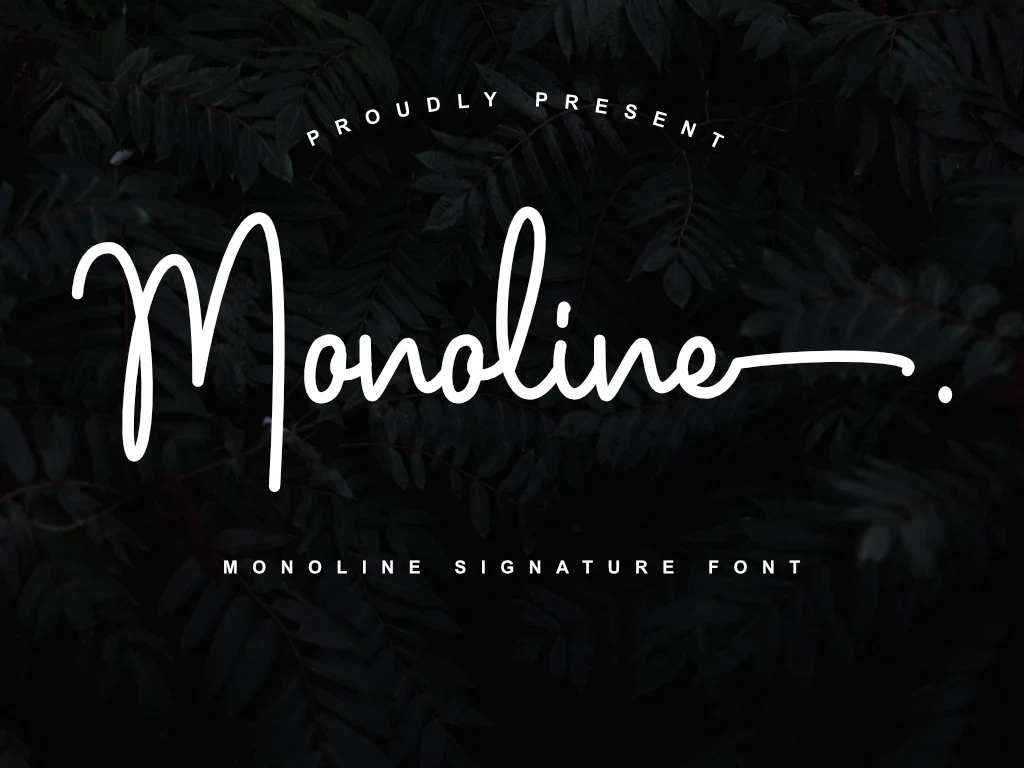
Best For: display text, elegant designs, luxury designs
Monoline Font gives connected display lettering a measured flow through a clear stroke rhythm and softly joined forms. It supports names and headings with a composed visual pace, but the evidence favors short display phrases instead of paragraphs or dense copy.
Expressive Display Connections
Expressive Display Connections push cursive movement through heavier strokes, stronger contrast, sweeping tails, and irregular rhythm. They create the boldest visual impact of the collection, but their flourishes and connected details require generous sizing.
Caboms Font
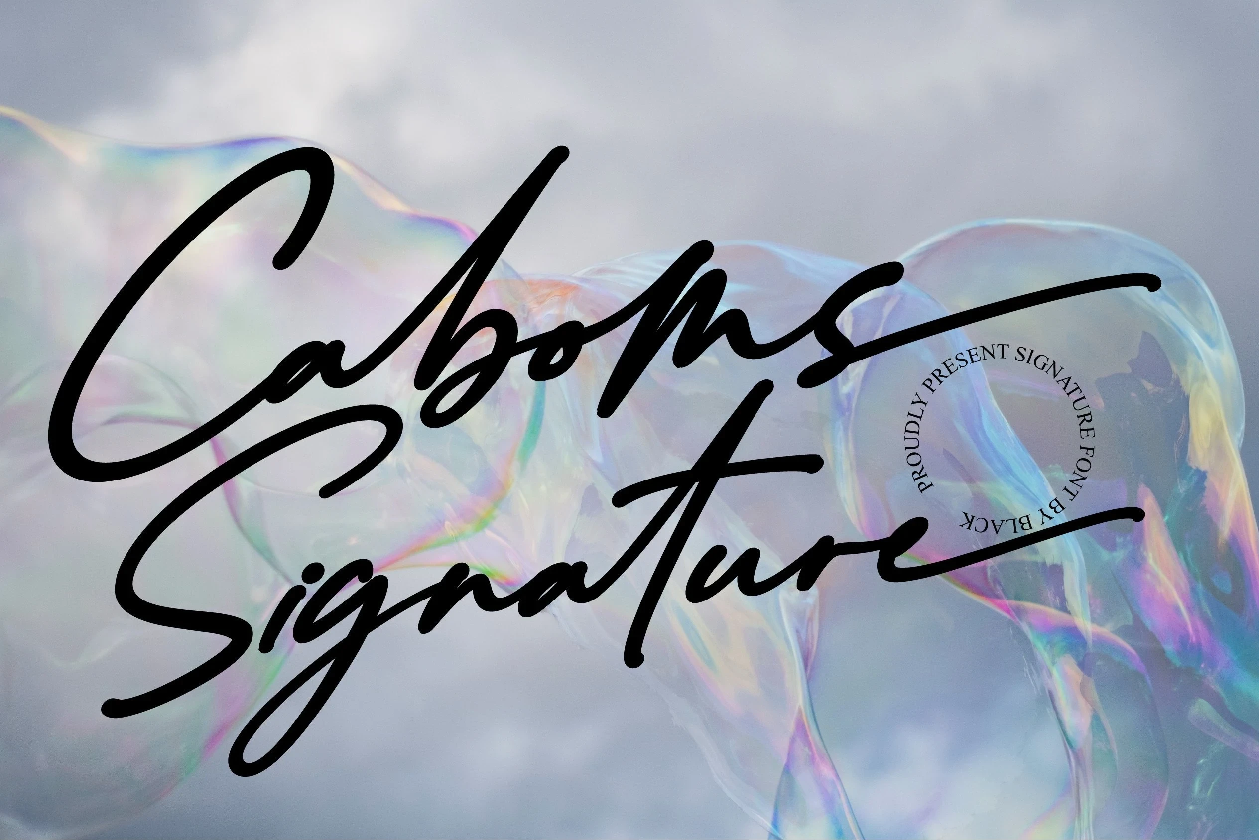
Best For: elegant designs, expressive designs
Caboms Font is suited to dramatic titles, combining high stroke contrast, right-slanting connected movement, and long sweeping flourishes. Its decorative script needs display scale, while the accompanying circular stamp detail can become difficult to read when reduced, so keep the composition spacious.
Bastony Signature Font
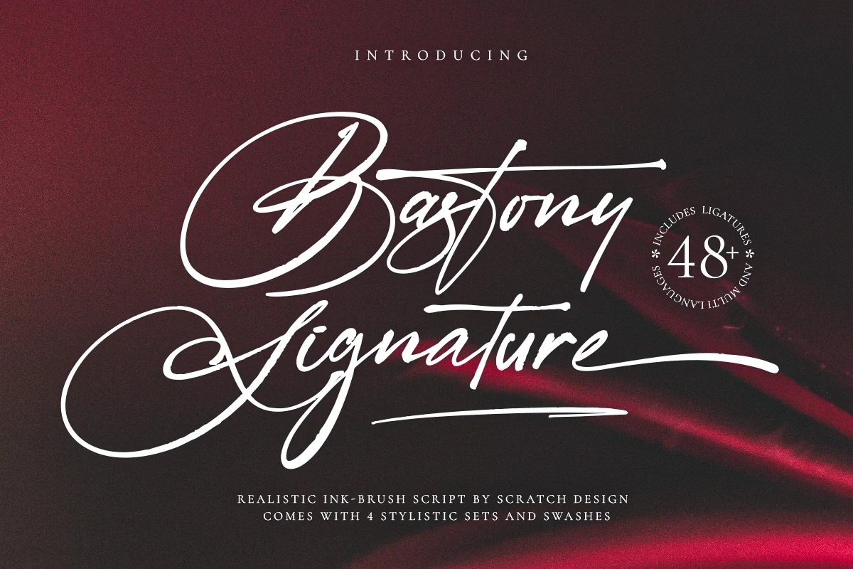
Best For: high-end designs, clean designs
Bastony Signature Font shifts connected cursive toward heavy, brush-like display lettering. Strong thin-to-thick contrast, a rightward slant, and elongated tails give logos and headlines impact, while the intricate joins make small-scale reading unreliable.
Citadels Signature Script Font

Best For: clean designs, expressive designs, decorative designs
Citadels Signature Script Font creates an energetic mark through high contrast, a rightward movement, shifting baselines, and changing ascender and descender lengths. It suits expressive branding at large sizes; the irregular rhythm becomes harder to parse in compact text.
Shadyspeed Script Font
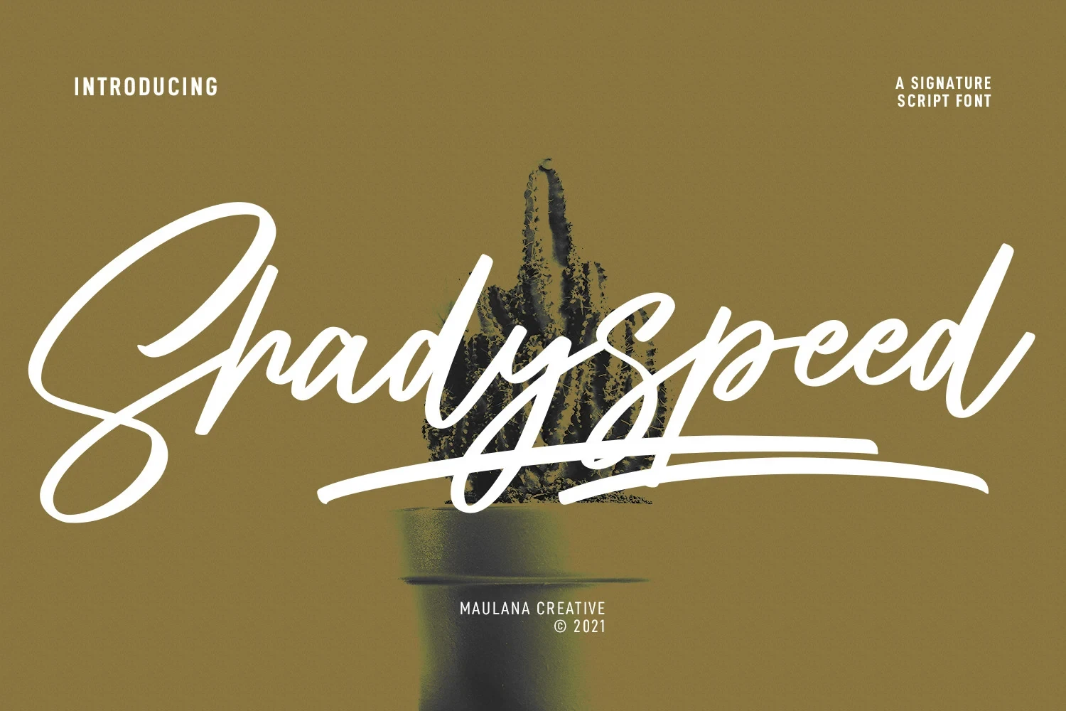
Best For: social media graphics, logos, book covers
Shadyspeed Script Font combines heavy right-slanting connections with ligatures, alternate characters, and an extended baseline swash. The stylistic options help shape a strong logo or book-cover mark, though the swash-heavy construction loses legibility when reduced.
Quixotic Font
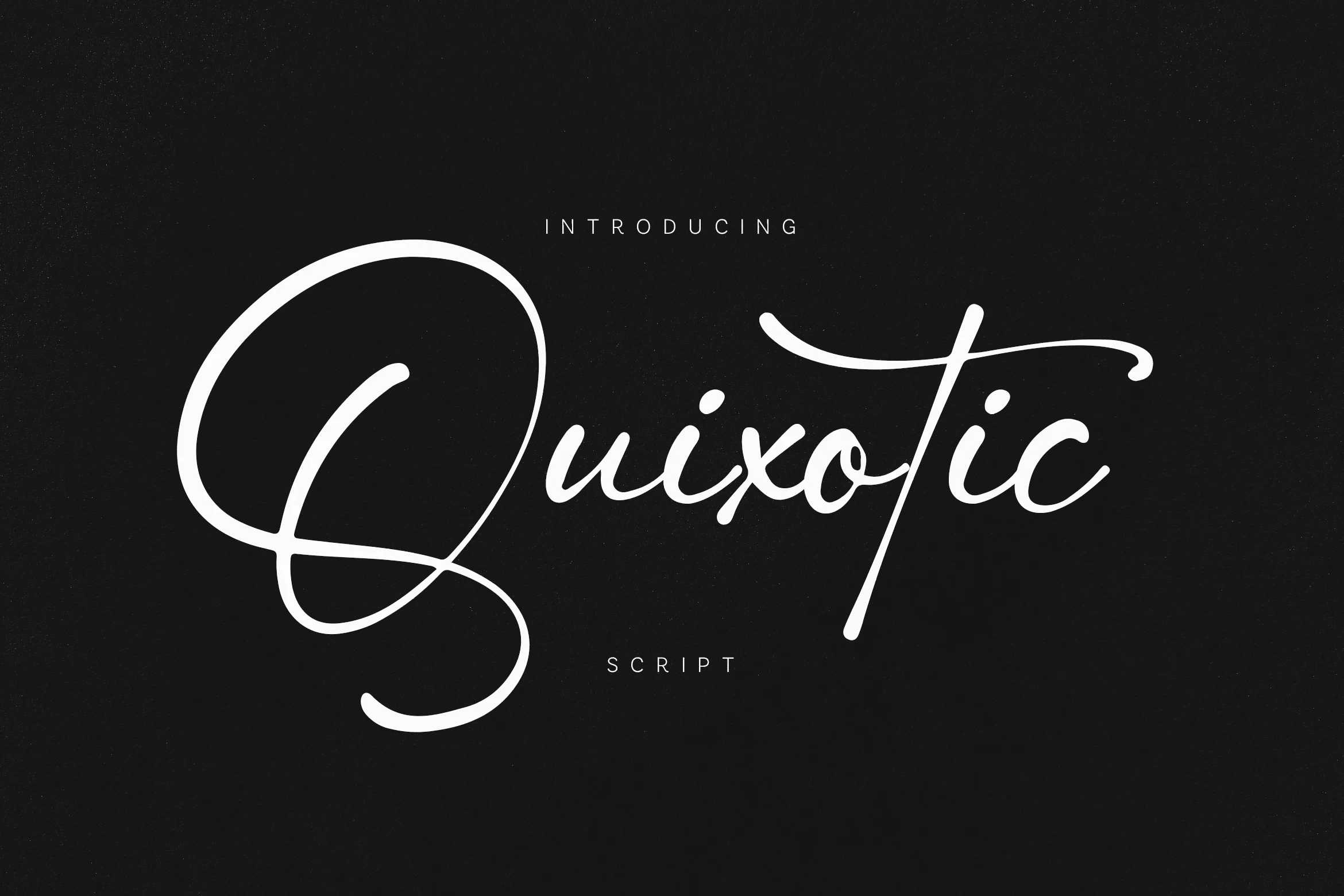
Best For: display text, wall art, modern designs
Quixotic Font keeps softly joined cursive movement controlled through a clean contemporary construction, avoiding the busiest ornamental effects. It suits modern display phrases and wall art, but its connected forms remain intended for names and short text rather than extended reading.
How to Choose the Right Font
Choose by the amount of motion your design can support: monoline styles are easier to control, swashes add ornament, and high contrast or irregular baselines create greater impact at the expense of clarity. Test every choice at its final size, reserving the most connected forms for names, logos, and short display phrases.