15 Best Bold Script Fonts in 2026
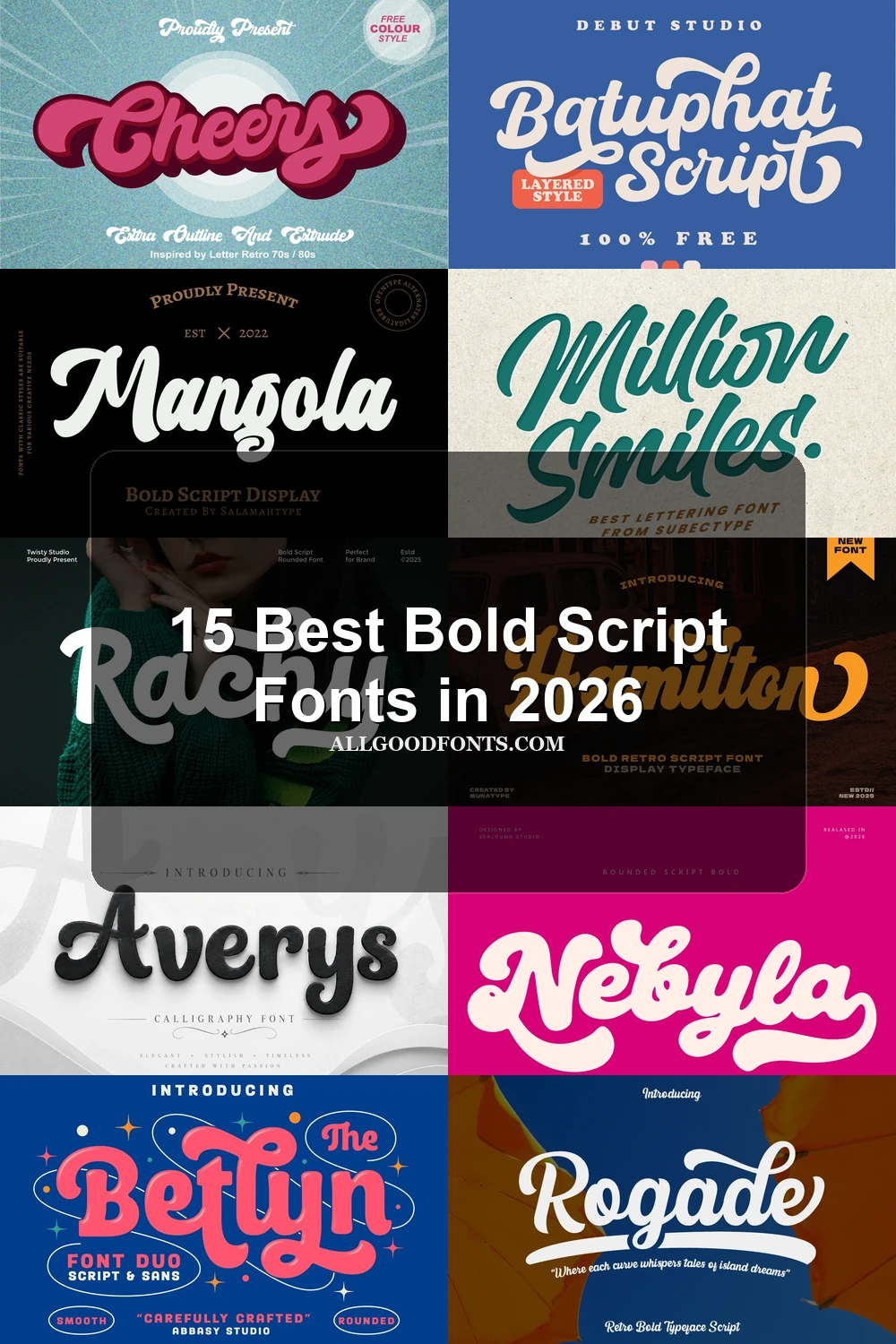
This collection spans open monolinear lettering, connected retro displays, slanted brush work, and flourished playful forms. These Bold Script Fonts suit logos, signage, packaging, invitations, social graphics, and other large-format designs where tone and immediate visual impact matter.
Looking for more script fonts? Browse our complete Script Fonts collection to compare modern, elegant, bold, signature, and retro script styles.
Bold Script Fonts: Casual and Rounded
These Bold Script Fonts use open, disconnected forms, rounded terminals, and steady strokes. Compared with the connected groups, they offer clearer spacing and a more relaxed, approachable display rhythm.
Roses Font
Best For: display text, clean designs, playful designs
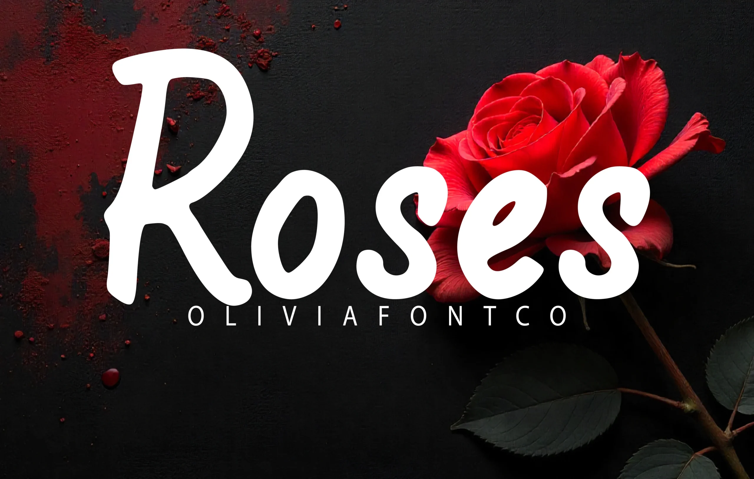
Roses Font uses disconnected, monolinear lettering with rounded terminals and irregular proportions. These Bold Script Fonts stay readable in large signage because the shapes are simple, while the uneven baseline keeps the mood casual and approachable.
Averys Font
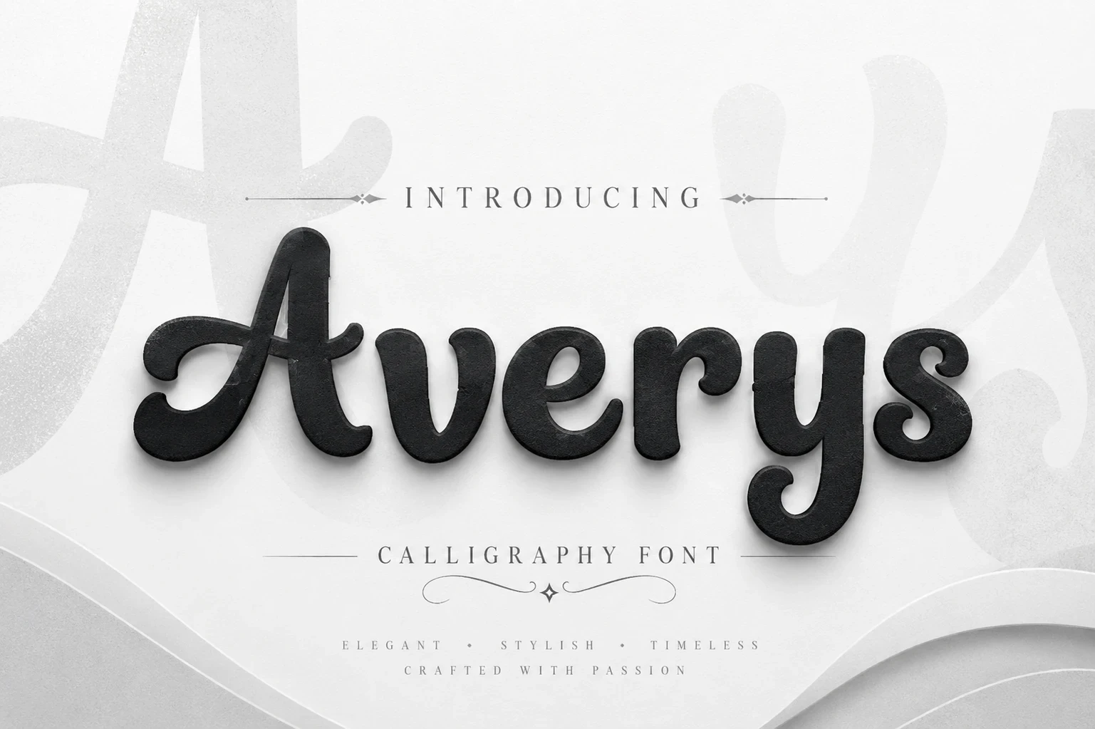
Best For: display text, clean designs, bold designs
Averys Font uses disconnected calligraphic-style forms, heavy uniform strokes, and rounded terminals. The open construction separates each character clearly, making it an approachable choice when you want display impact without dense connections.
Slanted Brush and Flourished Scripts
Slanted strokes, strong contrast, and expressive terminals give this group forward movement. It feels more energetic and embellished than the rounded category, with readability depending heavily on display scale.
Price Mart Duo Font
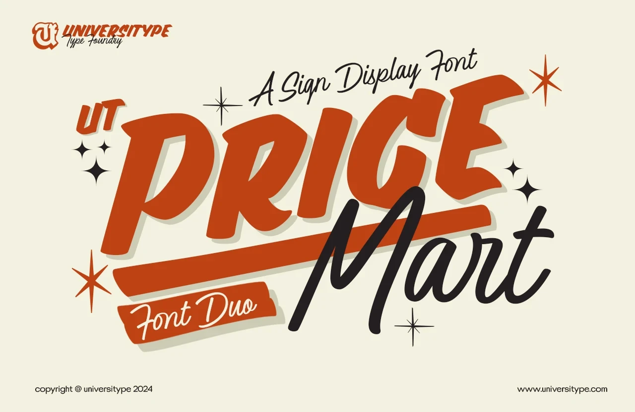
Best For: display text, classic designs, elegant designs
Price Mart Duo Font combines a heavy, high-contrast brush style with a thinner fluid companion. The main lettering can carry prominent signage, while the lighter partner works best as a larger accent rather than compact supporting copy.
Million Smiles Font

Best For: display text, bold designs, old-school designs
For logos, posters, and large headlines, Million Smiles Font brings a pronounced rightward slant and high-contrast connected strokes. Its rounded terminals create energetic movement, but decorative joins become harder to parse when the wording is reduced.
Mangola Font
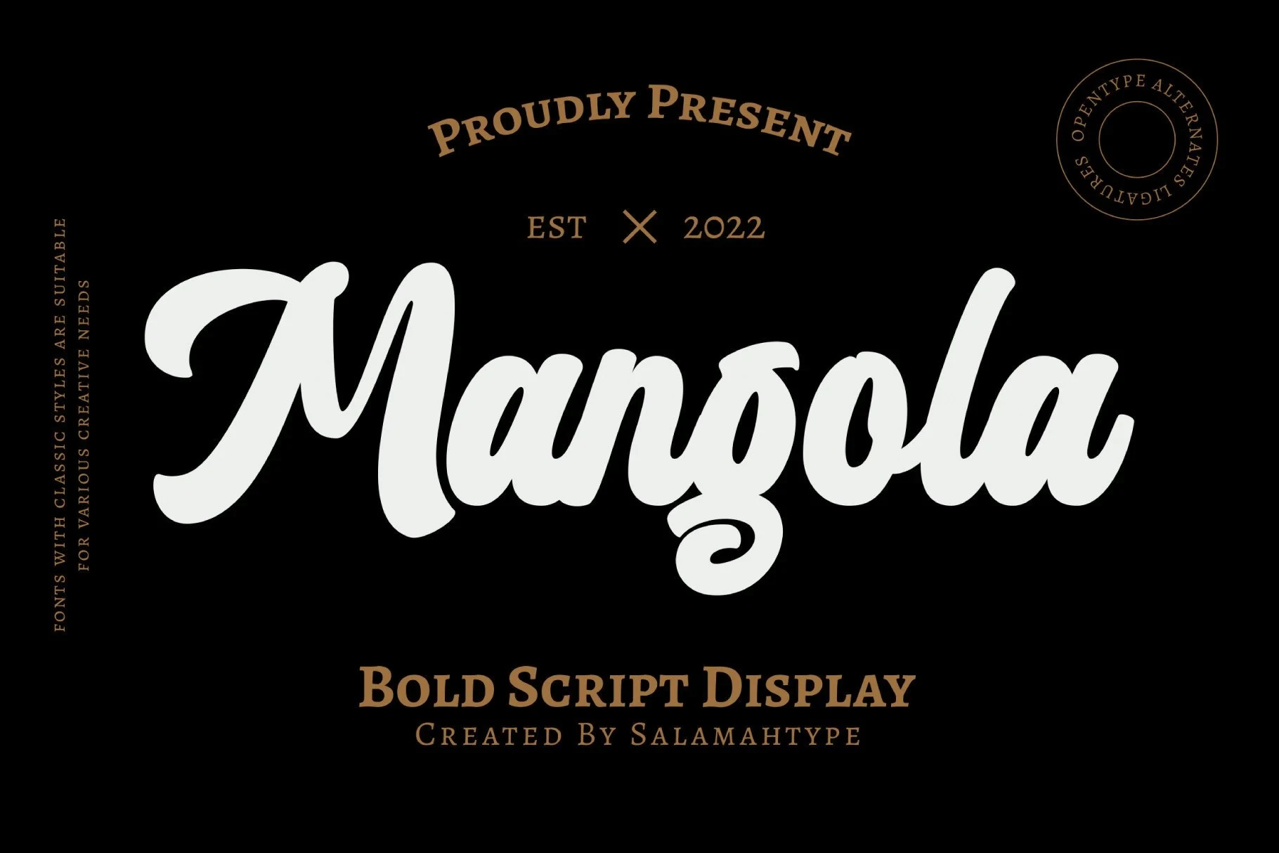
Best For: business cards, logos, invitations
Mangola Font delivers a heavy rightward-leaning display style, with a distinctive swash terminal on the lowercase a. Its dense joins suit short names, invitations, and logos more comfortably than paragraphs or small body text.
Platina Script Font
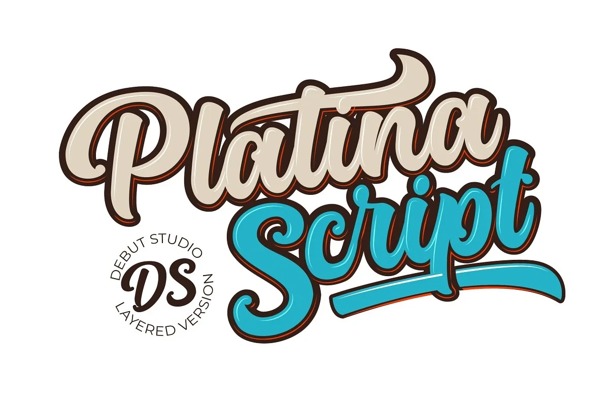
Best For: display text, bold designs, expressive designs
Platina Script Font is built for expressive headlines and signage, combining strong rightward movement with exaggerated swash-like terminals. The heavy connected strokes remain legible at large sizes, while layered color treatments can intensify its display impact.
Connected Retro Displays
Connected structures, thick weights, baseline movement, and occasional depth effects define these display faces. They deliver the strongest branding presence, but dense joins and shading restrict smaller applications.
Cheers Font
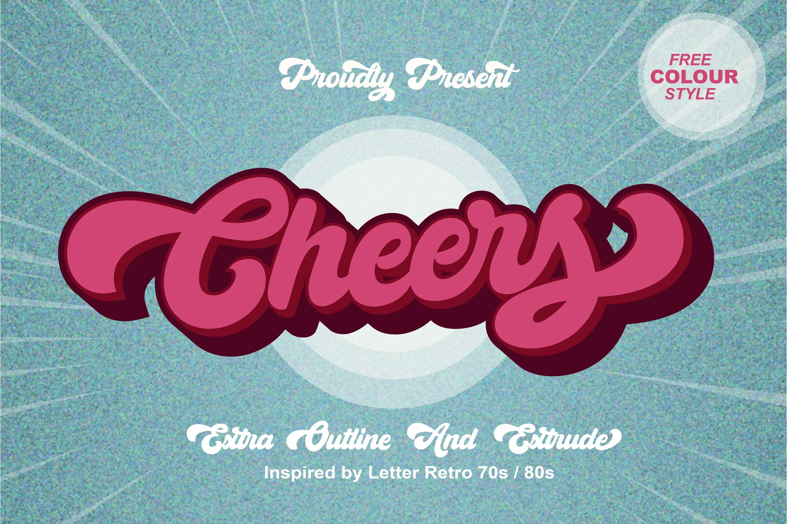
Best For: signage, product labels, display text
Cheers Font adds a heavy three-dimensional extrude treatment to connected display lettering. The depth reinforces signage and product-label work, and included ligatures expand its character options, though shading can reduce clarity at smaller sizes.
Nebyla Font
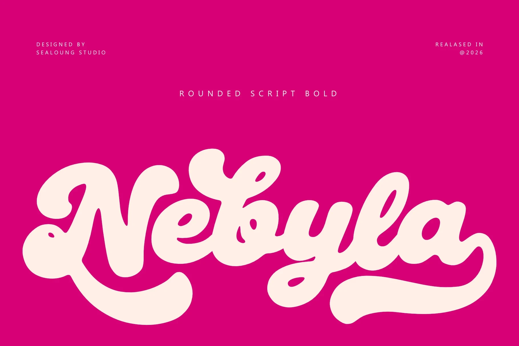
Best For: branding, headlines, website headers
Nebyla Font builds a rounded, heavy connected silhouette around looping terminals and swashes. Its clear weight suits headers and brand names, but the terminal detail needs generous sizing to remain distinct.
Betlyn Font
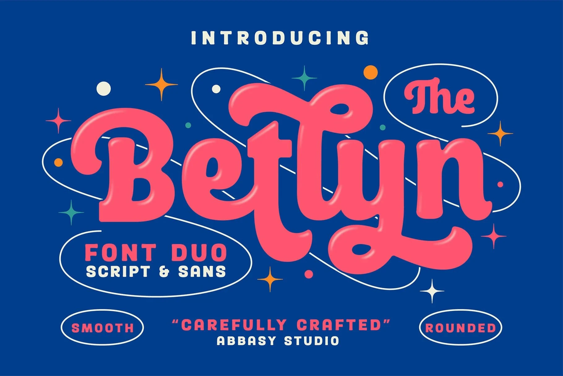
Best For: display text, bold designs, playful designs
Betlyn Font gives connected lettering an inflated, soft 3D impression through bold rounded forms. That volume makes short headlines and logos prominent, but the stylized construction is not suited to extended copy.
Rogade Font

Best For: packaging, posters, headlines
Rogade Font is especially effective for posters, packaging, and brand names because its pronounced horizontal swash anchors the baseline with a memorable finish. The bold connected structure remains clear at display size, while complex joins weaken small-format use.
Biyonella Font

Best For: branding, display text, soft designs
Biyonella Font: Betlyn Font features a thick connected structure that ends in an extended swash on the final a. These Bold Script Fonts create a memorable branding finish, while the dense character connections keep the face firmly in headline territory.
Hamilton Font

Best For: branding, retro designs, product labels
Hamilton Font suits product labels and brand marks that need high-contrast connected lettering with exaggerated curves and swashes. Its heavy weight holds up at larger sizes, but intricate joins and pronounced slant demand generous display treatment.
Bold Script Font
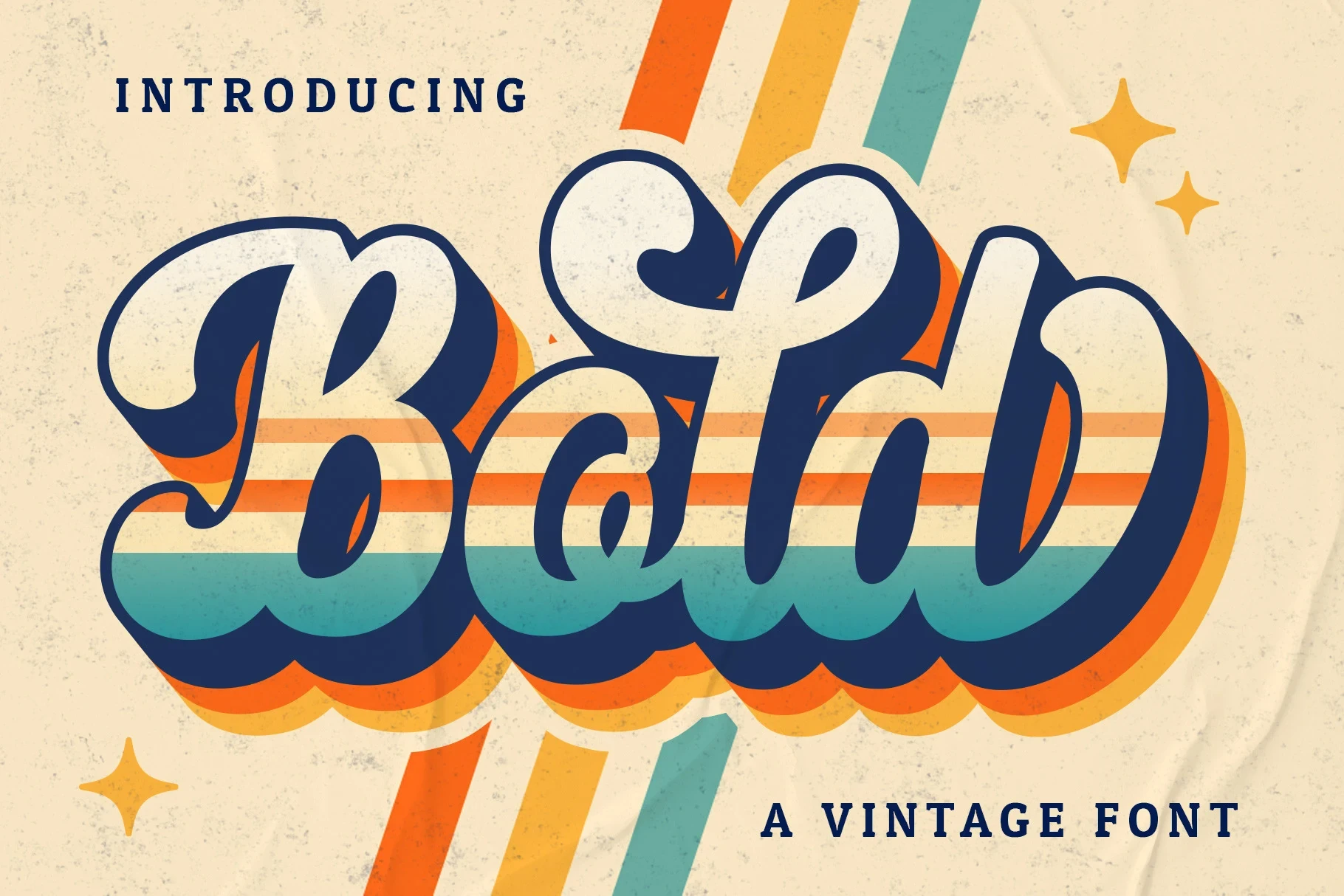
Best For: logos, branding, invitations, wedding designs
Bold Script Font has bubbly connected lettering and a pronounced baseline bounce. Its thick, high-contrast construction gives logos and invitations plenty of movement, but the uneven rhythm and weight are best reserved for display-scale wording.
Looped Playful Scripts
Loops, swashes, and unusual rhythm shape this lighter-hearted group. Upright or gently connected constructions distinguish it from the more forcefully slanted and heavily layered display styles.
Rachy Font

Best For: social media graphics, logos, branding, packaging
Rachy Font pairs thick monolinear connections with upward-curving swashes on the R and y. The consistent stroke weight supports readable logos and packaging, while those letter-specific flourishes add character without relying on heavy contrast.
Batuphat Font
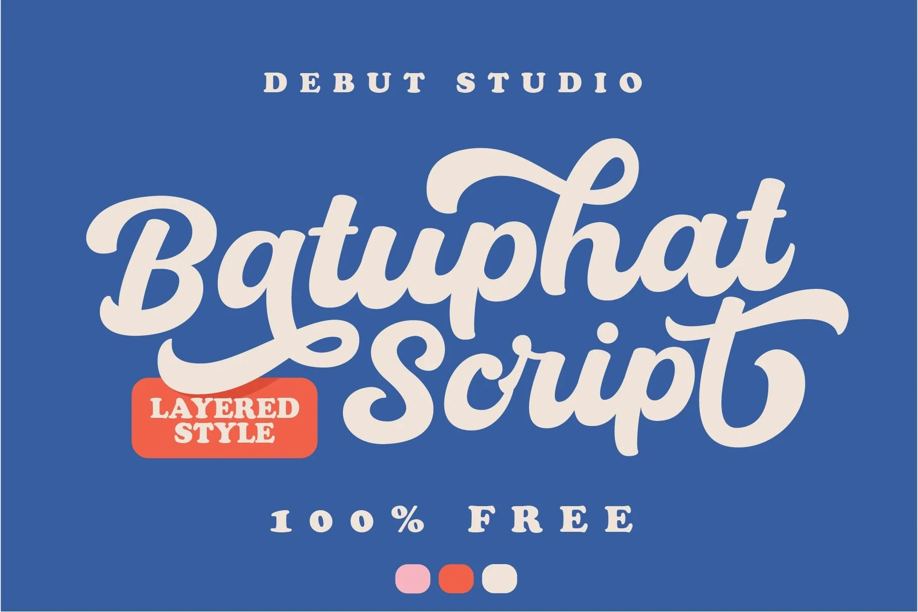
Best For: display text, bold designs, decorative designs
Batuphat Font takes a more upright stance, using pronounced loops and ornamental flourishes to create a settled rhythm. The monolinear weight supports large display wording, although the flourishes quickly become difficult to distinguish when reduced.
How to Choose the Right Font
Choose open, disconnected lettering when readability and a relaxed silhouette matter most; choose connected forms for stronger identity and movement. Within the Bold Script Fonts collection, check weight and contrast first, then test joins, swashes, and flourishes at the intended size before committing to packaging, signage, or headline use.