20 Best Bold Cute Fonts in 2027
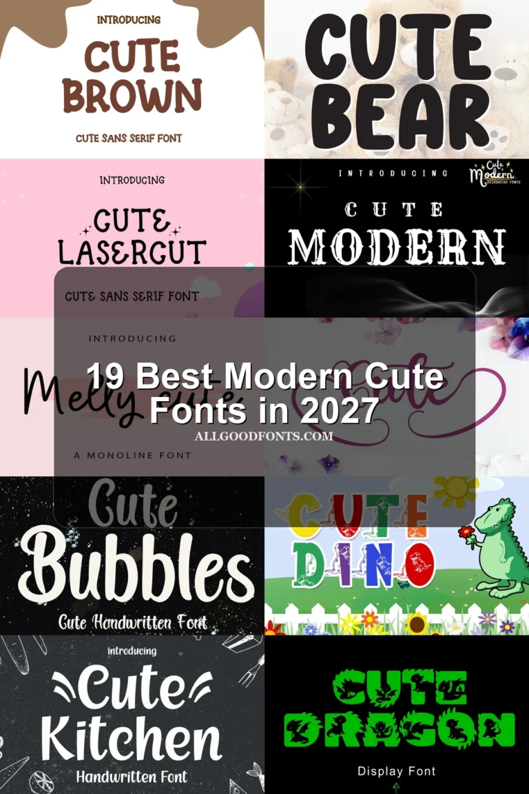
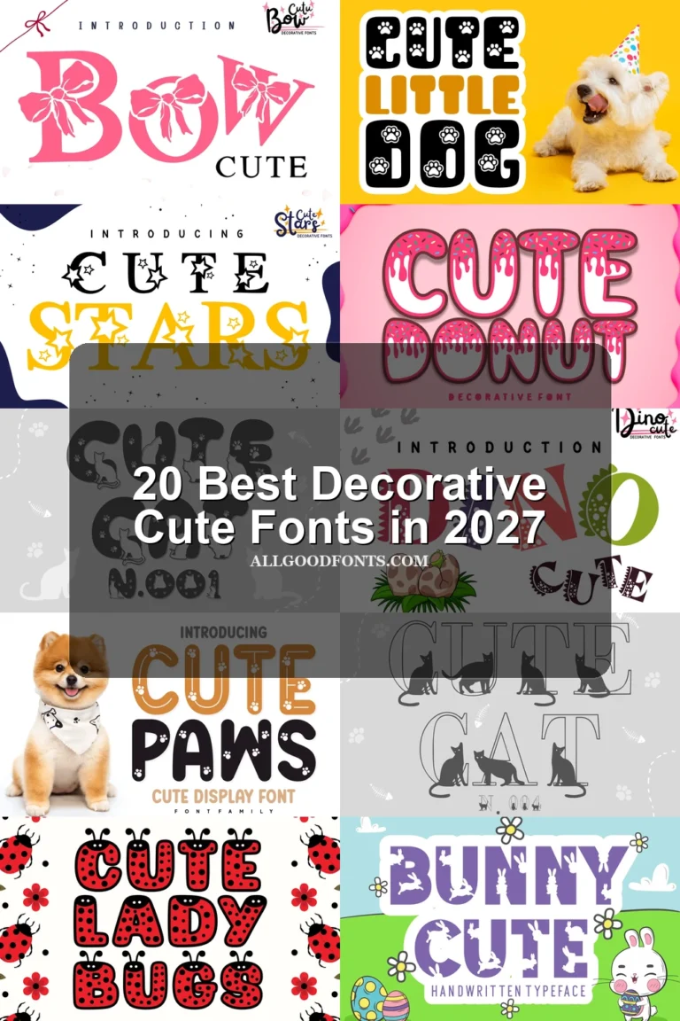
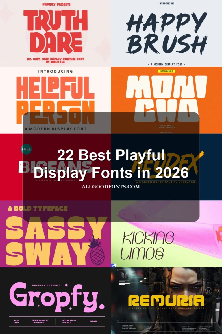
This collection ranges from wide, rounded display faces and sturdy block lettering to illustrated characters, dimensional effects, and connected cursive. These Bold Cute Fonts are built for posters, labels, invitations, merchandise, logos, stickers, and other short, expressive pieces where construction and scale matter.
Looking for more cute fonts? Browse our complete Cute Fonts collection to compare modern, bold, and cute cute styles.
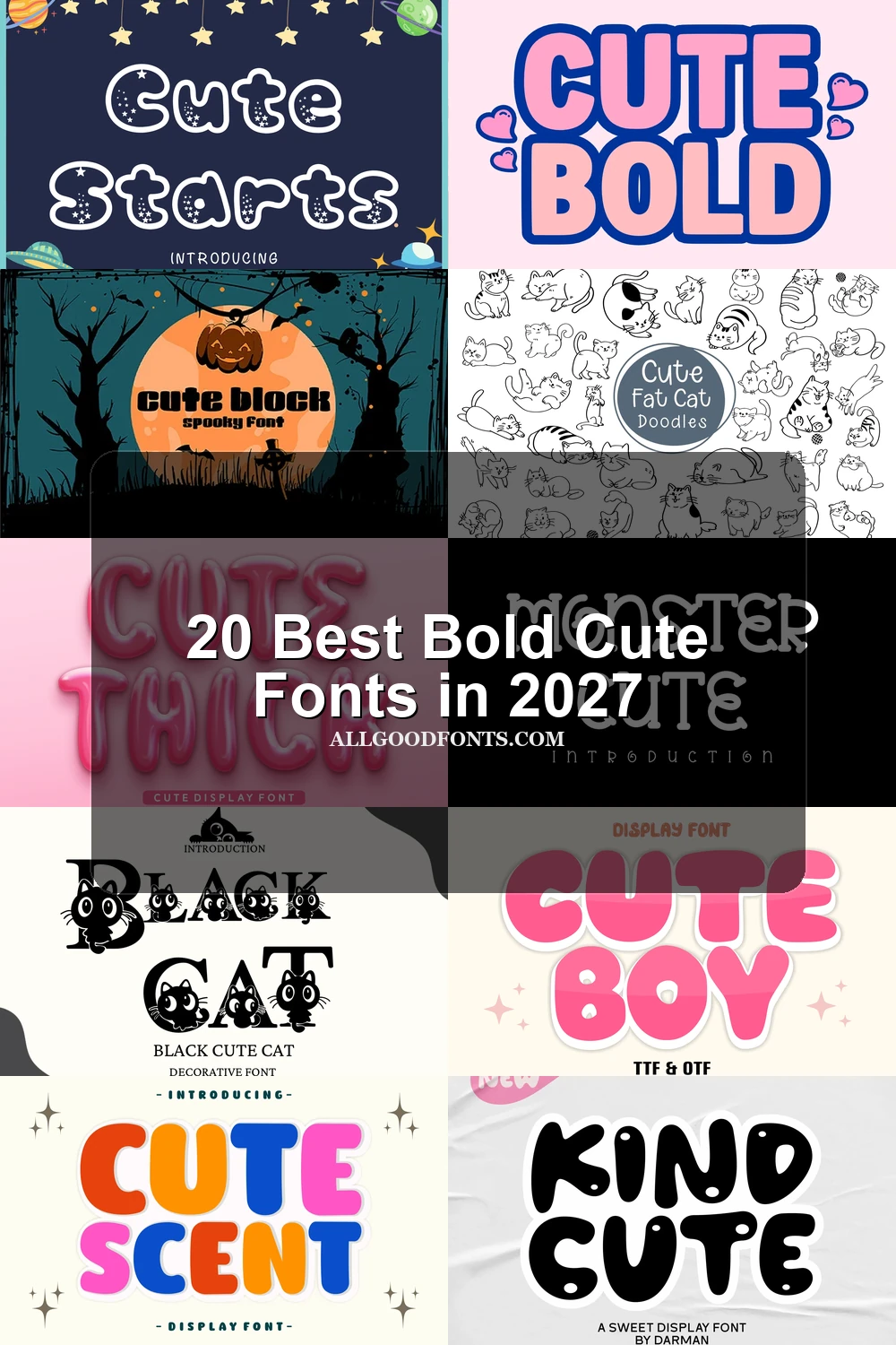
Bold Cute Fonts
These Bold Cute Fonts rely on broad, rounded, block-like construction and strong stroke weight, prioritizing clean impact and readable short headlines over intricate decoration.
Cute Bold Font

Best For: display text, playful designs
Cute Bold Font uses ultra-bold, wide rounded sans-serif forms with closed counters and a high x-height. Its tight spacing and thick strokes make these Bold Cute Fonts especially clear for large lettering, but less comfortable for small text.
Cute Thick Font
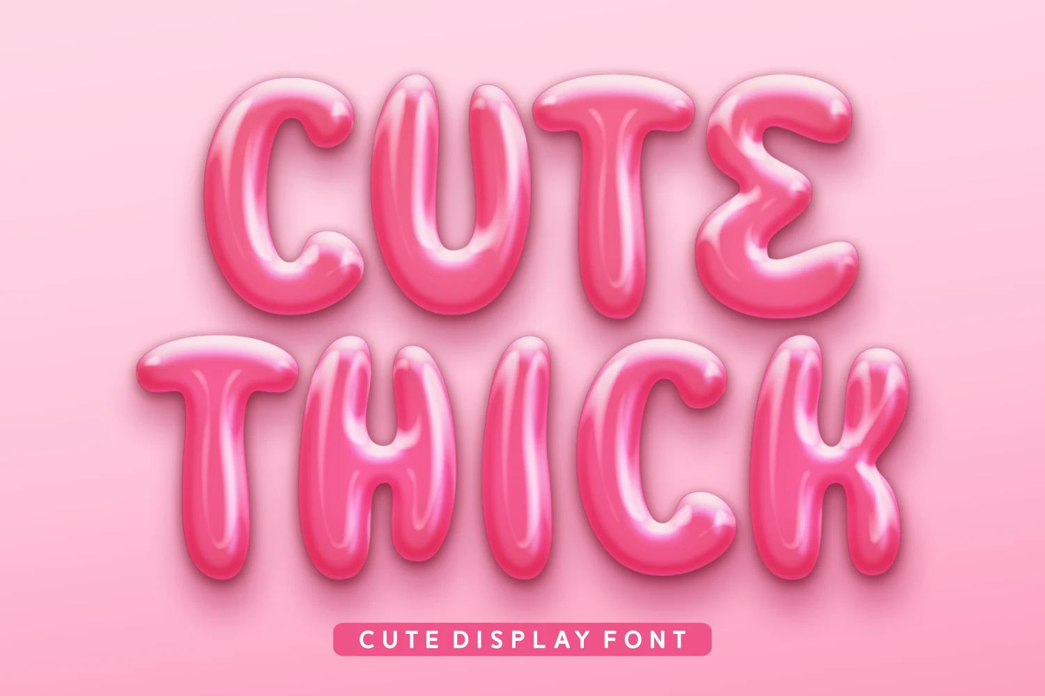
Best For: invitations, display text, soft designs
For invitations and short headlines, Cute Thick Font supplies inflated, soft-edged characters with simplified disconnected construction and very heavy visual weight. The uncluttered shapes read strongly when large, although reducing them can make the rounded forms blur together.
Cute Scent Font
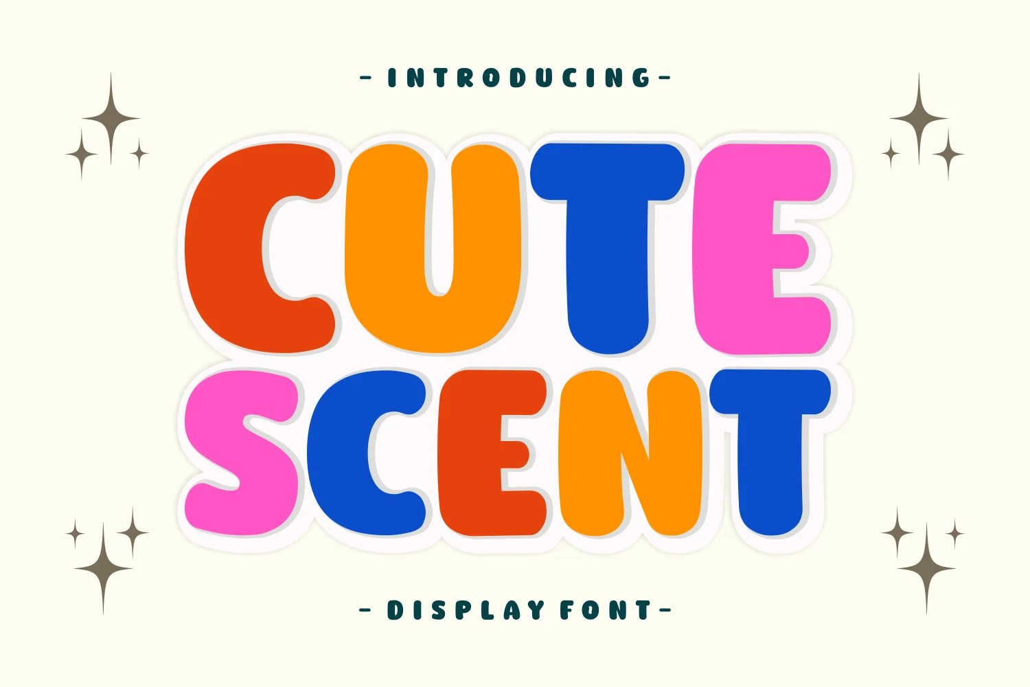
Best For: posters, product labels, display text
Cute Scent Font uses wide upright forms, heavy uniform strokes, and rounded terminals for immediate poster and label impact. Among Bold Cute Fonts, its multilingual support is a useful labeling advantage, while the dense weight still favors generous display scale.
Cute Tika Font

Best For: product labels, display text, clean designs
Cute Tika Font is built from heavy geometric capitals, thick slab serifs, and a largely monoline structure. These Bold Cute Fonts offer clean product-label presence and strong large-scale legibility, though the uppercase-only character set limits longer text applications.
Cute Boy Font
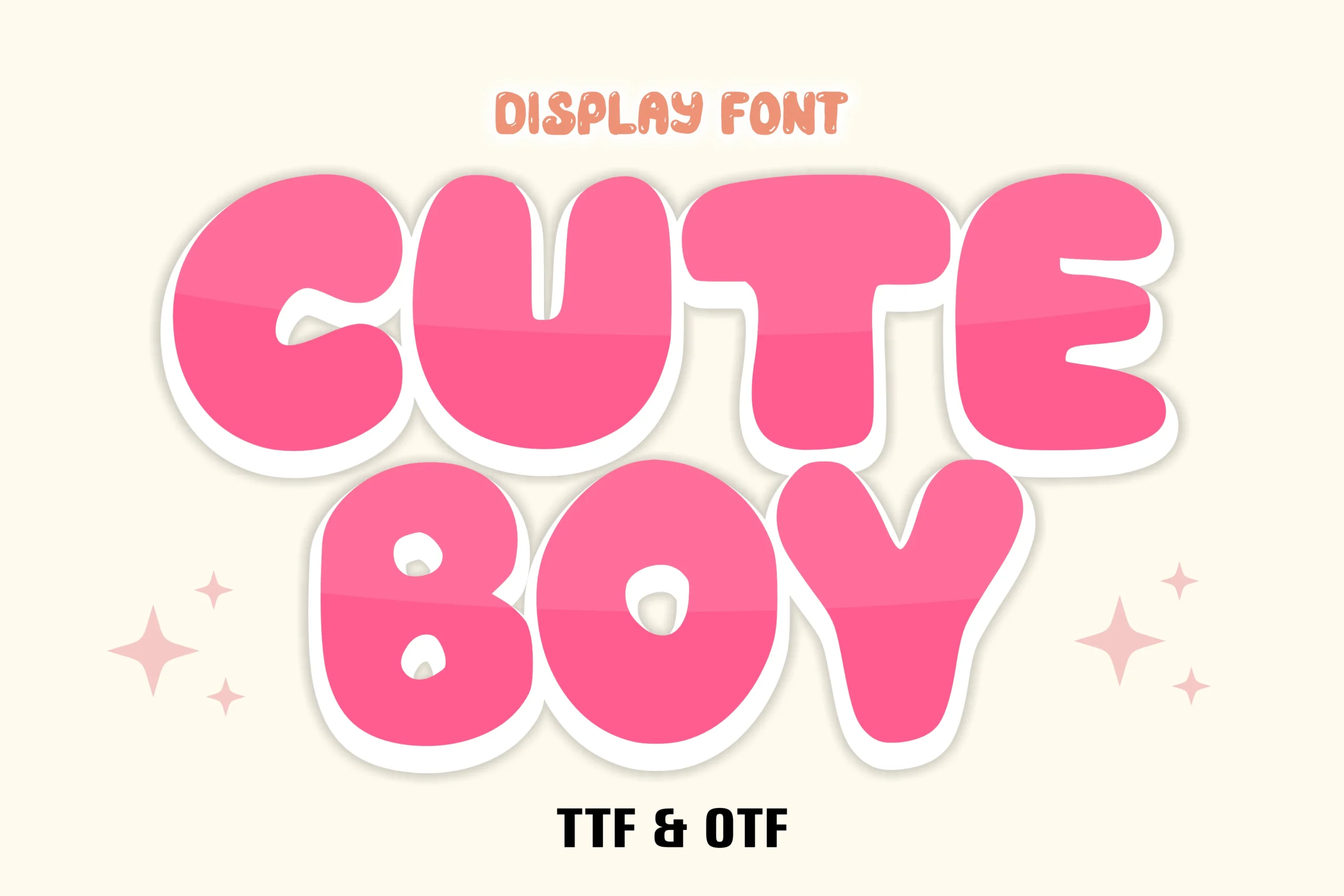
Best For: logos, packaging, stickers
Cute Boy Font gives inflated monoline letters a high-gloss finish through bright internal highlights. This dimensional treatment makes Bold Cute Fonts effective for logos, packaging, posters, and stickers, though the gloss can reduce clarity when the lettering is scaled down.
Cute Block Font
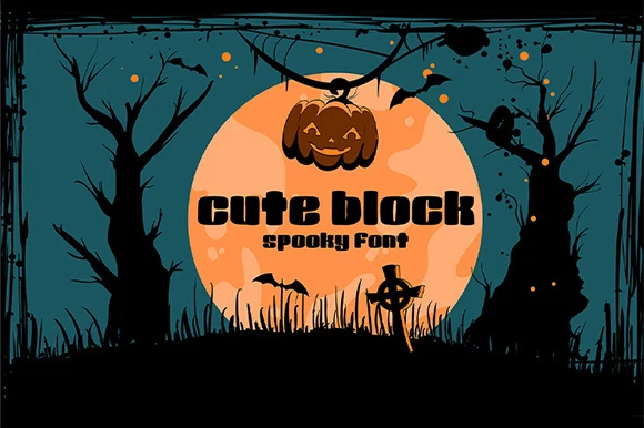
Best For: display text, short phrases, clean designs
For sturdy short phrases, Cute Block Font offers wide rectangular letters, stubby serifs, and very low stroke contrast. The solid construction gives reliable display-size readability, while the generous width can make compact compositions feel crowded.
Kind Cute Font
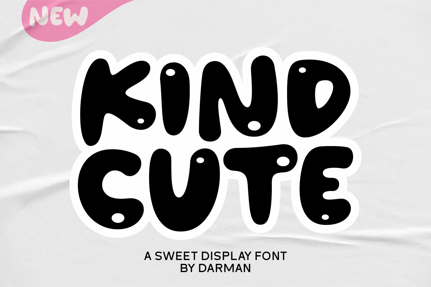
Best For: display text, soft designs, cute designs
Kind Cute Font builds ultra-bold balloon-like characters around distinctive circular cutouts. These Bold Cute Fonts gain a memorable signature for playful headings, but the small openings may disappear at very small sizes, so preserve generous scale and spacing.
Bear Cute Font

Best For: display text, soft designs, playful designs
Bear Cute Font keeps its wide, sturdy letters uncomplicated, using rounded corners and an even block-like stroke system. Without relying on texture or illustration, it delivers dependable readability for large headlines and approachable display work.
Cute Chunky Font
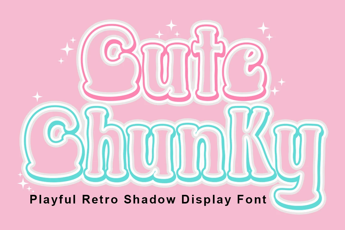
Best For: display text, soft designs, playful designs
Cute Chunky Font combines wide disconnected forms with a built-in dual-layer shadow effect. The layered depth strengthens poster impact and gives Bold Cute Fonts a nostalgic edge, but it sharply reduces clarity when the lettering is used at small sizes.
Characterful and Decorated Displays
This group adds illustrations, internal textures, unusual terminals, or dimensional effects to its letterforms, making it more decorative and scale-dependent than the sturdier display faces.
Cute Monster Font
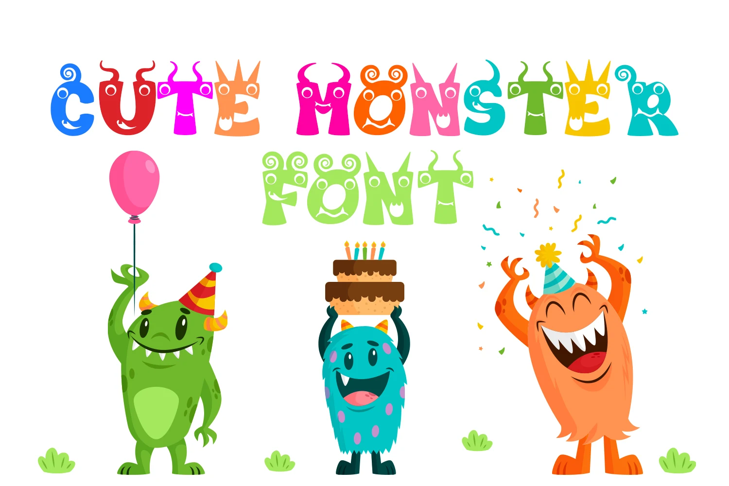
Best For: children’s designs, display text, playful designs
Cute Monster Font builds horns, eyes, and mouths directly into bulky, irregular letterforms. That integrated character treatment gives headings an immediate child-oriented personality, but the distortion and ornate details reserve it for large display accents rather than body copy.
Black Cute Cat Font
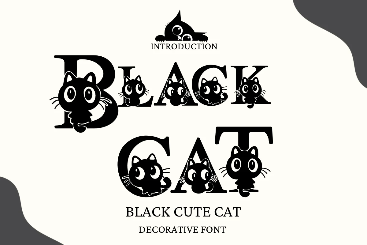
Best For: social media graphics, display text, playful designs
Black Cute Cat Font combines upright, high-contrast serif letters with bracketed triangular serifs and cat illustrations. The letter skeleton remains recognizable, though the integrated artwork can obscure it, so large decorative headlines are safer than dense wording.
Cute 'n' Bold Font

Best For: social media graphics, display text, wall art
Cute 'n' Bold Font pairs blocky cartoon proportions with thick lettering that works well with outlines or offset graphic treatments. Its five styles add variation for social graphics and wall art, but irregular forms are most effective in short display copy.
Cute Lime Font
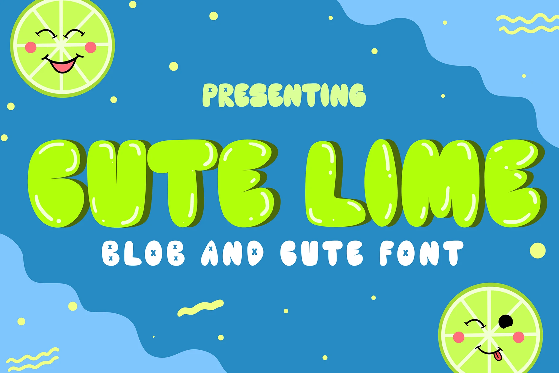
Best For: branding, display text, playful designs
Cute Lime Font gives bulbous upright letters a dimensional surface through built-in highlights and shadows. The effect can anchor a branding centerpiece, but those internal details lose definition when reduced, so keep the wording short and prominent.
Monster Cute Font

Best For: display text, playful designs, cute designs
Monster Cute Font combines curving letterforms, knob-like terminals, varied stroke widths, and eccentric flourishes. Its unusual vertical alignment creates a childlike heading style, but the busy construction makes it unsuitable for long-form reading or compact text blocks.
Cute Dog Font
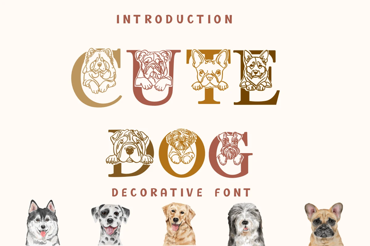
Best For: display text, wall art, playful designs
Cute Dog Font places line-art illustrations inside bold upright serif counters, combining recognizable letter skeletons with built-in imagery. The drawings need display scale to avoid congestion, making short titles and wall art more suitable than small supporting text.
Cute Starts Font
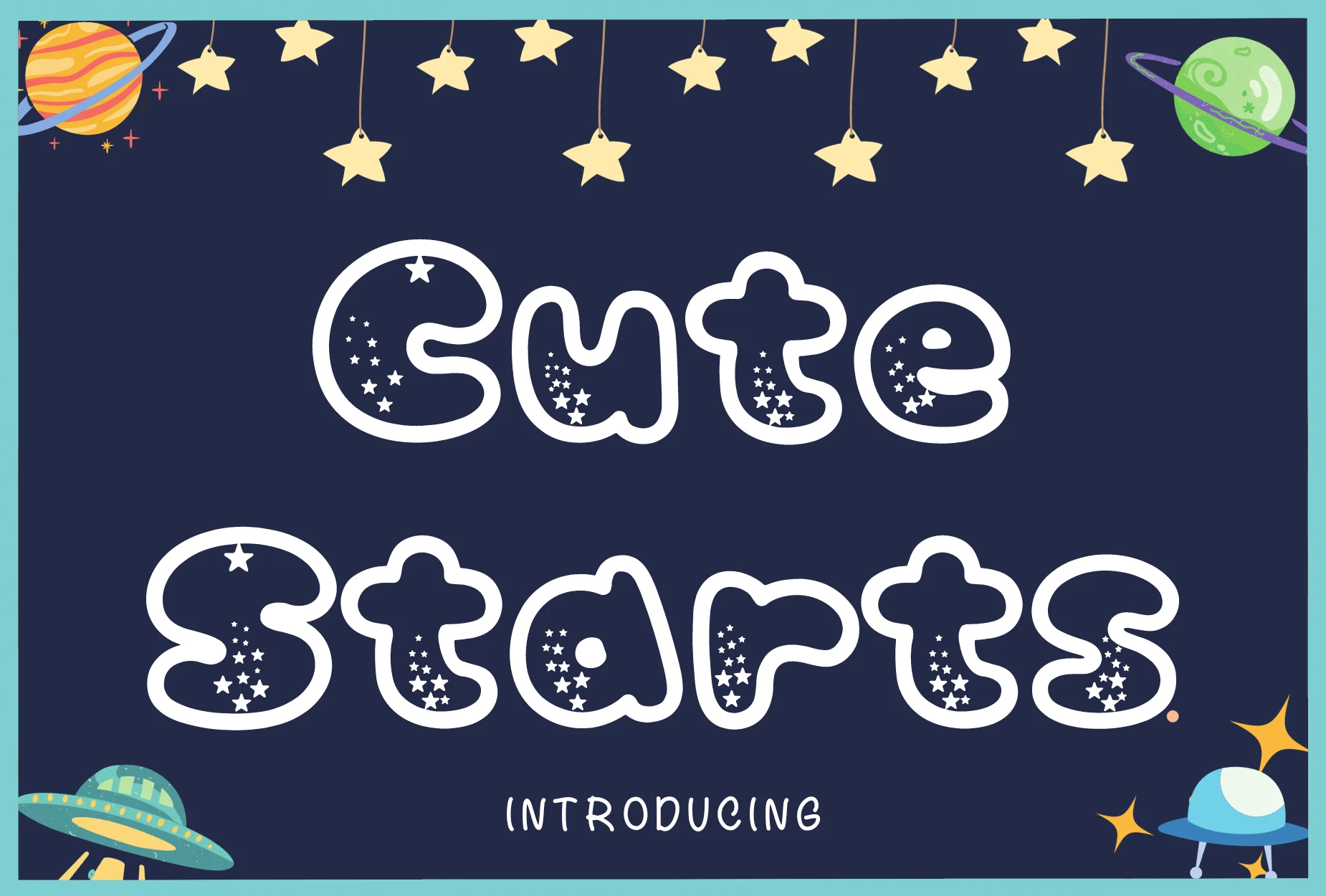
Best For: posters, headlines, display text
Cute Starts Font fills rounded disconnected characters with an internal star pattern instead of a plain interior. The texture makes short poster headings distinctive, yet it reduces legibility, so use generous display scale and keep supporting copy separate.
Flowing and Handwritten Styles
Connected or loosely arranged monoline lettering gives this category a softer, more personal rhythm, with generally better medium-size friendliness than heavily decorated display styles.
Cute Fat Cat Font

Best For: display text, soft designs, cute designs
Cute Fat Cat Font connects rounded lowercase-style forms with a consistent monoline stroke and a gently irregular baseline. The friendly rhythm stays readable at medium or large sizes, making it a practical choice for merchandise, crafts, and approachable display wording.
Cute Samantha Font
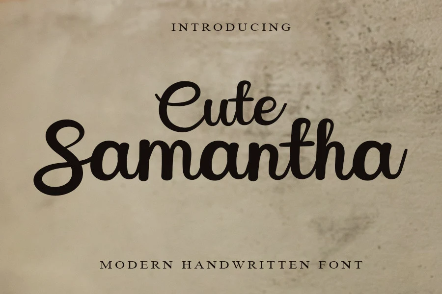
Best For: product labels, modern designs, cute designs
Cute Samantha Font connects upright cursive letters with a consistent monoline stroke and rounded terminals. The restrained construction keeps it readable for mid-sized labels and headlines, giving it more practical range than a script intended only for oversized accents.
Cute Rabbit Font
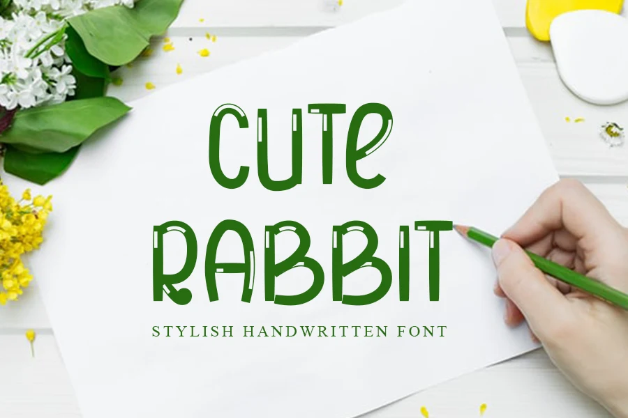
Best For: display text, soft designs, playful designs
Cute Rabbit Font uses light monoline uppercase forms with disconnected letters and an intentionally inconsistent baseline. Its soft terminals feel approachable in short headings, but the stylization becomes harder to parse at small sizes or in longer phrases.
Cute Alicia Font
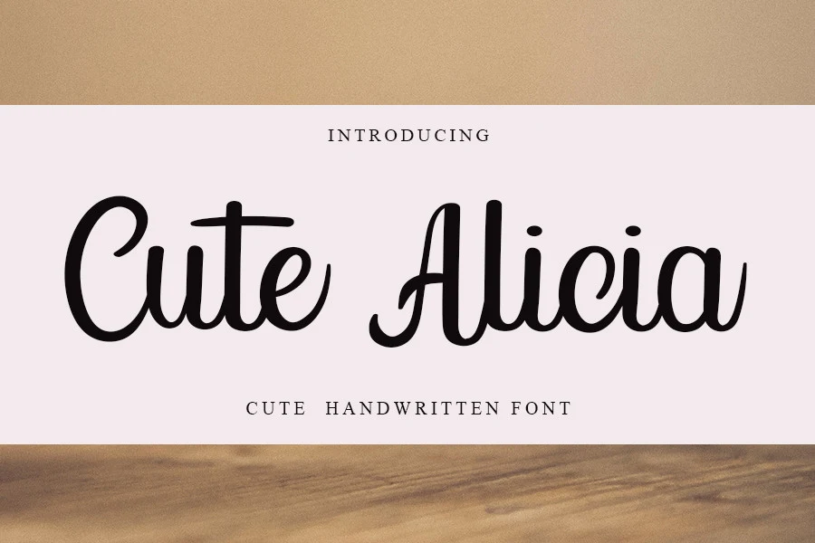
Best For: modern designs, clean designs, elegant designs
Cute Alicia Font uses connected cursive lettering with an upright monoline structure, rounded terminals, and generous spacing. Its cleaner construction preserves readability at medium-to-large sizes, making it a calmer script option for friendly display applications.
How to Choose the Right Font
Choose the simplest wide or block-built option when readability leads, especially for labels and short phrases. Pick illustrated, glossy, shadowed, or textured styles when the lettering is the design centerpiece. For a softer result, compare the connected scripts by spacing and stroke consistency, then reserve every ornate treatment for generous display scale.