13 Best Vintage Logo Fonts in 2026
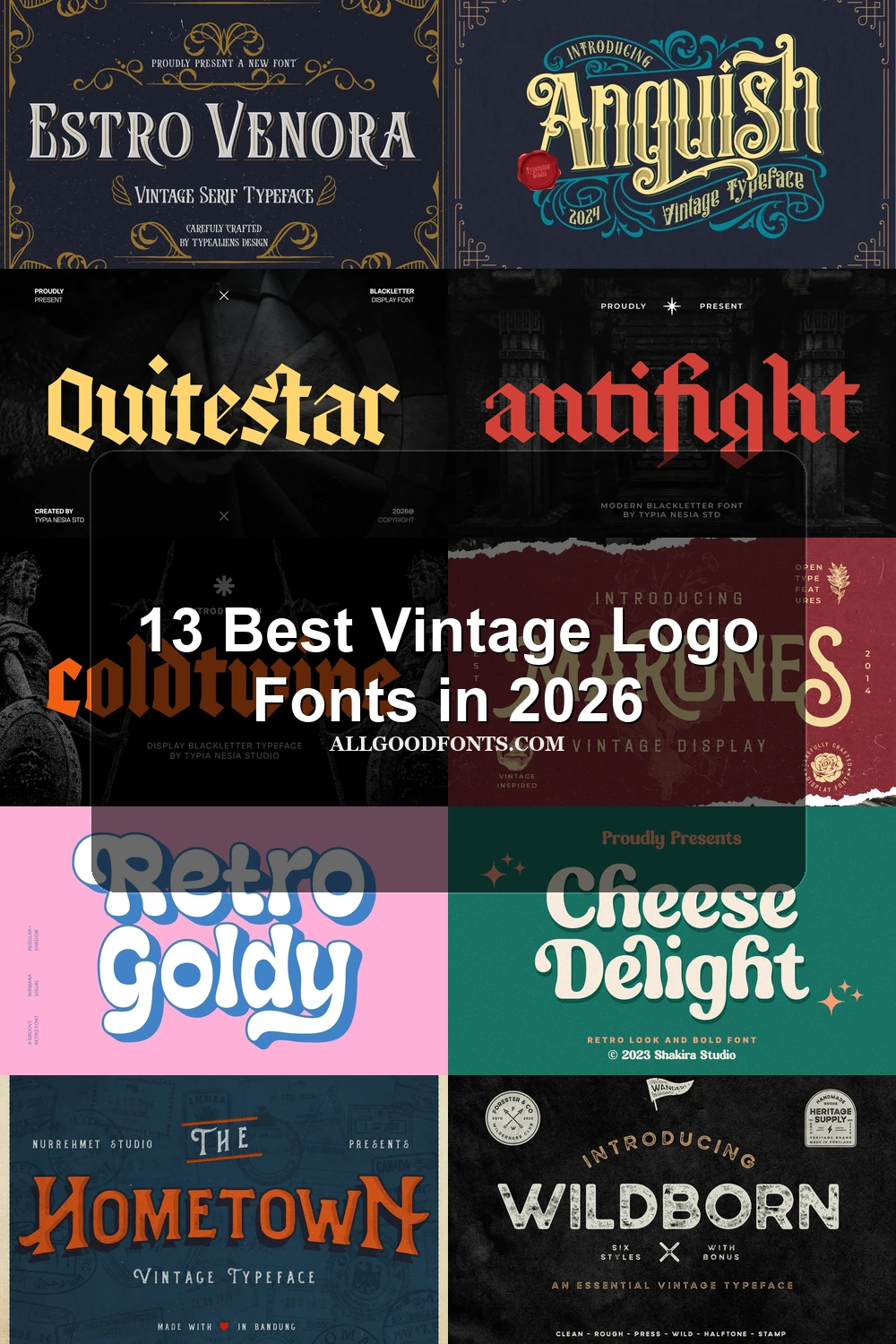
This collection moves from high-contrast Art Nouveau serifs and angular blackletter to rounded period lettering, lighter display faces, and contemporary revivals. These Vintage Logo Fonts are suited to memorable names, badges, packaging, signage, posters, and other short-form brand applications where construction and scale shape readability.
Looking for more logo fonts? Browse our complete Logo Fonts collection to compare logo-friendly logo styles.
Vintage Logo Fonts: Ornate Display
This Vintage Logo Fonts group uses decorative construction, strong contrast, pointed terminals, and compressed blackletter forms. Compared with the other categories, it creates the most imposing and visibly ornamental logo presence.
Estro Venora Font

Best For: signage, logos, display text
Estro Venora Font combines a bold Art Nouveau display serif with high contrast, pointed terminals, and geometric vertical forms. Its decorative strokes give large logos and signage a strong presence, while the lighter companion serif can handle supporting descriptions. Keep the main lettering large, since intricate details may weaken at smaller sizes.
Refined Sugarish Font

Best For: creative projects, logos, display text, headlines
For large logos and headlines, Refined Sugarish Font brings bubbly forms, high contrast, and tight overlapping spacing. The disconnected construction is sharpened by prominent swashes on the capital R and lowercase h, while thin connections and elaborate details limit its usefulness for small text or long wording. A clean secondary face can provide contrast.
Coldtwine Font
Best For: logos, display text, bold designs
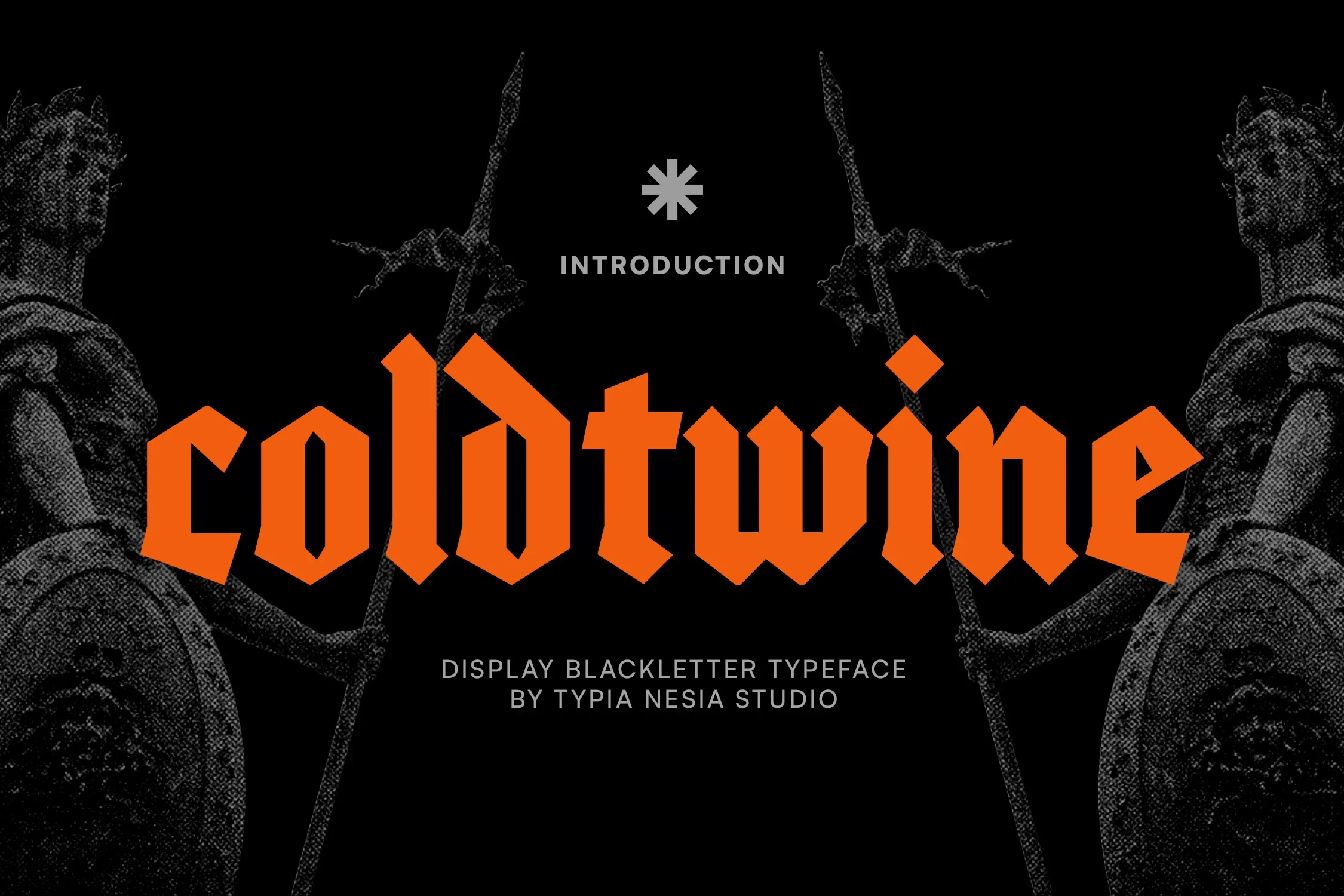
Coldtwine Font builds a forceful logo block from heavy, condensed blackletter forms, sharp angular terminals, and narrow proportions. Its sturdy silhouette reads well at display size and suits bold marks, though the intricate angular details can blur when the lettering is reduced.
Rounded Nostalgic Display
Rounded forms and lighter period strokes give this group a softer, more approachable display voice. Its lettering feels less forceful than the ornate serif and blackletter selections, with weight varying from bold to delicate.
Retro Goldy Font

Best For: eye-catching designs, logos, display text
Retro Goldy Font uses substantial rounded lettering to make short names and logo phrases immediately visible. Its bold period character suits eye-catching designs and playful branding, but the expressive letter shapes are better compared in headings or compact marks than carried through extended copy.
Kadinsky Font
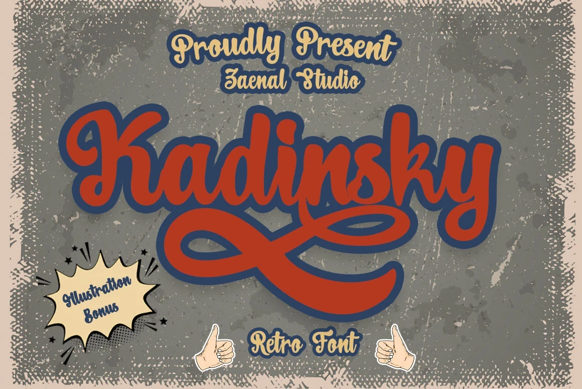
Best For: logos, display text, elegant designs
Kadinsky Font takes a lighter route, using slender strokes and rounded period lettering for refined names and marks. It has less visual mass than the heavier choices here, so it works best when an identity needs delicacy rather than a dense logo block.
Cheese Delight Font
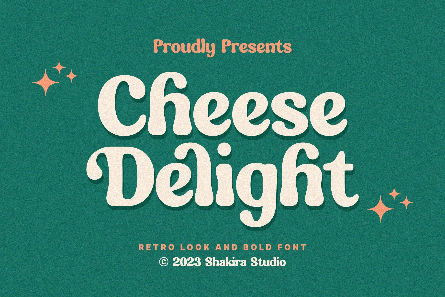
Best For: logos, display text, expressive designs
Cheese Delight Font uses a light display serif construction with slender strokes and a clear period cadence. It gives logos and headings an airy finish, but its restrained weight is less suitable for compact, heavy badges or small applications where stronger mass would improve visibility.
Expressive Period Marks
These display faces share clear stroke rhythm and period character while covering varied practical roles, from badges and labels to posters, covers, and promotional graphics.
Anguish Font
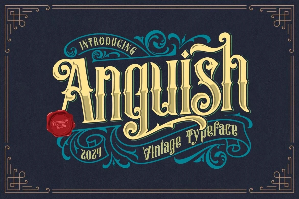
Best For: book covers, posters, logos, magazine covers
Anguish Font relies on a clear stroke rhythm and recognizable display letterforms to establish its period identity. It can support editorial-style logos, posters, book covers, and magazine covers, with its strongest results likely in short headings and title treatments rather than dense information.
Trilate Font
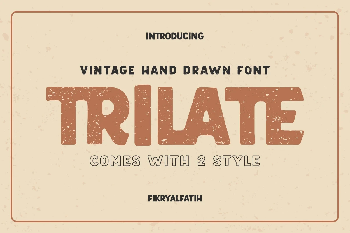
Best For: business cards, T-shirts, logos, branding
Trilate Font includes two styles, regular and rounded, allowing one period-inspired identity to shift across business cards, shirts, logos, and broader branding. That variation is most useful for short display wording, where the letterforms can remain legible while the chosen style adjusts the brand's surface character.
Hometown Font
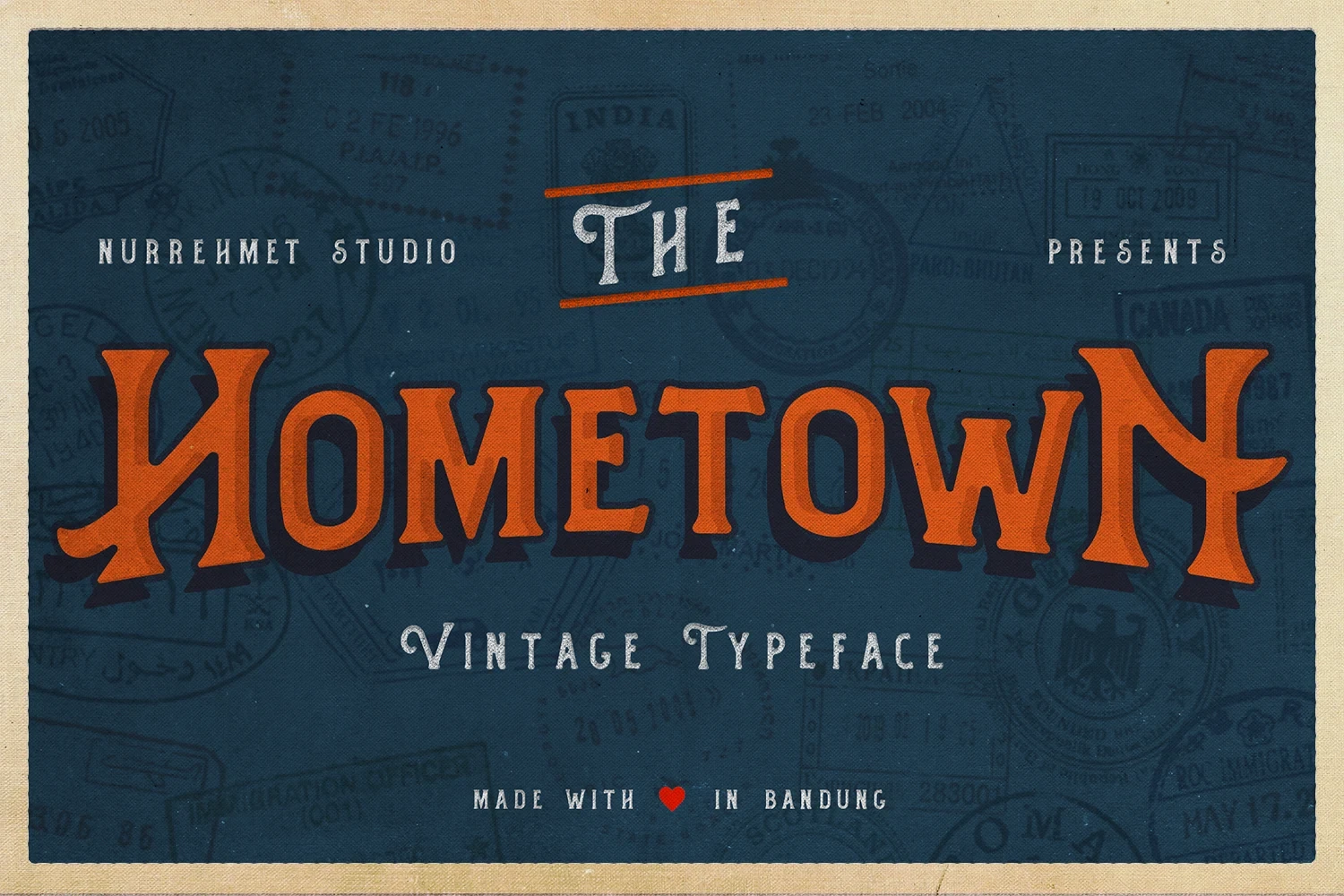
Best For: creative projects, logos, display text, classic designs
Hometown Font takes a straightforward period display approach, with recognizable letterforms and consistent stroke rhythm. That practical balance makes it a dependable choice for creative logos, display text, and established-looking marks when you want character without relying on highly complicated construction.
Wildborn Font
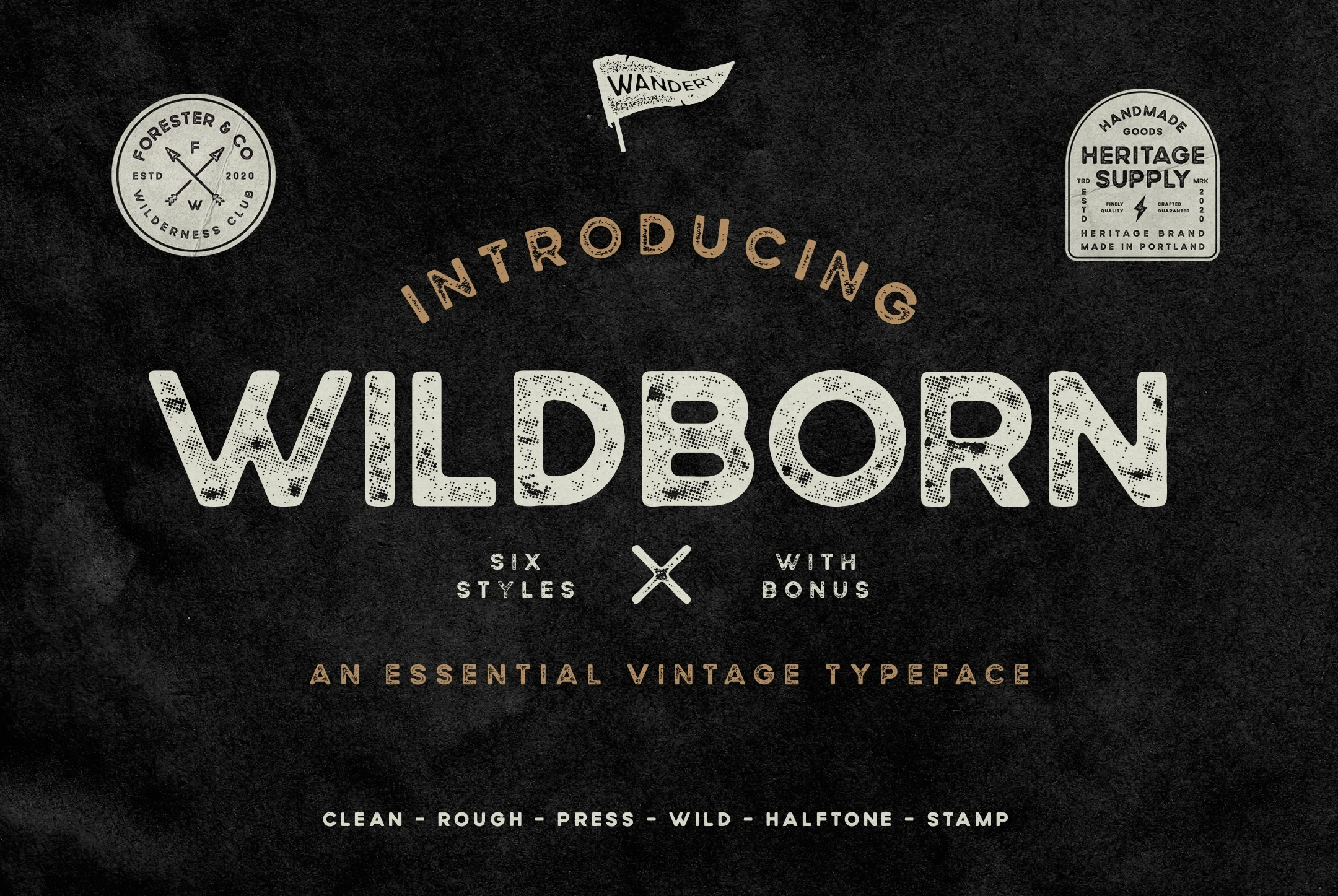
Best For: badges, quotes, logos, product labels
Wildborn Font is aimed at compact brand containers, including badges and product labels, where its period letterforms can occupy a defined shape. It also suits quotations and other short phrases; long wording is less appropriate because the display treatment needs room to remain clear and visually prominent.
Marones Font
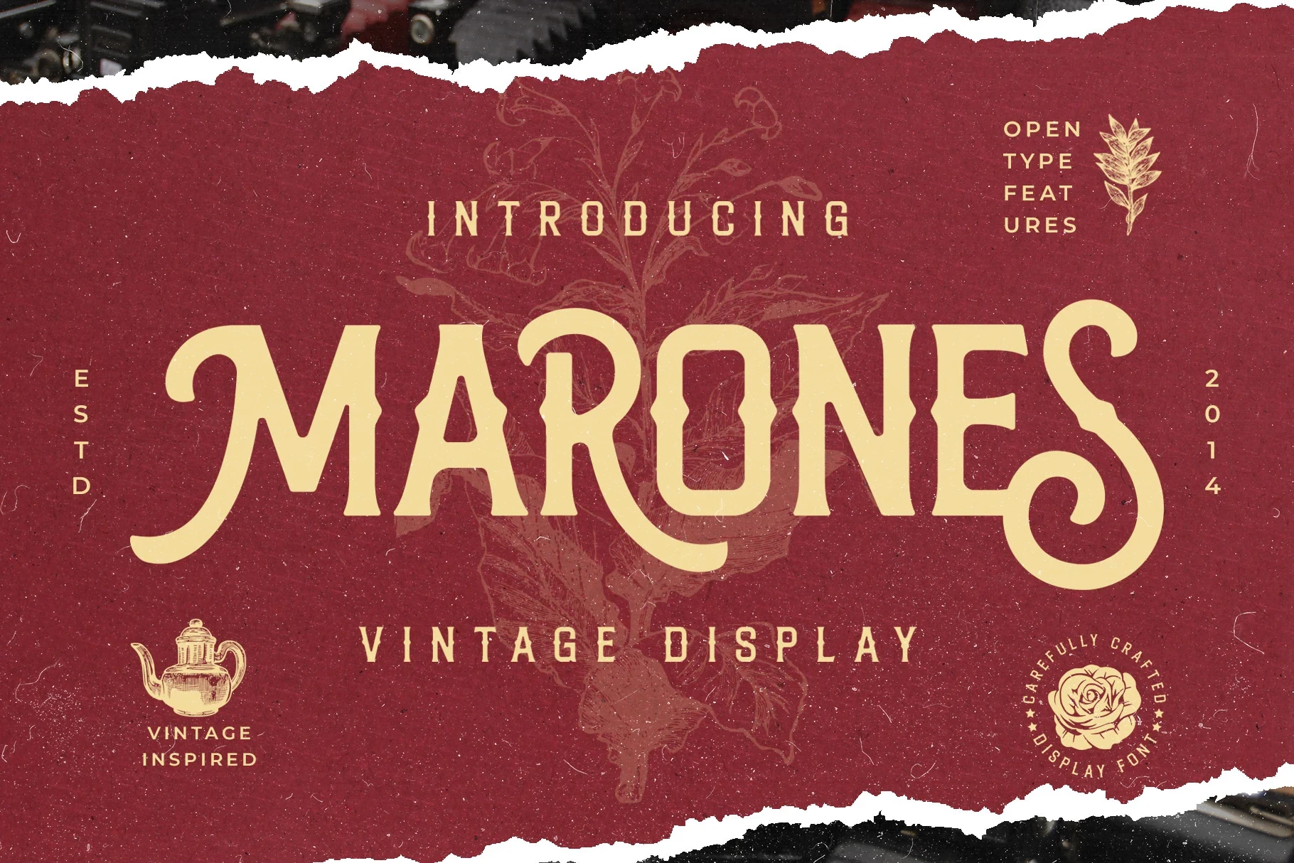
Best For: packaging, posters, stickers
Marones Font is positioned for tactile promotional graphics such as packaging, posters, and stickers. Its clear stroke rhythm supports bold short messages and adds a period-inspired surface to physical materials, but the available evidence points to display use rather than paragraph text.
Clean Contemporary Revival
This group pairs period display cues with cleaner contemporary construction. It is the easiest category to adapt to current brand systems, though the lettering still works best for names and brief phrases.
Quitestar Font
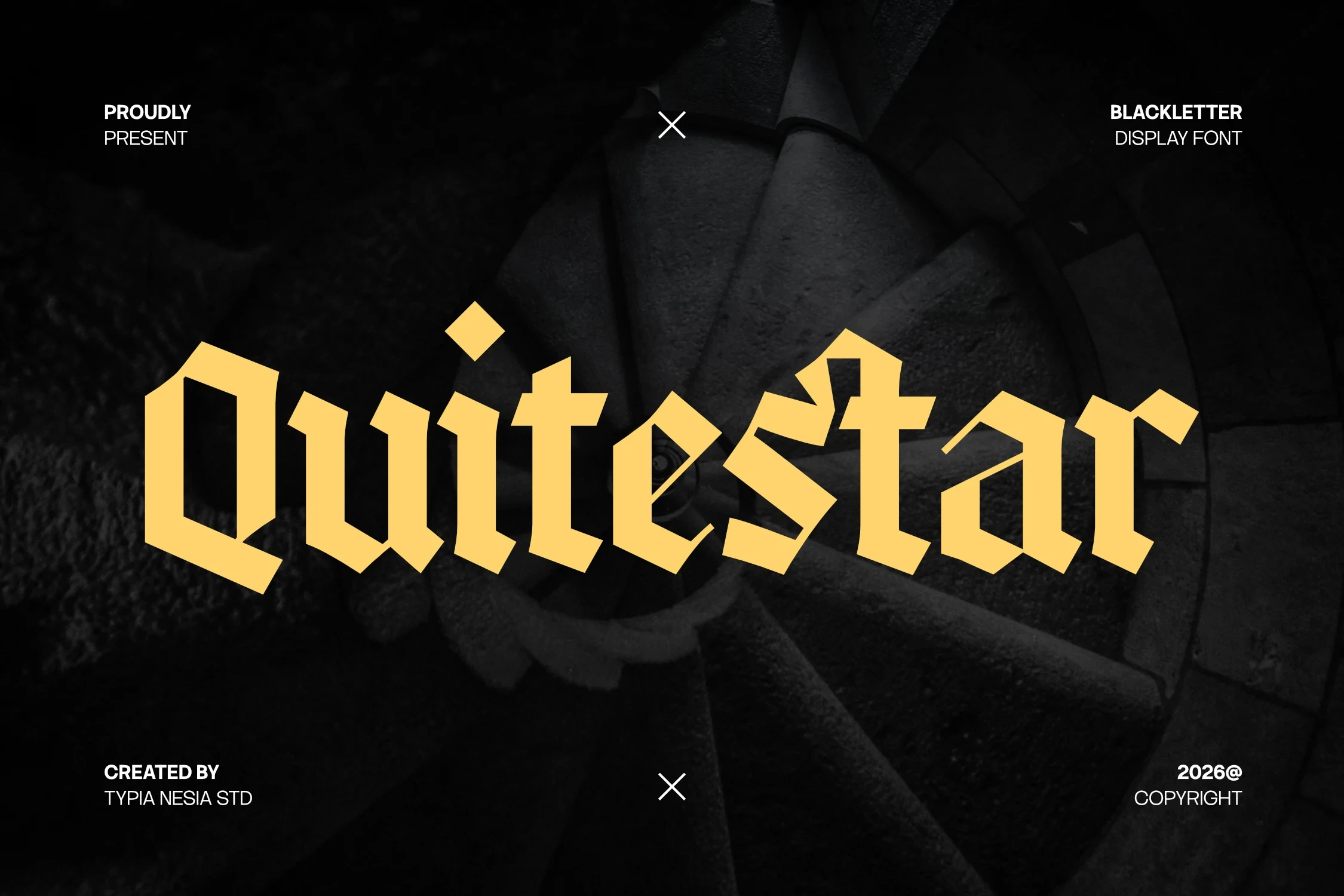
Best For: logos, display text, modern designs, clean designs
For current brand systems that still want period character, Quitestar Font offers a contemporary construction with a clear display rhythm. Its balanced direction keeps logos from feeling overly historical, while readability remains strongest in short names, headings, and brief brand phrases rather than continuous copy. Vintage Logo Fonts with this balance can bridge heritage cues and present-day identity work.
Antifight Font
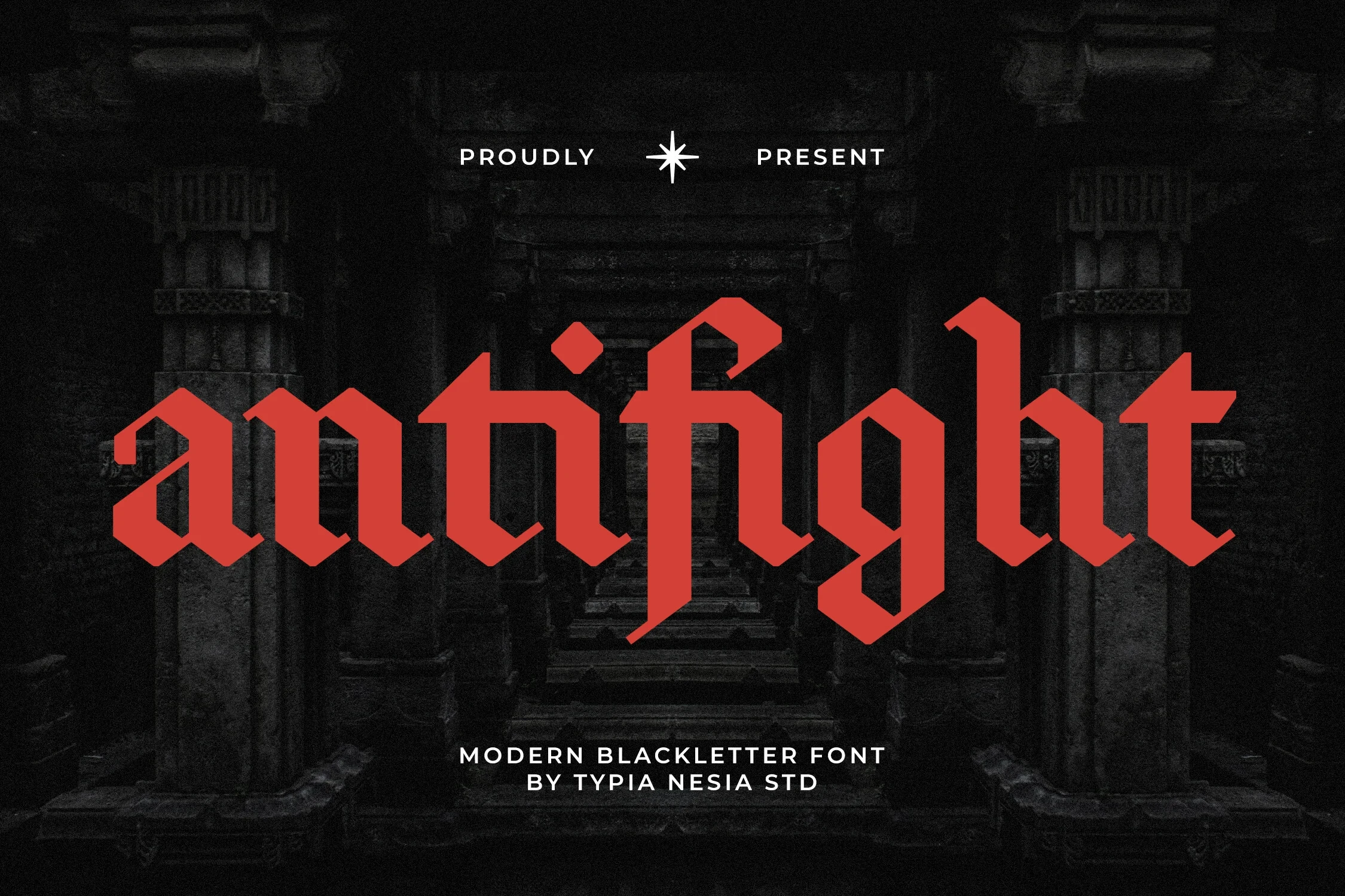
Best For: logos, display text, modern designs
Antifight Font pairs contemporary construction with a period display voice, making it useful when Vintage Logo Fonts need to connect current logo work with heritage branding. Its letterforms are easiest to read in short names, headings, and other display phrases, where the clear rhythm has room to register.
How to Choose the Right Font
Choose by construction first: high contrast, swashes, and angular terminals need generous scale, while rounded or straightforward forms are easier to read in compact marks. Use lighter faces for airy names, heavier styles for badges and signage, and contemporary revivals when Vintage Logo Fonts must fit a current brand system.