15 Best Bold Cursive Fonts in 2026
This collection moves from thick, upright connected lettering to sharply slanted scripts, brush-textured forms, looping flourishes, and hybrid wordmarks. These Bold Cursive Fonts are built for readable display work, including logos, packaging, posters, labels, signage, and short headline treatments rather than extended text.
Looking for more cursive fonts? Browse our complete Cursive Fonts collection to compare modern, bold, wedding, logo-friendly, and Cricut-ready cursive styles.

Bold Cursive Fonts
These Bold Cursive Fonts rely on connected, heavy strokes, usually with restrained contrast and rounded terminals. Their cleaner construction makes them more readable than highly flourished display scripts.
Glady Font
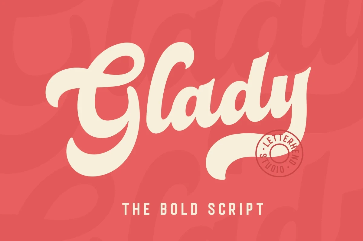
Best For: headlines, display text, bold designs
Glady Font uses thick monolinear joins, rounded terminals, and an exaggerated horizontal final swash to give Bold Cursive Fonts a friendly signature-like finish. It stays clear at headline size, but dense spacing can close up when reduced.
Jaqueline Font
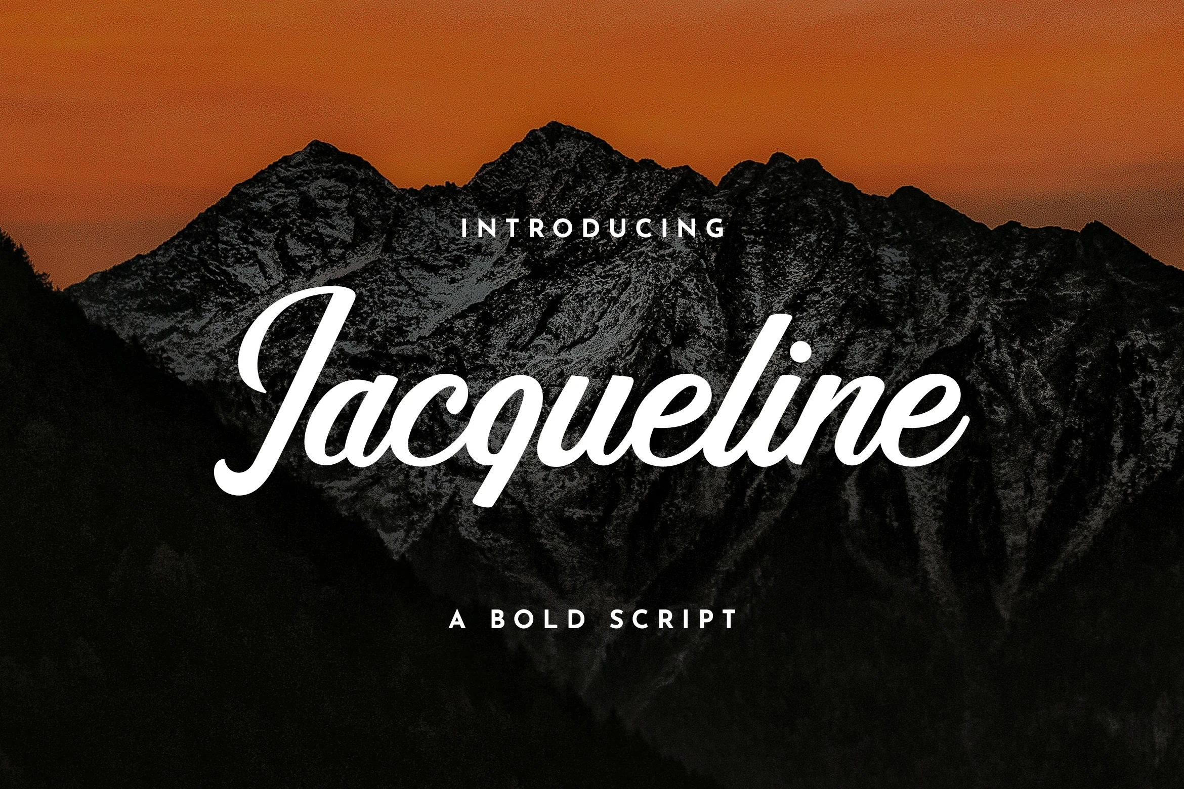
Best For: T-shirts, logos, posters, display text
Jaqueline Font pairs a strong rightward lean with consistent monolinear strokes, making this heavy connected style unusually easy to read at display sizes. Its uncomplicated construction supports shirts, posters, and logos, but not extended reading.
Tahta Font
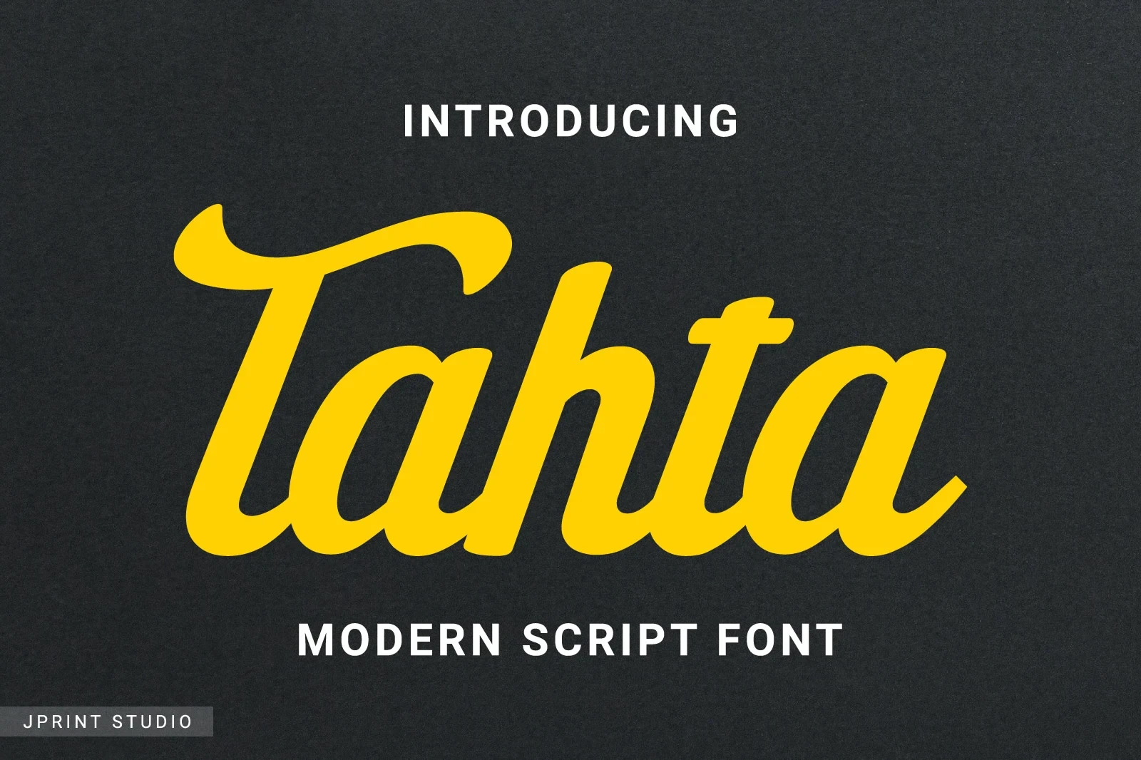
Best For: product labels, display text, minimal designs
Tahta Font builds its rounded rhythm from uniform heavy strokes, soft terminals, and a clear rightward slant. The letterforms remain legible for labels and headlines, provided they retain the generous scale expected of display lettering.
Vafgary Font
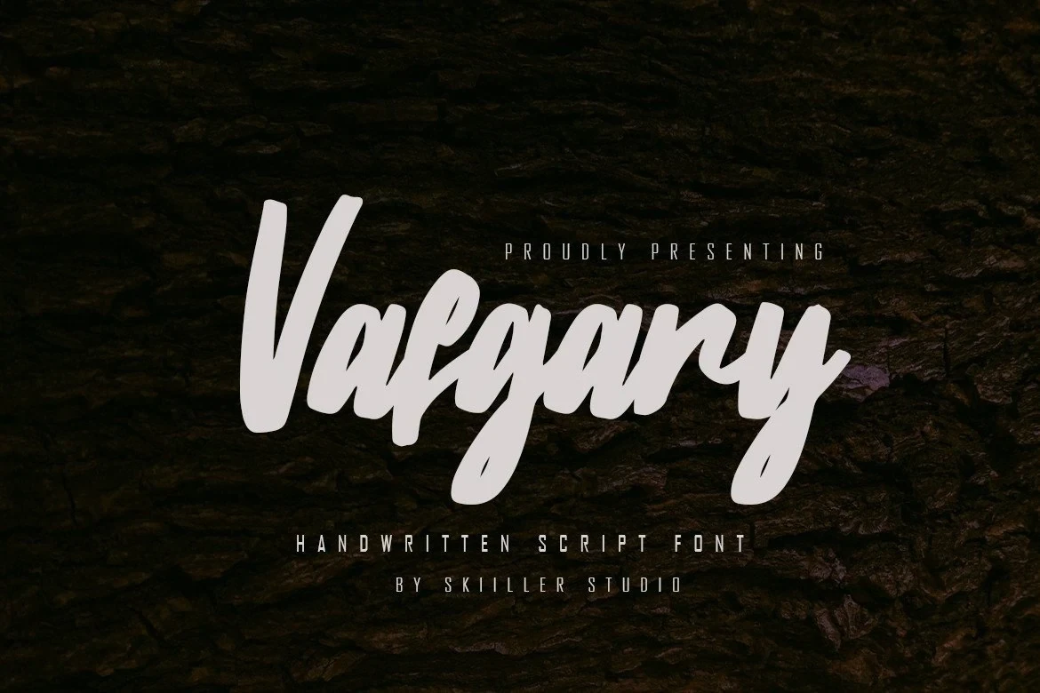
Best For: clean designs, soft designs, bold designs, expressive designs
Vafgary Font uses a handwritten execution, moderate contrast, heavy strokes, and a pronounced rightward slant to create continuous connected movement. It supports large headings especially well, while its dense construction limits clarity at very small scales.
Kleyra Font

Best For: packaging, posters, invitations, signage
Kleyra Font offers an upright alternative within Bold Cursive Fonts, using low contrast, thick flowing connections, and rounded terminals instead of a strong slant. It reads well on posters and packaging, though tiny text remains unsuitable.
Latton Font
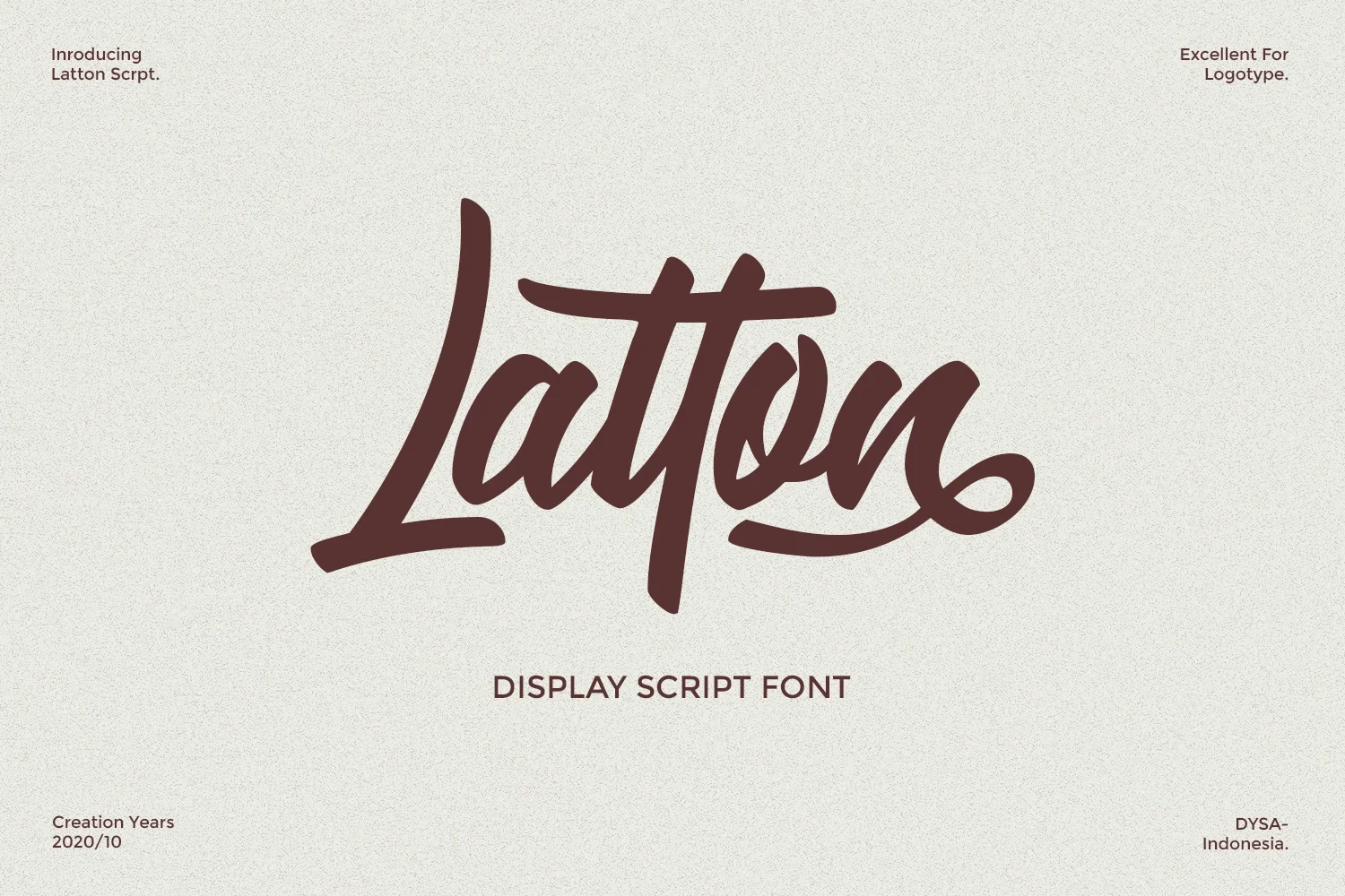
Best For: website headers, display text, bold designs, expressive designs
Latton Font keeps its connected lettering monolinear and heavy, then adds terminal swashes from the n and o. These flourished endings bring movement to headers, but the extra detail reduces usefulness in small blocks.
Slanted Swashes and Brush Contrast
This group emphasizes slant, brush texture, thick-thin contrast, and extended swashes. Compared with the upright scripts, these designs create more directional movement but demand larger setting sizes.
Clarkson Font
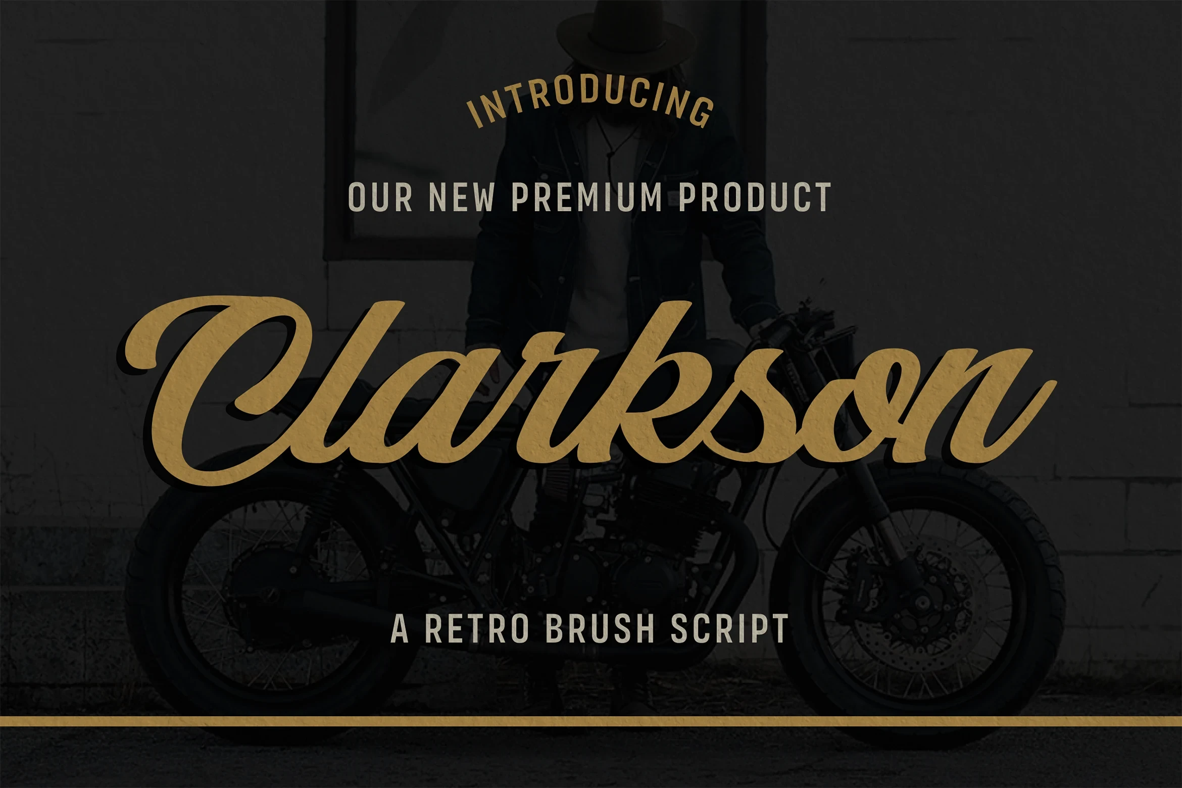
Best For: fashion branding, branding, editorial designs, display text
Clarkson Font combines connected cursive lettering with a bold monolinear stroke, pronounced rightward slant, and rounded terminals. Subtle flourishes keep it readable for headlines and branding, although the detail is less practical for small text.
The Linestay Font
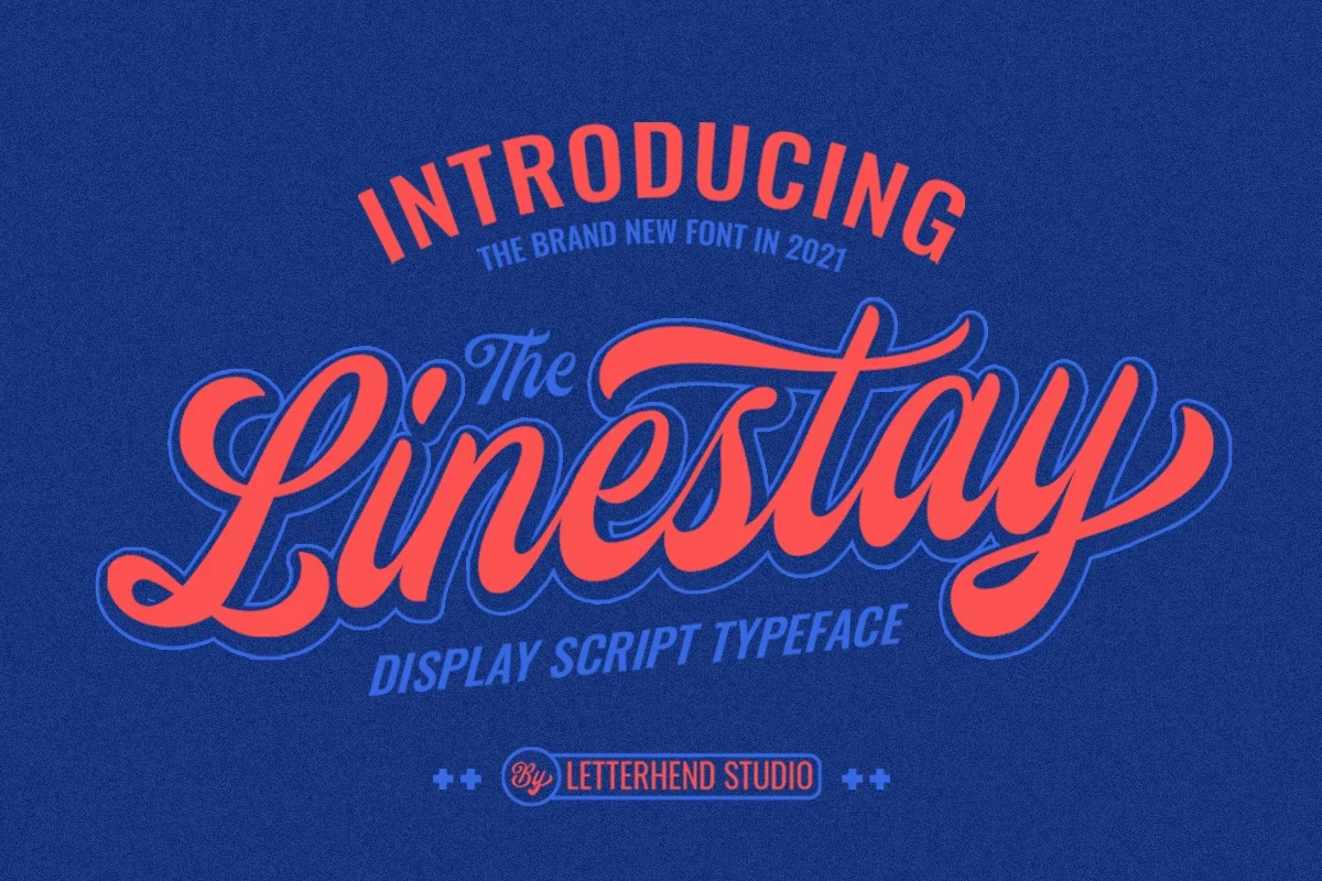
Best For: headlines, display text, bold designs
The Linestay Font suits large wordmarks where its condensed connected forms, heavy strokes, strong contrast, and extended loops can remain visible. The decorative connections add complexity, so it works less effectively in compact applications or reduced text.
Pearlside Font

Best For: branding, social media graphics, product labels, website headers
Pearlside Font pushes connected lettering upward with a pronounced slant, high thick-thin contrast, and a final under-stroke. Its alternate characters broaden branding and label options, while the extended swash favors short display phrases and large applications.
Brickrow Font
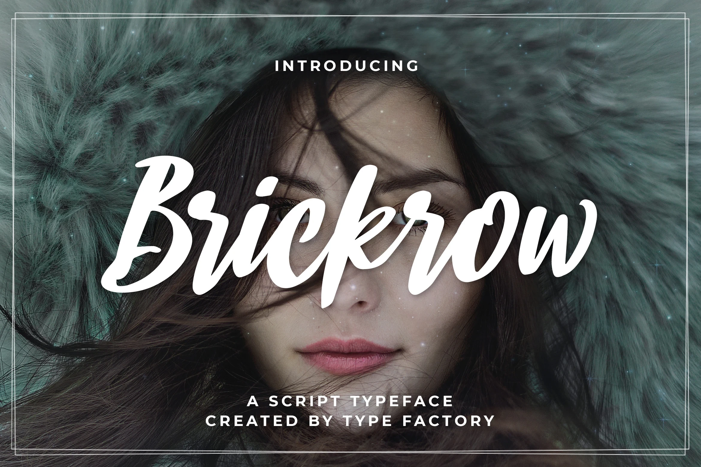
Best For: logos, posters, signage, badges
Brickrow Font brings high thick-thin contrast and visible brush texture to connected, right-leaning lettering. That density gives logos, badges, posters, and signage a strong surface character, though the textured strokes can blur when the size drops.
Sandbox Font
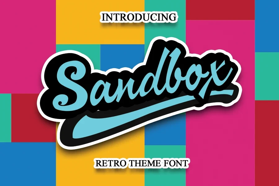
Best For: headlines, display text, clean designs, bold designs
Sandbox Font is defined by the final x, which launches a prominent underscoring swash beyond the connected word. The extended finish gives logos and headlines a strong horizontal shape, but becomes difficult to manage at smaller sizes.
Anitian Font
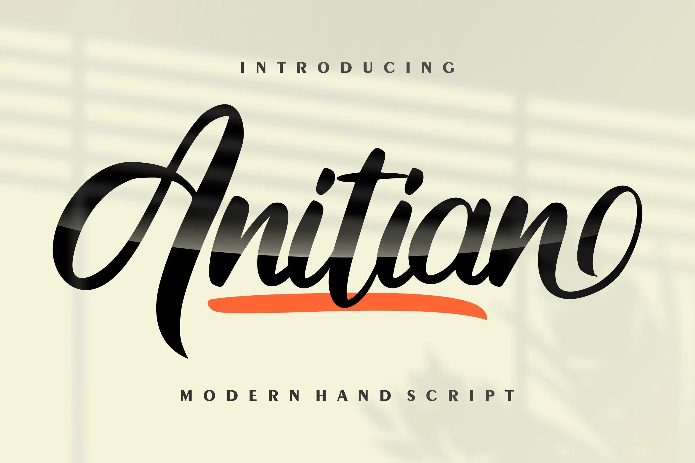
Best For: headlines, modern designs, clean designs, elegant designs
Anitian Font combines high contrast, rightward slant, elongated terminals, and multiple swashes for a detailed display cadence. Its connected forms suit elegant logos and headlines, while the layered styling loses legibility when reduced.
Mixed-Join and Hybrid Displays
Mixed joins, disconnected brush shapes, and script-and-sans combinations define this category. It offers the broadest structural variation, balancing decorative initials or irregular forms with clearer supporting characters.
Blinka Font

Best For: branding, modern designs, clean designs
Blinka Font creates distinction through contrast: a high-contrast calligraphic capital B introduces sweeping loops, while upright geometric lowercase letters provide clearer reading cues. This mixed construction is especially useful when a wordmark needs one decorative focal point.
Making Font

Best For: logos, product labels, display text
Making Font sits at the flowing-handwriting edge of this collection: its thick, rounded brush letters are bouncy and disconnected rather than fully joined. The irregular shapes suit large labels and logos, but small print loses clarity quickly.
Melt Font
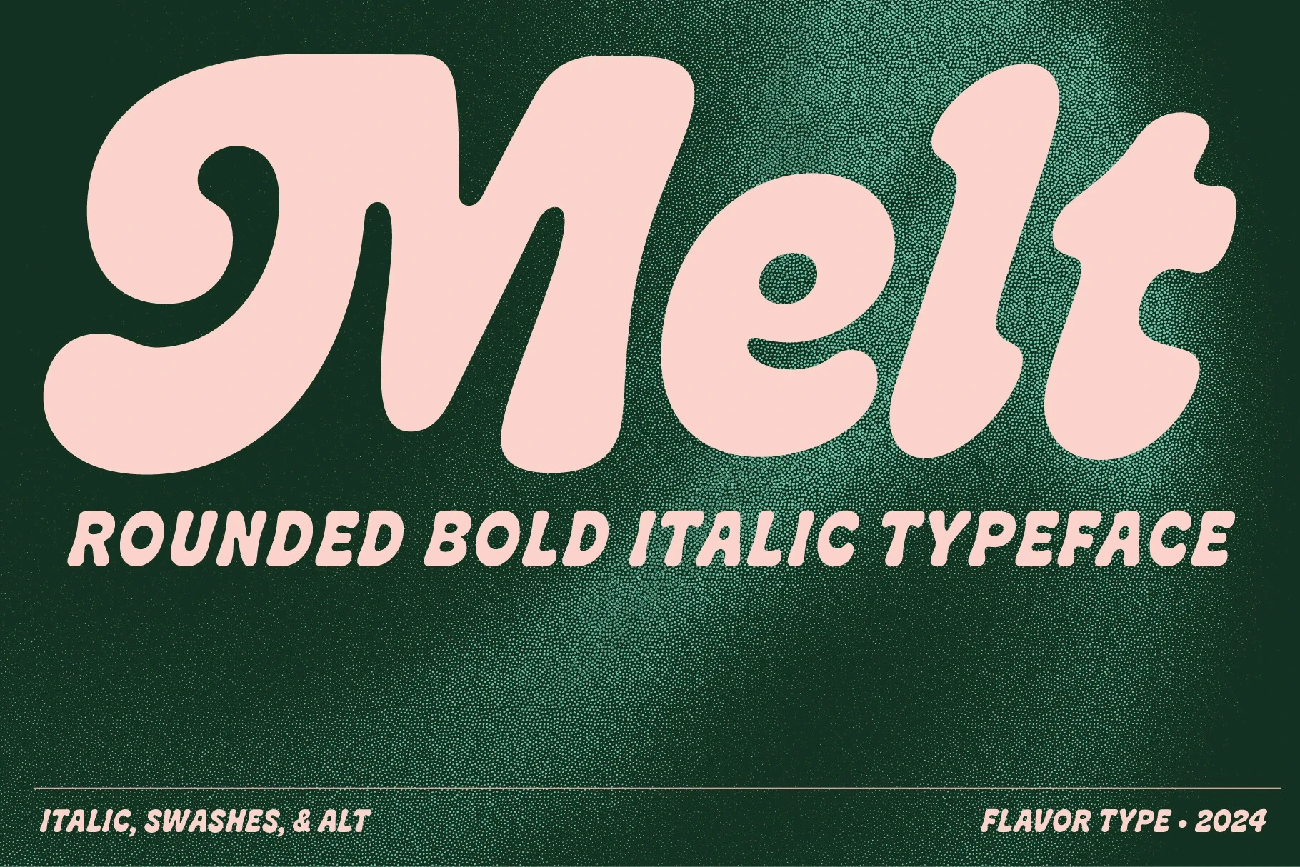
Best For: headlines, website headers, display text
Melt Font uses heavy rounded joins, smooth terminals, and a connected structure for a clear 1970s display character. Its thick curves need generous sizing, making it better for headlines, headers, and short display treatments than compact copy.
How to Choose the Right Font
Choose by construction first: monolinear options such as Jaqueline or Tahta offer clearer heavy display lettering, while Brickrow, Pearlside, and Anitian add more contrast and flourish. For logos, allow room for swashes; for packaging or posters, favor simpler joins. These Bold Cursive Fonts work best when scale protects their connections and terminals.